"Everything should be as simple as possible, but no simpler."
Not all navigation mechanisms on a site are equal.
Your job is to sort them out. You must determine the purpose and importance of the navigation within your site, bringing similar options together and presenting them as a cohesive unit. Of course, there are conventions to get you started—bars and tabs are commonly used for the main navigation, vertical mechanisms on the left for local navigation—but there are no set usage rules, and many variations exist.
To sort them out, try thinking like a visitor, not a designer. Take time to consider how visitors perceive the navigation mechanisms. Understanding the type of navigation a menu represents can help people predict links and reorient themselves on new pages.
But what makes a main navigation the main navigation? What makes a related link different than a local navigation? Several aspects distinguish types of navigation:
The type of content a mechanism accesses
Behavior of the navigational links and transition to the next page
The tasks and modes of seeking the mechanism supports
Visual treatment of navigational options
The position of a navigation on a page
What's more, the type of page on which a navigational menu appears greatly determines the navigation's purpose. The navigation on home pages is usually different from the navigation on product pages, for example, and visitors expect certain navigational elements to appear on search results pages. The role the page plays in the overall site also gives purpose to different types of navigation.
All of these aspects work together to allow site visitors to recognize that the main navigation is a main navigation and that local navigation is a local navigation. This sets the stage for interacting with the navigation and the site as a whole.
To help you ensure navigational concepts are immediately clear on your sites, this chapter surveys the various navigation types and their functions, as well as key page types. As you read on, however, keep in mind that there isn't a standard language among designers. The terminology describing navigation and navigational types can vary greatly. Whenever possible, alternative names are provided with each of the descriptions. Still, you may find alternative (or even contradictory) uses of terms in your organization. In all cases, just remember that your goal remains the same: to understand the role and purpose of navigation.
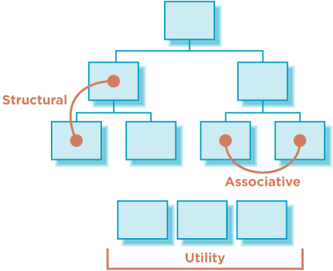
Most navigation types fall into three primary categories[51] (Figure 4-1).
- Structural
Connects one page to another based on the hierarchy of the site; on any page you'd expect to be able to move to the page above it and pages below it.
- Associative
Connects pages with similar topics and content, regardless of their location in the site; links tend to cross structural boundaries.
- Utility
Connects pages and features that help people use the site itself; these may lie outside the main hierarchy of the site, and their only relationship to one another is their function.
As its name implies, structural navigation follows the structure of a web site. It allows people to move up and down the different points of a site's hierarchy. Structural navigation can be further subdivided into two types: main navigation and local navigation.
Also called: global navigation, primary navigation, main nav.
The main navigation generally represents the top-level pages of a site's structure—or the pages just below the home page. The links in the main navigation are expected to lead to pages within the site and behave in a very consistent way. Users don't expect to land somewhere completely unrelated when using main navigation links. Changes in navigation from page to page are usually small when using the main navigation.
Overall, a main navigation supports a variety of user tasks and modes of information seeking, including known-item seeking, exploration, and even re-finding. From a user's standpoint, the main navigation plays a critical role in using the site:
The main navigation provides an overview and answers important questions users may have when first coming to a site, such as "does this site have what I'm looking for?"
The main navigation aids in orientation. It is comforting to have a persistent navigation mechanism across the site, particularly for large, information-rich sites.
It allows people to switch topics. Visitors can get to other sections of a site efficiently, or they can reset their navigation path and start over using main navigation options.
It helps when users get interrupted while navigating and reminds visitors where they are in a site.
Main navigation gives shape to a site. In many ways, the main navigation defines the boundaries of the site itself.
The main navigation is often presented in a global navigation area, which generally includes the site logo and utility navigation. (See the following section for more on utility navigation). As the name "global" implies, these controls generally appear in an unchanged, consistent position on all or nearly all pages of a site.
Consider the global navigation area of the University of Valencia (www.uv.es, Figure 4-2), for example. The six main navigation options are on the left below the logo. Some utility links are included to the right, such as a site map and link to site search. It's also typical to include a design element, such as a picture or graphic, to help create a brand image.
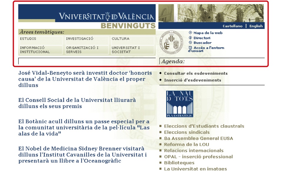
Critics of an ever-present global navigation point to its intrusion on valuable screen real estate. These concerns are entirely valid. The global navigation area in Figure 4-2 occupies a fair amount of the page, and the designers might have done a better job reducing it, particularly on content pages further down in the site. But it's not a question of including or excluding a global navigation: a global navigation area is usually a valuable navigational device. The question is how prominent and persistent it should be. The answer depends on several factors:
- The size of the site
Larger sites with thousands of pages may benefit from a steady main navigational mechanism across pages. Smaller sites may be navigable with only breadcrumbs or contextual navigation.
- User behavior and needs
Don't create prominent and persistent main navigation just for the sake of it. You need to understand your users and their information needs, then design accordingly.
- Stakeholder objectives
Companies have goals. Inherently, some options will be promoted and highlighted over others. A visible, persistent global navigation may fulfill a stakeholder need.
- Workflows that can't be interrupted
There are times when global navigation shouldn't be shown, or can vary its form. For instance, some task flows, such as a checkout process or online bank transfer, should restrain people from jumping out in the middle of a process.
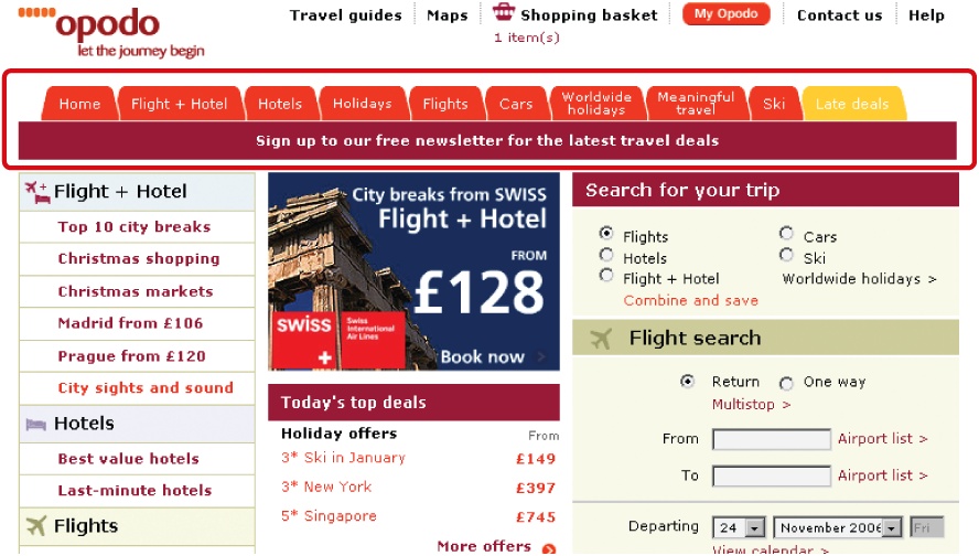
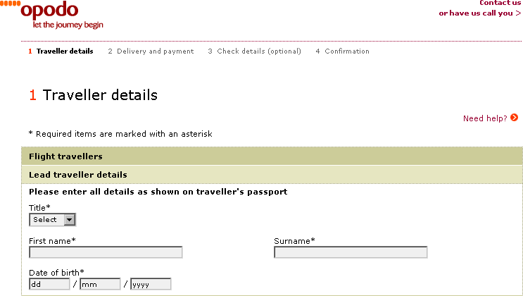
Compare Figure 4-3, which shows the home page of the Opodo travel site (www.opodo.co.uk), to Figure 4-4, which shows first step of the site's checkout process. For checkout, the main navigation tabs were removed to provide focus during the process and avoid errors.
Also called: sub-navigation, page-level navigation.
Local navigation is used to access lower levels in a structure, below the main navigation pages. The term "local" implies "within a given category." On a given page, local navigation generally shows other options at the same level of a hierarchy, as well as the options below the current page.
Local navigation often works in conjunction with a global navigation system and is really an extension of the main navigation. Because local navigation varies more often than main navigation, it is often treated differently.
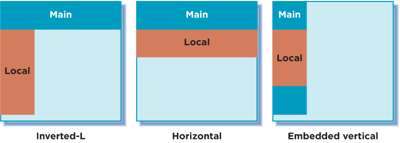
Common arrangements of local navigation and main navigation include:
- Inverted-L
It is very common to place a global navigation along the top of the page and have local navigation as a vertical link list on the left in the shape of an inverted L.
- Horizontal
Local navigation might also be represented by a second row of options under a horizontal global navigation or by dynamic menus.
- Embedded vertical
When the main navigation is presented in a vertical menu on the left or right, it's common to embed the local navigation between the main navigation options in a tree-like structure.
Figure 4-5 diagrams these three common arrangements. Keep in mind that other arrangements are possible, such as a right-hand local navigation, as well as combinations and hybrid arrangements.
Generally transitions from page to page with a local navigation are smooth and consistent. There's likely no expectation that links in local navigation will cause the user to leave the site, or even the site category. But local navigation can be more volatile than global navigation in some instances. It may be used to link to other page types, content formats.
Overall, local navigation provides a great deal of context, such as which topics belong together, related content, and so forth. In this sense, local navigation plays a key role in indicating the "aboutness" of the site. It also gives a sense of granularity of a topic. For this reason, local navigation supports general exploration, as well as known-item seeking and re-finding. It also points to content a visitor might not have known existed.
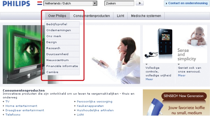
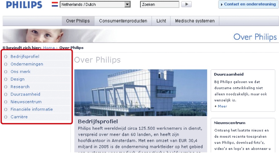
The Dutch version of the Philips web site (www.philips.nl) represents the local navigation with dynamic menus, which conserve screen real estate while providing quick access to options. In Figure 4-6, a dynamic menu extends from the main navigation and displays options for Over Philips. Clicking one of these local navigation then leads to a page where the menu is repeated on the left (Figure 4-7). Pages one level down from here are then also revealed, between the grey bars in the image. Overall, this is an efficient navigation strategy that makes good use of screen real estate.
Accessibility
Skip Navigation
Persistent, global navigational elements present issues for screen reader users: people don't need every menu option read aloud on every page repeatedly. For the first page a screen reader user encounters while using a site, this may be helpful. But on subsequent pages, it's time-consuming and annoying to hear the same options read each time.
For persistent navigation with many options, place a Skip Navigation link before the navigation mechanism starts, so visitors can jump to the main content of a page, thereby skipping the navigation. Such links can be coded so that sighted users don't see them, but screen readers catch them.
Another strategy is to show navigation at the bottom of the page and to have a Skip to Navigation link at the top of the page for keyboard-based browsers. Then, at the bottom of the navigation, include a Back to Content link to bring users back to the content of the page.
Associative navigation makes important connections across levels of a hierarchy or site structure. While reading about one topic, the user can access to other topics. This is a key aspect of hypertext in general, but is also at the heart of the embedded digression problem mentioned in Chapter 2.
Three common types of associative navigation are: contextual navigation, quick links, and footer navigation. Take a closer look at each in turn.
Also called: associative links, related links.
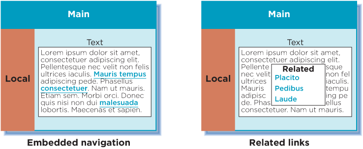
As the name implies, contextual navigation can vary. It's situational. Though links may transition to similar pages at the same level within the site, they quite frequently lead to new content areas, different page types, or even a new site.
Generally, contextual navigation is placed close to the content of a page. This creates a strong connection between the meaning of a text and the linked related pages. There are two typical arrangements of contextual navigation on the page (Figure 4-8):
- Embedded navigation
Contextual navigation may be embedded within the text itself. As a result, contextual navigation is often represented as plain text links.
- Related links
Contextual navigation may appear at the end or to the side of content.
If the navigation is embedded within text, there may be an explicit indication to prepare users for more disjointed interaction, such as linking to a different content format or another site. For instance, an embedded link may be preceded or succeeded by text indicating that the linked material is on a different site or in a different format. Figure 4-9 shows the Education page on the web site of the Information Architecture Institute (www.iainstitute.org). Links in the text lead to other pages in the site on various levels of the structure. The first link in the last paragraph opens a PDF document, as noted in the text. The second link goes to Amazon.com.

Contextual navigation doesn't support known-item seeking well. Instead, it supports exploration and may point people to new information. From a business standpoint, contextual navigation provides opportunities for upsell. Product pages in e-commerce sites, for instance, often have links to related products and services. This is a common use of contextual navigation in e-commerce.
Accessibility
Embedded links or associative navigation must make sense when read out of context. It's common to label associative links "For more information, click here," for example, with "click here" the only linked words. When skipping from link to link on a page, a screen reader user would just hear the link text and not the preceding phrases: "click here," "click here," "click here," and so on. It's better to link the entire sentence, or at least enough so that the linked portion is understandable on its own.
Related links are also used effectively on news sites. From one article, readers can get to other related articles. For example, each story on the web site for The Washington Post (www.washingtonpost.com) ends with related links (Figure 4-10). There are two main parts:
More stories on the same topic (Sports) as the current article. This includes a link that allows users to automatically search for even more articles on the same topic.
Links to the most-viewed articles from the same section that the current article is in (in this case, Sports), including a link to see the top 35 most-viewed articles in that section.
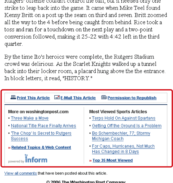
Look again at the links in the contextual navigation area of Figure 4-10, and you'll notice the Sports Articles links change based on which stories readers visit most. By observing what all site visitors do, a new type of navigation link arises: adaptive navigation.
Adaptive navigation is a special kind of a contextual navigation. Its links are generated from a process referred to as collaborative or social filtering. The process relies on an algorithmic ranking of some kind, based on user behavior. The principle is similar to a traditional best-seller list: if many people read something, it must be good. In this case, link relevance turns out to be a socially constructed phenomenon.
Adaptive navigation has been most prominently used to make recommendations on e-commerce sites. The classic example of this is the "Customers who bought this item also bought..." feature on Amazon.com. Figure 4-11 shows an example of this feature, using Jeffrey Zeldman's book Designing with Web Standards.[52]
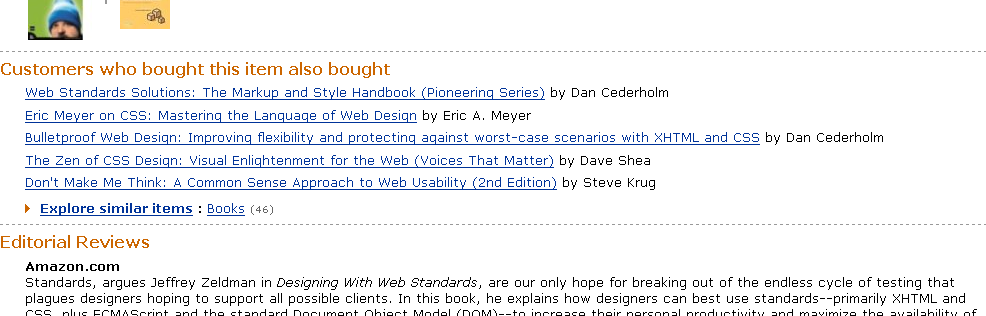
This is an example of passive collaborative filtering: the site automatically collects user behavior to generate the list. With active filtering, participants in the site must explicitly rate a product, person, or service. You may have seen this on web journals and other sites that have a Highest Rated Articles list or similar. Boxes and Arrows (www.boxesandarrows.com), for instance, allows readers to rate each story at the bottom of the text (Figure 4-12). Based on all ratings for all articles, visitors are then able to view the site's top-rated stories in the navigation.

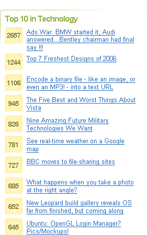
Lists of links produced by collaborative filtering are potentially long—virtually endless in some cases. Typically only the top items are displayed in a top-10-list fashion. If necessary, a More link might also be include to see more of the list. Because of the dynamic nature of adaptive navigation, you generally don't know how long each link may be in the mechanism. Commonly a vertical link list with ample space is used for adaptive navigation. It would be hard to imaging a horizontal arrangement of adaptive navigation options.
Digg.com has a list of top articles for each of its main categories. Because it's impossible to account for the length of article title, the design has to account for a mix of lengths (Figure 4-13).
Quick links provide access to important content or areas of the site that may not represented in a global navigation. Although similar to contextual navigation, quick links are contextual for the entire site, not a given page. They generally highlight frequently accessed content areas or tasks, but may also be used to promote areas deeper in the site. Marketers may see the value in quick links for an upsell effect.
Transitions from page to page using quick links may vary greatly. By definition, they tend to jump around. They may link to a related sub-site, online shop area, or even to a completely new web site.
Quick links often appear at the top or on the sides of pages. On the home page, they may be prominently positioned in component of their own, but on subsequent pages they may be reduced to a drop-down or dynamic menu.
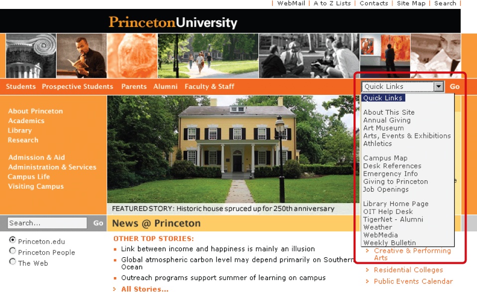
On the Princeton University web site (www.princeton.edu, Figure 4-14), quick links highlight key areas that are not represented by top-level navigation options. On the home page shown here, however, it might be better to display these links directly on the page, perhaps in a site map-like arrangement. Hiding them in a menu reduces the ability to rapidly scan the options.
Located at the bottom of the page, footer navigation is usually represented by text links. These often access a single page with no further levels of structure below them—a deadend, so to speak.
Traditionally, footer navigation contains supplementary information not pertinent to main topic of the site, such as copyright information, terms and conditions, and site credits. In this sense, footer navigation doesn't address a specific user need, but addresses a legal requirement for site owners. Footer navigation is often used as a catch-all for various types of content and it can lack consistency in an organizational scheme.
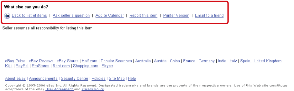
But footer navigation doesn't have to be insignificant. For instance, part or all of a site map can be included, as mentioned in Chapter 3. Related links and logical next steps may also be included. eBay.com offers task-based options at the end of item pages (Figure 4-15). These lead to various areas of the site across the hierarchy of pages. Amazon.com even shows visitors' history for a given session at the bottom of product pages. Other elements that may appear in a footer area include a Print This Page feature, an Email a Friend link, site help, the ability to comment on a page, and page rating features, among others.
The advantage of footer navigation is that it doesn't intrude on site content or functionality, potentially saving valuable real estate. Of course, links in a footer area may not be as visible as navigation elsewhere on the page. But as web users become savvier in general, scrolling longer pages becomes less problematic. Web designers can therefore make use of bottom-of-the-page navigation.[53]
Utility navigation connects tools and features that assist visitors in using the site. These pages are generally not part of the main topic hierarchy of the site. For example, a link to a search form or help pages aren't part of the main navigation or local navigation systems. Other options may not have a page associated with them at all. Instead, they are functions of the site, such as logging out or changing the font size.
Utility navigation may lead to varying page types or site functions. Transitions from page to page may be dramatic at times. For instance, from a single mechanism there may be links to a shopping cart, to a search form, and to a page about the site owner's organization—all quite different from one another, and potentially requiring significant reorientation on each new page.
Utility navigation is generally smaller than primary navigation mechanisms and appears on the top, sides, or bottom of the page. Global utility navigation quite often appears as simple text links. In some cases, the utility navigation is very closely related to the main navigation. As mentioned, utility navigation and main navigation often appear together in a global navigation area.
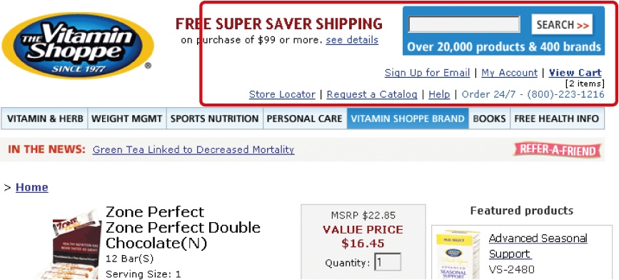
Figure 4-16 shows a fairly common utility navigation grouping found on Vitaminshoppe.com just above the main navigation bar. It includes a search input field, shopping cart link, help, and contact information.
But utility options aren't necessarily insignificant. For instance, on e-commerce sites, a shopping cart may appear in the utility options. This is obviously quite important for business.
There are many types of utility navigation, including:
Extra-site navigation
Toolboxes
Linked logos
Language and country selectors
Internal page navigation
Each deserves a detailed look.
Important for large corporations that may have diverse product areas or businesses, extra-site navigation links to other related sites, sub-sites, or companies. This type of meta-navigation allows people to switch to related web properties owned by a single provider.
Extra-site navigation is typically positioned at the top right of the page. Although generally quite small and represented as plain text, links in extra-site navigation may result in dramatic transitions. After all, they do lead to completely different sites. A common goal, however, is to make the navigation mechanism consistent across all sites. Unfortunately, these links are not always reciprocal, and the destination site may not link back to the originating site.
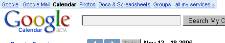
Figure 4-16 shows the extra-site navigation found on the top left of many Google.com sites, so users can move from product to product easily. Clicking the link in Figure 4-17 takes you from Google Mail to the Google Calendar and back quite easily. There is then a link to see more Google services at the end of the list.

Toolboxes bring together site options that perform functions—"tools" for doing things on the site. Toolboxes may include links to content or navigation pages, but often they link to functional pages. For this reason, transitions from this type of navigation may be great, even dramatic. From the home page, for instance, a toolbar may link to a search feature, contact form, and online shop. This may require more effort in reorientation.
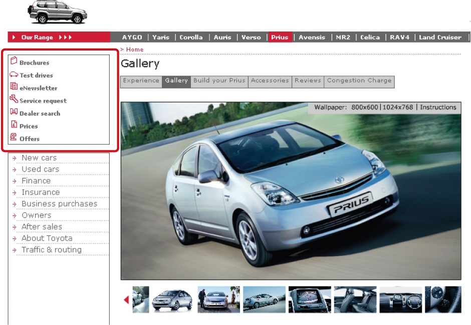
Figure 4-18 shows the toolbox navigation component from the Toyota UK web site (www.toyota.co.uk). This grouping of links is not thematically related; instead, they are grouped together because each link points to an important site function or tool.
Web sites very often have a logo at the top of each page. It is customary to link the entire image itself to the home page. People may or may not know of this behavior, so some sites add an explicit label underneath or to the side of the logo. In general, linking the logo provides a predictable way to return to a familiar starting point. In some ways it is like an "undo" option within for the navigation process.
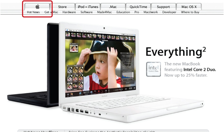
Because a Home option is often included in the global navigation, some sites have combined the two: the logo is incorporated in the navigation. Apple.com was one of the first to do this (Figure 4-19). Amazon.com also includes the logo in a main navigation tab, as does Toyota.com. This is an efficient way to save space and offer persistent visual branding throughout the site.
For sites that have sites in multiple languages, a language selector allows people to switch between them. Most often, visitors jump to the same web site, but in a different language. Sometimes, however, the local language site is completely different. Transitions may therefore be small or large. If there are only a few languages to select from, simple links at the top or bottom of the page may suffice.
Internationalization
It's bad practice to use images of national flags to switch language. Languages are often spoken in more than one country. For a Portuguese language site, you could potentially use an image of flags for Portugal or Brazil. Or, there may be more than one official language per country, such as in Switzerland, Belgium, or Canada.
You also need to consider what language the selections appear in. Do they appear in the language of the web site you are currently viewing, or in their original languages? This will affect the order of the options. Take the English version of a multi-language site as an example. If visitors from France are looking for française, they may see and understand the nearby option for French. But would someone from Finland find the English label Finnish when looking for Suomi? Or would someone from Spain find Spanish when looking for español? It's generally better to show the selections in their original language. Be sure to include diacritics (accents, umlauts, and other special characters) if you choose this option.
Accessibility
Keep in mind that if you do have a multi-language site, you need to declare the language of each site at the very top of the HTML code for each page. The code for this might look like this, for instance:
<html lang="en" xml:lang="en" xmlns="http://www.w3.org/1999/xhtml">
Additionally, alt texts for images and all other accessibility measures built into your code, such as frame titles, need to be translated for multi-language sites.
In some cases, content may differ based on the country or market. A country selector allows visitors to pick their market region. Note that language selection and country selection are different activities. For instance, eBay sites in the U.S., U.K., and Australia all appear in English, but each has different products available in each version of the site. There may be legal requirements involved here as well.
Large international organizations may have dozens of localized web sites. Country selection is more complicated in these cases. Sometimes country selection is done visually with a clickable world map. This, of course, assumes that people can identify the country they want on the map. Here, unlike for language selection, it is acceptable to use images of national flags.
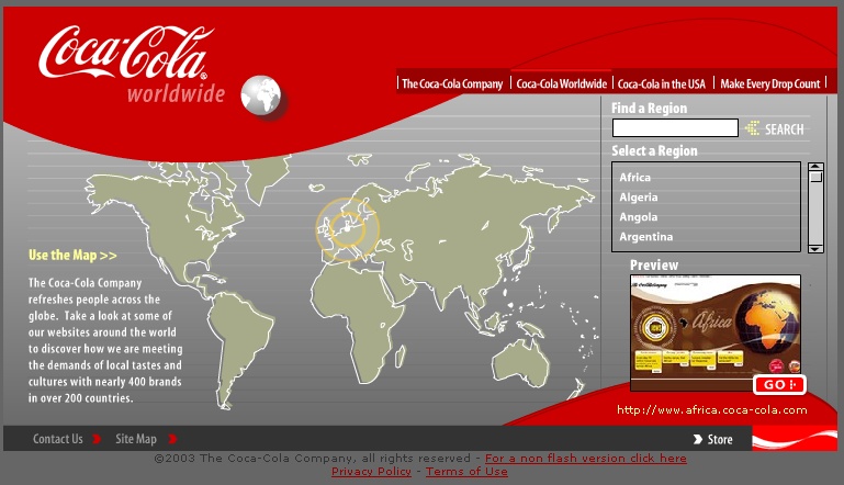
The country selector on the Coca-Cola site (www.cocacola.com, Figure 4-20) takes a two-pronged approach: The map is clickable by region, but there is also a navigation to select a country from an alphabetical list on the right.
Internationalization
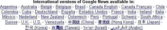
Many countries speak multiple languages. If you have a multi-language site, consider breaking region selection by language as well. Figure 4-21 shows the country selection menu at the bottom of Google News (http://news.google.com). The labels appear in the language of the country. If a country has two languages, the country name appears in both. Compare België to Belgique, and Canada English to Canada Français. Notice also the Spanish version for the U.S. as well (Estados Unidos). Finally, countries with non-alphabetical languages are listed at the end with the original characters, such as Chinese and Arabic. The designers include the English translations in parentheses.
Also called: anchor links, jump links.
Some web pages can be very long. In these cases, it may be advantageous to add internal page links that allow people to jump from one section of a page to another. Internal navigation links basically scroll the page up or down, providing a more efficient way of reaching sections of a longer page. It's customary to then provide a reciprocal link back to the top, so internal page navigation tends to come in pairs of links.
Beyond the quick access to content sections, internal links provide an overview of page content, much like a table of contents. It may be very difficult to get a sense of what's included on a longer page simply by scrolling and reading page headers. Sometimes a set of internal page links may even appear to be part the local navigation scheme.
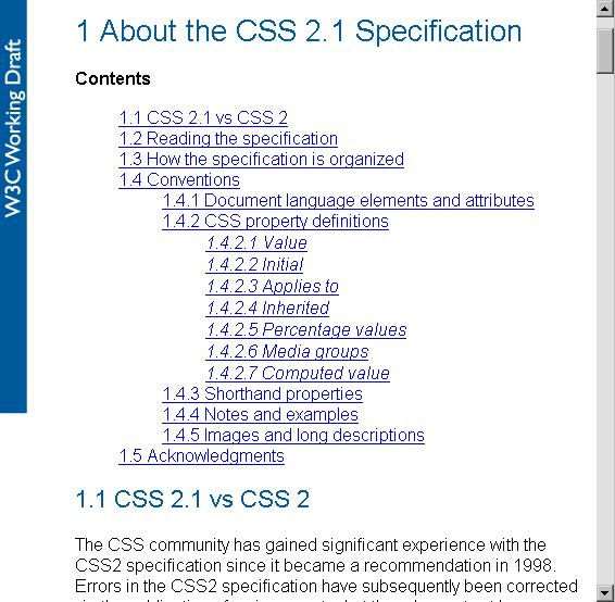
Technical specifications of the World Wide Web Consortium (W3C, www.w3c.org) are often very long, as the table of contents for the CSS 2.1 specification shows (Figure 4-22). These internal links jump within a page with no reload.
Here are some common internal linking issues:
Browsers don't distinguish between internal page links and external links. People may expect a transition to a new page when clicking a link, but instead, they are simply moved down on the same page.
Internal links may or may not be shown as visited links, depending on the link construction and browser. Sometimes internal links never appear as visited links, and sometimes all internal links appear as visited.
For consistency, all sections of a longer page may be included in jump links. This may mean, however, that the first link jumps to the first section, which may already be showing the page. You may have noticed that this happens on the W3C page shown in Figure 4-22.
Internal links at the top of pages take up valuable screen real estate.
Sometimes a sitewide decision is made to include "Back to Top" links on all pages. These links may then appear on pages that don't scroll.
If the last section of content is short, an internal link to it at the top may not scroll to the proper position. Though the last section will be present, it may be shown at the top of screen.
[51] See presentations from David Fiorito and Richard Dalton, Vanguard Group: "Creating a Consistent Enterprise Web Navigation Solution": www.iasummit.org/2004/finalpapers/73/73_Handout_or__final__paper.ppt and "Thinking Navigation." www.iasummit.org/2005/finalpapers/101_Presentation.ppt presented at the IA Summits in 2004 and 2005. These navigation types are derived directly from this work.
[52] Jeffrey Zeldman, Designing with Web Standards, Second Edition (New Riders, 2003).
[53] For more on using footer navigation to its fullest, see Jeff Lash, "More Than Just a Footer," Digital Web Magazine (February 2004).
Get Designing Web Navigation now with the O’Reilly learning platform.
O’Reilly members experience books, live events, courses curated by job role, and more from O’Reilly and nearly 200 top publishers.

