Chapter 4. Regression and Prediction
Perhaps the most common goal in statistics is to answer the question: Is the variable X (or more likely, ) associated with a variable Y, and, if so, what is the relationship and can we use it to predict Y?
Nowhere is the nexus between statistics and data science stronger than in the realm of prediction—specifically the prediction of an outcome (target) variable based on the values of other “predictor” variables. Another important connection is in the area of anomaly detection, where regression diagnostics originally intended for data analysis and improving the regression model can be used to detect unusual records. The antecedents of correlation and linear regression date back over a century.
Simple Linear Regression
Simple linear regression models the relationship between the magnitude of one variable and that of a second—for example, as X increases, Y also increases. Or as X increases, Y decreases.1 Correlation is another way to measure how two variables are related: see the section “Correlation”. The difference is that while correlation measures the strength of an association between two variables, regression quantifies the nature of the relationship.
The Regression Equation
Simple linear regression estimates exactly how much Y will change when X changes by a certain amount. With the correlation coefficient, the variables X and Y are interchangeable. With regression, we are trying to predict the Y variable from X using a linear relationship (i.e., a line):
We read this as “Y equals b1 times X, plus a constant b0.” The symbol is known as the intercept (or constant), and the symbol as the slope for X. Both appear in R output as coefficients, though in general use the term coefficient is often reserved for . The Y variable is known as the response or dependent variable since it depends on X. The X variable is known as the predictor or independent variable. The machine learning community tends to use other terms, calling Y the target and X a feature vector.
Consider the scatterplot in Figure 4-1 displaying the number of years a worker was exposed to cotton dust (Exposure) versus a measure
of lung capacity (PEFR or “peak expiratory flow rate”).
How is PEFR related to Exposure?
It’s hard to tell just based on the picture.
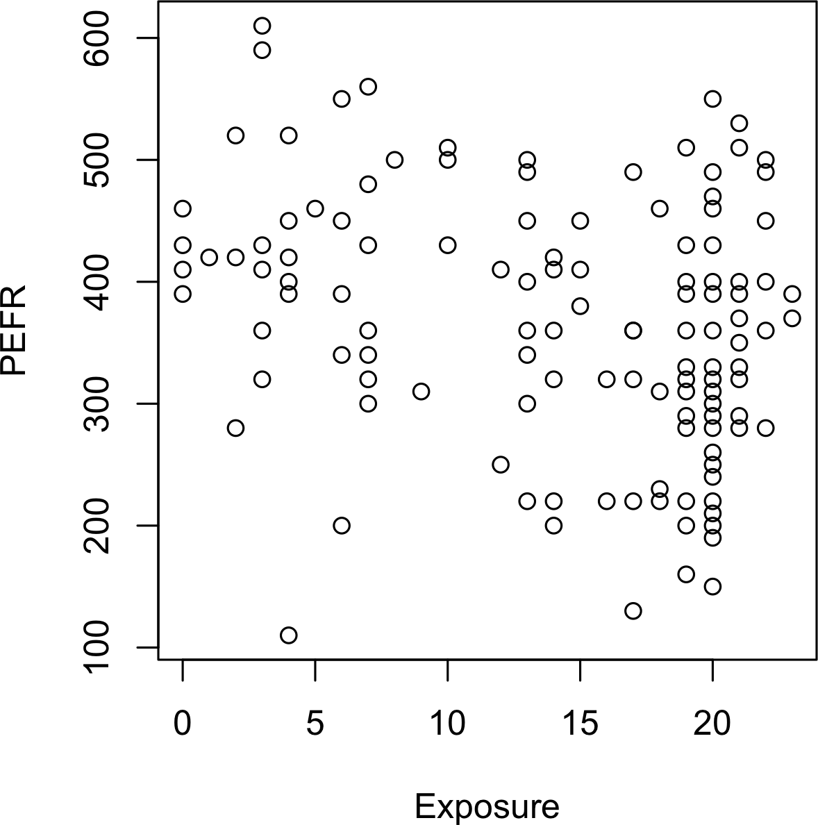
Figure 4-1. Cotton exposure versus lung capacity
Simple linear regression tries to find the “best” line to predict the response PEFR as a function of the predictor variable Exposure.
The lm function in R can be used to fit a linear regression.
model<-lm(PEFR~Exposure,data=lung)
lm stands for linear model and the ~ symbol denotes that PEFR is predicted by Exposure.
Printing the model object produces the following output:
Call:lm(formula=PEFR~Exposure,data=lung)Coefficients:(Intercept)Exposure424.583-4.185
The intercept, or , is 424.583 and can be interpreted as the predicted PEFR for a worker with zero years exposure.
The regression coefficient, or , can be interpreted as follows: for each additional year that a worker is exposed to cotton dust, the worker’s PEFR measurement is reduced by –4.185.
The regression line from this model is displayed in Figure 4-2.
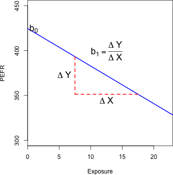
Figure 4-2. Slope and intercept for the regression fit to the lung data
Fitted Values and Residuals
Important concepts in regression analysis are the fitted values and residuals. In general, the data doesn’t fall exactly on a line, so the regression equation should include an explicit error term :
The fitted values, also referred to as the predicted values, are typically denoted by (Y-hat). These are given by:
The notation and indicates that the coefficients are estimated versus known.
Hat Notation: Estimates Versus Known Values
The “hat” notation is used to differentiate between estimates and known values. So the symbol (“b-hat”) is an estimate of the unknown parameter . Why do statisticians differentiate between the estimate and the true value? The estimate has uncertainty, whereas the true value is fixed.2
We compute the residuals by subtracting the predicted values from the original data:
In R, we can obtain the fitted values and residuals using the functions predict and residuals:
fitted<-predict(model)resid<-residuals(model)
Figure 4-3 illustrates the residuals from the regression line fit to the lung data. The residuals are the length of the vertical dashed lines from the data to the line.
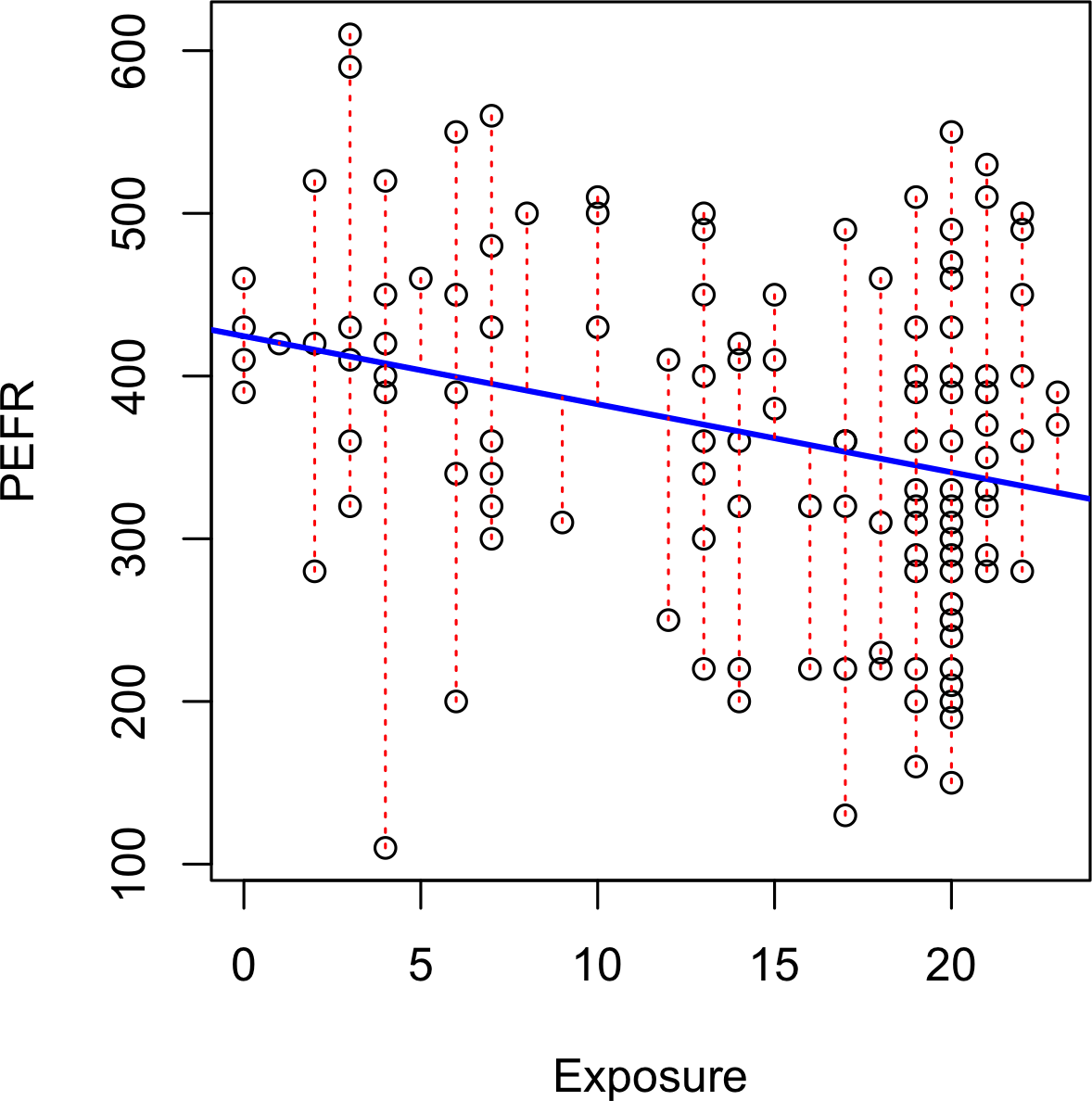
Figure 4-3. Residuals from a regression line (note the different y-axis scale from Figure 4-2, hence the apparently different slope)
Least Squares
How is the model fit to the data? When there is a clear relationship, you could imagine fitting the line by hand. In practice, the regression line is the estimate that minimizes the sum of squared residual values, also called the residual sum of squares or RSS:
The estimates and are the values that minimize RSS.
The method of minimizing the sum of the squared residuals is termed least squares regression, or ordinary least squares (OLS) regression. It is often attributed to Carl Friedrich Gauss, the German mathmetician, but was first published by the French mathmetician Adrien-Marie Legendre in 1805. Least squares regression leads to a simple formula to compute the coefficients:
Historically, computational convenience is one reason for the widespread use of least squares in regression. With the advent of big data, computational speed is still an important factor. Least squares, like the mean (see “Median and Robust Estimates”), are sensitive to outliers, although this tends to be a signicant problem only in small or moderate-sized problems. See “Outliers” for a discussion of outliers in regression.
Regression Terminology
When analysts and researchers use the term regression by itself, they are typically referring to linear regression; the focus is usually on developing a linear model to explain the relationship between predictor variables and a numeric outcome variable. In its formal statistical sense, regression also includes nonlinear models that yield a functional relationship between predictors and outcome variables. In the machine learning community, the term is also occasionally used loosely to refer to the use of any predictive model that produces a predicted numeric outcome (standing in distinction from classification methods that predict a binary or categorical outcome).
Prediction versus Explanation (Profiling)
Historically, a primary use of regression was to illuminate a supposed linear relationship between predictor variables and an outcome variable. The goal has been to understand a relationship and explain it using the data that the regression was fit to. In this case, the primary focus is on the estimated slope of the regression equation, . Economists want to know the relationship between consumer spending and GDP growth. Public health officials might want to understand whether a public information campaign is effective in promoting safe sex practices. In such cases, the focus is not on predicting individual cases, but rather on understanding the overall relationship.
With the advent of big data, regression is widely used to form a model to predict individual outcomes for new data, rather than explain data in hand (i.e., a predictive model). In this instance, the main items of interest are the fitted values . In marketing, regression can be used to predict the change in revenue in response to the size of an ad campaign. Universities use regression to predict students’ GPA based on their SAT scores.
A regression model that fits the data well is set up such that changes in X lead to changes in Y. However, by itself, the regression equation does not prove the direction of causation. Conclusions about causation must come from a broader context of understanding about the relationship. For example, a regression equation might show a definite relationship between number of clicks on a web ad and number of conversions. It is our knowledge of the marketing process, not the regression equation, that leads us to the conclusion that clicks on the ad lead to sales, and not vice versa.
Further Reading
For an in-depth treatment of prediction versus explanation, see Galit Shmueli’s article “To Explain or to Predict”.
Multiple Linear Regression
When there are multiple predictors, the equation is simply extended to accommodate them:
Instead of a line, we now have a linear model—the relationship between each coefficient and its variable (feature) is linear.
All of the other concepts in simple linear regression, such as fitting by least squares and the definition of fitted values and residuals, extend to the multiple linear regression setting. For example, the fitted values are given by:
Example: King County Housing Data
An example of using regression is in estimating the value of houses.
County assessors must estimate the value of a house for the purposes of assessing taxes.
Real estate consumers and professionals consult popular websites such as Zillow to ascertain a fair price.
Here are a few rows of housing data from King County (Seattle), Washington, from the house data.frame:
head(house[,c("AdjSalePrice","SqFtTotLiving","SqFtLot","Bathrooms","Bedrooms","BldgGrade")])Source:localdataframe[6x6]
  AdjSalePrice SqFtTotLiving SqFtLot Bathrooms Bedrooms BldgGrade
         (dbl)         (int)   (int)     (dbl)    (int)     (int)
1       300805          2400    9373      3.00        6         7
2      1076162          3764   20156      3.75        4        10
3       761805          2060   26036      1.75        4         8
4       442065          3200    8618      3.75        5         7
5       297065          1720    8620      1.75        4         7
6       411781           930    1012      1.50        2         8
The goal is to predict the sales price from the other variables.
The lm handles the multiple regression case simply by including more terms on the righthand side of the equation; the argument na.action=na.omit causes the model to drop records that have missing values:
house_lm<-lm(AdjSalePrice~SqFtTotLiving+SqFtLot+Bathrooms+Bedrooms+BldgGrade,data=house,na.action=na.omit)
Printing house_lm object produces the following output:
house_lmCall:lm(formula=AdjSalePrice~SqFtTotLiving+SqFtLot+Bathrooms+Bedrooms+BldgGrade,data=house,na.action=na.omit)Coefficients:(Intercept)SqFtTotLivingSqFtLotBathrooms-5.219e+052.288e+02-6.051e-02-1.944e+04BedroomsBldgGrade-4.778e+041.061e+05
The interpretation of the coefficients is as with simple linear regression: the predicted value changes by the coefficient for each unit change in assuming all the other variables, for , remain the same. For example, adding an extra finished square foot to a house increases the estimated value by roughly $229; adding 1,000 finished square feet implies the value will increase by $228,800.
Assessing the Model
The most important performance metric from a data science perspective is root mean squared error, or RMSE. RMSE is the square root of the average squared error in the predicted values:
This measures the overall accuracy of the model, and is a basis for comparing it to other models (including models fit using machine learning techniques). Similar to RMSE is the residual standard error, or RSE. In this case we have p predictors, and the RSE is given by:
The only difference is that the denominator is the degrees of freedom, as opposed to number of records (see “Degrees of Freedom”). In practice, for linear regression, the difference between RMSE and RSE is very small, particularly for big data applications.
The summary function in R computes RSE as well as other metrics for a regression model:
summary(house_lm)Call:lm(formula=AdjSalePrice~SqFtTotLiving+SqFtLot+Bathrooms+Bedrooms+BldgGrade,data=house,na.action=na.omit)Residuals:Min1QMedian3QMax-1199508-118879-20982874149472982Coefficients:EstimateStd.ErrortvaluePr(>|t|)(Intercept)-5.219e+051.565e+04-33.349<2e-16***SqFtTotLiving2.288e+023.898e+0058.699<2e-16***SqFtLot-6.051e-026.118e-02-0.9890.323Bathrooms-1.944e+043.625e+03-5.3628.32e-08***Bedrooms-4.778e+042.489e+03-19.194<2e-16***BldgGrade1.061e+052.396e+0344.287<2e-16***---Signif.codes:0'***'0.001'**'0.01'*'0.05'.'0.1' '1Residualstandarderror:261200on22683degreesoffreedomMultipleR-squared:0.5407,AdjustedR-squared:0.5406F-statistic:5340on5and22683DF,p-value:<2.2e-16
Another useful metric that you will see in software output is the coefficient of determination, also called the R-squared statistic or . R-squared ranges from 0 to 1 and measures the proportion of variation in the data that is accounted for in the model. It is useful mainly in explanatory uses of regression where you want to assess how well the model fits the data. The formula for is:
The denominator is proportional to the variance of Y. The output from R also reports an adjusted R-squared, which adjusts for the degrees of freedom; seldom is this significantly different in multiple regression.
Along with the estimated coefficients, R reports the standard error of the coefficients (SE) and a t-statistic:
The t-statistic—and its mirror image, the p-value—measures the extent to which a coefficient is “statistically significant”—that is, outside the range of what a random chance arrangement of predictor and target variable might produce. The higher the t-statistic (and the lower the p-value), the more significant the predictor. Since parsimony is a valuable model feature, it is useful to have a tool like this to guide choice of variables to include as predictors (see “Model Selection and Stepwise Regression”).
Warning
In addition to the t-statistic, R and other packages will often report a p-value
(Pr(>|t|) in the R output) and F-statistic. Data scientists do not generally get too involved with the interpretation of these statistics, nor with the issue of statistical significance.
Data scientists primarily focus on the t-statistic as a useful guide for whether to include a predictor in a model or not.
High t-statistics (which go with p-values near 0) indicate a predictor should be retained in a model, while very low t-statistics indicate a predictor could be dropped.
See “P-Value” for more discussion.
Cross-Validation
Classic statistical regression metrics (R2, F-statistics, and p-values) are all “in-sample” metrics—they are applied to the same data that was used to fit the model. Intuitively, you can see that it would make a lot of sense to set aside some of the original data, not use it to fit the model, and then apply the model to the set-aside (holdout) data to see how well it does. Normally, you would use a majority of the data to fit the model, and use a smaller portion to test the model.
This idea of “out-of-sample” validation is not new, but it did not really take hold until larger data sets became more prevalent; with a small data set, analysts typically want to use all the data and fit the best possible model.
Using a holdout sample, though, leaves you subject to some uncertainty that arises simply from variability in the small holdout sample. How different would the assessment be if you selected a different holdout sample?
Cross-validation extends the idea of a holdout sample to multiple sequential holdout samples. The algorithm for basic k-fold cross-validation is as follows:
-
Set aside 1/k of the data as a holdout sample.
-
Train the model on the remaining data.
-
Apply (score) the model to the 1/k holdout, and record needed model assessment metrics.
-
Restore the first 1/k of the data, and set aside the next 1/k (excluding any records that got picked the first time).
-
Repeat steps 2 and 3.
-
Repeat until each record has been used in the holdout portion.
-
Average or otherwise combine the model assessment metrics.
The division of the data into the training sample and the holdout sample is also called a fold.
Model Selection and Stepwise Regression
In some problems, many variables could be used as predictors in a regression. For example, to predict house value, additional variables such as the basement size or year built could be used. In R, these are easy to add to the regression equation:
house_full<-lm(AdjSalePrice~SqFtTotLiving+SqFtLot+Bathrooms+Bedrooms+BldgGrade+PropertyType+NbrLivingUnits+SqFtFinBasement+YrBuilt+YrRenovated+NewConstruction,data=house,na.action=na.omit)
Adding more variables, however, does not necessarily mean we have a better model. Statisticians use the principle of Occam’s razor to guide the choice of a model: all things being equal, a simpler model should be used in preference to a more complicated model.
Including additional variables always reduces RMSE and increases . Hence, these are not appropriate to help guide the model choice. In the 1970s, Hirotugu Akaike, the eminent Japanese statistician, deveoped a metric called AIC (Akaike’s Information Criteria) that penalizes adding terms to a model. In the case of regression, AIC has the form:
- AIC = 2P + n log(
RSS/n)
where P is the number of variables and n is the number of records. The goal is to find the model that minimizes AIC; models with k more extra variables are penalized by 2k.
AIC, BIC and Mallows Cp
The formula for AIC may seem a bit mysterious, but in fact it is based on asymptotic results in information theory. There are several variants to AIC:
-
AICc: a version of AIC corrected for small sample sizes.
-
BIC or Bayesian information criteria: similar to AIC with a stronger penalty for including additional variables to the model.
Data scientists generally do not need to worry about the differences among these in-sample metrics or the underlying theory behind them.
How do we find the model that minimizes AIC?
One approach is to search through all possible models,
called all subset regression.
This is computationally expensive and is not feasible for problems with large data and many variables.
An attractive alternative is to use stepwise regression, which successively adds and drops predictors to find a model that lowers AIC.
The MASS package by Venebles and Ripley offers a stepwise regression function called stepAIC:
library(MASS)step<-stepAIC(house_full,direction="both")stepCall:lm(formula=AdjSalePrice~SqFtTotLiving+Bathrooms+Bedrooms+BldgGrade+PropertyType+SqFtFinBasement+YrBuilt,data=house0,na.action=na.omit)Coefficients:(Intercept)SqFtTotLiving6227632.22186.50BathroomsBedrooms44721.72-49807.18BldgGradePropertyTypeSingleFamily139179.2323328.69PropertyTypeTownhouseSqFtFinBasement92216.259.04YrBuilt-3592.47
The function chose a model in which several variables were dropped from house_full:
SqFtLot, NbrLivingUnits, YrRenovated, and NewConstruction.
Simpler yet are forward selection and backward selection. In forward selection, you start with no predictors and add them one-by-one, at each step adding the predictor that has the largest contribution to , stopping when the contribution is no longer statistically significant. In backward selection, or backward elimination, you start with the full model and take away predictors that are not statistically significant until you are left with a model in which all predictors are statistically significant.
Penalized regression is similar in spirit to AIC. Instead of explicitly searching through a discrete set of models, the model-fitting equation incorporates a constraint that penalizes the model for too many variables (parameters). Rather than eliminating predictor variables entirely—as with stepwise, forward, and backward selection—penalized regression applies the penalty by reducing coefficients, in some cases to near zero. Common penalized regression methods are ridge regression and lasso regression.
Stepwise regression and all subset regression are in-sample methods to assess and tune models. This means the model selection is possibly subject to overfitting and may not perform as well when applied to new data. One common approach to avoid this is to use cross-validation to validate the models. In linear regression, overfitting is typically not a major issue, due to the simple (linear) global structure imposed on the data. For more sophisticated types of models, particularly iterative procedures that respond to local data structure, cross-validation is a very important tool; see “Cross-Validation” for details.
Weighted Regression
Weighted regression is used by statisticians for a variety of purposes; in particular, it is important for analysis of complex surveys. Data scientists may find weighted regression useful in two cases:
-
Inverse-variance weighting when different observations have been measured with different precision.
-
Analysis of data in an aggregated form such that the weight variable encodes how many original observations each row in the aggregated data represents.
For example, with the housing data,
older sales are less reliable than more recent sales.
Using the DocumentDate to determine the year of the sale, we can compute a Weight as the number of years since 2005 (the beginning of the data).
library(lubridate)house$Year=year(house$DocumentDate)house$Weight=house$Year-2005
We can compute a weighted regression with the lm function using the weight argument.
house_wt<-lm(AdjSalePrice~SqFtTotLiving+SqFtLot+Bathrooms+Bedrooms+BldgGrade,data=house,weight=Weight)round(cbind(house_lm=house_lm$coefficients,house_wt=house_wt$coefficients),digits=3)house_lmhouse_wt(Intercept)-521924.722-584265.244SqFtTotLiving228.832245.017SqFtLot-0.061-0.292Bathrooms-19438.099-26079.171Bedrooms-47781.153-53625.404BldgGrade106117.210115259.026
The coefficients in the weighted regression are slightly different from the original regression.
Further Reading
An excellent treatment of cross-validation and resampling can be found in An Introduction to Statistical Learning by Gareth James, et al. (Springer, 2013).
Prediction Using Regression
The primary purpose of regression in data science is prediction. This is useful to keep in mind, since regression, being an old and established statistical method, comes with baggage that is more relevant to its traditional explanatory modeling role than to prediction.
The Dangers of Extrapolation
Regression models should not be used to extrapolate beyond the range of the data.
The model is valid only for predictor values for which the data has sufficient values
(even in the case that sufficient data is available, there could be other problems: see “Testing the Assumptions: Regression Diagnostics”).
As an extreme case,
suppose model_lm is used to predict the value of a 5,000-square-foot empty lot.
In such a case, all the predictors related to the building would have a value of 0 and the regression equation would yield an absurd prediction of –521,900 + 5,000 × –.0605 = –$522,202.
Why did this happen?
The data contains only parcels with buildings—there are no records corresponding to vacant land.
Consequently, the model has no information to tell it how to predict the sales price for vacant land.
Confidence and Prediction Intervals
Much of statistics involves understanding and measuring variability (uncertainty). The t-statistics and p-values reported in regression output deal with this in a formal way, which is sometimes useful for variable selection (see “Assessing the Model”). More useful metrics are confidence intervals, which are uncertainty intervals placed around regression coefficients and predictions. An easy way to understand this is via the bootstrap (see “The Bootstrap” for more details about the general bootstrap procedure). The most common regression confidence intervals encountered in software output are those for regression parameters (coefficients). Here is a bootstrap algorithm for generating confidence intervals for regression parameters (coefficients) for a data set with P predictors and n records (rows):
-
Consider each row (including outcome variable) as a single “ticket” and place all the n tickets in a box.
-
Draw a ticket at random, record the values, and replace it in the box.
-
Repeat step 2 n times; you now have one bootstrap resample.
-
Fit a regression to the bootstrap sample, and record the estimated coefficients.
-
Repeat steps 2 through 4, say, 1,000 times.
-
You now have 1,000 bootstrap values for each coefficient; find the appropriate percentiles for each one (e.g., 5th and 95th for a 90% confidence interval).
You can use the Boot function in R to generate actual bootstrap confidence intervals for the coefficients, or you can simply use the formula-based intervals that are a routine R output.
The conceptual meaning and interpretation are the same, and not of central importance to data scientists, because they concern the regression coefficients. Of greater interest to data scientists are intervals around predicted y values (). The uncertainty around comes from two sources:
-
Uncertainty about what the relevant predictor variables and their coefficients are (see the preceding bootstrap algorithm)
-
Additional error inherent in individual data points
The individual data point error can be thought of as follows: even if we knew for certain what the regression equation was (e.g., if we had a huge number of records to fit it), the actual outcome values for a given set of predictor values will vary. For example, several houses—each with 8 rooms, a 6,500 square foot lot, 3 bathrooms, and a basement—might have different values. We can model this individual error with the residuals from the fitted values. The bootstrap algorithm for modeling both the regression model error and the individual data point error would look as follows:
-
Take a bootstrap sample from the data (spelled out in greater detail earlier).
-
Fit the regression, and predict the new value.
-
Take a single residual at random from the original regression fit, add it to the predicted value, and record the result.
-
Repeat steps 1 through 3, say, 1,000 times.
-
Find the 2.5th and the 97.5th percentiles of the results.
Prediction Interval or Confidence Interval?
A prediction interval pertains to uncertainty around a single value, while a confidence interval pertains to a mean or other statistic calculated from multiple values. Thus, a prediction interval will typically be much wider than a confidence interval for the same value. We model this individual value error in the bootstrap model by selecting an individual residual to tack on to the predicted value. Which should you use? That depends on the context and the purpose of the analysis, but, in general, data scientists are interested in specific individual predictions, so a prediction interval would be more appropriate. Using a confidence interval when you should be using a prediction interval will greatly underestimate the uncertainty in a given predicted value.
Factor Variables in Regression
Factor variables, also termed categorical variables, take on a limited number of discrete values. For example, a loan purpose can be “debt consolidation,” “wedding,” “car,” and so on. The binary (yes/no) variable, also called an indicator variable, is a special case of a factor variable. Regression requires numerical inputs, so factor variables need to be recoded to use in the model. The most common approach is to convert a variable into a set of binary dummy variables.
Dummy Variables Representation
In the King County housing data, there is a factor variable for the property type; a small subset of six records is shown below.
head(house[,'PropertyType'])Source:localdataframe[6x1]PropertyType(fctr)1Multiplex2SingleFamily3SingleFamily4SingleFamily5SingleFamily6Townhouse
There are three possible values: Multiplex, Single Family, and Townhouse.
To use this factor variable, we need to convert it to a set of binary variables.
We do this by creating a binary variable for each possible value of the factor variable.
To do this in R, we use the model.matrix function:3
prop_type_dummies<-model.matrix(~PropertyType-1,data=house)head(prop_type_dummies)PropertyTypeMultiplexPropertyTypeSingleFamilyPropertyTypeTownhouse110020103010401050106001
The function model.matrix converts a data frame into a matrix suitable to a linear model. The factor variable PropertyType, which has three distinct levels, is represented as a matrix with three columns.
In the machine learning community, this representation is referred to as one hot encoding (see “One Hot Encoder”).
In certain machine learning algorithms, such as nearest neighbors and tree models, one hot encoding is the standard way to represent factor variables (for example, see “Tree Models”).
In the regression setting, a factor variable with P distinct levels is usually represented by a matrix with only P – 1 columns. This is because a regression model typically includes an intercept term. With an intercept, once you have defined the values for P – 1 binaries, the value for the Pth is known and could be considered redundant. Adding the Pth column will cause a multicollinearity error (see “Multicollinearity”).
The default representation in R is to use the first factor level as a reference and interpret the remaining levels relative to that factor.
lm(AdjSalePrice~SqFtTotLiving+SqFtLot+Bathrooms++Bedrooms+BldgGrade+PropertyType,data=house)Call:lm(formula=AdjSalePrice~SqFtTotLiving+SqFtLot+Bathrooms+Bedrooms+BldgGrade+PropertyType,data=house)Coefficients:(Intercept)SqFtTotLiving-4.469e+052.234e+02SqFtLotBathrooms-7.041e-02-1.597e+04BedroomsBldgGrade-5.090e+041.094e+05PropertyTypeSingleFamilyPropertyTypeTownhouse-8.469e+04-1.151e+05
The output from the R regression shows two coefficients corresponding to PropertyType: PropertyTypeSingle Family and PropertyTypeTownhouse.
There is no coefficient of Multiplex since it is implicitly defined when PropertyTypeSingle Family == 0 and PropertyTypeTownhouse == 0.
The coefficients are interpreted as relative to Multiplex, so a home that is Single Family is worth almost $85,000 less, and a home that is Townhouse is worth over $150,000 less.4
Different Factor Codings
There are several different ways to encode factor variables, known as contrast coding systems. For example, deviation coding, also know as sum contrasts, compares each level against the overall mean. Another contrast is polynomial coding, which is appropriate for ordered factors; see the section “Ordered Factor Variables”. With the exception of ordered factors, data scientists will generally not encounter any type of coding besides reference coding or one hot encoder.
Factor Variables with Many Levels
Some factor variables can produce a huge number of binary dummies—zip codes are a factor variable and there are 43,000 zip codes in the US. In such cases, it is useful to explore the data, and the relationships between predictor variables and the outcome, to determine whether useful information is contained in the categories. If so, you must further decide whether it is useful to retain all factors, or whether the levels should be consolidated.
In King County, there are 82 zip codes with a house sale:
table(house$ZipCode)980089118980019800298003980049800598006980079800898010980111135818024129313346011229156163980149801998022980239802498027980289802998030980319803298033852421884553136625247526330812151798034980389803998040980429804398045980479805098051980529805357578847244641122248732614499980559805698057980589805998065980689807098072980749807598077332402442051343018924550238820498092981029810398105981069810798108981099811298113981159811628910667131336129615514935716203649811798118981199812298125981269813398136981449814698148981556194922603804094734653103322874035898166981689817798178981889819898199982249828898354193332216266101225393349
ZipCode is an important variable, since it is a proxy for the effect of location on the value of a house.
Including all levels requires 81 coefficients corresponding to 81 degrees of freedom.
The original model house_lm has only 5 degress of freedom; see “Assessing the Model”.
Moreover, several zip codes have only one sale.
In some problems, you can consolidate a zip code using the first two or three digits, corresponding to a submetropolitan geographic region.
For King County, almost all of the sales occur in 980xx or 981xx, so this doesn’t help.
An alternative approach is to group the zip codes according to another variable, such as sale price.
Even better is to form zip code groups using the residuals from an initial model.
The following dplyr code consolidates the 82 zip codes into five groups based on the median of the residual from the house_lm regression:
zip_groups<-house%>%mutate(resid=residuals(house_lm))%>%group_by(ZipCode)%>%summarize(med_resid=median(resid),cnt=n())%>%arrange(med_resid)%>%mutate(cum_cnt=cumsum(cnt),ZipGroup=ntile(cum_cnt,5))house<-house%>%left_join(select(zip_groups,ZipCode,ZipGroup),by='ZipCode')
The median residual is computed for each zip and the ntile function is used to split the zip codes, sorted by the median, into five groups. See “Confounding Variables” for an example of how this is used as a term in a regression improving upon the original fit.
The concept of using the residuals to help guide the regression fitting is a fundamental step in the modeling process; see “Testing the Assumptions: Regression Diagnostics”.
Ordered Factor Variables
Some factor variables reflect levels of a factor; these are termed ordered factor variables or ordered categorical variables.
For example, the loan grade could be A, B, C, and so on—each grade carries more risk than the prior grade.
Ordered factor variables can typically be converted to numerical values and used as is.
For example,
the variable BldgGrade is an ordered factor variable.
Several of the types of grades are shown in Table 4-1.
While the grades have specific meaning,
the numeric value is ordered from low to high, corresponding to higher-grade homes.
With the regression model house_lm,
fit in “Multiple Linear Regression”,
BldgGrade was treated as a numeric variable.
| Value | Description |
|---|---|
1 |
Cabin |
2 |
Substandard |
5 |
Fair |
10 |
Very good |
12 |
Luxury |
13 |
Mansion |
Treating ordered factors as a numeric variable preserves the information contained in the ordering that would be lost if it were converted to a factor.
Interpreting the Regression Equation
In data science, the most important use of regression is to predict some dependent (outcome) variable. In some cases, however, gaining insight from the equation itself to understand the nature of the relationship between the predictors and the outcome can be of value. This section provides guidance on examining the regression equation and interpreting it.
Multicollinearity
An extreme case of correlated variables produces multicollinearity—a condition in which there is redundance among the predictor variables. Perfect multicollinearity occurs when one predictor variable can be expressed as a linear combination of others. Multicollinearity occurs when:
-
A variable is included multiple times by error.
-
P dummies, instead of P – 1 dummies, are created from a factor variable (see “Factor Variables in Regression”).
-
Two variables are nearly perfectly correlated with one another.
Multicollinearity in regression must be addressed—variables should be removed until the multicollinearity is gone.
A regression does not have a well-defined solution in the presence of perfect multicollinearity.
Many software packages, including R,
automatically handle certain types of multicolliearity.
For example, if SqFtTotLiving is included twice in the regression of the house data, the results are the same as for the house_lm model.
In the case of nonperfect multicollinearity, the software may obtain a solution but the results may be unstable.
Note
Multicollinearity is not such a problem for nonregression methods like trees, clustering, and nearest-neighbors, and in such methods it may be advisable to retain P dummies (instead of P – 1). That said, even in those methods, nonredundancy in predictor variables is still a virtue.
Confounding Variables
With correlated variables, the problem is one of commission: including different variables that have a similar predictive relationship with the response. With confounding variables, the problem is one of omission: an important variable is not included in the regression equation. Naive interpretation of the equation coefficients can lead to invalid conclusions.
Take, for example, the King County regression equation house_lm from “Example: King County Housing Data”.
The regression coefficients of SqFtLot, Bathrooms, and Bedrooms are all negative.
The original regression model does not contain a variable to represent location—a very important predictor of house price.
To model location, include a variable ZipGroup that categorizes the zip code into one of five groups, from least expensive (1) to most expensive (5).5
lm(AdjSalePrice~SqFtTotLiving+SqFtLot+Bathrooms+Bedrooms+BldgGrade+PropertyType+ZipGroup,data=house,na.action=na.omit)Coefficients:(Intercept)SqFtTotLiving-6.709e+052.112e+02SqFtLotBathrooms4.692e-015.537e+03BedroomsBldgGrade-4.139e+049.893e+04PropertyTypeSingleFamilyPropertyTypeTownhouse2.113e+04-7.741e+04ZipGroup2ZipGroup35.169e+041.142e+05ZipGroup4ZipGroup51.783e+053.391e+05
ZipGroup is clearly an important variable:
a home in the most expensive zip code group is estimated to have a higher sales price by almost $340,000.
The coefficients of SqFtLot and Bathrooms are now positive and
adding a bathroom increases the sale price by $5,537.
The coefficient for Bedrooms is still negative.
While this is unintuitive, this is a well-known phenomenon in real estate.
For homes of the same livable area and number of bathrooms,
having more, and therefore smaller, bedrooms is associated with less valuable homes.
Interactions and Main Effects
Statisticians like to distinguish between main effects, or independent variables, and the interactions between the main effects. Main effects are what are often referred to as the predictor variables in the regression equation. An implicit assumption when only main effects are used in a model is that the relationship between a predictor variable and the response is independent of the other predictor variables. This is often not the case.
For example, the model fit to the King County Housing Data in “Confounding Variables” includes several variables as main effects,
including ZipCode.
Location in real estate is everything, and it is natural to presume that the relationship between, say, house size and the sale price depends on location.
A big house built in a low-rent district is not going to retain the same value as a big house built in an expensive area.
You include interactions between variables in R using the * operator.
For the King County data, the following fits an interaction between SqFtTotLiving and ZipGroup:
lm(AdjSalePrice~SqFtTotLiving*ZipGroup+SqFtLot+Bathrooms+Bedrooms+BldgGrade+PropertyType,data=house,na.action=na.omit)Coefficients:(Intercept)SqFtTotLiving-4.919e+051.176e+02ZipGroup2ZipGroup3-1.342e+042.254e+04ZipGroup4ZipGroup51.776e+04-1.555e+05SqFtLotBathrooms7.176e-01-5.130e+03BedroomsBldgGrade-4.181e+041.053e+05PropertyTypeSingleFamilyPropertyTypeTownhouse1.603e+04-5.629e+04SqFtTotLiving:ZipGroup2SqFtTotLiving:ZipGroup33.165e+013.893e+01SqFtTotLiving:ZipGroup4SqFtTotLiving:ZipGroup57.051e+012.298e+02
The resulting model has four new terms:
SqFtTotLiving:ZipGroup2, SqFtTotLiving:ZipGroup3, and so on.
Location and house size appear to have a strong interaction.
For a home in the lowest ZipGroup,
the slope is the same as the slope for the main effect SqFtTotLiving,
which is $118 per square foot (this is because R uses reference coding for factor variables; see “Factor Variables in Regression”).
For a home in the highest ZipGroup,
the slope is the sum of the main effect plus SqFtTotLiving:ZipGroup5,
or $118 + $230 = $348 per square foot.
In other words,
adding a square foot in the most expensive zip code group boosts the predicted sale price by a factor of almost 2.9, compared to the boost in the least expensive zip code group.
Model Selection with Interaction Terms
In problems involving many variables, it can be challenging to decide which interaction terms should be included in the model. Several different approaches are commonly taken:
-
In some problems, prior knowledge and intuition can guide the choice of which interaction terms to include in the model.
-
Stepwise selection (see “Model Selection and Stepwise Regression”) can be used to sift through the various models.
-
Penalized regression can automatically fit to a large set of possible interaction terms.
-
Perhaps the most common approach is the use tree models, as well as their descendents, random forest and gradient boosted trees. This class of models automatically searches for optimal interaction terms; see “Tree Models”.
Testing the Assumptions: Regression Diagnostics
In explanatory modeling (i.e., in a research context), various steps, in addition to the metrics mentioned previously (see “Assessing the Model”), are taken to assess how well the model fits the data. Most are based on analysis of the residuals, which can test the assumptions underlying the model. These steps do not directly address predictive accuracy, but they can provide useful insight in a predictive setting.
Outliers
Generally speaking, an extreme value, also called an outlier, is one that is distant from most of the other observations. Just as outliers need to be handled for estimates of location and variability (see “Estimates of Location” and “Estimates of Variability”), outliers can cause problems with regression models. In regression, an outlier is a record whose actual y value is distant from the predicted value. You can detect outliers by examining the standardized residual, which is the residual divided by the standard error of the residuals.
There is no statistical theory that separates outliers from nonoutliers. Rather, there are (arbitrary) rules of thumb for how distant from the bulk of the data an observation needs to be in order to be called an outlier. For example, with the boxplot, outliers are those data points that are too far above or below the box boundaries (see “Percentiles and Boxplots”), where “too far” = “more than 1.5 times the inter-quartile range.” In regression, the standardized residual is the metric that is typically used to determine whether a record is classified as an outlier. Standardized residuals can be interpreted as “the number of standard errors away from the regression line.”
Let’s fit a regression to the King County house sales data for all sales in zip code 98105:
house_98105<-house[house$ZipCode==98105,]lm_98105<-lm(AdjSalePrice~SqFtTotLiving+SqFtLot+Bathrooms+Bedrooms+BldgGrade,data=house_98105)
We extract the standardized residuals using the rstandard function and obtain the index of the smallest residual using the order function:
sresid<-rstandard(lm_98105)idx<-order(sresid)sresid[idx[1]]20431-4.326732
The biggest overestimate from the model is more than four standard errors above the regression line, corresponding to an overestimate of $757,753. The original data record corresponding to this outlier is as follows:
house_98105[idx[1],c('AdjSalePrice','SqFtTotLiving','SqFtLot','Bathrooms','Bedrooms','BldgGrade')]AdjSalePriceSqFtTotLivingSqFtLotBathroomsBedroomsBldgGrade(dbl)(int)(int)(dbl)(int)(int)111974829007276367
In this case, it appears that there is something wrong with the record: a house of that size typically sells for much more than $119,748 in that zip code. Figure 4-4 shows an excerpt from the statutory deed from this sale: it is clear that the sale involved only partial interest in the property. In this case, the outlier corresponds to a sale that is anomalous and should not be included in the regression. Outliers could also be the result of other problems, such as a “fat-finger” data entry or a mismatch of units (e.g., reporting a sale in thousands of dollars versus simply dollars).
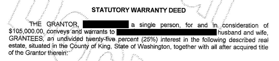
Figure 4-4. Statutory warrant of deed for the largest negative residual
For big data problems, outliers are generally not a problem in fitting the regression to be used in predicting new data. However, outliers are central to anomaly detection, where finding outliers is the whole point. The outlier could also correspond to a case of fraud or an accidental action. In any case, detecting outliers can be a critical business need.
Influential Values
A value whose absence would significantly change the regression equation is termed an infuential observation. In regression, such a value need not be associated with a large residual. As an example, consider the regression lines in Figure 4-5. The solid line corresponds to the regression with all the data, while the dashed line corresonds to the regression with the point in the upper-right removed. Clearly, that data value has a huge influence on the regression even though it is not associated with a large outlier (from the full regression). This data value is considered to have high leverage on the regression.
In addition to standardized residuals (see “Outliers”), statisticians have developed several metrics to determine the influence of a single record on a regression. A common measure of leverage is the hat-value; values above indicate a high-leverage data value.6
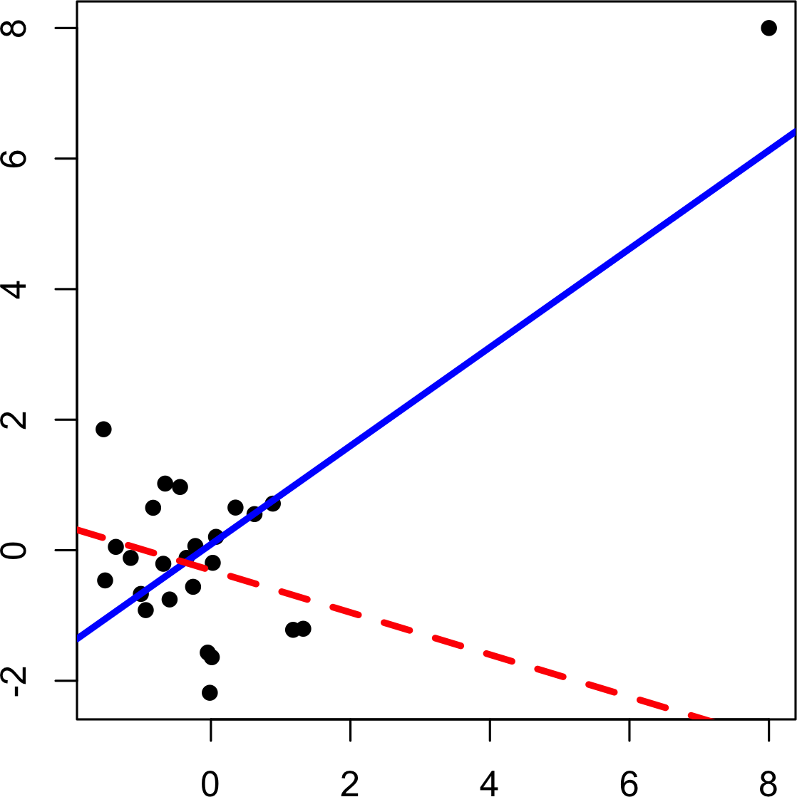
Figure 4-5. An example of an influential data point in regression
Another metric is Cook’s distance, which defines influence as a combination of leverage and residual size. A rule of thumb is that an observation has high influence if Cook’s distance exceeds .
An influence plot or bubble plot combines standardized residuals, the hat-value, and Cook’s distance in a single plot. Figure 4-6 shows the influence plot for the King County house data, and can be created by the following R code.
std_resid<-rstandard(lm_98105)cooks_D<-cooks.distance(lm_98105)hat_values<-hatvalues(lm_98105)plot(hat_values,std_resid,cex=10*sqrt(cooks_D))abline(h=c(-2.5,2.5),lty=2)
There are apparently several data points that exhibit large influence in the regression. Cook’s distance can be computed using the function cooks.distance, and you can use hatvalues to compute the diagnostics. The hat values are plotted on the x-axis, the residuals are plotted on the y-axis, and the size of the points is related to the value of Cook’s distance.
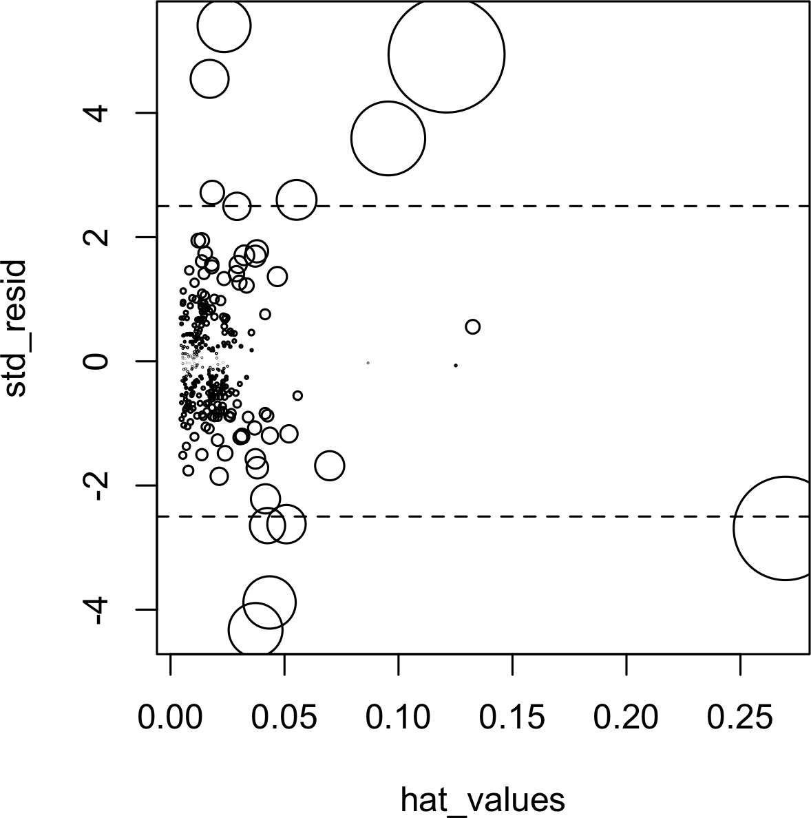
Figure 4-6. A plot to determine which observations have high influence
Table 4-2 compares the regression with the full data set and with highly influential data points removed.
The regression coefficient for Bathrooms changes quite dramatically.7
| Original | Influential removed | |
|---|---|---|
(Intercept) |
–772550 |
–647137 |
SqFtTotLiving |
210 |
230 |
SqFtLot |
39 |
33 |
Bathrooms |
2282 |
–16132 |
Bedrooms |
–26320 |
–22888 |
BldgGrade |
130000 |
114871 |
For purposes of fitting a regression that reliably predicts future data, identifying influential observations is only useful in smaller data sets. For regressions involving many records, it is unlikely that any one observation will carry sufficient weight to cause extreme influence on the fitted equation (although the regression may still have big outliers). For purposes of anomaly detection, though, identifying influential observations can be very useful.
Heteroskedasticity, Non-Normality and Correlated Errors
Statisticians pay considerable attention to the distribution of the residuals. It turns out that ordinary least squares (see “Least Squares”) are unbiased, and in some cases the “optimal” estimator, under a wide range of distributional assumptions. This means that in most problems, data scientists do not need to be too concerned with the distribution of the residuals.
The distribution of the residuals is relevant mainly for the validity of formal statistical inference (hypothesis tests and p-values), which is of minimal importance to data scientists concerned mainly with predictive accuracy. For formal inference to be fully valid, the residuals are assumed to be normally distributed, have the same variance, and be independent. One area where this may be of concern to data scientists is the standard calculation of confidence intervals for predicted values, which are based upon the assumptions about the residuals (see “Confidence and Prediction Intervals”).
Heteroskedasticity is the lack of constant residual variance across the range of the predicted values.
In other words, errors are greater for some portions of the range than for others.
The ggplot2 package has some convenient tools to analyze residuals.
The following code plots the absolute residuals versus the predicted values for the lm_98105 regression fit in “Outliers”.
df<-data.frame(resid=residuals(lm_98105),pred=predict(lm_98105))ggplot(df,aes(pred,abs(resid)))+geom_point()+geom_smooth()
Figure 4-7 shows the resulting plot.
Using geom_smooth, it is easy to superpose a smooth of the absolute residuals. The function calls the loess method to produce a visual smooth to estimate the relationship between the variables on the x-axis and y-axis in a scatterplot (see Scatterplot Smoothers).
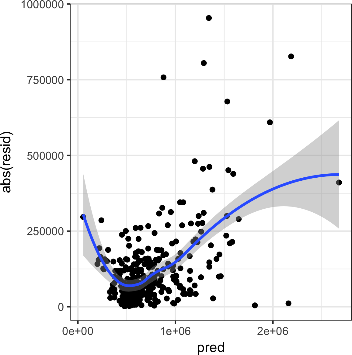
Figure 4-7. A plot of the absolute value of the residuals versus the predicted values
Evidently, the variance of the residuals tends to increase for higher-valued homes, but is also large for lower-valued homes.
This plot indicates that lm_98105 has heteroskedastic errors.
Why Would a Data Scientist Care about Heteroskedasticity?
Heteroskedasticity indicates that prediction errors differ for different ranges of the predicted value, and may suggest an incomplete model. For example, the heteroskedasticity in lm_98105 may indicate that the regression has left something unaccounted for in high- and low-range homes.
Figure 4-8 is a histogram of the standarized residuals for the lm_98105 regression.
The distribution has decidely longer tails than the normal distribution, and exhibits mild skewness toward larger residuals.
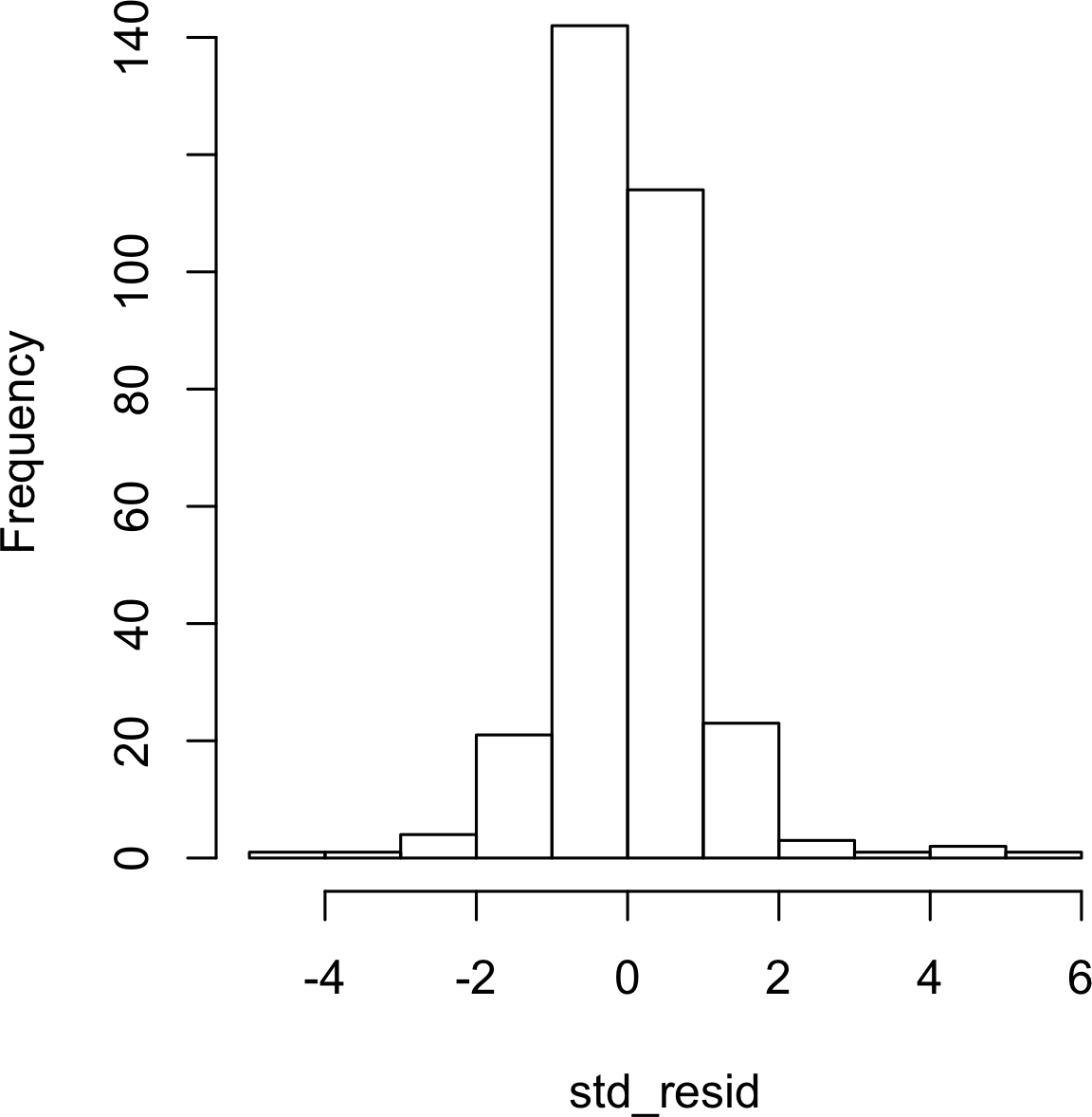
Figure 4-8. A histogram of the residuals from the regression of the housing data
Statisticians may also check the assumption that the errors are independent. This is particularly true for data that is collected over time. The Durbin-Watson statistic can be used to detect if there is significant autocorrelation in a regression involving time series data.
Even though a regression may violate one of the distributional assumptions, should we care? Most often in data science, the interest is primarily in predictive accuracy, so some review of heteroskedasticity may be in order. You may discover that there is some signal in the data that your model has not captured. Satisfying distributional assumptions simply for the sake of validating formal statistical inference (p-values, F-statistics, etc.), however, is not that important for the data scientist.
Scatterplot Smoothers
Regression is about modeling the relationship between the response and predictor variables. In evaluating a regression model, it is useful to use a scatterplot smoother to visually highlight relationships between two variables.
For example, in Figure 4-7, a smooth of the relationship between the absolute residuals and the predicted value shows that the variance of the residuals depends on the value of the residual.
In this case, the loess function was used; loess works by repeatedly fitting a series of local regressions to contiguous subsets to come up with a smooth.
While loess is probably the most commonly used smoother,
other scatterplot smoothers are available in R, such as super smooth (supsmu) and kernel smoothing (ksmooth).
For the purposes of evaluating a regression model, there is typically no need to worry about the details of these scatterplot smooths.
Partial Residual Plots and Nonlinearity
Partial residual plots are a way to visualize how well the estimated fit explains the relationship between a predictor and the outcome. Along with detection of outliers, this is probably the most important diagnostic for data scientists. The basic idea of a partial residual plot is to isolate the relationship between a predictor variable and the response, taking into account all of the other predictor variables. A partial residual might be thought of as a “synthetic outcome” value, combining the prediction based on a single predictor with the actual residual from the full regression equation. A partial residual for predictor is the ordinary residual plus the regression term associated with :
where is the estimated regression coefficient.
The predict function in R has an option to return the individual regression terms :
terms<-predict(lm_98105,type='terms')partial_resid<-resid(lm_98105)+terms
The partial residual plot displays the on the x-axis and the partial residuals on the y-axis.
Using ggplot2 makes it easy to superpose a smooth of the partial residuals.
df<-data.frame(SqFtTotLiving=house_98105[,'SqFtTotLiving'],Terms=terms[,'SqFtTotLiving'],PartialResid=partial_resid[,'SqFtTotLiving'])ggplot(df,aes(SqFtTotLiving,PartialResid))+geom_point(shape=1)+scale_shape(solid=FALSE)+geom_smooth(linetype=2)+geom_line(aes(SqFtTotLiving,Terms))
The resulting plot is shown in Figure 4-9.
The partial residual is an estimate of the contribution that SqFtTotLiving adds to the sales price.
The relationship between SqFtTotLiving and the sales price is evidently nonlinear.
The regression line underestimates the sales price for homes less than 1,000 square feet and overestimates the price for homes between 2,000 and 3,000 square feet.
There are too few data points above 4,000 square feet to draw conclusions for those homes.
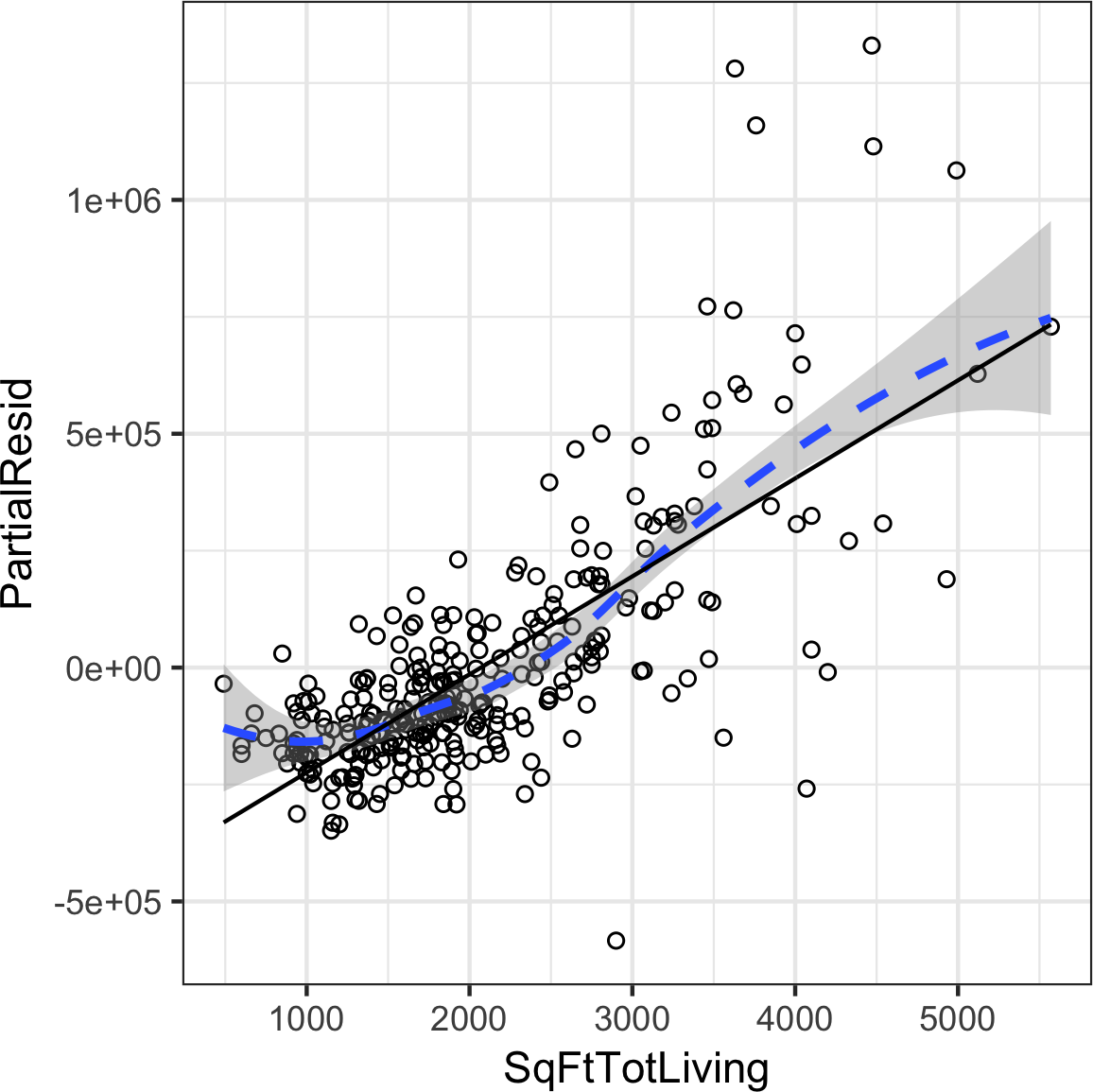
Figure 4-9. A partial residual plot for the variable SqFtTotLiving
This nonlinearity makes sense in this case: adding 500 feet in a small home makes a much bigger difference than adding 500 feet in a large home. This suggests that, instead of a simple linear term for SqFtTotLiving, a nonlinear term should be considered (see “Polynomial and Spline Regression”).
Polynomial and Spline Regression
The relationship between the response and a predictor variable is not necessarily linear. The response to the dose of a drug is often nonlinear: doubling the dosage generally doesn’t lead to a doubled response. The demand for a product is not a linear function of marketing dollars spent since, at some point, demand is likely to be saturated. There are several ways that regression can be extended to capture these nonlinear effects.
Nonlinear Regression
When statisticians talk about nonlinear regression, they are referring to models that can’t be fit using least squares. What kind of models are nonlinear? Essentially all models where the response cannot be expressed as a linear combination of the predictors or some transform of the predictors. Nonlinear regression models are harder and computationally more intensive to fit, since they require numerical optimization. For this reason, it is generally preferred to use a linear model if possible.
Polynomial
Polynomial regression involves including polynomial terms to a regression equation. The use of polynomial regression dates back almost to the development of regression itself with a paper by Gergonne in 1815. For example, a quadratic regression between the response Y and the predictor X would take the form:
Polynomial regression can be fit in R through the poly function.
For example, the following fits a quadratic polynomial for SqFtTotLiving with the King County housing data:
lm(AdjSalePrice~poly(SqFtTotLiving,2)+SqFtLot+BldgGrade+Bathrooms+Bedrooms,data=house_98105)Call:lm(formula=AdjSalePrice~poly(SqFtTotLiving,2)+SqFtLot+BldgGrade+Bathrooms+Bedrooms,data=house_98105)Coefficients:(Intercept)poly(SqFtTotLiving,2)1-402530.473271519.49poly(SqFtTotLiving,2)2SqFtLot776934.0232.56BldgGradeBathrooms135717.06-1435.12Bedrooms-9191.94
There are now two coefficients associated with SqFtTotLiving:
one for the linear term and one for the quadratic term.
The partial residual plot (see “Partial Residual Plots and Nonlinearity”) indicates some curvature in the regression equation associated with SqFtTotLiving.
The fitted line more closely matches the smooth (see “Splines”) of the partial residuals as compared to a linear fit (see Figure 4-10).
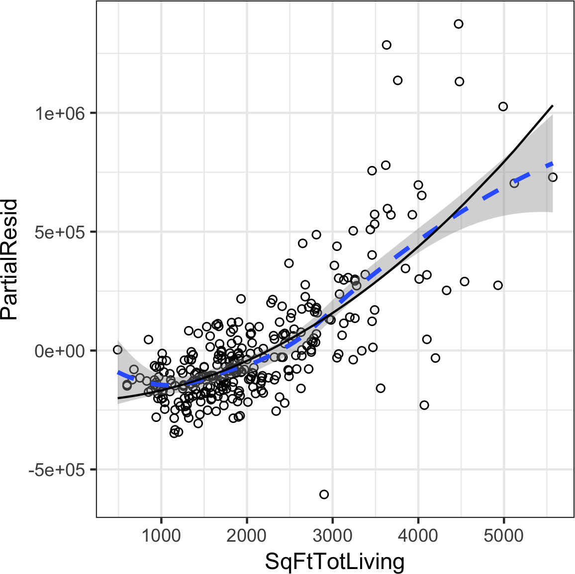
Figure 4-10. A polynomial regression fit for the variable SqFtTotLiving (solid line) versus a smooth (dashed line; see the following section about splines)
Splines
Polynomial regression only captures a certain amount of curvature in a nonlinear relationship. Adding in higher-order terms, such as a cubic quartic polynomial, often leads to undesirable “wiggliness” in the regression equation. An alternative, and often superior, approach to modeling nonlinear relationships is to use splines. Splines provide a way to smoothly interpolate between fixed points. Splines were originally used by draftsmen to draw a smooth curve, particularly in ship and aircraft building.
The splines were created by bending a thin piece of wood using weights, referred to as “ducks”; see Figure 4-11.

Figure 4-11. Splines were originally created using bendable wood and “ducks,” and were used as a draftsman tool to fit curves. Photo courtesy Bob Perry.
The technical definition of a spline is a series of piecewise continuous polynomials. They were first developed during World War II at the US Aberdeen Proving Grounds by I. J. Schoenberg, a Romanian mathematician.
The polynomial pieces are smoothly connected at a series of fixed points in a predictor variable, referred to as knots.
Formulation of splines is much more complicated than polynomial regression;
statistical software usually handles the details of fitting a spline.
The R package splines includes the function bs to create a b-spline term in a regression model.
For example, the following adds a b-spline term to the house regression model:
library(splines)knots<-quantile(house_98105$SqFtTotLiving,p=c(.25,.5,.75))lm_spline<-lm(AdjSalePrice~bs(SqFtTotLiving,knots=knots,degree=3)+SqFtLot+Bathrooms+Bedrooms+BldgGrade,data=house_98105)
Two parameters need to be specified: the degree of the polynomial and the location of the knots.
In this case, the predictor SqFtTotLiving is included in the model using a cubic spline (degree=3).
By default, bs places knots at the boundaries;
in addition, knots were also placed at the lower quartile, the median quartile, and the upper quartile.
In contrast to a linear term, for which the coefficient has a direct meaning, the coefficients for a spline term are not interpretable. Instead, it is more useful to use the visual display to reveal the nature of the spline fit. Figure 4-12 displays the partial residual plot from the regression. In contrast to the polynomial model, the spline model more closely matches the smooth, demonstrating the greater flexibility of splines. In this case, the line more closely fits the data. Does this mean the spline regression is a better model? Not necessarily: it doesn’t make economic sense that very small homes (less than 1,000 square feet) would have higher value than slightly larger homes. This is possibly an artifact of a confounding variable; see “Confounding Variables”.
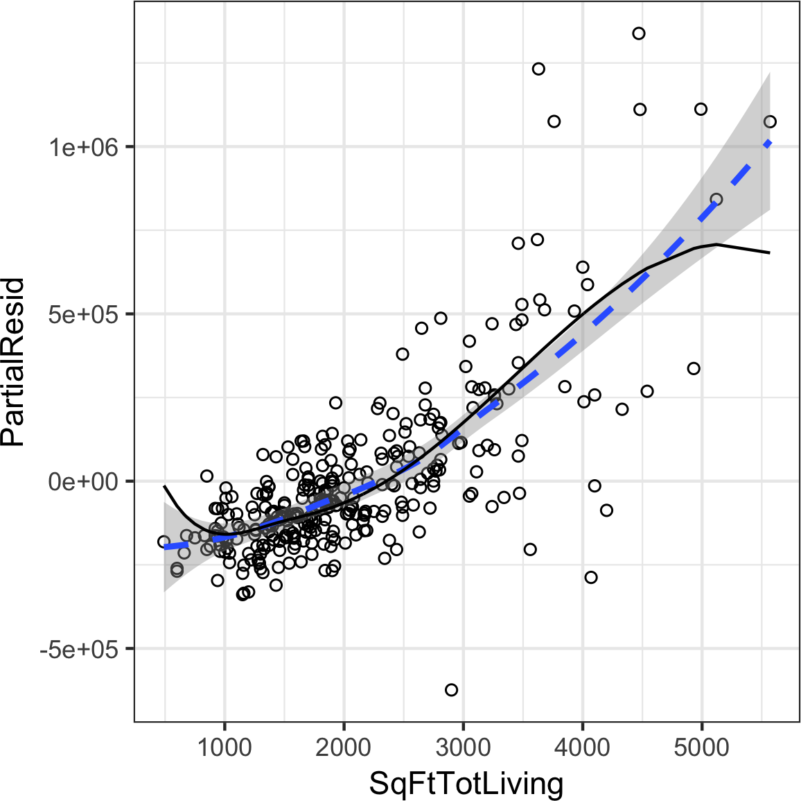
Figure 4-12. A spline regression fit for the variable SqFtTotLiving (solid line) compared to a smooth (dashed line)
Generalized Additive Models
Suppose you suspect a nonlinear relationship between the response and a predictor variable,
either by a priori knowledge or by examining the regression diagnostics.
Polynomial terms may not be flexible enough to capture the relationship, and spline terms require specifying the knots.
Generalized additive models, or GAM, are a technique to automatically fit a spline regression.
The gam package in R can be used to fit a GAM model to the housing data:
library(mgcv)lm_gam<-gam(AdjSalePrice~s(SqFtTotLiving)+SqFtLot+Bathrooms+Bedrooms+BldgGrade,data=house_98105)
The term s(SqFtTotLiving) tells the gam function to find the “best” knots for a spline term (see Figure 4-13).
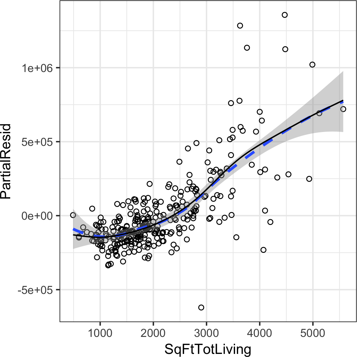
Figure 4-13. A GAM regression fit for the variable SqFtTotLiving (solid line) compared to a smooth (dashed line)
Further Reading
For more on spline models and GAMS, see The Elements of Statistical Learning by Trevor Hastie, Robert Tibshirani, and Jerome Friedman, and its shorter cousin based on R, An Introduction to Statistical Learning by Gareth James, Daniela Witten, Trevor Hastie, and Robert Tibshirani; both are Springer books.
Summary
Perhaps no other statistical method has seen greater use over the years than regression—the process of establishing a relationship between multiple predictor variables and an outcome variable. The fundamental form is linear: each predictor variable has a coefficient that describes a linear relationship between the predictor and the outcome. More advanced forms of regression, such as polynomial and spline regression, permit the relationship to be nonlinear. In classical statistics, the emphasis is on finding a good fit to the observed data to explain or describe some phenomenon, and the strength of this fit is how traditional (“in-sample”) metrics are used to assess the model. In data science, by contrast, the goal is typically to predict values for new data, so metrics based on predictive accuracy for out-of-sample data are used. Variable selection methods are used to reduce dimensionality and create more compact models.
1 This and subsequent sections in this chapter © 2017 Datastats, LLC, Peter Bruce and Andrew Bruce, used by permission.
2 In Bayesian statistics, the true value is assumed to be a random variable with a specified distribution. In the Bayesian context, instead of estimates of unknown parameters, there are posterior and prior distributions.
3 The -1 argument in the model.matrix produces one hot encoding representation (by removing the intercept, hence the “-”). Otherwise, the default in R is to produce a matrix with P – 1 columns with the first factor level as a reference.
4 This is unintuitive, but can be explained by the impact of location as a confounding variable; see “Confounding Variables”.
5 There are 82 zip codes in King County, several with just a handful of sales. An alternative to directly using zip code as a factor variable, ZipGroup clusters similar zip codes into a single group. See “Factor Variables with Many Levels” for details.
6 The term hat-value comes from the notion of the hat matrix in regression. Multiple linear regression can be expressed by the formula where is the hat matrix. The hat-values correspond to the diagonal of .
7 The coefficient for Bathrooms becomes negative, which is unintuitive. Location has not been taken into account and the zip code 98105 contains areas of disparate types of homes. See “Confounding Variables” for a discussion of confounding variables.
Get Practical Statistics for Data Scientists now with the O’Reilly learning platform.
O’Reilly members experience books, live events, courses curated by job role, and more from O’Reilly and nearly 200 top publishers.

