This chapter answers the question "Why Motif?" in
terms of the development of applications that are "easy enough for your
mother to use." It suggests some of the complexities that the
programmer has to master in order to make an application simple.
Congratulations! After slaving behind the computer
for months, fighting a deadline that seemed impossible to meet, you've
finished your software product and it's a big hit. The critics love it,
you're in the money, and everyone, including your mother, is buying
your new product. Just as everything seems to be going your way, your
worst nightmare comes true: your mother calls and asks you how to use
it.
An unlikely scenario? Not if you're developing
applications to run under the Motif graphical user interface (GUI). As
a proposed standard for graphical user interfaces, Motif may be
implemented on a wide range of computer platforms, from large IBM
mainframes right down to the PC that your mom may be using. The Open
Software Foundation (OSF), developer of the Motif GUI, hopes to reach
all kinds of computers and computer users no matter how advanced (or
limited) their computer skills may be.
So, will your mom really call you for help? Well,
mine did. In fact, she did something worse. She wanted me to explain
how to use a software product I didn't write. I didn't know how her
software worked or even what it was. Fortunately, though, the software
was based on Microsoft Windows, which has more than a passing
similarity to Motif. The experience of providing technical support to
my mother reminded me of some of the fundamental concepts behind the
design of a user interface and the role of the application programmer
in carrying out that design.
Before I tell my story, let me start with a little
background. I have been developing software for the X Window System for
several years. Every now and then, when the family gets together for
dinner, someone always asks the same thing, "So, explain it to me
again: just what is it that you do?" I launch into my usual
speech: "It's called X Windows, dad... uh, no, mom, it's
computer software... it's rather hard to explain, but..." The attention
span lasts only until the next course is served, at which time the
discussion turns to new ways for cooking eggplant. Little did I realize
that something actually registered with someone in my family, because
shortly thereafter, I got a call from my mom.
Mom: Guess what?!
Me: What?
Mom: Our company is switching to a new line of software based
on your work!
Me: Really? You're going to use electronic mail?
Mom: No, all of our insurance packages use this new software
that runs under Windows. You wrote that, didn't you?
Me: No, mom. I write software using X Windows -- and I
didn't write X, I just use it. I think you're talking about
Microsoft Windows. You're using it with your PC, right?
Mom: That's right, but it looks exactly like your software,
so I figured you could show me how to use it. I have never seen this
stuff before.
(Uh, oh... I see it coming now. Last time she wanted me to help
her explain her computer to her, I ended up translating the entire DOS
2.0 user's guide into English, which she conveniently forgot in about a
week.)
Me: Mom, I don't know Microsoft Windows, I know X Windows
and they're not the same...
Mom: You mean you won't help me?
Me: You don't understand -- I can't help you.
MS-Windows has nothing to do with X...
Silence.
Me: I don't think I'm getting through to you.
Silence.
Me: Ok, I'll be right over...
Despite all my explanations of the X Window System,
the only keyword my mom remembered was Windows. I had high
hopes, though, because I was actually going to teach her something
related to what I do for a living. And this time she had to listen
because her job depended on it.
After some fidgeting with diskettes and other
necessary start-up procedures, I finally got Microsoft Windows 3.0 up
and running. Sure enough, it looked just like Motif. Several
applications came up by default: a clock, an editor of some sort, and a
little calendar program. Immediately, the questions started flying at
me:
Mom: How do you access those buttons at the
top of the window?
Me: Those are called Pulldown Menus and every application has
them. They are located in what is called a MenuBar.
Mom: What does "F1" mean?
Me: The "F" denotes a function key and the "1" indicates it's
the first function key. Pressing it gives you help depending on where
the cursor is. For example...
Mom (interrupting): Why are these keys labeled
"ALT?" What do they do?
Me: Oh, those are used in conjunction with other keys. You
press "ALT" and then some other key and you get special attention,
like...
Mom (growing frustrated): Look what you did. Now there
are too many windows up. How do I get back to the one I was using?
Me (fighting for words): Well, you see, you can move
from one window to the next or between elements within a window by
using the Tab key and possibly some other key like the Control key, the
Shift key, or the Alt key, or maybe a combination of several of these
keys depending on where you want to go...
Mom (sitting back and sighing): Oh, that's way too
complicated, I'll never remember all that. And just look at
those colors--they're awful.
Me (trying to sound encouraging): You can change them
using this tool...
It was a long grueling day, but she eventually
figured out how to do most of what she had to do. After she memorized
those actions she used most frequently, she seemed quite capable and no
longer needed my supervision. Her favorite trick was Alt-F3,
which closed a window and terminated a program. Because she had several
things figured out, I thought I'd dare teach her something new.
Me: You know, if you don't want to use that
key sequence, you can define it yourself by...
Mom (protecting the computer like it was her only child
): NO! Don't touch anything! I know how to use it now, so don't confuse
me any more!
My fault. I figured that since she was pleased that
she could change window colors, she'd be eager to make other aesthetic
alterations. Her reaction to my offer to teach her how to change
keyboard input foreshadowed what was about to come. I was in the other
room when I heard a screech: "The computer is broken! The Alt-F3 thingy
you showed me doesn't work any more!" Sure enough, it didn't work on
the window she was trying to use it on, but as we discovered, that was
the only window on the screen where it didn't work. It turned out that
the program she tried it on didn't understand the Alt-F3 thingy. It was
devastating for my mom and, needless to say, she will never run that
program again.
We never did get to her new insurance software; we
didn't have to. All she needed to learn was how to use the graphical
user interface. She now reports having figured out her company's
software "all by herself" and I can't take credit for teaching her.
There are many lessons an application designer can
learn from this story. As it so happens, the designer and the
application programmer are often the same person. But whether you are
the designer of the software or an engineer responsible for
implementing someone else's design, there are still some basic
principles that will benefit you in your work. Let's begin with the
basics drawn from this particular story:
This principle is absolutely correct. Unfortunately,
many early X applications carry it too far and end up "spineless." Many
such programs actually require the user to make certain customizations
in order for the program to be usable or attractive. For some programs,
the problem worsens if unreasonable customization settings are given,
since there is no sanity-checking for unreasonable configurations.
So far, such customization issues have not gotten
out of hand because UNIX and X applications are used almost exclusively
by technical people who understand the environment and know how to work
within it. But it is now time to consider users who know absolutely
nothing about computers and who don't want to--they are only using your
software because they have to.
So, back to Motif. What is it and how can it help
you solve your user-interface design goals? To start, Motif is a set of
guidelines that specifies how a user interface for graphical computers
should look and feel. This term describes how an application
appears on the screen (the look) and how the user interacts with it
(the feel).
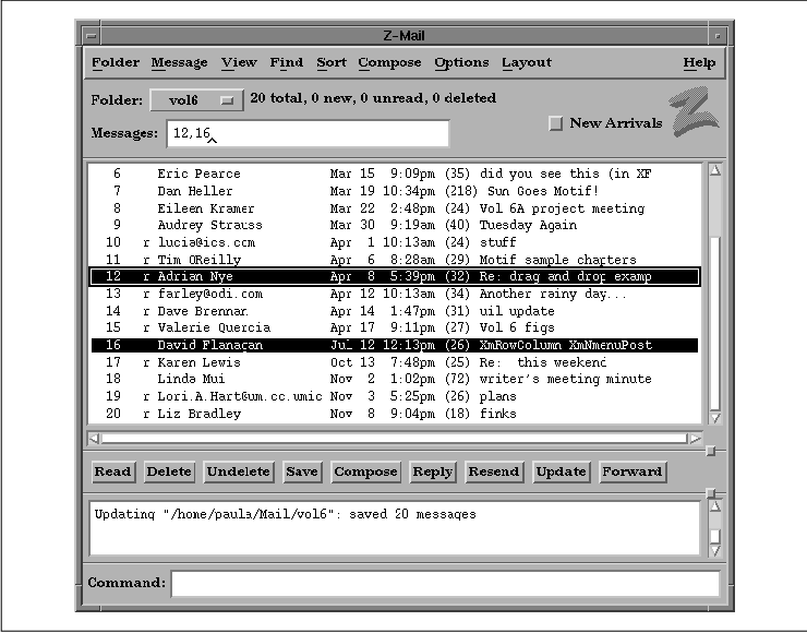
the figure shows a Motif application.
The user interacts with the application by typing at
the keyboard, and by clicking, selecting, and dragging various graphic
elements of the application with the mouse. For example, any
application window can be moved on the screen by moving the pointer to
the top of the window's frame (the title bar), pressing and holding
down a button on the mouse, and dragging the window to a new location.
The window can be made larger or smaller by pressing a mouse button on
any of the resize corners and dragging.
Most applications sport buttons that can be clicked
with the mouse to initiate application actions. Motif uses clever
highlighting and shadowing to make buttons, and other components, look
three-dimensional. When a button is clicked on, it actually appears to
be pressed in and released.
A row of buttons across the top of most applications
forms a menu bar. Clicking on any of the titles in the menu bar
pops up a menu of additional buttons. Buttons can also be arranged in
palettes that are always visible on the screen. When a button is
clicked, the application can take immediate action or it can pop up an
additional window called a dialog box. A dialog box can ask the
user for more information or present additional options.
This style of application interaction isn't new to
most people, since the Apple MacIntosh popularized it years ago. What
is different about Motif is that the graphical user interface
specification is designed to be independent of the computer on which
the application is running.
Motif was designed by the Open Software Foundation
(OSF), a non-profit consortium of companies such as Hewlett-Packard,
Digital, IBM, and dozens of other corporations. OSF's charter calls for
the development of technologies that will enhance interoperability
between computers from different manufacturers. Targeted technologies
range from user interfaces to operating systems.
Part of OSF's charter was to choose an appropriate
windowing system environment that would enable the technology to exist
on as wide a range of computers as possible. It was decided that the
OSF/Motif toolkit should be based on the X Window System, a
network-based windowing system that has been implemented for UNIX, VMS,
DOS, Macintosh, and other operating systems. X provides an extremely
flexible foundation for any kind of graphical user interface.
When used properly, the Motif toolkit enables you to
produce completely Motif-compliant applications in a relatively short
amount of time. At its heart, though, Motif is a specification rather
than an implementation. While most Motif applications are implemented
using the Motif toolkit provided by OSF, it would be quite possible for
an application implemented in a completely different way to comply with
the Motif GUI. The specification is captured in two documents: the
Motif Style Guide, which defines the external look and feel of
applications, and the Application Environment Specification,
which defines the application programmer's interface (API). Both books
have been published for OSF by Prentice-Hall and are available in most
technical bookstores.
The Motif specifications don't have a whole lot to
say about the overall layout of applications. Instead, they focus
mainly on the design of the objects that make up a user interface--the
menus, buttons, dialog boxes, text entry, and display areas. There are
some general rules, but for the most part, the consistency of the user
interface relies on the consistent behavior of the objects used to make
it up, rather than their precise arrangement.
The Motif specification is broken down into two
basic parts:
Motif can be used for virtually any application that
interacts with a computer user. Programs as conceptually different as a
CAD/CAM package or an electronic mail application still use the same
types of user-interface elements. When the user interface is
standardized, the user gets more quickly to the point where he is
working with the application, rather than just mastering its mechanics.
My experience with Microsoft Windows and my mother's
new software demonstrates how far Motif has come in reaching this goal.
I was faced with a window system that I had literally never seen before
and an operating system I rarely use (DOS), but that didn't prevent me
from using the application. This is not a coincidence; I knew how to
use MS-Windows because its user-interface is based on the same
principles as Motif. Motif can be seen as a superset of both MS-Windows
and Presentation Manager. Even though the others came first, Motif
views them as specific implementations of an abstract specification.
The Motif interface was intentionally modeled after
IBM's Common User Access (CUA) specification, which defines the
interface for OS/2 and Microsoft Windows. The reason for this is
twofold: first, there is a proven business model for profiting from an
"open systems" philosophy; second, the level of success and acceptance
of Microsoft Windows in the PC world is expected to be quite
substantial. As a result, more and more vendors are jumping on the
bandwagon and are supporting Motif as their native graphical interface
environment.
Just as my mom becomes more and more familiar with
how to use Windows-based software, so too are thousands of other PC
users. As the PC world migrates to UNIX and other larger-scale
computers, so too will their applications. In order to keep their
customer base, the developers of those PC applications will adopt Motif
as the GUI for the UNIX versions of their software. As a result, the
next few years will see the number of Motif users and developers grow
astronomically as Motif becomes the focal point for software and
hardware companies alike.
You have two options for making applications
Motif-compliant. You can write the entire application yourself, and
make sure that all your user-interface features conform to the Motif
GUI specifications, or you can use a programming toolkit, which is a
more realistic option. A toolkit is a collection of prewritten
functions that implement all the features and specifications of a
particular GUI.
However, a toolkit cannot write an application for
you, nor can it enforce good programming techniques. It isn't going to
tell you that there are too many objects on the screen or that your use
of colors is outrageous. The job of Motif is solely to provide a
consistent appearance and behavior for user-interface controls. So,
before we jump into the mechanics of the Motif toolkit, let's take a
moment longer with the philosophy of graphical user interfaces.
The principles behind an effective user interface
cannot be captured in the specifications for Motif or any other GUI.
Even though the Motif toolkit specifies how to create and use its
interface elements, there is still quite a bit left unsaid. As the
programmer, you must take the responsibility of using those elements
effectively and helping the user to be as productive as possible. You
must take care to keep things simple for the beginner and, at the same
time, not restrict the more experienced user. This task is perhaps the
most difficult one facing the programmer in application design.
There is frequently no right or wrong way to design
an interface. Good user-interface design is usually a result of years
of practice: you throw something at a user, he plays with it,
complains, and throws it back at you. Experience will teach you many
lessons, although we hope to guide you in the right direction, so that
you can avoid many common mistakes and so that the ones that you do
make are less painful.
So, rather than having absolute commandments, we
rely on heuristics, or rules of thumb. Here is a rough list to start
with:
The reason these seemingly obvious examples are
successful interface approaches is because they take advantage of the
fact that most people are already familiar with their real-life
counterparts. But there is another, less obvious quality inherent in
those objects: they are simple. The major problem concerning interface
design is that not everything is simple. There isn't always a
real-world counterpart to use as a crutch. In the most frustrating
cases, the concept itself may be simple, but there may not be an
obvious way to present the interaction. Of course, once someone thinks
of the obvious solution, it seems odd that it could have been difficult
in the first place.
Consider the VCR. Conceptually, a VCR is a simple
device, yet statistics say that 70% of VCR owners don't know how to
program one. How many times have you seen the familiar 12:00-AM
flashing in someone's living room? Researchers say that this situation
occurs because most VCRs are poorly designed and are "too featureful."
They're half-right; the problem is not that they are too featureful,
but that the ways to control those features are too complicated.
Reducing the capabilities of a VCR isn't going to make it easier to
use; it's just going to make it less useful. The problem with VCRs is
that their designers focused too much on functionality and not enough
on usability.
So, how do you design an interface for a VCR when
there is no other object like it? You improvise. Sure, the VCR is a
simple device; everyone understands how one is supposed to work, but
few people have actually designed one that is easy to use until
recently. Maybe you've heard about the new device that, when connected
to your VCR, enables you to have a complete TV program guide displayed
on your screen in the bar-graph layout similar to the nightly newspaper
listings. All you have to do is point and click on the program you want
to record and that's it--you're done. No more buttons to press, levels
of features to browse through, dials to adjust or manuals to read. At
last, the right interface has been constructed. None of the machine's
features have been removed. It's just that they are now organized in an
intuitive way and are accessible in an simple manner.
This method for programming VCRs satisfies the last
two heuristics. Functionality has not been reduced, yet simplicity has
been heightened because a creative person thought of a new way to
approach the interface. The lesson here is that no object should be
difficult to use no matter how featureful it is or how complex it may
seem. You must rely heavily on your intuition and creativity to produce
truly innovative interfaces.
Let's return to computer software and how these
principles apply to the user-interface design model. The first
heuristic is simplicity, which typically involves fewer, rather than
more, user-interface elements on the screen. Buttons, popup menus,
colors, and fonts should all be used sparingly in an application.
Often, the availability of hundreds of colors and font styles along
with the attractiveness of a three-dimensional interface compels many
application programmers to feel prompted, and even justified, in using
all of the bells and whistles. Unfortunately, overuse of these
resources quickly fatigues the user and overloads his ability to
recognize useful and important information.
Ironically, the potential drawbacks to simplicity
are those that are also found in complexity. By oversimplifying an
interface, you may introduce ambiguity. If you reduce the number of
elements on your screen or make your iconic representations too simple,
you may be providing too little information to the user about what a
particular interface element is supposed to do. Underuse of visual cues
may make an application look bland and uninteresting.
One of Motif's strengths is the degree of
configurability that you can pass on to the end user. Colors, fonts,
and a wide variety of other resources can be set specifically by the
user. You should be aware, however, that once your application ships,
its default state is likely to be the interface most people use, no
matter how customizable it may be. While it is true that more
sophisticated users may customize their environment, you are ultimately
in control of how flexible it is. Also, novice users quickly become
experts in a well-designed system, so you must not restrict the user
from growth.
Simplicity may not always be the goal of a user
interface. In some cases, an application may be intentionally complex.
Such applications are only supposed to be used by sophisticated users.
For example, consider a 747 aircraft. Obviously, these planes are
intended to be flown by experts who have years of experience. In this
case, aesthetics is not the goal of the interior design of a cockpit;
the goal is that of functionality.
In order to design an effective graphical user
interface for an application, you must evaluate both the goals of your
particular application and your intended audience. Only with a complete
understanding of these issues will you be able to determine the best
interface to use. And remember, your mom just might call you for help.