This chapter provides detailed descriptions of the
various classes of Motif manager widgets. Examples explore the various
methods of positioning children within the BulletinBoard, Form, and
RowColumn widgets.
As their name implies, manager widgets manage other
widgets, which means that they control the size and location (geometry)
and input focus policy for one or more widget children. The
relationship between managers and the widgets that they manage is
commonly referred to as the parent-child model. The manager acts as the
parent and the other widgets are its children. Since manager widgets
can also be children of other managers, this model produces the widget
hierarchy, which is a framework for how widgets are laid out visually
on the screen and how resources are specified in the resource database.
While managers are used and explained in different
contexts throughout this book, this chapter discusses the details of
the different manager widget classes. Chapter 3, Overview of the
Motif Toolkit, discusses the general concepts behind manager
widgets and how they fit into the broader application model. You are
encouraged to review the material in this and other chapters for a
wider range of examples, since it is impossible to deal with all of the
possibilities here. For an in-depth discussion of the X Toolkit
Composite and Constraint widget classes, from which managers are
subclassed, see Volume Four, X Toolkit Intrinsics Programming Manual
.
The Manager widget class is a metaclass for a number of functional subclasses. The Manager widget class is never instantiated; the functionality it provides is inherited by each of its subclasses. In this chapter, we describe the general-purpose Motif manager widgets, which are introduced below:
The MessageBox, SelectionBox, FileSelectionBox, and
Command widgets are also Motif manager widgets. These widgets are used
for predefined Motif dialogs and are discussed in Chapter 5,
Introduction to Dialogs; Chapter 6, Selection Dialogs; and
Chapter 7, Custom Dialogs.
A manager widget may be created and destroyed like
any other widget. The main difference between using a manager and other
widgets involves when the widget is declared to be managed in the
creation process. While we normally suggest that you create widgets
using XtVaCreateManagedWidget(), we recommend that you create
a manager widget using XtVaCreateWidget() instead, and then
manage it later using XtManageChild(). To understand why this
technique can be important, you need to understand how a manager widget
manages its children.
A manager widget manages its children by controlling
the sizes and positions of the children. The process of widget layout
only happens when the child and the parent are both in the managed
state. If a child is created as an unmanaged widget, the parent skips
over that widget when it is determining the layout until such time as
the child is managed. However, if a manager widget is not itself
managed, it does not perform geometry management on any of its children
regardless of whether those children are managed. To be precise, a
manager does not actually manage its children until it is both managed
and realized. If you realize all of your widgets at once, by calling
XtRealizeWidget() on the top-level widget of the application, as
described in Chapter 2, The Motif Programming Model, it should
not make a difference whether a manager is managed before or after its
children are created. However, if you are adding widgets to a tree of
already-realized widgets, the principles set forth in this section are
important. If you are adding children to an already-realized parent,
the child is automatically realized when it is managed. If you are
adding a manager widget as a child of a realized widget, you should
explicitly realize the widget before you manage it. Otherwise, the
resize calculations may be performed in the wrong order. In a case such
as this, it is essential to use XtManageChild() rather than
XtVaCreateManagedWidget(), since doing so allows you to make the
explicit realize call before managing the widget.
To demonstrate the problems that you are trying to
avoid, consider creating a manager as a managed widget before any of
its children are created. The manager is going to have a set of
PushButtons as its children. When the first child is added using
XtVaCreateManagedWidget(), the manager widget negotiates the size
and position of the PushButton. Depending on the type of manager widget
being used, the parent either changes its size to accommodate the new
child or it changes the size of the child to its own size. In either
case, these calculations are not necessary because the geometry needs
to change as more buttons are added. The problem becomes complicated by
the fact that when the manager's size changes, it must also negotiate
its new size with its own parent, which causes that parent to negotiate
with its parent all the way up to the highest-level shell. If the new
size is accepted, the result goes back down the widget tree with each
manager widget resizing itself on the way down. Repeating this process
each time a child is added almost certainly affects performance.
Because of the different geometry management methods
used by the different manager widgets, there is the possibility that
all of this premature negotiation can result in a different layout than
you intended. For example, as children are added to a RowColumn widget,
the RowColumn checks to see if there is enough room to place the new
child on the same row or column. If there isn't, then a new row or
column is created. This behavior depends heavily on whether the
RowColumn is managed and also on whether its size has been established
by being realized. If the manager parent is not managed when the
children are added, the whole process can be avoided, yet you still
have the convenience of using XtVaCreateManagedWidget() for
all of the widget children. When the manager is itself managed, it
queries its children for their size and position requests, calculates
its own size requirements, and communicates that size back up the
widget tree.
For best results, you should use
XtVaCreateWidget() to create manager widgets and
XtVaCreateManagedWidget() to create primitive widgets. Creating a
primitive widget as an unmanaged widget serves no purpose, unless you
explicitly want the widget's parent to ignore it for some reason. If
you are adding another manager as a child, the same principle applies;
you should also create it as an unmanaged widget until all its children
are added as well. The idea is to descend as deeply into the widget
tree and create as many children as possible before managing the
manager parents as you ascend back up. Once all the children have been
added, XtManageChild() can be called for the managers so that
they only have to negotiate with their parents once, thus saving time,
improving performance, and probably producing better results.
Despite all we've just said, realize that the entire
motivating factor behind this principle is to optimize the method by
which managers negotiate sizes and positions of their children. If a
manager only has one child, it does not matter if you create the
manager widget as managed or not. Also, the geometry management
constraints of some widgets are such that no negotiation is required
between the parent and the children. In these situations, it is not
necessary to create the manager as an unmanaged widget, even though it
has children. We will explain these cases as they arise.
In the rest of this chapter, we examine the basic
manager widget classes and present examples of how they can be used.
While geometry management is the most obvious and widely used aspect of
the widget class, managers are also responsible for keyboard traversal,
gadget display, and gadget event handling. Many of the resources of the
Manager metaclass are inherited by each of its subclasses for handling
these tasks.
The BulletinBoard is the most basic of the manager
widget subclasses. The BulletinBoard widget does not enforce position
or size policies on its children, so it is rarely used by applications
as a general geometry manager for widgets. The BulletinBoard is the
superclass for the Form widget and all of the predefined Motif dialog
widgets. To support these roles, the BulletinBoard has a number of
resources that are used specifically for communicating with
DialogShells.
The BulletinBoard has callback resources for
FocusIn, FocusOut, and MapNotify events. These
callbacks are invoked when the user moves the mouse or uses the TAB key
to traverse the widget hierarchy. The events do not require much visual
feedback and they only require application-specific callback routines
when an application needs to set internal states based on the events.
The XmNfocusCallback and XmNmapCallback resources are
used extensively by DialogShells.
Despite the low profile of the BulletinBoard as a
manager widget, there is a lot to be learned from it, since the
principles also apply to most other manager widgets. In this spirit,
let's take a closer look at the BulletinBoard widget and examine the
different things that can be done with it as a manager widget. If you
want to use a BulletinBoard directly in an application, you must
include the file <Xm/BulletinB.h>. The following code fragment
shows the recommended way to create a BulletinBoard:
   Widget  bboard;

   bboard = XtVaCreateWidget ("name",
       xmBulletinBoardWidgetClass, parent,
       resource-value-list,
       NULL);

   /* Create children */

   XtManageChild (bboard);
The parent parameter is the parent of the BulletinBoard, which
may be another manager widget or a shell widget. You can specify any of
the resources that are specific to the BulletinBoard, but unless you
are using the widget as a dialog box, your choices are quite limited.
Of the few BulletinBoard resources not tied to
DialogShells, the only visual one is XmNshadowType. When
used in conjunction with the XmNshadowThickness resource, you
can control the three-dimensional appearance of the widget. There are
four possible values for XmNshadowType:
   XmSHADOW_IN
   XmSHADOW_OUT
   XmSHADOW_ETCHED_IN
   XmSHADOW_ETCHED_OUT
The default value for XmNshadowThickness is
0, except when the BulletinBoard is the child of a
DialogShell, in which case the default value is 1. In either
case, the value can be changed by the application or by the user.
The XmNbuttonFontList resource may be set
to a font list as described in Chapter 19, Compound Strings.
This font list is used for each of the button children of the
BulletinBoard, when the button does not specify its own font. If the
resource is not specified, its value is taken from the
XmNbuttonFontList of the nearest ancestor that is a subclass of
BulletinBoard, VendorShell, or MenuShell. Similarly, the
XmNlabelFontList and XmNtextFontList resources can be set
for the Labels and Text widgets, respectively, that are direct children
of the BulletinBoard.
Since the BulletinBoard does not provide any
geometry management by default, you must be prepared to manage the
positions and sizes of the widgets within a BulletinBoard. As a result,
you must set the XmNx and XmNy resources for each
child. You may also have to set the XmNwidth and XmNheight
resources if you need consistent or predetermined sizes for the
children. In order to maintain the layout, you must add an event
handler for resize (ConfigureNotify) events, so that the new
sizes and positions of the children can be calculated. the source code
shows the use of an event handler with the BulletinBoard.
XtSetLanguageProc() is only available in X11R5; there is no
corresponding function in X11R4.
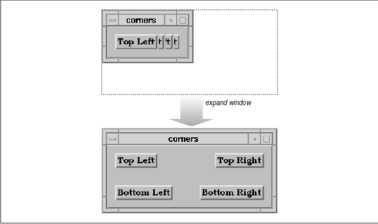
   /* corners.c -- demonstrate widget layout management for a
    * BulletinBoard widget.  There are four widgets each labeled
    * top-left, top-right, bottom-left and bottom-right.  Their
    * positions in the bulletin board correspond to their names.
    * Only when the widget is resized does the geometry management
    * kick in and position the children in their correct locations.
    */
   #include <Xm/BulletinB.h>
   #include <Xm/PushB.h>

   char *corners[] = {
       "Top Left", "Top Right", "Bottom Left", "Bottom Right",
   };

   static void resize();

   main(argc, argv)
   int argc;
   char *argv[];
   {
       Widget toplevel, bboard;
       XtAppContext app;
       XtActionsRec rec;
       int i;

       XtSetLanguageProc (NULL, NULL, NULL);

       /* Initialize toolkit and create toplevel shell */
       toplevel = XtVaAppInitialize (&app, "Demos", NULL, 0,
           &argc, argv, NULL, NULL);

       /* Create your standard BulletinBoard widget */
       bboard = XtVaCreateManagedWidget ("bboard",
           xmBulletinBoardWidgetClass, toplevel, NULL);

       /* Set up a translation table that captures "Resize" events
        * (also called ConfigureNotify or Configure events).  If the
        * event is generated, call the function resize().
        */
       rec.string = "resize";
       rec.proc = resize;
       XtAppAddActions (app, &rec, 1);
       XtOverrideTranslations (bboard,
           XtParseTranslationTable ("<Configure>: resize()"));

       /* Create children of the dialog -- a PushButton in each corner. */
       for (i = 0; i < XtNumber (corners); i++)
           XtVaCreateManagedWidget (corners[i],
               xmPushButtonWidgetClass, bboard, NULL);

       XtRealizeWidget (toplevel);
       XtAppMainLoop (app);
   }

   /* resize(), the routine that is automatically called by Xt upon the
    * delivery of a Configure event.  This happens whenever the widget
    * gets resized.
    */
   static void
   resize(w, event, args, num_args)
   Widget w;   /* The widget (BulletinBoard) that got resized */
   XEvent *event;  /* The event struct associated with the event */
   String args[]; /* unused */
   int *num_args; /* unused */
   {
       WidgetList children;
       Dimension w_width, w_height;
       short margin_w, margin_h;
       XConfigureEvent *cevent = (XConfigureEvent *) event;
       int width = cevent->width;
       int height = cevent->height;

       /* get handle to BulletinBoard's children and marginal spacing */
       XtVaGetValues (w,
           XmNchildren, &children,
           XmNmarginWidth, &margin_w,
           XmNmarginHeight, &margin_h,
           NULL);

       /* place the top left widget */
       XtVaSetValues (children[0],
           XmNx, margin_w,
           XmNy, margin_h,
           NULL);
       /* top right */
       XtVaGetValues (children[1], XmNwidth, &w_width, NULL);
       XtVaSetValues (children[1],
           XmNx, width - margin_w - w_width,
           XmNy, margin_h,
           NULL);
       /* bottom left */
       XtVaGetValues (children[2], XmNheight, &w_height, NULL);
       XtVaSetValues (children[2],
           XmNx, margin_w,
           XmNy, height - margin_h - w_height,
           NULL);
       /* bottom right */
       XtVaGetValues (children[3],
           XmNheight, &w_height,
           XmNwidth, &w_width,
           NULL);
       XtVaSetValues (children[3],
           XmNx, width - margin_w - w_width,
           XmNy, height - margin_h - w_height,
           NULL);
   }
The program uses four widgets, labeled Top Left, Top Right
, Bottom Left, and Bottom Right. The positions of the
buttons in the BulletinBoard correspond to their names. Since the
widgets are not positioned when they are created, the geometry
management only happens when the widget is resized. the figure shows
the application before and after a resize event.
When a resize event occurs, X generates a
ConfigureNotify event. This event is interpreted by Xt and the
translation table of the widget corresponding to the resized window is
searched to see if the application is interested in being notified of
the event. We have indicated interest in this event by calling
XtAppAddActions() and XtOverrideTranslations(), as shown
below:
   XtActionsRec rec;
   ...
   rec.string = "resize";
   rec.proc = resize;
   XtAppAddActions (app, &rec, 1);
   XtOverrideTranslations (bboard,
       XtParseTranslationTable ("<Configure>: resize()"));
As described in Volume Four, X Toolkit Intrinsics Programming Manual
, a translation table pairs a sequence of one or more events with a
sequence of one or more functions that are called when the event
sequence occurs. In this case, the event is a ConfigureNotify
event and the function is resize(). Translations are specified
as strings and then parsed into an internal format with the function
XtParseTranslationTable(). The routine creates an internal
structure of events and the functions to which they correspond. Xt
provides the table for translating event strings such as
<Configure> to the actual ConfigureNotify event, but Xt
cannot convert the string resize() to an actual function
unless we provide a lookup table. The XtActionsRec type
performs this task. The structure is defined as follows:
   typedef struct {
       String       string;
       XtActionProc proc;
   } XtActionsRec;
The action list is initialized to map the string resize to the
actual function resize() using XtAppAddActions(). We
install the translation table on the widget using
XtOverrideTranslations() so that when a ConfigureNotify
event occurs, the resize() function is called.
The resize() function takes four arguments.
The first two arguments are a pointer to the widget in which the event
occurred and the event structure. The args and num_args
parameters are ignored because we did not specify any extra parameters
to be passed to the function when we installed it. Since the function
is called as a result of the event happening on the BulletinBoard
widget, we know that we are dealing with a composite widget. We also
know that there is only one event type that could have caused the
function to be called, so we cast the event parameter
accordingly.
The task of the function is to position the children
so that there is one per corner in the BulletinBoard. We get a handle
to all of the children of the BulletinBoard. Since we are going to
place the children around the perimeter of the widget, we also need to
know how far from the edge to place them. This distance is taken from
the values for XmNmarginWidth and XmNmarginHeight.
All three resource values are retrieved in the following call:
   XtVaGetValues (w,
       XmNchildren,     &children,
       XmNmarginWidth,  &margin_w,
       XmNmarginHeight, &margin_h,
       NULL);
The remainder of the function simply places the
children at the appropriate positions within the BulletinBoard. The
routine uses a very simple method for geometry management, but it does
demonstrate the process.
The general issue of geometry management for
composite widgets is not trivial. If you plan on doing your own
geometry management for a BulletinBoard or any other composite widget,
you should be very careful to consider all the resources that could
possibly affect layout. In our example, we considered the margin width
and height, but there is also XmNallowOverlap,
XmNborderWidth (which is a general Core widget resource),
XmNshadowThickness (a general manager widget resource) and the
same values associated with the children of the BulletinBoard.
There are also issues about what to do if a child
decides to resize itself, such as if a label widget gets wider. In this
case, you must first evaluate what the geometry layout of the widgets
would be if you were to grant the Label permission to resize itself as
it wants. This evaluation is done by asking each of the children how
big they want to be and calculating the hypothetical layout. The
BulletinBoard either accepts or rejects the new layout. Of course, the
BulletinBoard may have to make itself bigger too, which requires asking
its parent for a new size, and so on. If the BulletinBoard cannot
resize itself, then you have to decide whether to force other children
to be certain sizes or to reject the resize request of the child that
started all the negotiation. Geometry management is by no means a
simple task; it is explained more completely in Volume Four, X
Toolkit Intrinsics Programming Manual.
The Form widget is subclassed from the BulletinBoard
class, so it inherits all of the resources that the BulletinBoard has
to offer. Accordingly, the children of a Form can be placed at specific
x,y coordinates and geometry management can be performed as in the
source code However, the Form provides additional geometry management
features that allow its children to be positioned relative to one
another and relative to specific locations in the Form.
In order to use a Form, you must include the file <
Xm/Form.h>. A Form is created in a similar way to other manager
widgets, as shown below:
   Widget form;

   form = XtVaCreateWidget ("name",
       xmFormWidgetClass, parent,
       resource-value-list,
       NULL);

   /* create children */

   XtManageChild (form);
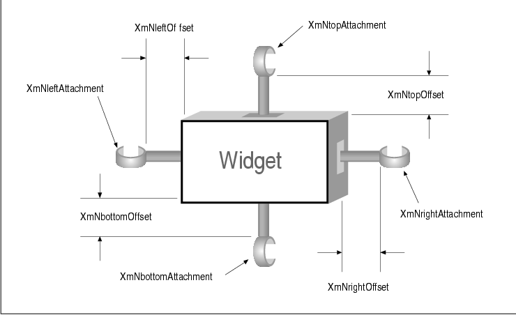
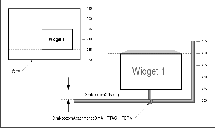
Geometry management in a Form is done using attachment resources. These resources are constraint resources, which means that they are specified for the children of the Form. The resources provide various ways of specifying the position of a child of a Form by attaching each of the four sides of the child to another entity. The side of a widget can be attached to another widget, to a fixed position in the Form, to a flexible position in the Form, to the Form itself, or to nothing at all. These attachments can be considered hooks, rods, and anchor points, as shown in the figure.
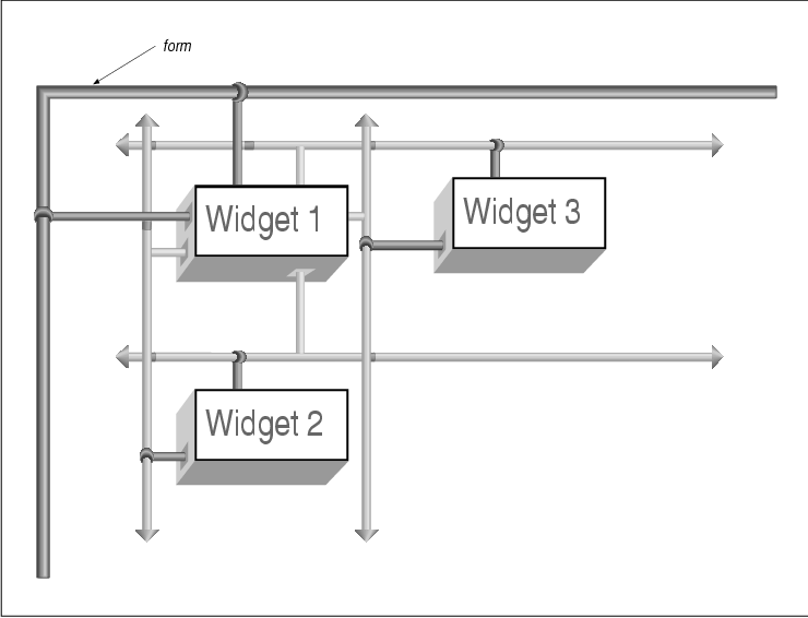
In this figure, there are three widgets. The sizes
and types of the widgets are not important. What is important is the
relationship between the widgets with respect to their positions in the
Form. Widget 1 is attached to the top and left sides of the Form
by creating two attachments. The top side of the widget is hooked to
the top of the Form. It can slide from side to side, but it cannot be
moved up or down (just like a shower curtain). The left side can slide
up and down, but not to the right or to the left. Given these two
attachment constraints, the top and left sides of the widget are fixed.
The right and bottom edges of the widget are not attached to anything,
but other widgets are attached to those edges.
The left side of Widget 2 is attached to the
right side of Widget 1. Similarly, the top side of Widget 2
is attached to the top side of Widget 1. As a result, the top
and left sides of the widget cannot be moved unless Widget 1
moves. The same kind of attachments hold for Widget 3. The top
side of this widget is attached to the bottom of Widget 1 and
its left side is attached to the left side of Widget 1. Given
these constraints, no matter how large each of the widgets may be, or
how the Form may be resized, the positional relationship of the widgets
is maintained.
In general, you must attach at least two adjacent
edges of a widget to keep it from moving unpredictably. If you attach
opposing sides of the widget, the widget will probably be resized by
the Form in order to satisfy the attachment policies. The following
resources represent the four sides of a widget:
   XmNtopAttachment
   XmNbottomAttachment
   XmNrightAttachment
   XmNleftAttachment
For example, if we want to specify that the top of a widget is attached to something, we use the XmNtopAttachment resource. Each of the four resources can be set to one of the following values:
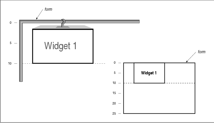
   XmATTACH_FORM
   XmATTACH_OPPOSITE_FORM
   XmATTACH_WIDGET
   XmATTACH_OPPOSITE_WIDGET
   XmATTACH_NONE
   XmATTACH_SELF
   XmATTACH_POSITION
When an attachment is set to XmATTACH_FORM, the specified side is attached to the Form as shown in the figure. If the resource that has this value is XmNtopAttachment, then the top side of the widget is attached to the top of the Form. The top attachment does not guarantee that the widget will not move from side to side. If XmNbottomAttachment is also set to XmATTACH_FORM, the bottom of the widget is attached to the bottom side of the Form. With both of these attachments, the widget is resized to the height of the Form itself. The same would be true for the right and left edges of the widget if they were attached to the Form.
When an attachment is set to
XmATTACH_OPPOSITE_FORM, the specified side of the widget is
attached to the opposite side of the Form. For example, if
XmNtopAttachment is set to XmATTACH_OPPOSITE_FORM, the top
side of the widget is attached to the bottom side of the Form. This
value must be used with a negative offset value (discussed in the next
section) or the widget is placed off of the edge of the Form and it is
not visible. While it may seem confusing, this value is the only one
that can be applied to an attachment resource that allows you to
specify a constant offset from the edge of a Form. The
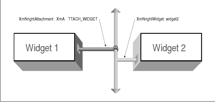
XmATTACH_WIDGET value indicates that the side of a widget is
attached to another widget. The other widget must be specified using
the appropriate resource from the following list:
   XmNtopWidget
   XmNbottomWidget
   XmNleftWidget
   XmNrightWidget
The value for one of these resources must be the widget ID. For example, the figure shows how to attach the right side of Widget 1 to the left side of Widget 2. This attachment method is commonly used to chain together a series of adjacent widgets. Chaining widgets horizontally does not guarantee that the widgets will be aligned vertically, or vice versa.
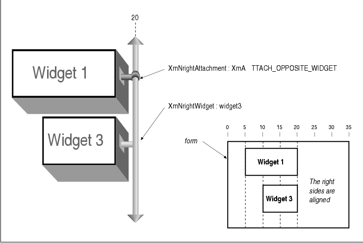
The XmATTACH_OPPOSITE_WIDGET value is just like XmATTACH_WIDGET, except that the widget is attached to the same edge of the specified widget, as shown in the figure. In this case, the right side of Widget 1 is attached to the right side of Widget 3. This attachment method allows you to align the edges of a group of widgets. As with XmATTACH_WIDGET, the other widget must be specified using XmNtopWidget, XmNbottomWidget, XmNleftWidget, or XmNrightWidget .
XmATTACH_NONE specifies that the side of a
widget is not attached to anything, which is the default value. This
case could be represented by a dangling hook that is not attached to
anything. If the entire widget moves because another side is attached
to something, then this side gets dragged along with it so that the
widget does not need resizing. Unless a particular side of a widget is
attached to something, that side of the widget is free-floating and
moves proportionally with the other parts of the widget. When the side
of a widget is attached using XmATTACH_POSITION, the side is
anchored to a relative position in the Form. This value works by
segmenting the Form into a fixed number of equally-spaced horizontal
and vertical positions, based on the value of the XmNfractionBase
resource. The position of the side must be specified using the
appropriate resource from the following list:
   XmNtopPosition
   XmNbottomPosition
   XmNleftPosition
   XmNrightPosition
See Section #sformpos for a complete discussion of position attachments. When an attachment is set to XmATTACH_SELF, the side of the widget is attached to its initial position in the Form. You position the widget initially by specifying its x,y location in the Form. After the widget has been placed in the Form, the attachment for the side reverts to XmATTACH_POSITION, with the corresponding position resource set to the relative position of the x,y coordinate in the Form. Now that we have explained the concept of Form attachments, we can reimplement the four corners example from the previous section. Unlike in the previous version, we no longer need a resize procedure to calculate the positions of the widgets. By specifying the correct attachments, as shown in the source code the widgets are placed and managed correctly by the Form when it is resized. XtSetLanguageProc() is only available in X11R5; there is no corresponding function in X11R4.
   /* form_corners.c -- demonstrate form layout management.  Just as
    * in corners.c, there are four widgets each labeled top-left,
    * top-right, bottom-left and bottom-right.  Their positions in the
    * form correspond to their names.  As opposed to the BulletinBoard
    * widget, the Form manages this layout management automatically by
    * specifying attachment types for each of the widgets.
    */
   #include <Xm/PushB.h>
   #include <Xm/Form.h>

   char *corners[] = {
       "Top Left", "Top Right", "Bottom Left", "Bottom Right",
   };

   main(argc, argv)
   char *argv[];
   {
       Widget toplevel, form;
       XtAppContext app;

       XtSetLanguageProc (NULL, NULL, NULL);

       toplevel = XtVaAppInitialize (&app, "Demos", NULL, 0,
           &argc, argv, NULL, NULL);

       form = XtVaCreateManagedWidget ("form",
           xmFormWidgetClass, toplevel, NULL);

       /* Attach the edges of the widgets to the Form.  Which edge of
        * the widget that's attached is relative to where the widget is
        * positioned in the Form.  Edges not attached default to having
        * an attachment type of XmATTACH_NONE.
        */
       XtVaCreateManagedWidget (corners[0],
           xmPushButtonWidgetClass, form,
           XmNtopAttachment,        XmATTACH_FORM,
           XmNleftAttachment,       XmATTACH_FORM,
           NULL);

       XtVaCreateManagedWidget (corners[1],
           xmPushButtonWidgetClass, form,
           XmNtopAttachment,        XmATTACH_FORM,
           XmNrightAttachment,      XmATTACH_FORM,
           NULL);

       XtVaCreateManagedWidget (corners[2],
           xmPushButtonWidgetClass, form,
           XmNbottomAttachment,     XmATTACH_FORM,
           XmNleftAttachment,       XmATTACH_FORM,
           NULL);

       XtVaCreateManagedWidget (corners[3],
           xmPushButtonWidgetClass, form,
           XmNbottomAttachment,     XmATTACH_FORM,
           XmNrightAttachment,      XmATTACH_FORM,
           NULL);

       XtRealizeWidget (toplevel);
       XtAppMainLoop (app);
   }
In this example, two sides of each widget are attached to the Form. It
is not necessary to attach the other sides of the widgets to anything
else. If we attach the other sides to each other, the widgets would
have to be resized so that they could stretch to meet each other. With
the specified attachments, the output of the program looks just like
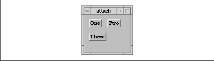
the output in the figure.
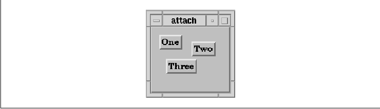
A more complex example of Form attachments is shown
in the source code This example implements the layout shown in the
figure. XtSetLanguageProc() is only available in X11R5; there
is no corresponding function in X11R4.
   /* attach.c -- demonstrate how attachments work in Form widgets. */

   #include <Xm/PushB.h>
   #include <Xm/Form.h>

   main(argc, argv)
   int argc;
   char *argv[];
   {
       Widget toplevel, parent, one, two, three;
       XtAppContext app;

       XtSetLanguageProc (NULL, NULL, NULL);

       toplevel = XtVaAppInitialize (&app, "Demos", NULL, 0,
           &argc, argv, NULL, NULL);

       parent = XtVaCreateManagedWidget ("form",
           xmFormWidgetClass, toplevel, NULL);
       one = XtVaCreateManagedWidget ("One",
           xmPushButtonWidgetClass, parent,
           XmNtopAttachment,   XmATTACH_FORM,
           XmNleftAttachment,  XmATTACH_FORM,
           NULL);
       two = XtVaCreateManagedWidget ("Two",
           xmPushButtonWidgetClass, parent,
           XmNleftAttachment,  XmATTACH_WIDGET,
           XmNleftWidget,      one,
           /* attach top of widget to same y coordinate as top of "one" */
           XmNtopAttachment,   XmATTACH_OPPOSITE_WIDGET,
           XmNtopWidget,       one,
           NULL);
       three = XtVaCreateManagedWidget ("Three",
           xmPushButtonWidgetClass, parent,
           XmNtopAttachment,   XmATTACH_WIDGET,
           XmNtopWidget,       one,
           /* attach left of widget to same x coordinate as left side of "one" */
           XmNleftAttachment,  XmATTACH_OPPOSITE_WIDGET,
           XmNleftWidget,      one,
           NULL);

       XtRealizeWidget (toplevel);
       XtAppMainLoop (app);
   }
The example uses three PushButton gadgets inside of a Form widget. The
output of the program is shown in the figure.
You should notice that the widgets are packed
together quite tightly, which might not be how you expected them to
appear. In order to space the widgets more reasonably, we need to
specify some distance between them using attachment offsets.
Attachment offsets control the spacing between
widgets and the objects to which they are attached. The following
resources represent the attachment offsets for the four sides of a
widget:
   XmNleftOffset
   XmNrightOffset
   XmNtopOffset
   XmNbottomOffset
the figure shows the graphic representation of attachment offsets.
By default, offsets are set to 0 (zero),
which means that there is no offset, as shown in the output for the
source code To make the output more reasonable, we need only to set the
left offset between widgets One and Two and the top
offset to between widgets One and Three. The resources
values can be hard-coded in the application or set in a resource file,
using the following specification:
   *form.One.leftOffset:   10
   *form.One.topOffset:    10
   *form.Two.leftOffset:   10
   *form.Three.topOffset:  10
Our choice of the value 10 was arbitrary. The widgets are now spaced more appropriately, as shown in the figure.
While the layout of the widgets can be improved by
setting offset resources, it is also possible to disrupt the layout.
Consider the following resource specifications:
   *form*leftOffset: 10
   *form*topOffset:  10
While it might seem that these resource values are simply a terser way to specify the offsets shown earlier, the figure makes it clear that these specifications do not produce the desired effect.
An application should hard-code whatever resources
may be necessary to prevent the user from setting values that would
make the application non-functional or aesthetically unappealing.
Offset resource values can be tricky because they apply individually to
each side of each widget in a Form. The problem with the resource
specifications used to produce the figure is that the offsets are being
applied to each side of every widget, when some of the alignments need
to be precise. In order to prevent this problem, we need to hard-code
the offsets for particular attachments, as shown in the following code
fragment:
   two = XtVaCreateManagedWidget ("Two",
       xmPushButtonWidgetClass, parent,
       XmNleftAttachment,  XmATTACH_WIDGET,
       XmNleftWidget,      one,
       XmNtopAttachment,   XmATTACH_OPPOSITE_WIDGET,
       XmNtopWidget,       one,
       XmNtopOffset,       0,
       NULL);

   three = XtVaCreateManagedWidget ("Three",
       xmPushButtonWidgetClass, parent,
       XmNtopAttachment,   XmATTACH_WIDGET,
       XmNtopWidget,       one,
       XmNleftAttachment,  XmATTACH_OPPOSITE_WIDGET,
       XmNleftWidget,      one,
       XmNleftOffset,      0,
       NULL);
The use of zero-length offsets guarantees that the widgets they are
associated with are aligned exactly with the widgets to which they are
attached, regardless of any resource specifications made by the user. A
general rule of thumb is that whenever you use
XmATTACH_OPPOSITE_WIDGET, you should also set the appropriate
offset to zero so that the alignment remains consistent.
In some situations it is necessary to use negative offsets to properly arrange widgets in a Form. The most common example of this situation occurs when using the XmATTACH_OPPOSITE_FORM attachment. Unless you use a negative offset, as shown in the figure, the widgets are placed off the edge of the Form and are not visible.
Form positions provide another way to position widgets within a
Form. The concept is similar to the hook and rod principle described
earlier, but in this case the widgets are anchored on at positions that
are based on imaginary longitude and latitude lines that are used to
segment the Form into equal pieces. The resource used to partition the
Form into segments is XmNfractionBase. Although the name of
this resource may suggest complicated calculations, you just need to
know that the Form is divided horizontally and vertically into the
number of partitions represented by its value. For example, the figure
shows how a Form is partitioned if XmNfractionBase is set to
5.
As you can see, there are an equal number of
horizontal and vertical partitions, but the size of the horizontal
partitions is not the same as the size of the vertical partitions. It
is currently not possible to set the number of horizontal partitions
separately from the number of vertical ones, although it is possible to
work around this shortcoming, as we will describe shortly.
Widgets are placed at the coordinates that represent
the partitions by specifying XmATTACH_POSITION for the
attachment resource and by specifying a coordinate value for the
corresponding position resource. The position resources are
XmNtopPosition, XmNbottomPosition, XmNleftPosition
, and XmNrightPosition. For example, if we wanted to attach the
top and left sides of a PushButton to position 1, we could use the
following code fragment:
   XtVaCreateManagedWidget ("name",
       xmPushButtonWidgetClass, form,
       XmNtopAttachment,   XmATTACH_POSITION,
       XmNtopPosition,     1,
       XmNleftAttachment,  XmATTACH_POSITION,
       XmNleftPosition,    1,
       NULL);
The right and bottom attachments are left unspecified, so those edges
of the widget are not explicitly positioned by the Form. If attachments
had been specified for these edges, the widget would have to be resized
by the Form in order to satisfy all the attachment constraints.
One obvious example of using position attachments is
to create a tic-tac-toe board layout, as is done in the source code
XtSetLanguageProc() is only available in X11R5; there is no
corresponding function in X11R4. XmStringCreateLocalized() is
only available in Motif 1.2; XmStringCreateSimple() is the
corresponding function in Motif 1.1.
   /* tictactoe.c -- demonstrate how fractionBase and XmATTACH_POSITIONs
    * work in Form widgets.
    */
   #include <Xm/PushB.h>
   #include <Xm/Form.h>

   main(argc, argv)
   int argc;
   char *argv[];
   {
       XtAppContext app;
       Widget toplevel, parent, w;
       int x, y;
       extern void pushed();  /* callback for each PushButton */

       XtSetLanguageProc (NULL, NULL, NULL);

       toplevel = XtVaAppInitialize (&app, "Demos", NULL, 0,
           &argc, argv, NULL, NULL);

       parent = XtVaCreateManagedWidget ("form",
           xmFormWidgetClass, toplevel,
           XmNfractionBase,    3,
           NULL);

       for (x = 0; x < 3; x++)
           for (y = 0; y < 3; y++) {
               w = XtVaCreateManagedWidget ("   ",
                   xmPushButtonWidgetClass, parent,
                   XmNtopAttachment,    XmATTACH_POSITION,
                   XmNtopPosition,      y,
                   XmNleftAttachment,   XmATTACH_POSITION,
                   XmNleftPosition,     x,
                   XmNrightAttachment,  XmATTACH_POSITION,
                   XmNrightPosition,    x+1,
                   XmNbottomAttachment, XmATTACH_POSITION,
                   XmNbottomPosition,   y+1,
                   NULL);
               XtAddCallback (w, XmNactivateCallback, pushed, NULL);
           }
       XtRealizeWidget (toplevel);
       XtAppMainLoop (app);
   }
   void
   pushed(w, client_data, call_data)
   Widget     w;           /* The PushButton that got activated */
   XtPointer  client_data; /* unused -- NULL was passed to XtAddCallback() */
   XtPointer  call_data;
   {
       char buf[2];
       XmString str;
       XmPushButtonCallbackStruct *cbs =
           (XmPushButtonCallbackStruct *) call_data;

       /* Shift key gets an O.  (xbutton and xkey happen to be similar) */
       if (cbs->event->xbutton.state & ShiftMask)
           buf[0] = '0';
       else
           buf[0] = 'X';
       buf[1] = 0;
       str = XmStringCreateLocalized (buf);
       XtVaSetValues (w, XmNlabelString, str, NULL);
       XmStringFree (str);
   }
The output of this program is shown in the figure.
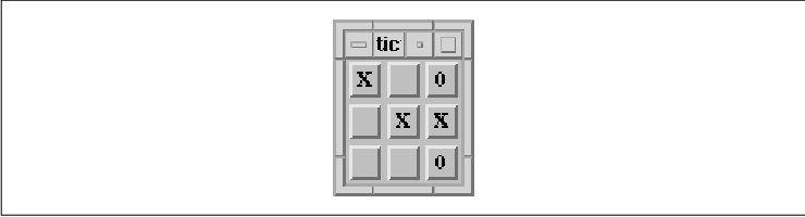
As you can see, the children of the Form are equally
sized because their attachment positions are segmented equally. If the
user resizes the Form, all of the children maintain their relationship
to one another. The PushButtons simply grow or shrink to fill the form.
One common use of positional attachments is to lay
out a number of widgets that need to be of equal size and equal
spacing. For example, you might use this technique to arrange the
buttons in the action area of a dialog. Chapter 7, Custom Dialogs
, provides a detailed discussion of how to arrange buttons in this
manner.
There may be situations where you would like to
attach widgets to horizontal positions that do not match up with how
you'd like to attach their vertical positions. Since the fraction base
cannot be set differently for the horizontal and vertical orientations,
you have to use the least common multiple as the fraction base value.
For example, say you want to position the tops and bottoms of all of
your widgets to the 2nd and 4th positions, as if the Form were
segmented vertically into 5 parts. But, you also want to position the
left and right edges of those same widgets to the 3rd, 5th, 7th, and
9th positions, as if it were segmented into 11 parts. You would have to
apply some simple arithmetic and set the value for XmNfractionBase
to 55 (5x11). The top and bottom edges would be set
to the 22nd (2x11) and 44th (4x11) positions and the
left and right edges would be set to the 15th (3x5), 25th (
5x5), 35th (7x5), and 45th (9x5) positions.
There are a few other useful Form resources that we
have not covered so far. The XmNhorizontalSpacing resource
can be used to specify the distance between horizontally adjacent
widgets, while XmNverticalSpacing specifies the distance
between vertically adjacent widgets. These values only apply when the
left and right offset values are not specified, so they are intended
to be used as global offset values global for a Form. The following
resource specification:
*horizontalSpacing: 10is equivalent to:
   *leftOffset:   10
   *rightOffset:  10
The XmNrubberPositioning resource specifies the default attachments for widgets in the Form. The default value of False indicates that the top and left edges are attached to the form by default. If XmNrubberPositioning is set to True, the top and left attachments are set to XmATTACH_POSITION by default. If the XmNtopAttachment or XmNleftAttachment resource is explicitly set for a widget, then the default attachment has no effect.
The XmNresizable resource is another
constraint resource that can be set on the children of a Form widget.
This resource indicates whether or not the Form tries to grant resize
requests from the child.
Some widget layouts are difficult to create using a
single Form widget. Since a manager widget can contain other managers,
it is often possible to generate the desired layout by using a Form
within a Form. One common problem is that there are no Form attachments
available to align two widgets horizontally if they have different
heights. We need a middle attachment resource, but one doesn't exist.
For example, if you have a series of Labels and Text widgets that you
want to pair off and stack vertically, it would be nice to align each
pair of widgets at their midsections.
To solve this problem, we can place each Label-Text
widget pair in a separate Form. If the top and bottom edges of the
widgets are attached to the Form, the widgets are stretched to satisfy
the constraints, which means that they are aligned horizontally. All of
these smaller Form widgets can be placed inside of a larger Form
widget. the source code shows an implementation of this idea.
XtSetLanguageProc() is only available in X11R5; there is no
corresponding function in X11R4.
   /* text_form.c -- demonstrate how attachments work in Form widgets
    * by creating a text-entry form type application.
    */

   #include <Xm/LabelG.h>
   #include <Xm/Text.h>
   #include <Xm/Form.h>

   char *prompts[] = {
       "Name:", "Phone:", "Address:",
       "City:", "State:", "Zip Code:",
   };

   main(argc, argv)
   int argc;
   char *argv[];
   {
       Widget toplevel, mainform, subform, label, text;
       XtAppContext app;
       char buf[32];
       int i;

       XtSetLanguageProc (NULL, NULL, NULL);

       toplevel = XtVaAppInitialize (&app, "Demos", NULL, 0,
           &argc, argv, NULL, NULL);

       mainform = XtVaCreateWidget ("mainform",
           xmFormWidgetClass, toplevel,
           NULL);

       for (i = 0; i < XtNumber (prompts); i++) {
           subform = XtVaCreateWidget ("subform",
               xmFormWidgetClass,   mainform,
               /* first one should be attached for form */
               XmNtopAttachment,    i ? XmATTACH_WIDGET : XmATTACH_FORM,
               /* others are attached to the previous subform */
               XmNtopWidget,        subform,
               XmNleftAttachment,   XmATTACH_FORM,
               XmNrightAttachment,  XmATTACH_FORM,
               NULL);
     /* Note that the label here contains a colon from the prompts
            * array above.  This makes it impossible for external resources
            * to be set on these widgets.  Here, that is intentional, but
            * be careful in the general case.
            */
           label = XtVaCreateManagedWidget (prompts[i],
               xmLabelGadgetClass,  subform,
               XmNtopAttachment,    XmATTACH_FORM,
               XmNbottomAttachment, XmATTACH_FORM,
               XmNleftAttachment,   XmATTACH_FORM,
               XmNalignment,        XmALIGNMENT_BEGINNING,
               NULL);
           sprintf (buf, "text_%d", i);
           text = XtVaCreateManagedWidget (buf,
               xmTextWidgetClass,   subform,
               XmNtopAttachment,    XmATTACH_FORM,
               XmNbottomAttachment, XmATTACH_FORM,
               XmNrightAttachment,  XmATTACH_FORM,
               XmNleftAttachment,   XmATTACH_WIDGET,
               XmNleftWidget,       label,
               NULL);
           XtManageChild (subform);
       }
       /* Now that all the forms are added, manage the main form */
       XtManageChild (mainform);

       XtRealizeWidget (toplevel);
       XtAppMainLoop (app);
   }
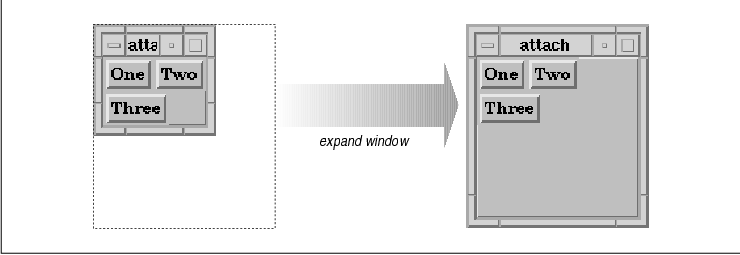
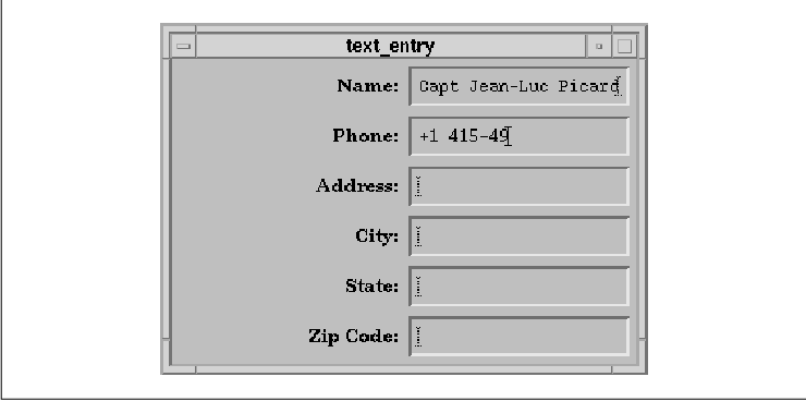
The output of the program is shown in the figure.
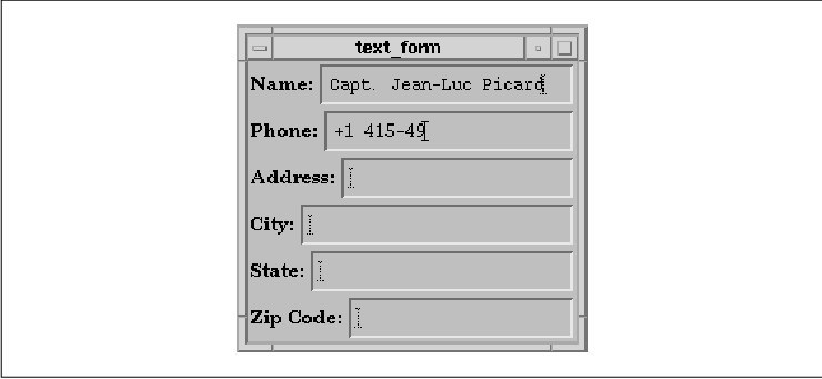
Notice that the Labels are centered vertically with
respect to their corresponding Text widgets. This arrangement happened
because each Label was stretched vertically in order to attach it to
the top and bottom of the respective Form. Of course, if the Labels
were higher than the Text widgets, the Text widgets would be stretched
instead.
Later, we'll show another version of this program
that gives better results. As you can imagine, there are many different
ways for a Form, or any other manager widget, to manage the geometry of
its children to produce the same layout. Later, when we discuss the
RowColumn widget, we will show you another solution to the problem of
horizontal alignment. It is important to remember that there is no
right or wrong way to create a layout, as long as it works for your
application. However, you should be very careful to experiment with
resizing issues as well as with resources that can be set by the user
that might affect widget layout, such as fonts and strings.
With a Form widget, you can specify a virtually
unlimited number of attachments for its children. The dependencies
inherent in these attachments can lead to various errors in the layout
of the widgets. One common problem involves circular dependencies. The
following code fragment shows a very simple example of a circular
dependency:
   w1 = XtVaCreateManagedWidget ("w1", xmLabelGadgetClass, form, NULL);
   w2 = XtVaCreateManagedWidget ("w2", xmLabelGadgetClass, form, NULL);

   XtVaSetValues (w1,
       XmNrightAttachment, XmATTACH_WIDGET,
       XmNrightWidget,     w2,
       NULL);
XtVaSetValues (w2, XmNleftAttachment,
XmATTACH_WIDGET, XmNleftWidget, w1, NULL); In this example, the left
widget is attached to the right widget and the right widget is attached
to the left one. If you do mistakenly specify a circular dependency, it
is unlikely that it will be as obvious as this example. Fortunately, in
most cases, the Motif toolkit catches circular dependencies and
displays an error message if one is found. When this situation occurs,
you need to reconsider your widget layout and try to arrange things
such that the relationship between widgets is less complex. One rule to
remember is that adjacent widgets should only be attached in one
direction.
When you attach the side of a widget to another
widget in a Form, you need to be careful about how you specify the
attached widget. If you specify this widget in the application code,
you need to make sure that the widget has been created before you
specify it as a resource value. With Motif 1.1, you cannot specify a
widget ID in a resource file unless you have installed your own
widget-name-to-widget-ID converter. (See Volume Four, X Toolkit
Intrinsics Programming Manual, for information about resource
converters.) In Motif 1.2, the toolkit provides a name-to-widget
converter, so you can specify widget IDs in a resource file.
Another common problem arises with certain Motif
compound objects, such as ScrolledList and ScrolledText objects.
XmCreateScrolledText() and XmCreateScrolledList() return
the corresponding Text or List widget, but it is the parent of this
widget that needs to be positioned within a Form. The following code
fragment shows an example of positioning a ScrolledList incorrectly:
   form = XmCreateForm (parent, "form", NULL, 0);

   list = XmCreateScrolledList (form, "scrolled_list", NULL, 0);

   XtVaSetValues(list,  /* <- WRONG */
       XmNleftAttachment, XmATTACH_FORM,
       XmNtopAttachment,  XmATTACH_FORM,
       NULL);
Since the List is a child of the ScrolledWindow, not the Form,
specifying attachments for the List has no effect on the position of
the List in the Form. The attachments need to be specified on the
ScrolledWindow, as shown in the following code fragment:
   XtVaSetValues (XtParent (list),
       XmNleftAttachment, XmATTACH_FORM,
       XmNtopAttachment,  XmATTACH_FORM,
       NULL);
If you specify attachments for two opposing sides of a widget, the Form
resizes the widget as needed, so that the default size of the widget is
ignored. In most cases, the Form can resize the widget without a
problem. However, one particular case that can cause a problem is a
List widget that has its XmNvisibleItemCount resource set.
This resource implies a specific size requirement, so that when the
List is laid out in the Form widget, the negotiation process between
the Form and the List may not be resolved. See Chapter 12, The List
Widget, for a complete discussion of the List widget.
Attachments in Form widgets can be delicate
specifications, which means that you must be specific and, above all,
complete in your descriptions of how widgets should be aligned and
positioned. Since resources can be set from many different places, the
only way to guarantee that you get the layout you want is to hard-code
these resource values explicitly. Even though it is important to allow
the user to specify as many resources as possible, you do not want to
compromise the integrity of your application. Attachments and
attachment offsets are probably not in the set of resources that should
be user-definable.
Although attachments can be delicate, they are also
provide a powerful, convenient, and flexible way to lay out widgets
within a Form, especially when the widgets are grouped together in some
abstract way. Attachments make it easy to chain widgets together, to
bind them to the edge of a Form, and to allow them to be fixed on
specific locations. You do not need to use a single attachment type
exclusively; it is perfectly reasonable, and in most cases necessary,
to use a variety of different types of attachments to achieve a
particular layout. If you specify too few attachments, you may end up
with misplaced widgets or widgets that drift when the Form is resized,
while too many attachments may cause the Form to be too inflexible. In
order to determine the best way to attach widgets to one another, you
may find it helpful to a draw picture first, with all of the hooks and
offset values considered.
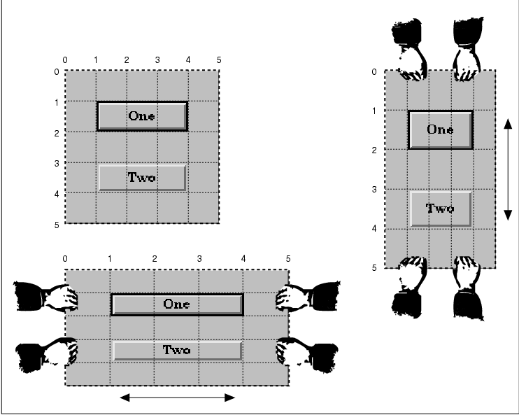
The RowColumn widget is a manager widget that, as
its name implies, lays out its children in a row and/or column format.
The widget is also used internally by the Motif toolkit to implement a
number of special objects, such as the Motif menus, including
PopupMenus, PulldownMenus, MenuBars, and OptionMenus. Many of the
resources for the RowColumn widget are used to control different
aspects of these objects. The Motif convenience functions for creating
these objects set most of these resources automatically, so they are
generally hidden from the programmer. The resources are not useful when
you are using the RowColumn as a simple manager widget anyway, so we do
not discuss them here.
The XmNrowColumnType resource controls how
a particular instance of the RowColumn is used. The resource can be set
to the following values:
   XmWORK_AREA
   XmMENU_BAR
   XmPULLDOWN
   XmMENU_POPUP
   XmMENU_OPTION
The default value is XmWORK_AREA; this value is also the one that you should use whenever you want to use a RowColumn widget as a manager. The rest of the values are for the different types of Motif menus. If you want to create a particular menu object, you should use the appropriate convenience function, rather than try to create the menu yourself using a RowColumn directly. We discuss menu creation in in Chapter 4, The Main Window, and Chapter 15, Menus. The RowColumn widget is also used to implement RadioBoxes and CheckBoxes, which are collections of ToggleButtons. See Chapter 11, Labels and Buttons, for more information on these objects.
The RowColumn is useful for generic geometry
management because it requires less fine tuning than is necessary for a
Form or a BulletinBoard widget. Although the RowColumn has a number of
resources, you can create a usable layout without specifying any
resources. In this case, the children of the RowColumn are
automatically laid out vertically. In the source code we create several
PushButtons as children of a RowColumn, without specifying any
RowColumn resources. XtSetLanguageProc() is only available in
X11R5; there is no corresponding function in X11R4.
   /* rowcol.c -- demonstrate a simple RowColumn widget.  Create one
    * with 3 pushbutton gadgets.  Once created, resize the thing in
    * all sorts of contortions to get a feel for what RowColumns can
    * do with its children.
    */
   #include <Xm/PushB.h>
   #include <Xm/RowColumn.h>

   main(argc, argv)
   int argc;
   char *argv[];
   {
       Widget toplevel, rowcol;
       XtAppContext app;

       XtSetLanguageProc (NULL, NULL, NULL);

       toplevel = XtVaAppInitialize (&app, "Demos", NULL, 0,
           &argc, argv, NULL, NULL);

       rowcol = XtVaCreateManagedWidget ("rowcolumn",
           xmRowColumnWidgetClass, toplevel, NULL);

       (void) XtVaCreateManagedWidget ("One",
           xmPushButtonWidgetClass, rowcol, NULL);

       (void) XtVaCreateManagedWidget ("Two",
           xmPushButtonWidgetClass, rowcol, NULL);

       (void) XtVaCreateManagedWidget ("Three",
           xmPushButtonWidgetClass, rowcol, NULL);

       XtRealizeWidget (toplevel);
       XtAppMainLoop (app);
   }
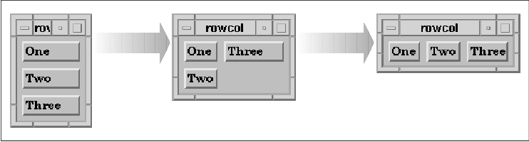
What makes the RowColumn widget unique is that it automates much of the
process of widget layout and management. If you display the application
and resize it in a number of ways, you can get a better feel for how
the RowColumn works. the figure shows a few configurations of the
application; the first configuration is the initial layout of the
application. As you can see, if the application is resized just so, the
widgets are oriented horizontally rather than vertically.
The orientation of the widgets in a RowColumn is
controlled by the XmNorientation resource. The default value
of the resource is XmVERTICAL. If we want to arrange the
widgets horizontally, we can set the resource to XmHORIZONTAL.
The orientation can be hard-coded in the application, or we can specify
the value of the resource in a resource file. The following resource
specification sets the orientation to horizontal:
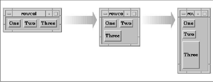
*RowColumn.orientation: horizontalAlternatively, we can specify the resource on the command line as follows:
% rowcol -xrm "*orientation: horizontal"the figure shows the output of the source code with a horizontal orientation. As before, the figure shows a few different configurations of the application, with the first configuration being the initial one.
If you use a RowColumn widget to manage more objects
than can be arranged in a single row or column, you can specify that
the widgets should be arranged in both rows and columns. You can also
specify whether the widgets should be packed together tightly, so that
the rows and columns are not necessarily the same size, or whether the
objects should be placed in identically-sized boxes. As with the Form
and BulletinBoard widgets, objects can also be placed at specific x, y
locations in a RowColumn widget. The RowColumn widget does not provide
a three-dimensional border, so if you want to provide a visual border
for the widget, you should create it as a child of a Frame widget.
The RowColumn widget can be quite flexible in terms
of how it lays out its children. The advantage of this flexibility is
that all of its child widgets are arranged in an organized fashion,
regardless of their widget types. The widgets remain organized when the
RowColumn is resized and in spite of constraints imposed by other
widgets or by resources. One disadvantage of the flexibility is that
sometimes the children need to be arranged in a specific layout so that
the user interface is intuitive.
the source code shows how to lay out widgets in a
spreadsheet-style format using a RowColumn. This layout requires that
each of the widgets be the same size and be spaced equally in a
predetermined number of rows and columns. XtSetLanguageProc()
is only available in X11R5; there is no corresponding function in
X11R4.
   /* spreadsheet.c -- This demo shows the most basic use of the RowColumn
    * It displays a table of widgets in a row-column format similar to a
    * spreadsheet.  This is accomplished by setting the number ROWS and
    * COLS and setting the appropriate resources correctly.
    */
   #include <Xm/LabelG.h>
   #include <Xm/PushB.h>
   #include <Xm/RowColumn.h>

   #define ROWS  8
   #define COLS 10

   main(argc, argv)
   int argc;
   char *argv[];
   {
       Widget toplevel, parent;
       XtAppContext app;
       char buf[16];
       int i, j;

       XtSetLanguageProc (NULL, NULL, NULL);

       toplevel = XtVaAppInitialize (&app, "Demos", NULL, 0,
           &argc, argv, NULL, NULL);

       parent = XtVaCreateManagedWidget ("rowcolumn",
           xmRowColumnWidgetClass, toplevel,
           XmNpacking,     XmPACK_COLUMN,
           XmNnumColumns,  COLS,
           XmNorientation, XmVERTICAL,
           NULL);

       /* simply loop thru the strings creating a widget for each one */
       for (i = 0; i < COLS; i++)
           for (j = 0; j < ROWS; j++) {
               sprintf (buf, "%d-%d", i+1, j+1);
               if (i == 0 || j == 0)
                   XtVaCreateManagedWidget (buf,
                       xmLabelGadgetClass, parent, NULL);
               else
                   XtVaCreateManagedWidget ("",
                       xmPushButtonWidgetClass, parent, NULL);
           }

       XtRealizeWidget (toplevel);
       XtAppMainLoop (app);
   }
The output of this example is shown in the figure.
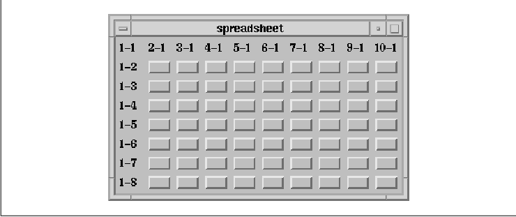
The number of rows is specified by the ROWS
definition and the number of columns is specified by COLS. In
order to force the RowColumn to lay out its children in the spreadsheet
format, we set the XmNpacking, XmNnumColumns, and
XmNorientation resources.
The value for XmNpacking is set to
XmPACK_COLUMN, which specifies that each of the cells should be the
same size. The heights and widths of the widgets are evaluated and the
largest height and width are used to determine the size of the rows and
columns. All of the widgets are resized to this size. If you are mixing
different widget types in a RowColumn, you may not want to use
XmPACK_COLUMN because of size variations. XmPACK_COLUMN is
typically used when the widgets are exactly the same, or at least
similar in nature. The default value of XmPACK_TIGHT for
XmNpacking allows each widget to keep its specified size and packs
the widgets into rows and columns based on the size of the RowColumn
widget.
Since we are packing the widgets in a row/column
format, we need to specify how many columns (or rows) we are using by
setting the value of XmNnumColumns to the number of columns.
In this case, the program defines COLS to be 10, which
indicates that the RowColumn should pack its children such that there
are 10 columns. The widget creates as many rows as necessary to provide
enough space for all of the child widgets.
Whether XmNnumColumns specifies the number
of columns or the number of rows depends on the orientation of the
RowColumn. In this program, XmNorientation is set to
XmVERTICAL to indicate that the value of XmNnumColumns
specifies the number of columns to use. If XmNorientation is
set to XmHORIZONTAL, XmNnumColumns indicates the
number of rows. If we wanted to use a horizontal orientation in our
example, we would set XmNnumColumns to ROWS and
XmNorientation to XmHORIZONTAL. The orientation also
dictates how children are added to the RowColumn; when the orientation
is vertical, children are added vertically so that each column is
filled up before the next one is started. If you need to insert a child
in the middle of an existing RowColumn layout, you can use the
XmNpositionIndex constraint resource to specify the position of the
child. Since this resource is used most often with menus, it is
discussed in Chapter 15, Menus.
In our example, we explicitly set the value of
XmNorientation to the default value of XmVERTICAL. If we
do not hard-code this resource, an external resource specification can
reset it. Since the orientation and the value for XmNnumColumns
need to be consistent, you should always specify these resources
together. Whether you choose to hard-code the resources, to use the
fallback mechanism, or to use a specification in a resource file, you
should be sure that both of the resources are specified in the same
place.
In the spreadsheet example, we can use either a
horizontal or vertical orientation. However, orientation may be
significant in other situations, since it affects how the RowColumn
adds its children. For example, if we want to implement the text-entry
form from the source code using a RowColumn, the order of the widgets
is important. In this case, there are two columns and the number of
rows depends on the number of text entry fields provided by the
application. We specify the orientation of the RowColumn as
XmHORIZONTAL and set XmNnumColumns to the number of
entries provided by the application, as shown in the source code
XtSetLanguageProc() is only available in X11R5; there is no
corresponding function in X11R4.
   /* text_entry.c -- This demo shows how the RowColumn widget can be
    * configured to build a text entry form.  It displays a table of
    * right-justified Labels and Text widgets that extend to the right
    * edge of the Form.
    */
   #include <Xm/LabelG.h>
   #include <Xm/RowColumn.h>
   #include <Xm/Text.h>

   char *text_labels[] = {
       "Name:", "Phone:", "Address:", "City:", "State:", "Zip Code:",
   };

   main(argc, argv)
   int argc;
   char *argv[];
   {
       Widget toplevel, rowcol;
       XtAppContext app;
       char buf[8];
       int i;

       XtSetLanguageProc (NULL, NULL, NULL);

       toplevel = XtVaAppInitialize (&app, "Demos", NULL, 0,
           &argc, argv, NULL, NULL);

       rowcol = XtVaCreateWidget ("rowcolumn",
           xmRowColumnWidgetClass, toplevel,
           XmNpacking,        XmPACK_COLUMN,
           XmNnumColumns,     XtNumber (text_labels),
           XmNorientation,    XmHORIZONTAL,
           XmNisAligned,      True,
           XmNentryAlignment, XmALIGNMENT_END,
           NULL);

       /* simply loop thru the strings creating a widget for each one */
       for (i = 0; i < XtNumber (text_labels); i++) {
           XtVaCreateManagedWidget (text_labels[i],
               xmLabelGadgetClass, rowcol,
               NULL);
           sprintf (buf, "text_%d", i);
           XtVaCreateManagedWidget (buf,
               xmTextWidgetClass, rowcol,
               NULL);
       }

       XtManageChild (rowcol);
       XtRealizeWidget (toplevel);
       XtAppMainLoop (app);
   }
The output of this example is shown in the figure.
The labels for the text fields are initialized by
the text_labels string array. When the RowColumn is created,
it is set to a horizontal orientation and the number of rows is set to
the number of items in text_labels. As you can see, the output
of this program is slightly different from the output for the
text_form example.
The example uses the XmNisAligned and
XmNentryAlignment resources to control the positioning of the
Labels in the RowColumn. These resources control the alignment of
widgets that are subclasses of Label and LabelGadget. When
XmNisAligned is True (the default), the alignment is taken
from the XmNentryAlignment resource. The possible alignment
values are the same as those that can be set for the Label's
XmNalignment resource:
   XmALIGNMENT_BEGINNING
   XmALIGNMENT_CENTER
   XmALIGNMENT_END
By default, the text is left justified. While the alignment of the Labels could also be specified using the XmNalignment resource for each widget, it is convenient to be able to set the alignment for the RowColumn and have it propagate automatically to its children. In our example, we use XmALIGNMENT_END to right justify the Labels so that they appear to be attached to the Text widgets.
In Motif 1.2, there is an additional resource for
controlling the alignment of various children. The
XmNentryVerticalAlignment resource controls the vertical
positioning of children that are subclasses of Label, LabelGadget, and
Text. The possible values for this resource are:
   XmALIGNMENT_BASELINE_BOTTOM
   XmALIGNMENT_BASELINE_TOP
   XmALIGNMENT_CENTER
   XmALIGNMENT_CONTENTS_BOTTOM
   XmALIGNMENT_CONTENTS_TOP
In the example, we do not specify this resource because the default value, XmALIGNMENT_CENTER, produces the layout that we want.
The RowColumn can be set up so that it only manages
one particular type of widget or gadget. In many cases, this feature
facilitates layout and callback management. For example, a MenuBar
consists entirely of CascadeButtons that all act the same way and a
RadioBox contains only ToggleButtons. The XmNisHomogeneous
resource indicates whether or not the RowColumn should only allow one
type of widget child. The widget class that is allowed to be managed is
specified by the XmNentryClass resource. XmNisHomogeneous
can be set at creation-time only. Once a RowColumn is created, you
cannot reset this resource, although you can always get its value.
These resources are useful for ensuring consistency; if you attempt to
add a widget as a child of a RowColumn that does not permit that widget
class, an error message is printed and the widget is not accepted.
The Motif toolkit uses these mechanisms to ensure
consistency in certain compound objects, to prevent you from doing
something like adding a List widget to a MenuBar, for example. In this
case, the XmNentryClass is set to
xmCascadeButtonWidgetClass. As another example, when
XmNradioBehavior is set, the RowColumn only allows ToggleButton
widgets and gadgets to be added. The XmCreateRadioBox()
convenience function creates a RowColumn widget with the appropriate
resources set automatically. (See Chapter 11, Labels and Buttons
.)
You probably do not need to use XmNisHomogeneous
unless you are providing a mechanism that is exported to other
programmers. If you are writing an interactive user-interface builder
or a program that creates widgets by scanning text files, you may want
to ensure that new widgets are of a particular type before they are
added to a RowColumn widget. In such cases, you may want to use
XmNisHomogeneous and XmNentryClass. Unless there is some
way for a user to to dynamically create widgets while an application is
running, these resources are not particularly useful.
The RowColumn does not provide any specific callback
routines that react to user input. While there are no callbacks for
FocusIn and FocusOut events, the widget does have
XmNmapCallback and XmNunmapCallback callback resources.
These callbacks are invoked when the window for the RowColumn is mapped
and unmapped. The callbacks are similar to those for the BulletinBoard,
but since the RowColumn is not designed specifically to be a child of a
DialogShell, the routines are invoked regardless of whether the parent
of the RowColumn is a DialogShell.
The XmNentryCallback is the only other
callback that is associated specifically with the RowColumn widget.
This callback resource makes it possible to install a single callback
function that acts as the activation callback for each of the children
of a RowColumn widget. The routine specified for the
XmNentryCallback overrides the XmNactivateCallback
functions for any PushButton or CascadeButton children and the
XmNvalueChangedCallback functions for ToggleButtons. The
XmNentryCallback is a convenience to the programmer; if you use it,
you don't have to install separate callbacks for each widget in the
RowColumn. XmNentryCallback functions must be installed before
children are added to the RowColumn, so be sure you call
XtAddCallback() before you create any child widgets.
The callback procedure takes the standard form of an
XtCallbackProc. The call_data parameter is an
XmRowColumnCallbackStruct, which is defined as follows:
   typedef struct {
       int      reason;
       XEvent  *event;
       Widget   widget;
       char    *data;
       char    *callbackstruct;
   } XmRowColumnCallbackStruct;
The reason field of this data structure is
set to XmCR_ACTIVATE when the XmNentryCallback is
invoked. The event indicates the event that caused the
notification. The entry callback function is called regardless of which
widget within the RowColumn was activated. Since an entry callback
overrides any previously-set callback lists for PushButtons,
CascadeButtons, and ToggleButtons, the parameters that would have been
passed to these callback routines are provided in the RowColumn
callback structure. The widget field specifies the child that
was activated, the widget-specific callback structure is placed in the
callbackstruct field, and the client data that was set for the
widget is passed in the data field.
the source code shows the installation of an entry
callback and demonstrates how the normal callback functions are
overridden. XtSetLanguageProc() is only available in X11R5;
there is no corresponding function in X11R4.
   /* entry_cb.c -- demonstrate how the XmNentryCallback resource works
    * in RowColumn widgets.  When a callback function is set for this
    * resource, all the callbacks for the RowColumn's children are reset
    * to point to this function.  Their original functions are no longer
    * called had they been set in favor of the entry-callback function.
    */
   #include <Xm/PushBG.h>
   #include <Xm/RowColumn.h>

   char *strings[] = {
       "One", "Two", "Three", "Four", "Five",
       "Six", "Seven", "Eight", "Nine", "Ten",
   };

   void
   called(widget, client_data, call_data)
   Widget widget;
   XtPointer client_data;
   XtPointer call_data;
   {
       XmRowColumnCallbackStruct *cbs =
           (XmRowColumnCallbackStruct *) call_data;
       Widget pb = cbs->widget;

       printf ("%s: %d0, XtName (pb), cbs->data);
   }

   static void
   never_called(widget, client_data, call_data)
   Widget widget;
   XtPointer client_data;
   XtPointer call_data;
   {
       puts ("This function is never called");
   }

   main(argc, argv)
   int argc;
   char *argv[];
   {
       Widget toplevel, parent, w;
       XtAppContext app;
       int i;

       XtSetLanguageProc (NULL, NULL, NULL);

       toplevel = XtVaAppInitialize (&app, "Demos",
           NULL, 0, &argc, argv, NULL, NULL);

       parent = XtVaCreateManagedWidget ("rowcolumn",
           xmRowColumnWidgetClass, toplevel,
           NULL);
       XtAddCallback (parent, XmNentryCallback, called, NULL);

       /* simply loop thru the strings creating a widget for each one */
       for (i = 0; i < XtNumber (strings); i++) {
           w = XtVaCreateManagedWidget (strings[i],
               xmPushButtonGadgetClass, parent, NULL);
           /* Call XtAddCallback() to install client_data only! */
           XtAddCallback (w, XmNactivateCallback, never_called, i+1);
       }

       XtRealizeWidget (toplevel);
       XtAppMainLoop (app);
   }
The RowColumn is created and its XmNentryCallback is set to
called(). This routine ignores the client_data parameter,
as none is provided. However, we do use the data field of the
cbs because this is the data that is specified in the call to
XtAddCallback() for each of the children. We install the
never_called() routine for each PushButton and pass the position of
the button in the RowColumn as the client_data. Even though
the entry callback overrides the activate callback, the client_data
is preserved.
Our example is a bit contrived, so it may seem
pointless to call XtAddCallback() for each PushButton and
specify an XmNentryCallback as well. The most compelling
reason for using an entry callback is that you may want to provide
client data for the RowColumn as a whole, as well as for each child
widget.
Remember that the RowColumn widget is also used for
a number of objects implemented internally by the Motif toolkit, such
as the Motif menu system, RadioBoxes, and CheckBoxes. Many of the
resources for the widget are specific to these objects, so they are not
discussed here. For more information on menus, see Chapter 4, The
Main Window, and Chapter 15, Menus; for information on
RadioBoxes and CheckBoxes, see Chapter 11, Labels and Buttons.
The Frame is a simple manager widget; the purpose of
the Frame is to draw a three-dimensional border around its child. In
Motif 1.1, a Frame can contain only one child. With Motif 1.2, the
widget can have two children: a work area child and a title child. The
Frame shrink wraps itself around its work area child, adding space for
a title if one is specified. The children are responsible for setting
the size of the Frame.
The Frame is useful for grouping related control elements, so that they are separated visually from other elements in a window. The Frame is commonly used as the parent of RadioBoxes and CheckBoxes, since the RowColumn widget does not provide a three-dimensional border. the figure shows a portion of a dialog box that uses Frames to segregate three groups of ToggleButtons.
To use Frame widgets in an application, you must
include the file <Xm/Frame.h>. Creating a Frame widget is just
like creating any other manager widget, as shown in the following code
fragment:
   Widget frame;

   frame = XtVaCreateManagedWidget ("name",
       xmFrameWidgetClass, parent,
       resource-value-list,
       NULL);
Since the Frame performs only simple geometry management, you can
create a Frame widget as managed using XtVaCreateManagedWidget()
and not worry about a performance loss. The Frame widget is an
exception to the guidelines about creating manager widgets that we
presented earlier in the chapter.
The principal resource used by the Frame widget is
XmNshadowType. This resource specifies the style of the
three-dimensional border that is placed around the work area child of
the Frame. The value may be any of the following:
   XmSHADOW_IN
   XmSHADOW_OUT
   XmSHADOW_ETCHED_IN
   XmSHADOW_ETCHED_OUT
If the parent of the Frame is a shell widget, the default value for XmNshadowType is set to XmSHADOW_OUT and the value for XmNshadowThickness is set to 1. Otherwise, the default shadow type is XmSHADOW_ETCHED_IN and the thickness is 2. Of course, these values may be overridden by the application or the user.
In Motif 1.2, the Frame provides some constraint
resources that can be specified for its children. The XmNchildType
resource indicates whether the child is the work area or the title
child for the Frame. The default value is XmFRAME_WORKAREA_CHILD
. To specify that a child is the title child, use the value
XmFRAME_TITLE_CHILD.
The XmNchildHorizontalAlignment and
XmNchildHorizontalSpacing resources control the horizontal
positioning of the title. The possible values for horizontal alignment
are:
   XmALIGNMENT_BEGINNING
   XmALIGNMENT_END
   XmALIGNMENT_CENTER
The XmNchildVerticalAlignment resource specifies the vertical positioning of the title child relative to the top shadow of the Frame. The possible values for this resource are:
   XmALIGNMENT_BASELINE_BOTTOM
   XmALIGNMENT_BASELINE_TOP
   XmALIGNMENT_CENTER
   XmALIGNMENT_WIDGET_TOP
   XmALIGNMENT_WIDGET_BOTTOM
the source code demonstrates many of the different shadow and alignment styles that are possible with the Frame widget. XtSetLanguageProc() is only available in X11R5; there is no corresponding function in X11R4. This example also uses functionality that is new in Motif 1.2; to take advantage of this functionality, define the symbol MOTIF_1_2 when you compile the program.
   /* frame.c -- demonstrate the Frame widget by creating
    * four Labels with Frame widget parents.
    */
   #include <Xm/LabelG.h>
   #include <Xm/RowColumn.h>
   #include <Xm/Frame.h>

   main(argc, argv)
   int argc;
   char *argv[];
   {
       Widget toplevel, rowcol, frame;
       XtAppContext app;

       XtSetLanguageProc (NULL, NULL, NULL);

       /* Initialize toolkit and create TopLevel shell widget */
       toplevel = XtVaAppInitialize (&app, "Demos",
           NULL, 0, &argc, argv, NULL, NULL);

       /* Make a RowColumn to contain all the Frames */
       rowcol = XtVaCreateWidget ("rowcolumn",
           xmRowColumnWidgetClass, toplevel,
           XmNspacing, 5,
           NULL);

       /* Create different Frames each containing a unique shadow type */
       XtVaCreateManagedWidget ("Frame Types:",
           xmLabelGadgetClass, rowcol, NULL);
       frame = XtVaCreateManagedWidget ("frame1",
           xmFrameWidgetClass, rowcol,
           XmNshadowType,      XmSHADOW_IN,
           NULL);
       XtVaCreateManagedWidget ("XmSHADOW_IN",
           xmLabelGadgetClass, frame,
           NULL);
   #ifdef MOTIF_1_2
       XtVaCreateManagedWidget ("XmALIGNMENT_CENTER",
           xmLabelGadgetClass, frame,
           XmNchildType, XmFRAME_TITLE_CHILD,
           XmNchildVerticalAlignment, XmALIGNMENT_CENTER,
           NULL);
   #endif

       frame = XtVaCreateManagedWidget ("frame2",
           xmFrameWidgetClass, rowcol,
           XmNshadowType,      XmSHADOW_OUT,
           NULL);
       XtVaCreateManagedWidget ("XmSHADOW_OUT",
           xmLabelGadgetClass, frame,
           NULL);
   #ifdef MOTIF_1_2
       XtVaCreateManagedWidget ("XmALIGNMENT_BASELINE_TOP",
           xmLabelGadgetClass, frame,
           XmNchildType, XmFRAME_TITLE_CHILD,
           XmNchildVerticalAlignment, XmALIGNMENT_BASELINE_TOP,
           NULL);
   #endif

       frame = XtVaCreateManagedWidget ("frame3",
           xmFrameWidgetClass, rowcol,
           XmNshadowType,      XmSHADOW_ETCHED_IN,
           NULL);
       XtVaCreateManagedWidget ("XmSHADOW_ETCHED_IN",
           xmLabelGadgetClass, frame,
     NULL);
   #ifdef MOTIF_1_2
       XtVaCreateManagedWidget ("XmALIGNMENT_WIDGET_TOP",
           xmLabelGadgetClass, frame,
           XmNchildType, XmFRAME_TITLE_CHILD,
           XmNchildVerticalAlignment, XmALIGNMENT_WIDGET_TOP,
     NULL);
   #endif

       frame = XtVaCreateManagedWidget ("frame4",
           xmFrameWidgetClass, rowcol,
           XmNshadowType,      XmSHADOW_ETCHED_OUT,
           NULL);
       XtVaCreateManagedWidget ("XmSHADOW_ETCHED_OUT",
           xmLabelGadgetClass, frame,
           NULL);
   #ifdef MOTIF_1_2
       XtVaCreateManagedWidget ("XmALIGNMENT_WIDGET_BOTTOM",
           xmLabelGadgetClass, frame,
           XmNchildType, XmFRAME_TITLE_CHILD,
           XmNchildVerticalAlignment, XmALIGNMENT_WIDGET_BOTTOM,
           NULL);
   #endif

       XtManageChild (rowcol);
       XtRealizeWidget (toplevel);
       XtAppMainLoop (app);
   }
The output of this example is shown in the figure.
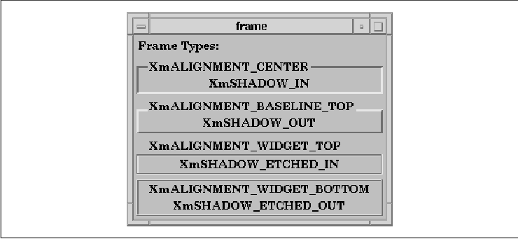
The program creates four Frame widgets. Each Frame
has two Label children, one for the work area and one for the title.
Each Frame uses a different value for the XmNshadowType and
XmNchildVerticalPlacement resources, where these values are
indicated by the text of the Labels. Although we have used a Label as
the work area child of a Frame in this example, it is not a good idea
to put a border around a Label. The shadow border implies
selectability, which can confuse the user.
The PanedWindow widget lays out its children in a
vertically-tiled format. The Motif Style Guide also provides for
a horizontally-oriented paned window, but the Motif toolkit does not
yet support it. The idea behind the PanedWindow is that the user can
adjust the individual panes to provide more or less space as needed on
a per-child basis. For example, if the user wants to see more text in a
Text widget, he can use the control sashes (sometimes called grips) to
resize the area for the Text widget. When the user moves the sash, the
widget above or below the one being resized is resized smaller to
compensate for the size change.
The width of the widget expands to that of its
widest managed child and all of the other children are resized to match
that width. The height of the PanedWindow is set to the sum of the
heights of all of its children, plus the spacing between them and the
size of the top and bottom margins. In Motif 1.1, widgets are placed in
a PanedWindow in the order that you create them, with the first child
being placed at the top of the PanedWindow. With Motif 1.2, you can set
the XmNpositionIndex constraint resource to control the
position of a child in a PanedWindow if you do not want to use the
default order.
An application that wants to use the PanedWindow
must include the file <Xm/PanedW.h>. An instance of the widget
may be created as usual for manager widgets, as shown in the following
code fragment:
   Widget paned_w;

   paned_w = XtVaCreateWidget ("name",
       xmPanedWindowWidgetClass, parent,
       resource-value-list,
       NULL);
   ...
   XtManageChild (paned_w);
The PanedWindow widget provides constraint resources
that allow its children to indicate their preferred maximum and minimum
sizes. the source code shows three widgets that are set in a
PanedWindow. XtSetLanguageProc() is only available in X11R5;
there is no corresponding function in X11R4.
   /* paned_wind1.c --there are two Label widgets that are positioned
    * above and below a Text widget.  The Labels' minimum and maximum
    * sizes are set to 25 and 45 respectively, preventing those
    * panes from growing beyond those bounds.  The Text widget has its
    * minimum size set to 35 preventing it from becoming so small that
    * its text cannot be read.
    */
   #include <Xm/Label.h>
   #include <Xm/PanedW.h>
   #include <Xm/Text.h>

   main(argc, argv)
   char *argv[];
   {
       Widget        toplevel, pane;
       XtAppContext  app;

       XtSetLanguageProc (NULL, NULL, NULL);

       toplevel = XtVaAppInitialize (&app, "Demos", NULL, 0,
           &argc, argv, NULL, NULL);

       pane = XtVaCreateWidget ("pane",
           xmPanedWindowWidgetClass, toplevel,
           NULL);

       XtVaCreateManagedWidget ("Hello", xmLabelWidgetClass, pane,
           XmNpaneMinimum,    25,
           XmNpaneMaximum,    45,
           NULL);

       XtVaCreateManagedWidget ("text", xmTextWidgetClass, pane,
           XmNrows,           5,
           XmNcolumns,        80,
           XmNpaneMinimum,    35,
           XmNeditMode,       XmMULTI_LINE_EDIT,
           XmNvalue,   "This is a test of the paned window widget.",
           NULL);

       XtVaCreateManagedWidget ("Goodbye", xmLabelWidgetClass, pane,
           XmNpaneMinimum,    25,
           XmNpaneMaximum,    45,
           NULL);

       XtManageChild (pane);

       XtRealizeWidget (toplevel);
       XtAppMainLoop (app);
   }
The two Label widgets are positioned above and below a Text widget in a
PanedWindow. The minimum and maximum sizes of the Labels are set to
25 and 45 pixels respectively, using the resources
XmNpaneMinimum and XmNpaneMaximum. No matter how the
PanedWindow or any of the other widgets are resized, the two Labels
cannot grow or shrink beyond these bounds. The Text widget, however,
only has a minimum size restriction, so it may be resized as large or
as small as the user prefers, provided that it does not get smaller
than the 35-pixel minimum. the figure shows two configurations
of this application.
One problem with setting the maximum and minimum
resources for a widget involves determining exactly what those extents
should be. The maximum size of 45 for the Label widgets in the
source code is an arbitrary value that was selected for demonstration
purposes only. If other resources had been set on one of the Labels
such that the widget needed to be larger, the application would
definitely look unbalanced. For example, an extremely high resolution
monitor might require the use of unusually large fonts in order for
text to appear normal. There are two choices available at this point.
One is to specify the maximum and minimum values in a
resolution-independent way and the other is to ask the Label widget
itself what height it wants to be.
Specifying resolution-independent dimensions
requires you to carefully consider the type of application you are
creating. When you specify resolution-independent values, you must
specify the values in either millimeters, inches, points, or font
units. The value of the XmNunitType Manager resource
controls the type of units that are used. the source code demonstrates
the use of resolution-independent dimensions. XtSetLanguageProc()
is only available in X11R5; there is no corresponding function in
X11R4.
   /* unit_types.c --the same as paned_win1.c except that the
    * Labels' minimum and maximum sizes are set to 1/4 inch and
    * 1/2 inch respectively.  These measurements are retained
    * regardless of the pixels-per-inch resolution of the user's
    * display.
    */
   #include <Xm/Label.h>
   #include <Xm/PanedW.h>
   #include <Xm/Text.h>

   main(argc, argv)
   char *argv[];
   {
       Widget        toplevel, pane;
       XtAppContext  app;

       XtSetLanguageProc (NULL, NULL, NULL);

       toplevel = XtVaAppInitialize (&app, "Demos", NULL, 0,
           &argc, argv, NULL, NULL);

       pane = XtVaCreateWidget ("pane",
           xmPanedWindowWidgetClass, toplevel,
           XmNunitType, Xm1000TH_INCHES,
           NULL);

       XtVaCreateManagedWidget ("Hello", xmLabelWidgetClass, pane,
           XmNpaneMinimum,    250, /* quarter inch */
           XmNpaneMaximum,    500, /* half inch */
           NULL);

       XtVaCreateManagedWidget ("text", xmTextWidgetClass, pane,
           XmNrows,           5,
           XmNcolumns,        80,
           XmNpaneMinimum,    250,
           XmNeditMode,       XmMULTI_LINE_EDIT,
           XmNvalue,   "This is a test of the paned window widget.",
           NULL);

       XtVaCreateManagedWidget ("Goodbye", xmLabelWidgetClass, pane,
           XmNpaneMinimum,    250, /* quarter inch */
           XmNpaneMaximum,    500, /* half inch */
           NULL);

       XtManageChild (pane);

       XtRealizeWidget (toplevel);
       XtAppMainLoop (app);
   }
The second technique that we can use is to query the Label widgets
about their heights. This technique requires the use of the Xt function
XtQueryGeometry(), as shown in the source code
XtSetLanguageProc() is only available in X11R5; there is no
corresponding function in X11R4.
   /* paned_wind2.c --there are two label widgets that are positioned
    * above and below a Text widget.  The labels' desired heights are
    * queried using XtQueryGeometry() and their corresponding maximum
    * and minimum sizes are set to the same value.  This effectively
    * prevents those panes from being resized.  The Text widget has its
    * minimum size set to 35 preventing it from becoming so small that
    * its text cannot be read.
    */
   #include <Xm/Label.h>
   #include <Xm/PanedW.h>
   #include <Xm/Text.h>

   main(argc, argv)
   char *argv[];
   {
       Widget        toplevel, pane, label;
       XtWidgetGeometry  size;
       XtAppContext  app;

       XtSetLanguageProc (NULL, NULL, NULL);

       toplevel = XtVaAppInitialize (&app, "Demos", NULL, 0,
           &argc, argv, NULL, NULL);

       pane = XtVaCreateWidget ("pane",
           xmPanedWindowWidgetClass, toplevel, NULL);

       label = XtVaCreateManagedWidget ("Hello",
           xmLabelWidgetClass, pane, NULL);
       size.request_mode = CWHeight;
       XtQueryGeometry (label, NULL, &size);
       XtVaSetValues (label,
           XmNpaneMaximum, size.height,
           XmNpaneMinimum, size.height,
           NULL);
       printf ("hello's height: %d0, size.height);

       XtVaCreateManagedWidget ("text", xmTextWidgetClass, pane,
           XmNrows,           5,
           XmNcolumns,        80,
           XmNresizeWidth,    False,
           XmNresizeHeight,   False,
           XmNpaneMinimum,    35,
           XmNeditMode,       XmMULTI_LINE_EDIT,
           XmNvalue,          "This is a test of the paned window widget.",
           NULL);

       label = XtVaCreateManagedWidget ("Goodbye",
           xmLabelWidgetClass, pane, NULL);
       size.request_mode = CWHeight;
       XtQueryGeometry (label, NULL, &size);
       XtVaSetValues (label,
           XmNpaneMaximum, size.height,
           XmNpaneMinimum, size.height,
           NULL);
       printf ("goodbye's height: %d0, size.height);

       XtManageChild (pane);

       XtRealizeWidget (toplevel);
       XtAppMainLoop (app);
   }
XtQueryGeometry() asks a widget what size it would like to be.
This routine takes the following form:
   XtGeometryResult
   XtQueryGeometry(widget, intended, preferred_return)
       Widget widget;
       XtWidgetGeometry *intended;
       XtWidgetGeometry *preferred_return;
Since we do not want to resize the widget, we pass NULL for
the intended parameter. We are not interested in the
return value of the function, since the information that we want is
returned in the preferred_return parameter. This parameter is
of type XtWidgetGeometry, which is defined as follows:
   typedef struct {
       XtGeometryMask request_mode;
       Position x, y;
       Dimension width, height, border_width;
       Widget sibling;
       int stack_mode;
   } XtWidgetGeometry;
We tell the widget what we want to know by setting the request_mode
field of the size variable that we pass to the routine. The
request_mode field is checked by the query_geometry
function within the called widget. Depending on which bits that are
specified, the appropriate fields are set within the returned data
structure. In the source code we set request_mode to
CWHeight, which tells the Label widget's query_geometry
method to return the desired height in the height field of the
data structure. If we had wanted to know the width as well, we could
have set request_mode as follows:
size.request_mode = (CWHeight | CWWidth);In this case, the width and height fields would be filled in by the Label widget.
Once we have the Label's desired height, we can set
the constraint resources XmNpaneMaximum and XmNpaneMinimum
to the height of the Label. By making these two values the same, the
pane associated with the Label cannot be resized. In most cases, the
XtQueryGeometry() method can be used reliably to determine proper
values for minimum and maximum pane extents. In Motif 1.1, many of the
Motif widgets do not have query_geometry methods, so they do
not return sensible values when XtQueryGeometry() is called.
In Motif 1.2, the query_geometry method has been implemented
for all Motif widgets. Setting extents is useful, since without them,
the user can adjust a PanedWindow so that the size of a widget is
unreasonable or unaesthetic. If you are setting the extents for a
scrolled object (ScrolledText or ScrolledList), you do not need to be
as concerned about the maximum extent, since these objects handle
larger sizes appropriately. Minimum states are certainly legitimate
though. For example, you could use the height of a font as a minimum
extent for Text or a List.
The PanedWindow widget can be useful for building
your own dialogs because you can control the size of the action area.
The action area is always at the bottom of the dialog and its size
should never be changed. See Chapter 7, Custom Dialogs, for a
complete discussion of how a PanedWindow can be used in in this manner.
The Sashes in a PanedWindow widget are in fact
widgets, even though they are not described or defined publicly. While
the Motif Style Guide says that the Sash is part of the
PanedWindow widget, the Motif toolkit defines the object privately,
which means that technically the Sash is not supported and it may
change in the future. However, it is possible to get a handle to a Sash
if you absolutely need one. In order to retrieve a Sash, you need to
include the header file <Xm/SashP.h>. The fact that the file
ends in an uppercase P indicates that it is a private header
file, which means that an application program should not include it.
However, there is no public header file for the Sash widget, so unless
you include the private header file, you cannot access the Sashes in a
PanedWindow.
If you retrieve all of the children from a
PanedWindow using XtVaGetValues() on the XmNchildren
resource, you can use the XmIsSash() macro to locate the Sash
children. This macro is defined as follows:
#define XmIsSash(w) XtIsSubclass(w, xmSashWidgetClass)Although XtIsSubclass() is a public function, xmSashWidgetClass is not declared publicly. One reason that you might want to get handles to the Sashes in a PanedWindow is to turn off keyboard traversal to the Sashes, as described in the next section.
The Motif Style Guide specifies methods by
which the user can interact with an application without using the
mouse. These methods provide a way for the user to navigate through an
application and activate user-interface elements on the desktop using
only the keyboard. Such activity is known as keyboard traversal
and is based on the Common User Access (CUA) interface specifications
from Microsoft Windows and Presentation Manager.
These specifications make heavy use of the TAB key
to move between elements in a user interface; related interface
controls are grouped into what are called tab groups. Some
examples of tab groups are a set of ToggleButtons or a collection of
PushButtons. Just as only one shell on the screen can have the keyboard
focus, only one widget at a time can have the input focus. When
keyboard activity occurs in a window, the toolkit knows which tab group
is current and directs the input focus to the active item within that
group.
The user can move from one item to the next within a
tab group using the arrow keys. The user can move from one tab group to
the next using the TAB key. To traverse the tab groups in the reverse
direction, the user can use SHIFT-TAB. The CTRL key can be used with
the TAB key in a Text widget to differentiate between a traversal
operation and the use of the TAB key for input. The SPACEBAR activates
the item that has the keyboard focus.
To illustrate the keyboard traversal mechanisms, let's examine tictactoe.c from the source code This program contains one tab group, the Form widget. Because the PushButtons inside of it are elements in the tab group, the user can move between the items in the tic-tac-toe board using the arrow keys on the keyboard, as illustrated in the figure.
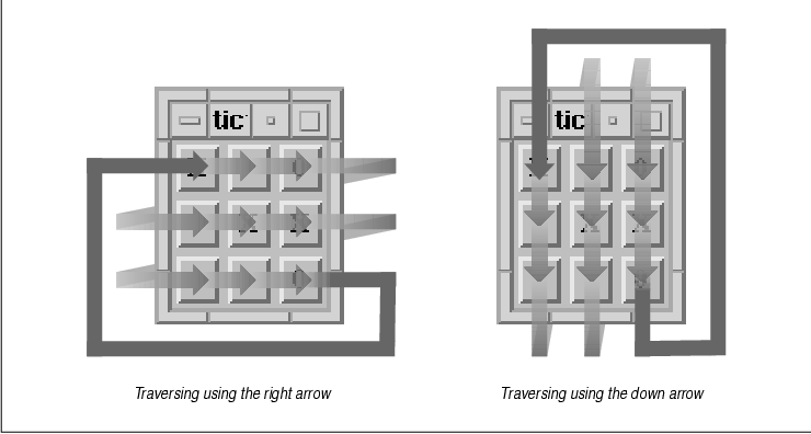
Pressing the TAB key causes the input focus to be
directed to the next tab group and set to the first item in the group,
which is known as the home element. Since there is only one tab
group in this application, the traversal mechanism moves the input
focus to the first element in the same group. Thus, pressing the TAB
key in this program always causes the home item to become the current
input item.
The conceptual model of the tab group mechanism
corresponds to the user's view of an application. With tab groups, the
widget tree is flattened out into two simple layers: the first layer
contains tab groups and the second layer contains the elements of those
groups. In this model, there is no concept of managers and children or
any sort of widget hierarchy. But as you know, an application is based
on a very structured widget hierarchy. The implementation of tab groups
is based on lists of widget pointers that refer to existing widgets in
the widget tree. These lists, known as navigation groups, are
maintained by the VendorShell and MenuShell widgets and are accessed by
the input-handling mechanisms of the Motif toolkit.
Each widget class in the Motif toolkit is
initialized either as a tab group itself or as a member of a tab group.
Manager widgets, Lists, and Text widgets are usually tagged as tab
groups, since they typically contain subelements that can be traversed.
For example, the elements in a List can be traversed using the arrow
keys on the keyboard; the up arrow moves the selection to the previous
element in the List widget. In a Text widget, the arrow keys move the
insertion cursor. The other primitive widgets, such as PushButtons and
ToggleButtons, are usually tagged as tab group members. Output-only
widgets are not tagged at all and are excluded from the tab group
mechanism, since you cannot traverse to an output-only widget. These
default settings are not permanent. For example, a PushButton or a
ToggleButton can be a tab group, although this setting is uncommon and
should only be done when you have a special reason for forcing the
widget to be recognized as a separate tab group.
When the TAB key is pressed, the next tab group in
the list of tab groups becomes the current tab group. Since manager
widgets are normally tab groups, the order of tab group traversal is
typically based on the order in which the manager widgets are created.
This entire process is automated by the Motif toolkit, so an
application does not have to do anything unless it wants to use a
different system of tab groups for some reason. In order to maintain
Motif compliance, we recommend that you avoid interfering with the
default behavior.
We are discussing keyboard traversal in the chapter
on manager widgets because managers play the most visible role in
keyboard traversal from the application programmer's perspective.
Managers, by their nature, contain other widgets, which are typically
primitive widgets that act as tab group members. Furthermore, manager
widgets must handle all of the input events for gadgets, so there is a
great deal of functionality that supports keyboard traversal written
into the Manager widget class.
Before we discuss the details of dealing with tab
groups, there are a few things we should mention. The implementation of
tab groups has changed from earlier versions of the toolkit; to
maintain backwards compatibility, remnants of the older implementation
are still resident in the current implementation, which may cause some
confusion in the current API. The technology of keyboard traversal is
still being improved. Although later implementations may not change the
existing API, new versions of the toolkit may optimize the process
substantially. Since the current implementation of tab groups is not
perfect, some people want to change the default behavior and control it
entirely on their own. We do not recommend this approach. You should
avoid interfering with the keyboard traversal mechanisms, as it will
make it easier to maintain compatibility with other Motif applications
and it won't require any changes for new versions of the toolkit. If
you are going to modify the operation of keyboard traversal, you should
be careful and test your changes thoroughly.
You can prevent a widget from participating in
keyboard traversal by removing the widget from the traversal list. To
remove a widget from the traversal list, set its XmNtraversalOn
resource to False. If the widget is a member of a tab group,
it is simply removed from the list and the user cannot traverse to it.
If the widget is a tab group, it is removed and all of its elements are
also all removed.
Let's experiment with tab group members by modifying
tictactoe.c. We can modify the pushed() callback routine
to remove the selected PushButton from the traversal list when it is
selected. If the keyboard is used to traverse and select the items on
the tic-tac-toe board, the toolkit automatically skips over those that
have already been selected. The new callback routine is shown in the
source code XtSetLanguageProc() is only available in X11R5;
there is no corresponding function in X11R4.
   void
   pushed(w, client_data, call_data)
   Widget      w;
   XtPointer   client_data;
   XtPointer   call_data;
   {
       char buf[2];
       XmString str;
       int letter;
       XmPushButtonCallbackStruct *cbs =
           (XmPushButtonCallbackStruct *) call_data;

       XtVaGetValues (w, XmNuserData, &letter, NULL);
       if (letter) {
           XBell (XtDisplayOfObject (w), 50);
           return;
       }
       /* Shift key gets an O.  (xbutton and xkey happen to be similar) */
       if (cbs->event->xbutton.state & ShiftMask)
           letter = buf[0] = '0';
       else
           letter = buf[0] = 'X';
       buf[1] = 0;
       str = XmStringCreateLocalized (buf);
       XtVaSetValues (w,
           XmNlabelString,     str,
           XmNuserData,        letter,
           XmNshadowThickness, 0,
           XmNtraversalOn,     False,
           NULL);
       XmStringFree (str);
   }
The user can still click on a previously-selected item with the mouse
button, but the routine causes an error bell to sound in this
situation.
Output-only widgets, like Labels and Separators,
always have their XmNtraversalOn resource initialized to
False. In most cases, setting the value to True would be
annoying to the user, since these objects cannot respond to keyboard
input anyway. The user would have to traverse many unimportant widgets
to get to a desired item. However, it is commonly overlooked that a
Label can have a XmNhelpCallback routine associated with it.
If the keyboard traversal mechanism allows the user to traverse to
Labels, he could get help on them by pressing the HELP or F1 keys. It
may be considered a design flaw in Motif that a non-mouse-driven
interface is not supported for getting help for these objects. However,
this situation is not generally a problem, since most people do not try
to get help on Labels and most programmers do not install help for
them.
A general problem that people tend to have with the
PanedWindow widget is that the Sashes are included in the traversal
list. Since the PanedWindow is a manager widget, it is a tab group,
which means that all of its children are members of the tab group. If
you run the program from the source code and use the TAB key to move
from one widget to the next, you'll find that the traversal also
includes the Sash widgets. Many users find it annoying to traverse to
Sashes, since it is more likely that they want to skip the Sashes when
using keyboard traversal, rather than use them to resize any of the
panes. While it is common to resize panes, people usually do so using
the mouse, not the keyboard.
As of Motif 1.2, it is possible to turn off Sash
traversal using the following resource specification in a resource
file:
*XmSash.traversalOn: FalsePrior to this release, the PanedWindow and its Sashes were created in such a way that you could not override the traversability of the Sashes using hard-coded values in the widget creation call or using a resource specification in a resource file. In fact, the internals of the PanedWindow widget hard-coded its Sash widgets' XmNtraversalOn resources to True as they were created, thus eliminating the possibility of turning traversal off using resources. The only way to turn off traversal for Sashes in this case was to reset the resource values after all of the Sashes were created. the source code demonstrates a routine that handles this task.
   #include <Xm/SashP.h>

   void
   TurnOffSashTraversal (panedw)
   Widget panedw;
   {
       Widget *children;
       int num_children;

       XtVaGetValues (panedw,
           XmNchildren,    &children,
           XmNnumChildren, &num_children,
           NULL);
       while (num_children-- > 0)
           if (XmIsSash (children[num_children]))
               XtVaSetValues (children[num_children],
                   XmNtraversalOn, False,
                   NULL);
   }
There are some applications that might actually have to be used without
a mouse, just as there are some users who prefer to use the keyboard,
so you should be careful about turning off keyboard traversal for the
Sashes in a PanedWindow widget. If you do turn off Sash traversal, we
recommend that you document the behavior and provide a way for the user
to control this behavior. For example, you could provide an
application-specific resource that controls whether or not Sashes can
be traversed using the keyboard.
As noted earlier, XmNtraversalOn can be set
on tab groups (which tend to be manager widgets) as well as tab group
members. If traversal is off for a tab group, none of its members can
be traversed. If keyboard traversal is something that you need to
modify in your application, you should probably hard-code
XmNtraversalOn values directly into individual widgets as you
create them. Turning off traversal is typically not something that is
done on a per-widget-class basis. When you turn traversal off in
application code, be careful to make sure that there is no reason that
a user would want to traverse to the particular widgets because once
you hard-code the resource values, they cannot be modified by the user
in a resource file.
The XmNnavigationType resource controls
whether a widget is a tab group itself or is a member of a tab group.
When this resource is set to XmNONE, the widget is not a tab
group, so it defaults to being a member of one. As a member, its
XmNtraversalOn resource indicates whether or not the user can
direct the input focus to the widget using the keyboard. This value is
the default for most primitive widgets. When the resource is set to
XmTAB_GROUP, the widget is a tab group itself, so it is included in
keyboard navigation. This value is the default for managers, Lists, and
Text widgets. By modifying the default value of the
XmNnavigationType resource for a widget, you can specify that a
primitive widget is a tab group. As a result, the user traverses to the
widget using the TAB key rather than one of the arrow keys. For
example, you can modify tictactoe.c by setting the
XmNnavigationType to XmTAB_GROUP for each PushButton.
There are two other values for XmNnavigationType
that are used for backwards compatibility with older versions of the
toolkit. They are not generally used unless you are porting programs
from Motif 1.0. In this version of the toolkit, there is an application
called XmAddTabGroup() to make a widget a tab group. With
Motif 1.0, the programmer was required to specify precisely which
widgets were tab groups, which were members of a tab group, and which
were not traversable. As a result, XmAddTabGroup() had to be
called for all manager widgets. To maintain backwards compatibility,
whenever XmAddTabGroup() is called, the toolkit assumes the
programmer is using the old Motif 1.0 specifications and disables the
new, automatic behavior. Unless your application is currently using the
old API, you can probably skip to the next section.
Calling XmAddTabGroup() is equivalent to
setting XmNnavigationType to XmEXCLUSIVE_TAB_GROUP.
If this value is set on a widget or if XmAddTabGroup() is
called, new widgets are no longer added as tab groups automatically.
Basically, the toolkit reverts to the old behavior. An exclusive tab
group is much the same as a normal tab group, but Motif recognizes this
special value and ignores all widgets that have the newer
XmTAB_GROUP value set. You can think of this value as setting
exclusivity on the tab group behavior.
The value XmSTICKY_TAB_GROUP can also be
used for XmNnavigationType in Motif 1.0. If this value is used
on a widget, the widget is included automatically in keyboard
traversal, even if another widget has its navigation type set to
XmEXCLUSIVE_TAB_GROUP or if XmAddTabGroup() has been
called. This value provides a partial workaround for the new behavior,
but not exactly. You can set a widget to be a sticky tab group without
completely eliminating the old behavior and without interfering with
the new behavior.
You can ignore these two values for all intents and
purposes. If you need to port an old application to a newer version of
the Motif toolkit, you should consider removing all of the calls to
XmAddTabGroup() and just going with the new behavior. If you need
to change the default behavior, you should use XmNONE and
XmTAB_GROUP to control whether or not a widget is a tab group or a
member of one. To control whether the widget is part of the whole
keyboard traversal mechanism, use the XmNtraversalOn resource.
In order for manager widgets to implement keyboard
traversal, they have their own event translation tables that specify
what happens when certain events occur. As discussed in Chapter 2,
The Motif Programming Model, a translation table specifies a series
of one or more events and an action that is invoked if the event
occurs. The X Toolkit Intrinsics handles event translations
automatically; when the user presses the TAB key, Xt looks up the event
<Key>Tab in the table and invokes the corresponding action
procedure. In this case, the procedure changes the input focus from the
current tab group to the next one on the list.
This mechanism is dependent on the window hierarchy
of the widget tree. Events are first delivered to the widget associated
with the window where the event took place. If that widget (or its
window) does not handle the type of event delivered, it passes the
event up the window tree to its parent, which then has the option of
dealing with the event. Assuming that the parent is a manager widget of
some kind, it now has the option to process the event. If the event is
a keyboard traversal event, the appropriate action routine moves the
input focus. The default event translations that manager widgets use to
handle keyboard traversal are currently specified as follows:
   <Key>osfBeginLine:         ManagerGadgetTraverseHome()
   <Key>osfUp:                ManagerGadgetTraverseUp()
   <Key>osfDown:              ManagerGadgetTraverseDown()
   <Key>osfLeft:              ManagerGadgetTraverseLeft()
   <Key>osfRight:             ManagerGadgetTraverseRight()
   Shift ~Meta ~Alt <Key>Tab: ManagerGadgetPrevTabGroup()
   ~Meta ~Alt <Key>Tab:       ManagerGadgetNextTabGroup()
   <EnterWindow>:             ManagerEnter()
   <LeaveWindow>:             ManagerLeave()
   <FocusOut>:                ManagerFocusOut()
   <FocusIn>:                 ManagerFocusIn()
The OSF-specific keysyms are vendor-defined, which means that the directional arrows must be defined by the user's system at run-time. Values like <Key>osfUp and <Key>osfDown may not be the same as <Key>Up and <Key>Down.
The routines that handle keyboard traversal are
prefixed by ManagerGadget. Despite their names, these
functions are not specific to gadgets; they are used to handle keyboard
traversal for all of the children in the manager. If a primitive widget
inside of a manager widget specifies an event translation that
conflicts with one of the manager's translations, the primitive widget
can interfere with keyboard traversal. If the primitive widget has the
input focus, the user cannot use the specified event to move the input
focus with the keyboard. The following code fragment shows how the
translation table for a PushButton can interfere with the keyboard
traversal mechanism in its parent:
   Widget pb;
   XtActionRec action;
   extern void do_tab();

   actions.string = "do_tab";
   actions.proc = do_tab;
   XtAddActions (&actions, 1);

   pb = XtVaCreateManagedWidget ("name",
       xmPushButtonWidgetClass, parent,
       resource-value-list,
       NULL);
   XtOverrideTranslations (pb, XtParseTranslationTable ("<Key>Tab: do_tab"));
The translation table is merged into the existing translations for the
PushButton widget. This translation table does not interfere with the
translation table in the manager widget, but it does interfere with
event propagation to the manager. When the TAB key is pressed, the
action routine do_tab() is called and the event is consumed by
the PushButton widget. The event is not propagated up to the manager
widget so that it can perform the appropriate keyboard traversal
action. The workaround for this problem is to have do_tab()
process the keyboard traversal action on its own, in addition to
performing its own action. This technique is discussed in the next
section.
Since a manager can also contain gadgets, the
manager widget must also handle input that is destined for gadgets.
Since gadgets do not have windows, they cannot receive events. Only the
manager widget that is the parent of a gadget can receive events for
the gadget. The manager widget has the following additional
translations to handle input on behalf of gadgets:
   <Key>osfActivate:              ManagerParentActivate()
   <Key>osfCancel:                ManagerParentCancel()
   <Key>osfSelect:                ManagerGadgetSelect()
   <Key>osfHelp:                  ManagerGadgetHelp()
   ~Shift ~Meta ~Alt <Key>Return: ManagerParentActivate()
   ~Shift ~Meta ~Alt <Key>space:  ManagerGadgetSelect()
   <Key>:                         ManagerGadgetKeyInput()
   <BtnMotion>:                   ManagerGadgetButtonMotion()
   <Btn1Down>:                    ManagerGadgetArm()
   <Btn1Down>,<Btn1Up>:           ManagerGadgetActivate()
   <Btn1Up>:                      ManagerGadgetActivate()
   <Btn1Down>(2+):                ManagerGadgetMultiArm()
   <Btn1Up>(2+):                  ManagerGadgetMultiActivate()
   <Btn2Down>:                    ManagerGadgetDrag()
Unlike with keyboard traversal translations, widget translations cannot interfere with the manager translations that handle events destined for gadgets. If a widget had the input focus, the user's actions cannot be destined for a gadget, since the user would have to traverse to the gadget first, in which case the manager would really have the input focus.
In Chapter 10, The DrawingArea Widget, we
discuss the problems involved in handling input events on the
DrawingArea widget. The problems arise because the widget can be used
for interactive drawing, as well as serve as a manager. There may be
events that you want to process in your application, but they could
also be processed by the DrawingArea itself. The problem is really a
semantic one, as there is no way to determine which action procedure
should be invoked for each event if the DrawingArea has a manager-based
action and the application defines its own action. For more information
on translation tables and action routines, see Chapter 2, The Motif
Programming Model, and Volume Four, X Toolkit Intrinsics
Programming Manual.
At times, an application may want to move the input
focus as a result of something that the user has done. For example, you
might have an action area where each PushButton invokes a callback
function and then sets the input focus to the home item in the tab
group, presumably to protect the user from inadvertently selecting the
same item twice. the source code demonstrates how this operation can be
accomplished.
   /* proc_traverse.c -- demonstrate how to process keyboard traversal
    * from a PushButton's callback routine.  This simple demo contains
    * a RowColumn (a tab group) and three PushButtons.  If any of the
    * PushButtons are activated (selected), the input focus traverses
    * to the "home" item.
    */
   #include <Xm/PushB.h>
   #include <Xm/RowColumn.h>

   main(argc, argv)
   int argc;
   char *argv[];
   {
       Widget toplevel, rowcol, pb;
       XtAppContext app;
       void do_it();

       XtSetLanguageProc (NULL, NULL, NULL);

       toplevel = XtVaAppInitialize (&app, "Demos", NULL, 0,
           &argc, argv, NULL, NULL);

       rowcol = XtVaCreateManagedWidget ("rowcolumn",
           xmRowColumnWidgetClass, toplevel,
           XmNorientation, XmHORIZONTAL,
           NULL);

       (void) XtVaCreateManagedWidget ("OK",
           xmPushButtonWidgetClass, rowcol, NULL);

       pb = XtVaCreateManagedWidget ("Cancel",
           xmPushButtonWidgetClass, rowcol, NULL);
       XtAddCallback (pb, XmNactivateCallback, do_it, NULL);

       pb = XtVaCreateManagedWidget ("Help",
           xmPushButtonWidgetClass, rowcol, NULL);
       XtAddCallback (pb, XmNactivateCallback, do_it, NULL);

       XtRealizeWidget (toplevel);
       XtAppMainLoop (app);
   }

   /* callback for pushbuttons */
   void
   do_it(widget, client_data, call_data)
   Widget widget;
   XtPointer client_data;
   XtPointer call_data;
   {
       /* do stuff here for PushButton widget */
       (void) XmProcessTraversal(widget, XmTRAVERSE_HOME);
   }
The three frames in the figure show the movement of keyboard focus in
the program. In the figure, the current input focus is on the Cancel
button; when it is selected, the input focus is changed to the OK
button.
The callback routine associated with the PushButtons
does whatever it needs and then calls XmProcessTraversal() to
change the input item to the home item, which happens to be the OK
button. This function can be used when an application needs to set the
current item in the tab group to another widget or gadget or it can be
used to traverse to a new tab group. The function takes the following
form:
   Boolean
   XmProcessTraversal(widget, direction)
       Widget widget;
       int    direction;
The function returns False if the VendorShell associated with
the widget has no tab groups, the input focus policy doesn't make
sense, or if there are other extenuating circumstances that would be
considered unusual. It is unlikely that you'll ever have this problem.
The direction parameter specifies
where the input focus should be moved. This parameter can take any of
the following values:
   XmTRAVERSE_CURRENT
   XmTRAVERSE_NEXT
   XmTRAVERSE_PREV
   XmTRAVERSE_HOME
   XmTRAVERSE_UP
   XmTRAVERSE_DOWN
   XmTRAVERSE_LEFT
   XmTRAVERSE_RIGHT
   XmTRAVERSE_NEXT_TAB_GROUP
   XmTRAVERSE_PREV_TAB_GROUP
All but the last two values are for traversing to items within the current tab group; the last two are for traversing to the next or previous tab group relative to the current one. In the case of the source code the call to XmProcessTraversal() forces the home element to be the current item in the current tab group. For a more sophisticated example of manipulating the input focus, see Section #stextcbs in Chapter 14, Text Widgets. One problem with XmProcessTraversal() is that you can only move in a relative direction from the item that has the input focus. This functionality is sufficient in most cases, since the logic of your application should not rely on the user following any particular input sequence. If you need to traverse to a specific widget regardless of the current item, in most cases you can make the following call:
XmProcessTraversal (desired_widget, XmTRAVERSE_CURRENT);This calling sequence specifies that the desired_widget takes the input focus, but only if the shell that contains the widget already has the keyboard focus. If the shell does not have the focus, nothing happens until the shell obtains the keyboard focus. When it does, the desired_widget should have the input focus.
Under certain conditions, this function may appear
not to work. For example, if you create a dialog and want to set the
input focus to one of its subwidgets, you may or may not get this to
happen, depending on whether or not the dialog has been realized and
mapped to the screen and whether or not keyboard focus has been
accepted. Unfortunately, there is no general solution to this problem
because the Motif toolkit isn't very robust about the programmer
changing input focus out from under it. You cannot call generic X
functions like XSetInputFocus() to force a widget to take
input focus or you will undermine Motif's attempt at monitoring and
controlling the input policy on its own.
In Motif 1.2, there are some new functions that make
it easier for an application to control keyboard traversal. The
XmGetFocusWidget() routine returns the widget that has the input
focus, while XmGetTabGroup() returns the widget that is the
tab group for the specified widget. You can also call
XmIsTraversable() to determine whether or not a particular widget
is eligible to receive the input focus. With Motif 1.1, you often
cannot determine which widget has the input focus or where a particular
widget is in the widget tree relative to the current input item.
Manager widgets are the backbone of an application.
Without them, primitive widgets have no way of controlling their size,
layout, and input focus. While the Motif toolkit provides many
different manager widget classes, you may find that there are some
things that you cannot do with them. Experienced toolkit programmers
have found that it is possible to port Constraint class widgets from
other toolkits to the Motif toolkit, by subclassing them from the
generic Manager widget class. This topic is beyond the scope of this
book.
This chapter introduces the Motif manager widgets,
but it does not discuss in detail some of the basic issues of geometry
management. If the basic concepts presented in this chapter are still
somewhat foreign to you, see Volume Four, X Toolkit Intrinsics
Programming Manual, for a more in-depth discussion of composite
widgets and geometry management.