This chapter contains an in-depth look at the label
and button widgets provided by the Motif toolkit. These widgets are the
most commonly used primitive widgets.
Labels and buttons are among the most widely used
interface objects in GUI-based applications. They are also the simplest
in concept and design. Labels provide the basic resources necessary to
render and manage text or images (pixmaps) by controlling color,
alignment, and other visual attributes. PushButtons are subclassed from
Label; they extend its capabilities by adding callback routines that
respond to user interaction from the mouse or keyboard. These visual
and interactive features provide the cornerstone for many widgets in
the Motif toolkit, such as CascadeButtons, DrawnButtons, and
ToggleButtons.
This chapter also discusses ArrowButtons. While the
ArrowButton is not subclassed from Label like the other buttons, it
does provide a subset of the interactive capabilities of the other
buttons. ArrowButtons do not contain text or graphical labels; they
simply display directional arrows that point up, down, left, or right.
These widgets are meant to act as companions to other interface objects
whose values or displays can be controlled or changed incrementally by
the user. An example might be four ArrowButtons that are used to
represent directional movement for the display of a bitmap editor.
Although CascadeButtons are subclassed from the
Label widget, they are specifically used in Motif menus and are not
addressed in this chapter. The menu systems that are provided by Motif
are separate entities and are treated separately in Chapter 4, The
Main Window, and Chapter 15, Menus. Since the Motif menus
use Labels and PushButtons for menu items, these widgets have certain
resources that only take effect when the widgets are used in menus.
These resources are not discussed in this chapter either.
Labels and buttons have a wide range of uses and
they are used in many of the compound objects provided by the Motif
toolkit. As a result, these widgets are discussed throughout this book.
This chapter provides a basic discussion of the main resources and
callbacks used by the objects. It also provides examples of common
usage and attempts to address problem areas.
Labels are simply props for the stage. They are not
intended to respond to user interaction, although a help callback can
be attached in case the HELP key is pressed. It is equally common to
find Labels displaying either text or graphics, yet they cannot display
both simultaneously in the conventional sense.
Since Labels can display text, it may not always be
obvious whether to use a Label or a Text widget to display textual
information. The Motif Style Guide suggests that Labels should
always be used when noneditable text is displayed, even if the text is
longer than what you might think of as a label. If a Label is large,
you can always place it in the work area of an automatic ScrolledWindow
widget, as discussed in Chapter 9, ScrolledWindows and ScrollBars
. Even if the text is expected to change frequently, your needs can
often be accommodated by a Label widget or gadget.
Another issue that affects the choice between a
Label widget and a Text widget is the ability to select the text. Even
if you have text that is not editable by the user, you may wish to
allow the user to select all or part of the text. With Motif 1.2, the
Label widget acts as a drag source for drag and drop operations, which
means that the full text of a Label can be manipulated using drag and
drop. All of the button subclasses of Label inherit the drag source
capability, so the text labels for PushButtons and ToggleButtons can
also be manipulated using drag and drop. However, this capability does
not allow the user to manipulate only part of the text. For that type
of interaction, and with previous versions of the toolkit, you need to
use a Text widget rather than a Label to provide selection
capabilities.
Labels have a number of added visual advantages over
Text widgets. The text in a Label can be greyed out when it is
insensitive and it can display text using multiple fonts. The Text
widgets do not support multiple fonts. In Motif 1.2, an insensitive
Text widget greys out its text, while in Motif 1.1 it does not. Labels
are also lighter-weight objects than Text widgets. There is little
overhead in maintaining or displaying a Label and there is no need to
handle event processing on a Label to the same degree as for a Text
widget. All things considered, we would recommend using Label widgets
over Text widgets.
However, when it comes to interactive objects,
Labels are not the best choice. In most cases where you want to allow
the user to click on a Label, it is more appropriate to use a
PushButton or a ToggleButton, since they are designed to support user
interaction. Furthermore, users who are familiar with other Motif
applications will not expect to have to interact with Labels. In short,
the best thing to do with Label widgets is simple and obvious: use them
to display labels.
There are a number of resources associated with
Labels that are used by other Motif objects or by widget classes that
are subclassed from Label. For example, since Labels (and PushButtons)
are used extensively as menu items in menus, they can have
accelerators, mnemonics, and other visual resources set to provide the
appropriate functionality for menus. These resources do not apply to
Labels (and PushButtons) that are not used as menu items, so we do not
discuss them here.
The only callback routine for the Label widget is
the XmNhelpCallback associated with all Primitive widgets. If
the user presses the HELP key on a Label widget, its help callback is
called. Whether a Label receives Help events depends on the
input policy the user is using and whether or not keyboard traversal is
on. Since it may not be possible for the user to use the HELP key on
Labels, we don't recommend providing help callbacks for them.
Applications that use Labels must include the header
file <Xm/Label.h>, which defines the xmLabelWidgetClass
type. This type is a pointer to the actual widget structure used by
XtVaCreateManagedWidget(). This routine can be used to create a
Label as follows:
   Widget label;

   label = XtVaCreateManagedWidget ("name",
       xmLabelWidgetClass, parent,
       resource-value-list,
       NULL);
This code fragment shows the most common way to create a Label. Since
Labels do not have children, there is no reason to create them as
unmanaged widgets first and then manage them later. As for all widgets
classes, the Motif toolkit also provides the XmCreateLabel()
convenience routine for creating Labels.
Label gadgets are also available. Recall that a
gadget is a windowless object that relies on its parent to display its
visual attributes and to provide it with events generated either by the
system or by the user. Since a gadget does not have a window, its
background color and pattern cannot be set individually; they are
provided by the parent.
The Label gadget is an entirely different class from
its widget counterpart. To use the gadget variant, you must include the
header file <Xm/LabelG.h> and use the xmLabelGadgetClass
pointer in the call to XtVaCreateManagedWidget(), as in the
following example:
   Widget label;

   label = XtVaCreateManagedWidget ("name",
       xmLabelGadgetClass, parent,
       resource-value-list,
       NULL);
A Label widget or gadget can display either text or
an image. The XmNlabelType resource controls the type of label
that is displayed; the resource can be set to XmSTRING or
XmPIXMAP. The default value is XmSTRING, so if you want to
display text in a Label, you do not need to set this resource
explicitly.
The resource that specifies the string that is
displayed in a Label is XmNlabelString. The value for this
resource must be a Motif compound string; common C character strings
are not allowed. The following code fragment shows the appropriate way
to specify the text for a Label:
   Widget    label;
   XmString  str = XmStringCreateLocalized ("A Label");

   label = XtVaCreateManagedWidget ("label",
       xmLabelWidgetClass, parent,
       XmNlabelString,  str,
       NULL);

   XmStringFree (str);
If the XmNlabelString resource is not specified, the Label
automatically converts its name into a compound string and
uses that as its label. Therefore, the previous example could also be
implemented as follows:
   Widget label;

   label = XtVaCreateManagedWidget ("A Label",
       xmLabelWidgetClass, parent,
       NULL);
This method of specifying the label string for the widget is much
simpler than using a compound string. It avoids the overhead of
creating and destroying a compound string, which is expensive in terms
of allocating and freeing memory. The problem with the name of the
widget shown above is that it is illegal as a widget name. Technically,
widget names should only be composed of alphanumerics (letters and
numbers), hyphens, and underscores. Characters such as space, dot (
.), and the asterisk (*) are disallowed because they make
it impossible for the user to specify these widgets in resource files.
On the other hand, using names that contain these characters can be to
your advantage if you want to try to prevent users from changing the
resource values of certain widgets. You can achieve the same result by
hard-coding the label or by using an illegal widget name. The first
method is more elegant, so the decision you make here should be
well-informed.
If you are going to hard-code the label string, you
can avoid the overhead of creating a compound string by using the
XtVaTypedArg feature of Xt, as shown in the following example:
   label = XtVaCreateManagedWidget ("widget_name",
       xmLabelWidgetClass, parent,
       XtVaTypedArg, XmNlabelString, XmRString,
           "A Label", 8, /* 8 = strlen("A Label") + 1 */
       NULL);
The C string "A Label" (which is 7 chars long, plus 1 NULL
byte) is automatically converted into a compound string by the toolkit
using a pre-installed type converter. This method can also be used to
change the label for a widget using XtVaSetValues().
Since compound strings are dynamically created and
destroyed, you cannot statically declare an argument list that contains
a pointer to a compound string. For example, it would be an error to do
the following:
   static Arg list[] = {
       ...
       XmNlabelString,  XmStringCreateLocalized ("A label"),
       ...
   };

   label = XtCreateManagedWidget ("name",
       xmLabelWidgetClass, parent,
       list, XtNumber (list));
This technique causes an error because you cannot create a compound
string in a statically declared array. For a complete discussion of
compound strings, see Chapter 19, Compound Strings.
A Label widget or gadget can display an image
instead of text by setting the XmNlabelType resource to
XmPIXMAP. As a result of this resource setting, the Label displays
the pixmap specified for the XmNlabelPixmap resource. the
source code demonstrates how pixmaps can be used as labels.
XtSetLanguageProc() is only available in X11R5; there is no
corresponding function in X11R4.
   /* pixmaps.c -- Demonstrate simple label gadgets in a row column.
    * Each command line argument represents a bitmap filename.  Try
    * to load the corresponding pixmap and store in a RowColumn.
    */
   #include <Xm/LabelG.h>
   #include <Xm/RowColumn.h>

   main(argc, argv)
   int argc;
   char *argv[];
   {
       XtAppContext app;
       Pixel fg, bg;
       Widget toplevel, rowcol;

       XtSetLanguageProc (NULL, NULL, NULL);

       toplevel = XtVaAppInitialize (&app, "Demos", NULL, 0,
           &argc, argv, NULL, NULL);

       if (argc < 2) {
           puts ("Specify bitmap filenames.");
           exit (1);
       }
       /* create a RowColumn that has an equal number of rows and
        * columns based on the number of pixmaps it is going to
        * display (this value is in "argc").
        */
       rowcol = XtVaCreateWidget ("rowcol",
           xmRowColumnWidgetClass, toplevel,
           XmNnumColumns,  int_sqrt (argc),
           XmNpacking,     XmPACK_COLUMN,
           NULL);

       /* Get the foreground and background colors of the rowcol to make
        * all the pixmaps appear using a consistent color.
        */
       XtVaGetValues (rowcol,
           XmNforeground, &fg,
           XmNbackground, &bg,
           NULL);

       while (*++argv) {
           Pixmap pixmap = XmGetPixmap (XtScreen (rowcol), *argv, fg, bg);
           if (pixmap == XmUNSPECIFIED_PIXMAP)
               printf ("Couldn't load %s0, *argv);
           else
               XtVaCreateManagedWidget (*argv, xmLabelGadgetClass, rowcol,
                   XmNlabelType, XmPIXMAP,
                   XmNlabelPixmap, pixmap,
                   NULL);
       }

       XtManageChild (rowcol);
       XtRealizeWidget (toplevel);
       XtAppMainLoop (app);
   }

   /* get the integer square root of n -- used to determine the number
    * of rows and columns of pixmaps to use in the RowColumn widget.
    */
   int_sqrt(n)
   register int n;
   {
       register int i, s = 0, t;
       for (i = 15; i >= 0; i--) {
           t = (s | (1 << i));
           if (t * t <= n)
               s = t;
       }
       return s;
   }
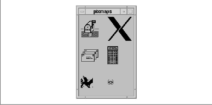
The program displays a two-dimensional array of pixmaps based on the
bitmap files listed on the command line. For example, the following
command produces the output shown in the figure.
% pixmaps flagup letters wingdogs xlogo64 calculator tie_fighter
To optimize the use of space by the RowColumn
widget, the number of rows and columns is set to the square root of the
number of images. For example, if there are nine pixmaps to load, there
should be a 3x3 grid of images. Since the number of files to be loaded
corresponds to the number of arguments in argv, argc
is passed to int_sqrt() to get the integer square root of its
value. This value tells us the number of columns to specify for the
XmNnumColumns resource of the RowColumn.
The bitmap files are read using XmGetPixmap()
, which is a function that creates a pixmap from the specified file.
This file must be in X11 bitmap format. Since the function needs
foreground and background colors for the pixmap, we use the colors of
the RowColumn. If the specified file cannot be found or if it does not
contain a bitmap, the function returns the constant
XmUNSPECIFIED_PIXMAP. XmUNSPECIFIED_PIXMAP is not 0
or NULL. Many people have a tendency to test for these values
upon return of functions that return opaque objects. The literal value
is 2. If this error condition is returned, the program skips
the file and goes on to the next one. For more detailed information on
XmGetPixmap() and other supporting functions, see Section #spixmaps
in Chapter 3, Overview of the Motif Toolkit.
A Label can be made inactive by setting the
XmNsensitive resource to False. While it may seem
frivolous to set a Label insensitive, since Labels are never really
active, it is quite common to associate a Label with another
interactive element, such as a List, a TextField, or even a composite
item such as RadioBox. In these situations, it is useful to desensitize
the Label along with its corresponding user-interface element, to
emphasive that the component is inactive. In the same vein, if
XtSetSensitive() is applied to a Manager widget, the routine
sensitizes or desensitizes all of the children of the widget, including
Labels.
If a Label is displaying text, setting the widget
insensitive causes the text to be greyed out. This effect is achieved
by stippling the text label. If a Label is displaying an image, you
need to specify the XmNlabelInsensitivePixmap resource to
indicate the image that is displayed when the Label is inactive; the
Label does not stipple the image for you. By default, the resource is
set to XmUNSPECIFIED_PIXMAP, which means that the Label will
not display a pixmap when it is insensitive. In order to have the Label
display a stippled pixmap, you must create a bitmap by AND-ing a
stipple pattern over the image and then set
XmNlabelInsensitivePixmap to this value.
Within the boundaries of a Label widget or gadget,
the text or image that is displayed can be left justified, right
justified, or centered. The alignment depends on the value of the
XmNalignment resource, which can have one of the following values:
   XmALIGNMENT_BEGINNING
   XmALIGNMENT_END
   XmALIGNMENT_CENTER
The default value is XmALIGNMENT_CENTER, which causes the text or pixmap to be centered vertically and horizontally within the widget or gadget. The XmALIGNMENT_BEGINNING and XmALIGNMENT_END values refer to the left and right edges of the widget or gadget when the value for XmNstringDirection is set to XmSTRING_DIRECTION_L_TO_R. If the text used within a Label is read from left-to-right (the default), the beginning of the string is on the left. However, if the text used is read from right-to-left, the alignment values are inverted, as should be the value for XmNstringDirection. These values also apply to Labels that display pixmaps.
If you have a set of Labels that are associated with
strings of text that are right justified, all of the Labels should use
the same alignment and string direction settings for consistency. One
way to handle this situation is to set the resources universally (as a
class-based resource) for all Labels and subclasses of Labels. For
example, if your application is written for a language that displays
text from right-to-left, you may choose to have the following lines in
the application defaults file:
   *XmLabel.stringDirection: string_direction_r_to_l
   *XmLabelGadget.stringDirection: string_direction_r_to_l
Note that the resource must be set for both the widget and gadget classes. You should also be aware that setting the string direction does not cause the compound strings for the Labels to be automatically converted to the right direction. Similarly, a Label that uses a compound string with a right-to-left string direction does not automatically set the XmNstringDirection resource appropriately. These are internationalization issues if you are thinking of supporting languages that are justified either left-to-right or right-to-left.
The RowColumn manager widget can also be used to
enforce consistency by controlling the geometry management of its
children. If you are using a RowColumn to lay out a group of Labels (or
objects subclassed from Label, such as PushButtons), you can tell the
RowColumn to align each of its children in a consistent manner using
the XmNentryAlignment resource. This resource takes the same
values as the XmNalignment resource for Labels. If the parent
of a Label widget or gadget is a RowColumn with its XmNisAligned
resource set to True, the alignment resource of each
of the Label children is forced to the same value as the
XmNentryAlignment resource.
You should note that the alignment is only enforced
when the RowColumn resource XmNrowColumnType is
XmWORK_AREA. If you are using a RowColumn to arrange components in
your application, its type should always be a work area. The other
types of the widget are used by the internals of Motif for creating
special objects like MenuBars and PulldownMenus. If you set the
XmNentryAlignment resource for other types of RowColumn widgets,
you may or may not see the alignment effects.
In Motif 1.2, there is a new RowColumn resource that
affects the vertical alignment of its children that are Labels,
subclasses of Label, and Text widgets. The
XmNentryVerticalAlignment resource can take one of the following
values:
   XmALIGNMENT_BASELINE_BOTTOM
   XmALIGNMENT_BASELINE_TOP
   XmALIGNMENT_CONTENTS_BOTTOM
   XmALIGNMENT_CENTER
   XmALIGNMENT_CONTENTS_TOP
The resource only takes effect when the children of the RowColumn are arranged in rows, which means that the XmNorientation is XmHORIZONTAL. The default value is XmALIGNMENT_CENTER, which causes the center of all of the children in a row to be aligned.
The fonts used within a Label are directly
associated with the font list element tags used in the compound string
specified for the XmNlabelString resource. The XmNfontList
resource for a Label specifies the mapping between font list tags and
font names that is used when displaying the text. Since a compound
string may use multiple character sets, a Label can display any number
of fonts, as specified in the XmNlabelString for the Label. A
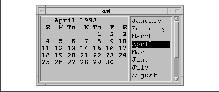
compound string may also contain embedded newlines. the source code
shows the use of a Label to display a single compound string that
contains a monthly calendar. XtSetLanguageProc() is only
available in X11R5; there is no corresponding function in X11R4.
XmFontListEntryCreate() is only available in Motif 1.2; there is no
corresponding function in Motif 1.1. XmFontListAppendEntry()
is only available in Motif 1.2; XmFontListCreate() and
XmFontListAdd() are the corresponding functions in Motif 1.1.
XmFONTLIST_DEFAULT_TAG replaces XmSTRING_DEFAULT_CHARSET
in Motif 1.2.
   /* xcal.c -- display a monthly calendar.  The month displayed is a
    * single Label widget whose text is generated from the output of
    * the "cal" program found on any UNIX machine.  popen() is used
    * to run the program and read its output.  Although this is an
    * inefficient method for getting the output of a separate program,
    * it suffices for demonstration purposes.  A List widget displays
    * the months and the user can provide the year as argv[1].
    */
   #include <stdio.h>
   #include <X11/Xos.h>
   #include <Xm/List.h>
   #include <Xm/Frame.h>
   #include <Xm/LabelG.h>
   #include <Xm/RowColumn.h>
   #include <Xm/SeparatoG.h>

   int year;
   XmStringTable ArgvToXmStringTable();
   void FreeXmStringTable();

   char *months[] = {
       "January", "February", "March", "April", "May", "June",
       "July", "August", "September", "October", "November", "December"
   };

   main(argc, argv)
   int argc;
   char *argv[];
   {
       Widget toplevel, frame, rowcol, label, w;
       XtAppContext app;
       Display *dpy;
       extern void set_month();
       XmFontList fontlist;
       XmFontListEntry entry;
       XFontStruct *font;
       XmStringTable strs;
       int month_no;

       XtSetLanguageProc (NULL, NULL, NULL);

       toplevel = XtVaAppInitialize (&app, "Demos", NULL, 0,
           &argc, argv, NULL, NULL);

       /* Create a fontlist based on the fonts we're using.  These are the
        * fonts that are going to be hardcoded in the Label and List widgets.
        */
       dpy = XtDisplay (toplevel);
       font = XLoadQueryFont (dpy, "-*-courier-bold-r-*--18-*");
       entry = XmFontListEntryCreate ("tag1", XmFONT_IS_FONT, font);
       fontlist = XmFontListAppendEntry (NULL, entry);
       font = XLoadQueryFont (dpy, "-*-courier-medium-r-*--18-*");
       entry = XmFontListEntryCreate ("tag2", XmFONT_IS_FONT, font);
       fontlist = XmFontListAppendEntry (fontlist, entry);
       XtFree (entry);

       if (argc > 1) {
           month_no = 1;
     year = atoi (argv[1]);
       }
       else {
           long time(), t = time(0);
           struct tm *today = localtime (&t);
           year = 1900 + today->tm_year;
           month_no = today->tm_mon+1;
       }

       /* The RowColumn is the general layout manager for the application.
        * It contains two children: a Label gadget that displays the calendar
        * month, and a ScrolledList to allow the user to change the month.
        */
       rowcol = XtVaCreateWidget ("rowcol",
           xmRowColumnWidgetClass, toplevel,
           XmNorientation, XmHORIZONTAL,
           NULL);

       /* enclose the month in a Frame for decoration. */
       frame = XtVaCreateManagedWidget ("frame",
           xmFrameWidgetClass, rowcol, NULL);
       label = XtVaCreateManagedWidget ("month",
           xmLabelGadgetClass, frame,
           XmNalignment, XmALIGNMENT_BEGINNING,
           XmNfontList,  fontlist,
           NULL);

       /* create a list of month names */
       strs = ArgvToXmStringTable (XtNumber (months), months);
       w = XmCreateScrolledList (rowcol, "list", NULL, 0);
       XtVaSetValues (w,
           XmNitems,      strs,
           XmNitemCount,  XtNumber(months),
           XmNfontList,   fontlist,
           NULL);
       FreeXmStringTable (strs);
       XmFontListFree (fontlist);
       XtAddCallback (w, XmNbrowseSelectionCallback, set_month, label);
       XtManageChild (w);
       XmListSelectPos (w, month_no, True); /* initialize month */

       XtManageChild (rowcol);
       XtRealizeWidget (toplevel);
       XtAppMainLoop (app);
   }

   /* callback function for the List widget -- change the month */
   void
   set_month(w, client_data, call_data)
   Widget w;
   XtPointer client_data;
   XtPointer call_data;
   {
       register FILE *pp;
       extern FILE *popen();
       char text[BUFSIZ];
       register char *p = text;
       XmString str;
       Widget label = (Widget) client_data;
       XmListCallbackStruct *list_cbs =
           (XmListCallbackStruct *) call_data;

       /* Ask UNIX to execute the "cal" command and read its output */
       sprintf (text, "cal %d %d", list_cbs->item_position, year);
       if (!(pp = popen (text, "r"))) {
           perror (text);
           return;
       }
       *p = 0;
       while (fgets (p, sizeof (text) - strlen (text), pp))
           p += strlen (p);
       pclose (pp);

       /* display the month using the "tag1" font from the
        * Label gadget's XmNfontList.
        */
       str = XmStringCreateLtoR (text, "tag1");
       XtVaSetValues (label, XmNlabelString, str, NULL);
       XmStringFree (str);
   }

   /* Convert an array of string to an array of compound strings */
   XmStringTable
   ArgvToXmStringTable(argc, argv)
   int argc;
   char **argv;
   {
       XmStringTable new =
           (XmStringTable) XtMalloc ((argc+1) * sizeof (XmString));

       if (!new)
           return (XmStringTable) NULL;

       new[argc] = 0;
       while (--argc >= 0)
           new[argc] = XmStringCreate (argv[argc], "tag2");
       return new;
   }

   /* Free the table created by ArgvToXmStringTable() */
   void
   FreeXmStringTable(argv)
   XmStringTable argv;
   {
       register int i;

       if (!argv)
           return;
       for (i = 0; argv[i]; i++)
           XmStringFree (argv[i]);
       XtFree (argv);
   }
The output of this program is shown in the figure.
The principal function in the source code is
set_month(). In this function, we call popen() to run the
UNIX program cal and read its input into a buffer. Since we
know ahead of time about how much text we are going to read, text
is declared with ample space (BUFSIZ). Each line is read
consecutively until fgets() returns NULL, at which
time we close the opened process using pclose() and convert
the text buffer into a compound string. This compound string specifies
a font list element tag and it includes newlines because fgets()
does not strip newline characters from the strings it retrieves.
The program displays the calendar for the month
corresponding to the selected item in the List, but only as a single
Label widget. If we wanted to display individual days using different
fonts (with Sundays grayed out, for example), then the text buffer
would have to be parsed. In this case, separate compound strings would
be created using a different font for the Sunday dates only. Since this
exercise is more about manipulating compound strings than it is about
Label widgets, we refer you to Chapter 19, Compound Strings, for
a detailed discussion of the use of multiple fonts in compound strings.
If you want to provide the user with the ability to select individual
days from the month displayed, you must parse the dates from the text
buffer and you probably want to use separate PushButton widgets for
each date. See the Appendix, Additional Example Programs, for an
example of this technique.
Since the PushButton is subclassed from Label, a
PushButton can do everything that a Label can. However, unlike Labels,
PushButtons can interact with the user and invoke functions internal to
the underlying application through callback routines. This
interactivity is the principal difference between PushButtons and
Labels. There are other visual differences, but these are adjusted
automatically by the PushButton widget using Label resources.
<Xm/PushB.h> and <Xm/PushBG.h> are the
header files for PushButton widgets and gadgets, respectively. These
objects can be created using XtVaCreateManagedWidget(), as in
the following code fragment:
   Widget pushb_w, pushb_g;

   pushb_w = XtVaCreateManagedWidget ("name",
       xmPushButtonWidgetClass, parent,
       resource-value-list,
       NULL);

   pushb_g = XtVaCreateManagedWidget ("name",
       xmPushButtonGadgetClass, parent,
       resource-value-list,
       NULL);
The major callback routine associated with the
PushButton widget is the XmNactivateCallback. The functions
associated with this resource are called whenever the user activates
the PushButton by pressing the left mouse button over it or by pressing
the SPACEBAR when the widget has the keyboard focus.
The other callback routines associated with the
PushButton are the XmNarmCallback and the
XmNdisarmCallback. Each function in an arm callback list is called
whenever the user presses the left mouse button when the pointer is
over the PushButton. When the PushButton is armed, the top and bottom
shadows are inverted and the background of the button changes to the
arm color. The arm callback does not indicate that the button has been
released. If the user releases the mouse button within the widget, then
the activate callback list is invoked. The arm callback is always
called before the activate callback, whether or not the activate
callback is even called.
When the user releases the button, the disarm
callback list is invoked. When the button is disarmed, its shadow
colors and the background return to their normal state. Like the arm
callback, the disarm callback does not guarantee that the activate
callback has been invoked. If the user changes her mind before
releasing the mouse button, she can move the mouse outside of the
widget area and then release the button. In this case, only the arm and
disarm callbacks are called. However, the most common case is that the
user actually selects and activates the button, in which case the arm
callback is called first, followed by the activate callback and then
the disarm callback.
The activate callback function is by far the most
useful of the PushButton callbacks. It is generally unnecessary to
register arm and disarm callback functions, unless your application has
a specific need to know when the button is pushed and released, even if
it is not activated. the source code demonstrates the use of the
various PushButton callbacks. XtSetLanguageProc() is only
available in X11R5; there is no corresponding function in X11R4.
XmStringCreateLocalized() is only available in Motif 1.2;
XmStringCreateSimple() is the corresponding function in Motif 1.1.
   /* pushb.c -- demonstrate the pushbutton widget.  Display one
    * PushButton with a single callback routine.  Print the name
    * of the widget and the number of "multiple clicks".  This
    * value is maintained by the toolkit.
    */
   #include <Xm/PushB.h>

   main(argc, argv)
   int argc;
   char *argv[];
   {
       XtAppContext app;
       Widget toplevel, button;
       void my_callback();
       XmString btn_text;

       XtSetLanguageProc (NULL, NULL, NULL);

       toplevel = XtVaAppInitialize (&app, "Demos",
           NULL, 0, &argc, argv, NULL, NULL);

       btn_text = XmStringCreateLocalized ("Push Here");
       button = XtVaCreateManagedWidget ("button",
           xmPushButtonWidgetClass, toplevel,
           XmNlabelString, btn_text,
           NULL);
       XmStringFree (btn_text);
       XtAddCallback (button, XmNarmCallback, my_callback, NULL);
       XtAddCallback (button, XmNactivateCallback, my_callback, NULL);
       XtAddCallback (button, XmNdisarmCallback, my_callback, NULL);

       XtRealizeWidget (toplevel);
       XtAppMainLoop (app);
   }

   void
   my_callback(w, client_data, call_data)
   Widget w;
   XtPointer client_data;
   XtPointer call_data;
   {
       XmPushButtonCallbackStruct *cbs =
           (XmPushButtonCallbackStruct *) call_data;

       if (cbs->reason == XmCR_ARM)
           printf ("%s: armed0, XtName (w));
       else if (cbs->reason == XmCR_DISARM)
           printf ("%s: disarmed0, XtName (w));
       else
           printf ("%s: pushed %d times0, XtName (w), cbs->click_count);
   }
The callback structure associated with the PushButton callback routines
is XmPushButtonCallbackStruct, which is defined as follows:
   typedef struct {
       int     reason;
       XEvent *event;
       int     click_count;
   } XmPushButtonCallbackStruct;
The reason parameter is set to XmCR_ACTIVATE,
XmCR_ARM, or XmCR_DISARM depending on the callback that
invoked the callback routine. We use this value to decide what action
to take in the callback routine. The event that caused the callback
routine to be invoked is referenced by the event field.
The value of the click_count field reflects
how many times the PushButton has been clicked repeatedly. A repeated
button click is one that occurs during a predefined time segment since
the last button click. Repeated button clicks can only be done using
the mouse. The time segment that determines whether a button click is
repeated is defined by the resource multiClickTime. This
resource is not defined by Motif but on a per-display basis; the value
should be left to the user to specify independently from the
application. You can get or set this value using the functions
XtGetMultiClickTime() or XtSetMultiClickTime(). The time
interval is used by Xt's translation manager to determine when multiple
events are interpreted as a repeat event. The default value is 200
milliseconds (1/5 of a second).
Unfortunately, there is no way to determine whether
you are about to receive multiple button clicks from a PushButton. Each
time the user activates the PushButton, the arm callback is invoked,
followed by the activate callback, followed by the disarm callback.
These three callbacks are invoked regardless of whether multiple clicks
have occurred.
The best way to determine whether multiple button
clicks have occurred would be for the disarm callback to be called only
when there are no more button clicks queued. Under this scenario, the
same callback function can be used to determine the end of a multiple
button click sequence. However, since the Motif toolkit does not
operate this way, we must approach the task of handling multiple button
clicks differently. We handle the situation by setting up our own
timeout routines independently of Motif and handling multiple clicks
through the timeout function. Even though we are going to use an
alternate method for handling multiple clicks, we can still use the
click_count parameter in the callback structure provided by the
PushButton callback routine. Our technique is demonstrated in the
source code XtSetLanguageProc() is only available in X11R5;
there is no corresponding function in X11R4.
XmStringCreateLocalized() is only available in Motif 1.2;
XmStringCreateSimple() is the corresponding function in Motif 1.1.
   /* multi_click.c -- demonstrate handling multiple PushButton clicks.
    * First, obtain the time interval of what constitutes a multiple
    * button click from the display and pass this as the client_data
    * for the button_click() callback function.  In the callback, single
    * button clicks set a timer to expire on that interval and call the
    * function process_clicks().  Double clicks remove the timer and
    * just call process_clicks() directly.
    */
   #include <Xm/PushB.h>

   XtAppContext app;

   main(argc, argv)
   int argc;
   char *argv[];
   {
       Widget toplevel, button;
       void button_click();
       XmString btn_text;
       int interval;

       XtSetLanguageProc (NULL, NULL, NULL);

       toplevel = XtVaAppInitialize (&app, "Demos",
           NULL, 0, &argc, argv, NULL, NULL);

       /* get how long for a double click */
       interval = XtGetMultiClickTime (XtDisplay (toplevel));
       printf ("Interval = %d0, interval);

       btn_text = XmStringCreateLocalized ("Push Here");
       button = XtVaCreateManagedWidget ("button",
           xmPushButtonWidgetClass, toplevel,
           XmNlabelString, btn_text,
           NULL);
       XmStringFree (btn_text);
       XtAddCallback (button, XmNactivateCallback, button_click, interval);

       XtRealizeWidget (toplevel);
       XtAppMainLoop (app);
   }

   /* Process button clicks.  Single clicks set a timer, double clicks
    * remove the timer, and extended clicks are ignored.
    */
   void
   button_click(w, client_data, call_data)
   Widget w;
   XtPointer client_data;
   XtPointer call_data;
   {
       static XtIntervalId id;
       void process_clicks();
       int interval = (int) client_data;
       XmPushButtonCallbackStruct *cbs =
           (XmPushButtonCallbackStruct *) call_data;

       if (cbs->click_count == 1)
           id = XtAppAddTimeOut (app, interval, process_clicks, False);
       else if (cbs->click_count == 2) {
           XtRemoveTimeOut (id);
           process_clicks (True);
       }
   }

   /* This function won't be called until we've established whether
    * or not a single or a double click has occured.
    */
   void
   process_clicks(client_data, id)
   XtPointer client_data;
   XtIntervalId id;
   {
       int double_click = (int) client_data;

       if (double_click)
           puts ("Double click");
       else
           puts ("Single click");
   }
The program displays the same basic PushButton widget. First, it
obtains the time interval that constitutes a multiple button click from
the display. This value is passed as the client_data to the
PushButton's callback function, button_click(). When the user
first clicks on the PushButton, the callback function is called, and
since it is a single-click at this point, a timer is set to expire on
the given time interval. If the timer expires, the function
process_clicks() is called with False as its parameter,
which means that a single-click has indeed occurred. However, if a
second button click occurs before the timer expires, the timer is
removed and process_clicks() is called directly with True
as its data, to indicate that a double-click has occurred. The function
process_clicks() can be any function that processes single,
double, or multiple clicks, depending on how you modify the example
we've provided.
If you run the source code you may find that you get
mixed messages about whether an action is a single or double mouse
click. A multiple mouse click means that the user has both pressed and
released the mouse button more than once. It is very common for a user
to intend to double click on a button only to find that she really
invoked a double press; she quickly pressed the mouse button twice, but
she failed to release it before the required time interval. This
problem makes it difficult to interpret double (multiple) button
clicks. It is important that you inform the user of the proper
double-clicking method in any accompanying documentation you provide
with your application, as attempting to program around this problem
will definitely cause you great distress.
If you are going to use multiple button clicks for
PushButtons, it is important that the multiple-click actions perform a
more global version of the single-click actions. The reason for this
recommendation is that if the user intends to perform a double click
but doesn't click fast enough, the single-click action is invoked
instead of the double-click action. If the two actions are completely
different, it can make an application difficult to use. You might also
consider displaying some visual cue to the user about the availability
of double-click actions. For example, you could use a multi-lined label
in a PushButton, where the first line indicates the single-click action
and the second line specifies the double-click action. If you use this
technique, make sure that your documentation informs the user how to
invoke either of the two actions.
While double-clicking is a popular interface
technique among application programmers and it is certainly useful for
computers with single-button mice, it may not be the best interface for
all occasions. Possible error conditions may arise when the user is
unfamiliar with single and double-clicking techniques. Users often trip
on mouse buttons, causing unintentional multiple clicks. Also, users
frequently intend to do one double click yet succeed in doing two
single clicks. As a result, they get very upset because the application
invokes the wrong action twice as opposed to the right action once.
Rather than subjecting your users to possible misinterpretation, it may
be better to define an alternate method for providing separate actions
for the same PushButton widget.
For example, you could define an action for a
SHIFT-modified button click. This action is easy enough for the user to
do, it is less subject to ambiguity or accidental usage, and it is much
easier to program. The callback function only needs to check the
event data structure and see if the SHIFT key is down when the
button is activated.
The PushButton looks for and reports multiple
button-click actions by default, so if you are not interested in
multiple button clicks, you should set the resource XmNmultiClick
to XmMULTICLICK_DISCARD. When multiple clicks are discarded,
only the first of a series of clicks are processed; the rest are
discarded without notifying the callback routine. To turn multiple
clicks back on, set the resource to XmMULTICLICK_KEEP.
A ToggleButton is a simple user-interface element
that represents a Boolean state. Usually, the widget consists of an
indicator (a square or diamond) with either text or a pixmap on one
side of it. The indicator is optional, however, since the text or
pixmap itself can provide the state information of the button. The
ToggleButton widget is subclassed from Label, so ToggleButtons can have
their labels set to compound strings or pixmaps and can be aligned in
the same ways and under the same restrictions as Label widgets.
Individually, a ToggleButton might be used to
indicate whether a file should be opened in overwrite mode or append
mode, or whether a mail application should update a folder upon process
termination. But for the most part, it is when ToggleButtons are
grouped together that they become interesting components of a user
interface. A RadioBox is a group of ToggleButtons in which only one may
be on at any given time. Like the old AM car radios, when one button is
pressed in, all of the others are popped out. A CheckBox is a group of
ToggleButtons in which each ToggleButton may be set independently of
the others. In a RadioBox the selection indicator is represented by a
diamond shape, and in a CheckBox it is represented by a square. In
either case, when the button is on, the indicator is filled with a
highlight color and appears to be pressed in, and when it is off, the
indicator appears to be popped out.
A CheckBox or a RadioBox can often present a set of
choices to the user more effectively than a List widget, a PopupMenu,
or a row of PushButtons. In fact, these configurations are so common
that Motif provides convenience routines for creating them:
XmCreateRadioBox() and XmCreateSimpleCheckBox().
RadioBoxes and CheckBoxes are really specialized instances of the
RowColumn manager widget that contain ToggleButton children.
Applications that use ToggleButtons must include the
header file <Xm/ToggleB.h>. ToggleButtons may be created using
XtVaCreateManagedWidget(), as in the following code fragment:
   Widget toggle;

   toggle = XtVaCreateManagedWidget ("name",
       xmToggleButtonWidgetClass, parent,
       resource-value-list,
       NULL);
ToggleButtons are also available in the form of gadgets. To use a
ToggleButton gadget, you must include the header file <Xm/ToggleBG.h
>. ToggleButton gadgets may be created using
XtVaCreateManagedWidget() as follows:
   Widget toggle;

   toggle = XtVaCreateManagedWidget ("name",
       xmToggleButtonGadgetClass, parent,
       resource-value-list,
       NULL);
As we'll show you later in this section, it is also possible to create
ToggleButtons at the same time as you create their RowColumn parent.
This technique is commonly used when you create a RadioBox or a
CheckBox.
the figure shows an example of several different ToggleButtons in various states.
Since ToggleButtons are fairly simple objects, there
are only a few resources associated with them aside from those
inherited from the Label class. Probably the most important of these
resources is XmNindicatorType, which controls whether the
selection indicator is a square or a diamond and indicates whether the
ToggleButtons are part of a CheckBox or a RadioBox. The resource can be
set to XmN_OF_MANY, which specifies a square-shaped indicator
that indicates that multiple ToggleButtons in the same group can be
selected, or XmONE_OF_MANY, which specifies a diamond-shaped
indicator that indicates that only one ToggleButton in the group may be
set. Applications rarely set this resource directly, however, because
the convenience routines that create RadioBoxes and CheckBoxes set the
resource automatically.
When you are grouping ToggleButtons together in a
single manager widget, the Motif toolkit expects you to use a RowColumn
widget. The RowColumn widget has several resources intrinsic to its
class that control the behavior of ToggleButton children. Setting the
RowColumn resource XmNradioBehavior to True
automatically changes the XmNindicatorType resource of every
ToggleButton managed by the RowColumn to XmONE_OF_MANY, which
provides the exclusive RadioBox behavior. Setting XmNradioBehavior
to False sets the XmNindicatorType to XmN_OF_MANY
and gives the CheckBox behavior. If you want to use ToggleButtons in a
manager widget other than a RowColumn, you need to set the
XmNindicatorType resource for each ToggleButton individually, as
well as manage the state of each button.
Many of the remaining resources are intended mostly
for fine-tuning the details of the indicator square or diamond. These
details are straightforward and do not require a great deal of
discussion. For example, the XmNindicatorSize resource can be
used to set the width and height of the indicator. There is nothing
magical about these sorts of resources or their side effects, so most
are either set automatically by the ToggleButton or they should be left
to the user to configure for herself.
The XmNselectPixmap resource specifies the
pixmap to use when a ToggleButton is on (or selected). The XmNset
resource specifies the state of a ToggleButton; the button is selected
when the resource is set to True. The selected pixmap only
applies if the XmNlabelType resource is set to XmPIXMAP
. XmNlabelType is a Label class resource, but it applies to
ToggleButtons since they are subclassed from Label. the source code
demonstrates the creation of a ToggleButton and the use of the
XmNselectPixmap resource. XtSetLanguageProc() is only
available in X11R5; there is no corresponding function in X11R4.
/* toggle.c -- demonstrate a simple toggle button. */
#include <Xm/ToggleB.h>
#include <Xm/RowColumn.h>
void
toggled(widget, client_data, call_data)
Widget widget;
XtPointer client_data;
XtPointer call_data;
{
XmToggleButtonCallbackStruct *state =
(XmToggleButtonCallbackStruct *) call_data;
printf ("%s: %s0, XtName (widget), state->set? "on" : "off");
}
main(argc, argv)
int argc;
char *argv[];
{
Widget toplevel, rowcol, toggle;
XtAppContext app;
Pixmap on, off;
Pixel fg, bg;
XtSetLanguageProc (NULL, NULL, NULL);
toplevel = XtVaAppInitialize (&app, "Demos", NULL, 0,
&argc, argv, NULL, NULL);
rowcol = XtVaCreateWidget ("_rowcol",
xmRowColumnWidgetClass, toplevel,
XmNorientation, XmHORIZONTAL,
NULL);
XtVaGetValues (rowcol,
XmNforeground, &fg,
XmNbackground, &bg,
NULL);
on = XmGetPixmap (XtScreen (rowcol), "switch_on", fg, bg);
off = XmGetPixmap (XtScreen (rowcol), "switch_off", fg, bg);
if (on == XmUNSPECIFIED_PIXMAP || off == XmUNSPECIFIED_PIXMAP) {
puts ("Couldn't load pixmaps");
exit (1);
}
toggle = XtVaCreateManagedWidget ("toggle",
xmToggleButtonWidgetClass, rowcol,
XmNlabelType, XmPIXMAP,
XmNlabelPixmap, off,
XmNselectPixmap, on,
NULL);
XtAddCallback (toggle, XmNvalueChangedCallback, toggled, NULL);
toggle = XtVaCreateManagedWidget ("toggle",
xmToggleButtonWidgetClass, rowcol,
XmNlabelType, XmPIXMAP,
XmNlabelPixmap, off,
XmNselectPixmap, on,
NULL);
XtAddCallback (toggle, XmNvalueChangedCallback, toggled, NULL);
XtManageChild (rowcol);
XtRealizeWidget (toplevel);
XtAppMainLoop (app);
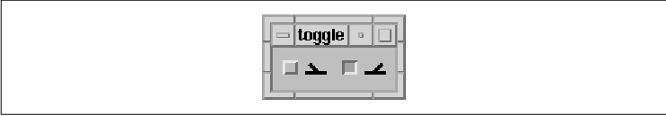
}
The output for this program is shown in the figure. The button on the
left shows the ToggleButton when it is in the off state and the button
on the right shows it in the on state. The pixmaps illustrate the
movement of a simple mechanical switch. Since the pixmaps make the
state of the toggle clear, the square indicator is not really
necessary. It can be turned off by setting XmNindicatorOn to
False (its default value is True).
In order to create the pixmaps for the
ToggleButtons, we use the function XmGetPixmap(), which is a
general-purpose pixmap loading and caching function. The function needs
a foreground and background color for the pixmap it creates, so we
retrieve and use the colors from the RowColumn that is the parent of
the ToggleButton. XmGetPixmap() loads the pixmaps stored in
the files switch_on and switch_off in the current
directory. The fact that the pixmap files happen to reside in the
current directory is not necessarily the recommended method for using
XmGetPixmap(). For a complete discussion of the function, see
Section #spixmaps in Chapter 3, Overview of the Motif Toolkit.
Those files contain the following bitmap definitions:
   #define switch_on_width 16
   #define switch_on_height 16
   static char switch_on_bits[] = {
      0x00, 0x00, 0x00, 0x00, 0x00, 0x00, 0x00, 0x00, 0x00, 0x18, 0x00, 0x3c,
      0x00, 0x1e, 0x00, 0x0f, 0x80, 0x07, 0xc0, 0x03, 0xff, 0xff, 0xff, 0xff,
      0xff, 0xff, 0x00, 0x00, 0x00, 0x00, 0x00, 0x00};
   #define switch_off_width 16
   #define switch_off_height 16
   static char switch_off_bits[] = {
      0x00, 0x00, 0x00, 0x00, 0x00, 0x00, 0x00, 0x00, 0x18, 0x00, 0x3c, 0x00,
      0x78, 0x00, 0xf0, 0x00, 0xe0, 0x01, 0xc0, 0x03, 0xff, 0xff, 0xff, 0xff,
      0xff, 0xff, 0x00, 0x00, 0x00, 0x00, 0x00, 0x00};
The XmNselectInsensitivePixmap resource can be used to specify
a third pixmap to be used when the widget or gadget is insensitive, but
in a selected state. When a ToggleButton is insensitive, the user
cannot change its value interactively.
The primary callback routine associated with the
ToggleButton is the XmNvalueChangedCallback, which is invoked
when the value of the ToggleButton changes. The ToggleButton also has
arm and disarm callbacks that are analogous to the callbacks in
PushButtons. The callback structure associated with the ToggleButton
callback routines is XmToggleButtonCallbackStruct, which is
defined as follows:
   typedef struct {
      int     reason;
      XEvent *event;
      int     set;
   } XmToggleButtonCallbackStruct;
When the value of the ToggleButton has changed, the
reason field is set to XmCR_VALUE_CHANGED and the set
field indicates the current state of the widget.
You can determine the state of a ToggleButton at any
time using either XmToggleButtonGetState() or
XmToggleButtonGadgetGetState(). These functions take the following
form:
   Boolean
   XmToggleButtonGetState(toggle_w)
       Widget toggle_w;

   Boolean
   XmToggleButtonGadgetGetState(toggle_w)
       Widget toggle_w;
Both of the routines return the state of the specified ToggleButton.
XmToggleButtonGetState() determines if the toggle_w
parameter is a widget or a gadget, so you can use the routine on either
a ToggleButton widget or a ToggleButton gadget.
XmToggleButtonGadgetSetState() can only be used on a gadget.
You can explicitly set the state of a ToggleButton
using similar functions: XmToggleButtonSetState() and
XmToggleButtonGadgetSetState(). These functions take the following
form:
   void
   XmToggleButtonSetState(toggle_w, state, notify)
       Widget   toggle_w;
       Boolean  state;
       Boolean  notify;

   void
   XmToggleButtonGadgetSetState(toggle_w, state, notify)
       Widget   toggle_w;
       Boolean  state;
       Boolean  notify;
The state argument specifies the state of the
ToggleButton. The notify parameter allows you to
specify whether or not the XmNvalueChangedCallback of the
ToggleButton is called when the state is changed. Just like the
corresponding get function, XmToggleButtonSetState()
determines if its parameter is a widget or gadget internally, so you
can use it on either a ToggleButton widget or a ToggleButton gadget.
XmToggleButtonGadgetSetState() can only be used on a gadget.
One important point to make about ToggleButtons is
that, unlike PushButtons and DrawnButtons, the callback is not
typically used to take an action in the application. This point becomes
clearer with groups of ToggleButtons, which are commonly used to set
the state of various variables. When the user has set the state as
desired, she might tell the application to apply the settings by
clicking on an associated PushButton. For this reason, the callback
routine for a ToggleButton may simply set the state of a global
variable; the value can then be used by other application functions.
Of course, like almost every object in Motif, a
ToggleButton can be put to many uses. For example, a single
ToggleButton could be used to swap the foreground and background colors
of a window as soon as the user selects the button. An application that
controls a CD player could have a Pause button represented by a
ToggleButton.
When a group of ToggleButtons are used as part of an
interface, it is in the form of a RadioBox or a CheckBox. The primary
difference between the two is the selection of the ToggleButtons
within. In a RadioBox, only one item may be selected at a time
(analogous to old-style AM car radios). You push one button and the
previously set button pops out. Examples of exclusive settings in a
RadioBox might be baud rate settings for a communications program or
U.S. versus European paper sizes in the page setup dialog of a word
processing program.
A RadioBox is implemented using a combination of
ToggleButton widgets or gadgets and a RowColumn manager widget. As
discussed in Chapter 8, Manager Widgets, the RowColumn widget is
a general-purpose composite widget that manages the layout of its
children. The RowColumn has special resources that allow it to act as a
RadioBox for a group of ToggleButtons.
In a RadioBox, only one of the buttons may be set at
any given time. This functionality is enforced by the RowColumn when
the resource XmNradioBehavior is set to True. For
true RadioBox effect, the XmNradioAlwaysOne resource can also
be set to tell the RowColumn that one of the ToggleButtons should
always be set. Since you have the freedom to add or delete
ToggleButtons from a RowColumn, regardless of their state, if you are
not careful you can violate this aspect of radio behavior. Also,
XmNradioBehavior is currently not a dynamically settable resource.
If you want to use it, you should create the RowColumn widget with this
resource set. Setting it using XtVaSetValues() after widget
creation may not result in the desired behavior. Whenever
XmNradioBehavior is set, the RowColumn automatically sets the
XmNindicatorType resource to XmONE_OF_MANY and the
XmNvisibleWhenOff resource to True for all of its
ToggleButton children. Furthermore, the XmNisHomogeneous
resource on the RowColumn is forced to True to ensure that no
other kinds of widgets can be contained in that RowColumn instance.
Motif provides the convenience function
XmCreateRadioBox() to automatically create a RowColumn widget that
is configured as a RadioBox. This routine creates a RowColumn widget
with XmNisHomogeneous set to True, XmNentryClass
set to xmToggleButtonGadgetClass, XmNradioBehavior
set to True, and XmNpacking set to XmPACK_COLUMN
. Keep in mind that unless XmNisHomogeneous is set to True
, there is nothing restricting a RadioBox from containing other classes
as well as ToggleButtons. Whether the RowColumn is homogeneous or not,
the toggle behavior is not affected. Although the Motif convenience
function sets the homogeneity, it is not a requirement. Prior to Motif
1.1.1, XmCreateRadioBox() actually set XmNisHomogeneous
to False rather than True, which is a bug. If your
code relies on the bug and now breaks, all you need to do is add code
to set XmNisHomogeneous to False when you create your
RadioBox. For example, you might want a RadioBox to contain a Label, or
perhaps even some other control area, like a Command widget.
the source code contains a program that creates and
uses a RadioBox. XtSetLanguageProc() is only available in
X11R5; there is no corresponding function in X11R4.
   /* simple_radio.c -- demonstrate a simple radio box.  Create a
    * box with 3 toggles: "one", "two" and "three".  The callback
    * routine prints the most recently selected choice.  Maintain
    * a global variable that stores the most recently selected.
    */
   #include <Xm/ToggleBG.h>
   #include <Xm/RowColumn.h>

   int toggle_item_set;

   void
   toggled(widget, client_data, call_data)
   Widget widget;
   XtPointer client_data;
   XtPointer call_data;
   {
       int which = (int) client_data;
       XmToggleButtonCallbackStruct *state =
           (XmToggleButtonCallbackStruct *) call_data;

       printf ("%s: %s0, XtName (widget), state->set? "on" : "off");
       if (state->set)
           toggle_item_set = which;
       else
           toggle_item_set = 0;
   }

   main(argc, argv)
   int argc;
   char *argv[];
   {
       Widget toplevel, radio_box, one, two, three;
       XtAppContext app;

       XtSetLanguageProc (NULL, NULL, NULL);

       toplevel = XtVaAppInitialize (&app, "Demos", NULL, 0,
           &argc, argv, NULL, NULL);

       radio_box = XmCreateRadioBox (toplevel, "radio_box", NULL, 0);

       one = XtVaCreateManagedWidget ("One",
           xmToggleButtonGadgetClass, radio_box, NULL);
       XtAddCallback (one, XmNvalueChangedCallback, toggled, 1);

       two = XtVaCreateManagedWidget ("Two",
           xmToggleButtonGadgetClass, radio_box, NULL);
       XtAddCallback (two, XmNvalueChangedCallback, toggled, 2);

       three = XtVaCreateManagedWidget ("Three",
           xmToggleButtonGadgetClass, radio_box, NULL);
       XtAddCallback (three, XmNvalueChangedCallback, toggled, 3);

       XtManageChild (radio_box);

       XtRealizeWidget (toplevel);
       XtAppMainLoop (app);
   }
The program creates three ToggleButtons inside of a RadioBox. When the user selects one of the buttons, the previously-set widget is toggled off, and the XmNvalueChangedCallback routine is called. Notice that the routine is called twice for each selection: the first time to notify that the previously set widget has been turned off, and the second time to notify that the newly set widget has been turned on. The output of the program is shown in the figure.
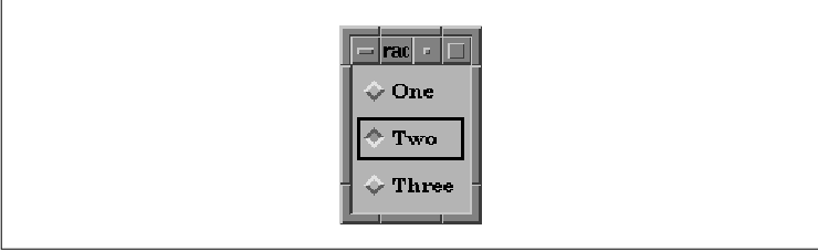
The global variable toggle_item_set
indicates which of the three selections is on. The value of
toggle_item_set is accurate at any given time because it is either
set to the most currently selected object or it is set to 0.
In a real application, this global variable would be used to store the
state of the buttons, so that other application functions could
reference them.
You should beware of lengthy callback lists,
however. If you have more than one function in the callback list for
the ToggleButtons (unlike the situation shown above), the entire list
is going to be called twice. A zero value for toggle_item_set
indicates that you are in the first of two phases of the toggling
mechanism. In this case, you can fall through your callback lists, as
the list is called again with the value set to the recently selected
toggle item.
Motif provides another RadioBox creation routine,
XmVaCreateSimpleRadioBox(), for creating simple RadioBoxes. If a
RadioBox only has one callback associated with it and you only need to
know which button has been selected, this routine may be used. The form
of the function is:
   XmVaCreateSimpleRadioBox(parent, name, button_set, callback, ..., NULL)
       Widget parent;
       String name;
       int    button_set;
       void  *callback;
In addition to the specified parameters, the function also accepts a
NULL-terminated list of resource-value pairs that apply to the
RowColumn widget that acts as the RadioBox. You can specify any normal
RowColumn resources in this list, as well as the value
XmVaRADIOBUTTON, which is a convenient method for specifying a
button that is to be created inside the RadioBox. This parameter is
followed by four additional arguments: a label of type
XmString, a mnemonic of type XmKeySym, an
accelerator of type String, and
accelerator_text (also of type XmString) that is used
to display the accelerator in the widget. Only the label
argument has any effect through Motif 1.2 and all subreleases. You can
use XmVaRADIOBUTTON multiple times in the same call to
XmVaCreateSimpleRadioBox(), so that you can create an entire group
of ToggleButtons in one function call.
the source code contains an example of
XmVaCreateSimpleRadioBox(). This program is functionally identical
to the previous example. XtSetLanguageProc() is only available
in X11R5; there is no corresponding function in X11R4.
XmStringCreateLocalized() is only available in Motif 1.2;
XmStringCreateSimple() is the corresponding function in Motif 1.1.
   /* simple_radio.c -- demonstrate a simple radio box by using
    * XmVaCreateSimpleRadioBox().  Create a box with 3 toggles:
    * "one", "two" and "three".  The callback routine prints
    * the most recently selected choice.
    */
   #include <Xm/RowColumn.h>

   void
   toggled(widget, client_data, call_data)
   Widget widget;
   XtPointer client_data;
   XtPointer call_data;
   {
       int which = (int) client_data;
       XmToggleButtonCallbackStruct *state =
           (XmToggleButtonCallbackStruct *) call_data;

       printf ("%s: %s0, XtName (widget), state->set? "on" : "off");
   }

   main(argc, argv)
   int argc;
   char *argv[];
   {
       Widget toplevel, radio_box;
       XtAppContext app;
       XmString one, two, three;

       XtSetLanguageProc (NULL, NULL, NULL);

       toplevel = XtVaAppInitialize (&app, "Demos", NULL, 0,
           &argc, argv, NULL, NULL);

       one  = XmStringCreateLocalized ("One");
       two  = XmStringCreateLocalized ("Two");
       three  = XmStringCreateLocalized ("Three");
       radio_box = XmVaCreateSimpleRadioBox (toplevel, "radio_box",
           0,  /* the inital choice */
           toggled, /* the callback routine */
           XmVaRADIOBUTTON, one,  NULL, NULL, NULL,
           XmVaRADIOBUTTON, two,  NULL, NULL, NULL,
           XmVaRADIOBUTTON, three, NULL, NULL, NULL,
           NULL);
       XmStringFree (one);
       XmStringFree (two);
       XmStringFree (three);

       XtManageChild (radio_box);

       XtRealizeWidget (toplevel);
       XtAppMainLoop (app);
   }
A CheckBox is similar to a RadioBox, except that
there is no restriction on how many items may be selected at once. A
word processing program might use a CheckBox for nonexclusive
settings, such as whether font smoothing, bitmap smoothing, or both,
should be applied.
Like RadioBoxes, CheckBoxes are implemented using
RowColumn widgets and ToggleButton children. To allow multiple items to
be selected, the XmNradioBehavior resource is set to False
. The convenience routine XmVaCreateSimpleCheckBox() works just
like the radio box creation routine, except that it turns off the
XmNradioBehavior resource. Rather than using this function, we can
simply create a common RowColumn widget without the aid of convenience
functions and add ToggleButton children. With this technique, we have
more direct control over the resources that are set in the RowColumn,
since we can specify exactly which ones we want using the varargs
interface for creating the widget.
the source code demonstrates how to create a
CheckBox with a regular RowColumn widget. XtSetLanguageProc()
is only available in X11R5; there is no corresponding function in
X11R4.
   /* toggle_box.c -- demonstrate a homebrew ToggleBox.  A static
    * list of strings is used as the basis for a list of toggles.
    * The callback routine toggled() is set for each toggle item.
    * The client data for this routine is set to the enumerated
    * value of the item with respect to the entire list.  This value
    * is treated as a bit which is toggled in "toggles_set" -- a
    * mask that contains a complete list of all the selected items.
    * This list is printed when the PushButton is selected.
    */
   #include <Xm/ToggleBG.h>
   #include <Xm/PushBG.h>
   #include <Xm/SeparatoG.h>
   #include <Xm/RowColumn.h>

   unsigned long toggles_set; /* has the bits of which toggles are set */

   char *strings[] = {
       "One", "Two", "Three", "Four", "Five",
       "Six", "Seven", "Eight", "Nine", "Ten",
   };

   /* A RowColumn is used to manage a ToggleBox (also a RowColumn) and
    * a PushButton with a separator gadget in between.
    */
   main(argc, argv)
   int argc;
   char *argv[];
   {
       Widget toplevel, rowcol, toggle_box, w;
       XtAppContext app;
       void toggled(), check_bits();
       int i;

       XtSetLanguageProc (NULL, NULL, NULL);

       toplevel = XtVaAppInitialize (&app, "Demos",
           NULL, 0, &argc, argv, NULL, NULL);

       rowcol = XtVaCreateManagedWidget ("rowcolumn",
           xmRowColumnWidgetClass, toplevel,
           NULL);

       toggle_box = XtVaCreateWidget ("togglebox",
           xmRowColumnWidgetClass, rowcol,
           XmNpacking,        XmPACK_COLUMN,
           XmNnumColumns,     2,
           NULL);

       /* simply loop thru the strings creating a widget for each one */
       for (i = 0; i < XtNumber (strings); i++) {
           w = XtVaCreateManagedWidget (strings[i],
               xmToggleButtonGadgetClass, toggle_box, NULL);
           XtAddCallback (w, XmNvalueChangedCallback, toggled, i);
       }

       XtVaCreateManagedWidget ("sep",
           xmSeparatorGadgetClass, rowcol, NULL);
       w = XtVaCreateManagedWidget ("Check Toggles",
           xmPushButtonGadgetClass, rowcol, NULL);
       XtAddCallback (w, XmNactivateCallback, check_bits, NULL);

       XtManageChild (rowcol);
       XtManageChild (toggle_box);

       XtRealizeWidget (toplevel);
       XtAppMainLoop (app);
   }

   /* callback for all ToggleButtons. */
   void
   toggled(widget, client_data, call_data)
   Widget widget;
   XtPointer client_data;
   XtPointer call_data;
   {
       int bit = (int) client_data;
       XmToggleButtonCallbackStruct *toggle_data =
           (XmToggleButtonCallbackStruct *) call_data;

       if (toggle_data->set) /* if the toggle button is set, flip its bit */
           toggles_set |= (1 << bit);
       else /* if the toggle is "off", turn off the bit. */
           toggles_set &= ~(1 << bit);
   }

   void
   check_bits(widget, client_data, call_data)
   Widget widget;
   XtPointer client_data;
   XtPointer call_data;
   {
       int i;

       printf ("Toggles set:");
       for (i = 0; i < XtNumber (strings); i++)
           if (toggles_set & (1<<i))
               printf (" %s", strings[i]);
       putchar ('0);
   }
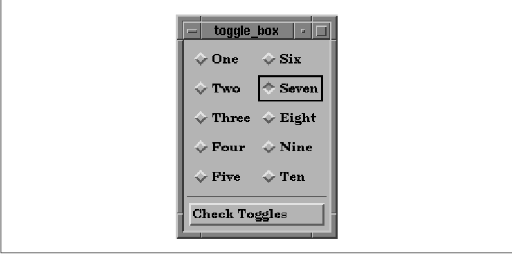
The output of this program is shown in the figure.
This example is similar to the previous RadioBox
examples, except that since more than one of the buttons may be set at
a time in a CheckBox, we can no longer use toggle_item_set the
way we did in the previous examples. Instead, we are going to change
its name to toggles_set and its type to unsigned
long. This time we are going to use the variable as a mask,
which means that its individual bits have meaning, rather than the
combined value of the variable. The bits indicate which of the
ToggleButtons have been set. Each time a ToggleButton changes its
value, the callback routine flips the corresponding bit in the mask. We
can therefore determine at any given time which buttons are set and
which are not. The unsigned long type can only
represent up to 32 ToggleButtons. If more buttons are used within the
CheckBox, a new mechanism is needed, although the basic design
presented here can still be used.
The PushButton in the program provides a way to
check the state of all of the ToggleButtons. The callback routine for
the PushButton prints the strings of those buttons that are selected by
looping through the toggles_set variable and checking for bits
that have been set.
One interesting aspect of this program is that it
works just as well if the CheckBox is a RadioBox. To test this
statement, we can run the program again with the radioBehavior
resource set to True via the -xrm command-line
option:
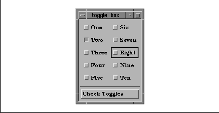
toggle_box -xrm "*radioBehavior: True"The result is shown in the figure.
As you can see, simply changing this single
RowColumn resource completely changes the appearance of all the
ToggleButtons.
An ArrowButton is just like a PushButton, except
that it only displays a directional arrow symbol. The arrow can point
up, down, left, or right. Motif provides both widget and gadget
versions of the ArrowButton; the associated header files are <
Xm/ArrowB.h> and <Xm/ArrowBG.h>. the source code shows a
program that creates four ArrowButtons, one for each direction.
XtSetLanguageProc() is only available in X11R5; there is no
corresponding function in X11R4.
   /* arrow.c -- demonstrate the ArrowButton widget.
    * Have a Form widget display 4 ArrowButtons in a
    * familiar arrangement.
    */
   #include <Xm/ArrowBG.h>
   #include <Xm/Form.h>

   main(argc, argv)
   int argc;
   char *argv[];
   {
       XtAppContext app;
       Widget toplevel, form;
       Display *dpy;

       XtSetLanguageProc (NULL, NULL, NULL);

       toplevel = XtVaAppInitialize (&app, "Demos",
           NULL, 0, &argc, argv, NULL, NULL);

       dpy = XtDisplay (toplevel);
       /* Rather than listing all these resources in an app-defaults file,
        * add them directly to the database for this application only. This
        * would be virtually equivalent to hard-coding values, since these
        * resources will override any other specified external to this file.
        */
       XrmPutStringResource
           (&dpy->db, "*form*topAttachment", "attach_position");
       XrmPutStringResource
           (&dpy->db, "*form*leftAttachment", "attach_position");
       XrmPutStringResource
           (&dpy->db, "*form*rightAttachment", "attach_position");
       XrmPutStringResource
           (&dpy->db, "*form*bottomAttachment", "attach_position");

       form = XtVaCreateWidget ("form", xmFormWidgetClass, toplevel,
           XmNfractionBase,     3,
           NULL);

       XtVaCreateManagedWidget ("arrow1",
           xmArrowButtonGadgetClass, form,
           XmNtopPosition,      0,
           XmNbottomPosition,   1,
           XmNleftPosition,     1,
           XmNrightPosition,    2,
           XmNarrowDirection,   XmARROW_UP,
           NULL);

       XtVaCreateManagedWidget ("arrow2",
           xmArrowButtonGadgetClass, form,
           XmNtopPosition,      1,
           XmNbottomPosition,   2,
           XmNleftPosition,     0,
           XmNrightPosition,    1,
           XmNarrowDirection,   XmARROW_LEFT,
           NULL);

       XtVaCreateManagedWidget ("arrow3",
           xmArrowButtonGadgetClass, form,
           XmNtopPosition,      1,
           XmNbottomPosition,   2,
           XmNleftPosition,     2,
           XmNrightPosition,    3,
           XmNarrowDirection,   XmARROW_RIGHT,
           NULL);

       XtVaCreateManagedWidget ("arrow4",
           xmArrowButtonGadgetClass, form,
           XmNtopPosition,      2,
           XmNbottomPosition,   3,
           XmNleftPosition,     1,
           XmNrightPosition,    2,
           XmNarrowDirection,   XmARROW_DOWN,
           NULL);

       XtManageChild (form);
       XtRealizeWidget (toplevel);
       XtAppMainLoop (app);
   }
the figure shows the output of this program.
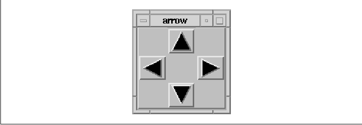
The size of the arrow-shaped image is calculated
dynamically based on the size of the widget itself. If the widget is
resized for some reason, the directional arrow grows or shrinks to fill
the widget. The XmNarrowDirection resource controls the
direction of the arrow displayed by an ArrowButton. This resource may
have one of the following values:
   XmARROW_UP
   XmARROW_DOWN
   XmARROW_LEFT
   XmARROW_RIGHT
ArrowButtons are useful if you want to provide redundant interface methods for certain widgets. For example, you could use ArrowButtons to move the viewport of a ScrolledWindow. Redundancy, when used appropriately, can be an important part of a graphical user interface. Many users may not adapt well to certain interface controls, such as PulldownMenus in MenuBars or keyboard accelerators, while they are perfectly comfortable with iconic controls such as ArrowButtons and PushButtons displaying pixmaps. ArrowButtons are also useful if you want to build your own interface for an object that is not part of the Motif widget set.
ArrowButton widgets and gadgets work in the same way
as PushButtons. ArrowButtons have an XmNactivateCallback, an
XmNarmCallback, an XmNdisarmCallback, and a
XmNmultiClick resource. The callback routines all take a parameter
of type XmArrowButtonCallbackStruct, which is defined as
follows:
   typedef struct {
       int     reason;
       XEvent  *event;
       int     click_count;
   } XmArrowButtonCallbackStruct;
This callback structure is identical to the one used for PushButtons.
ArrowButtons are commonly used to increment and
decrement a value, a position, or another type of data by some
arbitrary amount. If the amount being incremented or decremented is
sufficiently small in comparison to the total size of the object, it is
convenient for the user if you give her the ability to change the value
quickly. For example, we can emulate the activate callback routine
being called continuously when the user holds down the mouse button
over an ArrowButton widget. This functionality is not a feature of the
ArrowButton; it is something we have to add ourselves. To implement
this feature, we use an Xt timer as demonstrated in the source code
XtSetLanguageProc() is only available in X11R5; there is no
corresponding function in X11R4.
   /* arrow_timer.c -- demonstrate continuous callbacks using
    * ArrowButton widgets.  Display up and down ArrowButtons and
    * attach arm and disarm callbacks to them to start and stop timer
    * that is called repeatedly while the button is down.  A label
    * that has a value changes either positively or negatively
    * by single increments while the button is depressed.
    */
   #include <Xm/ArrowBG.h>
   #include <Xm/Form.h>
   #include <Xm/RowColumn.h>
   #include <Xm/LabelG.h>

   XtAppContext app;
   Widget label;
   XtIntervalId arrow_timer_id;
   typedef struct value_range {
       int value, min, max;
   } ValueRange;

   main(argc, argv)
   int argc;
   char *argv[];
   {
       Widget w, toplevel, rowcol;
       void start_stop();
       ValueRange range;

       XtSetLanguageProc (NULL, NULL, NULL);

       toplevel = XtVaAppInitialize (&app, "Demos",
           NULL, 0, &argc, argv, NULL, NULL);

       rowcol = XtVaCreateWidget ("rowcol",
           xmRowColumnWidgetClass, toplevel,
           XmNorientation, XmHORIZONTAL,
           NULL);

       w = XtVaCreateManagedWidget ("arrow_up",
           xmArrowButtonGadgetClass, rowcol,
           XmNarrowDirection,   XmARROW_UP,
           NULL);
       XtAddCallback (w, XmNarmCallback, start_stop, 1);
       XtAddCallback (w, XmNdisarmCallback, start_stop, 1);

       w = XtVaCreateManagedWidget ("arrow_dn",
           xmArrowButtonGadgetClass, rowcol,
           XmNarrowDirection,   XmARROW_DOWN,
           NULL);
       XtAddCallback (w, XmNarmCallback, start_stop, -1);
       XtAddCallback (w, XmNdisarmCallback, start_stop, -1);

       range.value = 0;
       range.min = -50;
       range.max = 50;
       label = XtVaCreateManagedWidget ("label",
           xmLabelGadgetClass, rowcol,
           XtVaTypedArg, XmNlabelString, XmRString, "0   ", 3,
           XmNuserData, &range,
           NULL);

       XtManageChild (rowcol);
       XtRealizeWidget (toplevel);
       XtAppMainLoop (app);
   }

   /* start_stop is used to start or stop the incremental changes to
    * the label's value.  When the button goes down, the reason is
    * XmCR_ARM and the timer starts.  XmCR_DISARM disables the timer.
    */
   void
   start_stop(w, client_data, call_data)
   Widget w;
   XtPointer client_data;
   XtPointer call_data;
   {
       int incr = (int) client_data;
       XmArrowButtonCallbackStruct *cbs =
           (XmArrowButtonCallbackStruct *) call_data;
       void change_value();

       if (cbs->reason == XmCR_ARM)
           change_value (incr, 1 );
       else if (cbs->reason == XmCR_DISARM)
           XtRemoveTimeOut (arrow_timer_id);
   }

   /* change_value is called each time the timer expires.  This function
    * is also used to initiate the timer.  The "id" represents that timer
    * ID returned from the last call to XtAppAddTimeOut().  If id == 1,
    * the function was called from start_stop(), not a timeout.  If the value
    * has reached its maximum or minimum, don't restart timer, just return.
    * If id == 1, this is the first timeout so make it be longer to allow
    * the user to release the button and avoid getting into the "speedy"
    * part of the timeouts.
    */
   void
   change_value(client_data, id)
   XtPointer client_data;
   XtIntervalId id;
   {
       ValueRange *range;
       char buf[8];
       int incr = (int) client_data;

       XtVaGetValues (label, XmNuserData, &range, NULL);
       if (range->value + incr > range->max ||
           range->value + incr < range->min)
           return;
       range->value += incr;
       sprintf (buf, "%d", range->value);
       XtVaSetValues (label,
           XtVaTypedArg, XmNlabelString, XmRString, buf, strlen(buf),
           NULL);
       arrow_timer_id =
           XtAppAddTimeOut (app, id==1? 500 : 100, change_value, incr);
   }
The output of this program is shown in the figure.
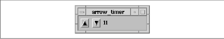
The program creates up and down ArrowButtons and
attaches arm and disarm callbacks that start and stop an internal
timer. Each time the timer expires, the value displayed by the Label
changes incrementally by one. The timer remains on as long as the
button is down. We know that the button has been released when the
disarm event occurs.
The function responsible for this behavior is
start_stop(); it is installed for both the arm and disarm callback.
When the button is pressed, the reason is XmCR_ARM,
and the timer starts. When the button is released, the disarm callback
is invoked, the reason is XmCR_DISARM, and the timer
is disabled. The start_stop() routine initiates the timer by
calling change_value(). Each time the timer expires,
change_value() is also called, which means that the function is
called repeatedly while the button is pressed. The id
represents the ID of the timer that recently expired from the last call
to XtAppAddTimeOut(). If the value is one, the function was
called from start_stop(), not as a timeout. We don't restart
the timer if the value has reached its maximum or minimum value. If
id is one, we know that this is the initiating call, so we make the
first timeout last longer to allow the user to release the button
before getting into the "speedy" timeouts. Otherwise, the time out
occurs every 100 milliseconds.
If you experiment with the program, you can get a
feel for how the functions work and modify some of the hard-coded
values, such as the timeout values. While we demonstrate this technique
with ArrowButtons, it can also be applied to a PushButton or any other
widget that provides arm and disarm callbacks.
DrawnButtons are similar to PushButtons, except that
they also have callback routines for Expose and
ConfigureNotify events. Whenever a DrawnButton is exposed or
resized, the corresponding callback routine is responsible for
redisplaying the contents of the button. The widget does not handle its
own repainting. These callbacks are invoked anytime the widget needs to
redraw itself, even if it is a result of a change to a resource such as
XmNshadowType, XmNshadowThickness, or the foreground
or background color of the widget.
The purpose of the DrawnButton is to allow you to
draw into it while maintaining complete control over what the widget
displays. Unlike with a PushButton, you are in control of the
repainting of the surface area of the widget, not including the beveled
edges that give it a 3D effect. To provide a dynamically changing
pixmap using a PushButton widget, you would have to change the
XmNlabelPixmap resource using XtVaSetValues().
Unfortunately, this method results in an annoying flickering effect
because the PushButton redisplays itself entirely whenever its pixmap
changes. By using the DrawnButton widget, you can dynamically change
its display by rendering graphics directly onto the window of the
widget using any Xlib routines such as XDrawLine() or
XCopyArea(). This tight control may require more work on your part,
but the feedback to the user is greatly improved over the behavior of
the PushButton.
DrawnButtons are created similarly to PushButtons
and ArrowButtons. However, because the widget provides you with its own
drawing area, there is no corresponding gadget version of this object.
The associated header file is <Xm/DrawnB.h> and it must be
included by files that create the widget. the source code shows a
simple example of how a DrawnButton can be created.
XtSetLanguageProc() is only available in X11R5; there is no
corresponding function in X11R4.
   /* drawn.c -- demonstrate the DrawnButton widget by drawing a
    * common X logo into its window.  This is hardly much different
    * from a PushButton widget, but the DrawnButton isn't much
    * different, except for a couple more callback routines...
    */
   #include <Xm/DrawnB.h>
   #include <Xm/BulletinB.h>

   Pixmap pixmap;

   main(argc, argv)
   int argc;
   char *argv[];
   {
       XtAppContext app;
       Widget toplevel, bb, button;
       Pixel fg, bg;
       Dimension ht, st;
       void my_callback();

       XtSetLanguageProc (NULL, NULL, NULL);

       toplevel = XtVaAppInitialize (&app, "Demos",
           NULL, 0, &argc, argv, NULL, NULL);

       bb = XtVaCreateManagedWidget ("bb",
           xmBulletinBoardWidgetClass, toplevel, NULL);

       XtVaGetValues (bb,
           XmNforeground, &fg,
           XmNbackground, &bg,
           NULL);
       pixmap = XmGetPixmap (XtScreen (bb), "xlogo64", fg, bg);

       button = XtVaCreateManagedWidget ("button",
           xmDrawnButtonWidgetClass, bb,
           NULL);

       XtVaGetValues (button,
           XmNhighlightThickness, &ht,
           XmNshadowThickness, &st,
           NULL);

       XtVaSetValues (button,
           XmNwidth, 2 * ht + 2 * st + 64,
           XmNheight, 2 * ht + 2 * st + 64,
           NULL);

       XtAddCallback (button, XmNactivateCallback, my_callback, NULL);
       XtAddCallback (button, XmNexposeCallback, my_callback, NULL);
       XtAddCallback (button, XmNresizeCallback, my_callback, NULL);

       XtRealizeWidget (toplevel);
       XtAppMainLoop (app);
   }

   void
   my_callback(w, client_data, call_data)
   Widget w;
   XtPointer client_data;
   XtPointer call_data;
   {
       XmDrawnButtonCallbackStruct *cbs =
           (XmDrawnButtonCallbackStruct *) call_data;
       if (cbs->reason == XmCR_ACTIVATE)
           printf ("%s: pushed %d times0, XtName(w), cbs->click_count);
       else if (cbs->reason == XmCR_EXPOSE) {
           Dimension ht, st;

           XtVaGetValues (w,
               XmNhighlightThickness, &ht,
               XmNshadowThickness, &st,
               NULL);

           XtVaSetValues (w,
               XmNwidth, 2 * ht + 2 * st + 64,
               XmNheight, 2 * ht + 2 * st + 64,
               NULL);

           XCopyArea (XtDisplay (w), pixmap, XtWindow (w),
               XDefaultGCOfScreen (XtScreen (w)), 0, 0, 64, 64,
               ht + st, ht + st);
       }
       else /* XmCR_RESIZE */
           puts ("Resize");
   }
The program simply displays the X Window System logo as shown in the
figure.
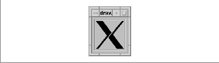
A single callback routine, my_callback(),
is specified for the XmNactivateCallback,
XmNexposeCallback, and XmNresizeCallback callbacks. The
callback structure associated with the DrawnButton is called the
XmDrawnButtonCallbackStruct, which is defined as follows:
   typedef struct {
       int      reason;
       XEvent  *event;
       Window   window;
       int      click_count;
   } XmDrawnButtonCallbackStruct;
The window field of the structure is the
window ID of the DrawnButton widget. This value is the same as that
returned by XtWindow(). The my_callback() callback
routine checks the value of the reason field to determine
which action to take. The reason can be one of the following
values: In some versions of the Motif 1.1 toolkit, the event
field of this callback structure is NULL when the reason is
XmCR_RESIZE. As a result, you cannot use the event
structure to provide you with the new dimensions of the widget. To
query the widget's size, you must use XtVaGetValues() or
possibly XtQueryGeometry(). The event field is also
NULL when the user activates the button using the keyboard rather
than the mouse.
   XmCR_ACTIVATE
   XmCR_ARM
   XmCR_DISARM
   XmCR_EXPOSE
   XmCR_RESIZE
When the reason is XmCR_EXPOSE, the callback routine handles drawing the X Window System logo in the DrawnButton. Since the widget takes care of drawing its own highlight and shadow, we have to be careful not to draw over these areas.
Since all of the rendering in a DrawnButton is the
responsibility of the application, you must decide whether you want to
render the graphics differently when the button is insensitive. Since
the DrawnButton is subclassed from the Label class, you can provide a
XmNlabelPixmap and XmNlabelInsensitivePixmap if you like,
but in this case you might as well use a PushButton instead of a
DrawnButton.
In Chapter 20, Signal Handling, we present an
example that shows how DrawnButtons can be used to construct an
application manager. An application manager is a program that
contains a set of icons, where each icon corresponds to a program. When
the user pushes one of the buttons, the corresponding program is run.
The button deactivates itself so that only one instance of each
application can run at a time. There is no particular reason for this
design restriction aside from the fact that it demonstrates the use of
the visual resources of the DrawnButton widget.
The XmNpushButtonEnabled resource of the
DrawnButton indicates whether or not the DrawnButton should look and
act like a PushButton. When the value is False (the default),
the DrawnButton displays whatever contents you put in it as well as a
shadow border. The style of the shadow is specified by the
XmNshadowType resource, which can be set to one of the following
values:
   XmSHADOW_IN
   XmSHADOW_OUT
   XmSHADOW_ETCHED_IN
   XmSHADOW_ETCHED_OUT
When XmNpushButtonEnabled is False, the button does not provide any feedback to the user when the button is activated.
When the value of XmNpushButtonEnabled is
set to True, the DrawnButton behaves like a PushButton and
does provide feedback to the user when the button is activated. The
shadow border for the button is always drawn in the XmSHADOW_IN
style, regardless of the setting of the XmNshadowType
resource. When the button is activated, the shadow is reversed, just as
for a PushButton.
The Label class acts as a superclass for more
widgets than any other widget in the Motif toolkit and as a result, its
use is rather broad. We have presented the fundamentals of Labels,
PushButtons, ToggleButtons, ArrowButtons, and DrawnButtons in this
chapter. For additional information on these widgets, especially their
uses in menu systems, see Chapter 4, The Main Window, and
Chapter 15, Menus. Examples of all these widgets are also
liberally spread throughout the rest of the book.
The following exercise is intended to stimulate and
encourage other creative uses of labels and buttons.