Understanding industrial design: Be playful
If you want to blend digital and physical design concepts successfully, you'll need to design products that are sensorial, simple, enduring, playful, thoughtful, sustainable, and beautiful.
 Sail Wagon, Brooklyn (LOC) (source: The Library of Congress on Flickr)
Playful
I do believe design is a new form of art and poetry, but with the strange destiny of bringing a little bit of joy to people. In that sense, humor probably helps.

Learn faster. Dig deeper. See farther.
ALBERTO ALESSI
CHILDREN HAVE THE UNCANNY ABILITY TO TURN EVERYTHING INTO PLAY. First-time parents are often perplexed to find their children playing with the box that housed a toy, just as readily as the toy itself. The world of the imagination is simply more accessible and tangible to children, who are not yet hardened by the years of pattern recognition that cause adults to categorize and compartmentalize experiences based on clearly defined expectations.
This library of familiar experiences is often harnessed by interaction designers, who draw upon standard conventions and commonly understood icons to make a design more discoverable and usable. These established patterns make it easier for people to do new things, because they recognize the structure from past experiences. They can make new experiences feel intuitive, from cooking on a new stove to switching email programs or driving an unfamiliar rental car. But conforming to expectations can also make a design unremarkable, defined more by a lack of negatives than by anything unique or compelling.
Good design goes beyond removing pain points or utilizing standards. Purposefully defying expectations in a playful way can often lead to a better experience, snapping people out of their everyday routine to surprise and delight them in some small way. These kinds of playful moments also require designers to break out of their molds, to look at problems with the fresh and imaginative eyes of a child instead of through the established lens of convention.
Playfulness should not be thought of as something you can add on at the end of a project, but as a quality that is deeply intertwined with a product’s form and purpose. In defying the ordinary, a playful design represents an alternative approach to solving a problem, a new way of looking at the world—but not a trade-off in functionality or quality. This is not about designing toys, which actually requires a very different approach. In this chapter, our focus is on functional products that use playfulness to create a better overall experience.
Expressions of playfulness are often context specific, so understanding how to design playful products will be studied through examples. The chapter is structured around various reasons why a design should be playful, from the simple notion of providing amusement to the larger goals of delighting users with the unexpected, elevating everyday actions, offering an emotional boost, or even encouraging behavior change.
Provide Amusement
Designers are in a position to bring human values to products and experiences, integrated with but separate from the engineering concerns of functionality, performance, and efficiency. The value of play is often only linked with children, an arbitrary cultural limitation that stunts the possibilities of both expression and design. Playfulness can be a part of everyday products with no justification needed beyond providing a moment of amusement. There is nothing more human than humor.
The Italian housewares manufacturer Alessi, which is founded on the idea that design is an artistic and poetic discipline, is the company perhaps most associated with joyful and humorous products. Alessio Alessi, president of the US division, has said that “irony is a very important element” of their products and that they look for designs that communicate beyond “representing a functional aspect but also representing an emotional aspect.”1
Alessi partners with well-known designers to create its products, but also hosts workshops that bring aspiring young designers together for an intensive week of creative exploration. These workshops, which Alessi refers to as “metaprojects,”2 are focused around open-ended topics with titles such as Memory Containers, Bio Memory, or The (Un)Forbidden City. The topics are not conceived of as a limiting constraint but a “hypothetical social-culture scenario that can act as a breeding ground for new projects.”3 Ideas generated during a workshop may lead to an Alessi product, or may simply advance the metaproject theme, which is often explored over the course of several years.
The Family Follows Fiction (F.F.F.) metaproject, which began in 1991, resulted in a series of playful interpretations on everyday housewares, often with a humorous twist on ordinary objects. F.F.F. was an exploration of the “emotional structure of objects,”4 channeling the creative processes of children and primitive cultures to uncover affective responses to the shape and structure of objects.5 The result was a collection of playful products, each one dutifully fulfilling its function while delighting the user with personality and whimsy.
The Magic Bunny toothpick holder by Stefano Giovannoni was one of the products that resulted from the F.F.F. metaproject, and was released commercially in 1998. As shown in Figure 1-1, this clever design features a plastic bunny with long pointed ears, sunk into an oversized hat of the same color and material. When the bunny is lifted out, the metaphor of the magician’s hat pays off by revealing that there are toothpicks hiding inside.
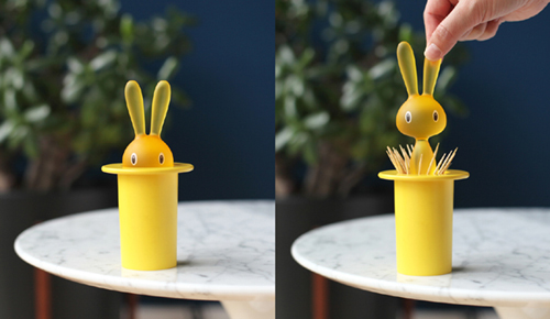
This metaproject was the first at Alessi to include explorations in plastic, and Giovannoni worked with Dupont to utilize a new material that allowed him to create a thicker than normal plastic mold. The bunny’s head is 4 cm thick, compared to other plastics at the time that would only allow for molds of 2–3 mm.6 This thickness provides a satisfying heft to the bunny’s head and a solid seal for the underlying toothpicks. Sitting on a tabletop, the toothpicks are kept dust free and clean until the bunny is lifted, at which point they are splayed outward in the hat, making them easy to grasp and remove.
Because the Magic Bunny reveals its toothpicks as a surprise, the form is not optimized for initial discoverability. However, this also presents an opportunity for interaction with others, as an icebreaker or conversation starter at a dinner party. Once the trick is shown to a guest, it not only brings a smile to their face, but will surely be remembered in the future. This trade-off between lower discoverability and delightful surprise is a common characteristic of playful designs, as they favor emotional responses over standard conventions.
Giovannoni brought a strong point of view to the F.F.F. metaproject. As both a designer and a toy collector, he was one of the participants who pushed back when Alessi initially spoke of certain objects as “toys.” In an interview, Giovannoni said, “I was very upset about that, because I never wanted to confuse toys with product. I was really interested in creating a difference.”7 He has stated that the “market and the feelings of the people are at the center of my work,”8 and that he aspires to democratize design through broadly appealing products that speak to a large audience. After many successful products, Alessi has embraced Giovannoni’s views on playfulness, crediting him with a “capacity to understand public sentiment like no other designer”9 the company works with.
Another product that emerged from the F.F.F. metaproject is the Diabolix bottle opener by Biagio Cisotti, a happy little devil in colored plastic that appears to bite the cap off your bottle (see Figure 1-2). It’s difficult to use the Diabolix without smiling, bringing a moment of humor and happiness to the otherwise ordinary task of opening a beverage.
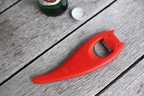
The amusement in the Diabolix design comes from the playful way that the form is integrated into the activity of bottle opening. The smooth curve and jagged top of the exposed steel are the perfect shape for both gripping a bottle cap and representing the little devil’s smile and fangs. Our recognition of this duality is what makes the product so enjoyable.
Humans have evolved with a quirk in our neural architecture that causes our brains to constantly look for significance in random or vague visual stimuli. This tendency is called pareidolia, from the Greek words “para,” meaning beside or beyond, and “eidolon,” meaning form or image.10 Because faces are such common stimuli, our brain looks for them everywhere, even in our built environment. We’ve all seen an electrical outlet, building, or car that looks like a face. The Diabolix bottle opener taps into this phenomenon, taking our brains through a cycle of recognition, questioning, and confirmation of the designer’s intent—it gives us permission to anthropomorphize. Many playful products use animal shapes but the Diabolix goes further, tapping into our natural perceptual tendencies to provide a feeling of discovery.
The best jokes unfold over time, the punch line waiting to land with just the right effect. The same is often true for playful products, with a moment of amusement emerging through use. The Diabolix bottle opener requires only a few seconds to recognize and appreciate, but the full impact of the Alessi Dozi magnetic paper clip holder unfolds over a longer arc, requiring the user to engage with it before the humor is revealed (see Figure 1-3).
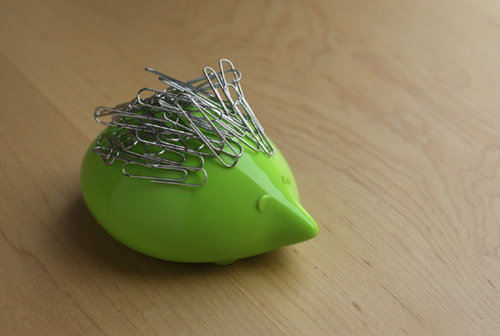
Dozi was designed by Mika H.J. Kim, a Korean designer who attended a 2002 Alessi workshop hosted by Laura Polinoro in Seoul.11 Shaped like a hedgehog, Dozi is an open-ended design that is only completed when paper clips are attached to its magnetic back. As the paper clips pile up, the hedgehog’s spiny coat begins to form and the user realizes the full possibilities of the design. Inevitably, the imagination is triggered and people try out various stacking techniques or other metal objects. The design holds paper clips well, but transcends that purpose to become a miniature sculpture that users can continually adjust. There’s no wrong way to use a Dozi, and because of the user participation, no two Dozis end up looking alike. The open-ended nature of the design is what makes it playful.
It’s also instructive to look at products that seem to be playful, but fall short of the deeper qualities represented in these Alessi examples. The Domo Toaster, shown in Figure 1-4, is one such example, where playfulness and function are at odds rather than reinforcing each other.
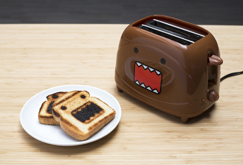
Domo, or Domo-Kun, was introduced to the world in 1998 as the official mascot of the Japanese television station NHK. However, this original association was all but lost after Domo was featured in a variety of Internet memes and achieved a more general status of pop culture icon. In recent years, Domo has appeared in numerous advertising campaigns for American companies such as Target and 7-Eleven, as well as being sold as a plush toy at retailers such as Urban Outfitters.12
The shape and color of the Domo Toaster mimic the distinctive character, with its open mouth and pointy teeth, but it goes a step further to actually burn the character’s likeness onto a piece of bread. It would seem to be a playful product, featuring a cute character and surprising us with a novel action, but unfortunately it doesn’t function very well as a toaster. To imprint a recognizable likeness of Domo on a piece of bread requires that the character’s eyes and mouth be burned in, while the surrounding bread is only lightly toasted. The surprise of seeing Domo on the bread is incompatible with making an edible, enjoyable piece of toast. The more evenly the bread is toasted, the harder it is to see the image.
The Domo Toaster may provide satisfaction or fun to Domo fans, but it fails to integrate its amusement value with its function. In forsaking the core purpose of its product category means the Domo Toaster should be classified as more of a toy than a playfully designed product.
This is the slippery slope designers can find themselves on when designing for amusement. The Domo Toaster is at one end of a spectrum, where the playfulness is in opposition to the functionality. On the other side is the Magic Bunny toothpick holder, where playfulness and functionality are intertwined and reinforce each other. Many playful designs will be found in the middle, where a moment of humor can be added without getting in the way.
An example of this middle ground can be found in the smartphone app Timehop, which aggregates all of your social media activity from a particular day in history. The mascot for the app is an illustrated dinosaur, which can be found at the bottom of the app’s main scroll view (see Figure 1-5). When users reach the end of their day’s historical feed, the dinosaur greets them with a funny daily quip. At first, the mascot is cropped to show only its upper half, but if users continue to scroll they can reveal that the dino is wearing boxer shorts. When they lift their fingers from the screen, the scroll view bounces back to hide this prehistoric indiscretion.
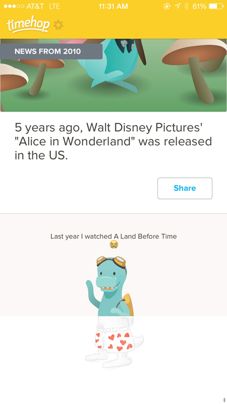
Timehop’s dinosaur in underpants is a playful element that provides a humorous moment without harming or supporting the core functionality of the app. It acts as a kind of reward for getting to the bottom, a hidden feature for those who find it. Users in the know are still rewarded for checking every day as occasionally the dinosaur’s bottom half has a one-time variation, such as scuba gear instead of boxer shorts.
Even in the middle of the integration spectrum, playfulness can imbue a product with a fun personality that benefits a product’s brand. Small moments of levity can be included without radically transforming a design, through witty copywriting on labels, navigation, and error messages. If it’s appropriate for the brand, these tiny moments of amusement make a product appear more human, fulfilling a task or function but doing so in a more lighthearted way that can ease users’ tension and even make them smile.
Delight with the Unexpected
People bring lots of expectations to products that seem familiar, assuming each new encounter will vary only slightly from those that came before. When designers intentionally subvert these assumptions through unexpected form, materials, scale, and functionality, it can catch someone’s attention and break them out of their routine. The unfamiliar can be delightful because it triggers a chemical reaction in the brain, a tiny release of dopamine that acts as the brain’s reward for experiencing something new. So as not to confuse, unexpected designs must be careful to remain coherent and usable, ideally making perfect sense once the user gets over the initial surprise.
Consider the Anglepoise Giant 1227 floor lamp (shown in Figure 1-6), which looks identical to the company’s classic desk lamp, but triple the size. The Original 1227 was designed in 1935 by British designer George Carwardine, who patented a new approach to using springs with constant tension that allowed the articulated lamp to be flexibly repositioned while remaining well balanced. The design became an archetype for what a desk lamp should be, inspiring countless similar designs throughout the 20th century.

In 2005, the Roald Dahl Museum and Story Centre approached Anglepoise about designing a version of the lamp at a gigantic scale.13 Dahl, the British author of whimsical children’s stories such as Charlie and the Chocolate Factory and The BFG, wrote many of his fantastical tales in his writing hut, at a desk illuminated by the Original 1227 lamp. The larger-than-life version, permanently installed at the museum, was designed to pay tribute to Dahl’s writing process in a manner appropriate to the imagination of his characters.
The Giant 1227 lamp playfully distorts reality. Extending to nearly nine feet in height, full-sized adults are reduced to the comparative stature of children in its presence. It is not the scale itself that makes the lamp playful, but the scaling of such an iconic form. We have conditioned ourselves to expect that particular form at a certain size, so it’s captivating to encounter it so much larger. Fortunately, the flexible positioning of the lamp works equally well at a large scale—part of the reason the company received so many petitions to make the Giant 1227 commercially available.14 Of course, the price has scaled as well, and it retails at nearly 15 times the cost of its diminutive sibling.
The Louis Ghost chair by Philippe Starck, shown in Figure 1-7, plays with our expectations in a different way. The chair references the style of a Louis XV armchair, but renders the shapes and lines of those heavy upholstered thrones in lightweight, transparent plastic.15 Baroque extravagance is translated into a seamless and durable form, injection molded as one piece with no joints or bindings. It’s even stackable up to six high and manufactured to resist scratches, shocks, and weather.16
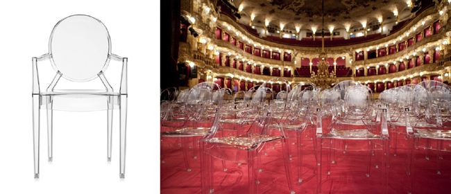
Starck is using irony as his playful medium, which has clearly delighted many people—over 1 million Louis Ghost chairs have been sold worldwide since its release in 2002.17 Starck has said that the chair “has a mix of materials and styles based on our shared memories. We all own this piece in a way.”18 This mash-up of Victorian form with modern materials is a kind of embedded story, a bridging of time periods that allows the user to fill in the historical gaps.
When playful combinations are meant to tell a story, it’s important that everyone gets the references. Nobody laughs when you have to explain a joke, so ironic mash-ups must resonate in an instant, not upon reflection. The Louis Ghost chair is designed for a general audience to grasp the story through unexpected but recognizable elements. It’s hard to know if Starck got feedback from users ahead of time, but the playfulness of a product can easily be evaluated. Do people understand what you’re trying to accomplish? Does the humor go over their heads? Does it fall flat? Does playfulness help support the functionality, or get in the way?
Not all unexpected combinations are immediately revealed. Another approach relies on disguise, where a product mimics the design of another in a playful way. Take, for instance, the Muji Bath Radio by design firm Industrial Facility (see Figure 1-8). At first it appears to be a shampoo bottle, a reasonable assumption given its context alongside similar bottles in a shower or bath. But twisting the knob at the top reveals its true identity, as sound begins playing from a waterproof speaker. Changing the radio station requires the user to flip the bottle over—a design choice specific to the context of a shower, where the station will be infrequently adjusted.
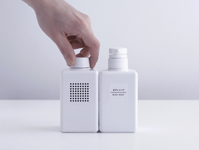
Muji manufactures a broad range of products, including clothes, housewares, and electronics. The designers at Industrial Facility have said that this breadth of capability inspired the idea that a radio could be an extension of Muji’s existing refillable bath products.19 The 2009 radio is similar in form to the refillable shampoo bottle that Muji introduced in 2003. It looks right at home in a shower, playfully disguised among simpler vessels, masking its electronic character.
The Bath Radio employs a kind of camouflage, designed to purposefully obscure its functionality at first glance. For houseguests who encounter the product without warning, the initial discovery of a hidden radio provides a moment of surprise, but the true delight is more long-term, as the novelty dissipates and the user comes to realize the appropriateness of the design. As the designers note, the similarity of the radio to shampoo and body wash bottles is quite fitting when you consider that they are all are things you consume while taking a shower.20
The principles of this simple radio can be applied to more advanced products with embedded computation and network connectivity. How might “smart” products perfectly fit into their environment to the point of disappearing? Based on context, what functionality really needs to be exposed and what can be hidden away? What other disparate activities could be unified in their design because they happen at the same time and place?
Some of the most delightful moments in life are the unexpected interactions we have with other people. In an urban environment, we are surrounded by strangers, but rarely do we find occasion to meet them. It’s common to see groups of people at a bus or train station each staring at their phones, isolated, just barely aware of each other. Playful design at the urban scale can break us out of these personal bubbles, creating a new environment for potential interaction with others.
Daily tous les jours is a Montreal-based studio that focuses on projects that foster interaction and collaboration between strangers.21 Founded by Mouna Andraos and Melissa Mongiat, their work features experiences of collective participation that break from the ordinary, including installations that get strangers to choreograph a dance together or join a giant sing-along. In 2011, a project called 21 Balançoires (21 Swings) was installed on a narrow strip of land separating two buildings in Montreal’s Quartier des Spectacles (see Figure 1-9).22 With cars and buses on either side of this median, it’s an unexpected place to find playground equipment—but these brightly colored swings with illuminated bottoms are not your typical children’s fare. Their hidden magic is revealed through use, when you realize that each swing is actually part of a giant musical instrument.
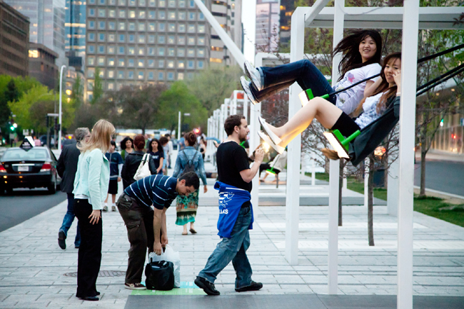
As they move back and forth, the swings emit different musical notes: nine play piano sounds, six sound like guitars, and six others mimic a vibraphone.23 The sounds are altered by movement, so as you swing higher the notes correspond with a higher pitch. Some sounds are only revealed when people swing together, creating a collaborative experience of discovery that can only be unlocked through interaction with others. If everyone is swinging independently, the sound can be dissonant, but by coordinating movements, participants can play the swings as one harmonious instrument. There’s even a special sound that is only revealed when all 21 swings are moving together.
Pierre Fortin, activity coordinator for the Quartier des Spectacles, affirms the value of play in urban reinvention, saying that it involves getting people to “meet, try things out, get surprised.”24 You can see those qualities in 21 Swings, as “you watch people on the swings, and they all have a big smile on their face.”25 A user experience can be playful through small microinteractions, but projects like 21 Swings use a playful approach to engage a higher order of design—facilitating interaction between people.
Designers can choose to make functional and usable choices that get out of a user’s way through conventional and expected design solutions. In many situations, this kind of invisible conformity is appropriate and clearly has value in smoothing the edges of an experience. However, to allow for the possibility of really delighting someone, designers should also explore the playful path of unexpected solutions. Unusual scale, ironic combinations, camouflaged identity, and surprising collaboration are only some of the ways to rethink the ordinary. The resulting design may be unexpected, but you can plan on a user’s increased enjoyment.
Elevate Everyday Actions
For many people, large portions of their days are filled with routine activities, such as commuting to work, preparing dinner, exercising, or cleaning the house. These habitual actions blend into the background of our lives, neither memorable nor something we look forward to. Products to support our everyday activities are often designed around efficiency and marketed on their ability to accomplish something faster or cheaper. What if instead products were designed to elevate these everyday moments? Bringing a playful approach to quotidian objects and situations can add excitement to mundane activities, turning common tasks into performances and breaking us out of our forgettable routines.
The Japanese designer Naoto Fukasawa regularly works at the intersection of everyday actions and playful design. His versions of common objects are able to break free from conventional approaches because his inspiration comes not from studying existing products, but from observing existing behavior. His process is to look for actions that people do without thinking, “to examine our subconscious behavior and design for that.”26 Because of this focus on behavior, Fukasawa situates his work within the broad definition of interaction design. Although his analog interactions are simpler than the computational possibilities that many interaction designers address, his focus on observing, supporting, and enhancing people’s behavior should be an inspiration to anyone designing for good user experiences.
For the Takeo Paper Show in 2000, Fukasawa redesigned a tea bag to invoke the shape of a marionette, turning the simple act of making tea into a performance (see Figure 1-10). The tea bag is a silhouette of a tiny person, with two strings attached instead of one, connected to a cross-shaped handle reminiscent of a marionette control. The concept for the redesign came from observing people dipping their tea bags in and out of a cup of hot water, which reminded him of a dancing marionette.
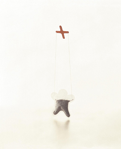
In using Fukasawa’s tea bag, a familiar and ritualized activity is unexpectedly recontextualized. When dipped, “the leaves swell to fill the bag, creating a deep-hued doll,”27 and people unexpectedly find themselves controlling a puppet. A previously forgettable and unconscious action is suddenly brought to the fore, an overlooked moment transformed into a playful one. Of course, the difference is also noticeable to those around the tea drinker, providing amusement and surprise to others who would have simply overlooked a traditional tea steeping process.
The Salt and Pepper Maracas shown in Figure 1-11 are another project where Fukasawa recasts existing behavior as a playful act. Salt and pepper shakers are a common playground for designer creativity, with many clever variants exploiting the duality of black and white or the expressive possibilities of a paired set. There are shakers shaped like robots, batteries, telephone handsets, clouds, grenades, and ghosts.28 But as with the marionette tea bag, Naoto’s redesign is inspired more by behavior than form.
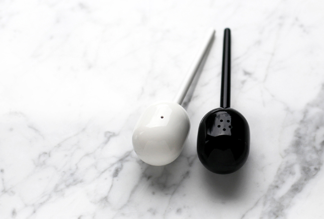
After observing people shaking salt and pepper onto their food, Fukasawa connected the action and sound to that of playing maracas, so he added a handle reminiscent of the musical instrument. The shakers are small in size, more similar to typical salt and pepper shakers than actual maracas. In this way, they invoke a different and playful context without impeding the primary activity or fostering self-consciousness. They introduce a moment of private performance into a meal, along with a smile before the next bite.
Of course, our days are also full of tasks less innocuous than salting our food or making a cup of tea. It is our chores that can perhaps benefit most from a playful elevation, the tasks that we need to do but would rather put off until tomorrow. Take, for example, cleaning the bathroom—what could be playful about that?
The prolific French designer Philippe Starck has designed everything from chairs to yachts, but has said that it took him “about two years to come up with the idea that would justify putting yet another toilet brush on the market.”29 That delay was not for lack of wanting, as Starck has claimed that it’s a product he’s hoped to design for 20 years, saying that “I’ve always thought it would be the apotheosis of my career.”30
His design is called the Excalibur Toilet Brush, named after King Arthur’s sword in an epic elevation of a lowly object (see Figure 1-12). The handle of the plastic brush invokes a fencing épée with its protective scabbard and rounded bristle brush at the end. The allusion to doing battle with a dirty toilet ends up being more literal than metaphorical, with the sheathing on the handle dutifully protecting a hand from the enemy’s splashback. The Excalibur forces the user to acknowledge they’ve been reluctantly jousting with the dirty bowl all along—so why not get into the fight?

The Excalibur comes in a variety of neutral colors, but not pure white. Starck explains that he wanted to make sure the product was visible in the bathroom, to be “present but remain discreet.”31 Normally there is little reason to showcase a toilet brush, but the Excalibur attracts attention, acknowledging the necessary dirty work but flipping that negative into a playful adventure.
Starck’s toilet brush and Fukasawa’s tea bag and shakers are all designed to elevate an everyday activity, but not change it. Fukasawa has a principle about “design dissolving in behavior,”32 where even a playful and performative product blends into the everyday. The act is made strange through metaphor but not behavior. An alternative approach is to change the very nature of a common activity, where people can play along using familiar actions but with completely different rules.
FigureRunning is a playful twist on everyday exercise. One of the most common uses for connected devices and sensors has been personal health. Dedicated devices like the Fitbit and Jawbone UP track movement throughout the day, and numerous smartphone apps can capture and share movement information. Nike+ and Runkeeper are two popular apps for runners, both of which record a runner’s route while keeping track of distance and calories burned. Many runners find this quantification of their exercise to be an important motivator and use it to track their progress or compete with friends.
The FigureRunning app and website take a different, more playful approach to running, focusing not on distance or speed but on “drawing” an image by plotting a run on a map (see Figure 1-13). Most running apps provide a visual record of a route, but with FigureRunning, the resulting image is the entire purpose. Users have been inspired to run routes in the shape of animals, faces, and words.33 During a run, the app allows users to change the color of their GPS trail, or “pencil,” which gives runners more creative control over how their route is rendered. A “multi-artist-run” feature allows multiple people to contribute to the same drawing, and FigureRunning has hosted challenges where runners try to find a route that matches a proposed shape.34
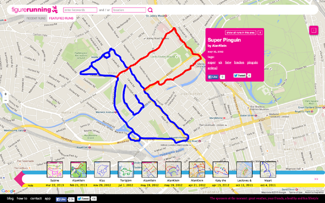
Optimizing a route for the perfect drawing may require runners to go well off the sidewalk, through parking lots, down alleys, and over fences. This playful reframing of why and how someone should run can lead people to explore their environment in new ways, and get more out of a run than just a good workout. It elevates an everyday activity in a hidden way, using what looks like normal exercise for purposes known only to the runner.
Precise sensors are increasingly being embedded into common objects, and smartphones provide a wealth of potential data. Designers can utilize this flow of data as a playful design material, treating everyday objects as individual actors on a larger stage. It’s already common to create chains of logical events, inferring intent for one action through another (such as turning off the “smart lights” if the “smart door” knows the house is empty). This is efficient, but not very fun. How might connected devices allow for new ways of elevating a daily ritual that brings a smile to the users and those around them? How might embedded computation let design dissolve more easily into behavior? How might we reframe existing activities as part of a playful system that helps users see their environment in a new way?
Offer an Emotional Boost
Designers are inherently optimistic, always seeing the potential for a better future through well-designed products and experiences. But not every day is wonderful, and sometimes people find themselves in drab, annoying, or scary situations. Design can’t always provide a functional solution, but like a friend offering a shoulder to cry on, products can support people emotionally. Playful designs can inject a bit of optimism, offering an emotional boost and pointing toward a better tomorrow.
Rainy days are inevitable, but the Sky Umbrella by graphic designer Tibor Kalman and Emanuela Frattini Magnusson tries to make them less of a drag (see Figure 1-14). The umbrella is undistinguished when collapsed, its black exterior and wooden handle blending in easily with others in an umbrella stand. But in a dreary downpour, opening the umbrella reveals a bright blue interior canopy dotted with fluffy white clouds. Users of the umbrella find themselves under their own private sky, a playful graphic treatment that may improve their mood, if not the actual weather.

Tibor Kalman often used humor and irony in his work, both for clients through his studio M&Co. and in his role as editor-in-chief at Colors magazine, which focused on multiculturalism and awareness of global issues. Even with serious topics, his approach was often playful, like when he sparked a conversation on race by Photoshopping Queen Elizabeth II to look like a black woman and Pope John Paul II to look Asian. Kalman tried to make people see the world in a different way and was fond of saying, “I’m always trying to turn things upside down and see if they look any better.”35 He meant that both conceptually and literally, and seems to be encouraging all of us to do the same with the optimistic underbelly of the Sky Umbrella.
Another playful take on bad weather is the smartphone app by the London design firm Nation, called simply Optimistic Weather (see Figure 1-15).36 The weather in the UK is notoriously bad, and the idea for the app emerged from a conversation about how poorly it’s predicted by many online services. Designer Tom Hartshorn wondered if it would be better to have a service that just purposefully “lied to you when the weather was going to be rubbish.”37
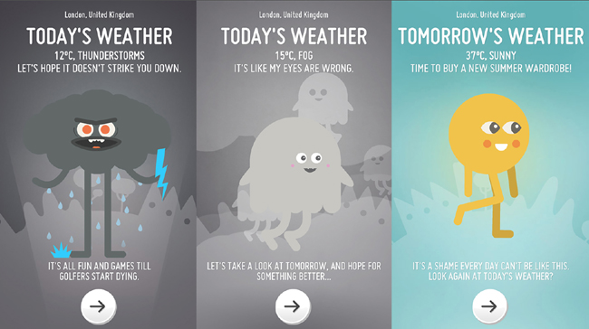
Upon opening the app, a cute cartoon character and witty copywriting accurately communicate the weather for the day, cheekily amping up the drama during rain or thunderstorms. But when the “tomorrow” button is pressed, the situation always improves, with plenty of sun and clear skies to look forward to. Even though the user knows it’s not reality, this playful lie can trigger a tiny bit of hope. After all, if the real forecast is wrong so often, won’t the fake one be right sometimes?
Lightening the mood on a dreary day is a welcome pick-me-up and gentle reminder not to take things too seriously. But some situations really are serious, and playful design has a role there too. For example, there’s nothing fun about an MRI scan, a stressful experience of sliding your body into a whirling, banging, 11-ton donut. When children need to be scanned, the fear and anxiety can be overwhelming, for both them and their parents. A successful MRI requires that a patient lie very still, so a squirming child will often need to endure repeated scans, or even be sedated, to acquire a clear image.
Doug Dietz had been designing MRI and CT machines at GE Healthcare for over 20 years before he tackled the challenge of making a better scanning experience for children.38 The size and noise inherent to MRI technology weren’t aspects he could change, so he offered emotional support by reframing the overall experience as a playful adventure. The GE Adventure Series transforms not just the MRI scanner, but the entire hospital room into a unique experience designed to reduce anxiety (see Figure 1-16).
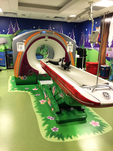
A variety of prototypes were created to integrate the scan into a broader playful narrative. In one version, the scanning bed looks like a canoe, and children are told to “hold still so that they don’t rock the boat.”39 Another transforms the machine into a spaceship zooming through the galaxy, with the noise of the machine signaling that the ship has entered “hypermode.”40 Still another appears to be a submarine, with a disco ball providing “underwater” light bubbles that dance around the room. The GE Adventure Series has worked, reducing the need for sedation and prompting at least one child to wonder if they could come back and do it again the next day.41
Whether a secret sky, a little white lie, or an immersive fantasy experience, these examples all use play to create an alternate reality. The boost they offer is a small escape, a playful engagement of the imagination to provide some temporary relief. Their willingness to use fiction is a welcome change from an increasingly quantified world, with constant data streams feeding us real-time facts. Ubiquitous access to information has had a positive effect on society, but can also be overwhelming. In a world full of connected devices, should designers always present reality, or a version of it? When is willful ignorance OK? How should we decide if information is important, or actionable? Is a strictly factual stance the right approach in an emotional context?
Creating an experience is inherently more involved than just displaying facts. Designers should have an emotional impact in mind, an experiential arc they are hoping to achieve. An experience has a beginning and key transition moments—opening the Sky Umbrella, tapping the “tomorrow” button, or lying down on the MRI scanner bed—and the narrative unfolds from there. Mark Twain famously said that we should “Never let the truth get in the way of a good story.” Some of the best narratives are fiction, and sometimes design is most appropriate and humane when it playfully hides the truth.
Encourage Behavior Change
Being playful can lighten the mood, make someone smile, and bring new life to everyday actions. But can it do more? In recent years, there has been interest in using playful approaches to change behavior, influencing people toward certain actions and away from others. In working toward this goal, playfulness is often conflated with “gamification,” an approach that uses common reward mechanisms from games such as points, levels, badges, and virtual currency to create motivation within non-game systems. These game mechanics have been applied toward a range of outcomes, including curbing addiction, encouraging exercise, and building healthy habits.
The results of gamification are often mixed. As seen in previous examples, playfulness is best achieved through a deep integration with functionality and activity, not layered on top of an otherwise fully separate system. The structures and incentives commonly used for gamification are often translated too literally from games, a transparent veneer of playfulness that users eventually grow tired of because it’s not an intrinsic motivator.
In his book Punished by Rewards, author Alfie Kohn demonstrates that manipulating people with external incentives often works only in the short term. Over time, people grow tired of artificial inducements and feel no sense of loss when they fall back into their old habits. Kohn notes that “rewards offer a ‘how’ answer to what is really a ‘why’ question.”42 Why would someone choose to change their behavior? Gamification often places the user inside of a system that pushes and pulls them toward particular actions. Kohn suggests that the way forward involves less manipulation and more respect, and thus providing people with as much control as possible.
Using playfulness to change behavior is in some ways a simpler notion than gamification. It relies on the idea that given the choice, people would rather do something fun and playful instead of neutral or ordinary. Playful designs are good for breaking people out of their everyday routines, which is the necessary condition for behavior change to occur. People cannot make decisions to change their behavior until they become aware of it. Instead of abstracting users’ actions into points or levels, playful designs can help them reflect on the behavior itself.
As part of a 2009 campaign for the German car manufacturer Volkswagen, the advertising agency DDB Stockholm introduced an initiative called “The Fun Theory,” with the goal of getting people to change their behavior.43 A series of experiments were launched that tried to make responsible behavior more fun, encouraging physical activity, safety, and environmental consciousness—all of which align with the Volkswagen brand. VW wasn’t trying to scientifically prove their theory, but the outcome was thought provoking and provides inspiring examples of how to intertwine playfulness with decision making.
The campaign solicited ideas from the public and was run as a contest, where the best ideas were chosen and then built. One of the experiments, called The World’s Deepest Bin, augmented a normal trash can with playful sound effects that made it seem as if the refuse had been thrown into a very deep and reverberating pit. Pedestrians tossing their trash were surprised by the unexpected sound, and often peered into the bin to see if it was really as deep as the audible feedback indicated. It wasn’t a long-term study, but people did throw nearly twice the amount of trash into that particular bin than into a “normal” bin nearby.44
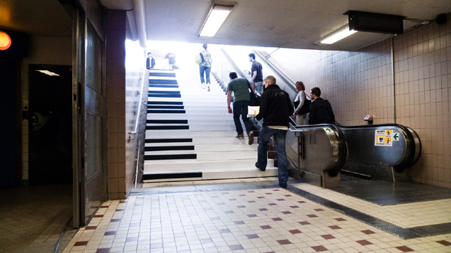
The Fun Theory experiment that offered the most direct choice between two behaviors was the Piano Staircase, which was designed to encourage people to walk up a flight of stairs instead of taking the adjacent escalator (see Figure 1-17). The experiment was installed in a Stockholm subway station, where the entire staircase leading above-ground was transformed into an oversized working piano. Each step was made to look like a piano key, and instrumented with sensors and speakers so that people’s weight triggered the appropriate note. The obvious visual transformation drew people in, and the delight at the sound of their steps kept them walking upward. The day it was installed, “66% more people than normal chose the stairs over the escalator.”45
Both The World’s Deepest Bin and the Piano Staircase used unexpected audio feedback to make an experience more playful and encourage a particular behavior. This technique has also been used on highways, where strips of uneven surface are purposefully cut into the road so that vehicles driving over them will “play” a song. These musical roads can be found in Denmark, Japan, South Korea, and the United States.
Some of the musical roads are designed to attract tourists, or keep drivers awake, but on Route 66 in Tijeras, New Mexico, a stretch of “singing road” is explicitly designed to encourage drivers to obey the speed limit. The vibrations from a series of rumble strips are recognizable as the song “America the Beautiful,” but only when travelling at 45 miles per hour (see Figure 1-18). New Mexico Department of Transportation Secretary Tom Church has said that “the goal of this experiment is to change driver behavior in a fun way.”46 The act of “playing” a highway with your vehicle doesn’t feel like a chore you’re being compensated for, but an unexpected possibility that’s worth the effort to achieve. This type of integrated playfulness is more naturally motivating than extrinsic rewards such as lower insurance premiums for driving at the speed limit.

A song in a road is a major undertaking, but small interventions can also have a big effect on behavior, particularly when they’re repeated and scaled at low cost. Take, for example, the tiny little fly that is etched onto urinals in the men’s bathrooms at Schiphol International Airport in Amsterdam. Cleaning a public restroom is a dirty job, and unfortunately men are not always very tidy. It turns out that this tiny black image of a housefly, placed just to the left of the urinal drain, creates a natural target that men take aim at without really thinking. After the fly was installed, spillage from the urinals went down by a whopping 80%. To the gratitude of restroom attendants everywhere, this tiny behavior-influencing fly can now be found in urinals all over the world.47
This kind of attraction to a particular behavior, without being instructed or forced, is what the behavioral economists Richard H. Thaler and Cass R. Sunstein refer to as a “nudge.”48 In their book by the same title, they talk about the concept of “choice architecture,” where designers can structure a system that nudges people to make better choices without forcing them down a particular path. Playful nudges aren’t explicitly addressed by Thaler and Sunstein, but a playful approach can be incorporated alongside any of their techniques to create an even stronger pull toward a new behavior.
A playful little nudge to drink more water was developed for the French company Vittel by the agency Ogilvy Paris in collaboration with Ova Design.49 The Vittel Refresh Cap looks like a normal twist-on water bottle top, but with a tiny timer built in. The timer is activated when the cap is screwed onto the bottle, and a little flag playfully pops up after an hour to remind the user to drink more water. Vittel has not yet released the cap commercially, but during a trial run in Paris, initial findings showed that “people drank more water during the day.”50
The Refresh Cap is a gentle nudge, waiting for you to notice that the flag has been raised instead of demanding immediate attention. It’s contextually placed directly on the bottle that contains more water, and it’s reactivated automatically when the user twists the cap back on. The raising of a tiny flag is a playful symbol that serves its purpose without being overly explicit or nagging.
Consider how different this reminder to drink water would be if it happened on a smartphone. After all, many people assume that for any problem, there’s an “app for that.” An app could offer an alarm to remind someone to drink more water, but all of the seamless integration into the experience itself would be lost. Reducing effort and friction is an important part of encouraging behavior change. If the behavior you’re designing for happens in the physical world, then it’s important to integrate the nudge with a physical interaction.
Of course, the flipside is that digital interactions need digital nudges. For example, PNC Bank worked with IDEO to design their Virtual Wallet bank account, which makes it easier to manage and save your money. A single Money Bar visualizes all of the user’s accounts in one graphic, and scheduled bills are plotted on a calendar to point out potential Danger Days where they might fall short and go overdrawn. Along with avoiding fees, the account has tools to help people save money, including a playful feature called Punch the Pig.
Punch the Pig references the traditional “piggy bank” coin holders that children use to save money. In Virtual Wallet, the feature takes the form of a small pig graphic that appears at the top of the screen, either according to a set schedule or at random “surprise” moments. When the pig is visible, clicking on it will transfer a set amount of money from the user’s checking account into savings. The idea is to make saving money as spontaneous as spending it. People regularly make impulse purchases, but Punch the Pig provides an opportunity for impulse saving.51
Users can customize the feature to allow for spontaneity while still being in control. The amount of money transferred with each click is configurable, and users can change the pig’s graphic overlay as well as the sound it makes when “punched.”
Online banking is not an environment where one would expect to find a playful interaction, but perhaps that’s why Punch the Pig has been so well received. In traditional bank accounts, users can always transfer money into savings, but the playful pig makes that tedious act a little bit of fun, nudging people toward a behavior they want but may have trouble following through on.
In all of these examples, the playfulness is an integrated part of the design, not an add-on feature like a leaderboard, points, or levels. We’ve seen the techniques before, including amusement, unexpectedness, and drama, but the difference here is in intention. The goal is not only to invoke a smile but to influence people toward a particular behavior. In this aim, designers must avoid pushing too hard in any one direction, always leaving users in control to make their own decisions. Given two choices, though, they will likely pick the playful one.
Path to the Playground
Designers have a responsibility to create useful and usable designs, those that do their job well without frustrating users. But that goal should only be a baseline, the foundation of a desirable, empathic, and enjoyable experience. Playfulness is one way to elevate a design, going beyond functionality to create an emotional connection with people.
In this chapter, we’ve looked at ways that playfulness can be valuable, with examples spanning various mediums, environments, and use cases. Common among them is how playfulness is uniquely intertwined with a design, not a general-purpose add-on or generically repeatable design pattern. Because of this, the choice to use a playful approach must be decided early on in a project by looking at what’s appropriate for the context. Is this an occasion in which humor or lightheartedness would be welcome? Would playfulness help support a user emotionally?
One challenge for designers is that playfulness will not emerge from any particular process. It takes creative exploration, trial and error, and iterative evaluation to see if playfulness is suitably integrated with and befitting to the functionality of your design. This may require a change in your process, and definitely requires strong integration between research, concept, structure, and detailed design. A playful product will not emerge from a committee or A/B testing. Its essence can be lost in translation between wireframes and visual design. If you think a playful approach is warranted, then your role as a designer is to champion and shepherd the concept from beginning to end.
If you need to convince your team and organization to head in this direction, remember to focus on why playfulness is valuable. It may not be thought of as part of the traditional human-centered design process, but nothing could be more human than designing to support emotional well-being alongside functional needs. Play is not only for children. We could all use a bit more levity in our lives.
1“Interview with Alessio Alessi. 2011 Design Miami,” Design Applause, December 14, 2011, accessed March 12, 2015, http://bit.ly/1OGzDb1.
2“Metaprojects,” Laura Polinoro, accessed March 12, 2015, http://bit.ly/1OGzHrt.
3“Alessi Explores the Potential of Chinese Product Design,” The Editor at Large, September 20, 2011, accessed March 12, 2015, http://bit.ly/1OGzILS.
4“F.F.F.,” Ambiente, December 13, 2008, accessed March 12, 2015, http://bit.ly/1OGzNPL.
5Diabolix, “Bottle Opener,” Alessi, accessed March 12, 2015, http://bit.ly/1OGzOTC.
6HK DC, “[BODW 2013 | Plenary Session] Stefano Giovannoni,” YouTube, March 12, 2014, accessed March 12, 2015, https://www.youtube.com/watch?v=0H7xcYPbBps.
7italiagrandtour’s channel, “Stefano Giovannoni – Part 3/8,” YouTube, August 18, 2011, accessed March 12, 2015, https://www.youtube.com/watch?v=OYir9Dpcip4.
8Ibid.
9“Stefano Giovannoni,” Alessi, accessed March 12, 2015, http://bit.ly/1OvtFve.
10Rebecca Rosen, “Pareidolia: A Bizarre Bug of the Human Mind Emerges in Computers,” The Atlantic, August 7, 2012, accessed March 12, 2015, http://theatln.tc/1OGA2tY.
11Dozi, “Magnetic Paper Clip Holder,” Alessi, accessed March 12, 2015, http://bit.ly/1OGA6Kr.
12“Domo,” Know Your Meme, accessed March 12, 2015, http://bit.ly/1OGA994.
13“About Anglepoise,” accessed March 12, 2015, https://www.anglepoise.com/about.
14Toby Walne, “Return to the Spotlight for Classic Anglepoise Lamp,” This Is Money, April 18, 2009, accessed March 12, 2015, http://bit.ly/1OGAtVf.
15“Louis Ghost,” Kartell Los Angeles, accessed March 12, 2015, http://bit.ly/1OGAvfV.
16Caroline Stanley, “What’s Behind the Louis Ghost Chair Lust?” Flavorwire, November 25, 2008, accessed March 12, 2015, http://bit.ly/1OGAys2.
17Alice Rawsthorn, “And Now, to Try and Catch the Wind,” The New York Times, August 6, 2008, accessed March 12, 2015, http://nyti.ms/1OGABUO.
18“Louis Ghost Chair,” Design Within Reach, accessed March 12, 2015, http://www.dwr.com/product/louis-ghost-armchair.do.
19“Bath Radio,” Industrial Facility, accessed March 12, 2015, http://bit.ly/1OGAHvr.
20Ibid.
21“About,” Daily Tous Les Jours, accessed March 12, 2015, http://bit.ly/1OGAKHP.
22“21 Balançoires,” Daily Tous Les Jours, accessed March 12, 2015, http://bit.ly/1OGAQ2f.
23Jeff Heinrich, “21-Swing Orchestra Strikes a Chord with Users in Quartier Des Spectacles,” Montreal Gazette, May 11, 2011.
24Ibid.
25Ibid.
26Kenya Hara, Designing Design (Baden, Switzerland: Lars Muüller Publishers, 2007), 44.
27Ibid, 47.
28“Brothers in Arms…I Mean…in Kitchen!”, Architecture of Life, accessed March 12, 2015, http://www.architectureoflife.net/en/brothers-in-arms-i-mean-in-kitchen/.
29Suzanne Slesin, “The Once and Future Brush,” The New York Times, February 15, 1995, accessed March 12, 2015, http://nyti.ms/1OGBpJi.
30Ibid.
31Ibid.
32Brian Ling, “Naoto Fukasawa: Without a Thought,” Design Sojourn, May 23, 2008, accessed March 12, 2015, http://bit.ly/1OGByfH.
33“Featured Runs,” FigureRunning, accessed March 12, 2015, http://figurerunning.com.
34“FigureRunning explained by @peprosenfeld in the Grand Theatre at PICNIC11,” September 18, 2011, accessed March 12, 2015, https://vimeo.com/29227292.
35Luke Williams, Disrupt: Think the Unthinkable to Spark Transformation in Your Business (Upper Saddle River, NJ: FT Press, 2011), 29.
36“Optimistic Weather,” Google Play, accessed March 12, 2015, https://play.google.com/store/apps/details?id=air.com.nation.WeatherApp.
37John Pavlus, “‘Optimistic Weather’ App Tells Sweet Lies About the Forecast,” Co.Design, June 22, 2011, accessed March 12, 2015, http://bit.ly/1OGCsZJ.
38“Doug Dietz,” d.school, accessed March 12, 2015, http://stanford.io/1OGCCAq.
39“From Terrifying to Terrific: The Creative Journey of the Adventure Series,” GE Healthcare, September 20, 2012, accessed March 12, 2015, http://bit.ly/1OGCDEt.
40David Kelley, “The Story of Doug Dietz: Creative Confidence in the MRI Suite,” Open IDEO, October 3, 2013, accessed March 12, 2015, http://bit.ly/1OGCH73.
41Ibid.
42Alfie Kohn, Punished by Rewards: The Trouble with Gold Stars, Incentive Plans, A’s, Praise, and Other Bribes (Boston: Houghton Mifflin, 1993), 90.
43“Home page,” The Fun Theory, accessed March 12, 2015, http://www.thefuntheory.com.
44“The World’s Deepest Bin,” The Fun Theory, September 21, 2009, accessed March 12, 2015, http://www.thefuntheory.com/worlds-deepest-bin.
45“Piano Staircase,” The Fun Theory, September 22, 2009, accessed March 12, 2015, http://www.thefuntheory.com/piano-staircase.
46Dina Salem, “Route 66 Adds Singing Road as Speeding Deterrent,” ABC News, October 2, 2014, accessed March 12, 2015, http://abcn.ws/1OGD5m7.
47“The Amsterdam Urinals,” Nudge Blog, April 11, 2008, accessed March 12, 2015, https://nudges.wordpress.com/the-amsterdam-urinals/.
48Richard H. Thaler and Cass R. Sunstein, Nudge: Improving Decisions about Health, Wealth, and Happiness (New Haven, CT: Yale University Press, 2008).
49“Vittel Refresh Cap,” Fubiz, June 3, 2014, accessed March 12, 2015, http://bit.ly/1OGDjJP.
50Jonathan O’Callaghan, “Never Get Thirsty Again! Alarm inside Vittel Bottle Cap Reminds You to Drink Every Hour,” Daily Mail Online, May 29, 2014, accessed March 12, 2015, http://dailym.ai/1OGDkxm.
51“Virtual Wallet | Punch the Pig!” PNC, accessed March 12, 2015, http://pnc.co/1OGDnct.