Using design patterns to find greater meaning in your data
Visualizations that show comparisons, connections, and conclusions offer analytical clarity.
 Cockington Green Gardens Maze. (source: Michael on Flickr)
Design patterns are one of the best ways to solve commonly recurring problems. In design and engineering, a design pattern provides guidance for how to solve a problem with a repeatable solution—a template approach that can apply to different types of situations. Your data sets may evolve and your questions may become more specific, but you still need an approach to navigate and analyze your data. This is why core design patterns based on function can help you navigate your data in a more structured way.
Patterns based on function can help you see differences and similarities more clearly, understand relationships and behaviors more intimately, and predict future results with a greater level of certainty. When these patterns are presented as visualizations, they help you 1) see comparisons, 2) make connections, and 3) draw conclusions from your data sets.

Learn faster. Dig deeper. See farther.
These three major functions to data visualizations are based on our own findings of analyzing charts for their functional purpose. There are, of course, more detailed secondary functions that charts can serve, but ultimately, the major functions can be described as:
- Comparisons: Visuals based on comparisons can help reveal differences and similarities. An example is visuals that show rank order or how events unfold over a specified period of time.
- Connections: Linked and related data produce visualizations that reveal themes or associations within the data set. Examples of establishing connections in your data include categorizing data into logical groups.
- Conclusions: Visualizations can organize your data to provide answers to questions or, more directly, present an outcome. For example, what-if scenarios can illustrate the results of a decision.
To ground these design patterns, let’s review a scenario that links these three major patterns to a plausible series of questions. The following scenario presents one hypothetical data set and sample data visualizations from each of the major design patterns: comparisons, connections, and conclusions. Consider the process of evaluating a range of investment options. First, you might review how the investment options have performed. Deep comparisons show you not just the returns, but also the sequential path that has created those returns. You might ask: Which fund(s) has provided the best returns? And how do those returns compare to the benchmark?
Showing comparisons: Fund & Benchmark Performance
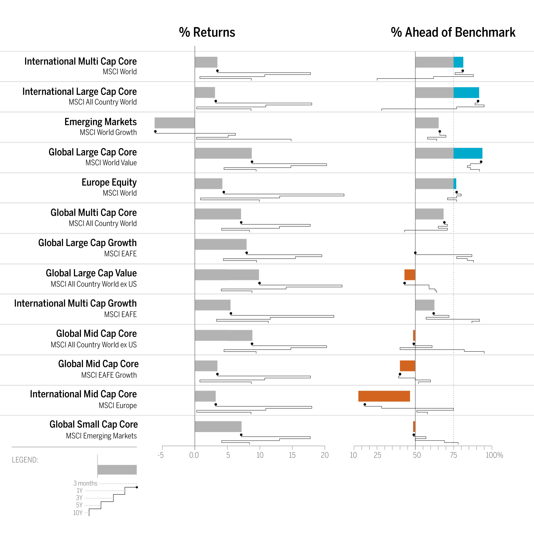
As shown in Figure 1, the bar chart with sparkline enables you to review the data at two different levels: a high-level assessment of the short-term three-month returns is represented with the bar chart, while the sparkline (the line chart below the bar) provides the details of the historical returns. Quickly and concisely, the sparkline shows you the path that has led up to the most recent returns. You can then assess that a narrow path provides consistent returns across the years while a wide path provides varied returns. Side-by-side comparisons of funds organized into two columns—% Returns and % Ahead of Benchmark—enables peer comparisons and fund-specific benchmark comparisons. Hence, you can see that not only has Global Large Cap Core provided positive returns, it has also provided the best and most consistent returns when compared to the benchmark.
Next, you might ask about how the returns relate to overall category performance. This is a time to step back and gain a higher level of context to the returns.
Making connections: Category Performance
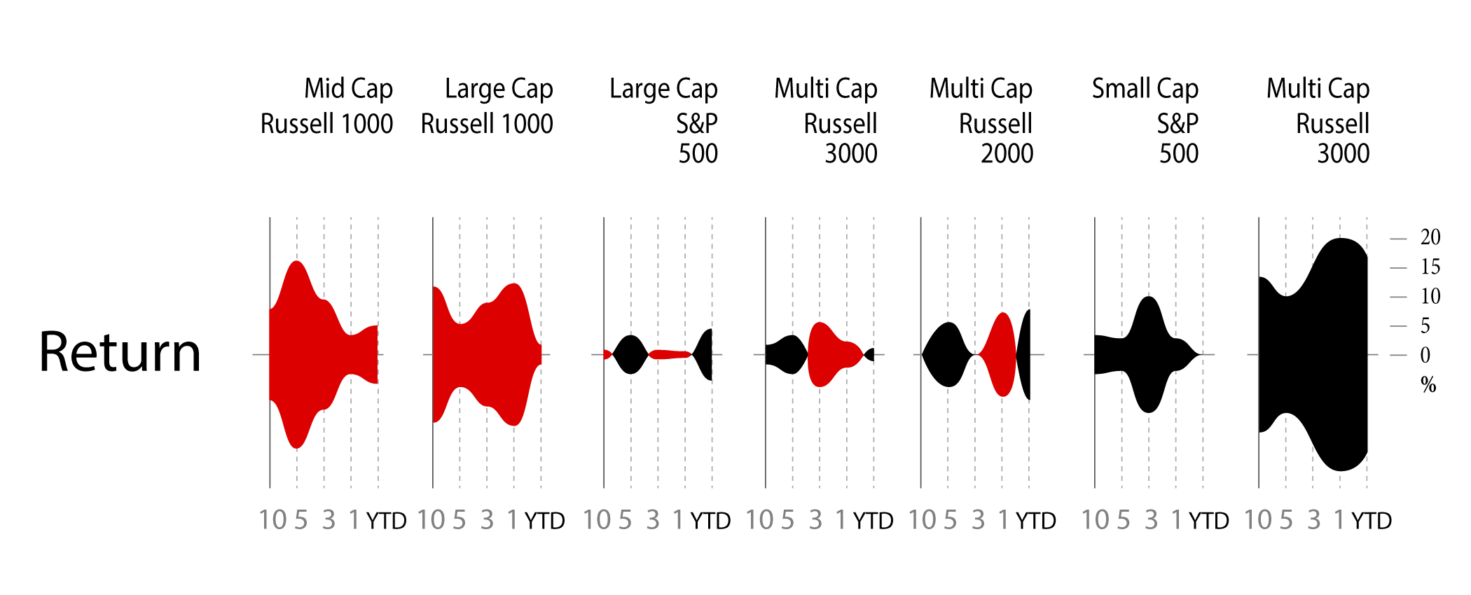
The string of charts in Figure 2 shows 10-year to year-to-date (YTD) performance returns, which can be interpreted as individual charts or a group of category charts.
Similar to sounds waves, the symmetrical area charts grow equidistant from the source (the zero line) at each time interval to accentuate the returns even further. Here, the y-axis is shown in percentage. Instead of using the zero line to indicate positive or negative returns, it uses color to denote if the category returns are positive (black) or negative (red). For example, Multi Cap Russell 3000 Growth produced 20% positive returns within the one-year time period and is shown with color fill in both directions from the zero line to purposefully duplicate the large gains and specifically uses black color fill to indicate the returns are positive. As evident from the name, the symmetrical chart doubles the returns to emphasize the amount with color fill.
What else can you derive from organizing the information in a spectrum of negative to positive returns? Based on this organization, three groups of categories have resulted in straight losses (red), heavy gains (black), or a mix of gains and losses across a decade of returns. The string of charts makes it easier for you to see these three groups of categories to assess their distribution. Just like sound waves, each chart is a sound bite that streams the returns for each category with a “scream” announcing a huge gain (e.g., Multi-Cap Russel 3000 Growth) or loss (e.g., Mid Cap Russel Mid Cap Growth). In some cases (e.g., Large Cap S&P 500), the chart quietly announces mixed returns to adequately demand less attention.
Next, you might wonder how you would have fared if you had invested in certain funds. You might ask: if I had purchased this fund five years ago, what would my return be? And what about the YTD returns? Since market timing is key to investment choices, the following presentation of hypothetical investments represents a range of results.
Drawing conclusions: Fund Performance

In Figure 3, varied performance results become clear with a layered approach to show five potential entry points (10-year, 5-year, 3-year, 1-year, YTD) into an investment. For example, the International Large Cap Core fund provided 27% YTD returns, which contrast the negative returns you would have received had you invested in the fund 1, 5, or 10 years ago. Here, conclusions are derived based on known inputs with a divided review of positive or negative outcomes (shown on the y-axis).
The line weights help to identify each entry point and show the range of differences between the entry points. Accordingly so, resulting returns are shown with simplified curves that connect the inputs and outputs. In this case, the chart has been customized to show an instance in which the user has opted to see the YTD return values as percentages listed to the right of each resulting output.
Combining and altering design patterns to yield simple, effective visuals
The sample visualizations shown above combine common design patterns, like the bar and sparkline (as seen in Figure 1), and alter the traditional line and area charts to simplify the visual and effectively highlight the main points. Doubling the area chart (as seen in Figure 2) emphasizes the returns and clearly distinguishes the groups of category charts. Curved lines (as seen in Figure 3) link two points—the entry point and the performance result—to present final outcomes.
Although the line and area charts are commonly used and familiar to most people, these alterations require some additional effort to fully decode the meaning. Once explained, you can apply the pattern of use to more of the same charts. And while the Symmetrical Area Profiles and Curved Line Paths are new visualization patterns, increased adoption will make these two new patterns more familiar, common, and quickly interpreted.
Selecting visualizations based on functional purpose
First and foremost, think of visualizations as functional design patterns that can be reapplied to your own data sets and specific situations. As mentioned above, a design pattern provides a template approach that can apply to different scenarios. The key to applying the best-matched template is to consider the functional aspects of the data visualization. To start on this path, navigate your data with visual inquiries that help you see comparisons, make connections, and draw conclusions from your data sets. This framework of navigating your data can help you set up interesting visuals that connect you even closer to your data.
In most cases, a deeper understanding of your data will require further investigation with multiple visualizations that can aggregate, filter, and drill down into details of your data. But at the very least, the visualizations shown above provide you with a few example starting points that can lead you to ask more pointed questions, explore the data further, and ultimately follow a path to gain more valuable insights.