2015 Data Science Salary Survey
Tools, trends, what pays (and what doesn’t) for data professionals.
 Engraving of the reading room at the British Museum
Executive Summary
Now in its third edition, the 2015 version of the Data Science Salary Survey explores patterns in tools, tasks, and compensation through the lens of clustering and linear models. The research is based on data collected through an online 32-question survey, including demographic information, time spent on various data-related tasks, and the use/non-use of 116 software tools. Over 600 respondents from a variety of industries completed the survey, two-thirds of whom are based in the United States.
Key findings include:

Learn faster. Dig deeper. See farther.
- The same four tools—SQL, Excel, R, and Python—remain at the top for the third year in a row
- Spark (and Scala) use has grown tremendously from last year, and their users tend to earn more
- Using last year’s data for comparison, R is now used by more data professionals who otherwise tend to use commercial tools
- Inversely, R is no longer used as frequently by data practitioners who use other open source tools such as Python or Spark
- Salaries in the software industry are highest
- Even when all other variables are held equal, women are paid thousands less than their male counterparts
- Cloud computing (still) pays
- About 40% of variation in respondents’ salaries can be attributed to other pieces of data they provided
We invite you to not only read the report but participate: try plugging your own information into one of the linear models to predict your own salary. And, of course, the survey is open for the 2016 report. Spend just 5 to 10 minutes and take the anonymous salary survey here. Thank you!
Introduction
For the third year running, we at O’Reilly Media have collected survey data from data scientists, engineers, and others in the data space about their skills, tools, and salary. Some of the same patterns we saw last year are still present—newer, scalable open source tools in general correlate with higher salaries, Spark in particular continues to establish itself as a top tool. Much of this is apparent from other sources: large software companies that traditionally produced only proprietary software have begun to embrace open source; Spark courses, training programs, and conference talks have sprung up in great numbers. But who actually uses which tools (and are the old ones really disappearing)? Which tools do the highest earners use, and is it fair to attribute a particular variation in salary to using a certain tool? We hope that the findings in this iteration of the Data Science Salary Survey will go beyond what is already obvious to any data scientist or Strata attendee.
Preliminaries
This report is based on an online survey open from November 2014 to July 2015, publicized to the O’Reilly audience but open to anyone who had the link. Of the 820 respondents who answered at least one question, about a quarter dropped out before completing the survey and have been excluded from all segments of analysis except for those showing responses to single questions. We should be careful when making conclusions about survey data from a self-selecting sample—it is a major assumption to claim it is an unbiased representation of all data scientists and engineers—but with a little knowledge about our audience, the information in this report should be sufficiently qualified to be useful. As is clear from the survey results, the O’Reilly audience tends to use more newer, open source tools, and underrepresents non-tech industries such as insurance and energy. O’Reilly content—in books, online, and at conferences— is focused on technology, in particular new technology, so it makes sense that our audience would tend to be early adopters of some of the newer tools.
A final word on the self-selecting nature of the sample: differences between results in this survey and other surveys may simply arise from the samples’ idiosyncrasies and not from any meaningful difference. Findings from other salary survey reports—there have been a few recently in the data space—sometimes conflict directly with our findings, but this doesn’t necessarily imply that one set of findings are erroneous. Likewise, discrepancies between our own salary surveys don’t necessarily imply a trend. The methodology between this year’s survey and last year’s is close enough to allow us to make some conclusions based on year-to-year differences, but only when the numbers are very strong.
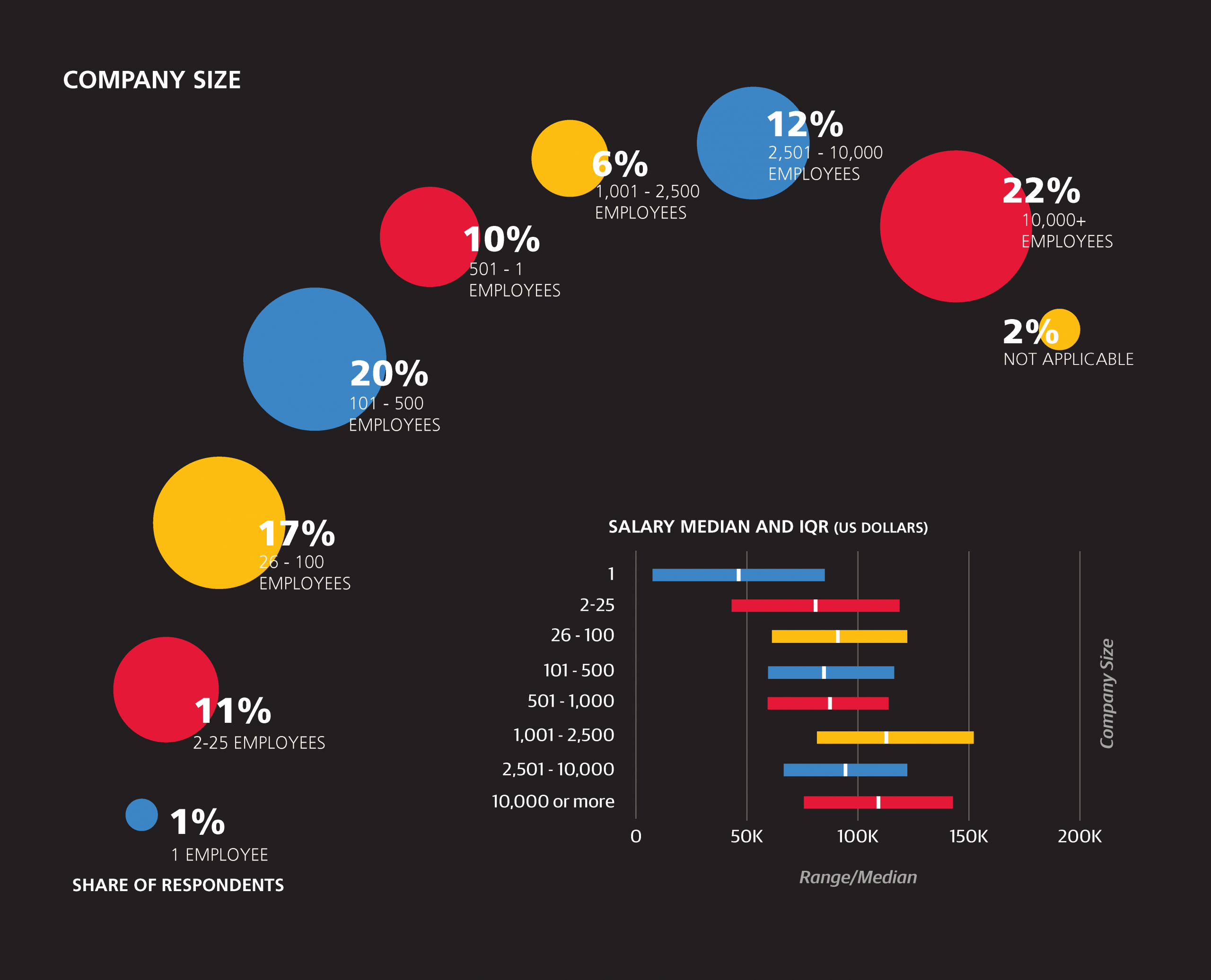
Introducing the Sample: Basic Demographics
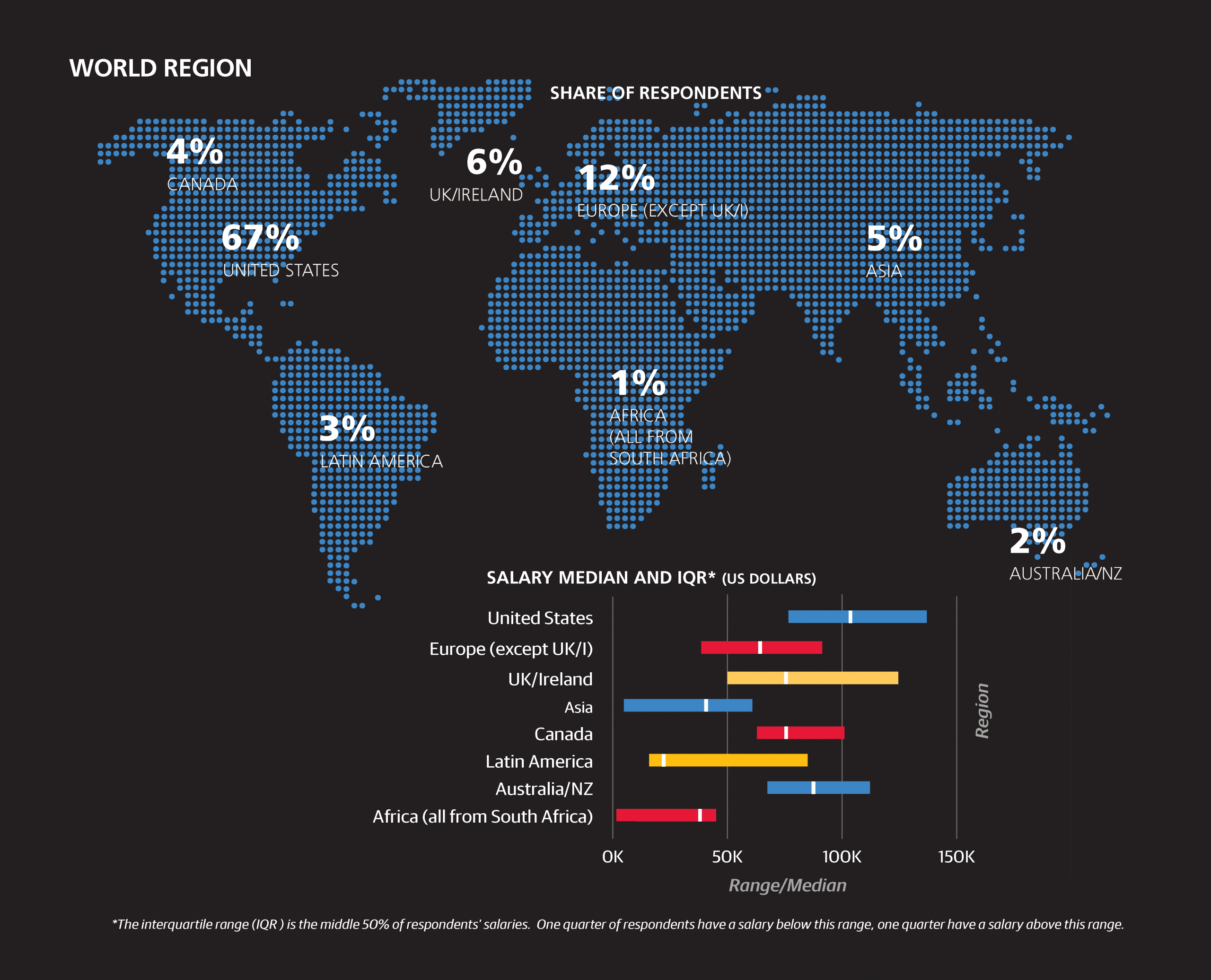
Before we discuss salary we should describe who exactly took the survey. Despite the fact that this is a “data science” survey, only one-quarter of the respondents have job titles that explicitly identify them as “data scientists.” Of course, it is debatable how much meaning can be assumed simply from a job title—more on that later—but it’s safe to say that the data science world is inhabited by people who call themselves something else: by job title, 14% of the sample are analysts, 10% are engineers (usually “data,” “software,” or “analytics” engineers), 6% are programmers/developers, 3% are architects (of various kinds), 4% are in the business intelligence sector, and 1% are statisticians. Management is also present in the sample: managers (9%) and directors (5%) are the most significant groups, with a handful of VPs, CxOs, and founders as well. The rest of the sample comprised mostly of students, postdocs, professors, and consultants. Judging by the tools used by the sample, the vast majority—even the managers—had some technical side to their role, regardless of job title.
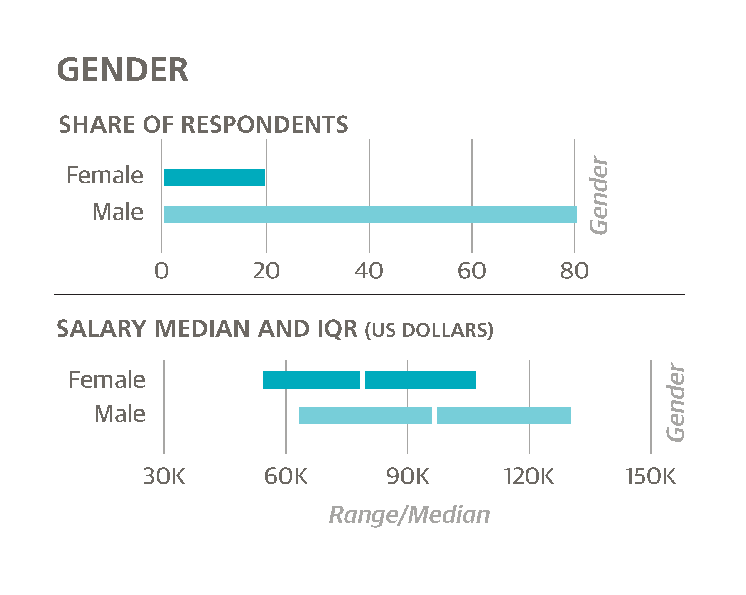
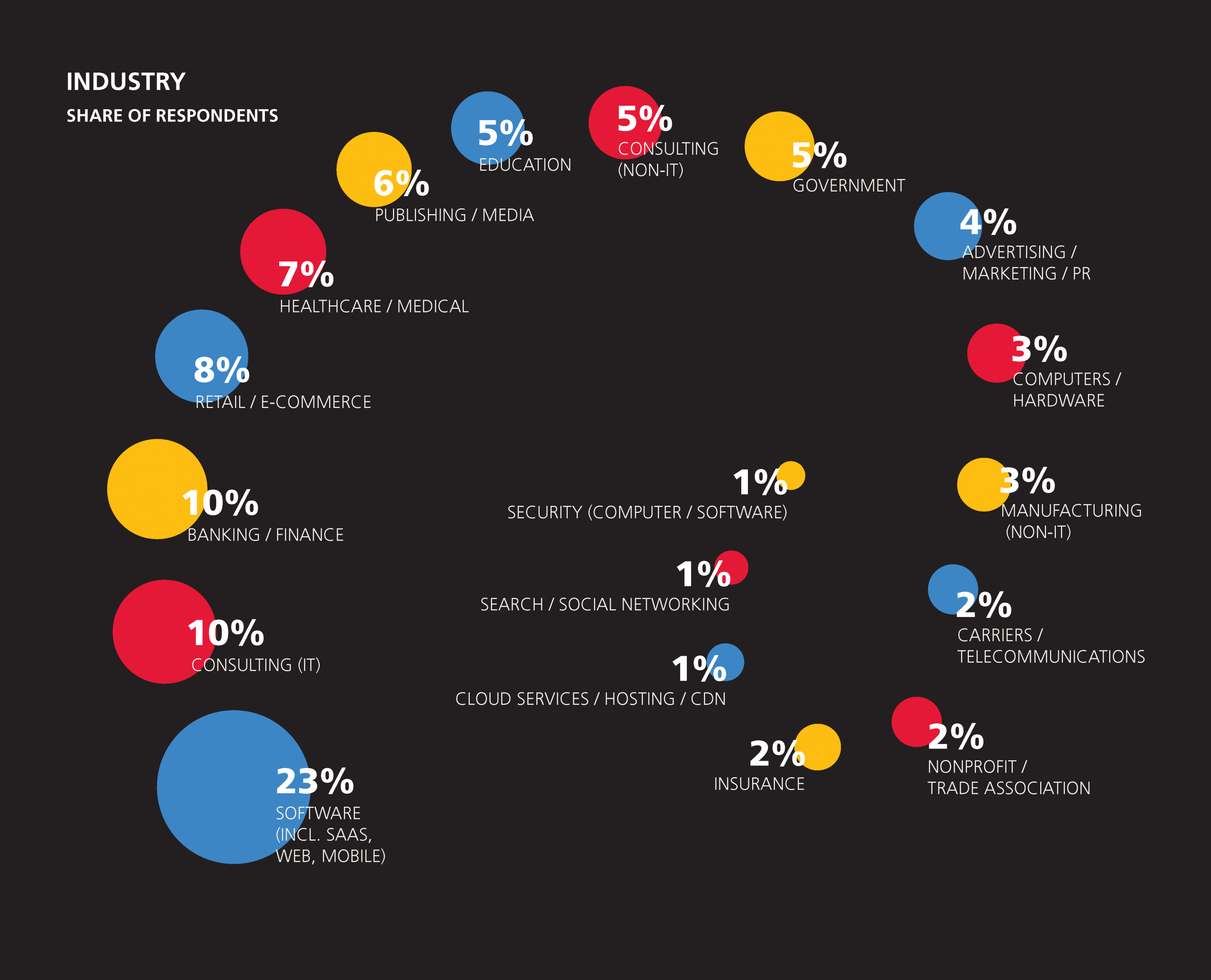
Beyond job title, the sample includes respondents from 47 countries and 38 states across multiple industries, including software, banking, retail, healthcare, publishing, and education. Two-thirds of the survey sample is based in the US, and compared to its share in population, California is disproportionately represented (22% of the US respondents, 15% of the total sample). The software industry’s 23% share is the largest among industries, and this excludes other “tech” industries such as IT consulting, computers/hardware, cloud services, search, and (computer) security; when considered in aggregate, these account for 40% of the sample. A third of the sample is from companies with over 2,500 employees, while 29% comes from companies with fewer than 100 employees. One-third of the sample is age 30 or younger, while less than 10% is older than 45.
In terms of education, 23% of the sample hold a doctorate degree, and 44% (not including the PhDs) hold a master’s. Many respondents reported to be a “student, full- or part-time, any level”: aside from the 3% who gave job titles indicating full-time study (usually at the graduate level), 15% of the sample—data scientists, analysts, and engineers—said they were students. Two-thirds of respondents had academic backgrounds in computer science, mathematics, statistics, or physics.

Salary: The Big Picture
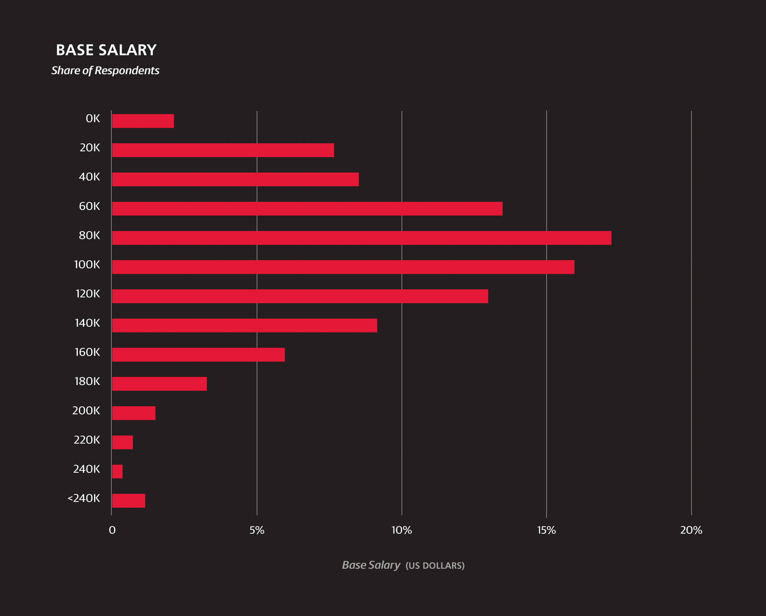
The median annual base salary of the survey sample is $91,000, and among US respondents is $104,000. These figures show no significant change from last year.1 The middle 50% of US respondents earn between $77,000 and $135,000. For understanding how salary varies over features we introduce a linear model; for now we only consider basic demographic variables, but later we will introduce others that describe respondents’ work and skills in more detail. While looking at median salaries for a particular slice of respondents gives a general idea of how much a certain demographic might influence salary, a linear model is a simple way of isolating and estimating the “effect” of a certain variable.2
Management
Because the directors, VPs and CxOs, and founders, in this order, come from companies of decreasing size, their actual hierarchal level is more or less even (and, it turns out, so are their salaries), and we group them together when constructing salary models. We call this group “upper management” to distinguish them from regular “managers” (who include project and product managers), although it should be remembered that few, if any, respondents come from large companies above the director level. For the basic model we will ignore job title distinctions except for the two management categories. That is, the first model treats data “scientists” and data “analysts” the same. However, we exclude those respondents who are students.3
A basic, parsimonious linear model
We created a basic, parsimonious linear model using the lasso with R2 of 0.382.4 Most features were excluded from the model as insignificant:
70577 intercept
 +1467 age (per year above 18; e.g., 28 is +14,670)
 –8026 gender=Female
 +6536 industry=Software (incl. security, cloud services)
–15196 industry=Education
 -3468 company size: <500
  +401 company size: 2500+
–15196 industry=Education
+32003 upper management (director, VP, CxO)
 +7427 PhD
+15608 California
+12089 Northeast US
  –924 Canada
–20989 Latin America
–23292 Europe (except UK/I)
–25517 Asia
Base pay
Starting at a base salary of $70,577, we add $1,467 for every year of age past 18 (so the base for a 48-year-old is $114,587). Salaries at larger companies tend to be higher—add another $401 if your company has more than 3,000 employees, but subtract $3,468 if it has fewer than 5005—and the software industry is the only one to have a significant positive coefficient. Education has a negative coefficient—presumably, these are largely respondents who work at a university. Those in upper management take home an average of $32,000 extra in their base salary.
Gender
Just as in the 2014 survey results, the model points to a huge discrepancy of earnings by gender, with women earning $8,026 less than men in the same locations at the same types of companies. Its magnitude is lower than last year’s coefficient of $13,000, although this may be attributed to the differences in the models (the lasso has a dampening effect on variables to prevent over-fitting), so it is hard to say whether this is any real improvement.
Geography
In terms of geography, the top-earning locations are California (+$16,000) and the Northeast (+$12,000; from NY/NJ into New England), while the rest of the country, as well as UK/Ireland and Australia/NZ, are estimated to be roughly equal. The rest of Europe, meanwhile, is much lower (–$23,000), not far off from Asia (–$26,000) and Latin America (also –$21,000). Making reliable distinctions in salary between countries, as opposed to the continental aggregates, is not possible due to the relatively small non-US sample.
Education
According to this model, a PhD is worth $7,500 (each year) to a data scientist. As for a master’s degree—its estimated contribution to salary was not significant enough for the algorithm to make it into this first model.


1Throughout the report we use base salary; in the past we have also reported total salary, but find total salary is error-prone in a self-reporting online survey. Salary information was entered to the nearest $5,000, but quantile values cited in this report include a modifier that estimates the error lost by using rounding.
2“Effect” is in quotations because without a controlled experiment we can’t assume causality: particular variables, within a margin of error, might be certain to correlate with salary, but this doesn’t mean they caused the salary to change, quite relevantly to this study, it doesn’t necessarily mean that if a variable’s value is changed someone’s salary would change (if only it were so simple!). However, depending on the variable, the degree of causality can be inferred to a greater or lesserextent. For example, with location there is a very clear and expectable variation in salary that largely reflects local economies and costs of living. If we include the variable “uses Mac OS,” we see a very high coefficient—people who use macs earn more—but it seems highly unlikely that this caused any change in salary. More likely, the companies that can afford to pay more can also afford to buy more-expensive machines for their employees.
3We should note that there are multiple variables corresponding to “student”. The group that are excluded from (all) of our salary models are the 3% that identify primarily as a student, that is, this is their job title. This group includes doctoral students and post-docs. These respondents, if they had any earnings at all, reported salaries of up to $50,000, but the nature of their employment seems so far removed—certainly in terms of how pay is determined—that it seems best to remove them from the model entirely. A second group of “students” are the ones who replied affirmatively that they are “currently a student (full- or part-time, any level)”, and was 17% of the sample: most of these “students” are also working at non-university jobs, and are kept in the model.
4The lasso model is a type of linear regression. The algorithm finds coefficients that minimize the sum squared error of the predicted variable plus the sum of absolute values of the estimated coefficients times a constant parameter. For our models, we used ten-fold cross validation to determine an optimal value of this parameter (as well as its standard deviation over the ten subsets), and then chose the parameter one-half standard error higher for a slightly more parsimonious model (choosing a full standard error higher, as is often practiced, consistently resulted in extremely parsimonious and rather weak models). The R2 values quoted are the average R2 of the ten test sets. Since the final model is trained on the full set, the actual R2 should be slightly higher.
5This should be qualified, however, that this is base salary: the earnings of startup employees include speculative amounts that could, on average, reverse this coefficient; as previously mentioned, since this is hard to measure we are sticking to base salary for the sake of even comparison.
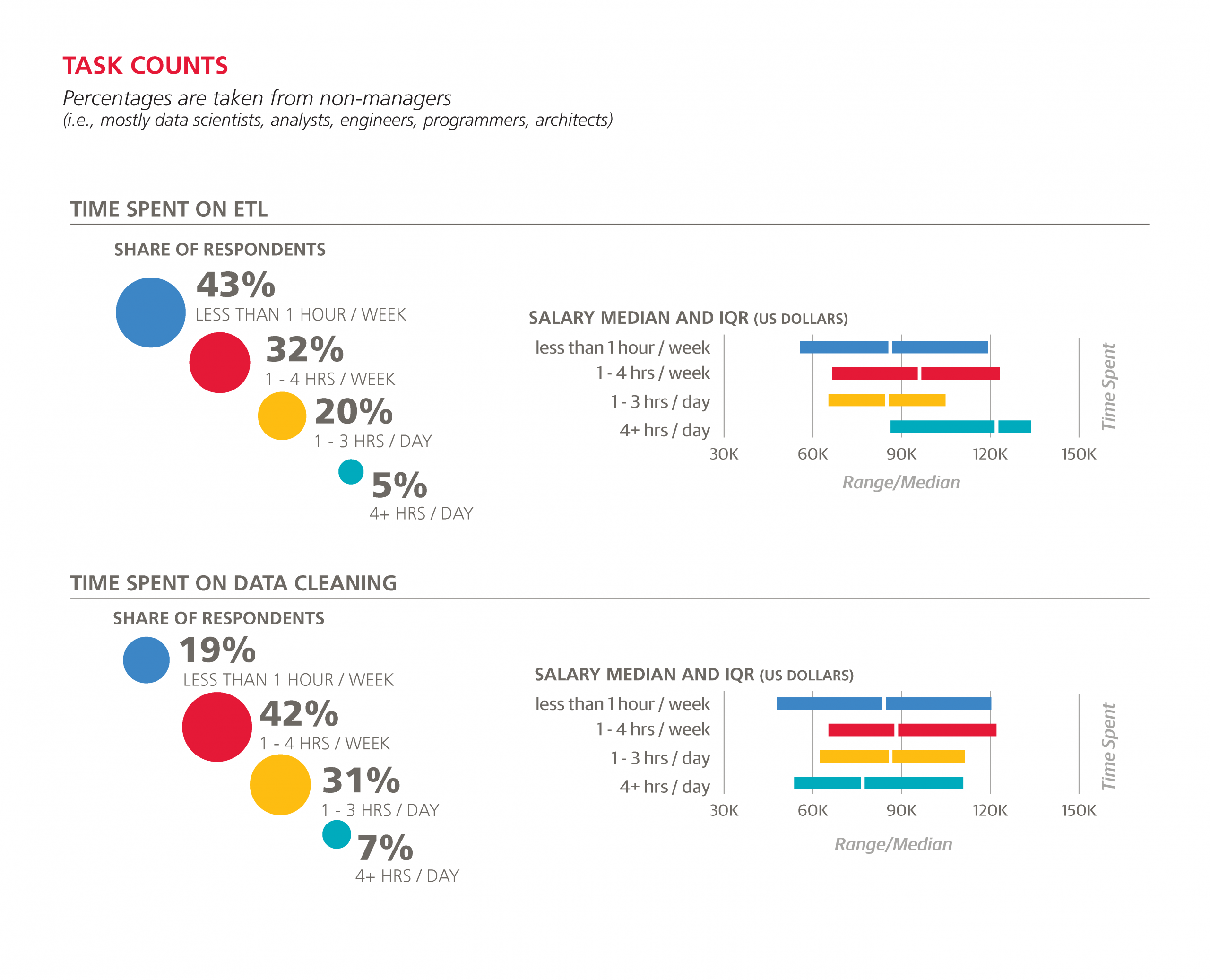
How You Spend Your Time
Another set of questions on the survey asked for the approximate amount of hours spent on certain tasks, such as data cleansing, ETL, and machine learning. For managers, directors, VPs, and executives (even at small companies), the task breakdown is very different, as we would expect: fewer technical tasks, more meetings. Removing their responses gives us a general idea of how people spend their time in the data space.
Even among non-managers, it appears that the more time spent in meetings, the more a data scientist (/analyst/engineer) earns. About half of the respondents report spending at least one hour per day on average in a meeting, with 12% spending at least four hours per day in meetings. This pattern is confirmed when we add the task features to the salary model.
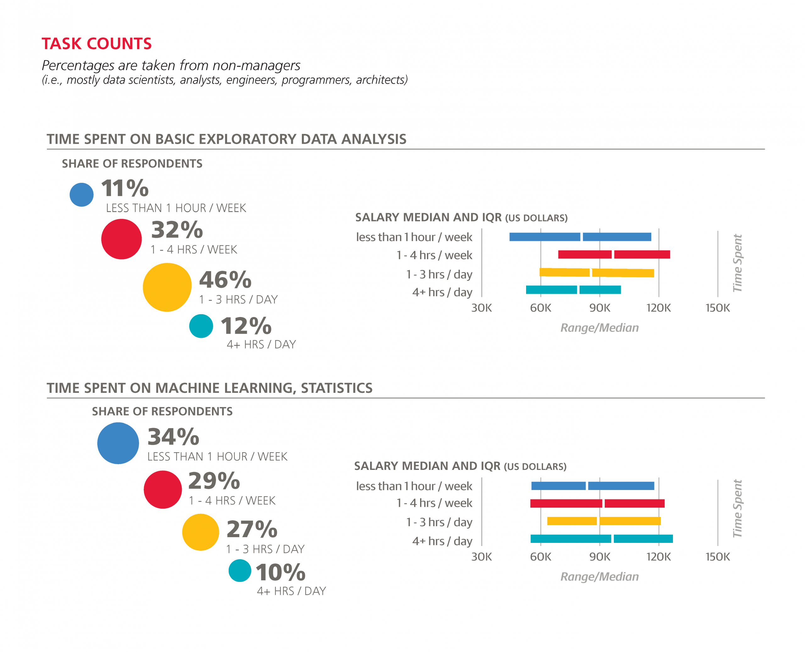
Among technical tasks, basic exploratory analysis occupies more time than any other, with 46% of the sample spending one to three hours per day on this task and 12% spending four hours or more. After this, data cleaning eats up the most hours: 39% spend at least one hour per day cleaning data.
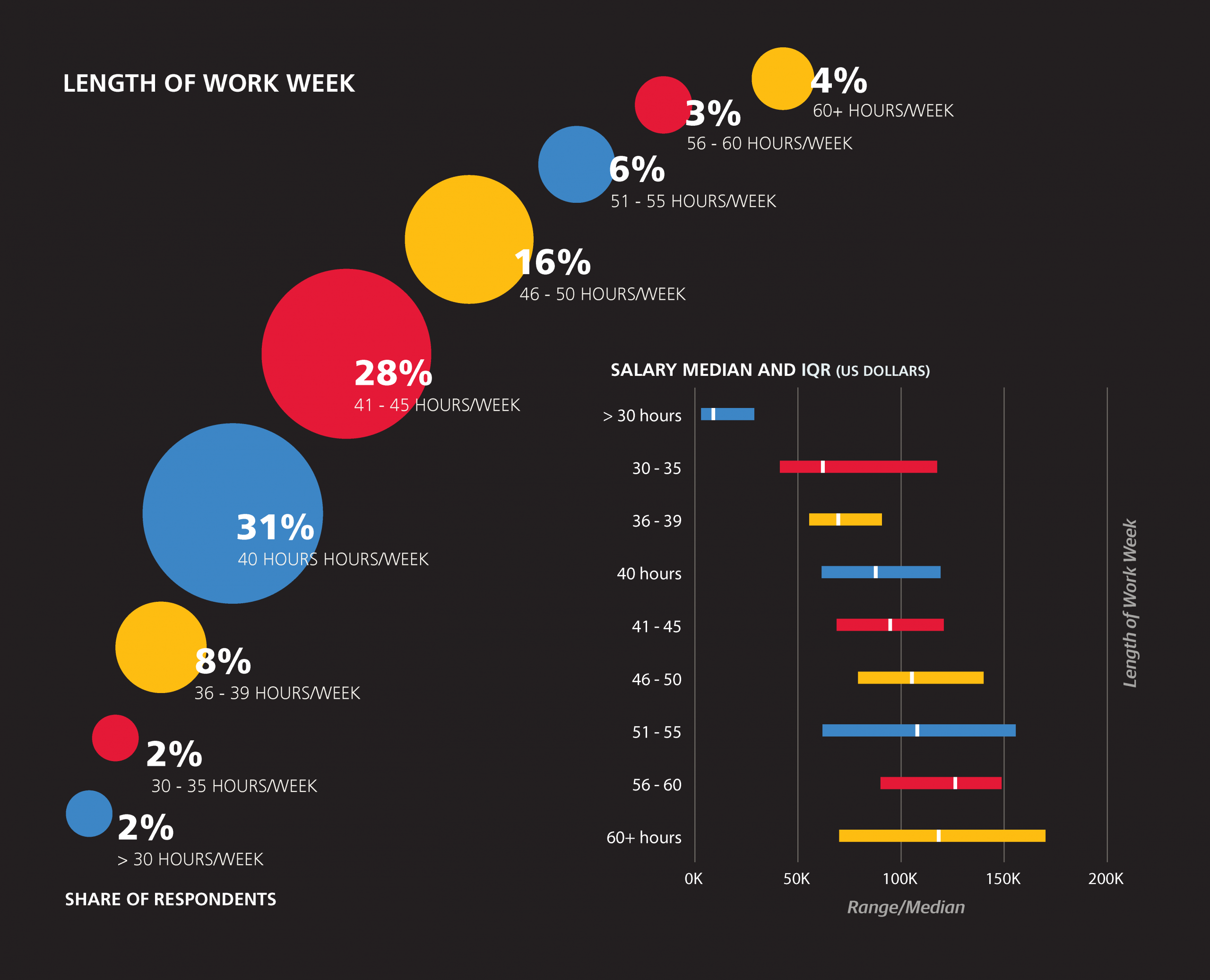
To put these hour figures into context, it may help to know the length of the entire work week. Most (75%) of respondents work between 40 and 50 hours per week, with the remaining 25% split evenly between those who work fewer than 40 and more that 50 hours per week. Working longer hours does, in fact, correspond to higher salary.
A final variable will be introduced for the second salary model: bargaining skills. While not exactly an objective rubric, the one-to-five scale (“poor” to “excellent”) is a simple way of estimating an incontrovertibly valuable skill. The distribution of answers was symmetric, with 40% choosing the middling “3” and 8% each choosing the extreme values of “1” and “5.”


A Revised Model, Including Tasks
With the new features on top of the ones used previously, we create a new model. This time, however, we restrict the pool of respondents further: not only do we take out (full-time) students, but professors, managers, and upper management as well. This second model has an R2 of 0.408:
14595 intercept
+1449 age (per year of age above 18)
+7205 bargaining skills (times 1 for “poor” skills to 5 for “excellent” skills)
+663 work_week (times # hours in week, e.g., 40 hours = $26,520)
-4207 gender=Female
+6593 industry=Software (incl. security, cloud services)
-7696 industry=Education
+1787 company size: 2500+
+13429 PhD
+3496 master’s degree (but no PhD)
+2991 academic specialty in computer science
+17264 California
+9511 Northeast US
+1752 Southern US
-1623 Canada
-3073 UK/Ireland
-20139 Europe (except UK/I)
-24026 Latin America
-27823 Asia
+9416 Meetings: 1 - 3 hours / day
+11282 Meetings: 4+ hours / day
+4652 Basic exploratory data analysis: 1 - 4 hours / week
-6609 Basic exploratory data analysis: 4+ hours / day
-1273 Creating visualizations: 1 - 3 hours / day
-2241 Creating visualizations: 4+ hours / day
+130 Data cleaning: 1 - 4 hours / week
+1733 Machine learning, statistics: 1 - 3 hours / day
Geography
As we reduce the sample under consideration and add new features, some of the old features change or even drop out, as is the case with “company size < 500”. Changes are apparent in the geographic variables: the penalty for Europe is reduced, coefficients for UK/ Ireland and the Southern US appear, and the California boost grows even more, to $17,000.
The intercept has been transformed to $14,595, but this is because we now add $663 per hour in our work week and $7,205 per bargaining skill “point” (1 to 5). So with a 40- hour work week and middling bargaining skills (i.e., a “3”), a 38-year-old man from the US Midwest would begin the calculation of base salary at $91,710.
Education
Other changes include a reduction in the “Education” penalty, presumably because we no longer include professors, and a significant boost in the value of a PhD to $13,429. Readers holding a master’s degree should be relieved to learn that, unlike the first, basic model, the second one does not ignore their degree and places a respectable value on it of $3,496. Computer science (as an academic specialty) appears as a feature in this model with a coefficient of $2,991.
Gender
The coefficient for women has decreased in magnitude, although this is largely because of the correlation between gender and certain features that heavily influence salary, and does not really constitute an “improvement” on the picture painted by the first model. For example, 37% of women reported below-average bargaining skills (a score of 1 or 2), while the corresponding figure for men was only 25%.
Time spent on tasks
The estimated effect on salary of various tasks in various time quantities was slightly different than what might be expected by looking at the median salaries of those respondents who spent a certain amount of time on the tasks. For example, the median salary of respondents who spend at least four hours per day on ETL was an impressive $123,000, but no variable for ETL proved significant in the model.
As mentioned above, more meeting time emphatically correlates with higher salary, even among non-managers. According to the model, spending over four hours per day on any one technical task never increases expected salary. In the case of basic exploratory analysis and creating visualizations, spending half of each day on these tasks decreases expected salary by $6,609 and $2,241, respectively. Interestingly, spending one to fourhours per week on basic exploratory analysis is the sweet spot for this task, boosting expected salary by $4,652.
Machine learning/statistics appears to be the only technical task for which a commitment of greater than one hour per day is rewarded in the model (not penalized or ignored): spending one to three hours per day on machine learning raises expected salary by $1,733.
Tools versus Tools
Let’s Take a Break from the Money
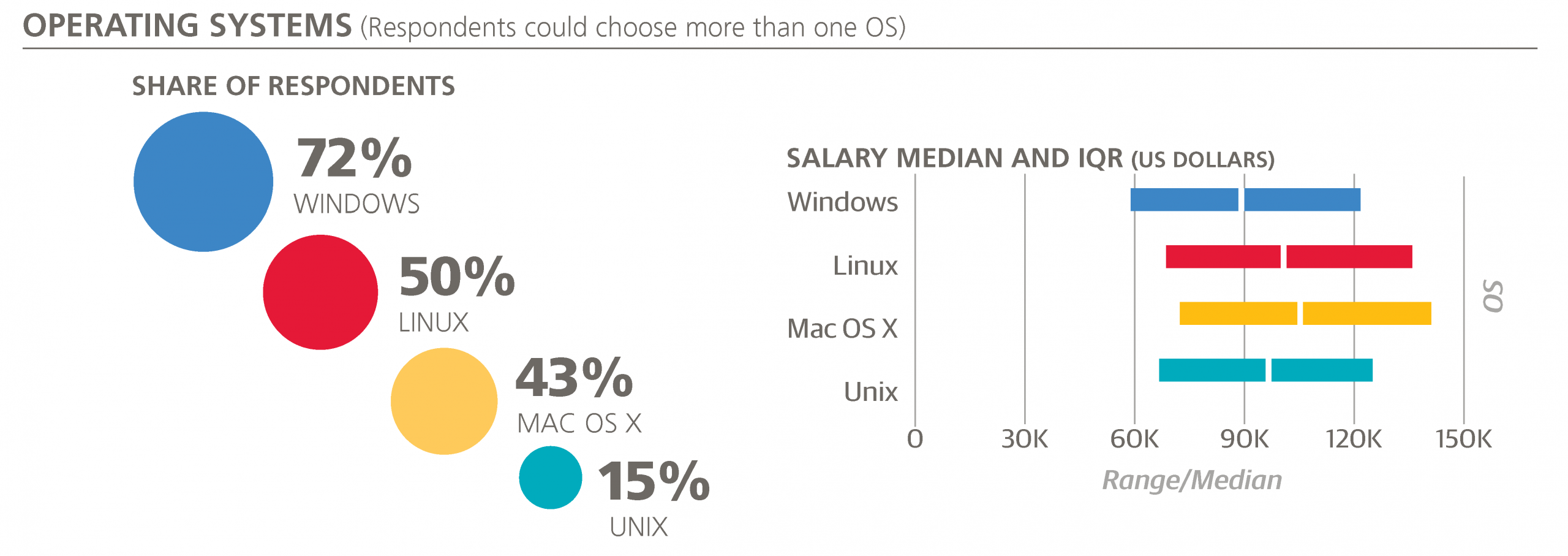
The first category of tools that’s worth mentioning is operating systems. Windows is still the most widely used (72%), and Linux (50%) is slightly more popular than Mac OS X (43%). Compared to last year, Mac OS X and Windows have both gained 6-7%. Almost everyone uses either Mac OS X or Windows (94%, up from 87% of last year’s sample), and there is a significant overlap between each of these operating systems: all three are used by 12% of the sample (compared to 9% last year), and only 46% use just one of the three.
Specific Tool Usage Rates
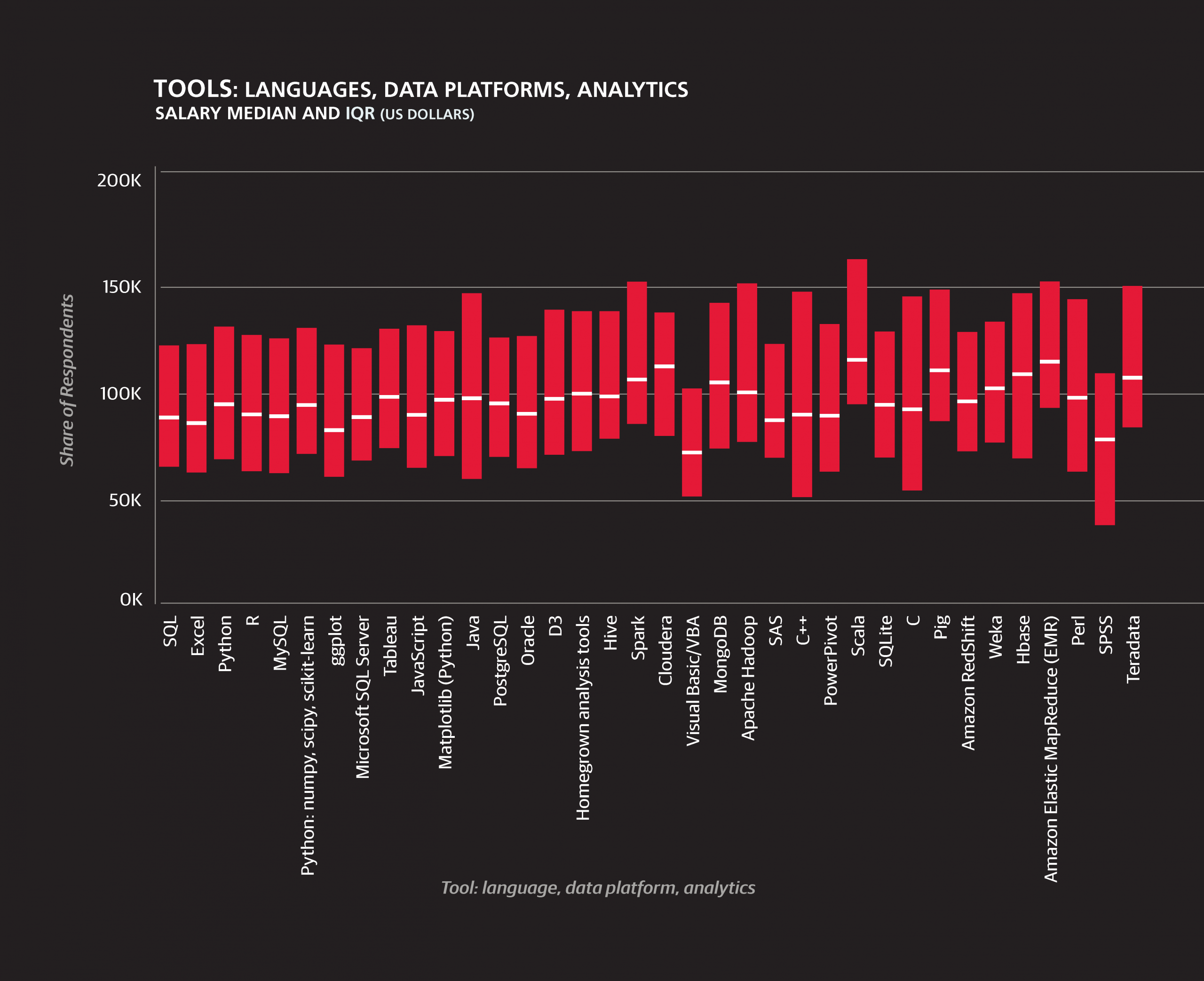
Beyond operating systems, we will refrain from imposing our own system of classification.6 Tool usage rates on the whole changed little from last year’s salary survey results:
- 68% of the sample use SQL
- 59% use Excel
- 51% use Python
All of the above rates are within 1% of last year’s values.
- R, however, fell from 57% to 52%, although this is only marginally significant (p = .13).
- The new, powerful, and suddenly popular Spark, as well as Scala, the language in which Spark is written, saw large increases to 17% and 10%, respectively.
- Tableau’s share also grew from 25% to 31%.
Aside from R, other tools that are not used as widely by this year’s survey respondents as last year’s include:
- Perl (12% to 8%)
- Matlab (12% to 6%)
- C# (12% to 6%)
- Mahout (10% to 3%)
- Apache Hadoop (19% to 13%)
- Java (32% to 23%)
All of these differences are statistically significant at the 0.10 level.
Tool Clusters
One possible route in analyzing tool usage is to organize them in clusters; this is a route we have taken in the past two salary survey reports as well. Using an affinity propagation algorithm using (a transformation of) the Pearson correlation coefficient between two tools’ usage values as a similarity metric, we construct nine clusters consisting of two to eight tools out of those used by at least 5% of the sample. Plotting the nine clusters based on their average similarity by the same metric (after scaling down to two dimensions), we have a picture of which tools tend to be used with which others.7
Analysis of the Clusters
The clusters based on this year’s data share the basic divide found in the clusters of the previous two reports: open source versus proprietary, new Hadoop versus more established relational, scripting versus point-and-click. The former tools are found in the lower right of the “map,” the latter in the upper left. However, a few important differences have emerged, beyond the idiosyncrasies generated by the algorithm.8
In the 2014 data, for example, Tableau was a unique tool occupying the otherwise empty middle ground between the two mega-clusters representing open source and proprietary tools. The current picture is more mixed, and more bridges appear to be stretching across the divide.
Which Tools Tend to Be Used with Which Others
After determining the nine clusters, we plot them using multidimensional scaling with average correlation as the distance metric. So, for example, the Python/Spark and MySQL/PostgreSQL are close together because correlations of tool pairs between the clusters – Scala and MySQL, Python and MySQL, Java and SQLite, etc. – are relatively high. Of course, correlations of tool pairs between the clusters are generally not as high as correlations within a cluster.
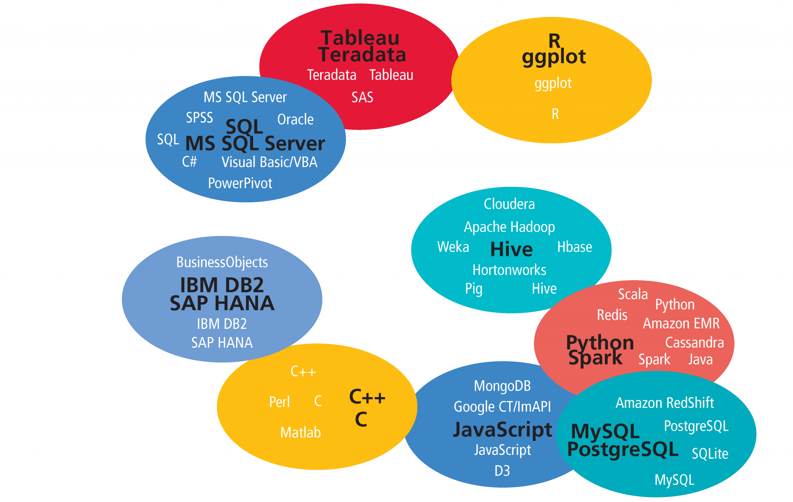
R usage is changing
R is a prime example of a tool that is bridging the divide between open source and proprietary tools. The correlation coefficient between R and a majority of tools from clusters 1, 7, and 9 increased—the correlation between R and Teradata becoming particularly strong—as well as the coefficient between R and Windows (operating systems were not included in the clustering), from –0.059 to 0.043. In contrast, the coefficient between R and almost all (22 of 26) tools in the other clusters decreased. Most notable were the drop in correlation with Python (0.298 to 0.188), MongoDB (0.081 to -0.042), Spark (0.090 to 0.004), and Cloudera (0.087 to -0.063).
There are several reasons why R usage might be changing. The acquisition of Revolution Analytics by Microsoft reflects a particular interest in R by one of the traditional leaders in the data space, as well as a general rise in attention paid by large software vendors to open source products. Alternatively, the open-source-only crowd might be finding they don’t need such a large selection of tools, that Spark and Python do the job just fine. The large number of R packages has often been cited as a key advantage of R over tools such as Python, but this is not the kind of advantage that is guaranteed to last: there is no reason why developers of other open source tools can’t gradually build on their own libraries to catch up. In contrast, it makes sense that users of tools such as Teradata, which now supports R, would find it enormously useful to have access to such a variety of open source libraries within the proprietary tool they are already using. If users of other open source tools are dropping R, it would be ironic that the hottest new open source big data tool, Spark, recently released a version that supports R.
Other open source tools
Aside from R, the main “open source” tools are found in clusters 2, 4, 5, and 6. Tools between these four clusters are all relatively well-correlated, though it is interesting that they are distributed with clear themes: cluster 4 contains top open source relational databases, cluster 5 consists of major open source Hadoop distributions and associated tools, cluster 6 is concerned with the web and web-based visualization in particular, and cluster 2 is defined by Spark and Python.
Spark and Scala
On the topic of cluster 2 we should mention Scala: like Spark, or rather with Spark, it has grown tremendously in the data space in the last year. The correlation coefficient between the two tools is 0.548 (up from 0.360 last year), but perhaps the most telling statistic is that while among Spark users 46% use Scala, among those who do not use Spark only 2% of the sample used Scala. It appears that in the data space, despite its suitability for a variety of applications, the Scala language has become inextricable with Spark. In comparison, while Java remains in the open source cluster with Python and Spark, its usage declined from 2014 according to the survey data.
Hadoop-themed cluster
Cluster 5, the Hadoop-themed cluster, contains tools that in last year’s sample correlated very negatively with the collection of proprietary tools. This year, however, it has drifted closer toward them, somewhat similarly to R, but without the same drop in correlation with open source tools in other clusters. Pairs of tools such as Cloudera/Visual Basic, Apache Hadoop/C#, Pig/SPSS, and Excel/Hortonworks correlated negatively in the 2014 sample but now correlate positively .9 Large software companies that produce proprietary data products have made efforts to incorporate new and popular open source technology into their own products, and as with R, Hadoop seems to be making its way into the non-open source mainstream. Perhaps this a general pattern illustrated well by the cluster map: new open source tools pop up in the lower right corner and drift up and to the left, making room for the next new tools and letting the cycle repeat. There are, of course, exceptions: MySQL and PostgreSQL (of cluster 4) have not drifted anywhere close to the proprietary clusters, and remain firmly planted in the open source bottom right.
Tools with the most overall usage
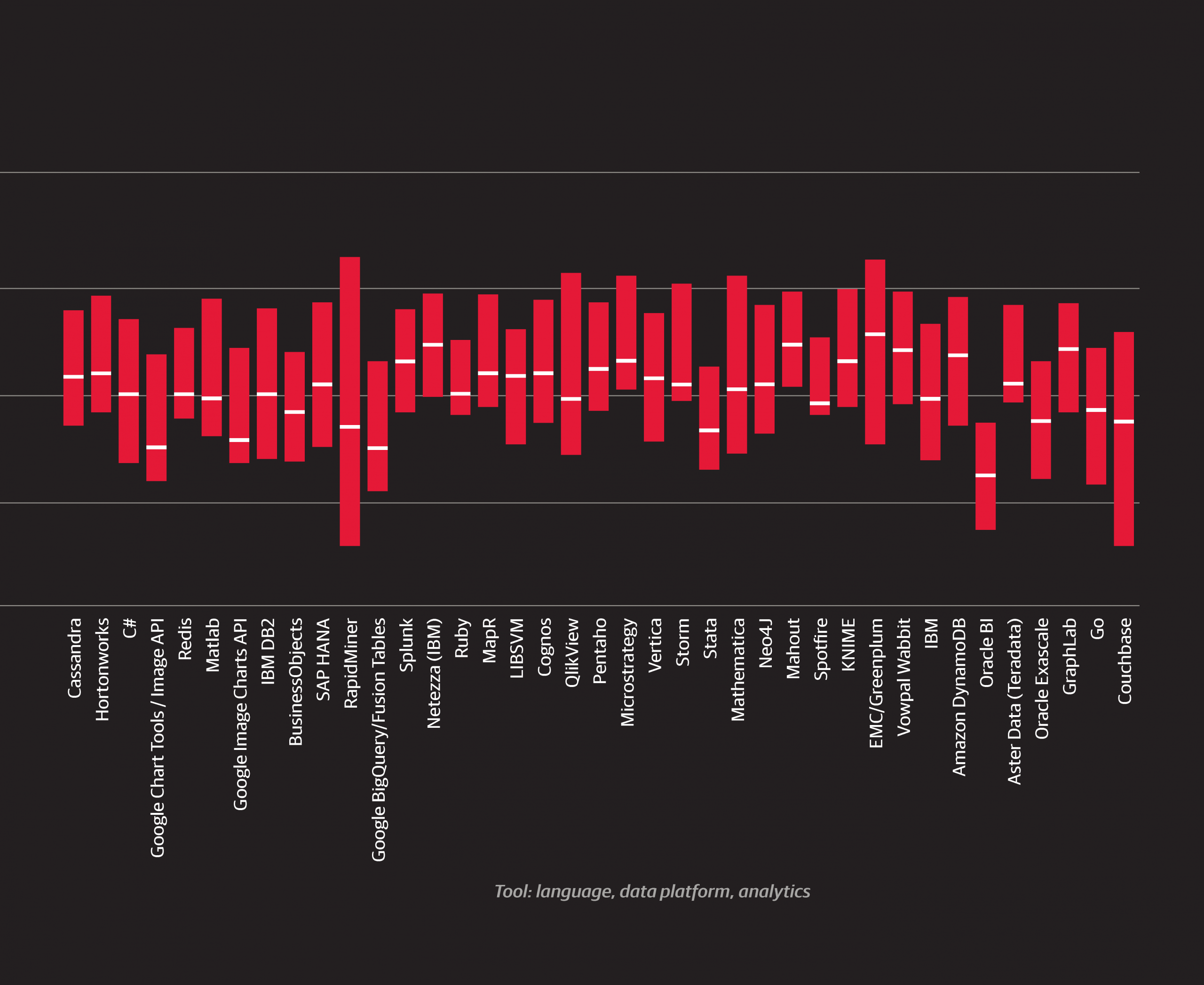
The cluster of tools that has the most usage overall was cluster 1, consisting of SQL, five Microsoft products, and two other proprietary tools, Oracle and SPSS. Respondents who use these tools tend to work in larger, older companies and are less likely to come from a software company than those who do not use them. Continuing the pattern from the previous year’s report, cluster 1 tools correspond with lower salaries on average. Seven of the twelve tools whose users had median salaries of $95,000 or less were from this cluster.

6While some natural categories exist, there are large grey zones between tools that make any classification somewhat arbitrary.
7The clusters are labeled from 1 to 9, ranked in terms of the total usage of the tools within them (with the exception of clusters 5 and 6, the same order would be produced if we used the number of unique respondents using any one tool in the cluster). Clusters are identified by this number and by the most commonly used tool in the cluster (e.g., R in cluster 3) and the “exemplar” (e.g., ggplot), which is the tool chosen by the algorithm as the most representative of the other tools in the cluster. In the case of Hive and JavaScript, the exemplar isthe most commonly used tool.
8The clustering methods used in the 2013 and 2014 reports were not radically dissimilar from the affinity propagation algorithm used here from Scikit-Learn. The most salient difference directly attributable to the change in algorithms is that with AP (on this data) the number of clusters tends to be higher.
Tools and Salary: A More Complete Model
We are now ready to incorporate tools into a third salary model. We keep the same pool of features available as in the second model, plus one feature for each tool, and also keep the same subsample (no professors, students, or management). The larger clusters in the 2014 report were more conducive to being converted into features (as the number of tools in a given cluster that someone uses), but here it makes more sense to keep the tool-features as binary variables representing the usage/non-usage of one tool.
In addition to tools, we also add two features for cloud computing: one for the amount of cloud computing, the other for the type of cloud computing (public or private; this feature turns out to be insignificant in the model).
Most of the features kept in the previous model remain, and eleven tools are now included. The R2 has only modestly increased, to 0.427.
26393 intercept
 +1505 age (per year of age above 18)
 +6106 bargaining skills (times 1 for “poor” skills to 5 for “excellent” skills)
  +420 work_week (times # hours in week)
 -2785 gender=Female
 +3012 industry=Software (incl. security, cloud services)
 -6412 industry=Education
 +1412 company size: 2500+
 +9274 PhD
  +919 master’s degree (but no PhD)
  +101 academic specialty in computer science
+14667 California
+10693 Northeast US
  +231 Southern US
  -451 Canada
 -1486 UK/Ireland
-17084 Europe (except UK/I)
-21077 Latin America
-26146 Asia
 +8489 Meetings: 1 - 3 hours / day
 +9461 Meetings: 4+ hours / day
 +3007 Basic exploratory data analysis: 1 - 4 hours / week
 -3249 Basic exploratory data analysis: 4+ hours / day
 +1342 cloud computing amount: Most or all cloud computing
 -3977 cloud computing amount: Not using cloud computing
+11731 Spark
 +7894 D3
 +6086 Amazon Elastic MapReduce (EMR)
 +3929 Scala
 +3213 C++
 +1435 Apache Hadoop
 -3243 Visual Basic/VBA
Changes in the Selection and Value of Coefficients
As we saw moving from the first to second model, there were a few changes in the selection and value of coefficients, in particular with certain coefficients being dampened by those of new features. For example, machine learning as a task vanishes, but its clear replacements are found in the tools, many of which support, or are even specifically designed for machine learning tasks (and whose features do in fact correlate with the machine learning variable that dropped out).
The impact of Spark and Scala
It is no surprise that Spark is the tool with the greatest coefficient. If we indulge in a possible violation of assuming cause and effect, learning Spark could apparently have more of an impact on salary than getting a PhD. Scala is another bonus: those who use both are expected to earn over $15,000 more than an otherwise equivalent data professional.
D3 for visualization
The only tool devoted to visualization kept in the model is D3, with an impressive coefficient of +$7,894. While the training overhead in mastering a tool like D3 (including learning some JavaScript) is significantly higher than some of the common viz alternatives such as Excel and ggplot, the final product can be quite impressive: you don’t just make a graph, but an interactive SVG-based app. It appears that either data scientists are being paid more for having this skill, or the ones who already make more tend to choose the D3 path.
Cloud computing
The benefits of cloud computing are old news, and are confirmed by the salary model. Not only is there a positive amount attributed to using cloud computing for most or all applications, there is an even more significant penalty for those who do not use any cloud computing. The +$6,086 coefficient of Amazon EMR drives home this point: cloud computing pays.
Problems with variables
Correlation among dependent variables can present problems in the creation of a meaningful linear model, and it is worth mentioning how this works in the particular case of our model. The lasso prevents excessive inclusion of features, and if two features are highly correlated usually at most one will make it into the model, but this means that certain variables that do correlate with salary—in addition to another dependent variable—get left out. This largely explains why exactly one tool is present from four clusters (D3, C++, Visual Basic/ VBA, and Apache Hadoop). To a certain extent, the tools included are functioning as representatives for their clusters in the model, and are the tools that most cleanly correspond to a consistent change in salary holding the other features in the model constant. (To illustrate this: if we force Visual Basic/VBA out of the model, then SPSS will be included; if we force out Apache Hadoop, then Hortonworks will be included.)
Integrating Job Titles into Our Final Model
The ommission of job titles as features in the models we’ve so far presented is deliberate: we want to see how much can be predicated only from demographics and information about what someone does, not what they are called. This also allows us to compare the model without titles to a fourth and final model with titles, to see if job titles give us information not extractible from the other data we have about each individual. Before we show this model, it is worth describing the job title categories we are using in the context of the other variables we have been working with: demographics, tasks, and tools. As with the second and third models, we will restrict this section to the non-managerial and non-academic groups.
Classifying Job Titles
Respondents entered their job titles into a text field (as opposed to picking a choice from a drop-down menu), and we have classified the entries using a few simple rules to remove the overlapping respondents who would otherwise qualify for more than one group.9
Little can be said with any certainty about some of the smaller groups such as DBA and statistician: the former tends to use Perl and work for older companies, the latter tends to use R and not use any cloud computing, but none of these observations are backed up by much statistical significance. However, these titles do not appear to be very common in the space, and we would expect that many who could call themselves statisticians could have reasonably called themselves something else (for example, “analyst” or “data scientist”).
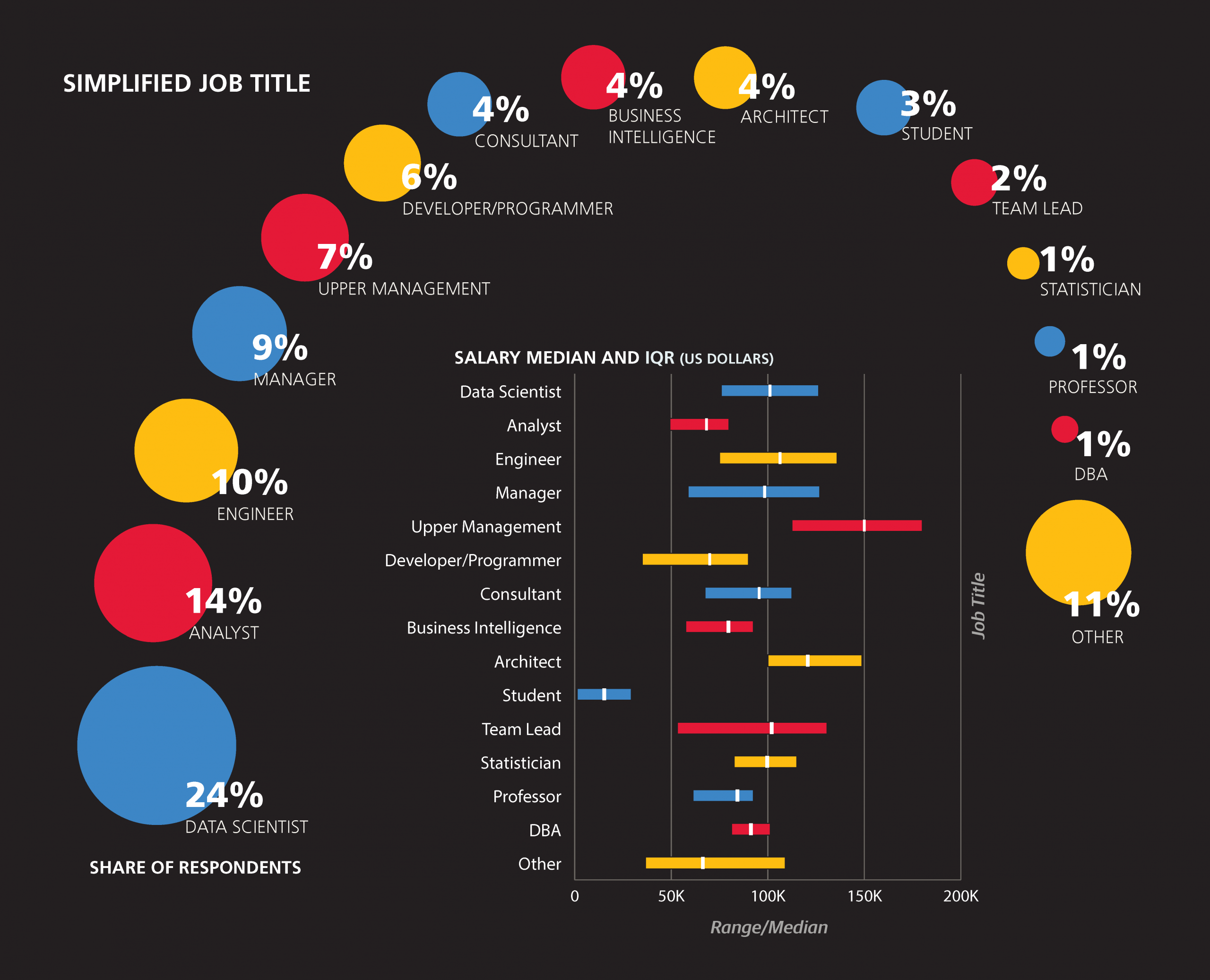
Architects
Architects are more likely to use D3 (54% of architects use D3 versus 24% of non-architects), Java (52% vs. 23%), Hortonworks and Cassandra (both 30% vs. 6%). They spend more time than the rest of the sample on ETL and attending meetings. Only two architects were women (7%)—even lower than the share of women in the rest of the sample (21%).
Developers/Programmers
The developers (or programmers) in the sample should not be considered an unbiased representation of all developers: they did, after all, complete a long data science survey. Still, this group is clearly different from the rest of the respondents, using less R (22% vs. 52%) but more JavaScript (56% vs. 26%) and D3 (44% vs. 24%). This indicates that the intersection of the data space and the wider world of programming is most active in the sub-space of visualization.
Engineers
Like developers, engineers use less R than the rest of the sample (30% vs. 53% of non-engineers). They use less Excel (34% vs. 64%) and SAS (3% vs. 13%) as well, but more Scala (24% vs. 9%) and Spark (29% vs. 18%). In terms of tasks, engineers are less likely to spend time presenting analysis (44% present analysis less than one hour a week, versus 25% for non-engineers).
Business Intelligence roles
The set of “Business Intelligence”/“Business Analyst” respondents was similar to non-BI analysts, and these two are closer to each other than either to data scientists. Few respondents from either the BI or analyst groups use Spark (BI: 4%, analysts: 3%, data scientists: 28%) and Apache Hadoop (7%, 7%, 19%), while most use Excel (85%, 82%, 54%). They are also less likely to work for startups (more specifically, companies five years or younger: 17%, 15%, 32%). For most other variables that set the BI and analysts apart from data scientists, a clear gradient exists with analysts in the middle.
Tools favored by BI that fit this pattern include Visual Basic/ VBA (41%, 27%, 9%), PowerPivot (37%, 15%, 6%), Microsoft SQL Server (71%, 44%, 24%), and SQL (93%, 82%, 72%); while tools favored by data scientists include Python (28%, 39%, 72%) and R (41%, 50%, 72%).
Aside from tool usage, there are other variables that follow this gradient: holding a PhD (4%, 10%, 44%), spending at least one hour per day on creating visualizations (57%, 44%, 31%), spending at least one hour per day on machine learning (12%, 24%, 54%) and performing most or all tasks on cloud computing (4%, 13%, 29%). One variable that does not follow this gradient is age: BI are the oldest (53% older than 35), then data scientists (32%), and analysts are the youngest (only 22% over 35).
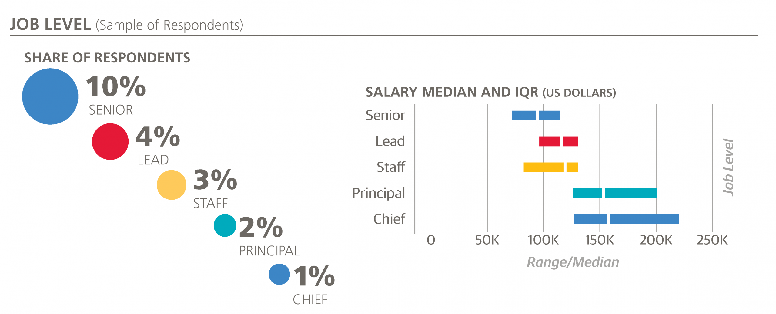
In addition to the above job title classification, we can extract features conveying the level of an individual: “Senior,” “Lead,” “Staff,” “Chief,” and “Principal” are terms that frequently precede titles such as “Data Scientist,” “Analyst,” “Engineer,” and “Developer”.10
Our Final Model
Adding job title and level features to the third salary model, we produce our final model. Six of the new features are kept in this model, and R2 rises slightly to 0.433.
30572 intercept
  +1395 age (per year of age above 18)
  +5911 bargaining skills (times 1 for “poor” skills to 5 for “excellent” skills)
   +382 work_week (times # hours in week)
  -2007 gender=Female
  +1759 industry=Software (incl. security, cloud services)
   -891 industry=Retail / E-Commerce
  -6336 industry=Education
   +718 company size: 2500+
   -448 company size: <500
  +8606 PhD
   +851 master’s degree (but no PhD)
 +13200 California
 +10097 Northeast US
  -3695 UK/Ireland
 -18353 Europe (except UK/I)
 -23140 Latin America
 -30139 Asia
  +7819 Meetings: 1 - 3 hours / day
  +9036 Meetings: 4+ hours / day
  +2679 Basic exploratory data analysis: 1 - 4 hours / week
  -4615 Basic exploratory data analysis: 4+ hours / day
   +352 Data cleaning::1 - 4 hrs / week
  +2287 cloud computing amount: Most or all cloud computing
  -2710 cloud computing amount: Not using cloud computing
  +9747 Spark
  +6758 D3
  +4878 Amazon Elastic MapReduce (EMR)
  +3371 Scala
  +2309 C++
  +1173 Teradata
   +625 Hive
  -1931 Visual Basic/VBA
 +31280 level: Principal
 +15642 title: Architect
  +3340 title: Data Scientist
  +2819 title: Engineer
  -3272 title: Developer
  -4566 title: Analyst
“Principal” is the only job level to be kept in the model, with a large coefficient attached to it (+$31,280). Respondents with other job levels specified in their title do have higher median salaries than those with no title, but job levels correlate well with other features, such as age, and so they do not add anything to the model that isn’t there already.
Coefficients
Job titles, on the other hand, do add something more. Architects, data scientists, and engineers have positive coefficients, while developers and (non-BI) analysts have negative coefficients. Having seen the correlations between tools and titles it should be no surprise that there is a reduction in magnitude of certain tools’ coefficients. For example, there is a clear shift from the coefficients of Spark and D3 to those of Architect, Data Scientist, Engineer: to a majority of respondents, their expected salary based on the model would be the same (e.g., to an analyst who doesn’t use Spark or a data scientist who does). One interesting newcomer that enters the model once title features are allowed is Teradata, finally breaking the open source monopoly on positive coefficients.
The inclusion of job titles by the parsimonious lasso algorithm could mean that there aren’t enough features to properly differentiate the functions of different jobs. That is, we are missing too many details about the skills, tasks, and challenges that define a data professional’s job. Alternatively, it could mean that simply calling yourself something different can have a real impact on salary. The improvement from the third to fourth model is probably too small to seriously make the latter claim, but we can’t rule it out.
9After the managerial and academic groups (professors and students), “Architect” takes precedence: for example, a “data scientist/architect” is an architect. “Business Intelligence” encompasses job titles that have “business intelligence” or “BI” in them, but also includes “business analysts.”Unless they are architects or in the BI group, anyone with “data scientist,” “data science,” or one of several, mostly singleton “scientist” job titles (“analytic scientist,” “marketing scientist,” “machine learning scientist”) is a data scientist. Remaining respondents are identified, in order of precedence, as an “Engineer,”“Analyst,” “Developer” (or “Programmer”), “Consultant,” or “[Team] Lead” (if their title includes that keyword). “Statistician” and “Database Administrator” are two small title categories that had almost no overlap with any other. After all of these assignments, we are still left with a large (10%) “Other” category for those titles that do not fit into any of the above groups, such as “Bioinformatician,” “User Experience Designer,” “Economist,” or “FX Quant Trader.”
10“Principal” is also found on its own: this is the job title of three respondents in the survey.
Finding a New Position
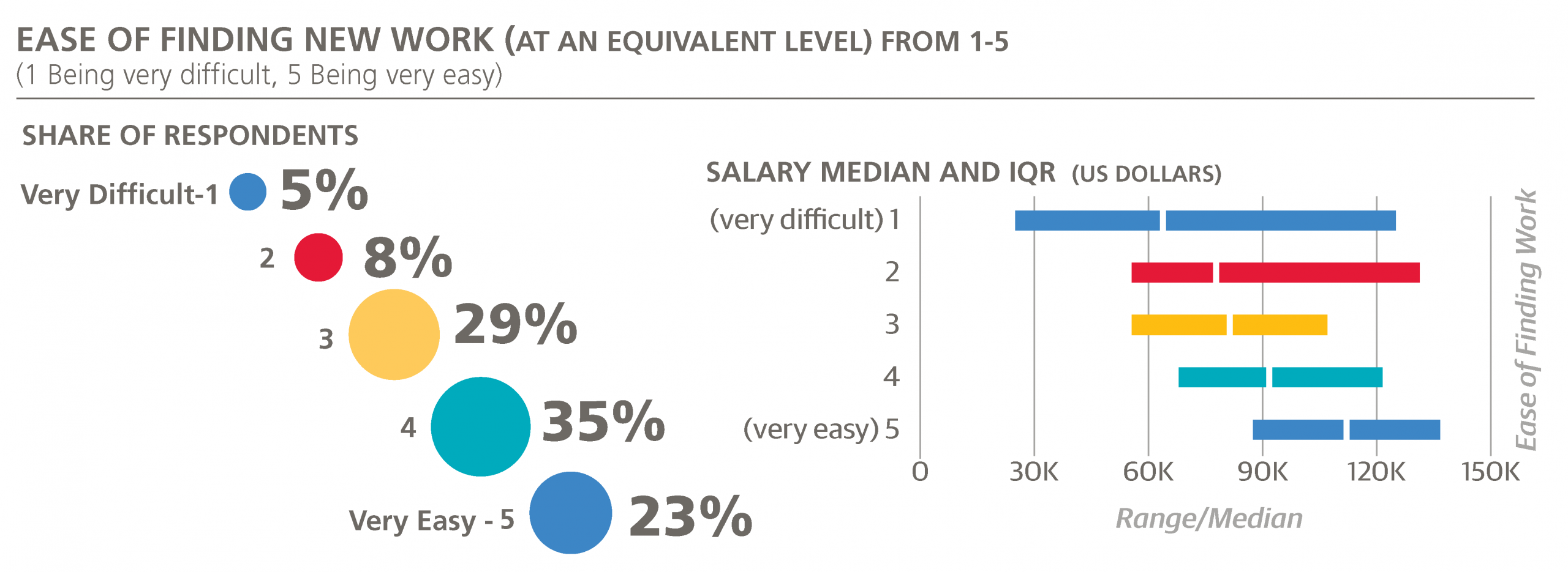
The last piece of information we will investigate is a different kind of rating: how easy it would be to find a new position, assuming that the new job is more or less equivalent to the respondent’s current one, in terms of compensation, workload, and interest in the work. Like the bargaining skills rating, this metric is quite subjective, but it is an important dimension parallel to salary. Answers were also based on a five-point scale: “1” signifying “very difficult” and “5” signifying “very easy.”
The overall results were optimistically high: almost one-quarter gave the top score of 5, and only 13% thought their prospects would translate to a 1 or 2. Salary and (expected) ease of finding work turn out to be highly correlated: the groups of respondents who gave answers 1, 2, 3, 4, and 5 have median salaries $64,00, $78,000, $80,000, $92,000, and $112,000. In terms of geographic location, the highest average responses come from California, the Northeast US, and Texas (3.9), followed by UK/ Ireland, the Southwestern US, and the Midwest (3.8).
The major tools (those with >5% usage rates) can similarly be ranked by the mean “ease of finding new work” scores of their users. The top four tools by this metric were Amazon Redshift, Teradata, Amazon EMR, and Cloudera (mean score, 3.92 to 3.98), while the bottom four tools were SPSS, C#, Perl, and BusinessObjects.
Wrapping Up
Understanding salary is a tricky business: the rules that determine it can change from year to year (for example, not knowing Spark was okay in 2010), we’re not supposed to know what our colleagues make (for good reason), and it’s extremely important (we all have to eat). Statistics from on an anonymous online survey based on a self-selected sample doesn’t exactly put the “science” into “data science,” but such research can still be valuable—and let’s face it, much of the other information that might inform one’s understanding of industry trends is in the same assumption-violating category.
Only about 40% of the variation in the survey sample’s salaries is explained by our models, but this is nevertheless a decent starting point for practitioners to estimate their worth and for employers to understand what is reasonable compensation for their employees. It would be unwise to assume correlation is causation: learning a given tool with a hefty coefficient may not instantly trigger a raise, and whatever you take from this report, it should not be a desire to needlessly stretch tomorrow’s meeting to put you in the four hours/day bracket. Still, it seems likely that in the long run knowing the highest paying tools will increase your chances of joining the ranks of the highest paid.
In future editions of the Salary Survey, we may look to better understand roles and the shift to merge open source and non-open source tools (such as R).
We encourage you to participate in this research and take the survey that will contribute to next year’s report: the Data Science Salary Survey is a community effort, and every voice counts.
Thank you!