
 The Seven Virtues, by Brueghel, published by Philippe Galle. (source: Wikimedia Commons)
 Executive Summary
IN THIS FOURTH EDITION of the O’Reilly Data Science
Salary Survey, we’ve analyzed input from 983 respondents
working in the data space, across a variety of industries—
representing 45 countries and 45 US states. Through the
results of our 64-question survey, we’ve explored which tools
data scientists, analysts, and engineers use, which tasks they
engage in, and of course—how much they make.
Key findings include:
- Python and Spark are among the tools that contribute
most to salary. - Among those who code, the highest earners are the ones
who code the most. - SQL, Excel, R and Python are the most commonly used
tools. - Those who attend more meetings, earn more.
- Women make less than men, for doing the same thing.
- Country and US state GDP serves as a decent proxy for
geographic salary variation (not as a direct estimate, but
as an additional input for a model). - The most salient division between tool and tasks usage
is between those who mostly use Excel, SQL, and a small
number of closed source tools—and those who use more
open source tools and spend more time coding. - R is used across this division: even people who don’t code
much or use many open source tools, use R. - A secondary division emerges among the coding half—
separating a younger, Python-heavy data scientist/analyst
group, from a more experienced data scientist/engineer
cohort that tends to use a high number of tools and earns
the highest salaries.
To see our complete model and input your own metrics to
predict salary, see Appendix B: The Regression Model (but beware—there’s a transformation
involved: don’t forget to square the result!).
Introduction
FOR THE FOURTH YEAR RUNNING, we at O’Reilly Media
have collected survey data from data scientists, engineers, and
others in the data space, about their skills, tools, and salary.
Across our four years of data, many key trends are more or less
constant: median salaries, top tools, and correlations among
tool usage. For this year’s analysis, we collected responses from
September 2015 to June 2016, from 983 data professionals.
In this report, we provide some different approaches to the
analysis, in particular conducting clustering on the respondents
(not just tools). We have also adjusted the linear model
for improved accuracy, using a square root transform and
publicly available data on geographical variation in economies.
The survey itself also included new questions, most notably
about specific data-related tasks and any change in salary.
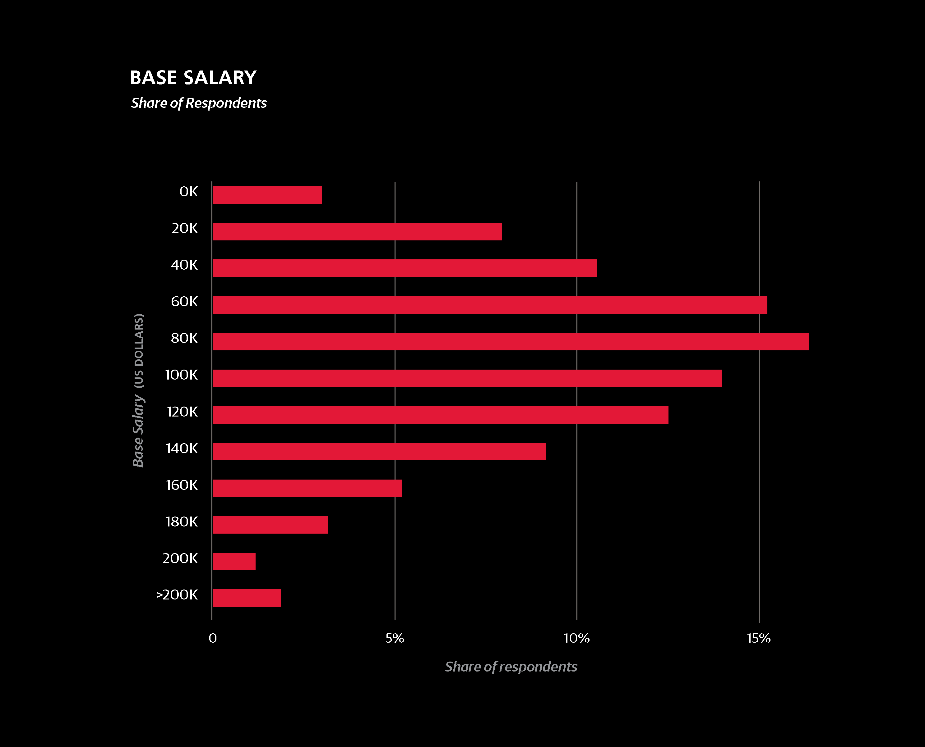
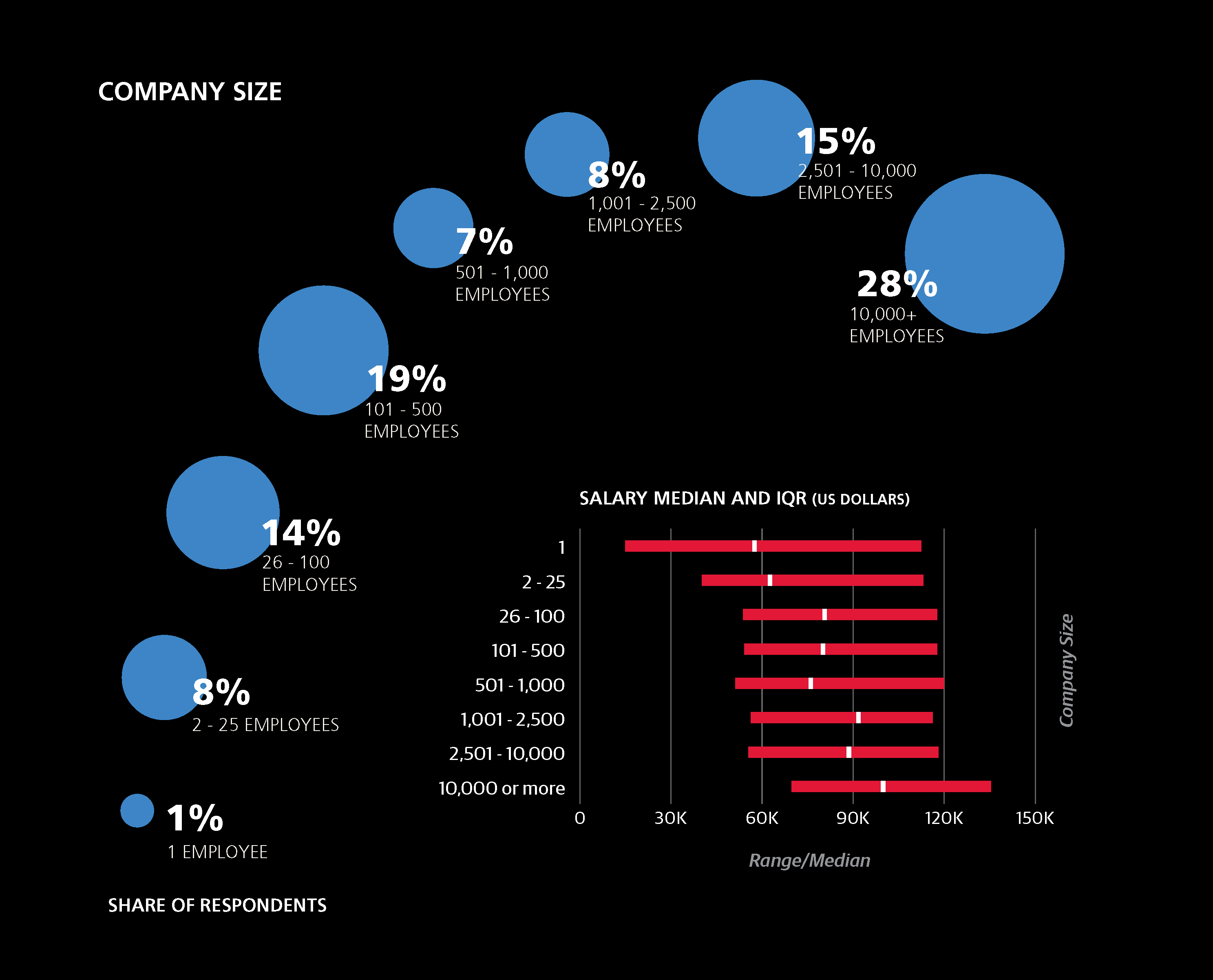
Salary: The Big Picture
The median base salary of the entire sample was $87K. This
figure is slightly lower than in previous years (last year it
was $91K), but this discrepancy is fully attributable to shifts
in demographics: this year’s sample had a higher share of non-US respondents and respondents aged 30 or younger.
Three-fifths of the sample came from the US, and these
respondents had a median salary of $106K.
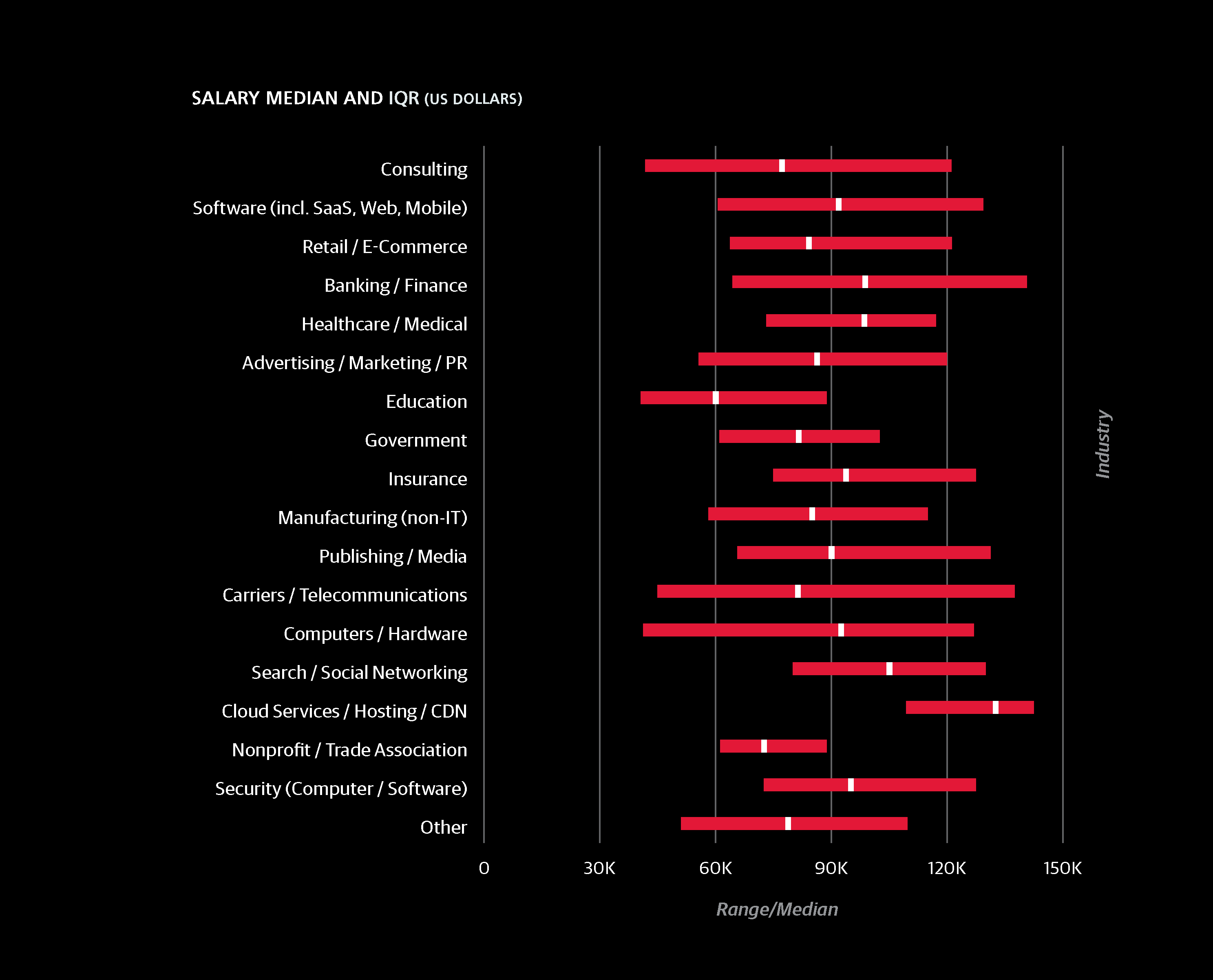
Understanding Interquartile Range
For a number of survey questions, we show graphs of answer
shares and the median salaries of respondents who gave
particular answers. While median salary is probably the best
number to compare how much two groups of people make, it
doesn’t say anything about the spread or variation of salaries.
In addition to median, we also show the interquartile range
(IQR)—two numbers that delineate salaries of the middle
50%. This range is not a confidence interval, nor is it based
on standard deviations.
As an example, the IQR for US respondents was $80K to
$138K, meaning one quarter of US respondents had salaries
lower than $80K and one quarter had salaries higher than
$138K. Perhaps more illustrative of the value of the IQR is
comparing the US Northeast and Midwest: the Northeast has
a higher median salary ($105K vs. $98K) but the third quartile cutoffs are $133K for the Northeast and $138K for the Midwest.
This indicates that there is generally more variation in
Midwest salaries, and that among top earners—salaries might
be even higher in the Midwest than in the Northeast.
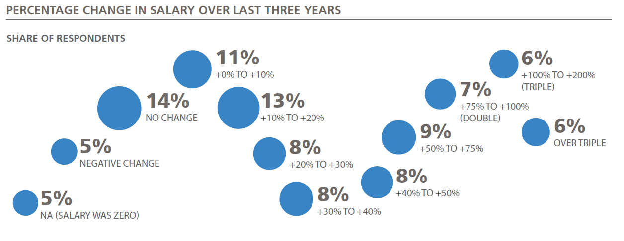
How Salaries Change
We also collected data on salary change over the last three
years. About half of the sample reported a 20% change, and
the salary of 12% of the sample doubled. We attempted to
model salary change with other variables from the survey,
but the model performed much more poorly, with an R2
of just 0.221. Many of the same significant features in the
salary regression model also appeared as factors in predicted
salary change: Spark/Unix, high meeting hours, high coding
hours, and building
prototype models, all
predict higher salary
growth, while using
Excel, gender disparity,
and working at
an older company
predict lower salary
growth. Geography
also correlated
positively with salary
change, meaning that
Assessing Your Salary
To use the model for you own salary, refer to the full model in
Appendix B: The Regression Model, and add up the coefficients that apply to you.
Once all of the constants are added, square the result for a
final salary estimate (note: the coefficients are not in dollars).
The contribution of a particular coefficient to the eventual
salary estimate depends on the other coefficients: the higher
the salary, the higher the contribution of each coefficient.
For example, the salary difference between a junior data scientist
and a senior architect will be greater in a country with
high salaries than somewhere with lower salaries.
Factors that Influence Salary: The Regression Model
WE HAVE INCLUDED OUR FULL regression model in
Appendix B: The Regression Model. For this year’s report, we have made two
important changes to the basic, parsimonious linear model we
presented in the 2015 report. We have included: 1) external
geographic data (GDP by US state and country), and 2) a
square root transformation. The transformation adds one step
to the linear model: we add up model coefficients, and then
square the result. Both of these changes significantly improve
the accuracy in salary estimates.
Our model explains about three-quarters of the variance in
the sample salaries (with an R2 of 0.747). Roughly half of the
salary variance is due to geography and experience. Given the
important factors that can not be captured in the survey—
for example, we don’t measure competence or evaluate the
quality of respondents’ work output—it’s not surprising that a
large amount of variance is left unexplained.
Impact of Geography
Geography has a huge impact on salary, but is not adequately
captured due to sample size. For example, if a country is represented by only one or two respondents, this isn’t enough to justify
giving the country its own coefficient. For this reason, we use
broad regional coefficients (e.g., “Asia” or “Eastern Europe”),
keeping in mind however that economic differences within a
region are huge, and thus the accuracy of the model suffers.
To get around this problem, we’ve used publicly available
records of per capita GDP of countries and US states. While
GDP itself doesn’t translate to salary, it can serve a proxy
function for geographic salary variation. Note that we use
per capita GDP on the state and country level; therefore the
model is likely to produce an inaccurate estimate with GDP
figures for smaller geographic units.
Two exceptions were made to the GDP data before incorporating
it into the model. The per capita GDP of Washington DC
is $181K—much greater than in neighboring Virginia ($57K)
and Maryland ($60K). Many (if not most) data science jobs in
Maryland and Virginia are actually in the greater DC metropolitan
area, and the survey data suggest that average data science
salaries in these three places are not radically different from
each other. Using the true $181K figure would produce gross overestimates for DC salaries, and so the per capita GDP figure
for DC was replaced with that of Maryland, $60K.
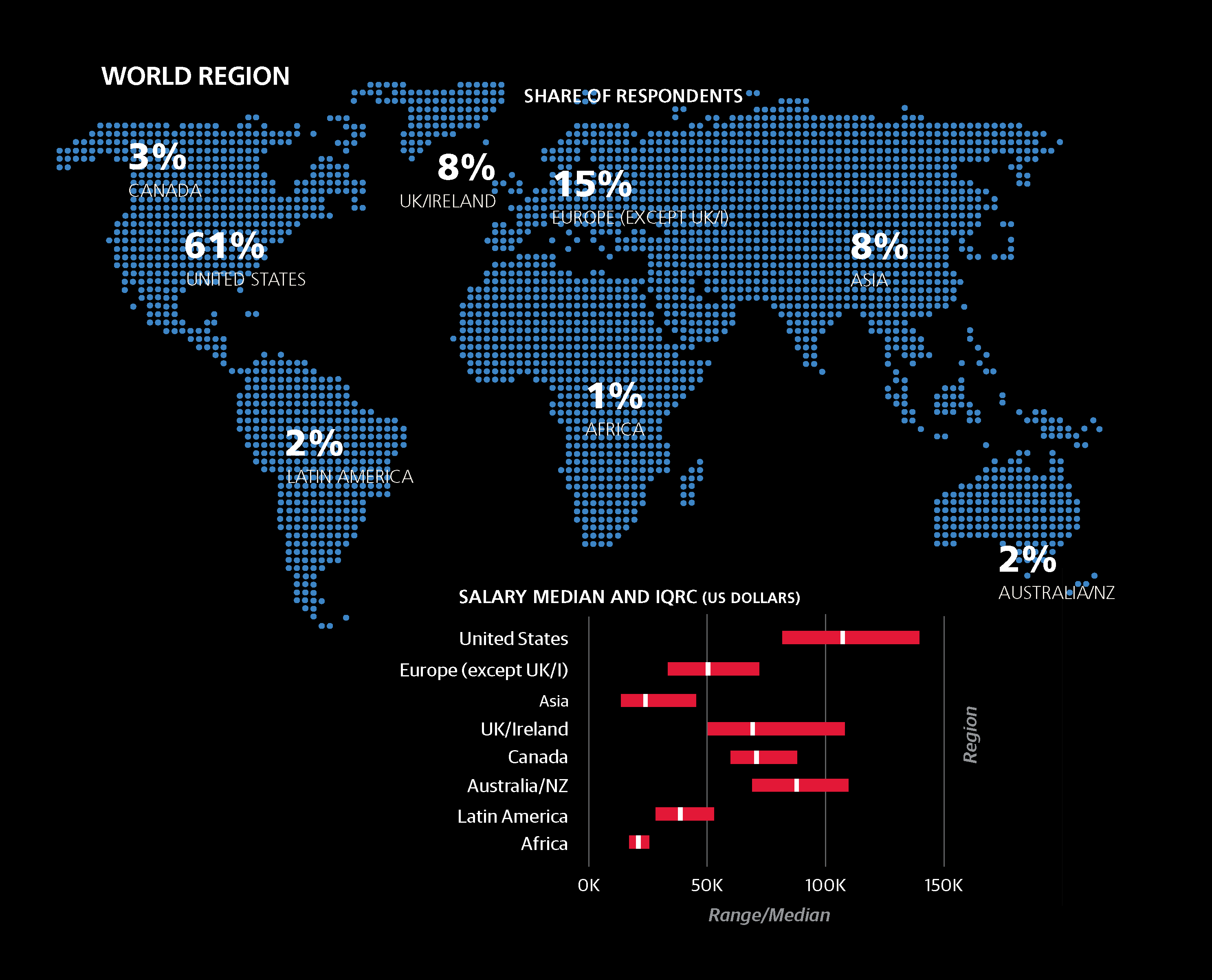
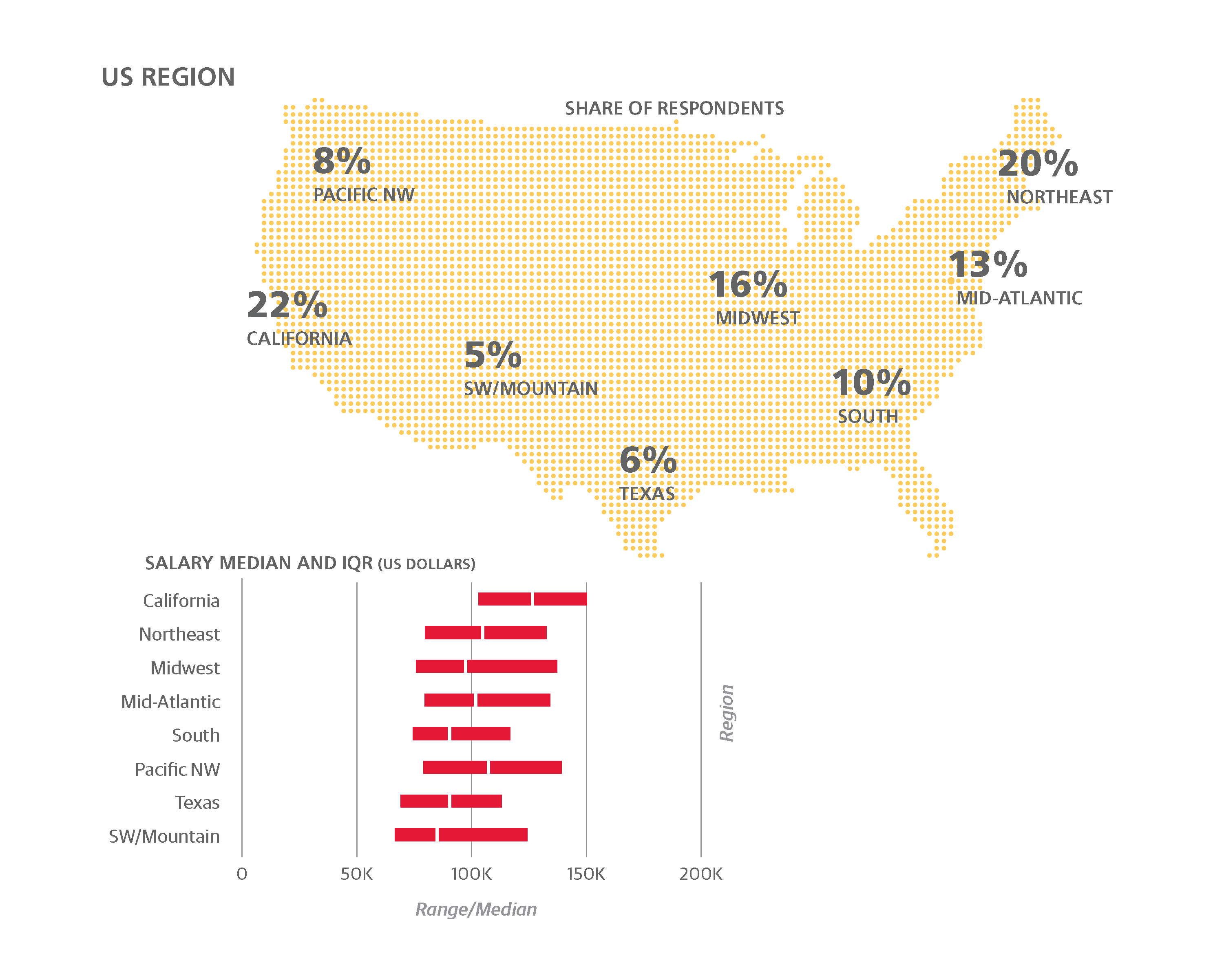
The other exception is California. In all of the salary surveys we
have conducted, California has had the highest median salary
of any state or country, even though its per capita GDP ($62K)
is not ranked so high (nine states have higher per capita GDPs,
as do two countries that were represented in the sample,
Switzerland and Norway). The anomaly is likely due to the San
Francisco Bay Area, where, depending on how the region is
defined, per capita GDP is $80K–$90K. As a major tech center,
the Bay Area is likely overrepresented in the sample, meaning
that the geographic factor attributable to California should be
pushed upward; an appropriate compromise was $70K.
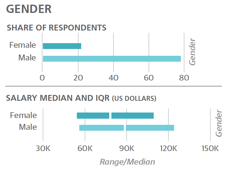
Considering Gender
There is a difference of $10K between the median salaries of
men and women. Keeping all other variables constant—same
roles, same skills—women make less than men.
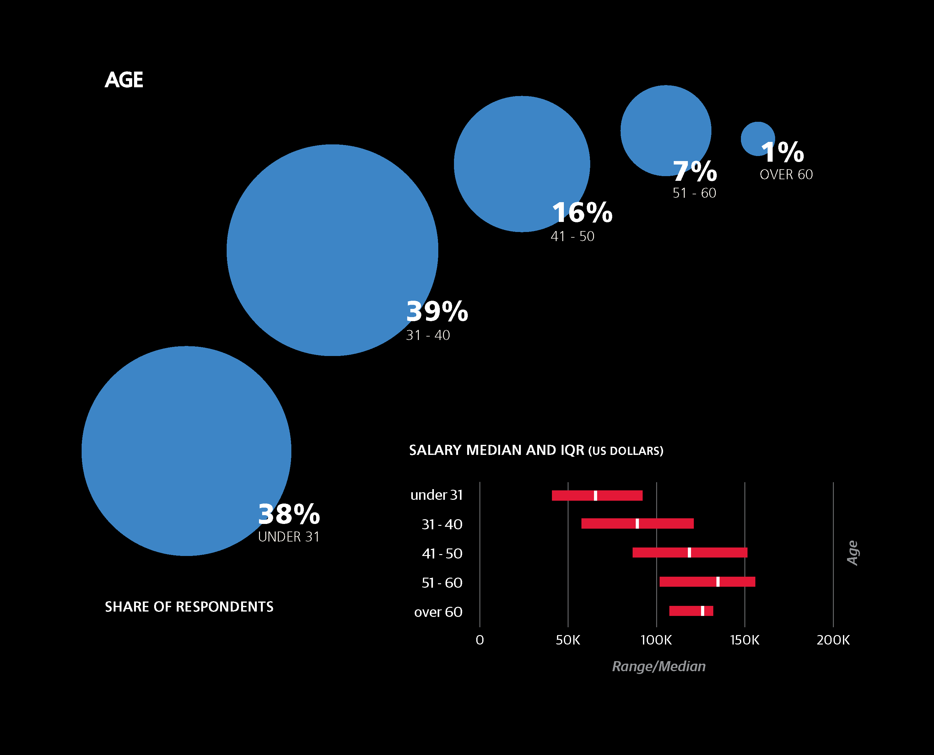
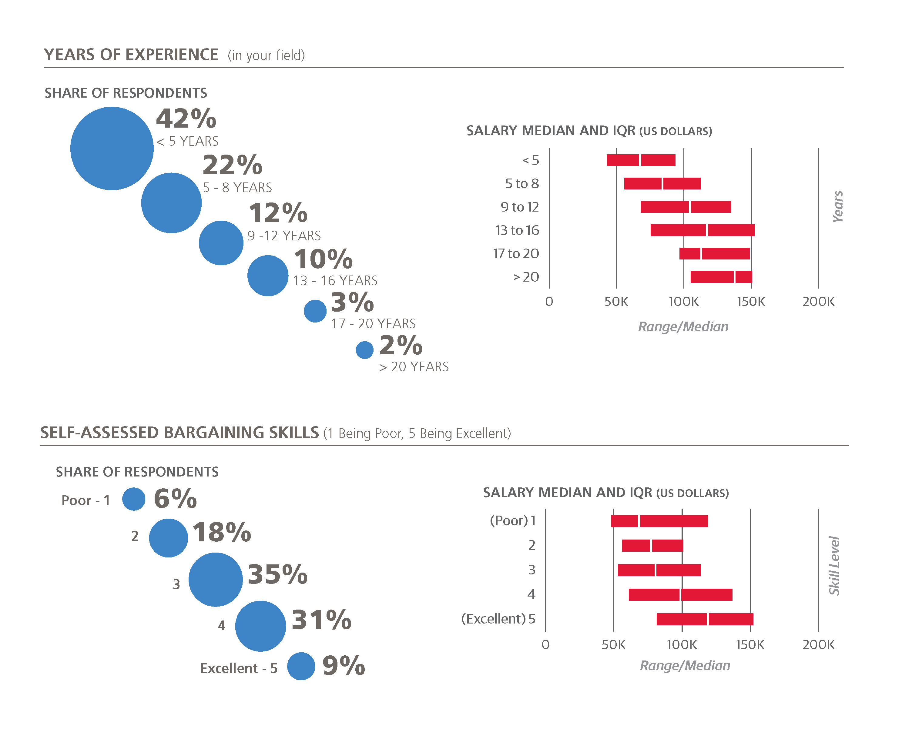
Age, Experience, and Industry
Experience and age are two important variables that influence
salary. The coefficient for experience (+3.8) translates to an
increase of $2K–$2.5K on average, per year of experience. As
for age, the biggest jump is between people in their early and
late 20s, but the difference between those aged 31–65 and
those over 65 is also significant.
We also asked respondents to rate their bargaining skills on
a scale of 1 to 5, and those who gave higher self-evaluations
tended to have higher salaries. The difference in salary
between two data scientists, one with a bargaining skill “1”
and the other with “5”, with otherwise identical demographics
and skills, is expected to be $10K–$15K.
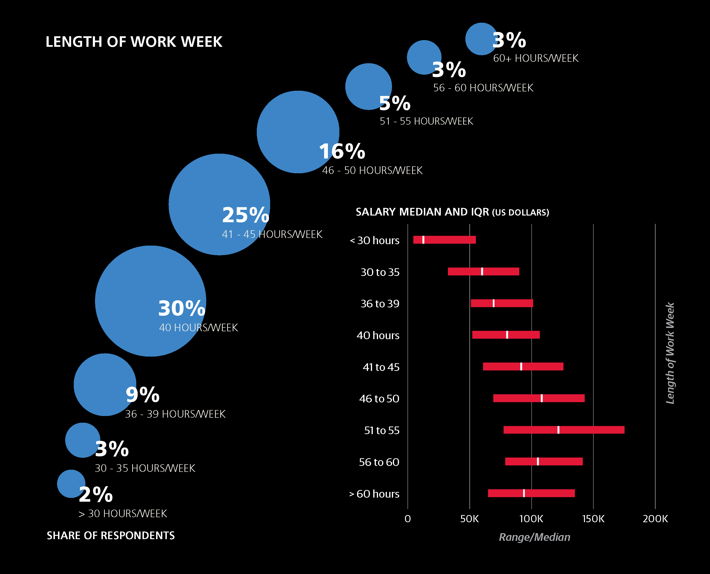
Finally, in terms of work-life balance, our results show that
once you are working beyond 60 hours, salary estimates
actually go down.
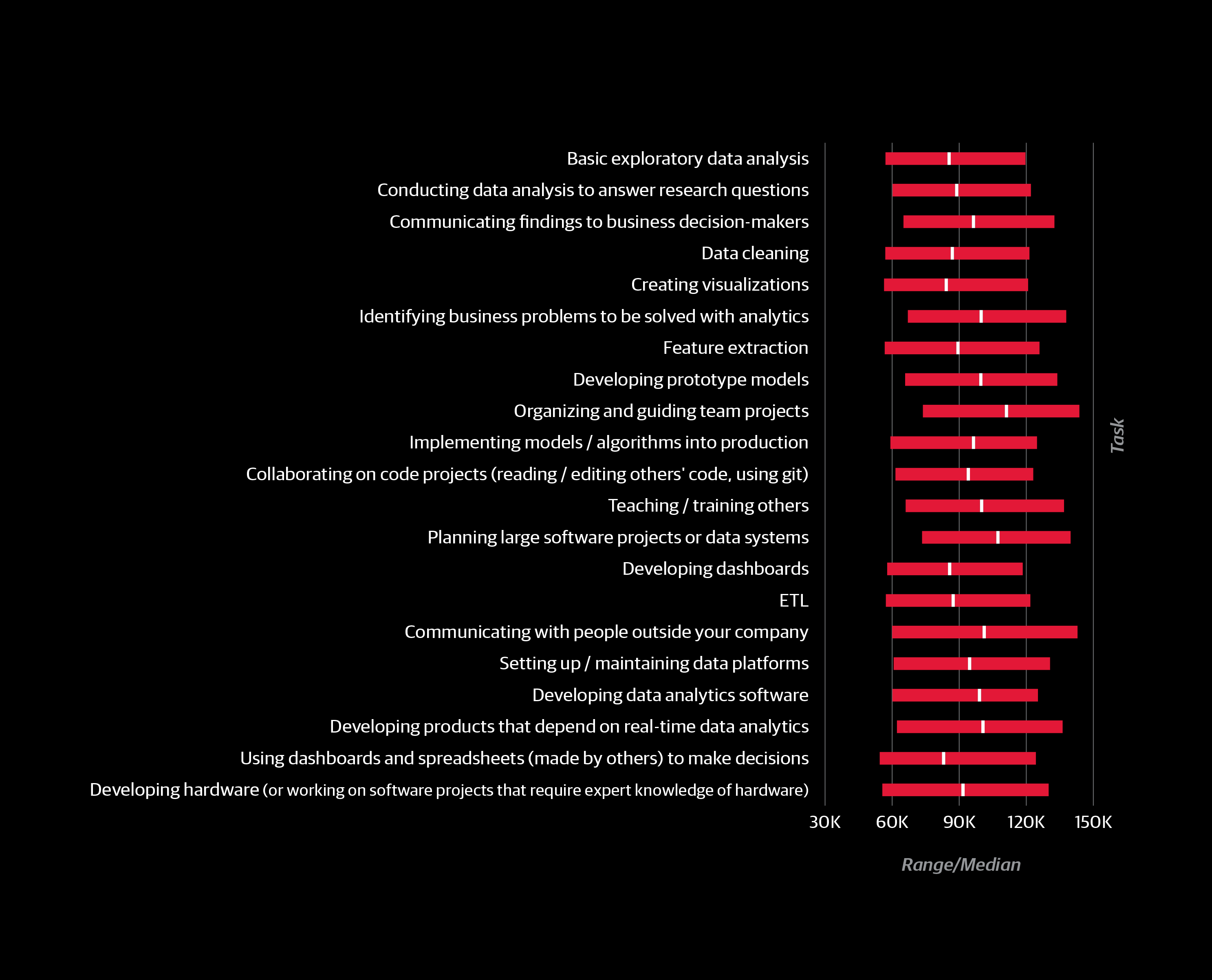
How You Spend Your Time
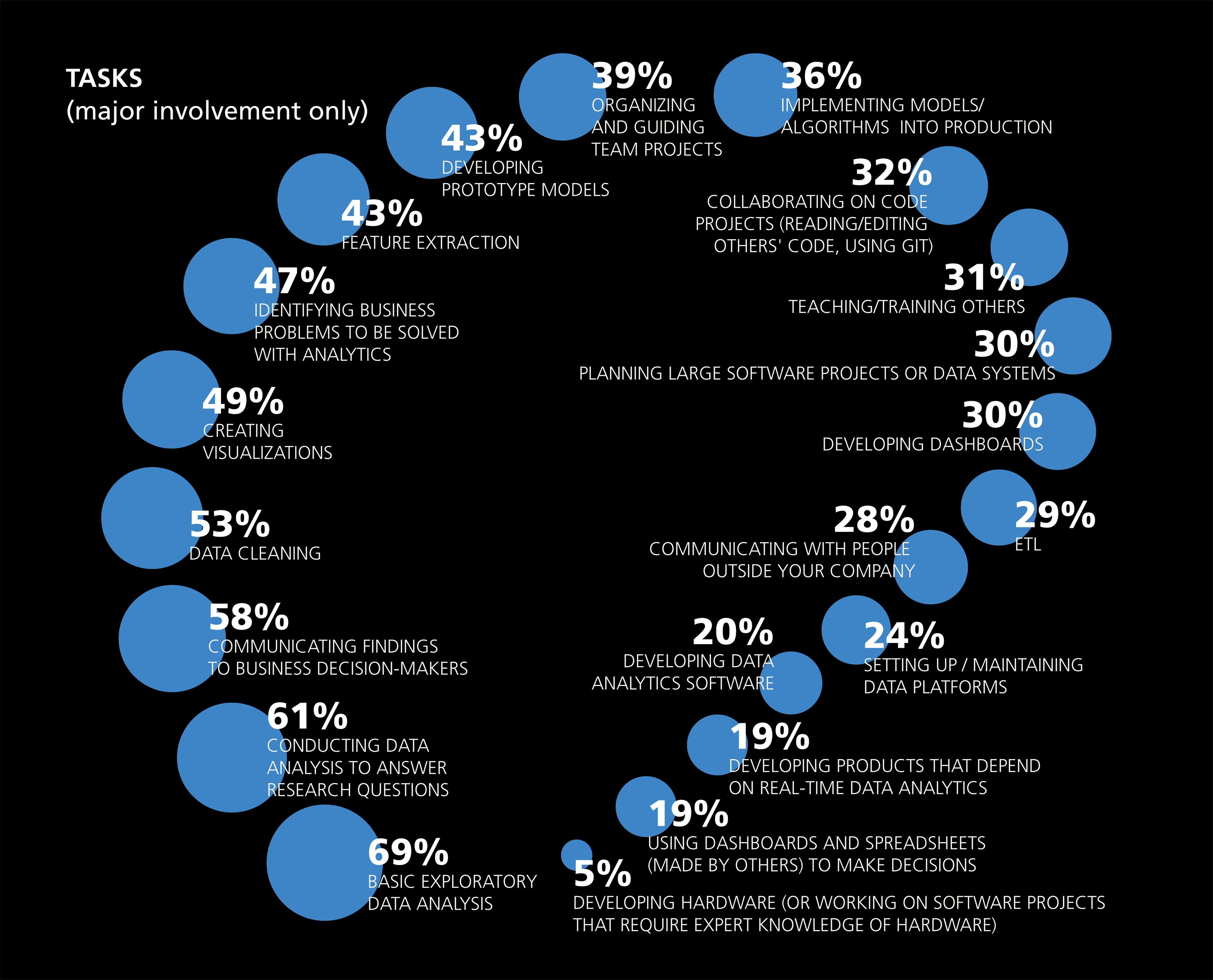
Importance of Tasks
The type of work respondents do was captured through four
different types of questions:
- involvement in specific tasks
- job title
- time spent in meetings
- time spent coding
For every task, respondents chose from three options: no
engagement, minor engagement, or major engagement.
The task with the greatest impact on salary (i.e., the greatest
coefficient) was developing prototype models. Respondents
who indicated major engagement with this task received
on average a $7.4K boost, based on our model. Even minor
engagement in developing prototype models had a +4.4
coefficient.
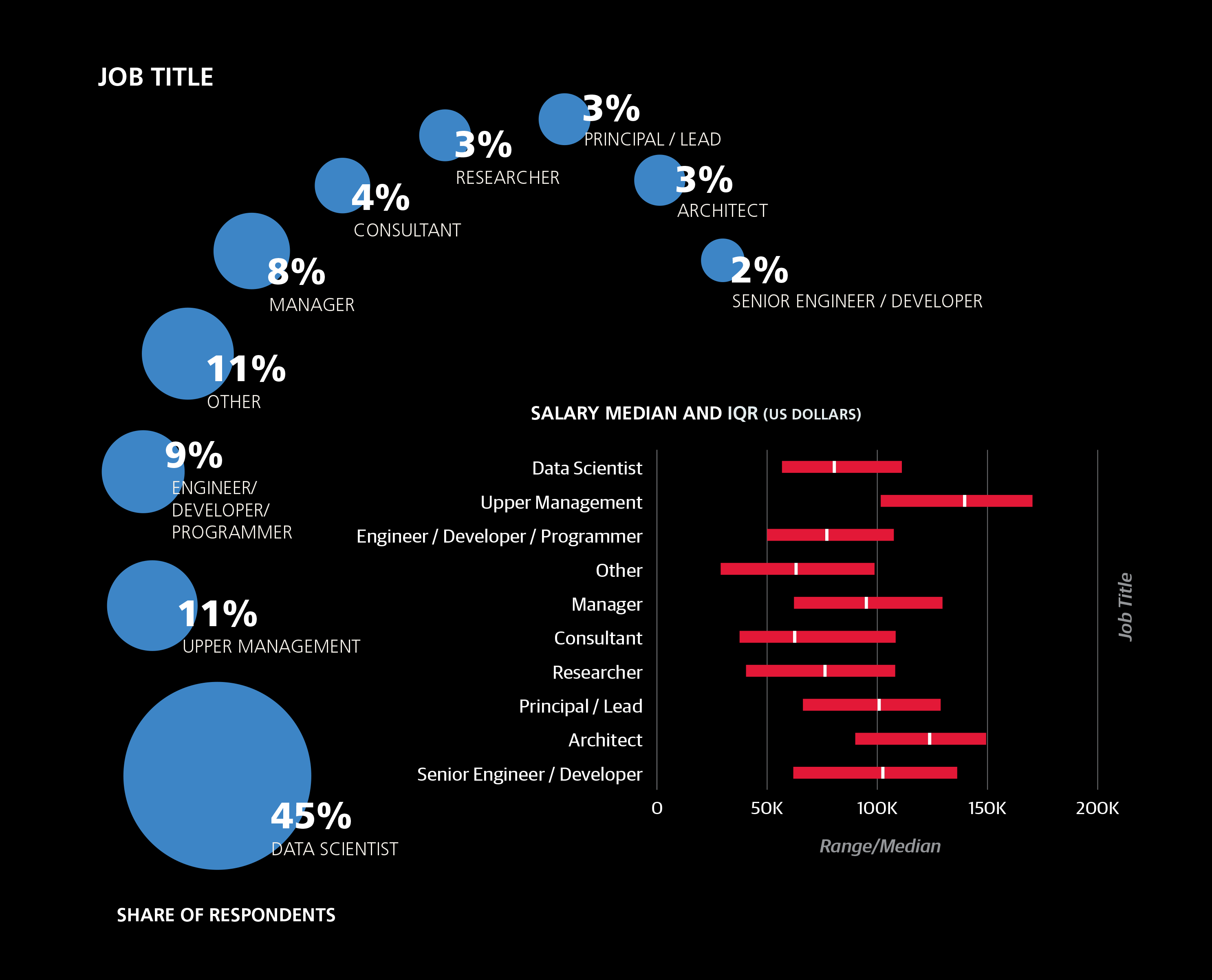
Relevance of Job Titles
When both tasks and job titles are included in the training
set, job title “wins” as a better predictor of salary. It’s notable
however, that titles themselves are not necessarily accurate
at describing what people do. For example, even among
architects there was only a 70% rate of major engagement
in planning large software projects—a task that theoretically
defines the role. Since job title does perform well as a salary
predictor, despite this inconsistency, it may be that “architect,”
for example, is a symbol of seniority as much as anything else.
Respondents with “upper management” titles—mostly C-level
executives at smaller companies, directors and VPs—had a
huge coefficient of +20.2. Engagement in tasks associated
with managerial roles also had a positive impact on salary,
namely: organizing team projects (+9.7), identifying business
problems to be solved with analytics (+1.5/+6.7), and communicating
with people outside the company (+5.4).
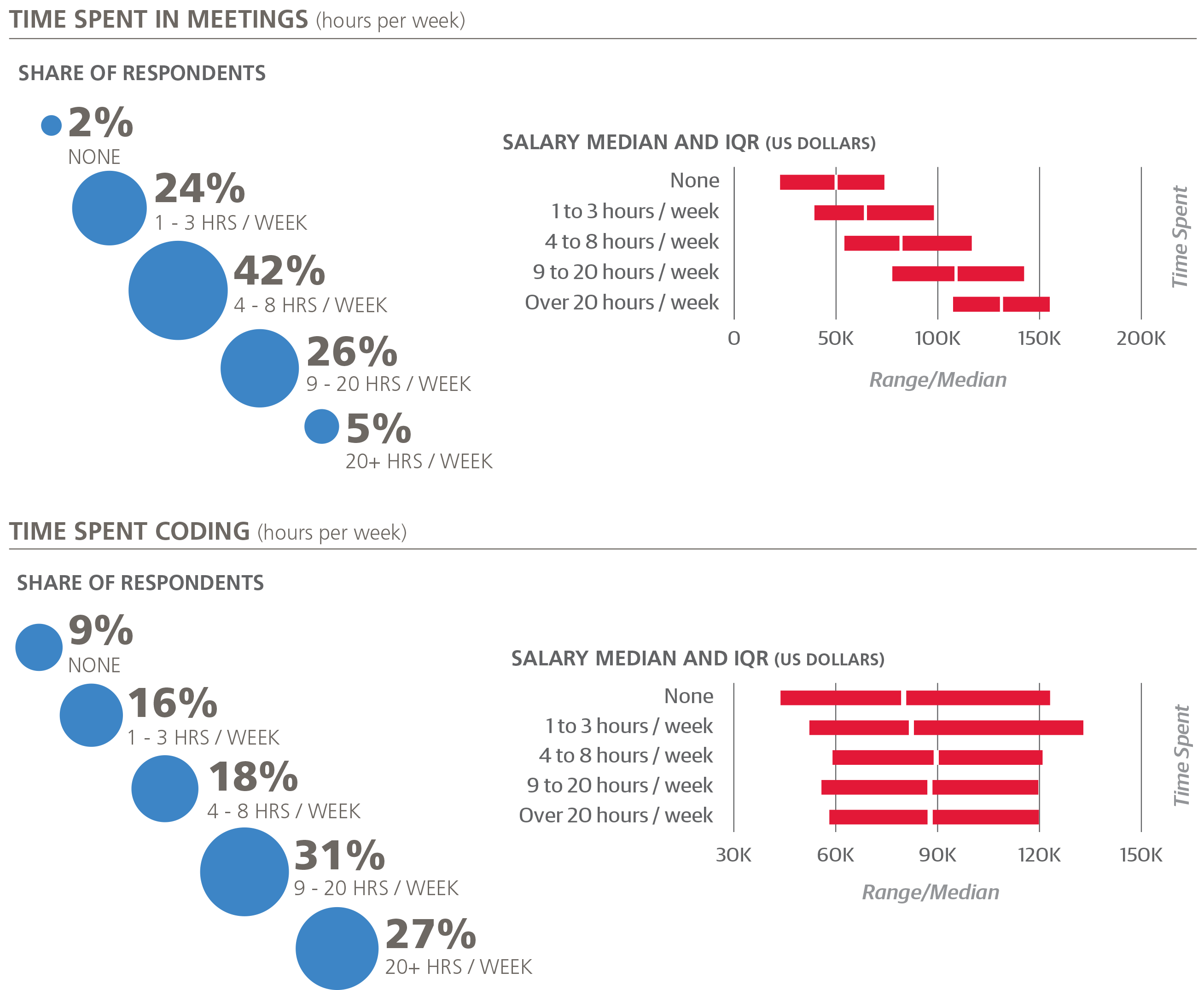
Time Spent in Meetings
People who spend more time in meetings tend to make more.
This is the variable we often use as a reminder that the model
does not guarantee that the relationships between significant
variables and salary are causative: if someone starts scheduling
many meetings (and doesn’t change anything else in their
workday) it is unlikely that this will lead to anything positive,
much less a raise.1
Role of Coding
The highest median salaries belong to those who code 4–8
hours per week; the lowest to those who don’t code at all.
Notably, only 8% of the sample reported that they don’t
code at all, significantly down from last year’s 20%. Coding is
clearly an integral part of being a data scientist.
1Of course, we haven’t actually tested this. If you try it out, let us know how
it goes.
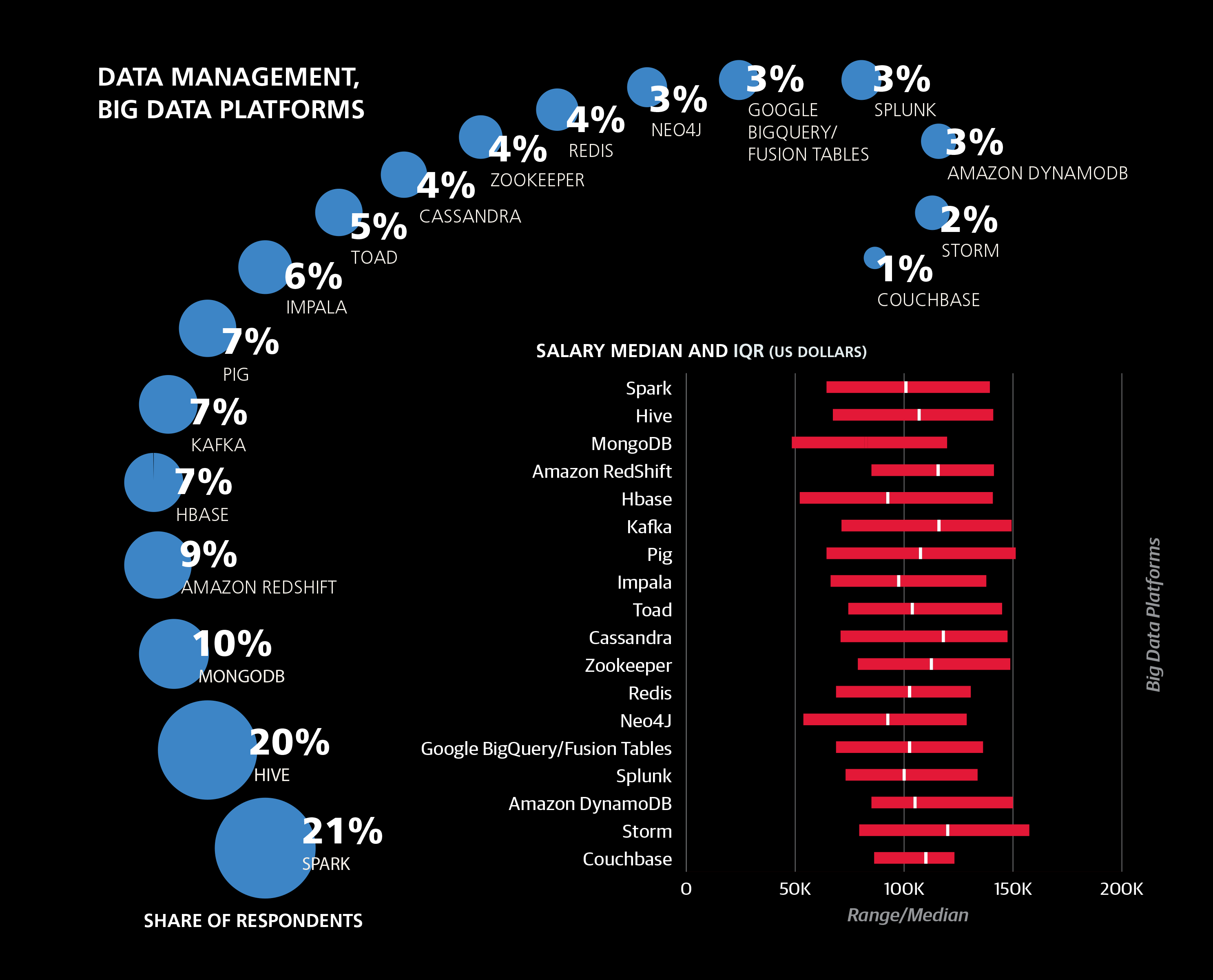
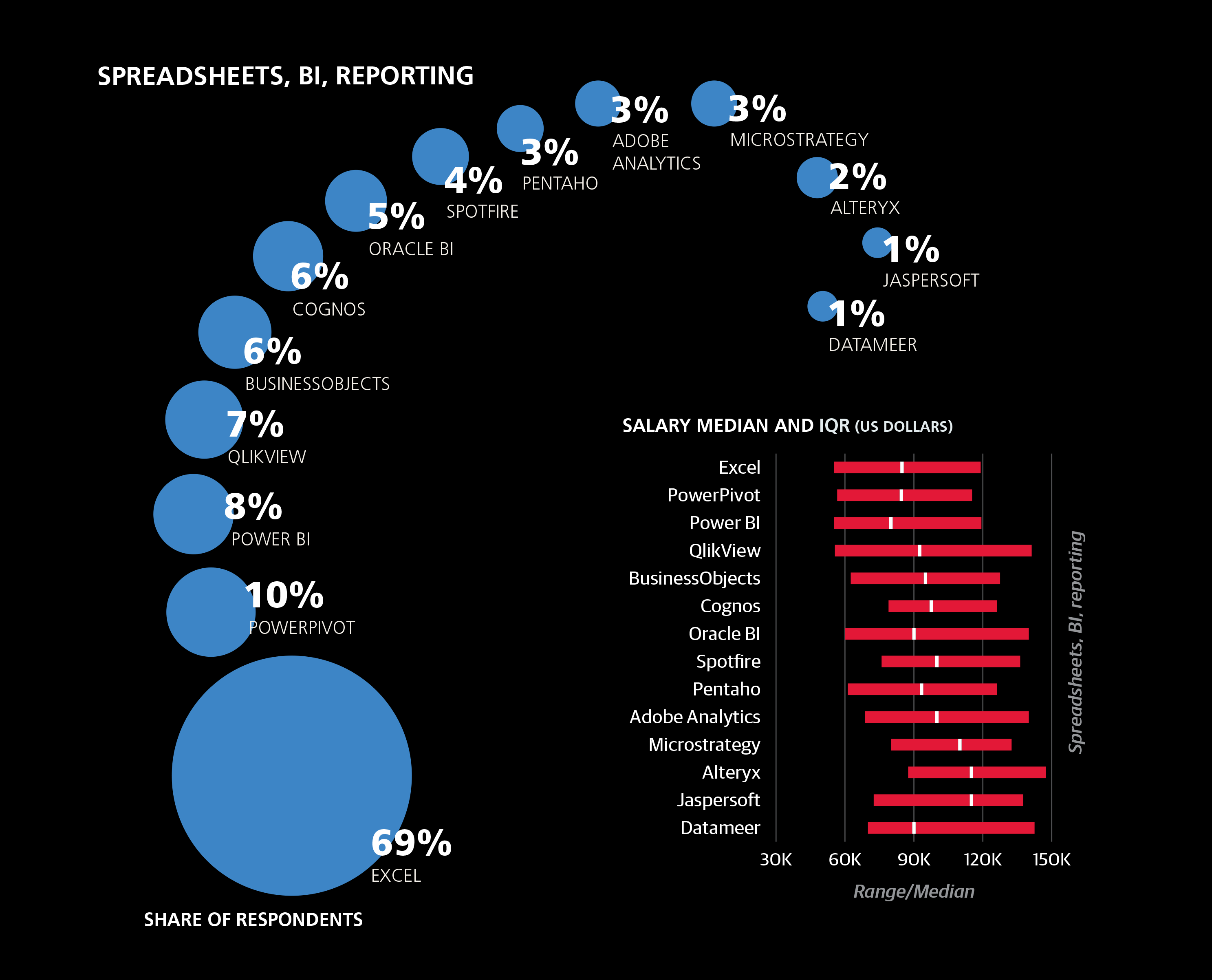
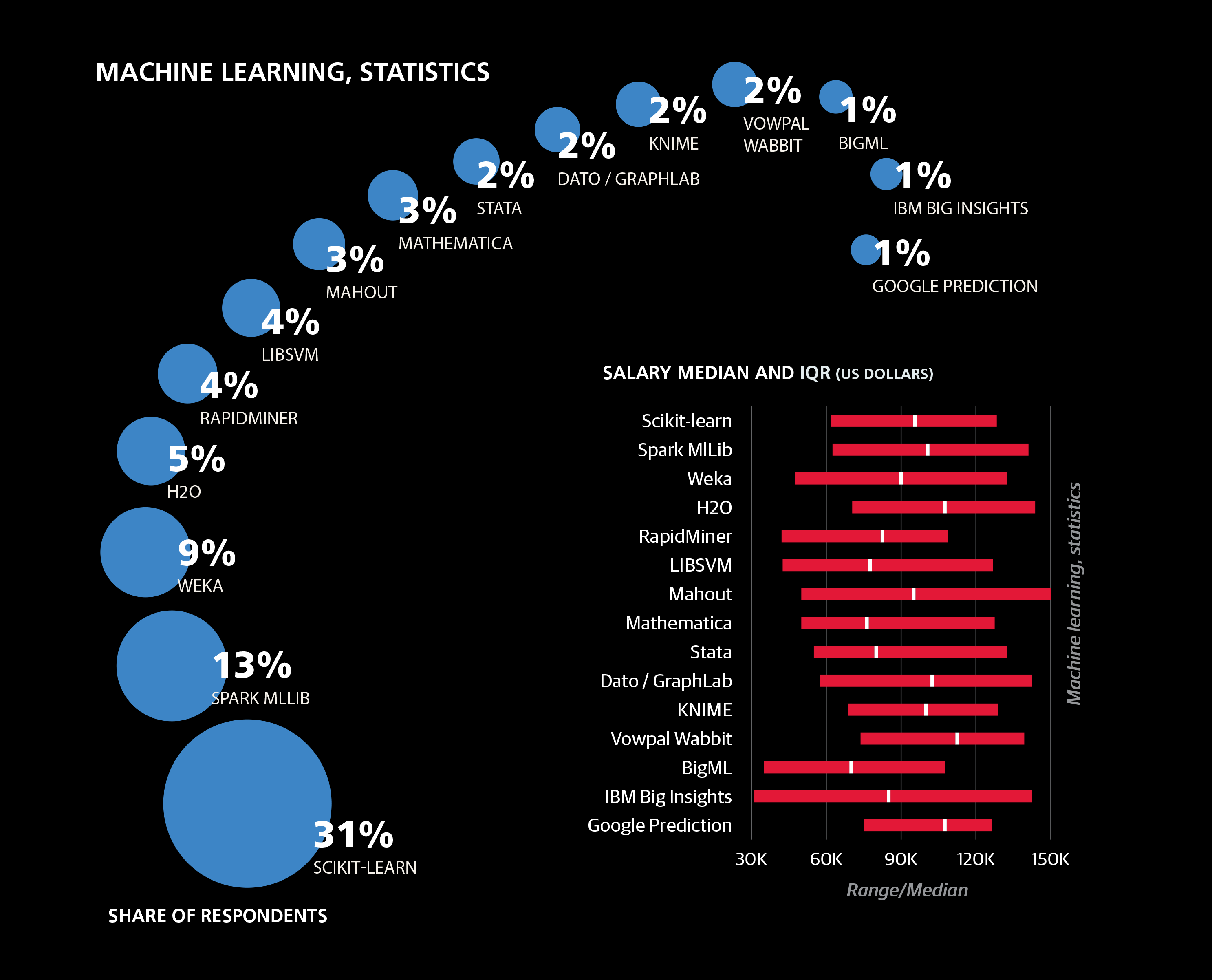
The Impact of Tool Choice
The Top Tools
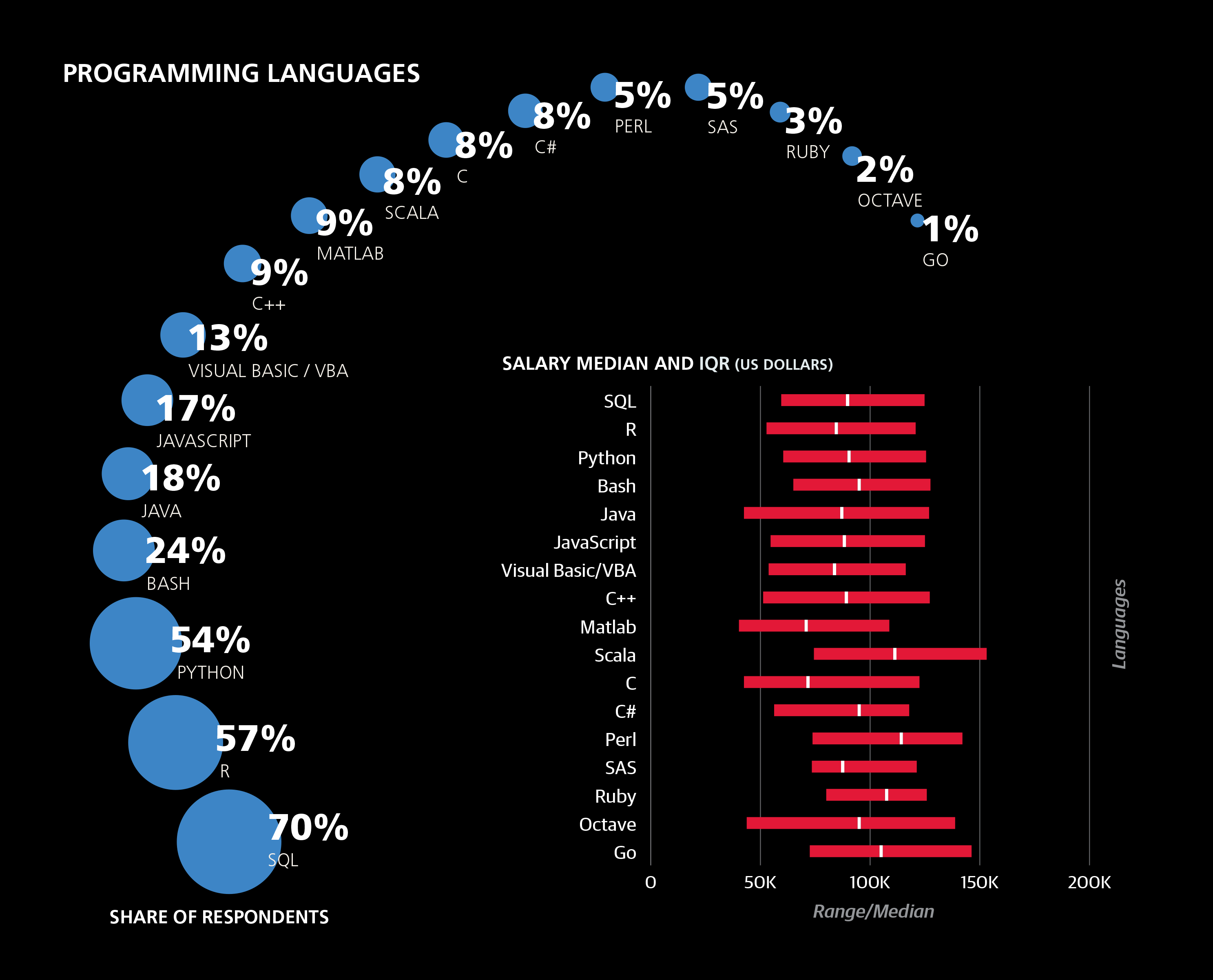
The top two tools in the sample were Excel and SQL, both
with use by 69% of the sample, followed by R (57%) and
Python (54%). Compared to last year, Excel is up (from 59%),
as is R (from 52%), while SQL and Python are only slightly
higher than last year.
Over 90% of the sample reported spending at least some
time coding, and 80% used at least one of Python, R, and
Java, although only 8% used all three. The most commonly
used tools (except for operating systems) were included in
the model training data as individual coefficients; of these,
Python, JavaScript, and Excel had significant coefficients:
+4.6, –2.2 and –7.4, respectively. Less commonly used tools
were first grouped together into clusters and aggregate
features were included that represent counts of tools used from each cluster. For five clusters that were found to have a
significant correlation with salary, coefficients are added on a
per-tool basis.2
The cluster with the largest coefficient was centered on Spark
and Unix, contributing +3.9 per tool. Spark usage was 20%,
up from last year’s a modest 3%, and it continues to be used
by the more well paid individuals in the sample.
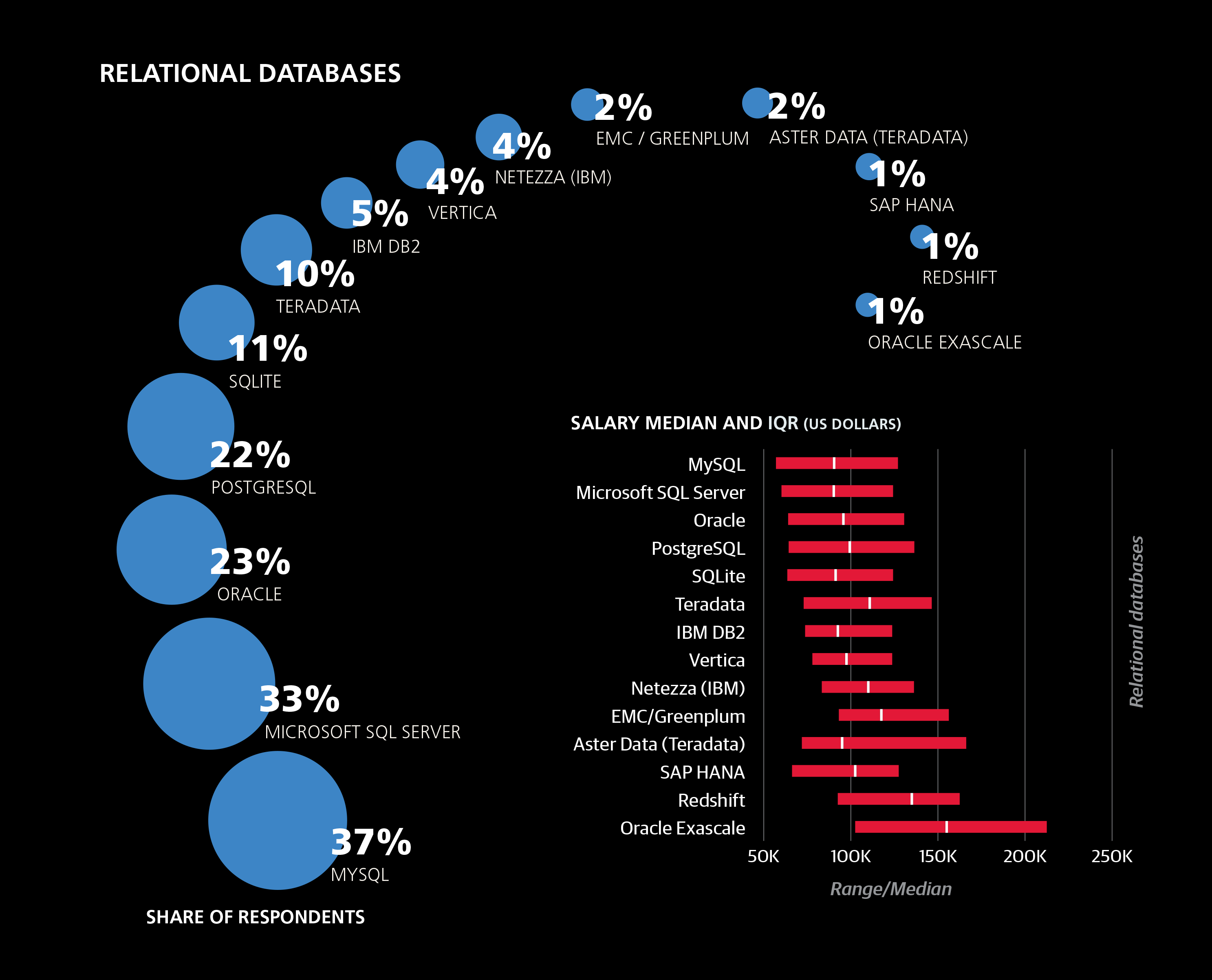
In contrast to the largely open source Spark/Unix cluster, the
second highest cluster coefficient (+2.4) was assigned to a
cluster dominated by proprietary software: Tableau, Teradata,
Netezza, Microstrategy, Aster Data, and Jaspersoft. In last
year’s report, Teradata also featured as a tool with a large,
positive coefficient. The other three clusters with significant
coefficients mostly consisted of open source data tools.
Which Tools to Add to Your Stack
While the model we’ve explained is a good way to get an estimate
for how much someone earns given a certain tool stack, it
doesn’t necessarily work as a good guide for which tool to learn
next. The real question is whether a tool is useful for getting
done what you need to get done. If you never have to analyze
more data than can fit into memory on your local machine, you
might not get any benefit—much less a salary boost—by using
a tool that leverages distributed systems, for example.
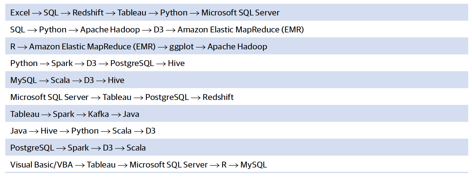
Salary and Sequences of Tools
In the following sequences of tools, the next tool in the
sequence was frequently used by respondents who used all
earlier tools, and these sequences had the best salary differentials
at each step.
If you know the first tool in a sequence, you might consider
learning the second, and so on.
2Tools are added up to a maximum number. This is because few respondents
had more than that number of tools from the cluster, and so if someone
uses more, there is no evidence to support continued addition of coefficients.
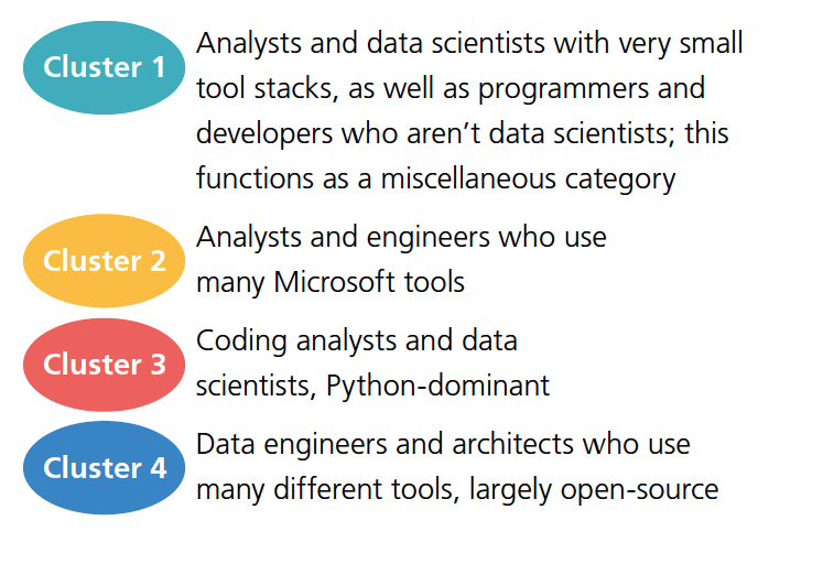
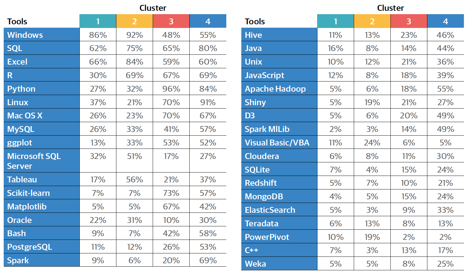
The Relationship Between Tools and Tasks: Clustering Respondents
DATA PROFESSIONALS ARE NOT A homogenous group—
there are various types of roles in the space. While it is
easier—and more common—to classify roles based on titles,
clustering based on tools and tasks is a more rigorous way to
define the key divisions between respondents of the survey.
Every respondent is assigned to one of four clusters based on
their tools and tasks.3
The four clusters were not evenly populated: their shares of
the survey sample were 29%, 31%, 23%, and 17%, respectively.
They can be described as shown on the right.
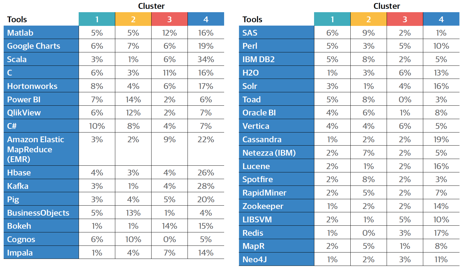
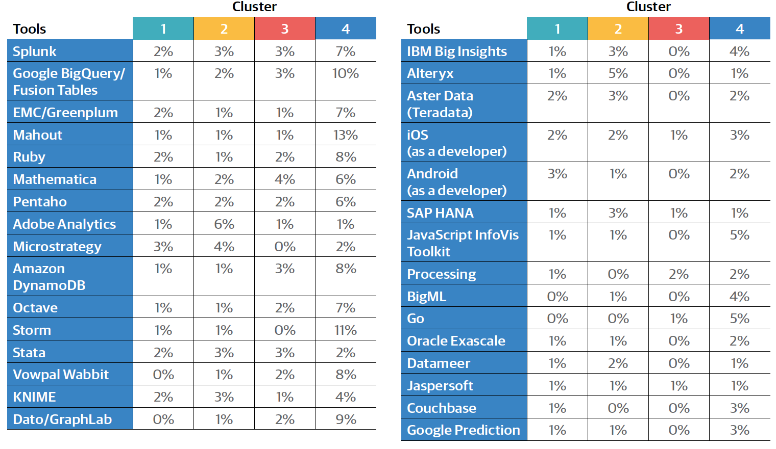
A selection of tool and task percentages are described in the
sections that follow, and the full profiles of tool/task percentages
are found in Appendix A: Full Cluster Profiles.
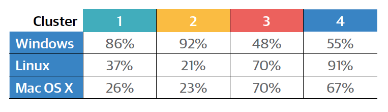
Operating Systems
In our three previous Data Science Salary Survey reports, the
clearest division in tool clusters separated one group of open
source, usually GUI-less tools, from another consisting of
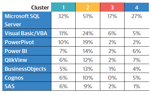
proprietary software, largely developed by Microsoft. Common
tools in the open source group have been Linux, Python,
Spark, Hadoop, and Java, and common tools in the Microsoft/
closed source group include Windows, Excel, Visual Basic, and
MS SQL Server. This same division appears when we cluster respondents, and is clearest when we look at the usage of
operating systems:
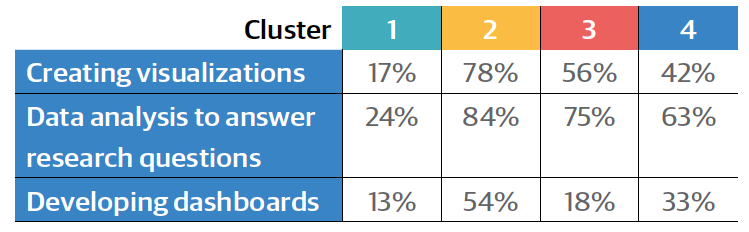
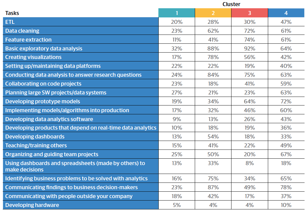
A set of tasks also emphasize the division between the first
two and last two clusters. The following percentages represent
respondents who indicated major engagement in these
tasks:
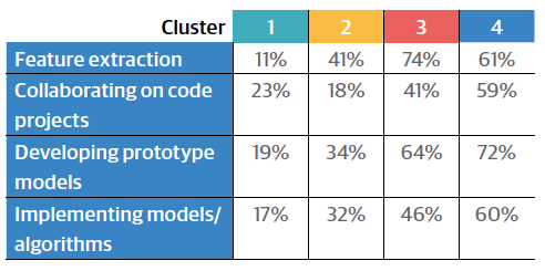
For all of the above tasks, the top two percentages were held
by clusters 3 or 4 and were both much higher than either
percentage for clusters 1 and 2.
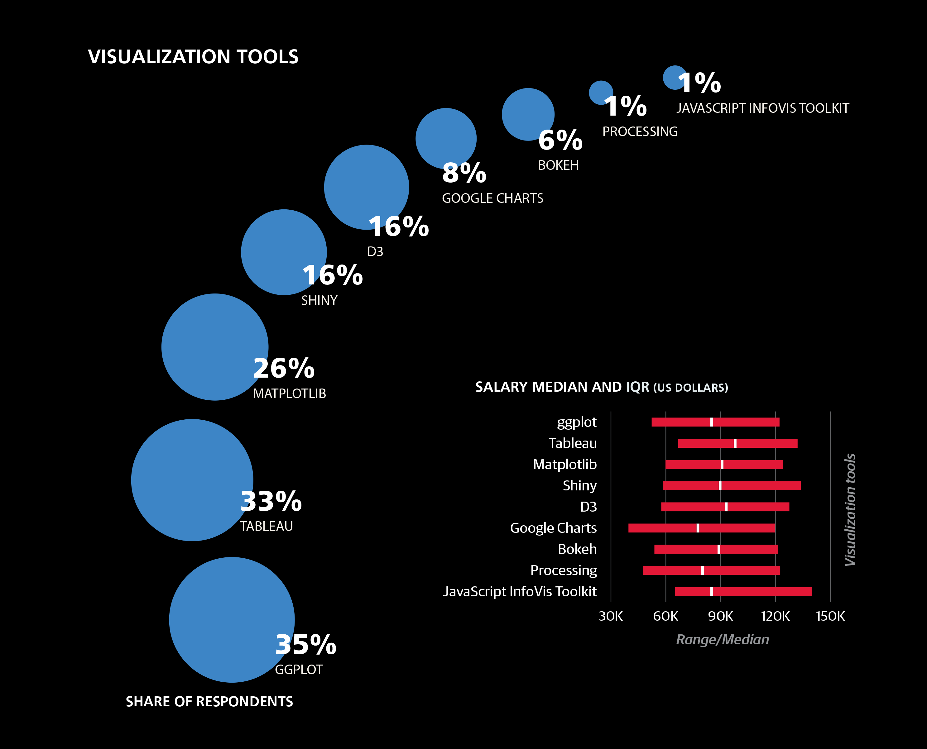
Python, Matplotlib, Scikit-Learn
Another set of tools that exposed the primary split between
clusters 1/2 and 3/4 are Python and two of its popular
packages, Matplotlib (for visualization) and Scikit-Learn (for
machine learning):
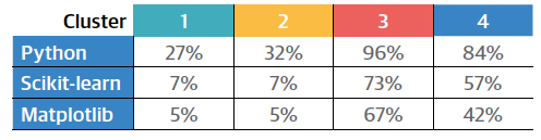
Survey respondents assigned to clusters 3 and 4 tend to use
Python much more than those assigned to 1 and 2, and the
relative difference (as a ratio) grows when we look at the two
packages: cluster 3 and 4 respondents are 8–10 times as likely
to use them as cluster 1 and 2 respondents. Between clusters
3 and 4 there is a difference as well, albeit more minor:
cluster 3 has a higher Python usage rate, while a larger share
of cluster 4 respondents don’t use Python or these packages.
It turns out that these are the only tools whose highest usage
rate is among cluster 3 respondents.4 For most other tools
that are used much more frequently by clusters 3 and 4 than
by 1 and 2, they are also used more frequently by cluster 4
than by cluster 3.
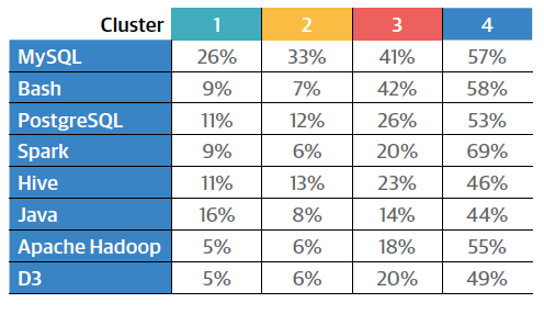
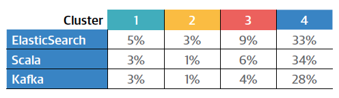
Cluster 4 rates for two tasks also stand out:
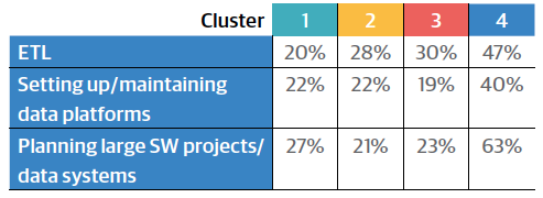
Cluster 4, it seems, is much more of an “open source data
engineer” descriptor than cluster 3, which heads in that
direction but not nearly to the same extent. It’s not rare for
cluster 3 respondents to have used these tools—86% of them
used at least one—but on average they only used about 2.2.
In comparison, respondents in cluster 4 used an average of
5.3 tools. The fact that ETL and data management are much
more important in cluster 4 than cluster 3, implies that while
both might represent data science, cluster 3 tends toward the analyst’s side of the field, and cluster 4 tends toward the
engineering or architecture side.
As for the other two clusters, differences between clusters 1
and 2 become apparent once we look at the rest of the aforementioned
proprietary tool set. Cluster 2 respondents tended
to use these much more frequently.
For most of tools shown below, cluster 1 has the second
highest usage rate, but they significantly lag behind those of
cluster 2. Cluster 1 respondents tended to use fewer tools in
general: just under 8 on average, compared to 10, 13, and 21
for the three other clusters, respectively.
Tasks Without Coding
There are also some tasks that are undertaken by cluster 2
respondents significantly more frequently than those in other
clusters:
The first two tasks are functions of an analyst, and are
fairly common among cluster 3 and 4 respondents as well.
Crucially,
none of these tasks depend on being able to code
(at least, not as much as the four tasks above that are closely
associated with clusters 3 and 4). The low percentages for
cluster 1 sheds some light on the nature of this cluster: most
respondents in the sample whose primary function is not as a
data scientist, analyst, or manager seem to be grouped there.
This includes programmers who aren’t deep in the space (e.g.,
Java programmers who only use a few data tools). There are
analysts and data scientists in cluster 1, but they tend to have
small tool sets, and the composite feature of non-participation in many data tasks and non-use of data tools is what binds
cluster 1 together.
Some of the proprietary tools listed above are used by respondents
in cluster 4 about as much as those in cluster 1, most
notably SQL Server. In other words, they begin to violate the
primary cluster 1/2 vs. 3/4 split. A few other tools and tasks
take this pattern even further, or simply don’t show large
usage differences between clusters:
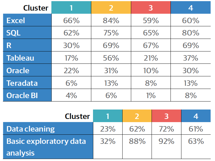
Tableau, Oracle, Teradata, and Oracle BI usage is higher in
clusters 2 and 4, lower in clusters 1 and 3. The same is true
for SQL, but like Excel and R, it’s exceptional in its wide usage
across all four clusters. In fact, SQL and Excel are the only two
tools (or tasks) that are used by over half of the respondents
in each cluster. R is not used as much by cluster 1, but usage
among the other three clusters is about the same: 67%–
69%. Data cleaning and basic exploratory analysis are similarly
high for clusters 2, 3, and 4, and much lower for cluster 1.
These tasks and tools cut across the cluster boundaries, and
don’t seem to have much correlation with the more salient
tool/task differences.
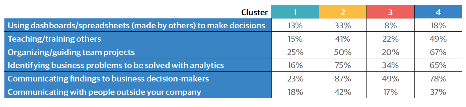
Managerial and Business Strategy Tasks
Perhaps even more illustrative of the connection between
clusters 2 and 4 are the managerial/business strategy tasks. The implication is that respondents in 2/4 tend to be more
senior, which turns out to be true, but only to an extent. In
terms of years of experience, clusters 1, 2, and 4 are about
the same—8–9 years on average—while for the cluster 3, the
average is much smaller: only 4.4 years; a similar difference
exists for age.
Despite representing the least experienced cohort, cluster 3
isn’t the lowest paid; that distinction goes to cluster 1, with
a median salary of $72K. At $84K, cluster 3 is still lower than
cluster 2 ($88K), but cluster 4 salaries tended to be far higher
than either, with a median of $112K. Cluster 4 respondents
tend to use a far greater number of tools than respondents
in the other clusters, and many of the tools they commonly
use are ones that had positive coefficients in the regression
model.
3We tried a variety of clustering algorithms with various numbers of clusters,
and the two best performing models came from KMeans, with two and
four clusters. The partition in the 2-cluster model is more or less preserved
in the 4-cluster model, so we will use the latter, keeping in mind that there
is a primary split between the first two and last two clusters.
4Excluding tools that didn’t have a significant difference between the top
two percentages: Mac OS X, ggplot, Vertica, and Stata.
Wrapping Up: What to Consider Next
THE REGRESSION MODEL WE USE to predict salary
describes relationships between variables, but not where the
relationships come from, or whether they are directly causative.
For example, someone might work for a company with
a colossal budget that can afford high salaries and expensive
tools, but this doesn’t mean that their high salary is driven up
by their tool choice.
Of course, it’s not so simple with salary. When tools become
industry standards, employers begin to expect them, and it
can hurt your chances of landing a good job if you are missing
key tools: it’s in your interest to keep up with new technology.
If you apply for a job at a company that is clearly interested
in hiring someone who knows a certain tool, and this tool is
used by people who earn high salaries, then you have leverage knowing that it will be hard for them to find an alternative
hire without paying a premium.
This information isn’t just for the employees, either. Business
leaders choosing technologies need to consider not just the
software costs, but labor expenses as well. We hope that the
information in this report will aid the task of building estimates
for such decisions.
If you made use of this report, please consider taking the
2017 survey. Every year we work to build on the last year’s
report, and much of the improvement comes from increased
sample sizes. This is a joint research effort, and the more
interaction we have with you, the deeper we will be able to
explore the data science space. Thank you!
Appendix A: Full Cluster Profiles
Appendix B: The Regression Model
+60.0 Constant: everyone starts with this number
+2.6 Multiply by per capita GDP, in thousands (e.g., for Iowa, 2.6 * 52.8 = 137.28)
-7.8 gender = Female
+3.8 Per year of experience
+7.4 Per bargaining skill “point”
+17.2 Age: 26 to 30
+22.5 Age: 31 to 35
+24.8 Age: 36 to 65
+38.5 Age: over 65
+3.9 Academic speciality is/was mathematics, statistics or physics
+12.2 PhD
-9.7 Currently a student (full- or part-time, any level)
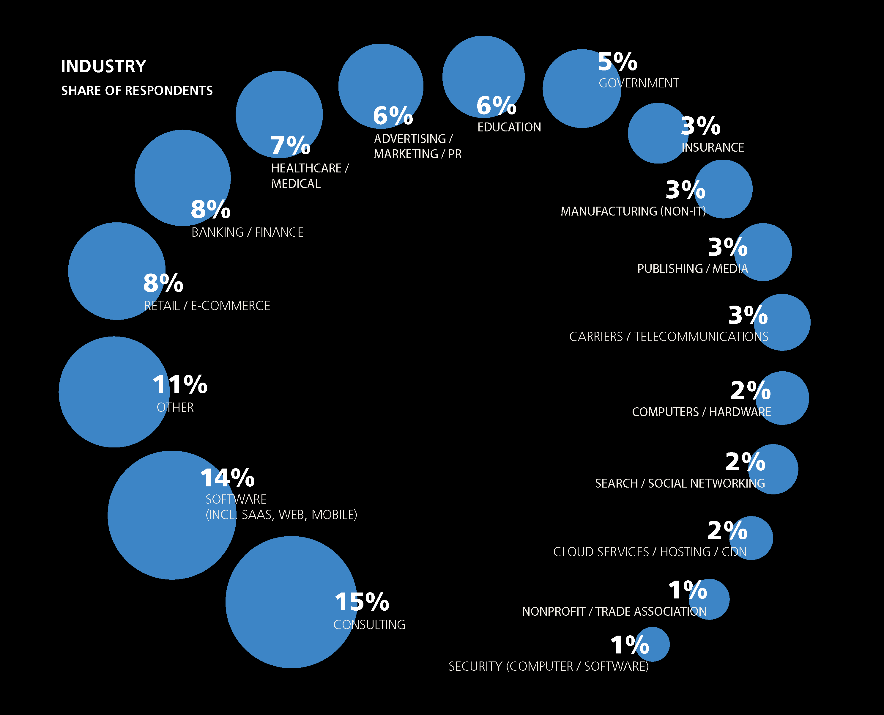
+2.2 industry = Software (incl. SaaS, Web, Mobile)
+3.0 industry = Banking/Finance
-2.0 industry = Advertising/Marketing/PR
-24.5 industry = Education
-3.9 industry = Computers/Hardware
+7.1 industry = Search/Social Networking
+3.6 Company size: 501 to 10,000
+7.7 Company size: 10,000 or more
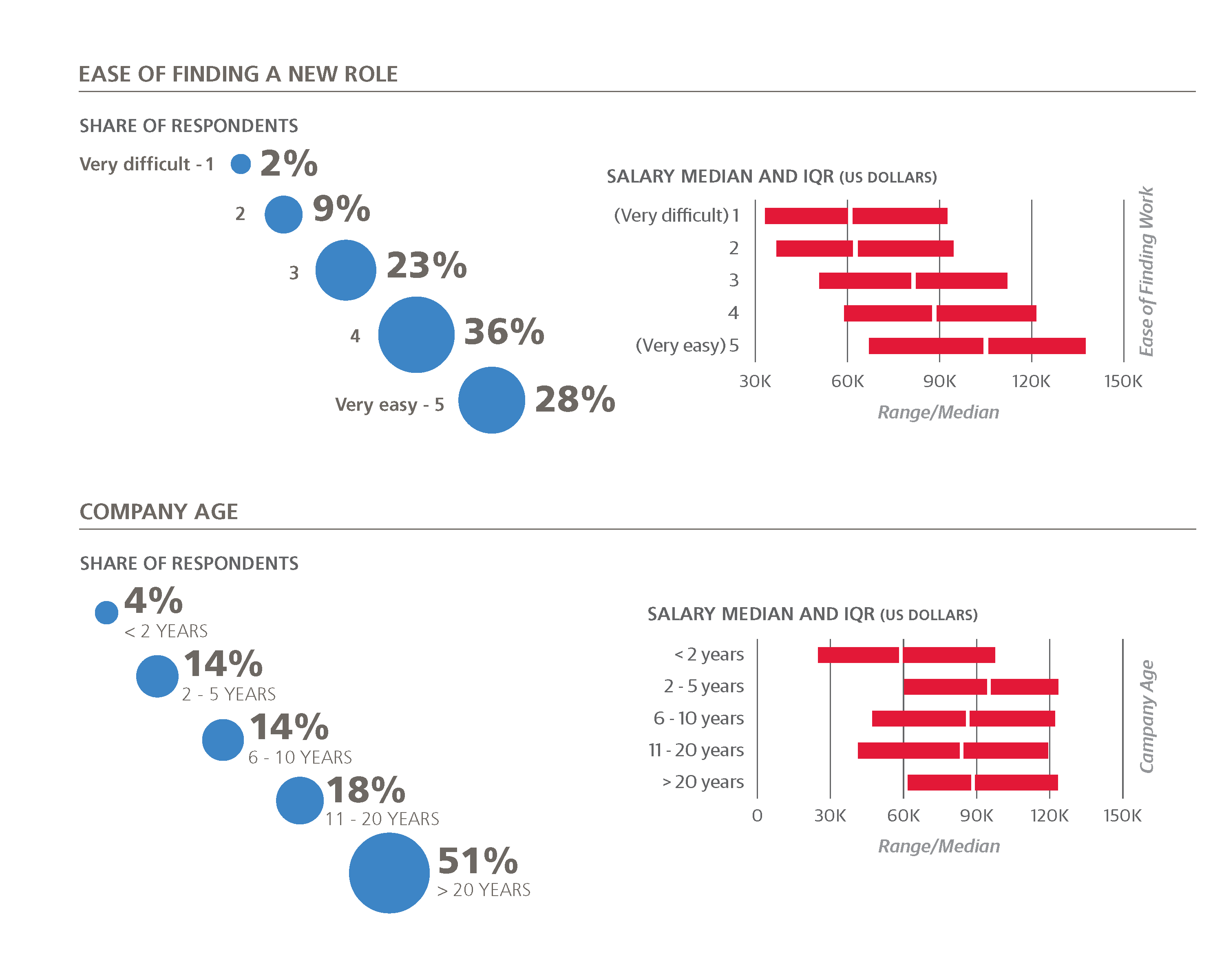
-4.3 Company age: over 10 years old
-8.2 Coding: 1 to 3 hours/week
–3.0 Coding: 4 to 20 hours/week
–0.5 Coding: Over 20 hours/week
+1.0 Meetings: 1 to 3 hours/week
+9.2 Meetings: 4 to 8 hours/week
+20.6 Meetings: 9 to 20 hours/week
+21.1 Meetings: Over 20 hours/week
+1.0 Workweek: 46 to 60 hours
–2.4 Workweek: Over 60 hours
+20.2 Job title: Upper Management
-0.9 Job title: Engineer/Developer/Programmer
+3.1 Job title: Manager
-1.0 Job title: Researcher
+14.3 Job title: Architect
+4.6 Job title: Senior Engineer/Developer
+4.5 ETL (minor involvement)
-1.9 ETL (major involvement)
-4.9 Setting up/maintaining data platforms (minor involvement)
+4.4 Developing prototype models (minor involvement)
+12.1 Developing prototype models (major involvement)
-1.3 Developing hardware, or working on projects that
require expert knowledge of hardware (major)
+9.7 Organizing and guiding team projects (major)
+1.5 Identifying business problems to be solved with analytics (minor)
+6.7 Identifying business problems to be solved with
analytics (major)
+5.4 Communicating with people outside your company
(major)
+3.2 Most or all on work done using cloud computing
+4.6 Python
-2.2 JavaScript
-7.4 Excel
+1.7 for each of MySQL, PostgreSQL, SQLite, Redshift,
Vertica, Redis, Ruby (up to 4 tools)
+3.9 for each of Spark, Unix, Spark MlLib, ElasticSearch, Scala, H2O, EMC/Greenplum, Mahout (up to 5 tools)
+1.5 for each of Hive, Apache Hadoop, Cloudera, Hortonworks, Hbase, Pig, Impala (up to 5 tools)
+2.4 for each of Tableau, Teradata, Netezza (IBM), Microstrategy, Aster Data (Teradata), Jaspersoft (up to 3 tools)
+1.3 for each of MongoDB, Kafka, Cassandra, Zookeeper, Storm, JavaScript InfoVis Toolkit, Go, Couchbase (up to 4 tools)