
 Concentric (source: Publicdomainpictures.net)
 Responsive Web Design
Mobile is no longer “the future.” As mentioned in Chapter 1, handsets are the primary Internet access method (http://slidesha.re/eW8wQ9) for a vast number of global Internet users. People are primarily using handsets to access the Internet, and these devices present their own unique set of challenges. Between the tremendous amount of latency on mobile networks (see “Mobile Networks”) and hardware challenges like WiFi signal strength and battery power (see “Mobile Hardware”), it’s more important than ever that we design and develop sites that are as high performing and efficient as possible. We need to aim for no unnecessary overhead for our users and optimize for perceived performance on all screen sizes.
The challenge with responsive web design sites is that it can be very easy to accidentally deliver unnecessary content like too-large images or unused CSS and JavaScript. Because the process of creating a responsively designed site can often include adding markup and functionality to optimize your layout and content for smaller screens, it’s no surprise that many sites deliver the same page weight or additional page weight to mobile devices without the designers and developers even realizing it.
Many creators of responsive sites are already going above and beyond in their decision-making process: reflowing content, choosing to hide or show various elements, making smart decisions about hierarachy, and more. We need to build an additional step into this responsive web design workflow: ensuring that we are delivering only the necessary content in terms of page weight and requests, not just information architecture.
Guy Podjarny found that the majority of responsively designed sites are currently delivering roughly the same page weight to small and large screens. But it doesn’t have to be this way: responsive web design is not inherently bad for performance, and we can be smart about what we deliver to our users. By being intentional in your approach to designing a responsive site and deliberate with what kinds of assets you require your users to download, you can build an excellent user experience that performs well regardless of screen size.
Deliberately Loading Content
Because we so often create a responsive site by adding things like more media queries for various screen sizes, it’s easy to forget that we may also be adding a ton of extra overhead for our users. This is especially true when a design starts with a desktop version and is then edited to scale down for smaller screens: what happens to those assets that have been optimized for the desktop view? Too often these are left as is; images are always served at the same size (just scaled down visually, through CSS), or fonts continue to be delivered and implemented as they are on desktop. We need to be deliberate with how we load content and ensure we are delivering only the bytes that our user absolutely needs.
Images
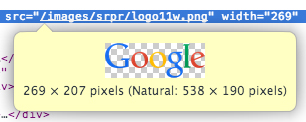
Images should be served at the size at which they are displayed on the page to eliminate any unnecessary overhead for your users. In Figure 1-1, we can see a screenshot of Google’s home page with Chrome DevTools open. The size at which the Google logo is displayed is smaller than the actual height and width of the logo file.
This means that users are downloading unnecessary bytes, since their browsers downloaded an image that’s unnecessarily large for how it’s displayed. As you inspect an image in Chrome DevTools, you’ll be able to see the height and width of the image as it is displayed on the page as well as the image’s “natural” size, which can often be different than the display size (Figure 1-2).
In Figure 1-2, we can see that Google may be sending a retina-sized version of the image to users. Since retina displays cram twice as many pixels into their screens, a designer or developer can send an image twice as large as necessary and scale it down for display in the browser. This technique makes images look crisp on retina displays. Unfortunately, it also means users who aren’t using retina displays will download unnecessary image file bytes.

Inspect the images on your site and see if there are opportunities for serving appropriately sized files. You have a few different ways to tell the browser which image to serve: RESS solutions, CSS media queries, and the new picture specification.
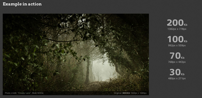
RESS, which stands for responsive web design with server-side components, is one option for creating and serving correctly sized images. You can improve performance by choosing which assets to serve to your user on the server side, rather than optimizing them on the client side. Your server can make smart decisions by looking at a user agent string, from which it can guess things like your user’s screen size, device capabilities like touch, and more. Tools like Adaptive Images (http://adaptive-images.com/) detect your user’s screen size and will automatically create, cache, and deliver correctly sized images based on your defined breakpoints (see Figure 1-3). In his book High Performance Responsive Design (O’Reilly), Tom Barker outlines a number of RESS techniques and how to implement them.
However, there are a number of downsides to RESS solutions. RESS won’t respond to client-size changes (e.g., if a user rotates the device from portrait to landscape). Let’s say you’re using RESS to send a perfectly resized image to your user’s browser. If that user rotates her device and your responsive layout changes, your server won’t know to send a new image to fit the new layout. This is why techniques like media queries and the new picture specification tend to be better solutions for responsive images.
There has been a lot of research done to determine which methods are best for displaying a correctly sized image using CSS in a responsive design, thanks in particular to Tim Kadlec (http://bit.ly/1jqN9gF) and Cloud Four (http://bit.ly/1tu0f7X). However, browsers can do unexpected things as they determine which image(s) to download for your page with CSS, which is why it’s important to test your site’s performance and ensure that you are asking your users’ browsers to download only the necessary resources.
For example, simply setting display: none to an element will not prevent a browser from downloading the image:
<div id="hide">
  <img src="image.jpg" alt="Image" />
</div>

/* Seriously, don't do this.
   Browsers will still download the image. */

@media (max-width: 600px) {
  #hide {
    display: none;
  }
}
The same goes for applying display: none to an element with a background-image; the image will still be downloaded:
<div id="hide"></div>

/* Again, don't do this.
   Browsers will still download the image. */

#hide {
  background: url(image.jpg);
}

@media (max-width: 600px) {
  #hide {
    display: none;
  }
}
Instead, if you want to hide an image from displaying with CSS in a responsive design, you can try hiding the parent element of the element with a background-image:
<div id="parent">
  <div></div>
</div>

/* Hide the parent element;
   Browsers will not download the image. */

#parent div {
  background: url(image.jpg);
}


@media (max-width: 600px) {
  #parent {
    display: none;
  }
}
Alternatively, you could apply different media queries to tell the browser which background-image is appropriate to download at which screen size. A browser will download an image when it matches a media query:
<div id="match"></div>

@media (min-width: 601px) {
  #match {
    background: url(big.jpg);
  }
}

@media (max-width: 600px) {
  #match {
    background: url(small.jpg);
  }
}
Note that if media queries overlap, older browsers will download both images.
But what about serving up retina images with CSS? We can ensure that only the retina version is downloaded for most browsers by using a media query to serve the retina version:
<div id="match"></div>

#match {
  background: url(regular.png);
}

@media (-webkit-min-device-pixel-ratio: 1.5),
  (min--moz-device-pixel-ratio: 1.5),
  (-o-min-device-pixel-ratio: 3/2),
  (min-device-pixel-ratio: 1.5) {
    #match {
      background: url(retina.png);
    }
}
Devices running Android 2.x that have a device pixel ratio equal to or above 1.5 will unfortunately download both versions of the image (regular.png as well as retina.png), but as Kadlec notes in his article (http://bit.ly/1jqN9gF), it’s unlikely that you will encounter a retina device running Android 2.x.
Your best bet for displaying a correctly sized picture in modern browsers is to take advantage of the picture element in HTML. picture is currently supported in Chrome 38, Firefox 33, and Opera 25, and is a part of the new picture specification (http://bit.ly/1tu0v6R). This new specification allows you to tell the browser which image file to download and when, and it includes a fallback for browsers that don’t support the picture element.
Here’s a simple example of the picture element that uses a media query to determine which image file to download. The first source to match, top to bottom, is the resource that gets picked for the browser to download:
<picture>
  <source media="(min-width: 800px)" srcset="big.png">
  <source media="(min-width: 400px)" srcset="small.png">
  <img src="small.png" alt="Description">
</picture>
Check out how amazing this is. Not only are we able to match media attributes to tell the browser which image file to download, but we also have a low-resolution image that will be downloaded by browsers that don’t support the picture element. Picturefill (http://scottjehl.github.io/picturefill/) is a polyfill that enables support for the picture element in browsers that don’t currently support it, so you can start using picture today! A good rule of thumb here is that all the images defined in the same picture element should be able to be described with the same alt attribute.
You can use the picture element to serve retina images when applicable, too!
<picture>
  <source media="(min-width: 800px)"
    srcset="big.png 1x, big-hd.png 2x">
  <source media="(min-width: 600px)"
    srcset="medium.png 1x, medium-hd.png 2x">
  <img src="small.png" srcset="small-hd.png 2x"
    alt="Description">
</picture>
In this example, srcset tells the browser which image to choose at different pixel densities. Again, we’re saving overhead for our users by being precise and telling the browser exactly which single image file is the right one to retrieve and display.
One additional superpower of the picture element is the type attribute:
<picture>
  <source type="image/svg+xml" srcset="pic.svg">
  <img src="pic.png" alt="Description">
</picture>
We can tell our user’s browser to ignore an image source unless it recognizes the contents of the type attribute. In this example, browsers that recognize SVG will download the SVG file, and the rest will download the fallback PNG. Again, we’re able to tell the browser exactly which single image file is the right one to download and display, saving our user from unnecessary page weight overhead.
But what about fluid designs? Or what if you just have a handful of different image sizes, and want your user’s browser to choose the most appropriate resource without listing specific viewport sizes or screen resolutions? The picture specification can help with these, too, using the sizes attribute. sizes follows this syntax:
sizes="[media query] [length],
       [media query] [length],
       etc...
       [default length]"
Each media query in the sizes attribute will relate to a length that the image will be displayed on the page, relative to the viewport size. So if you have a length of 33.3vw, the browser understands that the image will be displayed at 33% of the viewport width. If you have a length of 100vw, the browser understands that the image will be displayed at 100% of the viewport width. This math helps the browser choose which image will be most appropriate to retrieve and show to your user.
sizes is smart because it will look through each media query to see which applies before figuring out the correct image to download. In this example, we can tell the browser that at larger screens, the image will be shown at 33% of the viewport, but the default width of the image is 100% of the viewport:
sizes="(min-width: 1000px) 33.3vw,
  100vw"
The browser looks in the srcset list of images to see their dimensions. We can tell the browser the width of each image in our list with the syntax image.jpg 360w, where image.jpg is the path to the image file and 360w indicates that this image is 360 px wide:
<img srcset="small.jpg 400w,
       medium.jpg 800w,
       big.jpg 1600w"
     sizes="(min-width: 1000px) 33.3vw,
       100vw"
     src="small.jpg"
     alt="Description">
With this list of images in srcset and list of display widths in sizes, browsers can pick the best image to fetch and display to your user based on media query and viewport size. This comes in handy when you use a content management system, too; allow your CMS to generate the sources and markup for your image. This way, a CMS user has to upload only one version and not worry about how it will be displayed at different screen sizes. Note that, as demonstrated in this example, you can use the new picture specification without using the picture element!
You can use all of the pieces of this new specification in concert to give your user’s browser a ton of power in choosing which image should be downloaded and displayed. You’ll be able to choose to serve differently cropped images at different screen sizes, as well as retina-optimized images for high-pixel-density devices, and you can give the browser the power to choose the right image for the job based on media query. All of this is excellent for performance.
Fonts
Font files can add a huge amount of overhead to your site because they require additional requests and increase page weight. As discussed in “Optimizing Web Fonts,” there are several ways of optimizing your font files to ensure they are as high performing as possible. One additional consideration you can make in your responsive design is to load your custom font file only on larger screens. This is something we do at Etsy, as we would rather save our users from downloading the extra font file overhead if they’re on a mobile device.
To do this, set your normal fallback fonts on your content. Then use a media query to only apply your web font to content at a large breakpoint:
@font-face {
  font-family: 'FontName';
  src: url('fontname.woff') format('woff');
}

body {
  font-family: Georgia, serif;
}

@media (min-width: 1000px) {
  body {
    font-family: 'FontName', Georgia, serif;
  }
}
This will download and apply the font file only if the user’s device matches the media query. All browsers (except Internet Explorer 8 and lower) are smart about downloading a font file only if it applies. Internet Explorer 8 and lower will download all @font-face files referenced in a page’s CSS file, even if they aren’t used on the page.
Approaches
While you’ll make many decisions about how to create your site’s responsive web design during the actual design and development process, it’s important to take a beat before you begin any work to consider your overall approach and how it will impact performance. Building performance into project documentation, taking the time to look at your site from a mobile-first perspective, and figuring out how you’re going to measure the performance of your site across media queries will help you to create a speedy, responsively designed site.
Project Documentation
If possible, incorporate performance into your project documentation for any project (not just responsive web designs!). For a responsive site, you’ll want to benchmark and continue to measure the same standard performance metrics like total page weight, total page load time, and perceived performance using the Speed Index. But you’ll also want to be able to set goals for devices and media queries, not just an average overall page using your design.
As we’ll discuss in “Approach New Designs with a Performance Budget,” there are ways to make compromises on site speed as you develop. By setting a performance budget, you’ll be able to make concessions as you balance aesthetics and performance. For any responsive web design, you’ll be making these same concessions; maybe you’ll want to serve a large image at a particular media query that puts you over your budget, so you’ll decide to not deliver extra font weights to make up the time. Table 1-1 outlines an example performance budget for a responsive web design.
| Measure | Goal | Notes |
|---|---|---|
Total page load time | 2 seconds | For all breakpoints |
Total page weight | 500 KB |
|
Total page weight | 300 KB |
|
Speed Index | 1,000 | For all breakpoints |
Set some expectations within your project documentation about how you expect to avoid unnecessary page weight or requests to any device. In addition, make it clear that you will be measuring these things for each media query or screen size and what your goals are, as in Table 1-1. These kinds of budgets can get a bit fuzzy. For example, what happens if you rotate a device and it switches between budgets? It’s essential to have a baseline indicating the importance of performance to set expectations for those who are working on the project. Remember that this will benefit not just your mobile users, but your desktop users as well.
Mobile First
A mobile-first approach to designing any site will help you in so many areas. It will prompt you to:
Ask critical questions up front (“What is the core purpose of this page?”).
Identify the most important functionality and content for your users.
Establish design patterns and how they will change across screen sizes.
Think about your site from an accessibility perspective (“How accessible will this be for people on slower connections or less capable devices?”).
By starting with a mobile-first approach, you can attempt to avoid the square peg/round hole mentality that many designers and developers fall into when they try to reshape a desktop experience for mobile devices. You can progressively enhance your site by adding functionality, incorporating more powerful animations and styles, and taking advantage of newer devices’ capabilities, all while keeping track of performance implications as you add on.
The mobile experience shouldn’t be bare-bones. It should be a deliberate experience; designers and developers should use the benefits of, and be cognizant of the limitations for, each platform their site will be rendered on. Mobile isn’t just an add-on to desktop, and desktop isn’t just an add-on to mobile. Content parity doesn’t mean that each platform’s experience should be identical. We should be designing and developing with our users’ needs in mind.
A mobile-first approach forces you to ask these important questions about core user needs early and will help you with the performance of your site. An experience with intention about your users will help you focus on what kinds of assets are being delivered to them. An approach in which you make hard decisions about functionality and content hierarchy at small screen sizes will help you keep your total page weight and number of requests down. A site that starts with the most important content and assets, rather than tacking on media queries to handle smaller screen sizes, will be a huge help in keeping your performance under control.
For your responsive site, consider your smallest screen sizes first. Reorder your CSS to deliver small screen styles first, and use progressive enhancement to add content and capabilities as screen sizes get larger. Deliver correctly sized assets, ensure there’s no scrolling jank, and make the page’s core functionality interactive as quickly as possible. From there, you can make decisions about how to share larger assets on larger screens, reflow content in your hierarchy, and continue to be deliberate about performance in your overall user experience.
Measure Everything
In Chapter 6, we’ll cover how to continue to measure your performance as you iterate and test your designs. You’ll use all of these tactics on a responsively designed site, just as you would any other site. But there are some additional considerations for measuring a responsive web design.
Primarily, you need to ensure that only the appropriate content is being loaded at each breakpoint. Don’t join the other 72% of websites that are serving up the same size responsive design site across screen sizes.
If you’re able to, implement automated tests that measure the total page weight for each of your chosen breakpoints. Tom Barker included an excellent chapter on continuous web performance testing in his book High Performance Responsive Design, which outlines how to implement Phantom JS tests that measure each breakpoint’s performance, including YSlow score and total page weight.
You can also test this manually. Emulate a device using Chrome DevTools and use the Resources panel to see which image size is being downloaded for that device. Here is an example set of media queries in which I choose to serve a different image based on breakpoint:
@media (min-width: 601px) {
section {
background: url(big.png);
}
}
@media (max-width: 600px) {
section {
background: url(small.png);
}
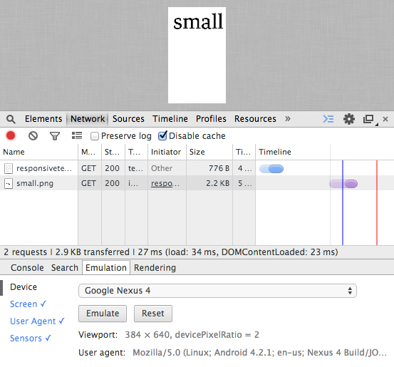
}I want to make sure not only that the correct image is downloaded for a particular device size, but that both images aren’t downloaded. I used Chrome DevTools with caching disabled to emulate a Google Nexus 10 that would match the larger media query (Figure 1-4), and a Google Nexus 4 that would match the smaller media query (Figure 1-5).
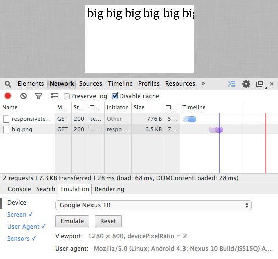
Each emulated device correctly downloaded only the image that was needed. We can also see the total page size transferred: 7.3 KB for the larger device, and 2.9 KB for the smaller device. Continue to check on the resources and total page weight being delivered to each breakpoint determined in your project plans to ensure that you’re meeting your goals.
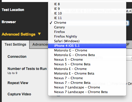
For measuring total page load time and Speed Index at each breakpoint, check out WebPagetest’s drop-downs for browser (Figure 1-6) and connection speed (Figure 1-7).
The Dulles, Virginia, WebPagetest location includes a number of mobile browsers in the Browser drop-down. This testing location includes physical devices, like the iPhone 4 and the Nexus 5, on which you can test.
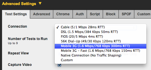
The different connections listed in the Connections drop-down are created using traffic shaping. This means Chrome DevTools will emulate what a user may experience on this type of connection, but the results will be more consistent across tests because the test is actually happening on WiFi.
Compare the results for each breakpoint to make sure that your total page load time and Speed Index meets or beats the goal outlined in your project documentation.
All of the other techniques in this book will also help you optimize your responsive web design for performance. As you design your responsive site, be deliberate about which assets are downloaded by your users. Develop a performance budget at each breakpoint and use a mobile-first approach when designing and developing the site. Be sure to also check out Tom Barker’s book, High Performance Responsive Design, for more in-depth details on optimizing both the backend and frontend of your responsively designed website for performance.
As always, measuring performance as you work and as your site ages will help you keep page load time under control. In the next chapter, we’ll dive into tools and routines for checking in on the performance of your site to help you get a holistic view of your user experience over time.