
 An example of intentional camera movement (ICM), which creates an impressionistic effect. (source: Colin on Wikimedia Commons)
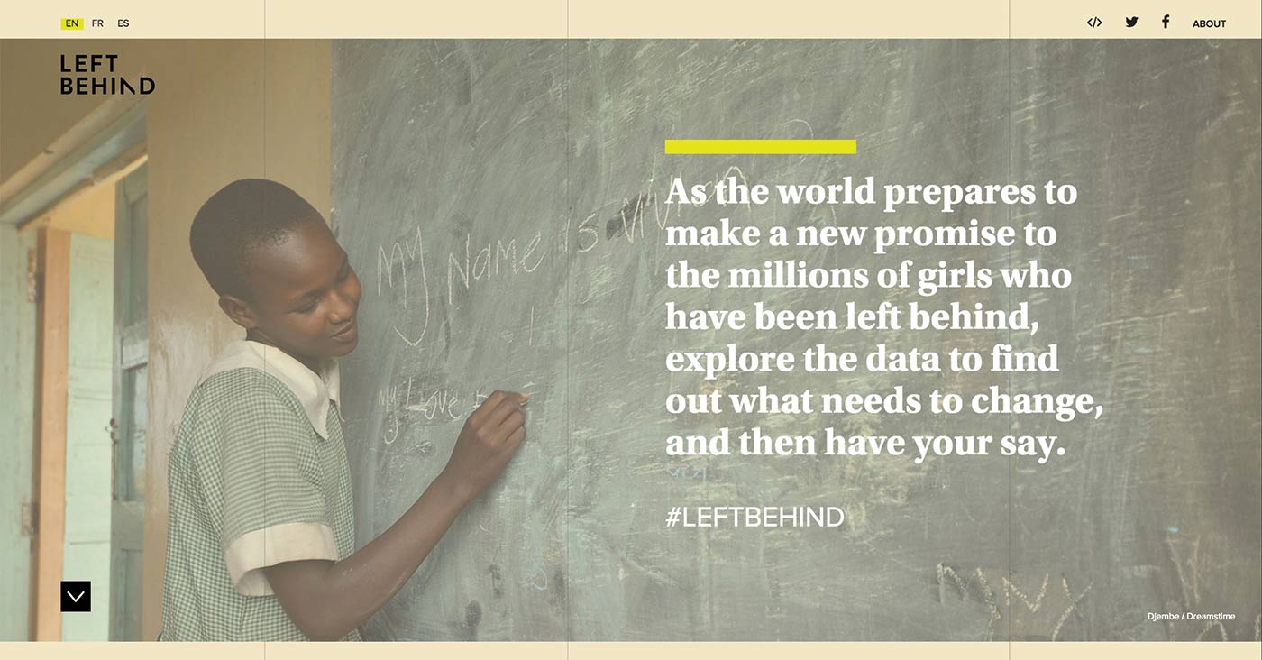
 UNESCO Institute for Statistics wanted to launch an interactive data visualization that would rally the public to engage with the issue of gender equality in education, share advocacy messages, and ultimately, request that policymakers devise a more effective plan to ensure that girls in the developing world would be prioritized when the UN rewrote the Millennium Development Goals in 2015. Today, there are 59 million children (6-11 years old) missing from classrooms, or 9% of the primary school-age population. The majority of these children are girls.
“For millions of girls in sub-Saharan Africa, and elsewhere, the goal of Universal Primary Education is still unmet,” explained Jennifer Morrow of the UIS. “What can we do to ensure that these girls aren’t left behind again?”
The UIS asked the FFunction team to come on board to create an interactive visualization, which would be called Left Behind. As creative director at FFunction, I led the team and devised ways to make the data personal, in order to incite engagement and action from the end user.
At kick-off, we defined several main prerequisites. Left Behind had to be:
- Visually compelling and highly interactive
- Trilingual (Spanish, French, English)
- Easy to navigate
- Easy to share on social media and to embed on third-party sites and blogs
But the driving message that needed to come through at every level in the interactive was simple: without more investment in basic resources, new global commitments to these girls would be meaningless. The numbers were compelling; here are some major points:
- In Chad, only 45 girls attended school for every 100 boys attending school
- Nearly 1/10 of the world’s school-aged children did not attend school
- Of the global illiterate population, 2/3 were women
- Sub-Saharan Africa needed 3.9 million new teachers
- In Niger, 69% of girls were out of school
- Congo had an average class size of 107 students
The idea was that we would use UNESCO’s data to weave an emotive but credible online experience that could be an educational resource for citizens, journalists, and policymakers alike—aiming to raise awareness and encourage the international community to get the ball rolling on new initiatives that would shape the social dynamics and economy of the entire region.
Images, data, and storytelling
It was important to us that we created visual contrast between the photos, the information, and the narration. A key part of this was to show that real people are behind the numbers by using photos chosen primarily from the World Bank’s library of images.
One major design challenge was this: how to create representations that were visually interesting but simple enough so as to not steal the show. We didn’t want to overshadow the photos or the data itself. There were a couple of designs that we created and then subsequently had to redo because they didn’t work in this respect, which can happen often in dataviz. It’s sometimes trial and error.
The fact that the client supplied the data on an API made the process much easier, as we didn’t have to go through the rigmarole of normalizing/validating the data and ensuring its credibility. Thus, we could get down to prototyping early on in the process.
One of the most important tasks was to clearly follow the evolution of the narration and make sure the charts told the story in a way that was both accurate and compelling—something that was stripped down and reminiscent of the kind of high-level data journalism you might find in The New York Times.
The data the UIS gave us (mostly gleaned from a joint report they published with UNICEF) touched on many different topics, so it was difficult initially to write a coherent story and to transition from one indicator to the next.
At the very beginning, we asked our data journalist to review the indicators and to re-order them, and to sketch out a narrative. We drew wireframes based on that story, but we went through several iterations before we had a narrative thread that worked for everyone involved and worked with the data.
The visualizations
On some of our earlier sketches, the visualizations were a lot more complex, but we decided to go with simple to drive the message home. Complexity, we found, was unnecessary.
Elements on the left-hand side pull out various points of interest, and charts and data selectors are interactive to encourage exploration. We used a combination of map-based visualizations, line charts with sliders, bar charts, donut charts, and scatterplots.
Every chart in Left Behind points back to its original source, both for transparency and to enable further research. This is something we learned from a previous UIS project: instead of linking to the UIS data portal, it was much more interesting to link to the indicators featured in the dataviz directly.
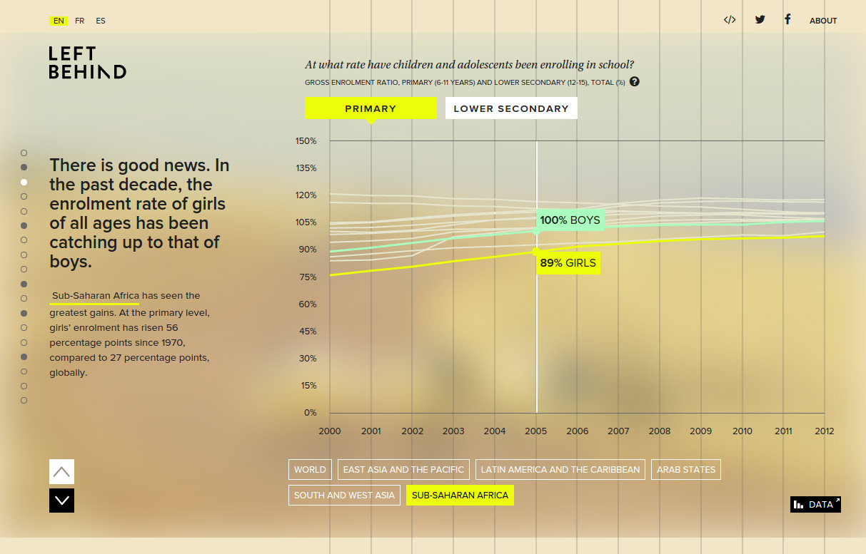
We had data for almost all countries in the world, but if we had shown them all, the countries where girls are left behind would have been almost invisible. So, we sometimes chose the countries that were worst off, and chose a point of reference like North America and Europe (for example, when displaying the number of years of schooling).
UI/UX
It was essential that the interactive function seamlessly across desktop and tablet, which brought up some interesting design challenges for the team.
Touchscreen interactions
Several issues came up with the touchscreen interactions when we came to design the tablet version of Left Behind:
- How can we label and select the countries in the linegraph?
- How do we go about selecting the smaller countries on the map?
On a few occasions, we had to make compromises for the touch version and ensure the visualization was readable without interaction (using a legend, for example).
So, the desktop version frequently offers the datapoint on mouseover, but the tablet version shows only the overall message without the exact datapoint.
We made the buttons with the countries easy to tap, then they open a tooltip with the data point and label. Thus, users can understand the graph, even if it’s static.
Multilingual UI
Creating multilingual UI is more than just switching out the copy. Our mandate was to create interfaces in French, Spanish, and English. At FFunction, we’ve done a lot of bilingual and trilingual UI over the years—one memorable example was designing a UI for Qasr al Hosn Festival that had to work in English (left-to-right) and Arabic (right-to-left).
We know from experience that a French translation is typically 20% longer than its English counterpart, so we had to think carefully about the layout of Left Behind in order to achieve a result that design-wise would be identical across the three languages. One issue we had was button-labelling; the French version was sometimes so long that it wouldn’t fit, so we had to create various iterations until we had something that worked.
Shareability and social collaboration
Social collaboration is the name of the game in the 21st century. Users expect to have an easy and intuitive way to share their data visualization discoveries with others. In designing Left Behind, we tried to make sure this capability was native, fully integrated, and not treated as an afterthought.
There are specific messages within the interactive that users can choose and share on social media. All 20 levels of the interactive can be shared, sparking off conversations on very specific issues, such as toilet facilities, the paucity of female teachers, or access to electricity or water. The interactive visualization breaks down not only the numbers of girls missing from classrooms, but potential barriers they may experience in gaining an education.
The interactive was designed to be not just a communication piece, but a call to action. It finishes with a range of pre-written Tweets that the user can share. UNESCO also promoted the hashtag #leftbehind in association with the interactive to drive conversation online.
The piece is fully embeddable in an iframe to make it easy for anyone to embed. The UIS does this with all of their dataviz projects to leverage third-party partnerships and encourage the informal dissemination of UIS-produced data and products (versus the formal dissemination of the database).

There is a legitimate concern about data becoming quickly outdated in projects such as this. The best solution in this case was: UIS has an API that automatically updates Left Behind with each new data release, which occurs twice a year. This exemplifies the benefits of an API reach beyond data integrity. “(Left Behind) has fairly long shelf life, we just need to updated the text in a few places to keep it current,” explained Jennifer Morrow of UIS. “This also makes it attractive to our partners who may have it embedded on their sites. So, it continues to attract traffic and we continue to promote it.”
At the time of writing this post, Google Analytics shows that the piece has attracted more than 12,000 pageviews since its launch on International Women’s Day last year.
Designers today have an increasing responsibility to use their powers for good, visualizing the issues in ways that make an impact online and—ultimately—in real life. Data is a powerful way to cut through the mushy rhetoric that has historically characterized global development communications, and allow citizens and policymakers to see both the big picture and fine-grained detail.