How can I add simple, automated data visualizations and dashboards to Jupyter Notebooks
Learn how to use PixieDust in Jupyter Notebooks to create quick, easy, and powerful visualizations for exploring your data.
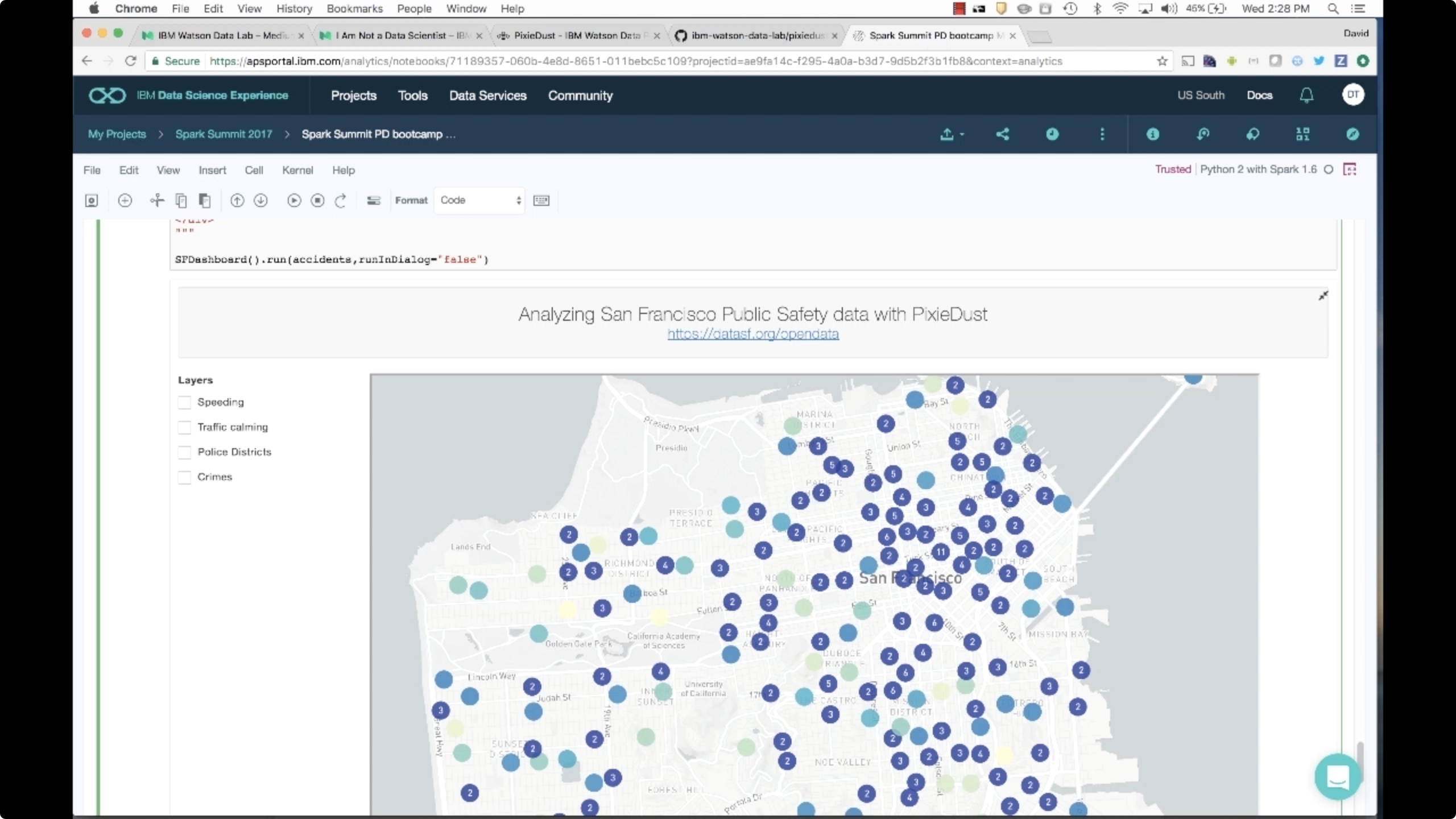 Screen from "How can I add simple, automated data visualizations and dashboards to Jupyter Notebooks?" (source: O'Reilly)
The IBM Watson Developer Advocacy team has developed an open source tool called PixieDust, which makes creating data visualizations and dashboards quick and easy in Jupyter Notebooks—something that previously required in-depth knowledge of libraries such as matplotlib or Seaborn. In this video, David Taieb gives you a high-level overview of PixieDust and explains how you can use it to increase your productivity with easy-to-create visualizations of your data right in your notebooks, allowing you to explore your data without needing a computer science degree to build data charts and graphs!