How to design a product at a startup
It's all about building an MVP.
 Simplicity (source: Rodger Evans on Flickr)
As far as the customer is concerned, the interface is the product.
[Raskin 2000, 5], Jeff Raskin, The Humane Interface

Learn faster. Dig deeper. See farther.
For someone browsing the web, Google is a text box and a page of results, and not the bots that crawl the web, the algorithm to rank pages, or the hundreds of thousands of servers in multiple data centers around the world. For someone who needs a ride, Uber is a button on their phone they can push to order a car, and not the real-time dispatch system, the payment processing systems, or all the effort that goes into recruiting drivers and fighting with regulators. And for someone using a smartphone, the iPhone consists of the parts they can see (e.g., the screen), hear (e.g., a caller’s voice), and touch (e.g., a button), and not the GSM, WiFi, and GPS radios, the multi-core CPU, the operating system, the supply chain that provides the parts, or the factories in China that assemble them. To a customer, the design of the product is all that matters.
Joel Spolsky called this “The Iceberg Secret.” Just as the part of the iceberg that you can see above the water represents only 10% of its total size, the part of a product that you can see and touch—the user interface—represents only 10% of the work. The secret is that most people don’t understand this [Spolsky 2002]. When they see a user interface that looks crappy, they assume everything about the product is crappy. If you’re doing a demo to a potential customer, above all else you must have a polished presentation. You can’t ask them to imagine how it would look and just focus on the “functionality.” If the pixels on the screen look terrible, the default assumption is that the product must be terrible, too.
You might think the Iceberg Secret doesn’t apply to programmers, but no one is immune. I prefer iPhone to Android, open source projects with beautiful documentation pages to those with plain-text readmes, and blog posts on Medium to those on Blogger. It’s almost as if we’re all hard wired to judge a book by its cover. But product design isn’t just the cover. It’s also how it’s printed, the title, the praise on the back, the typography, the layout, and even the text itself.
Most people make the mistake of thinking design is what it looks like. People think it’s this veneer—that the designers are handed this box and told, Make it look good! That’s not what we think design is. It’s not just what it looks like and feels like. Design is how it works.
[Walker 2003], Steve Jobs
Design is how it works. Yes, the iPhone is prettier than most other smartphones, and that counts for something, but it’s more than just a question of style. The sharp screen, the fonts, and the layout make it easier to read the text. The buttons are big and easy to use. The touchscreen is precise and the UI is fast and responsive. The phone tries to anticipate your needs, dimming the screen automatically in response to the amount of ambient light, or shutting off the screen entirely when you hold the phone to your ear. You don’t have to think about it or fight with it—it “just works.” And while other smartphones may have caught up in terms of features and price, they still can’t match the experience. This is why Apple invests so heavily in design, and not coincidentally, this is why it’s the most valuable company in the world.
Design is a useful skill even if you aren’t building a product and even if the word “designer” is not part of your job title. Everybody uses design all the time. You use design every time you create a slide deck for a presentation, format your résumé, build a personal home page, arrange the furniture in your living room, plan out the syllabus for a class, or come up with the architecture for a software system. Design is fundamentally about how to present information so other people can understand it and use it. Given that much of success in life comes down to how well you communicate, it’s remarkable just how little design training most people get as part of their education.
Due to my lack of training, I used to think of design and art ability as something you either had or you didn’t. My own artistic abilities were limited to drawing stick figures all over my notebooks, so clearly I didn’t have that ability. It took me a long time to realize that design and art are both skills that can be learned through an iterative process.
Design is iterative
A few years ago, I took an art class with my sister. The art teacher was a family friend, and he would come over to our house and have us paint still lifes and skylines using pencils and water colors. One day, I was working on a fruit still life and struggling to paint an orange. The best I could do was a bland blotch of orange paint in a vaguely circular shape. The teacher noticed I was frustrated and asked me, “What color is an orange?” Not sure if it was a trick question, I replied, “Orange?” The art teacher smiled and said, “What else?” I stared at the piece of fruit for a minute and said, “I guess there’s a little white and yellow where the light hits the skin.” Still smiling, the art teacher said, “Good. And what else?” I stared at the fruit some more. “And nothing else. It’s a goddamn orange. All I see is orange and various shades of orange.”
The art teacher leaned over, took the brush from my hands, and began making some changes to my painting. As he worked, he explained what he was doing. “A spherical shape will have a highlight, which we can paint in white and yellow, and some shadows, which can be red, brown, and green. The orange also casts a shadow to the side, so let’s use gray and blue for that, and add in some brown and sienna to separate the edge of the orange from the shadow it casts” (see Figure 1).
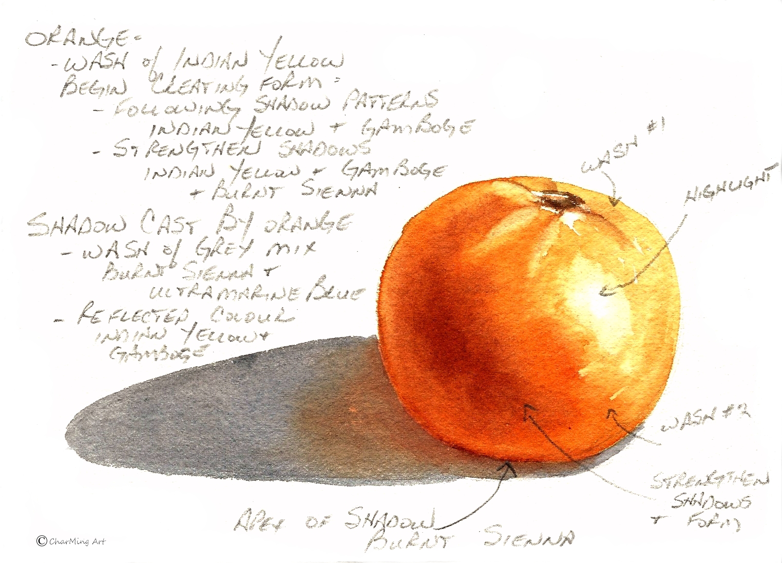
I stared back and forth between the canvas and the actual fruit. An orange isn’t orange. It’s orange, yellow, white, red, brown, sienna, green, and blue. After a little while, I had a few realizations:
- Art involves many concrete tools and techniques that can be learned. The art teacher knew all the ingredients of how to paint something spherical, almost like a recipe: you take several cups of base color, mix in a tablespoon of shadow, add a pinch of highlight, stir, and you have a sphere.
- The representation of an orange in my head is different from what the orange looks like in the real world, but I’m unaware of all the missing details until I try to reproduce the image of an orange on canvas.
- Similarly, the representation of an orange on a canvas is different from what an orange looks like in the real world. This difference is usually intentional because the goal of art is not to create a photocopy of something in the real world but to present it in a specific way that makes you think or feel something.1
I’m still not much of an artist, but understanding the mindset of an artist has made me realize that artistic talent is a skill that can be improved by practicing, by training your eye to deliberately observe why something looks the way it does, and by recognizing that the goal of art is to communicate something to the viewer. These same three principles apply to design:
- Design is a skill that can be learned.
- You have to train your eye to consciously recognize why some designs work and others do not.
- The goal of design is to communicate something to the user.
I hope to convince you of all three points in this chapter. The most important thing to keep in mind about the first point is that design is an iterative, incremental process. Your first draft will be awful, but the only way to come up with a good design, and the only way to become a good designer, is to keep iterating. What makes this particularly challenging is that during your life, you’ve developed a sense of taste from having seen thousands of products created by professional designers, and there is no way your early design work will match up. It’s like a music lover who has spent years listening to the beautiful violin concertos of Mozart and Bach, who dreams of playing at Carnegie Hall, and who finally picks up the violin for the first time, excitedly draws the bow across the strings, and is horrified by the screeching sounds that come out. Everyone who does creative work goes through a phase where their work does not satisfy their own taste. This is completely normal and the only solution is to do more work. Keep playing the violin. Keep coming up with new designs. Keep iterating and eventually, perhaps after a long time, your skills will catch up to your taste, and you’ll finally produce work that makes you happy [Glass 2009]. But for now, just remember that done is better than perfect.
The second point is that to get better at design, you need to try to consciously understand why a particular design does or doesn’t work for you. Next time you marvel at how simple it is to use an iPad, pause and ask yourself why. What is it about its design that makes it simple enough that almost anyone can use it, from a non-tech-savvy grandparent to a two-year-old? Why is it that these same people can’t figure out how to use a desktop computer or a tablet that requires a stylus? We’ll discuss what your eye should look for in a design in Visual Design.
Finally, the third point—that the goal of design is to communicate with the user—means that although looking pretty is a valuable aspect of design, it’s even more important to recognize that design is about helping people achieve their goals. Therefore, every design needs to start with an understanding of the user, which we’ll cover next as part of user-centered design.
1There is a classic story of Pablo Picasso traveling on train when a passenger recognizes him and asks, “Why do you distort reality in your art instead of painting people the way they actually are?” Picasso asks, “What do you mean by the way they actually are?” The passenger pulls out a photo of his wife from his wallet and says, “Well, this is what my wife actually looks like.” Picasso looks at the image and says, “She’s rather small and flat, isn’t she?”
User-centered design
I remember sitting in a conference room at LinkedIn with several co-workers getting ready to kick off our next project. We knew what we wanted to build and we had broken down the work into a list of tasks. All that was left was to record these tasks somewhere so we could track our progress over time. We decided to try out the issue-tracking software that the rest of the company was using. It had all sorts of fancy features, including search, reporting tools, and colorful charts. There was just one problem: we couldn’t figure out how to use it.
We had seven professional programmers in that room. We knew what we wanted to do. We thought we knew how to do it, too, as we had all used issue-tracking software many times before, and we had all been using websites—nay, building websites—for several decades. I therefore find it hard to adequately capture just how frustrating it was to to run into an issue-tracking website that utterly stumped everyone in the room. We spent several hours trying to figure out how to define a new project in the issue tracker, how to start a project once we defined it, how to move tickets between projects, how to use the 15 different view modes, why all the charts were empty after we finished a project, and what the 50 different text boxes on the issue-creation screen were for. It was maddening. After lots of frustration, we gave up and ended up using Post-it notes. The issue tracking software was better than Post-it notes in every aspect, except in the one aspect that mattered the most: helping people achieve their goals.
Notice the emphasis on the words “people” and “goals.” Design isn’t about buttons, or colorful charts, or features. It’s about people and goals. In the story just described, the people were software experts and the issue tracker miserably failed to help us accomplish our goal of tracking the work for our project. Worse yet, it failed at the most important design goal of all:
The number-one goal of all computer users is to not feel stupid.
[Cooper 2004, 25], Alan Cooper, The Inmates are Running the Asylum
In the past, my process for designing software—if you could really call it a process—consisted of the following steps:
- Sit down with the team and ask “What features would be cool for version 5.0 of our product?”
- Come up with a long list of features, argue over prioritization, and set an arbitrary deadline.
- Work furiously to get as many of the features as possible done before the deadline. Inevitably run out of time and start cutting the features that are taking too long.
- Cram whatever features were completed on time anywhere they would fit into the user interface.
- Release version 5.0 to users. Hope and pray that users like it.
- Repeat.
There are many things wrong with this process, but perhaps the biggest is that at no point do the goals of a real user come into the picture. I built things that were “cool” rather than what users actually needed. I had no idea how to figure out what users actually wanted (something I’ll cover as part of not available), but I knew how to add features, so that’s exactly what I did. I had a bad case of feature-itis and it took me a long time to find the cure.
The solution is to realize that you can’t bolt a “design” onto a product after the engineering and product work. Design is the product. It must be part of your process from day one. Here are five principles of user-centered design that you should incorporate into your product development process:
- User stories
- Personas
- Emotional design
- Simplicity
- Usability testing
User stories
Doing design up front does not mean that you need to come up with a detailed 300-page spec, but before you dive into the code, you should be able to define a user story. A user story is a short description of what you’re building from the perspective of the user. It should answer three questions:
- Who is the user?
- What are they trying to accomplish?
- Why do they need it?
The first question, “Who is the user?”, requires you to understand people, which is surprisingly hard. Because you’re a person, you probably think you understand why people act the way they do, or at least your own motivations, but as you saw in the previous chapter, the vast majority of your behavior is controlled by the subconscious and you are often completely unaware of it (see not available).
If you’re a programmer, understanding your users is even harder. Every person forms a conceptual model in their head of how a product works. While a programmer’s model is usually very detailed—often at the level of interfaces, events, messages, APIs, network protocols, and data storage—the typical user’s model is usually less detailed, inaccurate, and incomplete (e.g., many users don’t differentiate between software and hardware or the monitor and the computer). This mismatch in conceptual models makes it difficult for a programmer to communicate with a user.
And therein is the catch: communication is what design is all about. You’re trying to present information to the user, to tell them what can be done, and to show them how to do it. Unfortunately, many programmers don’t realize that because they know so much about their software that they think of it in a completely different way than the user. We can’t remember what it was like to be a novice. This is called the curse of knowledge, a cognitive effect beautifully demonstrated by a Stanford study:
In 1990, Elizabeth Newton earned a Ph.D. in psychology at Stanford by studying a simple game in which she assigned people to one of two roles: “tappers” or “listeners.” Tappers received a list of twenty-five well-known songs, such as “Happy Birthday to You” and “The Star Spangled Banner.” Each tapper was asked to pick a song and tap out the rhythm to a listener (by knocking on a table). The listener’s job was to guess the song, based on the rhythm being tapped. (By the way, this experiment is fun to try at home if there’s a good “listener” candidate nearby.)
The listener’s job in this game is quite difficult. Over the course of Newton’s experiment, 120 songs were tapped out. Listeners guessed only 2.5 percent of the songs: 3 out of 120.
But here’s what made the result worthy of a dissertation in psychology. Before the listeners guessed the name of the song, Newton asked the tappers to predict the odds that the listeners would guess correctly. They predicted that the odds were 50 percent. The tappers got their message across 1 time in 40, but they thought they were getting their message across 1 time in 2. Why?
When a tapper taps, she is hearing the song in her head. Go ahead and try it for yourself—tap out “The Star-Spangled Banner.” It’s impossible to avoid hearing the tune in your head. Meanwhile, the listeners can’t hear that tune—all they can hear is a bunch of disconnected taps, like a kind of bizarre Morse Code.
[Heath Heath 2007, 19], Chip Heath and Dan Heath, Made to Stick
As a programmer, when you’re designing your software, you’re always “hearing the tune in your head.” Your user, however, doesn’t hear anything. All they have to work with is the user interface (UI) you designed. You can’t expect the user to know what you know and you can’t rely on filling the gaps with documentation or training—as Steve Krug said, “the main thing you need to know about instructions is that no one is going to read them” [Krug 2014, 51]—so your only option for building a successful product is to get great at design.
This might sound obvious, but it’s easy to forget it as a programmer because the tools you use to do your job are the pinnacle of bad design. In part, this is because most software designed for use by programmers is also designed for use by the computer, and the computer doesn’t care about usability. All day long, you are dealing with memorizing magical incantations (the old joke goes “I’ve been using Vim for about two years now, mostly because I can’t figure out how to exit it.”), learning to parse esoteric formats like logfiles, core dumps, and XML (to be proficient at Java, you must also become fluent in a language called stack trace), and being treated like a worthless criminal by error messages (“illegal start of expression,” “invalid syntax,” “error code 33733321,” “abort, retry, fail”). To be a successful programmer, you have to develop a high tolerance for terrible design, almost to the point where you don’t notice it any more. But if you want to build software that normal people can use, you have to have empathy and you have to silence many of your instincts as a programmer.
The process of programming subverts the process of making easy-to-use products for the simple reason that the goals of the programmer and the goals of the user are dramatically different. The programmer wants the construction process to be smooth and easy. The user wants the interaction with the program to be smooth and easy. These two objectives almost never result in the same program.
[Cooper 2004, 16], Alan Cooper, The Inmates are Running the Asylum
Even if you get past the hurdle of understanding your users, the second question, “What are they trying to accomplish?”, still trips many people up. One of the most common design mistakes is to confuse a user’s goals (what they want to accomplish) with tasks (how they can accomplish it). A classic example comes from the Space Race during the Cold War. NASA scientists realized that a pen could not work in the microgravity of space, so they spent millions of dollars developing a pen with a pressurized ink cartridge that could write in zero gravity, upside down, underwater, and in a huge range of temperatures. The Soviets, meanwhile, used a pencil. This story is an urban legend,2 but it’s a wonderful illustration of what happens when you lose sight of the underlying goal and become overly focused on a particular way of doing things. As Abraham Maslow said, “I suppose it is tempting, if the only tool you have is a hammer, to treat everything as if it were a nail” [Maslow 1966, 15].
One of the best ways to tell tasks apart from goals is to use the “five whys” technique you saw in the previous chapter (see not available). The other is to follow Alan Cooper’s advice from The Inmates Are Running the Asylum:
There is an easy way to tell the difference between tasks and goals. Tasks change as technology changes, but goals have the pleasant property of remaining very stable. For example, to travel from St. Louis to San Francisco, my goals are speed, comfort, and safety. Heading for the California gold fields in 1850, I would have made the journey in my new, high-tech Conestoga wagon. In the interest of safety, I would have brought my Winchester rifle. Heading from St. Louis to the Silicon Valley in 1999, I would make the journey in a new, high-tech Boeing 777.
[Cooper 2004, 150], Alan Cooper, The Inmates are Running the Asylum
The point of the third question, “Why do they need it?”, is to force you to justify why you’re building what you’re building. This is where the customer development process from the previous chapter comes into play (see not available). If this product or feature isn’t solving an important problem for a real user, you shouldn’t be wasting your time building it.
You should always take the time to answer all three user story questions in writing. The act of transforming your product ideas from the ephemeral and fuzzy form of thoughts in your head into concrete words and drawings on paper will reveal gaps in your understanding, and it’s cheaper to fix those when they are just a few scribbles on a piece of paper than after you’ve written thousands of lines of code. A few lines of text and some sketches in a readme, wiki, or Post-it note are enough to force you to walk through the end-to-end experience from the user’s perspective and ensure that you know what you’re building, who you’re doing it for, and why it’s worth doing.
Personas
Here’s another quick way to significantly improve your design skills: stop designing products for the “average person.” The average person has one testicle and one fallopian tube [Burnham 2010], so if you’re designing for average, you are designing for no one.
The actual Average User is kept in a hermetically sealed vault at the International Bureau of Standards in Geneva.
[Krug 2014, 18], Steve Krug, Don’t Make Me Think
A better idea is to design for personas. A persona is a fictional character that represents a real user of your product who has specific goals, traits, and desires. For example, I designed hello-startup.net for the following personas:
- Mike: a 19-year-old undergraduate student studying computer science at UMass Amherst. Mike has been obsessed with technology most of his life, started coding in middle school, and spends a lot of his day browsing Reddit and Hacker News. Mike is starting to think about jobs after graduation. He’s interested in startups, but his parents are pushing him to join a well-known, established company, and he’s not sure what to do.
- Monica: a 28-year-old Senior Software Engineer working for Oracle. Monica got a computer science degree from MIT and then worked at several big software companies after college, finally landing at Oracle after several years. She is getting bored with the work and is looking for something that will challenge her more and allow her to make a bigger impact in the world. She has a couple of startup ideas, but she’s not sure what to do next.
- Mahesh: a 21-year-old programmer who dropped out of Stanford along with his roommate to start a company. Mahesh and his co-founder have been working on the company for six months, but they are struggling. They are not sure how to design the product, what technologies they should use to build it, how to get customers to use it, or where to find developers to help them.
Each persona should include a name, age, short bio, work history, and a set of skills, beliefs, goals, and any other details relevant to your business.3 To make it seem even more like a real person, it’s a good idea to add a photograph to each persona (preferably a photo you find on a stock photography website and not a photo of anyone you know in real life). Once you have defined personas for your product, never mention the “average user” again, either in user stories or in conversations. Don’t let your team argue over whether the “average user” would prefer feature X or Y, as everyone will have a different understanding of what is “average.” Instead, only discuss whether your personas would want X or Y. For example, would the “average user” of hello-startup.net want a calculator to help them estimate the value of their stock options? I have no idea. Would Mike, Monica, or Mahesh want such a calculator? I can make an educated guess that Mike and Mahesh would find such a tool useful.
Personas should be based on your market research and customer interviews (see not available). Your goal is to identify a small number (typically 1–3) of primary personas whose goals must be fulfilled or else the entire product is a failure. For example, Mike, Monica, and Mahesh are the primary personas for hello-startup.net, so if they can’t find what they need, the product might as well not exist. Your goal is to make these primary personas as happy as possible by figuring out their goals and building a product that is exceptional at helping them achieve those goals, and nothing else (see Focus on the differentiators).
The broader a target you aim for, the more certainty you have of missing the bull’s-eye. If you want to achieve a product-satisfaction level of 50%, you cannot do it by making a large population 50% happy with your product. You can only accomplish it by singling out 50% of the people and striving to make them 100% happy. It goes further than that. You can create an even bigger success by targeting 10% of your market and working to make them 100% ecstatic. It might seem counterintuitive, but designing for a single user is the most effective way to satisfy a broad population.
[Cooper 2004, 126], Alan Cooper, The Inmates are Running the Asylum
The reason personas are such a powerful design tool is that they force you to think about real people and to take into account their wants, limitations, personalities, and perhaps most importantly, their emotions.
Emotional design
Studies have shown that people interact with computers and software much like they would with another human. Most people act politely toward computers, though occasionally things get hostile; they react differently to computers with female voices than those with male voices; and in the right scenario, people think of computers as team members or even friends [Reeves and Nass 2003]. Have you ever thrown a temper tantrum when your printer refuses to work? Have you ever found a piece of software that you simply love? Have you ever begged and pleaded with your computer that it didn’t lose your Word document after a crash? Whether you realize it or not, every piece of software makes you feel something. Most of your emotional reactions are automatic and the parts of the brain that control them have not evolved enough to distinguish between a real person and an inanimate object that acts like a person.
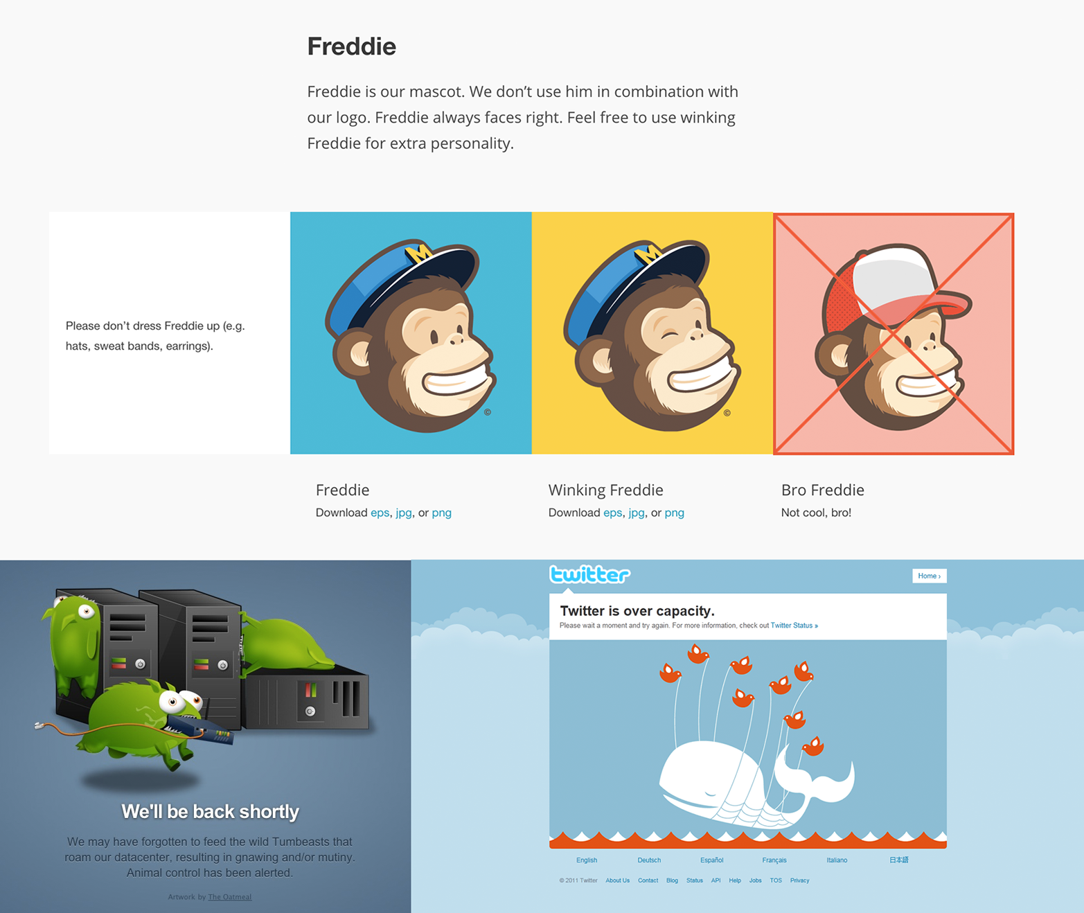
This is why the best designs always have an aspect of humanity and emotion in them. For example, Google has many hidden Easter eggs (e.g., try Googling “recursion,” “askew,” or “Google in 1998”), April Fools’ jokes (e.g., look up PigeonRank and Gmail Paper), an “I’m feeling lucky button,” and on many days, they replace their logo with a Google Doodle to commemorate important events. Virgin America replaced the standard, boring flight safety video with an entertaining music video that now has more than 10 million views on YouTube. During the holiday season, Amazon adds a music player to the website which lets you listen to Christmas songs while you shop. On IMDb, the ratings for This Is Spinal Tap go up to 11 and they show parodies of famous movie quotes on their error pages, such as “404: Page not found? INCONCEIVABLE. – Vizzini, The Princess Bride.” MailChimp includes its mascot, a monkey dressed as a mailman, on almost every page; Tumblr’s downtime page used to show magical “tumblebeasts” wreaking havoc in their server room; and Twitter’s downtime page shows a “fail whale” (see Figure 2).
These might seem like little details, but they are a big deal, as the emotional aspects of a design are as important to users as the functional aspects.4
Think of your product as a person. What type of person do you want it to be? Polite? Stern? Forgiving? Strict? Funny? Deadpan? Serious? Loose? Do you want to come off as paranoid or trusting? As a know-it-all? Or modest and likable? Once you decide, always keep those personality traits in mind as the product is built. Use them to guide the copywriting, the interface, and the feature set. Whenever you make a change, ask yourself if that change fits your app’s personality. Your product has a voice—and it’s talking to your customers 24 hours a day.
[Fried, Hansson, and Linderman 2006, 123], Jason Fried, David Heinemeier Hansson, and Matthew Linderman, Getting Real
Whatever personality or voice you choose for your product, I recommend that politeness is part of it. If people think of your software as a person, then it’s a good idea to teach it some manners. Here are a few examples:
- Be considerate
-
The program just doesn’t care about me and treats me like a stranger even though I’m the only human it knows.
[Cooper 2004, 163], Alan Cooper, The Inmates are Running the Asylum
Whenever possible, try to design software that acts like a considerate human being who remembers you. Remember the user’s preferences, what they were doing the last time they were using your software, and what they’ve searched for in the past, and try to use this information to predict what they will want to do in the future. For example, most web browsers remember the URLs you’ve typed in in the past. Google Chrome takes this even further so that as you start to type in “www.goo”, it not only completes the URL to “www.google.com” for you, but if this is a URL you’ve typed in many times before, it will start to fetch the page before you’ve hit Enter so that it loads faster. Google is also considerate with passwords. If you recently changed your password and you try to log in with the old one by accident, instead of the standard “invalid password” error message, Google shows you a reminder that “your password was changed 12 days ago.”
- Be responsive
- A good design is responsive to the user’s needs. For example, Apple laptops detect the amount of ambient light in the room and adjust the screen brightness and the keyboard backlight automatically. Of course, responsiveness doesn’t have to be fancy. One of the simplest design elements that is often overlooked is providing basic feedback. Did the user click a button? Show them an indication to confirm the click, such as changing the button appearance or making a sound. Will it take time to process the click? Show an indication that there is work going on in the background, such as a progress bar or an interstitial. Programmers often overlook this because in local testing, the processing happens on their own computer, so it’s almost instantaneous. In the real world, the processing may happen on a busy server thousands of miles away, with considerable lag. If the UI doesn’t show feedback, the user won’t know if the click went through, and will either jam the button down 10 more times or lose confidence and give up entirely.
- Be forgiving
- Human beings make mistakes. Constantly. Design your software to assume that the user will make a typo, click the wrong button, or forget some critical information. For example, when you try to send an email in Gmail, it scans the text you wrote for the word “attachment,” and if you forgot to attach something, it’ll pop up a confirmation dialog to check if that was intentional. Also, after you click Send, Gmail gives you several seconds to “undo” the operation, in case you change your mind or forgot some important detail. I wish all software had an Undo button. Sometimes I wish life did, too.
The last point on being forgiving of errors is so important that it’s worth discussing it a bit more.
Eliminate the term human error. Instead, talk about communication and interaction: what we call an error is usually bad communication or interaction. When people collaborate with one another, the word error is never used to characterize another person’s utterance. That’s because each person is trying to understand and respond to the other, and when something is not understood or seems inappropriate, it is questioned, clarified, and the collaboration continues. Why can’t the interaction between a person and a machine be thought of as collaboration?
[Norman 2013, 67], Don Norman, The Design of Everday Things
No one likes error messages. No one wants to see “PC Load Letter.” And most of all, no one wants to feel like the error is their fault. Online forms are often the worst offenders. You spend a long time filling out dozens of text boxes, click Submit, and when the page reloads, you get an obscure error message at the top of the page. Sometimes it’s not clear what you did wrong, and on some particularly rage-inducing websites, all the data you entered is gone. This is an indication that the designer did not think through the error states of the application. Here are some rules of thumb to avoid this mistake:
- Instead of error messages, provide help and guidance [Norman 2013, 65]. For example, avoid words like “Error,” “Failed,” “Problem,” “Invalid,” and “Wrong.” Instead, explain what kind of input you’re looking for and how the user’s input differs.
- Check the user’s input while the user is typing (not after a page submission) and show feedback, both positive and negative, right next to where the user is looking (not at the top of the page).
- Never lose the user’s work.
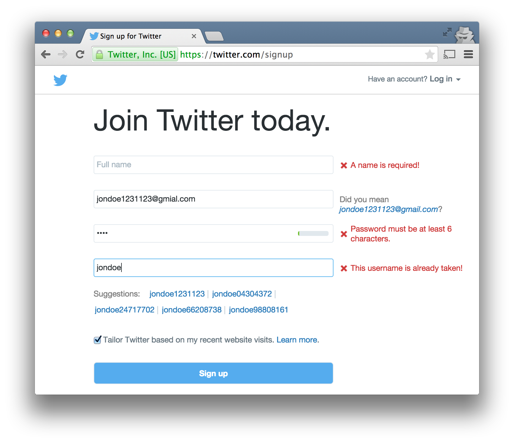
Twitter’s sign-up form is a great example. It gives you feedback while you type, either showing a green checkmark if your input is valid or a red X with a brief message explaining what is required instead, as shown in Figure 3. For instance, the password field has a small progress bar that fills up as you enter a more secure password; if you enter a username that’s already registered, you see suggestions for similar usernames that are available; if you make a typo in your email address, such as jondoe@gmial.com, a message shows up that says “Did you mean jondoe@gmail.com?” It’s a great user experience that makes filling out a form feel less like doing paperwork and more like you’re having a conversation with a person who is helpful and politely asks you for clarification when they don’t understand you.
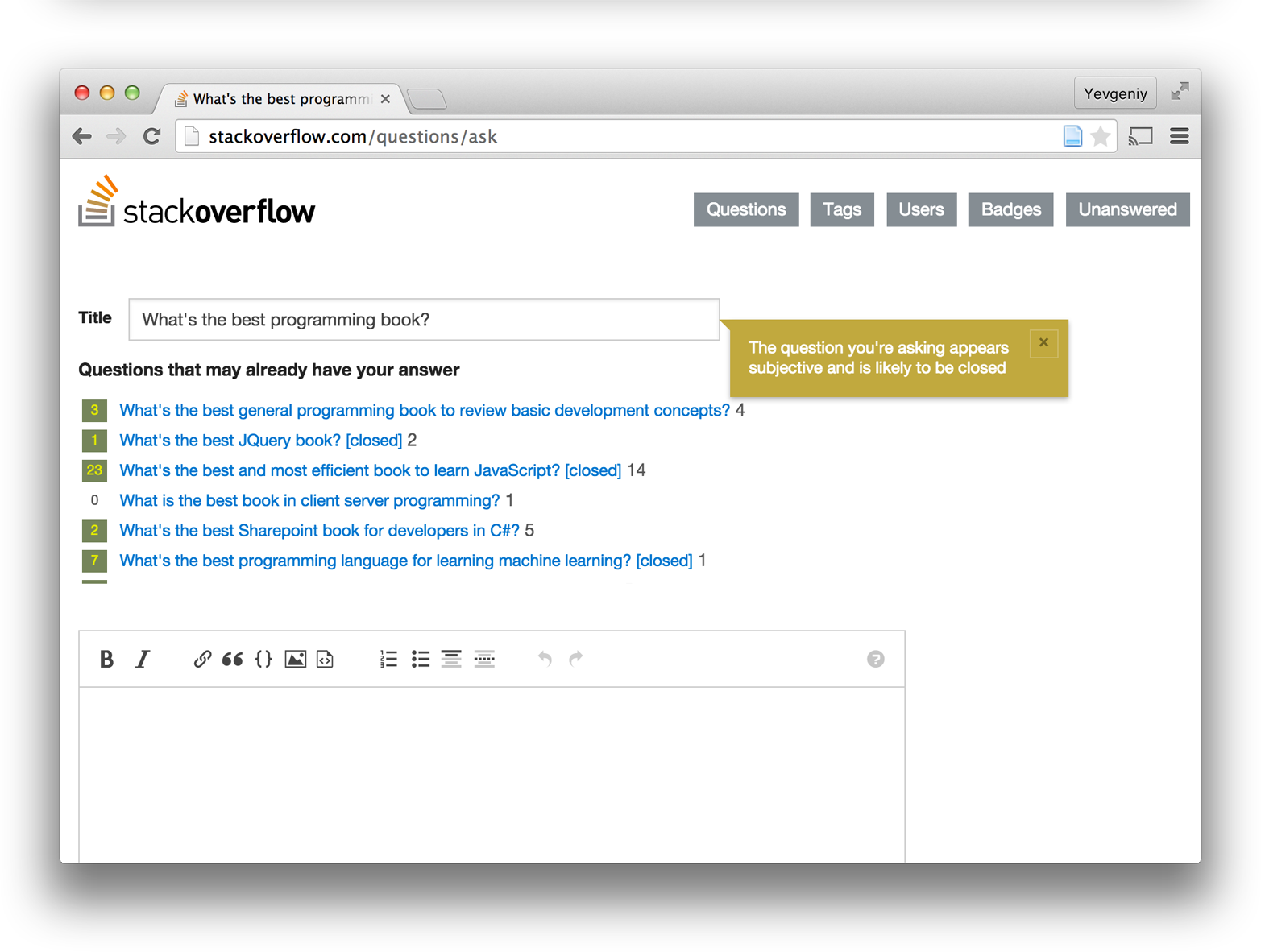
In addition to showing helpful messages, you should try to create a design that prevents mistakes in the first place. In Lean manufacturing, this is called a poka-yoke, which is a Japanese term for “mistake-proofing.” For instance, when you’re typing a new question into Stack Overflow, it automatically searches for similar questions to discourage you from submitting duplicates and automatically warns you if your question is likely to be closed for being subjective (e.g., “what is the best X?”), as shown in Figure 4.
The gold standard is making errors more or less impossible. For example, PC motherboards are designed so that every component has a different type of connector, as shown in Figure 5. This ensures that there is no way to accidentally insert the CPU into a PCI slot or plug an ethernet cable into the VGA slot. Modern ATMs return your ATM card and force you to take it before you can get your cash so that you don’t forget your card. It’s slightly harder but still possible to do this in software, too. For example, with Microsoft Word, I always dreaded the possibility that my computer would crash before I had a chance to save my work. With Google Docs, this sort of error is effectively impossible because all changes are auto-saved almost instantly. An even simpler version is disabling the Submit button on a form immediately after a user clicks it to make it impossible to submit the form more than once.
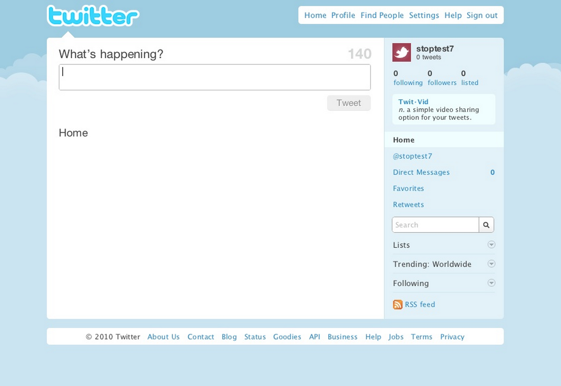
In addition to handling error states, you should also make sure your design handles a blank state: that is, what the application looks like the first time a user interacts with it, before she’s entered any data [Fried, Hansson, and Linderman 2006, 97]. A design for a new social network might look great when the user has connected with hundreds of friends and can see all of their updates and pictures in the newsfeed, but what does the design look like when the user first signs up? For example, Figure 6 shows the blank state Twitter previously used for brand-new users.

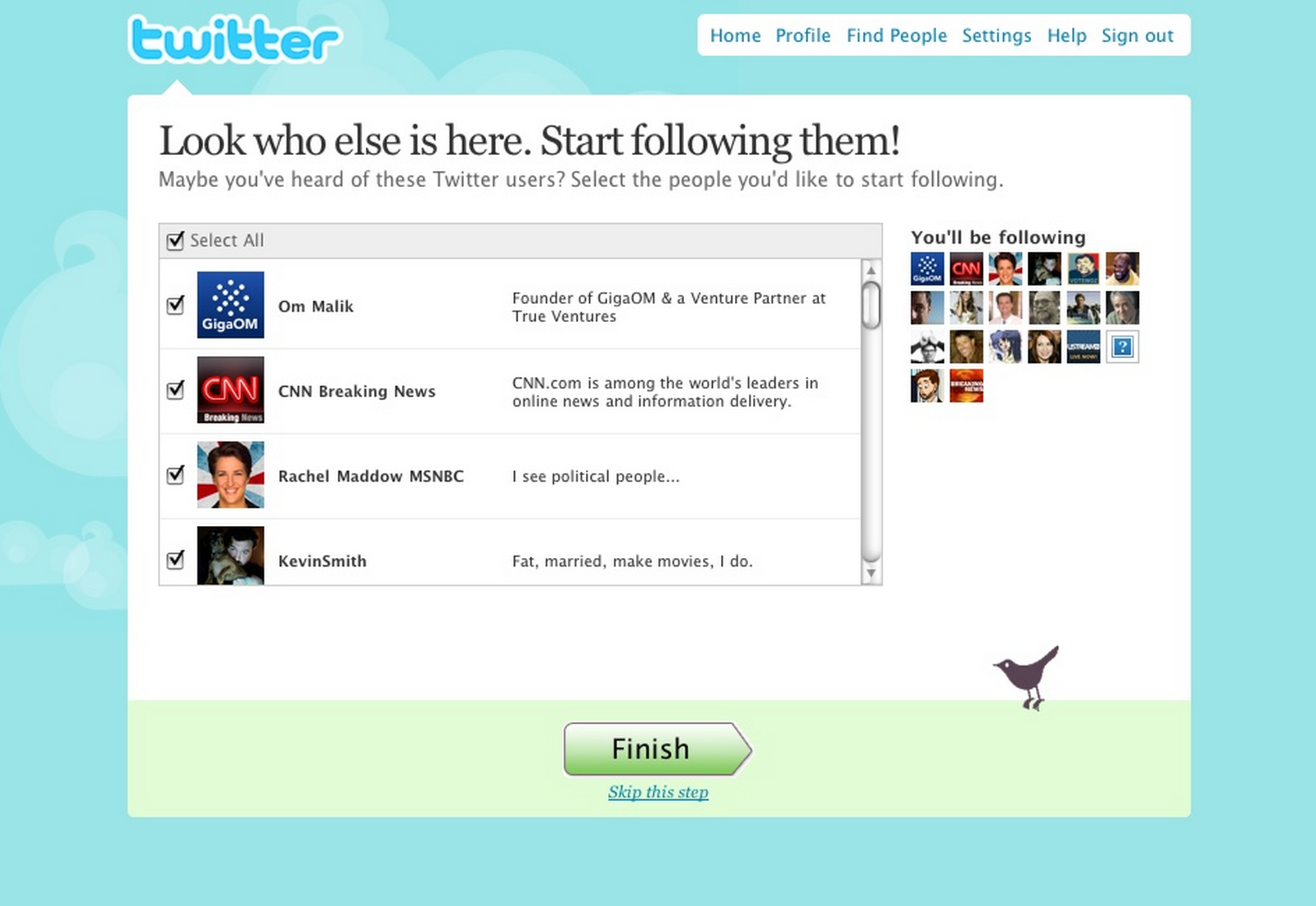
If you show a completely empty newsfeed, your new users will not have a great experience and are not likely to continue using your service. Figure 7 shows the new design for Twitter’s blank state, which immediately prompts the user to start following popular Twitter accounts.
Simplicity
Almost every creative discipline shares a single goal: simplicity. Isaac Newton, a mathematician and scientist, said “truth is ever to be found in the simplicity, and not in the multiplicity and confusion of things” [Powell 2003, 29]. Steve McConnell, a programmer, wrote in his book Code Complete that “managing complexity is the most important technical topic in software development” [McConnell 2004, 78]. And Jonathan Ive, Apple’s chief designer, said that “there is a profound and enduring beauty in simplicity” [Etherington 2013]. Everyone strives for simplicity. The problem is that making things that are simple is not simple.
At first glance, this is unintuitive. We often think of “simple” as minimalistic and as having nothing extra. So if you start with a blank slate and only add a few things here and there, shouldn’t you end up with a simple design? If you’ve ever written an essay or a complicated piece of code, or tried to design a product, you’ll know that your first draft is always an overly complicated mess. It takes a tremendous amount of work to whittle that mess down into something simple.
I would have written a shorter letter, but I did not have the time.
Blaise Pascal
A better way to think about it is that projects don’t start with a blank slate, but with a vast amount of materials, knowledge, and ideas all mixed together. It’s a little bit like sculpting. You start with a huge block of marble and you need to chip away at it, day by day, until you’ve finally revealed the statue that was within the rock (and within your mind). As Antoine de Saint Exupéry said, “perfection is attained not when there is nothing more to add, but when there is nothing more to remove.” You might have to remove extraneous features from a product, redundant words from an essay, or extra code from a piece of software. You keep removing things until all you are left with is the very core of the design, the differentiators, and nothing else (see Focus on the differentiators). That’s simplicity.
Simplicity is about saying what is the one thing I must get done [Heath Heath 2007, 27]? What is the one thing my product must do? What is the one thing my design must communicate to the user? Ask these questions regularly and after you’ve come up with an answer, ask them again. Does the product I designed do that one thing? Or did I get lost in the implementation details and end up doing something else?
The opposite question is equally important: what things should my product not do? Every extra feature has a significant cost. With physical objects, this cost is relatively obvious. For example, imagine a Swiss Army knife with 10 tools crammed inside: a knife, a screwdriver, a can opener, tweezers, and so on. Now you’re considering adding a pair of scissors. Scissors take up a lot of room, so you’ll have to make the knife bigger or make all the existing tools more cramped. Either way, it’s clear that this will make the knife more unwieldy to use and more expensive to produce. Therefore, you either set the bar very high for adding a new tool, or you remove one of the original 10 tools to make room [Cooper 2004, 27].
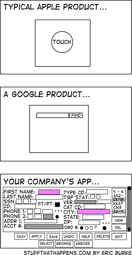
The trade-offs in software are identical—every new feature makes the previous features harder to use and makes the software more expensive to produce—but it’s not nearly as obvious. In fact, most companies believe that the way to build a better product is to cram more and more features into it, release after release, until it can do everything. Except it can’t, because no one can figure out how to use it, as shown in Figure 8.
The companies that succeed at designing something simple are the ones that recognize that the number of features you can cram into software isn’t constrained by physical limitations, like the amount of space in a knife, but by the mental limitations of a human using it. Design needs to be simple not because simple is prettier, but because human memory can only process a small number of items at a time. If you cram too many things into a design, it will quickly exceed the limits of human memory, and the user will find the product overwhelming and unusable. This is why you have to limit the amount of information in any design (less text, fewer buttons, fewer settings) and the number of features in any product (see Focus on the differentiators).
People think focus means saying yes to the thing you’ve got to focus on. But that’s not what it means at all. It means saying no to the hundred other good ideas that there are. You have to pick carefully. I’m actually as proud of the things we haven’t done as the things I have done. Innovation is saying no to 1,000 things.
[Gallo 2011], Steve Jobs
Most programmers love deleting code, especially as the result of finding a more concise solution to a problem. This usually requires that you understand the problem at a deeper level so that you can come up with an implementation that is more elegant. The same is true of design. You should enjoy the process of removing features and chopping out parts of a design, especially as the result of finding a more elegant solution. As with programming, to come up with a more elegant design, you need to develop a deeper understanding of the problem.
Sometimes you develop this understanding through user research, customer development, and techniques like the “five whys”. But many interesting problems in the world are wicked problems, where you must build the solution before you can really understand what problem you were solving. That is, solving the problem gives you a clearer view of the problem, which will allow you to build an even better solution. Building the new solution will lead to an even better understanding of the problem, and the cycle can repeat again and again. Design is iterative, and it can take many iterations to come up with a simple solution for a hard problem.
Actually, making the solution simple isn’t the goal. The real goal, in the words of Apple’s design chief Johnathan Ive, is to solve problems so that, “you’re not aware really of the solution [and] you’re not aware of how hard the problem was that was eventually solved” [Richmond 2012]. What matters is not that the solution is simple, but that you make the user’s life simple. The iPhone is an incredibly complicated piece of technology, but using it is simple. The only way to find out if you’ve succeeded at making the user’s life simple is to observe them while they are using your product, a process formally known as usability testing.
Usability testing
In the previous chapter, I discussed the idea that, no matter how much thinking and validation you do, some of your assumptions will still be wrong. The solution was to test those assumptions by putting the product in front of real customers (see not available). The same logic applies to design. No matter how good you become at user-centered design, some of your design ideas will not work, and the only way to figure that out is to put the design in front of real users in the form of a usability test.
Don’t confuse usability testing with focus groups. The goal of a focus group is to see how people feel about an idea or a product. The goal of usability testing is to see how people use your actual product to accomplish specific tasks. While there are companies that can run official usability studies for you, these tend to be expensive and time consuming, and most startups can get by with their own simpler process. Here is a rough outline (see Don’t Make Me Think [Krug 2014, chap. 9] for a more thorough description):
- Bring a small number of users (3–5) into your office.
- Set up recording equipment (e.g., iPhone on a tripod).
- Record the users while they perform a list of tasks with your product.
- Have your team watch the recording.
- Decide what actions to take based on your learnings.
- Repeat every 3–4 weeks.
If you’ve never done usability testing before, you’ll soon learn that the first time you observe people outside of your company using your product is an eye-opening experience. It takes just a few hours per month, and in return, you will regularly learn things about your product design that you would never have found through any other means. The most important thing to remember is if you’re in the room with the users as a facilitator, you are there to observe and not interfere. You can encourage the users and answer logistical questions, but you cannot help them use the product, especially if they make a mistake. The user might get frustrated, but the whole point of usability testing is to find these mistakes and frustrations so you can fix them.
In addition to usability testing, there are a few other tools you can use to improve your designs. One option is to build a mechanism directly into your product that makes it easy to send you feedback, such as a feedback form on a web page. Only a small percentage of users will take the time to send feedback, but it’s usually valuable content when they do. A second option is to periodically conduct usability surveys. It’s a bit like sending a feedback form directly to each user’s inbox. There is an art to building usability surveys correctly, so it’s a good idea to use a dedicated usability product that will take care of the details for you (e.g., Survey.io).
2See its Snopes page.
3See http://www.ux-lady.com/diy-user-personas/ for a complete guide.
4See http://littlebigdetails.com for lots of great examples.
Visual Design
Let’s now turn our attention to the visual aspects of design. People have been doing visual design for thousands of years, so it’s a deep field. This section will only cover a “Hello, World” tutorial of visual design. When you’re getting started with a new programming language, your first goal is always to learn just enough that you can create a program in that language that prints “Hello, World” to the screen, which helps you build confidence by getting something simple working very quickly before you dive deeper and start learning how to build more complicated programs. Similarly, in this tutorial, my goal is to introduce you to the basic design skills you need to get something simple working so you can build your confidence before diving deeper and learning how to create more complicated designs.
The basic visual design skills and techniques are:
- Copywriting
- Design reuse
- Layout
- Typography
- Contrast and repetition
- Colors
In this tutorial, I’ll primarily focus on two examples: fixing the design of a résumé, which is a design task that almost everyone is familiar with, and designing a website from scratch (specifically this book’s companion site, hello-startup.net) which follows a process that is a bit more like what is required for a typical startup. Pay attention not to the specific design decisions I make for the résumé and hello-startup.net, as they won’t apply everywhere, but to the thought process behind those decisions.
Copywriting
Although many people think of colors, borders, pictures, and fancy animations as the primary tools of design, the real core of almost all software design is actually text. In fact, you could remove the colors, borders, pictures, and just about everything else from most applications, and as long as you left the text, it would probably still be minimally usable. This is not to say that the other elements don’t matter, but most of the information that a user needs in a software product is in the titles, headers, body paragraphs, menus, and links, so even when doing visual design, your first priority should always be copywriting.
Great interfaces are written. If you think every pixel, every icon, every typeface matters, then you also need to believe every letter matters.
[Fried, Hansson, and Linderman 2006, 101], Jason Fried, David Heinemeier Hansson, and Matthew Linderman, Getting Real
Take the time to think through what you’re going to say to the user and how you’re going to say it (see also Emotional design). A good title and headline—the elevator pitch—are especially important, as they are the first thing the user sees when they use your application, or when they see your application in search results, or when you’re pitching an idea to an investor. Have you noticed that when you’re flipping through a magazine, newspaper, or scientific journal, you only read some of the articles? Have you ever stopped to consider why you read those articles and not the other ones? Your headline must resonate with the personas you’re targeting, telling them not only what you do (“Our software can do X”), but also why the user should care (“Our software can do X so you can succeed at Y”). Knowing how to craft a clear message that explains your why—your mission—is one of the keys to success in all aspects of business (see not available and not available).
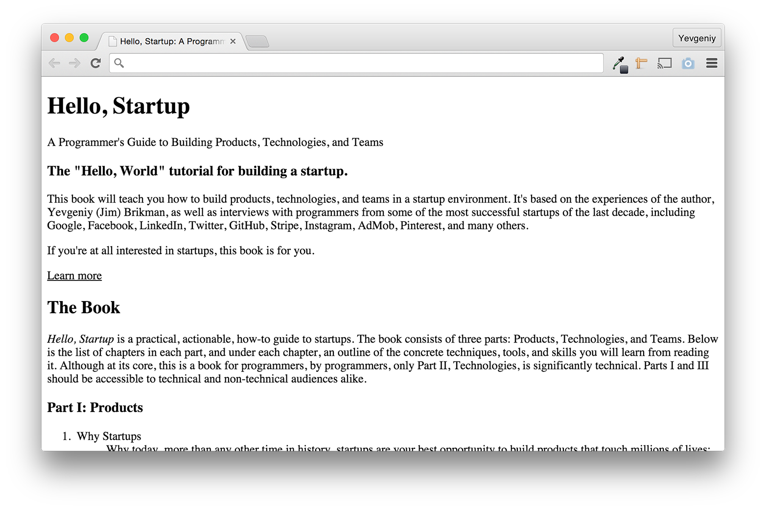
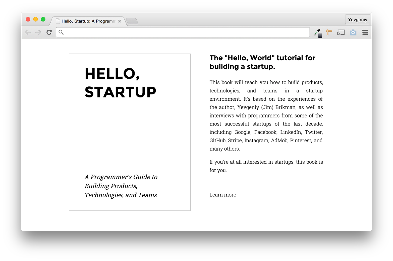
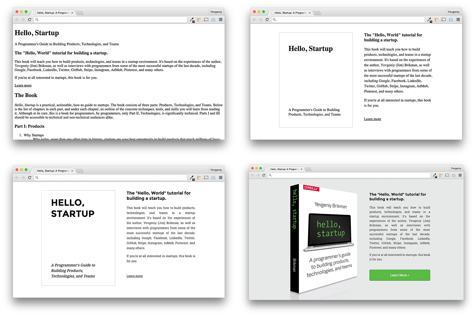
It’s usually a mistake to leave copywriting to the end, or even worse, create a design that only contains placeholder text such as the standard Latin filler text “lorem ipsum.” It reduces the most important part of the design, the copywriting, to just the shape of the text so you don’t see the variations with real-world data and you don’t focus on writing a message that resonates with your audience [Fried, Hansson, and Linderman 2006, 121]. The first thing I did when building hello-startup.net was to write down the information Mike, Monica, and Mahesh (see Personas) would want to see, as shown in Figure 9. I started with the outline of the basic sections—information about the book, the author, a way to buy the book, latest news, and startup resources—and then filled in the details. I ended up with a large amount of clean, semantic HTML. It’s not particularly attractive, but remember, design is iterative, and this is just the very first draft.
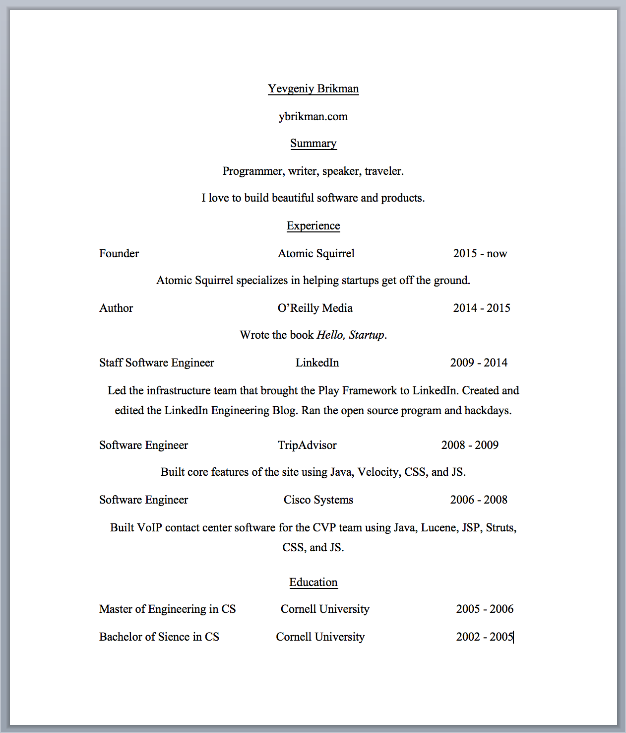
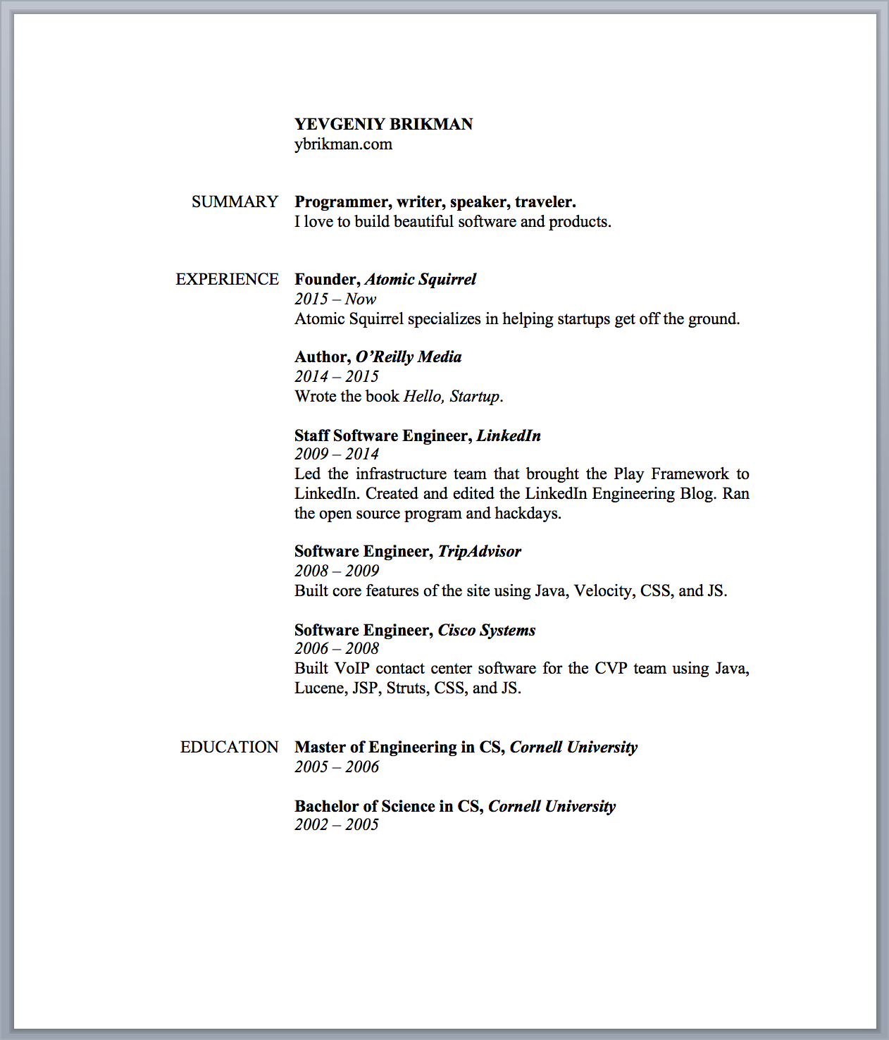
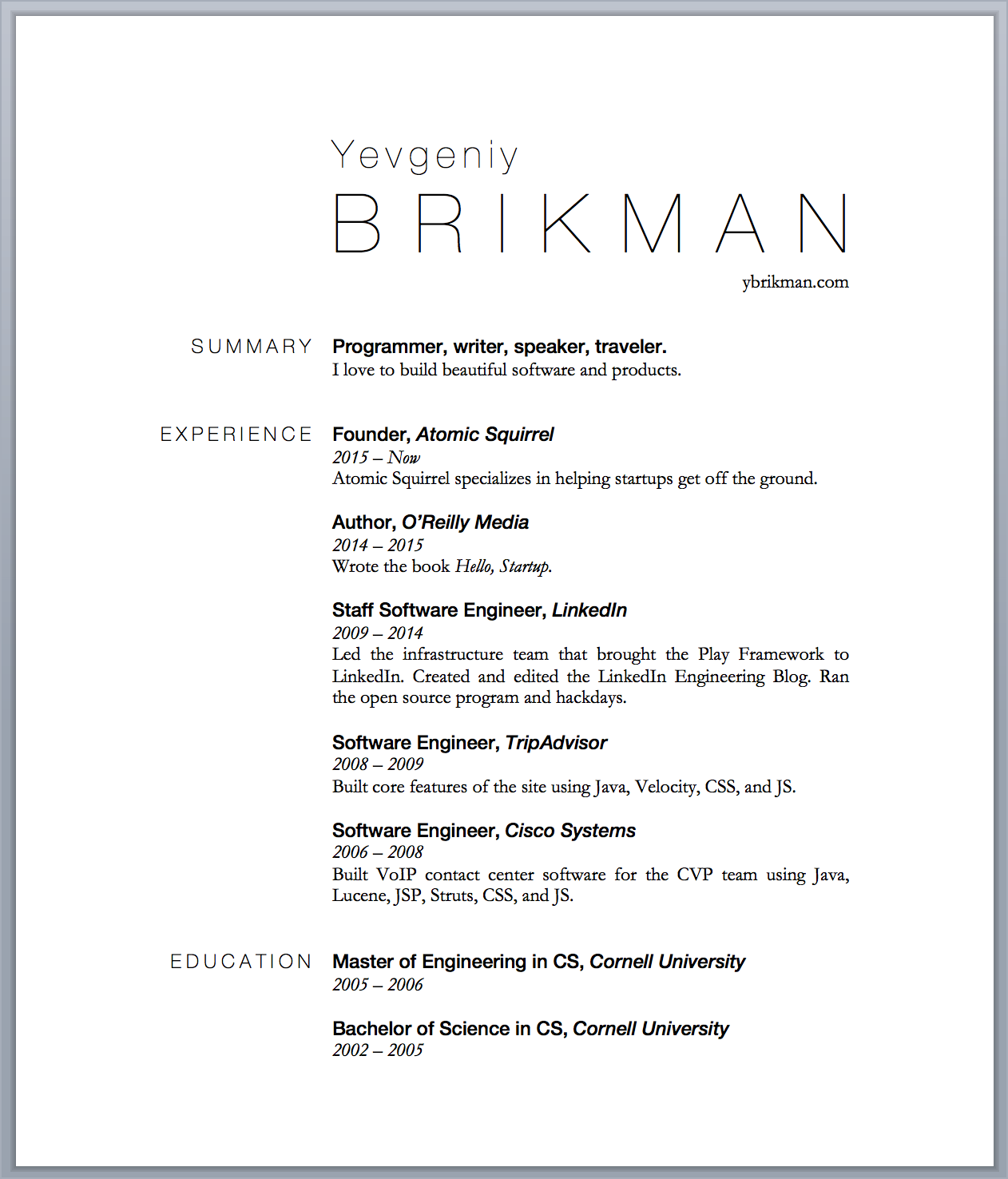
The first draft of the résumé, as shown in Figure 10, is loosely based on a style I’ve seen in hundreds of résumés over the years. It’s also a bit ugly, but the copywriting is in place so it’s a good starting point.
Design reuse
Good artists copy; great artists steal.
[Sen 2012], Steve Jobs
If you’re new to design, or almost any discipline, the best way to get started is to copy others. Don’t reinvent the wheel, especially if you aren’t an expert on wheels. In fact, even if you are an expert on wheels (that is, an experienced designer), you should still reuse existing designs as much as possible (the same logic applies to reusing code, as discussed in not available). When you copy others, you save time, you learn, and you get access to high-quality, battle-tested work. Copy and paste might seem like an unsatisfying way to learn design, but as we discussed in the last chapter, copy, transform, and combine are the basis of all creative work (see not available).
I start every project by browsing existing designs and seeing what I can reuse or adapt to my own needs. For example, there are thousands of templates for web, mobile, and email that you can use instead of coming up with a design from scratch. One of my favorites is Bootstrap, which is not just a template but an open source, responsive HTML/CSS/JavaScript framework that comes with a default set of styles, behaviors, plug-ins, and reusable components.
If you don’t want to jump into code right away, you can use a wireframing or prototyping tool, such as Balsamiq, UXPin, or Justinmind, that lets you put together a design by dragging and dropping from a library of UI elements. There are also hundreds of websites where you can find stock photos, graphics, and fonts, including free options (e.g., Wikimedia Commons, Google Fonts) and paid options (e.g., iStock, Adobe Typekit). Finally, you can also leverage the design community through websites such as Dribbble (a community where designers can share and discuss their work) and DesignCrowd (an online marketplace where you can quickly hire a freelancer to design a logo or a website). See http://www.hello-startup.net/resources/design/ and http://www.hello-startup.net/resources/images-photos-graphics/ for the full list of design resources.
I loosely based the final design of hello-startup.net on a free Bootstrap template called Agency and the final design of the résumé on a template I found on Hloom.5 However, to help you train your designer’s eye, I won’t use these templates right away but instead will build up to them step by step so you can learn to recognize the different aspects of visual design, starting with layout.
Layout
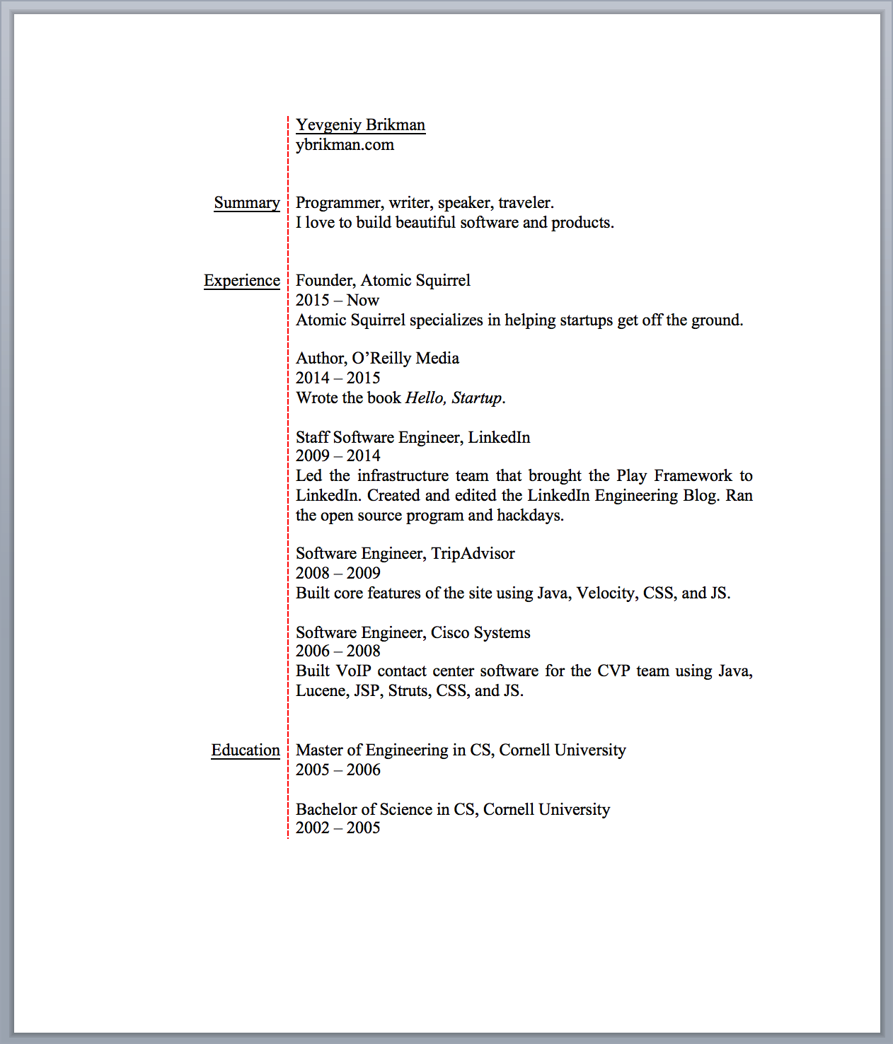
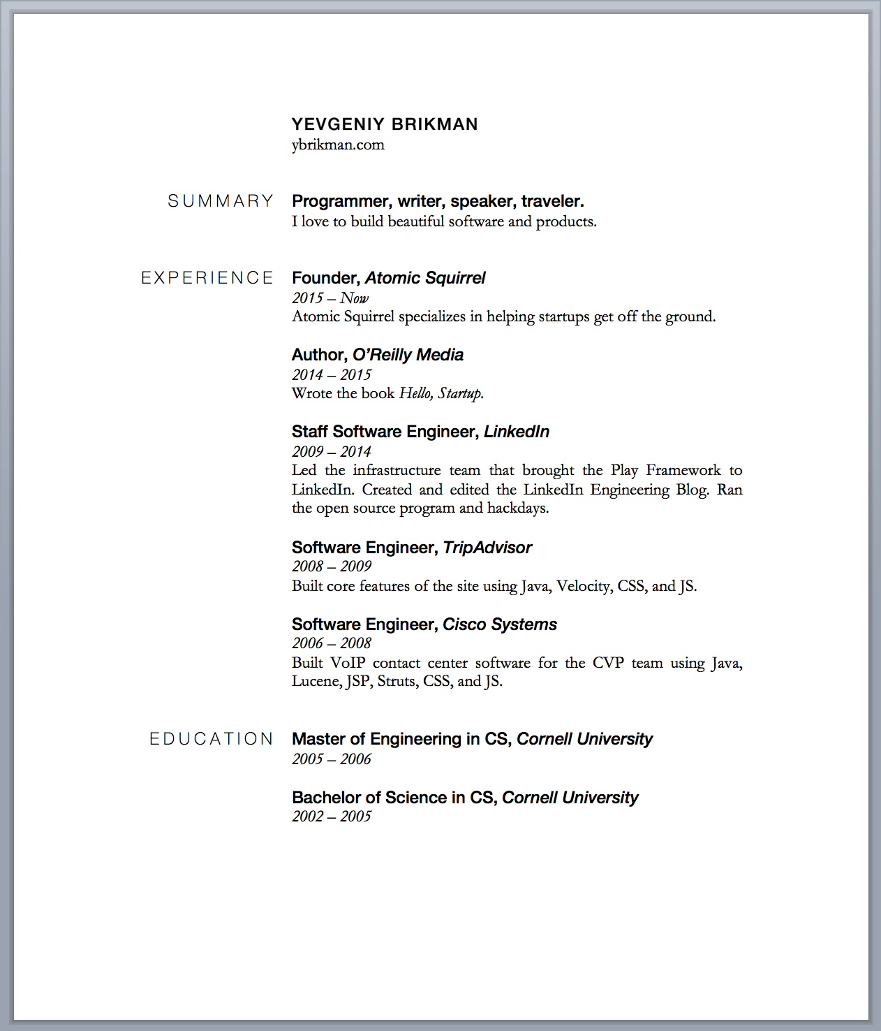
A good layout arranges the elements on the screen so that you can infer a lot of information based on their positions relative to one another. One aspect of layout is proximity. The proximity between elements indicates if they are logically related or not. Items that are logically connected should be closer together; items that are not connected should be further apart [Williams 2014, chap. 2]. Take a look at Figure 11, which shows the original résumé on the left and the exact same résumé, but with slightly better use of proximity, on the right.
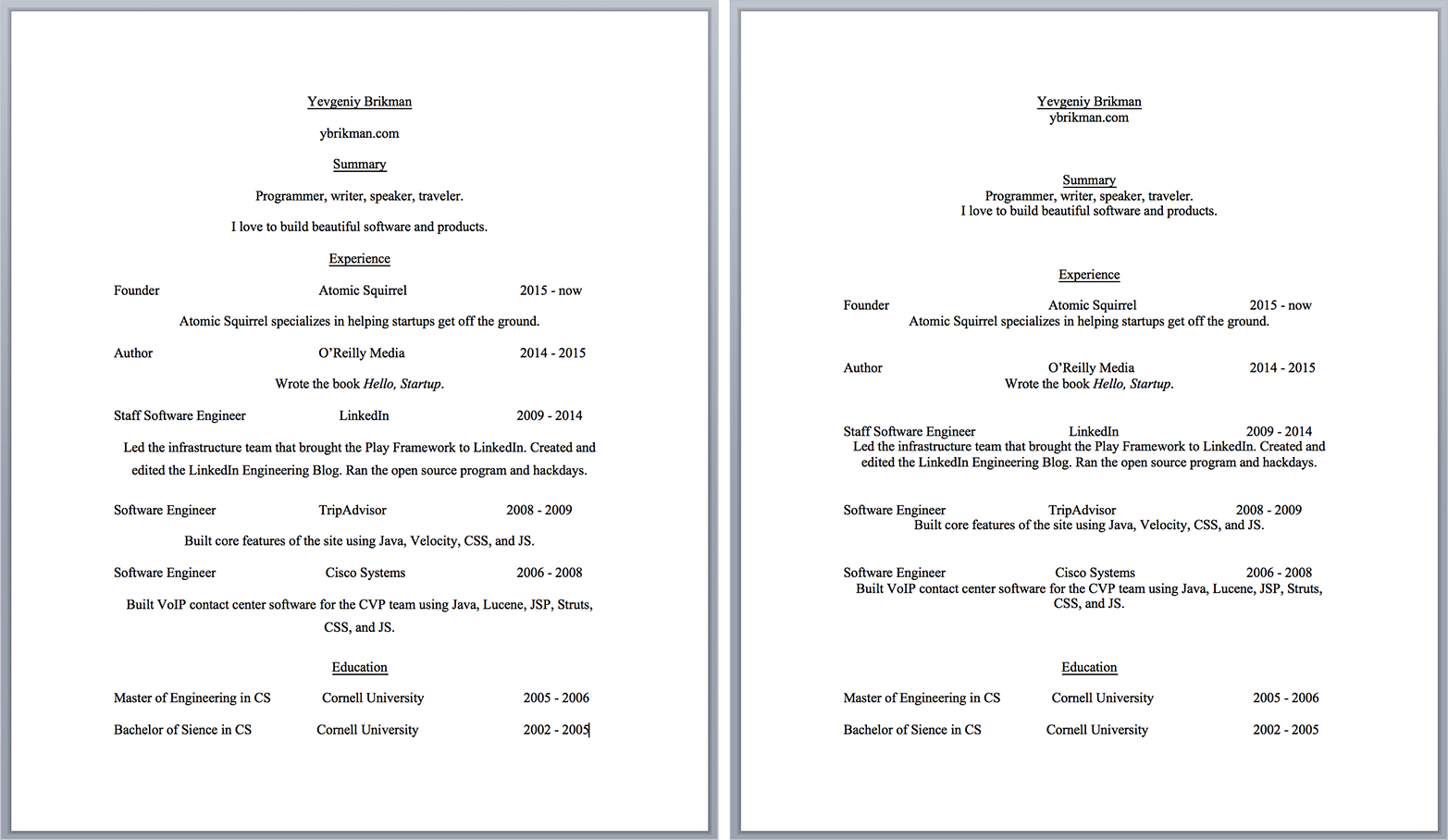
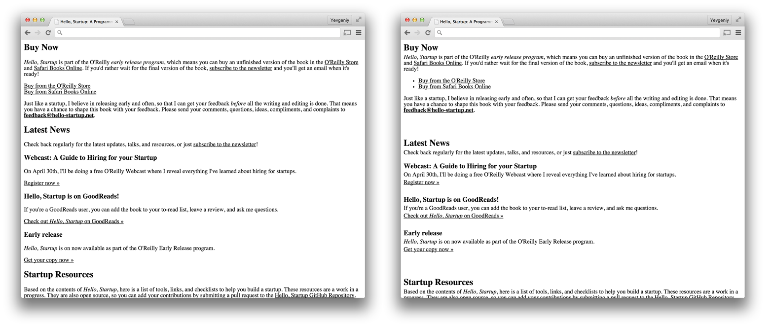
I’ve put two new lines between the different sections (summary, experience, education), but only half a new line between a section header and the contents of that section (e.g., between “Summary” and “Programmer, writer, speaker, traveler”). I’ve pulled all the information for a single job closer together, but put a new line between different jobs so it’s clear where one starts and another one ends. I did a similar fix for the hello-startup.net design, as shown in Figure 12.
In the design on the right, it’s clearer that “Buy Now,” “Latest News,” and “Startup Resources” are separate sections because I increased the spacing between them. You can also tell that “Webcast: A Guide to Hiring for your Startup” and the two lines below it are all part of one logical unit because I decreased the spacing between them.
Try to balance the close proximity of related elements with lots of whitespace between unrelated elements. The human mind is limited in how much information it can process at a time, so a key aspect of readability is putting lots of whitespace between elements so that you can focus on just one thing at a time. And I do mean lots of whitespace. Most beginners try to cram everything tightly together, so a good rule of thumb is “double your whitespace”: put space between your lines, put space between your elements, and put space between your groups of elements [Kennedy 2014]. Medium, a blogging platform known for its beautiful design, is an inspiring example of just how much you can do with whitespace and typography, as shown in in Figure 13.
Another critical aspect of layout is alignment. Alignment allows you to communicate that there is a relationship between elements, not by moving them closer together or further apart (as with proximity) but by positioning them along common lines. Here is the golden rule of alignment:
Nothing should be placed on the page arbitrarily. Every element should have some visual connection with another element on the page.
[Williams 2014, 13], Robin Williams, The Non-Designer’s Design Book
Notice how the résumé in Figure 11 has many different and seemingly arbitrary alignments: the section headings are center-aligned, the job titles are left-aligned, the company name is center-aligned (but poorly, just using spaces and tabs), the dates are right-aligned (again, poorly), and the job descriptions are center-aligned. Figure 14 shows the same résumé, but with a single, stronger alignment.
Notice how this layout is easier to read, as everything is positioned along a strong vertical line between the section headers and the section contents. Of course, there isn’t actually a line there, but your mind inserts one, as shown in Figure 15.
These sorts of lines show up everywhere in design, so teach yourself to consciously notice them. For example, Figure 16 shows hello-startup.net with a better use of alignment. Where is the line in this design?
As a rule of thumb, try to choose one strong line and and align everything to it. In other words, don’t align some things to the left, some things to the right, and some things to the center. Also, use center alignment sparingly, as it doesn’t create an obvious strong line for the mind, and results in a design that looks more amateurish. This is just a rule of thumb, so you can certainly break it from time to time but you should do so consciously.
Typography
Typography is the art and science of arranging text so that it is readable and beautiful. In this section, we’ll look at just a few of the most important aspects of typography: measure, leading, typeface, and style.
Measure is the length of each line. If lines are too short, the reader will be interrupted too frequently to go to the next line. If lines are too long, the reader will get impatient waiting to reach the end of a line. For example, which version of hello-startup.net is easier to read in Figure 17?
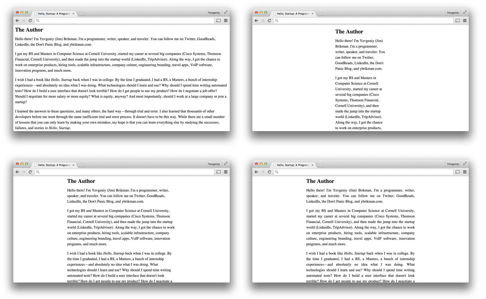
Most people find the bottom images easier to read than the top ones, and the bottom-right image to look the best overall for two reasons. First, the justified alignment in the bottom-right image creates strong lines on the sides of each paragraph, which is helpful when reading large amounts of text (this is why this style is used in most books and newspapers). Second, the bottom images use the proper amount of measure, which is around 45–90 characters per line. As a rule of thumb, you want a measure that’s just long enough to fit all the letters of the alphabet laid out back to back, 2–3 times [Butterick 2015, sect. line length]:
abcdefghijklmnopqrstuvwxyz abcdefghijklmnopqrstuvwxyz abcdefghijklm
Leading is the amount of vertical space between lines. As with measure, if you have too little or too much leading, the text becomes hard to read. The sweet spot for leading tends to be 120%–145% of the font size [Butterick 2015, sect. line spacing], as shown in the bottom image of Figure 18.
The typeface is the design of the letters. Every operating system comes with a number of standard, built-in typefaces, such as Arial, Georgia, Times New Roman, and Verdana. Many of these are not particularly good looking, and even those that are tend to be overused and therefore look bland in most designs. One of the simplest things you can do to dramatically improve your designs is to stop using system typefaces. You can get high-quality alternative typefaces from free sites like Google Fonts and paid sites like Adobe Typekit. But how do you know which of the thousands of typefaces you should use?
At a high level, all typefaces can be grouped into five classifications: serif, sans serif, script, decorative, and monospace. The typefaces within a classification vary widely, and some typefaces don’t fit neatly within any classification, but here are some rules of thumb that will help you get started.
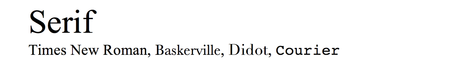
Serif typefaces have small lines called serifs at the end of a stroke on each letter or symbol. For example, in Figure 19, notice the little lines that jut out to each side from the bottom of the “r” in the word “Serif,” almost like the letter is on a pedestal. The stroke used in serif typefaces also tends to vary in thickness at different parts of the letter. For example, in Figure 19, the letter “S” in “Serif” is thinner at the top and bottom of the S than in the middle. The serifs and variation in thickness make each letter look more distinct, which helps reading speed, especially for large amounts of text. Therefore, serif typefaces are great for large amounts of body text and print material (most books use serif typefaces for the main body of text). As the oldest style of typeface, dating back not just to the days of the printing press but all the way back to letters carved into stone by the ancient Romans, you can also use serif typefaces in headers when you want a “classical” look.
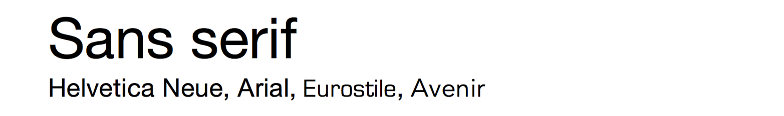
“Sans” is a French word that means without, so “sans serif” typefaces are those without serifs. Notice how the letter “r” in “serif” in Figure 20 does not have any lines jutting out at the bottom. Sans serif typefaces also tend to have a more uniform stroke thickness throughout the letter. For example, in Figure 20, the “S” in “Sans” is the same thickness everywhere. Because sans serif typefaces have a simple and uniform appearance, they aren’t as good as serif typefaces for large amounts of medium-sized body text, but they are typically better at extreme sizes such as large headers and small helper text. In fact, the tiny details of a serif typeface might look blurry if the letters are too small or you’re viewing them on low-resolution screen, so sans serif typefaces are very popular in digital mediums.
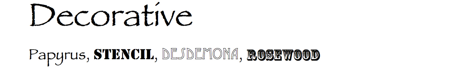
As the name implies, decorative typefaces are used as decoration or accents. These typefaces are distinct, fun, and highly varied, which is great when you need some text to really stand out, as you can see in Figure 21. However, they tend to be hard to read, so you will typically want to limit their use to a few words in a title or subtitle.
Script typefaces look like handwriting, cursive, or calligraphy, as shown in Figure 22. Similar to decorative typefaces, they are a great way to add an accent to a page, but don’t use them for more than a few words or letters because they are hard to read.
Each letter in a monospace typeface, as shown in Figure 23, takes up the same amount of space, which is typically only useful when displaying snippets of code (that’s why all terminals, text editors, and IDEs use monospace typefaces) and text that needs to look like it came from a typewriter.
There are many styles that you can apply to a typeface to change how it looks, including text size, text thickness (i.e., bold or thin), text obliqueness (i.e., italics), letter spacing, underline, and capitalization. A particular combination of typeface and style is a font. Each font in your design should serve a specific purpose. The résumé violates this rule, as it uses Times New Roman 12pt for all of the text. The only exception is a few underlines for emphasizing the section headings, but the underline is not a good choice. Virtually no book, magazine, or newspaper uses underlines because they make the text harder to read. The only exception is websites, where an underline is used for hyperlinks and therefore should not be used for anything else to avoid confusion. Let’s remove the underline and use several different font styles to improve the look of the résumé, as shown in Figure 24.
The structure of the résumé is clearer now: all the job and education titles are bold, all the company and school names are bold and italic, all the dates are italic, and all the section headings are in uppercase letters. It’s an improvement but it still looks bland because the entire résumé is using just a single typeface, Times New Roman.
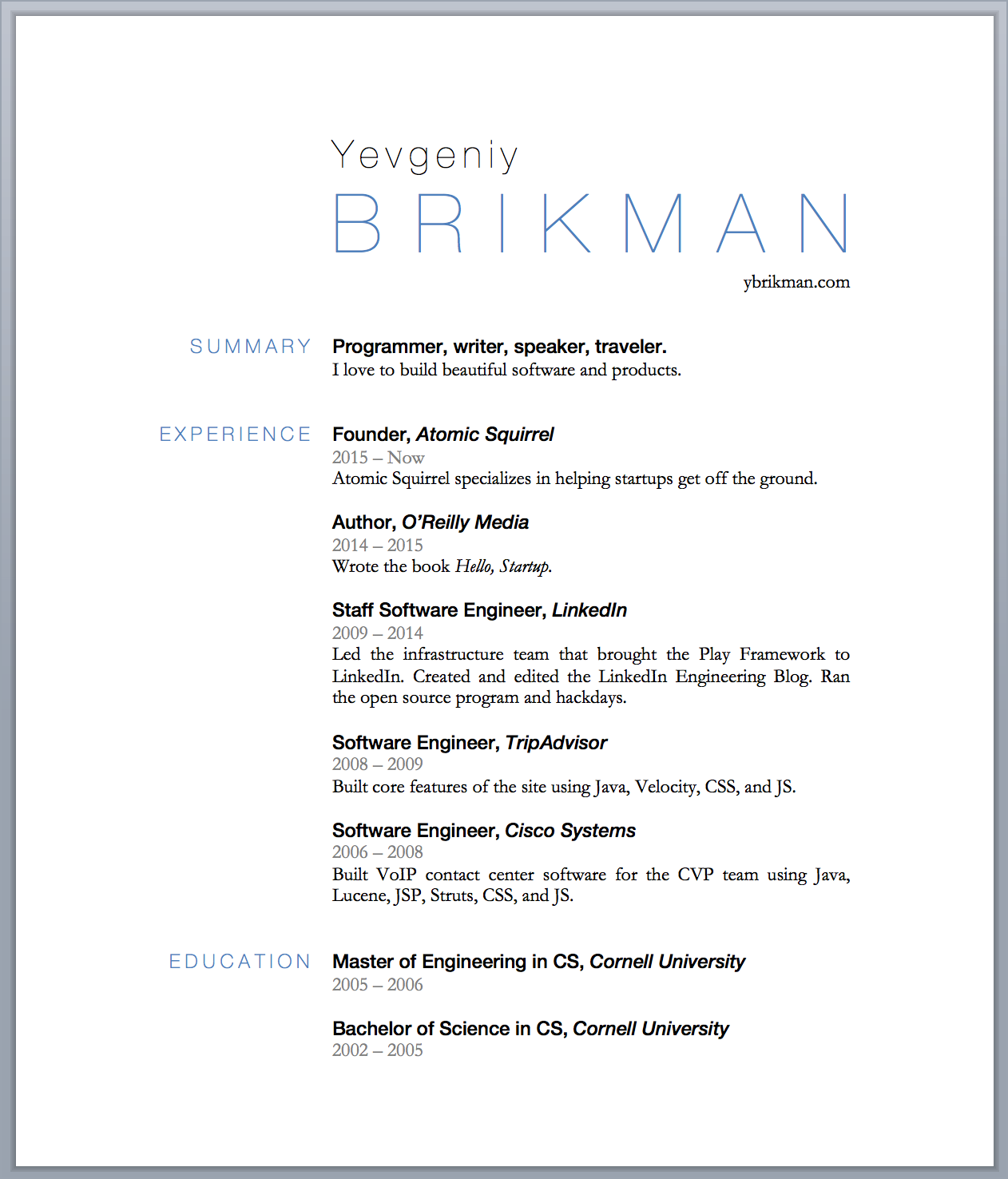
It can take a fair bit of experimentation and experience to find typefaces that look good together. If you’re new to the whole font business, then you might want to let the professionals handle it. If you Google “font pairings,” you will find dozens of websites that give you wonderful, pre-vetted recommendations. For example, the Google Web Fonts Typographic Project shows dozens of ways to pair fonts available in Google Fonts, Just My Type does the same thing for Adobe Typekit pairings, and Fonts in Use let’s you browse a gallery of beautiful typography from the real world and filter it by industry, format, and typeface. I found lots of great options in Fonts in Use for the résumé, but I chose a conservative set that’s likely to work on other people’s computers, consisting of Helvetica Neue for headings and titles and Garamond for the body text, as shown in Figure 25.
For hello-startup.net, I’m using the fonts from the Agency template, which are Montserrat, Droid Serif, and Roboto Slab (all available for free in Google Fonts), as shown in Figure 26.
These new fonts make the designs look a little cleaner, but overall, they are still fairly bland. We need some contrast to spice things up.
Contrast and repetition
Whereas proximity and alignment tell you that two elements are related, contrast is used to make it clear that two parts of the design are different. For example, when you mix multiple fonts, the most important thing to understand is that you need to have significant contrast between them. In the résumé, the job titles are in bold Helvetica Neue so you can easily distinguish them from the job descriptions, which are in regular Garamond. Notice how this message is reinforced through repetition: all the job titles use one font, all the section headings use another font, and all the body text uses a third font. Once you’ve defined a purpose for some element in your design—whether that’s a font choice or a logo in the corner, or the way elements are aligned—you should repeat it everywhere. This repetition becomes your brand (see not available for more information), and if it’s distinct enough, the reader will be able to recognize your style anywhere (see Figure 27 for an example).
You can create contrast in your fonts through a combination of varying the style (i.e., text size, thickness, capitalization) and the typeface classification. If you use two fonts that are too similar, such as the same typeface at 12pt and 14pt, or two different fonts that use serif typefaces, then they will be in conflict and the design won’t look right. Therefore, each time you introduce a new font, it must be for a specific purpose, and to make that clear, you need to communicate it loudly by having a lot of contrast. For example, in Figure 28, I added a lot more contrast to the résumé title by using a big, thin, uppercase font, with lots of letter spacing.
Another key role of contrast is to focus the user’s attention on an important part of the design. While someone reading a book might read every word, users of most products do not:
What [users] actually do most of the time (if we’re lucky) is glance at each new page, scan some of the text, and click on the first link that catches their interest or vaguely resembles the thing they’re looking for. There are almost always large parts of the page that they don’t even look at. We’re thinking “great literature” (or at least “product brochure”), while the user’s reality is much closer to “billboard going by at 60 miles an hour.”
[Krug 2014, 21], Steve Krug, Don’t Make Me Think
Therefore, not only should every font in your design serve a specific purpose, but every screen should have one central thing that it’s trying to get the user to do. This is known as the call to action (CTA). For example, the main thing I want people to do on hello-startup.net is to learn about the book, so I can add a big Learn More button as a CTA, as shown in Figure 29.
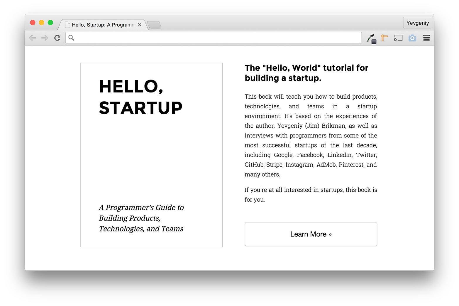
It’s a start, but I can make the button jump out more by using colors to increase the contrast.
Colors
OKCupid is a great example of using colors and contrast to make a very noticeable CTA, as shown in Figure 30.
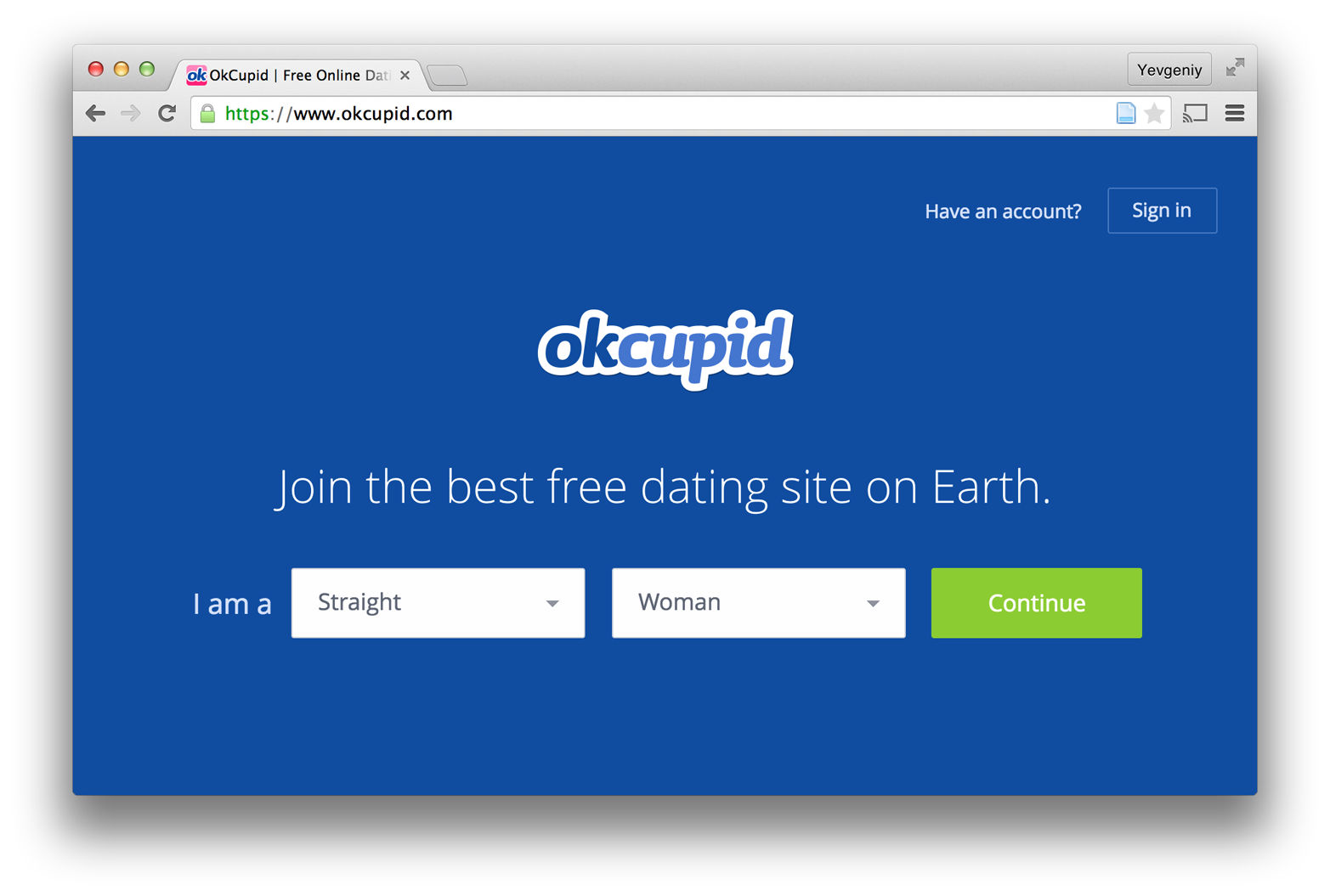
As soon as you go to the website, it’s clear what the site is (thanks to the clear copywriting) and what you’re supposed to do (thanks to the clear CTA). The central placement, the large fonts, and the contrasting colors make it so that the CTA practically jumps out at you. This is the key to using contrast effectively: if two items on a page are not the same, make them very different [Williams 2014, 69]. Or as William Zinsser wrote, “Don’t be kind of bold. Be bold.” [Zinsser 2006, 70].
How do you know which colors to use to achieve a good contrast? When you’re a kid, playing with colored paints and crayons is a blast. As an adult, choosing colors that work well in a design is slightly less fun. Color theory is even more complicated than typography. To do it well, you have to take into account physiology (e.g., putting red text on a blue background can create an effect known as chromostereopsis, which causes the text to be fuzzy, making reading difficult and even painful [Chromostereopsis 2014]), biology (e.g., about 8% of men have color deficiency while 2%–3% of women have extra color sensors and see more colors than average [Roth 2006]), psychology (e.g., each color comes with a number of associations and can have a significant effect on mood), technology (e.g., digital displays use the RGB color model, while most print devices use CMYK), art sensibility (e.g., some colors go together in a harmonious fashion, others do not), and the physics and mechanics of colors (e.g., the color wheel, primary, secondary, and tertiary colors, color mixing, hue, saturation, lightness, tints, and shades). It’s a lot to learn.
If you’re just getting started, I can offer you two tips that will save you time. The first tip is to do all of your design work in grayscale first and add color last. That is, figure out the copywriting, layout, and typography, and make the design work without any color. At the very end, when everything else is in place, you can add in some color, and even then, only with purpose [Kennedy 2014]. Think of adding color like painting a house: you should do it after you’ve put up the walls, windows, and doors, and not before. It’s easier to experiment with different color schemes when the rest of the design in place, as it allows you to deliberately choose colors as an accent, set a mood, or bring out a particular theme. For example, the résumé we’ve been working on has been black and white the entire time. It’s now easy to toss in a single color as a highlight, as shown in Figure 31.
Notice how this color scheme only makes sense once the layout (two columns) and font choices (a thin Helvetica Neue with a large font size and lots of letter spacing) are in place. Had I tried to add color to the original design, I would’ve probably done something different and had to change it anyway once the layout and typography were in place.
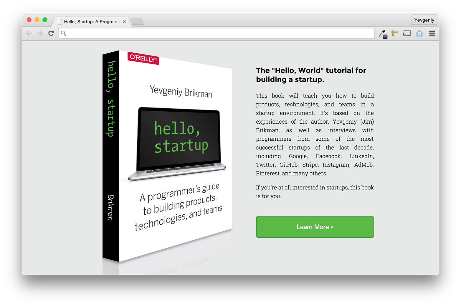
With hello-startup.net, I did the entire design in grayscale, and I can allow pictures in the design to influence the colors. For example, the cover image I got for the book had a gray reflection and green text, so I used those two colors throughout the design, as shown in Figure 32.
The second tip is to use palettes put together by professionals instead of trying to come up with your own. You can, of course, copy the color schemes used on your favorite websites, but there are also tools dedicated specifically to helping you work with colors. For example, Adobe Color CC and Paletton can generate a color scheme for you using color theory (e.g., monochromatic, adjacent colors, triads). Adobe Color CC, COLOURlovers, and Dribbble’s color search also allow you to browse through premade color schemes.
A quick review of visual design
Figures 3-33 and 3-34 show the progression of the résumé and hello-startup.net designs, respectively. Take a minute to look through these images and consciously name what changed between them.
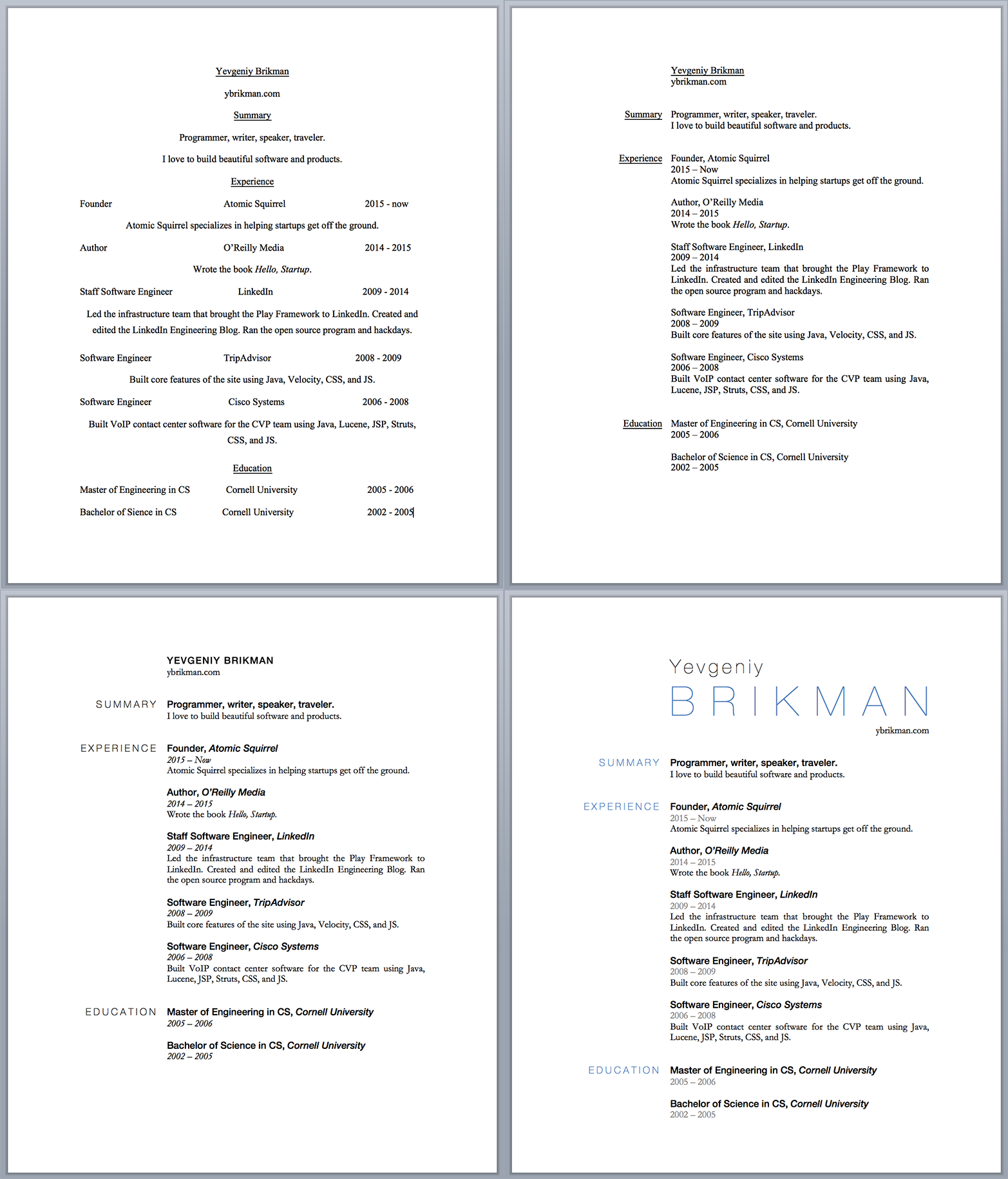
Hopefully, you were able to spot the following aspects of visual design:
- Top left: copywriting
- Top right: layout (alignment and proximity)
- Bottom left: typography (measure, leading, typefaces, fonts)
- Bottom right: contrast and colors
Finally, all the steps are based on templates, font combinations, and color palettes I found online, so at the center of it all is design reuse.
The MVP
The first design challenge you’ll have at your startup is building the initial version of your product. Even if you’ve come up with a great idea and validated it with real customers, resist the temptation to lock yourself in a room for a year to design and build the perfect product. Remember, a product is not just one idea but a constant cycle of new problems, new ideas, and execution. Execution is expensive, so you need to validate each new problem and idea as quickly and cheaply as possible with customers. The best way to do that is to build what’s known as a minimum viable product, or MVP.
MVP is a term that’s often misinterpreted. “Minimum” is often misread as “ship something—anything—as soon as humanly possible,” which misleads people into recklessly focusing on time to market above all else. “Viable” is often incorrectly understood as “enough features for the product to function,” which misleads people into building many features that are unnecessary and omitting the ones that actually matter. And “product” incorrectly suggests that the MVP must be a product, so people often overlook simpler, cheaper ideas for an MVP.
The term MVP was popularized by Eric Ries’s book The Lean Startup, which has a proper definition: an MVP is “a version of a new product which allows a team to collect the maximum amount of validated learning about customers with the least effort” [Ries 2011a, 103]. The point of an MVP is learning. The goal is to find the cheapest way to validate a hypothesis with real customers.
The “minimum” in MVP means eliminating anything that does not directly help you validate the current hypothesis. For example, when 37signals first launched their project management tool, Basecamp, their MVP did not include the ability to bill customers. The hypothesis they were validating was that customers would sign up for a web-based project management tool with a clean user interface. A billing system does not help validate that hypothesis so it can be eliminated from the MVP and added later (if customers actually start signing up). On the other hand, they invested time in coming up with a clean and simple design for the MVP, as that was an essential part of the hypothesis they were testing.
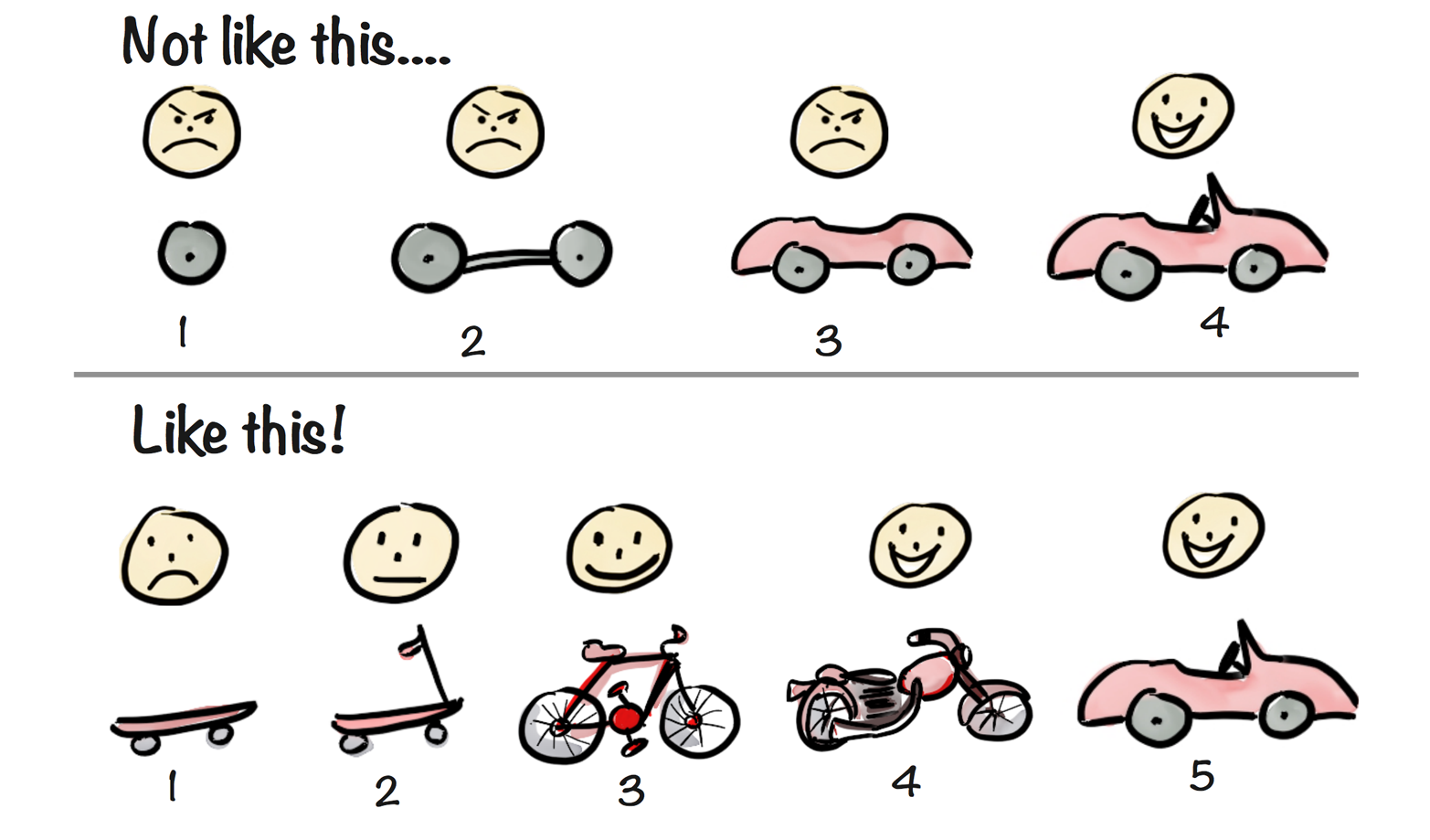
The “viable” in MVP means that the MVP has everything it needs for customers to accept it. The MVP might have bugs, it might be missing features, it might be ugly, and it might not even resemble the actual product you ultimately want to build, but it has to solve a problem the customer cares about. See Figure 35 for a great demonstration of the difference between a non-viable and viable MVP.
And finally, the “product” in MVP really means “experiment.” It could be a working prototype of your product or something simpler, such as as a landing page with a demonstration video, just as long as it can validate your hypothesis (see Types of MVPs for more information).
Building an MVP is not a one-time activity. For one thing, you will most likely have to build multiple MVPs before you find one that works. But even more importantly, building MVPs is more of a way of thinking than just an activity you do early in the life cycle of a product. Think of it like placing little bets instead of betting the house every time you play a game of cards. Whether you’re trying out ideas for a new product that no one has ever used or adding new features to an existing product that has lots of traction, you should use the MVP mindset, which can be summarized as:
- Identify your riskiest, most central assumption.
- Phrase the assumption as a testable hypothesis.
- Build the smallest experiment (an MVP) that tests your hypothesis.
- Analyze the results.
- Repeat step 1 with your new findings.
No matter how confident you are in an idea, always try to find the smallest and cheapest way to test it, and always try to keep projects small and incremental. Research by the Standish Group on over 50,000 IT projects found that while three out of four small projects (less than $1 million) are completed successfully, only one in 10 large projects (greater than $10 million) are completed on time and on budget, and more than one out of three large projects fail completely [The Standish Group 2013, 4].
The Standish Group has categorically stated with much conviction—backed by intense research—that the secret to project success is to strongly recommend and enforce limits on size and complexity. These two factors trump all others factors.
[The Standish Group 2013, 4], The CHAOS Manifesto 2013
Let’s now take a look at the different types of MVPs you can build.
Types of MVPs
An MVP doesn’t have to be an actual product. It just has to be something that can validate a hypothesis when a customer uses it. Here are the most common types of MVPs:
- Landing page
- An easy, cheap, and surprisingly effective MVP is a simple web page that describes your product and asks the user for some sort of commitment if they are interested, such as providing their email address to get more info or placing a pre-order. The general idea is to describe the most ideal vision of your product and see how much traction you can get, even if the product does not yet exist. If the most idealized description of your idea can’t convince a few people to sign up for your mailing list, you may want to rethink things. For example, Buffer, a Social Media Management app, started as a landing page that showed a description of the product idea, some pricing details, and a way to sign up for a mailing list to get more info, as shown in Figure 36. They got enough sign-ups, and just as importantly, enough clicks on the pricing options, to have enough confidence to build the actual product.
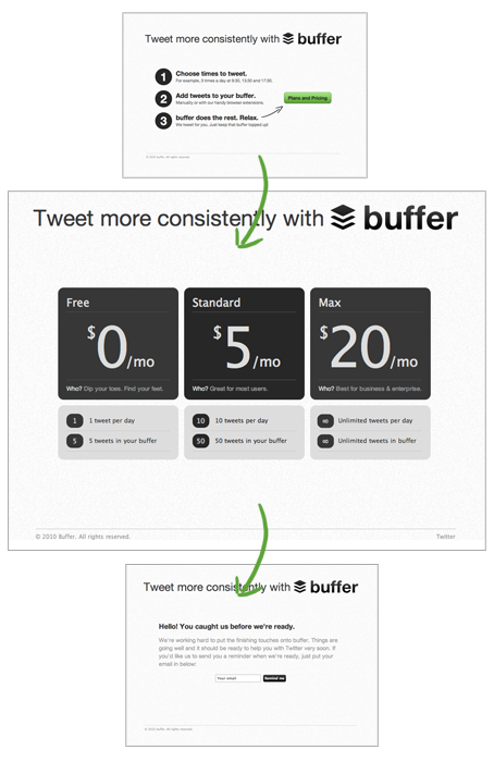
Figure 36. The Buffer MVP [Gascoigne 2011] Because the text and images on a landing page are quicker to update than a working product, a landing page is one of the most efficient ways to hone in on the right design, message, and market. You can experiment with different wording, target different customer segments, try out different pricing strategies, and iterate on each one until you find a sweet spot (see not available for how to measure the performance of each iteration). You can host your own landing pages on AWS or GitHub Pages, or use one of the many tools custom-built for landing pages, such as LaunchRock, Optimizely, Lander, or LeadPages.
- Explainer video
- Before Drew Houston started building DropBox, he wanted to be sure he wasn’t spending years building a product nobody wanted. Even building a simple prototype that users could try on their own computers would have taken a long time, because it would have required building a reliable, high-performance online service to store all the data. Instead, Houston built a much simpler MVP: a landing page with a sign-up form, plus a four-minute explainer video, as shown in Figure 37.
Figure 37. The DropBox explainer video The video was an effective way to show the product in action rather than just describe it, and it included some Easter eggs (e.g., references to XKCD and Office Space) for the tech-savvy viewer. Houston put the video on Hacker News and Digg, and within 24 hours, the landing page got hundreds of thousands of views and 70,000 sign-ups. This gave Houston the confidence that it was worth building the actual product [Ries 2011b]. Tools such as PowToon, GoAnimate, and Camtasia allow you to make an explainer video for free or on a small budget.
- Crowdfunding
- Crowdfunding sites such as Kickstarter or Indiegogo are a bit like a landing page with an explainer video, except instead of email addresses, interested customers give you money to support your project. In other words, this is a way to get customers to buy your product before you build it, which is the best validation you can get. One of the most successful Kickstarter campaigns of all time was for the Pebble watch, which raised $10 million from 68,000 backers with little more than a prototype [Gorman 2013], as shown in Figure 38.
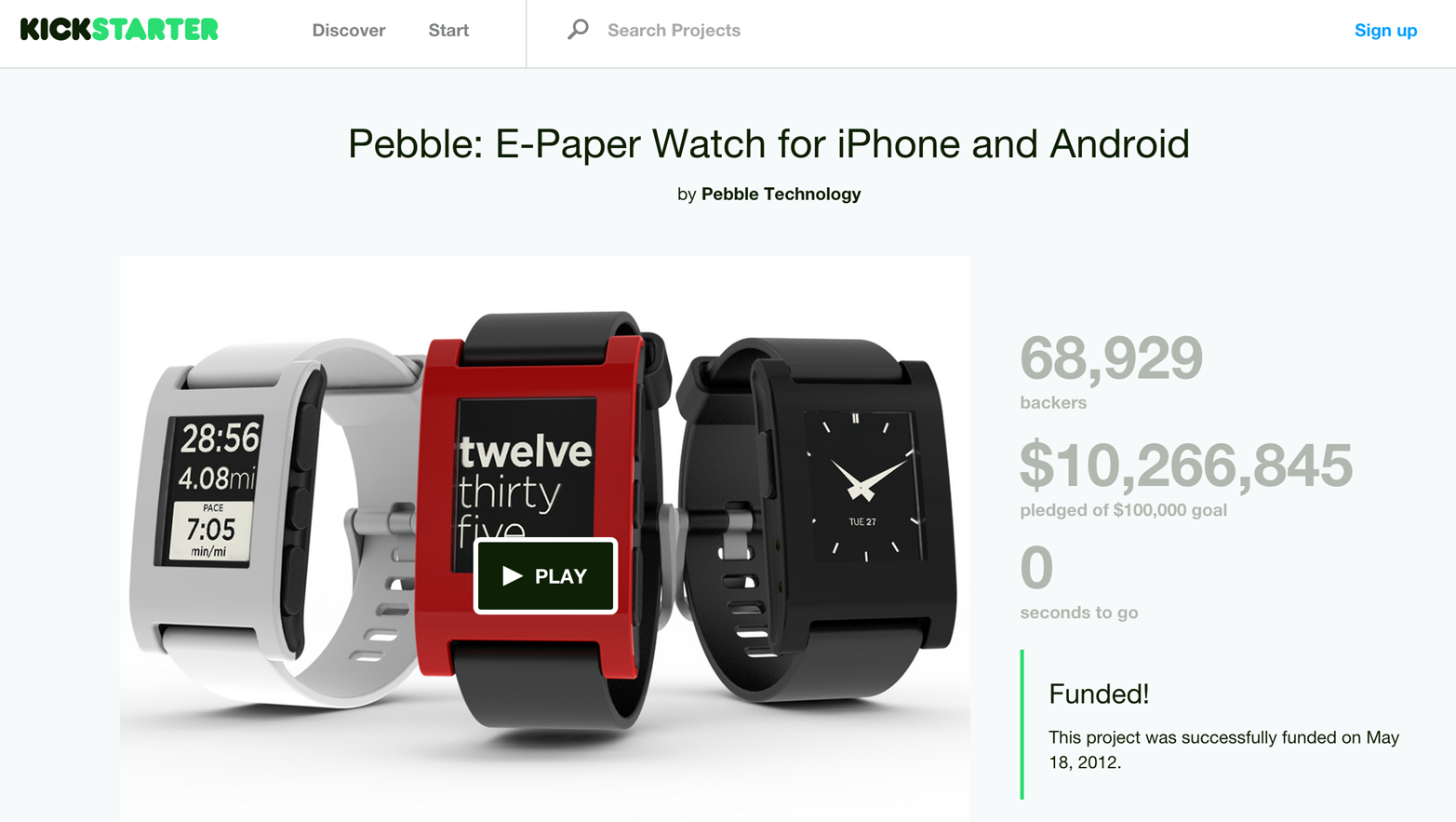
Figure 38. Pebble raised $10 million on Kickstarter before building the product - Wizard of Oz
- A Wizard of Oz MVP is one that looks like a real product to a user but behind the scenes, the founders are doing everything manually. For example, when Nick Swinmurn wanted to test his idea for Zappos, a place to buy shoes online, he went around to local shoe stores, took pictures of the shoes they had in stock, and put the pictures up on a website that looked like a real online shoe store, as shown in Figure 39.
Figure 39. A screenshot of Zappos.com from 1999 via the Internet Archive When a user placed an order, Swinmurn went back to the local shoe store, bought the shoe, and shipped it to the customer. This allowed Swinmurn to validate his hypothesis that people would be willing to buy shoes on the Internet without having to invest in a huge inventory of shoes, an automated ordering system, a factory to stock and deliver the shoes, and so on [Hsieh 2013, 58]. Pay no attention to the man behind the curtain.
- Piecemeal MVP
- A piecemeal MVP is similar to the Wizard of Oz MVP, except some of the manual pieces are automated as cheaply as possible with existing, off-the-shelf tools. For example, to create the Groupon MVP, Andrew Mason put a custom skin on a WordPress Blog (see Figure 40), used FileMaker to generate coupon PDFs, and sent them out using Apple Mail [Mason 2010].
Figure 40. A screenshot of groupon from 2009 via the Internet Archive
Check out http://www.hello-startup.net/resources/mvp for a list of tools you can use to build an MVP. Whatever type of MVP you end up building, the key is to ensure that you build something that is minimal but still viable. And the best way to do that is to focus on your differentiators.
Focus on the differentiators
In a talk called “You and Your Research” (which has often been nicknamed “You and Your Career,” as it has advice that applies to almost any career and not just research), Richard Hamming, a notable mathematician at Bell Labs, describes how he started sitting with the chemistry researchers at lunch:
I started asking, “What are the important problems of your field?” And after a week or so, “What important problems are you working on?” And after some more time I came in one day and said, “If what you are doing is not important, and if you don’t think it is going to lead to something important, why are you at Bell Labs working on it?” I wasn’t welcomed after that; I had to find somebody else to eat with!
[Hamming 1995], Richard Hamming, “You and Your Research”
Richard Hamming did important work at Bell Labs because he intentionally sought out important problems, and not just comfortable ones. Although his method of questioning can make people uncomfortable, it’s something we should all apply to our lives. What’s important in your field? What are you working on? Why aren’t those one and the same?
The same reasoning applies to building an MVP. What is important in your product? What are you actually building in the MVP? Why aren’t those one and the same? The most important aspect of a product is its differentiators: those features that separate it from all the other alternatives. People often refer to differentiators as the “competitive advantage,” but that phrase makes it seem like any advantage, no matter how marginal, is enough. It’s not. Your differentiators need to be much, much better than the competition. You’re looking not for a 10% improvement, but a 10x improvement. Anything less, and most customers simply won’t think it’s worth the effort to switch.
Therefore, it’s important to ask yourself, “what two or three things does my product do exceptionally well?” Once you identify this small number of core features, build your MVP around them and ignore just about everything else. For example, when Google first launched Gmail, its differentiators were 1 GB of storage space (in an era when most other email providers only gave you 4 MB) and a zippy user interface (it had conversation view, powerful search features, and used Ajax to show new emails instantly instead of having to refresh the page). Almost all other features, such as a “rich text” composer and address book, were minimal or absent [Buchheit 2010] but it didn’t matter, as the differentiators were so compelling that it made all other email services look primitive.
Another great example was the original iPhone. Apple is known for building complete, polished, end-to-end solutions, but in many ways, the original iPhone was an MVP. It didn’t have an App Store, GPS, 3G, a front-facing camera, a flash for the rear-facing camera, games, instant messaging, copy and paste, multi-tasking, wireless sync, Exchange email, MMS, stereo Bluetooth, voice dialing, audio recording, or video recording. Despite all that, the iPhone was still years ahead of any other smartphone because Apple relentlessly focused on doing a few things exceptionally well: the multi-touch user interface, the hardware design, and the music and web surfing experience were at least ten times better than any other phone. And customers loved it.
Getting customers to love your product, not just like it, is a huge advantage. It’s much easier to take a product that a small number of users love and get a lot more users to love it than it is to take a product that a large number of users like and get them to love it [Graham 2008]. To take users from “like” to “love,” you need to sweep them off their feet. You need to “wow” them. Think of the last time something made you say “wow.” It probably took somebody going above and beyond to delight you. It probably took something exceptional, and the simple fact is that doing exceptional things takes a lot of time. So if you want users to love you, instead of doing a merely competent job at many things, choose a few of them and knock them out of the park.
How do you know which features to focus on? One way to figure it out is to write a blog post announcing the product launch before you build anything. What are the two or three key items you’re going to highlight in that blog post? What features will you show off in the screenshots? What will be the title of the blog post? Good blog posts are short, so this exercise will help you tease out what features really matter to make your product look enticing. Those are the must-haves for the MVP. Everything else is optional. In fact, everything else is not only optional, but oftentimes, detrimental. Every extra feature has a significant cost (see Simplicity), so unless it’s absolutely essential for delighting customers or validating your hypothesis, it doesn’t belong in the MVP.
Once you’ve figured out your differentiators and built an MVP around them, you can use it to validate your hypotheses. Perhaps the most important validation of all is getting customers to buy the MVP.
Buy the MVP
One of your goals with the MVP, even at a very early stage, is to get customers to buy your solution. Note the emphasis on the word “buy.” Many people will tell you they “like” an idea, and they might even mean it, but there is a huge difference between liking something and being committed to buying it. It costs more than just money to buy a new product—it also costs time [Traynor 2014]. It takes time to convince your family (in the case of a consumer product) or your co-workers (in the case of an enterprise product) that the product is worth it, it takes time to install or deploy it, it takes time to train yourself and others to use it, and it takes time to maintain and update it in the future. The time aspect applies even if your product is free for some of your users (e.g., an ad-supported website or a freemium service), so no matter what pricing strategy you’re considering, your goal is to get a firm commitment to buy the product.
Every type of MVP you saw earlier, even the most minimal ones, provides an opportunity to buy. This is obviously the point of a crowdfunded MVP, but you can also have a pre-order form on a landing page MVP, and you can charge money for a Wizard of Oz, even if you have to accept payment in cash. You can tweak the price until you find a sweet spot, but don’t give it away for free. In fact, tweaking the price is a great way to see just how serious a customer is about using your product:
I ask [my customers], “If the product were free, how many would you actually deploy or use?” The goal is to take pricing away as an issue and see whether the product itself gets customers excited. If it does, I follow up with my next question: “Ok, it’s not free. In fact, imagine I charged you $1 million. Would you buy it?” While this may sound like a facetious dialog, I use it all the time. Why? Because more than half the time customers will say something like, “Steve, you’re out of your mind. This product isn’t worth more than $250,000.” I’ve just gotten customers to tell me how much they are willing to pay. Wow.
[Blank 2013, 52], Steve Blank, The Four Steps to the Epiphany
What kind of customer would commit to buying a product that doesn’t exist? Or, even if you have a working prototype, what kind of customer is willing to do business with a brand-new startup despite all the bugs, performance problems, missing features, and the fact that you might be out of business in a few months? In the book Diffusion of Innovations, Everett Rogers groups customers into five categories [Rogers 2003, chap. 7]:
- Innovators are willing to take risks on new technologies because technology itself is a central interest in their life, regardless of its function, and they are always on the lookout for the latest innovations.
- Early adopters are also willing to take risks on new technology, not because of an interest in the technology but because they find it easy to visualize the benefits the technology would have in their lives.
- Early majority customers are driven by a need to solve a specific problem. They are able to envision how a new technology could be a solution, but they also know many new innovations end up failing, so they are willing to wait and see if it works out for others before buying it for themselves.
- Late majority customers also have a specific problem to solve, but they are not comfortable using a new technology to solve it. They will wait until a technology is mature, has established itself as a standard, and has a support network around it before buying.
- Laggards avoid new technologies as much as they can. They are the last to adopt a new innovation and usually only do so because they have no other choice.
The number of customers in each category roughly follows a bell curve, as shown in Figure 41.
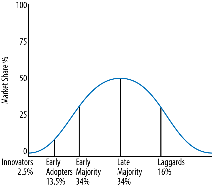
To be a successful company, you usually have to sell to the early and late majority, but you won’t be able to get there until you’ve convinced the innovators and early adopters. That is, innovation diffuses from left to right in the bell curve in Figure 41, and you can’t skip to a new category until you’ve been successful with a previous one. And because each category of customers is looking for something different, it is essential to understand what kind of customer you’re targeting or else you’ll end up with the wrong product, marketing strategy, and sales process.
What the early adopter is buying […] is some kind of change agent. By being the first to implement this change in their industry, the early adopters expect to get a jump on the competition, whether from lower product costs, faster time to market, more complete customer service, or some other comparable business advantage. They expect a radical discontinuity between the old ways and the new, and they are prepared to champion this cause against entrenched resistance. Being the first, they also are prepared to bear with the inevitable bugs and glitches that accompany any innovation just coming to market.
[Moore and McKenna 2006, 25], Geoffrey Moore and Regis McKenna, Crossing the Chasm
Your goal in the early days of a startup, when you’re still validating the problem and solution, is to find the right early adopters. These are the kinds of customers who will commit to buying your solution long before it’s ready because they believe in your vision rather than the specific product. Steve Blank calls this group of customers earlyvangelists and provides the following handy list to help identify them:
- They have a problem or need.
- They understand they have a problem.
- They’re actively searching for a solution and have a timetable for finding it.
- The problem is so painful that they’ve cobbled together an interim solution.
- They’ve committed, or can quickly acquire, budget dollars to purchase.
[Blank 2013, 35], Steve Blank, The Four Steps to the Epiphany
If you can find a customer who has already hacked together their own interim solution, that may be the best indicator of all because then you know you’ve found a real problem and a strong lead. Every industry has earlyvangelists, though there usually aren’t that many. That said, at this early stage, when you have no product and no customers, getting even a single customer is a huge win. Before you can get to thousands or millions of customers, you need to get 1, then 10, and then 100. To do that, you might have to do things that don’t scale.
Do things that don’t scale
One of the most common pieces of advice Y Combinator gives to startups is to “do things that don’t scale.” That is, in the early days of a startup, you might have to do many things manually, such as hiring, recruiting users, and customer service. This will feel inefficient, especially to programmers, who will be tempted to yell “But that won’t scale!” But manual labor is often the only way to get the fly wheel started, and only once it’s really going do you need to worry about scaling. For example, the founders of Airbnb went door to door in New York to recruit early users and even helped them photograph their apartments [Graham 2013]. The founders of Homejoy, a startup that helps customers find home cleaning services, initially went around to customers’ homes and did all the cleaning themselves [Cheung Adora 2014]. The founders of Pinterest recruited their first users by going to coffee shops and personally asking strangers to try the product. They would also go to Apple stores and set all the browsers to the Pinterest home page [Altman 2014a]. The employees of Wufoo, a startup that helps users create online forms, used to send handwritten thank-you notes to every single customer:
Perhaps the biggest thing preventing founders from realizing how attentive they could be to their users is that they’ve never experienced such attention themselves. Their standards for customer service have been set by the companies they’ve been customers of, which are mostly big ones. Tim Cook doesn’t send you a hand-written note after you buy a laptop. He can’t. But you can. That’s one advantage of being small: you can provide a level of service no big company can.
Once you realize that existing conventions are not the upper bound on user experience, it’s interesting in a very pleasant way to think about how far you could go to delight your users.
[Graham 2013], Paul Graham, Co-founder of Y Combinator
When you’re a tiny startup and still validating your ideas, you can afford to do things that don’t scale to get your first customers. If the idea works, you can make the process more scalable through automation later. But if it doesn’t work (and most ideas don’t), then you’ve saved an enormous amount of time by not building a bunch of automation for the wrong thing. Also, by getting directly involved in the nitty-gritty details of your business, you become a domain expert, which as you saw earlier, is essential for coming up with great ideas.
Recap
A user interface is like a joke. If you have to explain it, it’s not that good.
[LeBlanc 2014], Martin LeBlanc, Founder of Iconfinder
Design is an essential skill because the user interface is the product. The good news is that the design process is iterative: any design can be incrementally improved and any person can incrementally improve their design skills. The best thing you can do is to start reusing existing designs, writing user stories, and designing for personas. With practice, you can learn copywriting, layout, typography, contrast, repetition, and colors. By giving your product a personality, especially a polite one that is responsive, considerate, and forgiving, you can build a design that resonates emotionally. And by frequently running usability tests, you can get direct feedback on how you’re progressing.
However, no matter how good your design is, there is no way to be sure if it will be successful. Therefore, the best strategy is to constantly be running small experiments and adjusting them based on feedback from real users. Do a little market research, talk to potential customers, release a quick MVP, learn from your users’ reactions, and then repeat again and again.
I’m the author of Amazon’s best-selling interview book, but it all started with a little 20-page PDF. Honestly, it wasn’t very good. I’m embarrassed to look at it now. It was good enough to act as an MVP, even though I didn’t think about it that way at the time. It ended up testing the market, establishing that there was a real demand, and from there I could expand on it. It also got me very early feedback on what matters.
There was one other company I started that was much the same thing. It started small, and then by accident, I realized I had a company.
It’s so easy to hear an idea from yourself or someone else and cross it off as being a bad idea for various reasons. I could tell you a million reasons for why my company would fail. And yet, it succeeds despite those reasons (and perhaps because of them, in some cases).
The truth is that it’s so hard to predict what will and won’t work. An MVP allows you to try something out relatively quickly and cheaply. Those results often mean more than your other predictions.
[McDowell 2015], Gayle Laakmann McDowell, Founder and CEO of CareerCup
A lot of people find this hectic, trial-and-error approach unsettling. It’s tempting to look at a successful product and assume that it appeared in the creator’s head exactly as you see it now, fully formed, beautiful, and complete. But that’s like seeing Michael Jordan looking smooth and dominant on the basketball court and assuming he came out of the womb 6′6″ and 216 lbs, with the ability to dunk and an unstoppable fade-away shot.
I’ve missed more than 9000 shots in my career. I’ve lost almost 300 games. 26 times, I’ve been trusted to take the game winning shot and missed. I’ve failed over and over and over again in my life. And that is why I succeed.
[Goldman and Papson 1999, 49], Michael Jordan
Any time you hold a polished product in your hand, remember that what you’re looking at is the final iteration of thousands of trials and errors that included many missteps, pivots, redesigns, and compromises. And the entire way, the company that built it was probably struggling to survive and hoping it could find a working combination before going out of business.
Starting a company is like throwing yourself off the cliff and assembling an airplane on the way down.
[Chang 2013], Reid Hoffman, Co-founder and Chairman of LinkedIn
This is what it means for a startup to be in “search mode.” It is a frantic race against time to find a problem worth solving and a solution that’s worth building, and the best way to make that happen is not to hope for a eureka moment but to use an iterative, experimental process.