

 Clockwork mechanism for an ancient clock at the British Museum. (source: William Warby on Flickr)
 Many businesses are turning to data analytics to provide insight for making operational decisions. Two areas in particular where data analytics can help companies is (1) improved service delivery to customers, and (2) more efficient and effective resource allocation. To arrive at actionable insights, the analysis often relies on multiple data sets of varying size and content. In this article, we will discuss one simple example where data engineering, data analysis, and the merging of two data sets can help a company in both the above areas.
Use case: Scheduling 24-hour support staff
Many companies provide ongoing support for their products and services. This support often requires a round-the-clock team of support technicians and engineers to quickly respond to issues as they arise. Depending on how customers use the product and their geographic locations, however, it may be difficult to appropriately schedule support staff across the 24-hour period, leading to the possibility of overstaffing or understaffing during any given period. Making appropriate support-staffing decisions, however, speaks to both critical operations areas noted above. Understaffing can lead to delayed response times when issues arise, reducing the quality of customer service. Overstaffing indicates that resources are being underutilized, adding unnecessary costs.
A straightforward approach to making staffing decisions might involve estimating a couple of metrics: (1) the baseline productivity of a single staff member (e.g. how many tickets can a staff member respond to in a given period of time), and (2) any temporal patterns to when tickets are generated (e.g., is the ticket generation rate different by hour of day or day of week). But these metrics can be difficult to determine without complex data analysis, and using them in a straightforward way may also require making several simplifications and assumptions. An alternative approach is to examine patterns in the metric of interest and make scheduling adjustments based on that metric.
Our approach to measuring responsiveness
In a round-the-clock customer support example, a good metric for support staff responsiveness is the amount of time it takes for a support technician to take a first action in response to a service ticket. In this scenario, we are imagining that issues are raised through a software interface that generates a service ticket and that the entire service team has the ability to respond to tickets in the service queue. The goal of the analysis, then, is to understand how this metric varies by staffing level and determine if any adjustments need to be made.
Preparing the data
For a software ticketing system like the one described above, service tickets may be stored in a historical time series that produces a record each time an action related to the ticket is taken. If the data are stored in a relational system, these historical records may also connect to metadata related to the ticket, such as the entity that opened the ticket, and further details about the ticket.
Regardless of the complexity of the database, however, it should be possible to join and query the database system to obtain a single time series table where each record contains the following information: ticket ID number, time of action, and action taken. Depending on the specific problem, there may be important metadata that should be included to further segment the data, such as the type of ticket; but for this example, we will assume the simplest case, where all ticket types can be treated the same.
The data table stub below shows a sample of what such a time series table might look like.
Ticket ID | Time | Action |
TKT101 | April 4, 2016 01:03PM GMT | Created |
TKT101 | April 4, 2016 01:06PM GMT | Modified by Technician |
TKT102 | April 4, 2016 01:13PM GMT | Created |
TKT103 | April 4, 2016 01:14PM GMT | Created |
TKT102 | April 4, 2016 01:17PM GMT | Modified by Technician |
TKT104 | April 4, 2016 01:17PM GMT | Created |
TKT104 | April 4, 2016 01:21PM GMT | Modified by Technician |
TKT105 | April 4, 2016 01:22PM GMT | Created |
TKT106 | April 4, 2016 01:22PM GMT | Created |
Using these data, we can derive another data set that gives the amount of time elapsed between when a ticket is created and the time of first action. These derived data (sample shown below) will serve as the basis for our analysis.
Ticket ID | Time Created | Time to First Action (Min) |
TKT101 | April 4, 2016 01:03PM GMT | 3 |
TKT102 | April 4, 2016 01:13PM GMT | 4 |
TKT103 | April 4, 2016 01:14PM GMT | 10 |
TKT104 | April 4, 2016 01:17PM GMT | 4 |
TKT105 | April 4, 2016 01:22PM GMT | 5 |
TKT106 | April 4, 2016 01:22PM GMT | 6 |
Aggregating the data
We can aggregate the data in several ways to obtain useful insights into support operations. To answer the initial question we posed about whether support staffing levels are adequate, we would aggregate the data by determining the average time to first action for tickets created during each hour of day. Since staffing schedules may change periodically, often on a monthly basis, we also limit the analysis to tickets created during the specific period of time when a particular schedule was in effect.
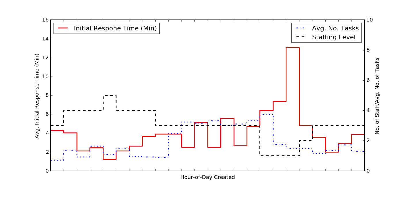
This plot shows the average initial response time, by hour of day that a ticket was created (in red). For comparison, we also show the average number of tasks opened, by hour of day (in blue). The black dashed line shows the number of support staff working during each hour of day. Perhaps the most striking feature of this plot is that large increase in response time for tickets opened between 16h to 19h (4 p.m. to 7 p.m.); this increase also coincides with a drop in staffing levels from three people to one person.
The immediate implication, based on a qualitative visual examination of the above chart, alone, is that staffing levels should be increased during the 16h to 19h period. It is interesting, however, to examine this a bit more quantitatively.
Initial response time vs. ticket creation rate
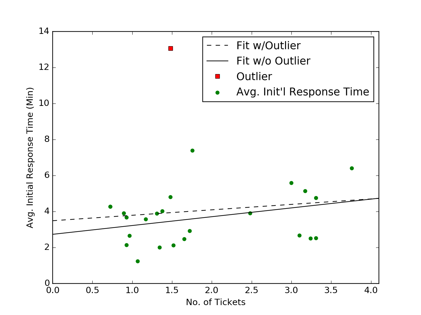
We might expect there to be a relationship between the average initial response time and the average numbers of tasks that are generated at any particular time. The plot below shows, for each hour of day, the average response time compared to the average number of tickets created (indicated as green dots).
The black dashed line shows a linear fit to these data, used to determine if there is a trend in this relationship. There is also a significant outlier corresponding to the 18h to 19h period, with an unusually high response time. If we remove this point when performing the linear fit, we obtain the trend shown in the solid black line. Comparing the RMSE calculated, after removing the outlying point for either fit, does not indicate a substantial difference (1.4 versus 1.5), and it’s also apparent by visual inspection that neither fit provides much predictive value.
For example, based on the fit alone, we might expect that at no ticket creation rate below 4/hr should we expect the initial response time to exceed five minutes, but the data clearly show five hours of day when the response time is greater than five minutes.
Initial response time vs. staffing level
Another relationship we should examine is between the staffing level and the average initial response time. The plot below indicates a much more apparent trend where the higher the staffing level, the shorter the initial response time. For each hour-of-day, the blue dots show the average response time for any given staffing level. Once again, we perform a simple linear fit to the data with (dashed black line) and without (solid black line) the outlier corresponding to the 18h to 19h block.
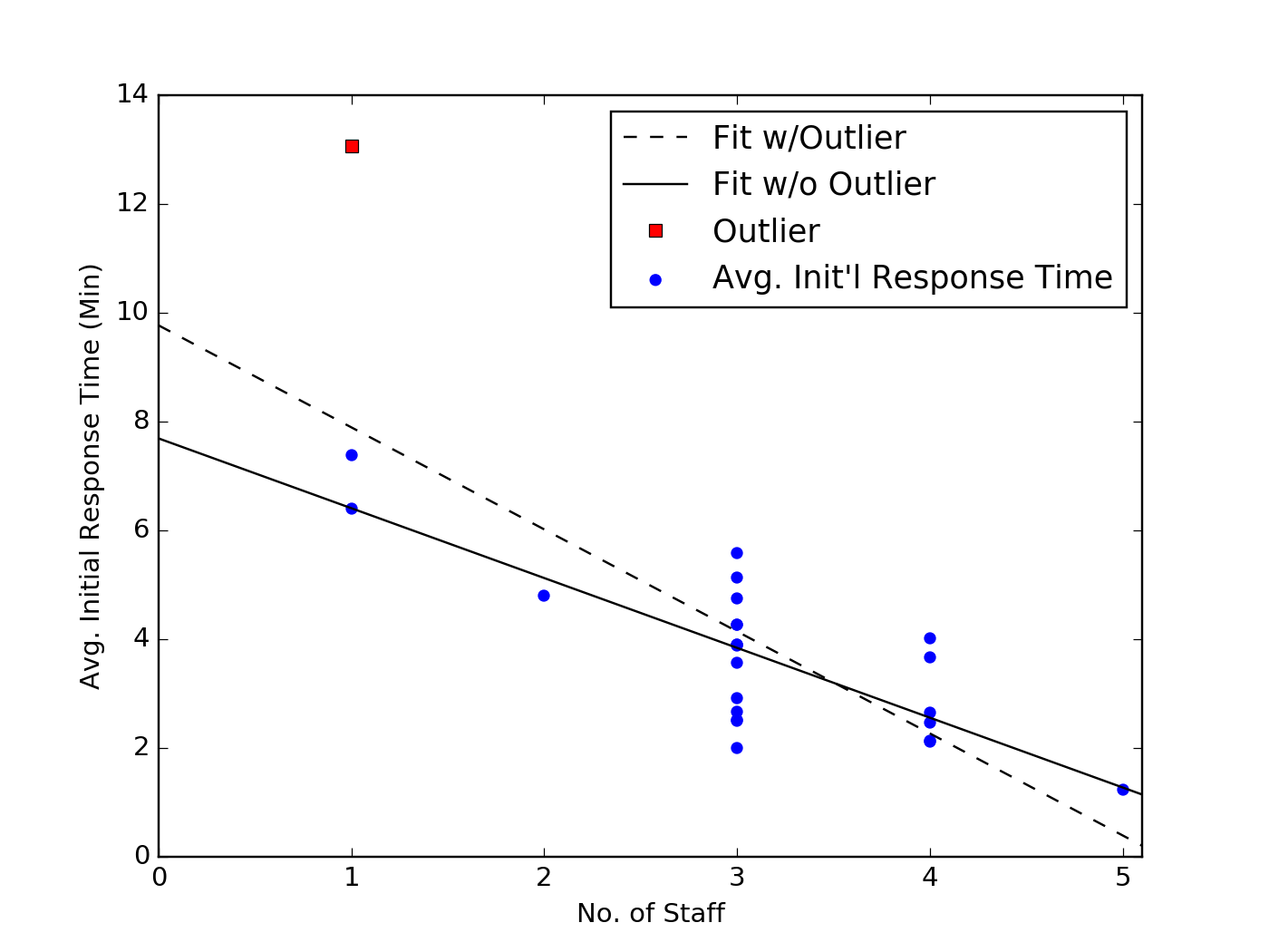
In this case, removing the outlier does appear to have a more significant impact on the trendline, though the predictive value of both fits are similar. To use the example above, both fits would suggest that keeping the minimum staff level at three people or more would result in an average initial response time below five minutes. There are only two hours of day where these models are incorrect (11h to 12h and 13h to 14h), and in both of those cases, the average response time is still below six minutes.
Given this trend, the longer initial response time during the 18h to 19h block is less surprising, though this hour remains a significant outlier. To better understand this, we can go back to our initial plot, which showed the data as a time series. When we do so, it becomes obvious that the increase in initial response time occurs during the final hour of a three-hour block, where there is only one person staffed. Analysis of additional data concerning the other duties the support staff are attending to may offer better insight into this outlier. Initial hypotheses, though, could be that either the staff member on duty begins to feel fatigue during her third hour alone, slowing down her overall performance or she develops a backlog of work from her competing responsibilities, which slows down her initial response time.
The analyses we have already discussed above, however, suggest that to make an improved staffing decision, the support operations manager does not need to understand the cause for the 18h to 19h block outlier. Increasing the staffing level to two or three people during this period is likely to reduce the overall initial response time. If the manager sets an initial response time target of around five minutes, these analyses also suggest that the team is overstaffed during the 1h to 8h block, when there are four or five staff members on duty. Rescheduling these staff to later parts of the day will likely reduce the average initial response time overall, and significantly improve the response time during the 16h to 19h block.
Making better decisions
Data analytics offer powerful tools for helping a company make better operations decisions. In particular, combining data from multiple data sources and applying time-series techniques can provide deep insights into a company’s operational strengths and weaknesses. In this example, we have shown how combining straightforward analyses of a company’s ticket management data with information about its staffing scheduling can help a support operations manager make better staff scheduling decisions.
This example was put together by Datapipe’s data and analytics team.