Improving security through data analysis and visualizations
Five questions for Charles Givre on building effective security analytics programs.
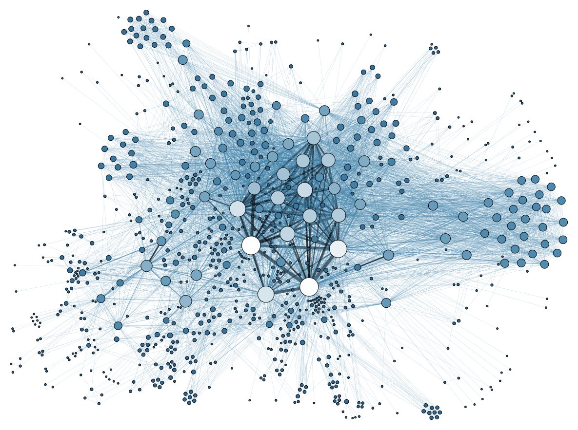 Social Network Analysis Visualization (source: CC BY SA 3.0 Martin Grandjean)
I recently sat down with Charles Givre, data scientist, to discuss the characteristics of successful security analytics programs, principles for effective data visualizations, and how effective data visualizations can reduce response time. Here are some highlights from our talk.
Defenders are increasingly employing data analysis to help protect their organizations with varying levels of success. What characteristics define the organizations that have the most successful security analytics programs?
In my opinion, it isn’t enough for a company to simply have a security analytics program. This isn’t unique to security analytics, but the companies that truly maximize the benefit of any analytics program are the ones that have a culture of data literacy from top to bottom. You can have a killer analytics program, but if the C-Suite or other stakeholders don’t understand the analytics being presented to them, the resulting recommendations are not likely to be implemented or acted upon.

Learn faster. Dig deeper. See farther.
What I’m getting at is if companies want to have successful analytics programs, the entire organization needs to build a culture that embraces data. On a practical level, this means educating your engineers about data science and analytics and encouraging them to conduct their own experiments. It also means making sure they have access to, and knowledge of, the latest data science tools and techniques. They, like all learners, need to have the permission to experiment and fail. Analytics and data science are more akin to research than software development and it’s inevitable that some experiments will fail.
Lately, there’s been a lot of discussion regarding the importance of effective data visualization. How does data visualization fit into a successful security analytics program?
We’ve all heard the saying that a picture is worth a thousand words. When done properly, visualizing data enables people to see relationships and patterns in their data that they might never see, or alternately would take them a very long time to uncover. Visualizing data also enables humans to process exponentially more data than would ever be possible simply by just looking at the raw numbers.
Ultimately, using effective data visualizations will enable a security analytics program to derive much more value from the data. There’s a term I really love that I believe was coined by Bill Franks, the Chief Analytics Officer of Teradata, which is time to insight (TTI). TTI is a measure of how long it takes to go from raw data to something of value. It is important, especially in security, because in the security realm, insights’ value decreases over time. Effective visualization can dramatically decrease the TTI and thus improve your organization’s response time and increase the value of insights and analytic efforts.
In the last few years, there have been a lot of really amazing tools, both open source and commercial, that make creating effective visualizations very easy. I personally recommend Apache Superset and Metabase. Also, for data scientists, District Data Labs recently released a great python module called YellowBrick (which we will be covering in our class), that facilitates machine learning model evaluation through visualization.
What are some basic tips and techniques for creating meaningful visuals of your security data?
I’m a follower of the “Tufte school” of data visualization, so here are some of my guiding principles. These really apply to any visualization, not just security data.
- Keep it simple: The more brainpower the reader has to spend decoding the message of a visualization, the less is available for understanding the message and the longer it takes. I’m a fan of clean, simple visualizations. Edward Tufte coined the term “chartjunk” and I see a lot of security visualizations that are loaded with clutter and other non-data elements. In general, if it isn’t data, you shouldn’t put it in your visualizations.
- Don’t lie with your data: Make sure that the visualization techniques are accurately representing your data. Make sure you are scaling things correctly, labeling axes, and so forth.
- Avoid distortion: Don’t use any chart named after food (pie, donut), especially 3D versions. Pie and donut charts distort your data, especially 3D charts. In general these charts should be avoided.
- Tell a story: Finally, the best visualizations tell compelling stories by putting as much data in front of the reader and illustrating relationships between them. Humans are very good at seeing patterns and anomalies, and the best visualizations can help people see them more quickly.
My last tip is that in recent years, there have been a lot of new tools that make designing nice visualizations much easier. In fact, many really prevent you from creating the disasters that you’d find here: https://www.reddit.com/r/dataisugly/. If you are a Python user, you really should take a look at Seaborn, YellowBrick, and Altair as they are all really impressive libraries.
You recently announced Griffon, a virtual environment for data science. How might this tool benefit data-minded security professionals?
One of the issues I’ve consistently encountered when teaching data science classes is that many of the open source data science tools can be quite difficult to install and configure correctly.
In the security world, Offensive Security solved this problem years ago with Kali Linux, however, nothing really comparable exists for data science, until Griffon. My colleagues and I created Griffon to use in our teaching, but really it can benefit data-minded security professionals by allowing them to try and experiment with a wide variety of data science tools that they might not have even known existed before, without having to go through the headache of installing and configuring these tools.
As an added bonus, Griffon allows you to use many Linux-based data science tools on any host environment. You can download the latest version of Griffon from our Github repository.
We are planning on implementing a Docker version, as well as including tutorials bundled with Griffon itself, so look for that in future releases!
You’re teaching a 2-day course on Data analysis and machine learning for cybersecurity at the O’Reilly Security Conference in New York this October. What presentations are you looking forward to attending while there?
I’m particularly looking forward to hearing Alex Pinto’s talk about automating threat hunting. I’m also hoping to attend Security + Design * Data Science: A Bot Story, which is being presented by Bobby Filar and Rich Seymour from Endgame. What’s not to love about the combination of UX, Security, and Data Science? Seriously though, I’m of the opinion that UX and design are often left out of data science talks and I think that good UX can really make data science products much better.