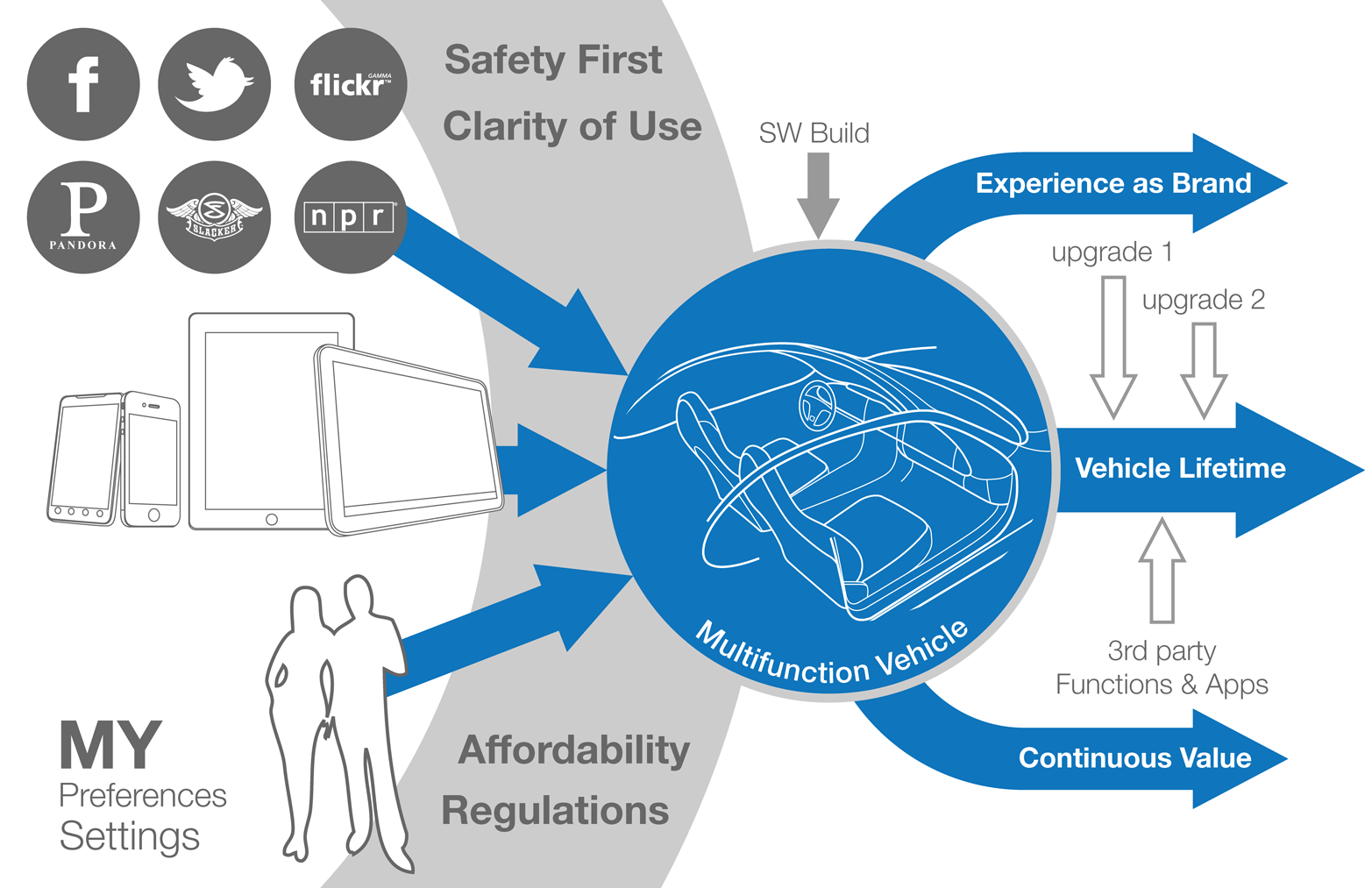
Interface and interaction design
Read chapter 8 from Designing Connected Products: UX for the Consumer Internet of Things.
 A Reactable in use playing music (source: Reactable/Massimo Boldrin)
In this chapter, we will look at interface and interaction design for connected products. Many connected products involve web and smartphone interfaces. But there are many good resources available on these platforms already. This chapter will focus on the possibilities beyond point-and-click or touchscreen interfaces. This is for two reasons.

Learn faster. Dig deeper. See farther.
First, point-and-click and touchscreen interfaces dominate the majority of UX design work. But both interface types are less likely to be used on embedded devices like smart thermostats and or smart plugs.
Second, the Internet of Things provides an opportunity to redefine how we interact with digital devices. This point is brilliantly argued by designer Bret Victor in his “Brief Rant About the Future of Interaction Design.”1 Victor discusses the diverse and intricate ways we use our hands on a daily basis. He critiques the many concept explorations that, although looking into the future, still revolve around touchscreens. The aim of this chapter is to inspire designers to experiment with new ways of interacting with products.
This chapter introduces:
-
Different interface types and their benefits and drawbacks (Types of Interaction)
-
Specific interface design challenges for embedded devices (Multimodal Interaction and Interface Combinations)
-
Ways to design accessible and universal interfaces (Universal Design and Accessibility)
This chapter addresses the following issues:
-
Why having a screen isn’t necessarily better than not having a screen (Is a screen better than no screen?)
-
What strategic decisions designers face about the interactivity of a device (Deciding on the Level of Interactivity of a Connected Device)
-
How interfaces can reduce the amount of attention asked from users (Glanceable and Ambient Interfaces)
-
How devices can receive complex input through simple interfaces (Working with Limited Input and Output Capabilities)
Types of Interaction
Our bodies and abilities define how we can “talk” to devices (input). Our sensory system defines how we can “listen” to devices (output).
Yet, the way we interact with devices has so far been very limited. Tom Igoe and Dan O’Sullivan illustrated this in their book Physical Computing. Figure 1-1 shows their illustration of “how the computer sees us”: one eye instead of two because we only look at two-dimensional screens; one finger only, as we input through sequential tapping, which might as well be the same single finger; two small ears to hear stereo audio output from laptop speakers and the like. Igoe and O’Sullivan point out: “To change how the computer reacts to us, we have to change how it sees us.”2

If the illustration were updated to include new interface technologies as they become available, it would gradually become more human-like. New interface technologies mean the computer is able to understand more about our actions and behaviors: seeing full body posture and gestures or listening to what we say.
This isn’t to say new interface technologies necessarily improve the way we interact with products, but it shows how limited interfaces still are and how they only gradually enable new ways of interaction. This chapter aims to inspire you to think about different input and output possibilities. The following tables list some of the ways in which we could provide input, or receive output, and how they might be used:
| Input Through | Used In… |
|---|---|
|
Touch, Press |
Physical contols, touchscreens |
|
Movement and manipulation |
Tangible UIs |
|
Speech |
Speech recognition |
|
Whole body |
Gesture recognition, proximity sensing |
|
Galvanic skin response |
Stress detection |
|
Thoughts |
Brain-computer interfaces |
|
Heart rate |
Determining stress, anxiety, sleep… |
| Receive Output Through | Used In… |
|---|---|
|
Seeing |
LEDs, screens |
|
Hearing |
Sound, voice output |
|
Tactile sensing |
Vibration, force feedback, shape |
|
Smell |
Scent messaging |
|
Temperature sensing |
Temperature output |
There are more interface types we could list. And not all the types we listed are readily applicable at the moment. Breaking down interaction into these components lets us combine them in different ways: a device might take voice input, but output only through a screen. Or it might have physical controls, but only respond using a voice through a speaker.
In this chapter, we will discuss combinations of inputs and outputs that are particularly relevant for connected products.
Physical Controls
Physical controls are everywhere: push buttons that activate something, switches that let us choose between two states, sliders and rotary knobs that let us set a value on a range or select between multiple settings. Figure 1-2 shows a few different kinds.
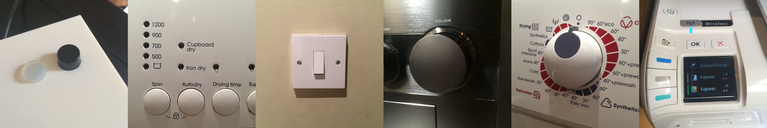
Physical controls aren’t just input; sometimes they show a current setting. An electrical outlet switch controls the outlet, but also tells you if it’s on or off. The tactile nature even allows you to feel the switch in the dark and use it without seeing it. In electronic devices, this can make things complicated. When users can change a setting from more than one place, controls might need to be motorized (like HiFi systems where the volume knob rotates even when the remote is used), or a combination of physical control and display is required.
Physical controls are also expensive to change once your product is shipped. If you plan to update the functions of buttons later on, you might have to keep labeling abstract (through color coding or by using geometric shapes), or combine buttons with displays (“soft keys”). These options aren’t always feasible and the cost of fixing design faults can be high. When Ford needed to fix a design fault relating to physical controls, it required issuing a recall of over 13,000 cars.3 Getting physical controls right is crucial, and button placement can make or break a product.
In addition to the placement, function, or type of control (button, switch, dial, etc.) designers also need to think about the tactile aspects. The haptic and tactile characteristics of a control influence the experience of a physical device. From the outside, they might be invisible.
To enable designers to work with the nuances that exist, the specifications for controls include operating force graphs. Figure 1-3 shows such graphs for different versions of what (from the outside) looks like the same button. Note the differences in both stroke (the distance the button travels when pressed) and operating force (the force at which the button “activates”).
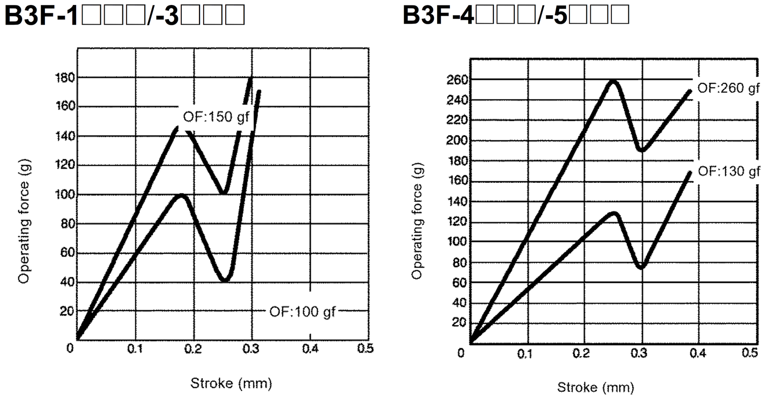
From the outside, a user won’t be able to spot that difference. But it will make a noticeable difference to the way the interaction feels. This has a practical aspect: making sure a button is harder to press so users don’t trigger it by accident. There is also an emotional aspect: making sure pressing a button feels satisfying rather than flimsy.
To get an idea for how nuanced the tactile quality of a button can feel, just read a few reviews on the blog http://knobfeel.tumblr.com. It’s not exactly a serious resource, but it gives an idea of how certain physical controls feel to somebody over other ones. For example, one of the reviews reads: “I don’t quite understand how it simultaneously is light to move, but [has] a heavy feel. The rotation can only be described as creamy.”4
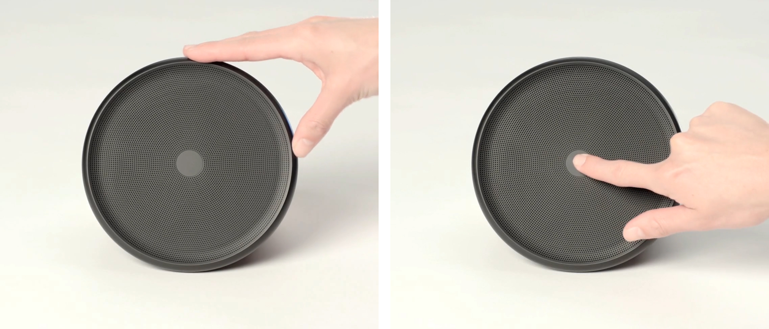
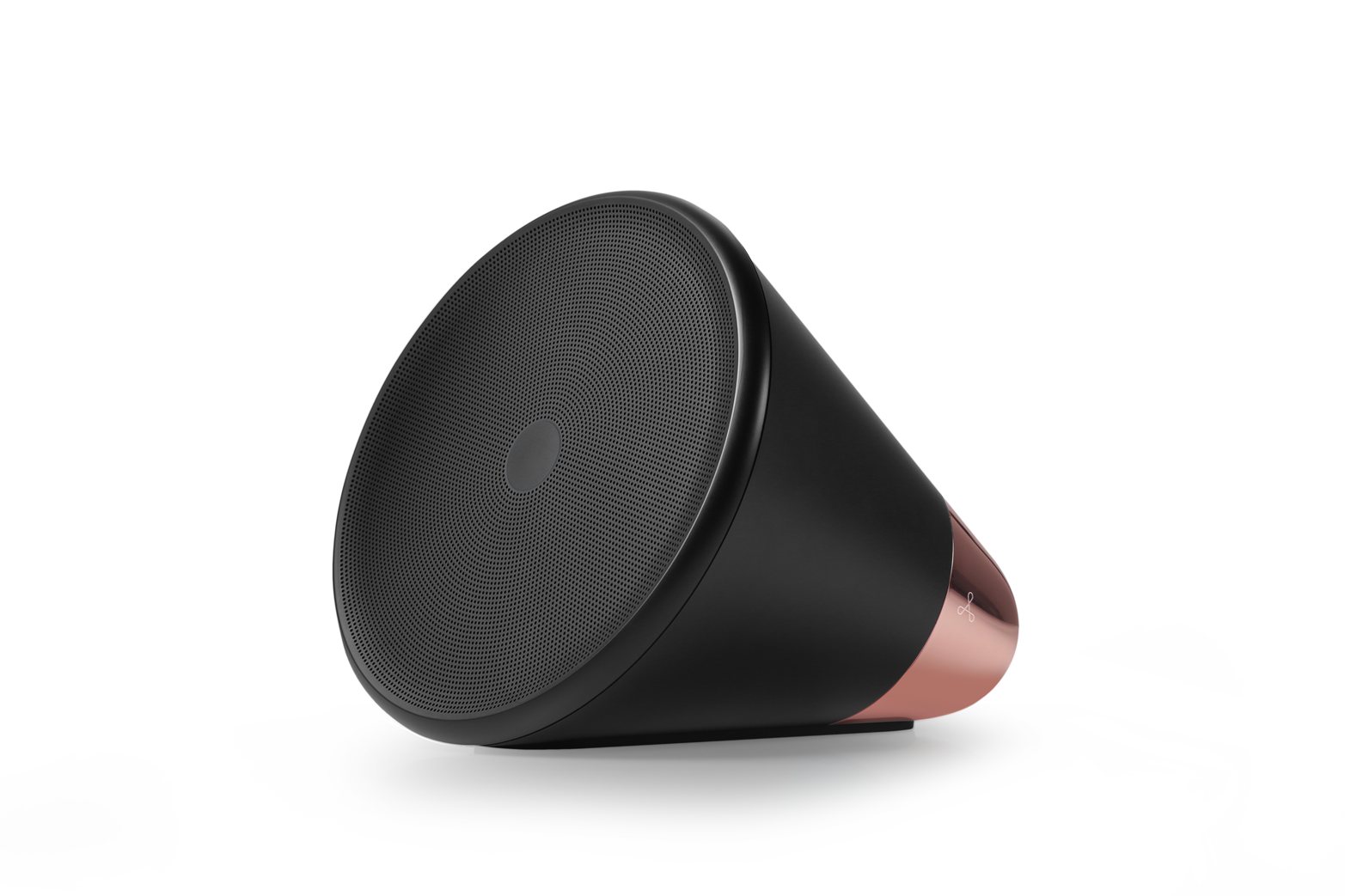
Physical controls can become an identifying feature that makes a product stand out. Think of the click wheel control of the iPod. Another example is the Aether Cone (see Figure 1-4): a connected speaker that uses physical controls as part of its minimalistic interface. The device combines voice input with physical controls. It learns about personal preferences and automatically curates a playlist.
Rotating the front speaker grille slightly skips the current song. Rotating it further changes the entire musical genre. Pressing in the center of the speaker activates the voice input feature that lets users request specific songs. This interface is intriguing and makes the product stand out from its competition.
Using unconventional physical controls that are integrated with the device design can have drawbacks. Discovering the controls can be hard when they are nonobvious. Users need to learn where the controls are and how they work. Good usability can also be a challenge. Controls defined by the form factor, instead of interaction requirements, might be suboptimal for the interactions required. Keeping controls to the bare minimum is often part of what makes a product simple and elegant. But too few controls can negatively influence the usability and value. A single control might need to do different things at different times. This means users have to switch modes (which can lead to mode errors) or accept less functionality. If you’re using unconventional controls on your device, consider helping users with discovery and learning. To do this, you can utilize marketing and advertising to educate people about how they can use your product. The early TV adverts for Apple’s iPhone took this approach. The short clips demonstrated how features worked by stepping viewers through the interaction. This has no doubt helped early customers know how to use the device before they even bought it.
Once a customer has purchased the product, the out-of-box experience (the moment where the product is taken out of its packaging) can help, too. Printed instructions that are revealed to users as they unbox the device or removable labels affixed to the product can convey essential information about its controls.
| Physical Controls | |
|---|---|
|
Are great… |
… for direct and fast control. Giving users access to something without having to find an app or navigate a menu. Think volume, mute, or camera buttons on smartphones to provide quick access anytime. |
|
Are less appropriate… |
… on products that change and develop through software updates. For obvious reasons, it is hard to change controls around after the product is manufactured. Abstract labels (such as colors or shapes) or combinations with screens can keep physical controls dynamic. |
Visual and Screen Interfaces
Next, we’ll discuss interfaces that communicate through visual means like using LEDs to communicate through light and the benefits and drawbacks of different screen technologies.
Light output
Almost every electronic device has at least one LED somewhere showing that it is switched on or communicating a particular status. Connected devices often have more things to communicate. Hubs and bridges often have a number of LEDs to show a variety of connectivity statuses. When devices need to communicate even more, it can get complicated. Color-coding or blink patterns might be required to convey complex information through a simple LED. This can make understanding what is going on tedious. Table 1-4 gives you an idea of the sort of information that might have to be in the user manual.
|
Flashing red |
Not connected |
|
Flashing orange |
Trying to connect but incorrect WiFi details |
|
Flashing red, orange |
Trying to connect but not succeeding (might be due to a firewall) |
|
Flashing red, orange, green |
Device booting up and connecting |
|
Flashing green |
Downloading firmware update |
|
Solid green |
Device connected |
|
Not lit up |
Device running (LED off to conserve power) or not powered up at all |
Light can also be the main interface of a device. The Ambient Orb (see Figure 1-5) is a ball-shaped device that glows in different colors. It can be configured to display data such as current energy prices or stock prices. Creator David Rose describes it as a “single-pixel browser [that] glows a color to reflect online information.” Light here isn’t a secondary signal—it’s key for the primary purpose of the device: conveying information in a glanceable, ambient way, requiring less attention and providing less distraction.

The Ambient Umbrella (see Figure 1-6) uses light in a similar way. Its handle glows when it is going to rain to remind the owner to take it out.

Visual input
Users can also give device input through light or other visual means. A device can use a camera to interpret a graphical pattern like a barcode or a QR code. Devices can also use light sensors to react to ambient lighting conditions or receive input from other devices through LED blink patterns.
Because these kinds of interactions and interfaces aren’t often referred to as “visual input,” we’ll discuss them in a separate section (“Computer Vision, Barcodes, and Devices ‘Seeing’”).
Screens and displays
Sometimes, you need more than lights. When a device needs to display complex information or users need to provide more sophisticated input, screens may be more appropriate. As a UX designer you’ll be familiar with screen-based user interfaces of smartphones or personal computers. But there is a range of (simpler) display types that require different design approaches UX designers are less likely to be familiar with.
Custom segment displays
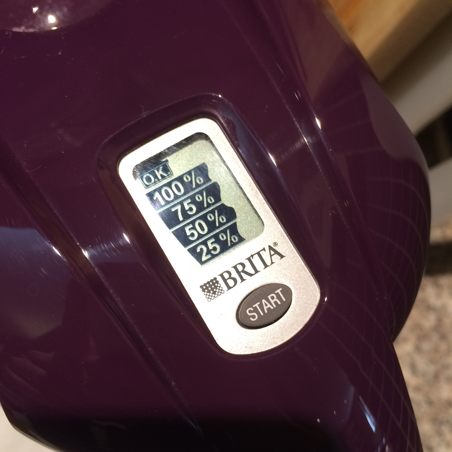
Custom segment displays are what many cheap electronic devices use, like the water filter system shown in Figure 1-7. The underlying technology is often LCD (liquid crystal display). This means transparent segments become visible when an electric charge is applied.
When creating a product with such a display, every possible state the display needs to be able to show needs to be considered in the design phase. Even segments that might only appear in certain situations need to be given real estate. If a heating controller can show temperature in both Fahrenheit and Celsius, segments for both °C and °F need to be part of the segmentation layout. They cannot be in the same place.
Segment displays are low cost and use little power. But they are unable to display dynamic alphanumeric information. To do that, you can use a character set display.
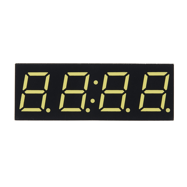
Character set displays
You most likely have seen a simple character set display in clocks or electronic calculators. These character set displays typically use a 7-segment layout for each character (see Figure 1-8).
Character set displays work through systems of 7, 14, or sometimes 16 segments (see Figure 1-9) that are switched on in combination to create numbers. 14- and 16-segment displays can also display basic alphabetic characters.
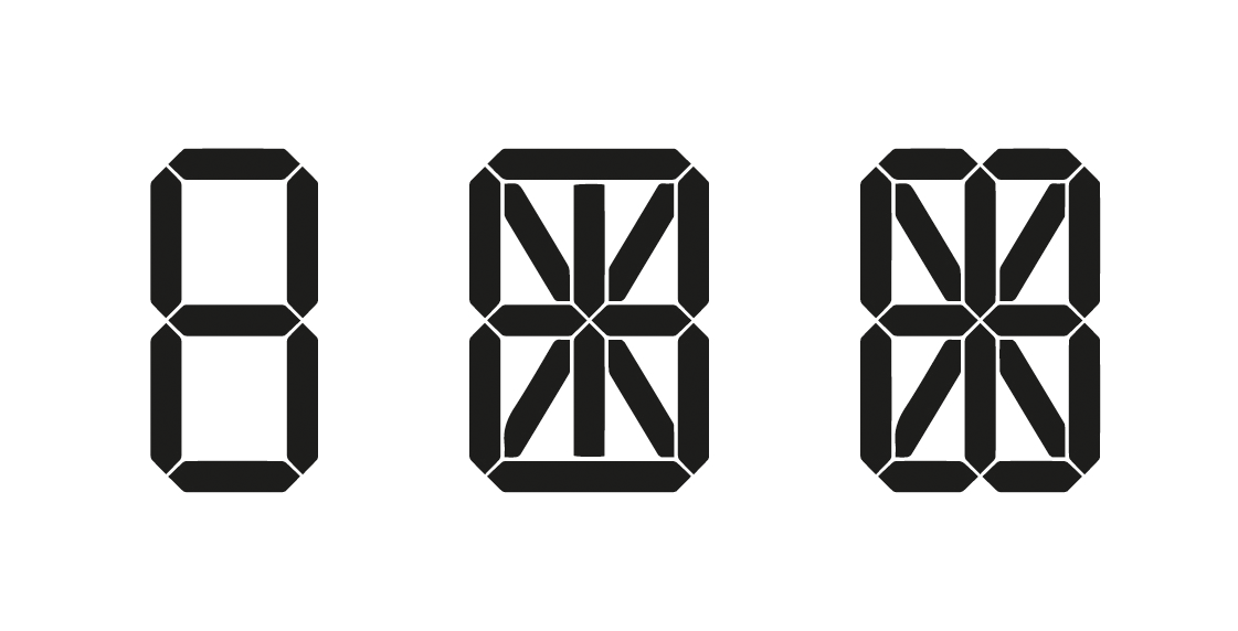
Displays like this are cheap, but have a limited character set. A 7-segment system is only usable for displaying numbers. Other types such as 14- or 16-segment systems can display letters, but with limitations. See Figure 1-10 for an example of the character set of a 14-segment display.

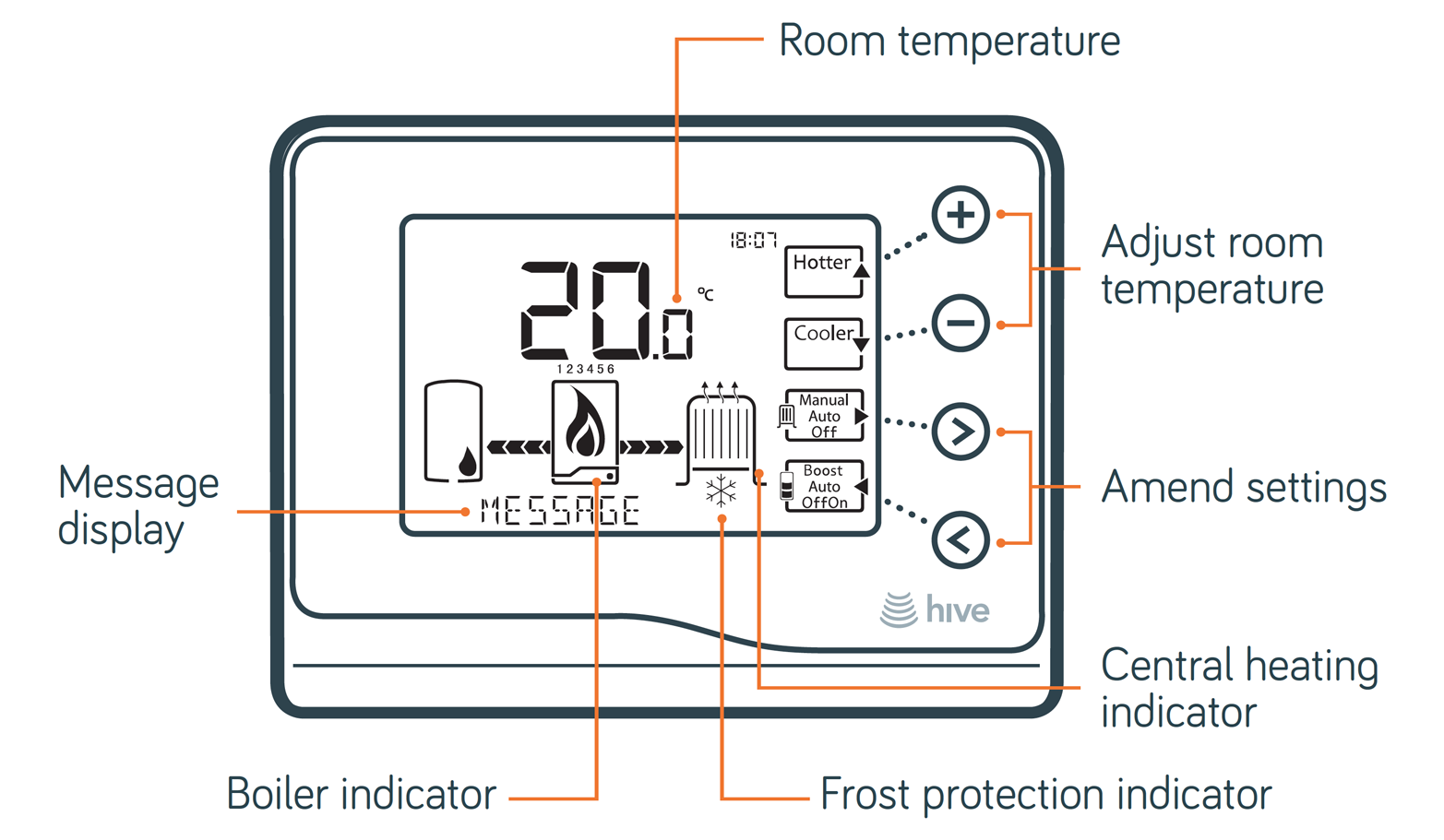
By combining character set and custom segment displays, you can display both dynamic alphanumeric data and illustrations or graphical elements. Figure 1-11 shows such a combination used in a heating controller. A custom segment display that shows boiler and radiator illustrations is combined with a character set display for dynamic messages.
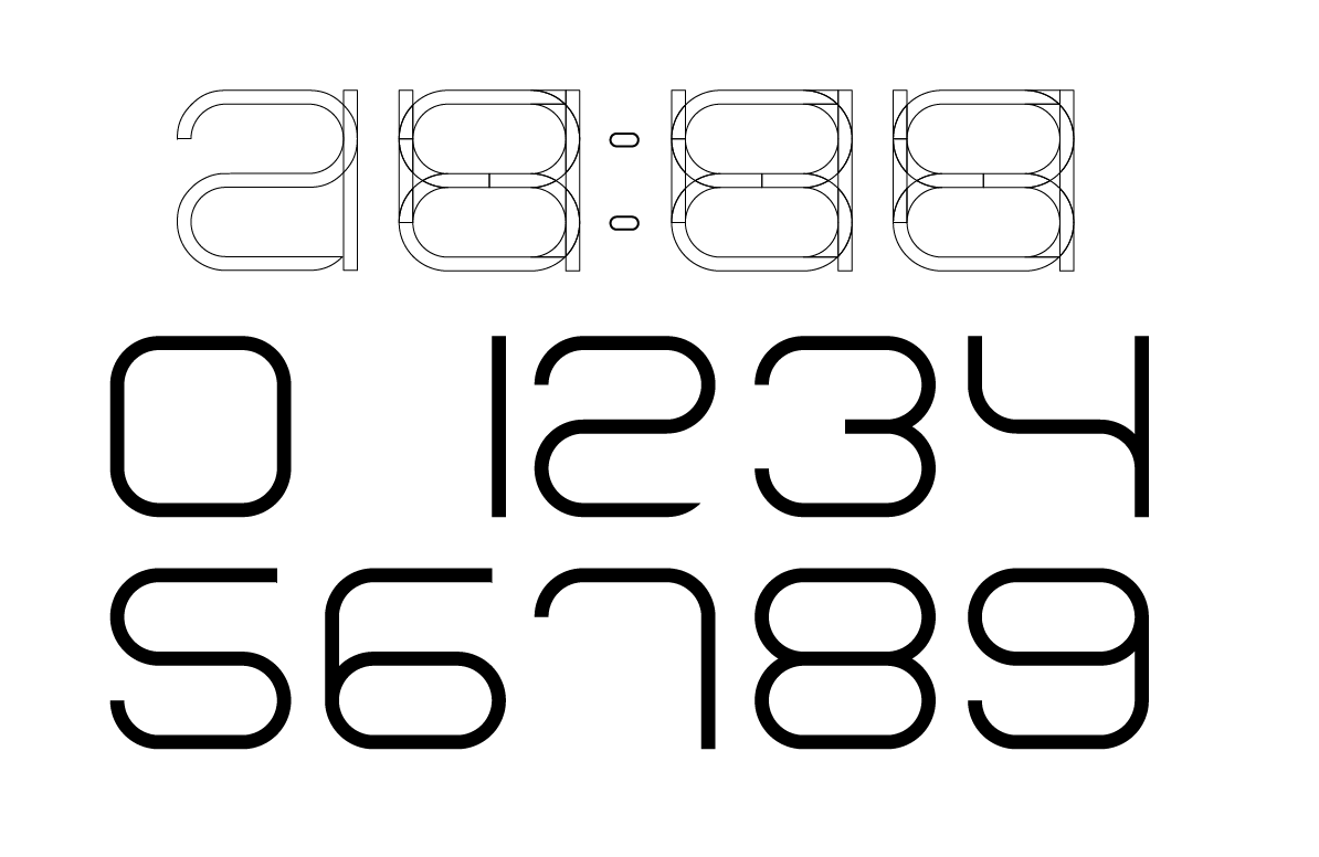
Segmented character set displays don’t have to be ugly. The creators of the CST-1 watch designed a custom segmented font to display numeric characters (see Figure 1-12).
Dynamic displays
Displays with the fewest limitations have a matrix of pixels, each of which can be turned on or off individually. In principle, displays like this are the kind we’re all used to from smartphones or computer monitors. A notable distinction is between monochrome and color displays.
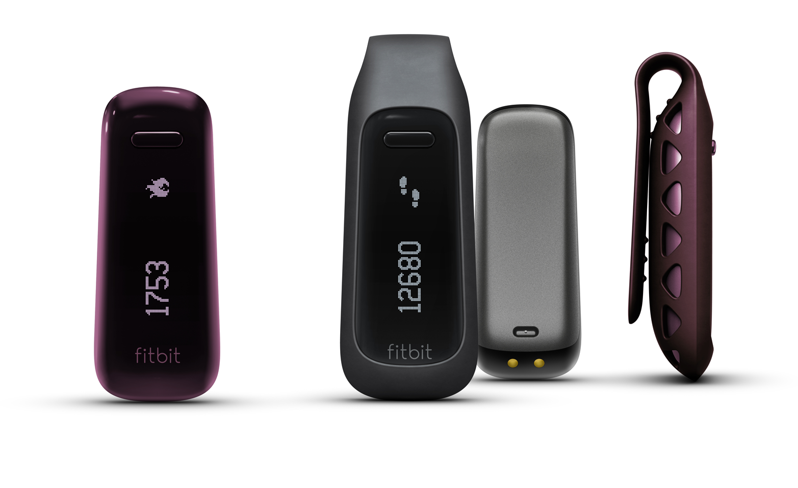
Monochrome displays tend to be cheaper, but (as their name suggests) unable to display colors or shades. The Fitbit activity tracker uses such a monochrome OLED matrix display. It shows both alphanumeric information and simple graphics (see Figure 1-13).
UX designers will be familiar with color pixel matrix displays from smartphones, laptops, and tablet devices. Touchscreens are essentially pixel matrix displays combined with a transparent touch sensitive layer.
Electronic ink displays
A more unusual display technology with unique advantages and disadvantages is electronic ink.
Made popular through ebook readers like Amazon Kindle, the technology is used in more and more devices like connected watches or smartphones. Electronic ink displays resemble the appearance of traditional ink and paper, and are easy to read in direct sunlight. Unlike the previously described technologies, they only require electricity to change the state, not to hold it. This means the device uses less power.
This opens up new possibilities for designers, too. For example, an electronic ink display can show something when a device is off. To greet and guide users, a display could already show information when the user unpacks the product and hasn’t even switched on.
There are also some disadvantages that constrain the design. Electronic ink displays have a very low refresh rate. They also suffer from an effect called “ghosting,” where shadows from a previous display state can still be seen. This rules out interactions like scrolling, the use of mouse pointers, or animations in the UI.
Is a screen better than no screen?
You might think it’s good to put a screen on a device where possible, but this isn’t necessarily the case. Firstly, screens obviously increase the cost of a device. Having a screen means extra components and adds design and development effort.
Secondly, and perhaps more importantly, there are usability considerations, too. When designing apps or websites, a lot of work has already been done for designers. They can rely on platform features, design frameworks, and widely familiar interaction patterns. If you add a screen to a connected device, you essentially need to develop an interaction paradigm from scratch. How do menus work? How do you navigate them? How do users learn this potentially unfamiliar UI?
Moreover, once a screen is available, it becomes harder to say “no” to adding all sorts of information and features since real estate seems endless. So it becomes harder to keep devices simple and focused.
That’s why designers need to take a step back early on in the design process to ask: What if this product didn’t have a screen? Could it still work? You might just discover an opportunity for a beautifully simple and easy-to-use connected product.
| Screens | |
|---|---|
|
Are great… |
… for making physical objects dynamic. For example, by combining screens with physical controls to get dynamic labels. |
|
Are less appropriate… |
… for keeping the user experience simple. Once a product has a screen, the ability to display more information at no extra cost can lure design teams away from simplicity. |
Audio and Voice Interfaces
In this section, we’ll discuss interfaces that use sound. This includes simple audio output using speakers, using synthesized voice output as well as interfaces that allow for user input through speech recognition.
Audio output
Audio can be a useful output method. Users don’t have to look at the device directly and don’t even have to be near it. At the same time, anyone who has experienced the persistent beeping of a washing machine that has finished a cycle or a smoke alarm indicating its low battery knows how annoying audio output can be.
Audio is pervasive. Unlike lights, audio is almost never subtle. Sounds immediately trump visual indications. They are hard to ignore. Audio also has a bigger emotional character. This is obvious for speech: tone and accent can be perceived as sympathetic and friendly, or the opposite. It’s also the case for other sounds: pitch and quality immediately carry emotions. A sound can convey urgency like an ear-piercing high-pitch beep. Or it can convey a sense of satisfaction like a fulfilling swoosh sound when an email is sent.
| Audio Output | |
|---|---|
|
Is great… |
… for urgent and time-critical alerts. Because audio is pervasive, it is great to quickly grab a user’s attention. |
|
Is less appropriate… |
… for environments where it becomes annoying. The biggest challenge with audio is to not make it annoying. This requires a good understanding of the environment the product will be in and careful application of audio. |
Voice interfaces
We’ll split voice interfaces into two subsections. First, using synthesized voice as output, and second, speech recognition interfaces that take voice as input.
Voice as output
Instead of sound effects, audio output can also be used for computer-generated speech. This is a powerful method for providing a wide range of information.
For example, the Nest Protect smoke alarm uses its speaker to play warning sounds. But it also gives more information using speech: a voice tells the user in which room smoke was detected.
In car navigation systems that use speech, the advantage is twofold: drivers can keep their eyes on the road, and information that would be visually complex can be simpler to convey in speech. An illustration of a road layout can become confusing when it doesn’t exactly match reality, or when a junction involves a complex road layout. In such situations, verbal instructions don’t necessarily become more complex. The nature of language means instructions need to be delivered in chunks (sentences) and sequenced (one after another, not all at the same time).
While this linear nature can be helpful in some situations (like the car navigation system), it has shortcomings in other contexts. For example, when voice output is used to present possible user commands (like in interactive voice response systems), its single information stream requires users to listen to and remember all possible options at a given time before making a decision.
Beyond usability, there are a few more things to consider if you’re planning to use voice as a form of output, or a voice-based interface in general. Similar to the emotional aspects of sound we discussed earlier, the tone of voice or accent in a voice plays an important role too. This is a known consideration in the business of running call centers: for example, in the UK a study found that the Geordie accent is perceived as friendly and even as an accent that puts callers in a good mood.5
In addition, voice interfaces with synthesized speech might be constrained to certain geographic regions by virtue of only supporting selected languages. For example, at the time of writing, more than 3 years after Apple Siri was first introduced into the iPhone, it still only supports 9 different languages and 15 regions.
Voice as input
Speech recognition is available on most modern smartphones. When it works, it can be a quick way to give complex commands. Setting an alarm using a touchscreen, for example, requires a series of steps that include fiddling around with UI components to select hours and minutes or even doing math to translate the user’s way of thinking (“wake me up in 3 hours from now”) into the constraints of the UI (set time when alarm should go off). A voice command for the same input can be quicker and easier (“wake me up in 3 hours”).
Voice input can remove the need for many other controls. The Amazon Dash (see Figure 1-14), a device that lets users add items to a shopping list, only has two buttons: one to activate voice input, and one for a barcode scanner. Voice input replaces an entire keyboard in this case.

But there are also a few challenges with the technology.
Speech recognition is still unreliable. Anyone that has used it has encountered situations where commands were misinterpreted. Feedback mechanisms are required to confirm correct recognition. This can be done using a screen, like in interfaces such as Apple Siri or Google Now. When the point of using voice as input is to avoid looking at a screen, of course, this feedback mechanism isn’t available. Confirmation can be done through speech output, but this quickly becomes a frustrating loop going back and forth.
Another challenge is to know what commands are possible in the first place. Users must recall (instead of recognize) what “functions” are available, or how they need to phrase commands. Devices with screens often display a list of possible commands to help users with this problem.
Devices need to know when to listen for a command. One approach is to press a button, but this means the overall interaction isn’t hands free. Another approach is activation phrases like “OK, Google” that indicate that a command follows. The downside of this approach is that users agonize over the idea that a device is constantly listening to everything that is being said. It also makes false positive detection a problem—when you say something that sounds similar to “OK, Google.”
A prank exploiting this is to play Xbox online multiplayer games using the gamer name “Xbox sign out.” Other players will eventually say the name out loud, perhaps to vent their confusion about it in the game’s audio channel. If those players have the voice control features enabled, they will soon disappear from the game server.6
Lastly, most of the current voice recognition features rely on server-side processing to interpret what a user has said. This means the feature relies on the device having a reliable and fast data connection, which fundamentally limits the number of situations where it can be used.
| Voice Interfaces | |
|---|---|
|
Are great… |
… when other channels are occupied. Think car navigation. Drivers can keep eyes on the road and still get information. |
|
… for products or contexts where weak connectivity is possible or that are used in high noise environments. Speech recognition is often done server-side. A fluid experience requires a good data connection. Noise or other people talking make recognition less reliable. |
Gestural Interaction
Gestural interactions exist on touchscreens (like “swiping” or “pinching”). Using computer vision, devices can also recognize mid-air gestures as user input.
Perhaps one of the most famous examples is from the film Minority Report. Chief John Anderton (played by Tom Cruise) controls a computer system using both his hands in mid-air, almost like conducting an orchestra (see Figure 1-15).
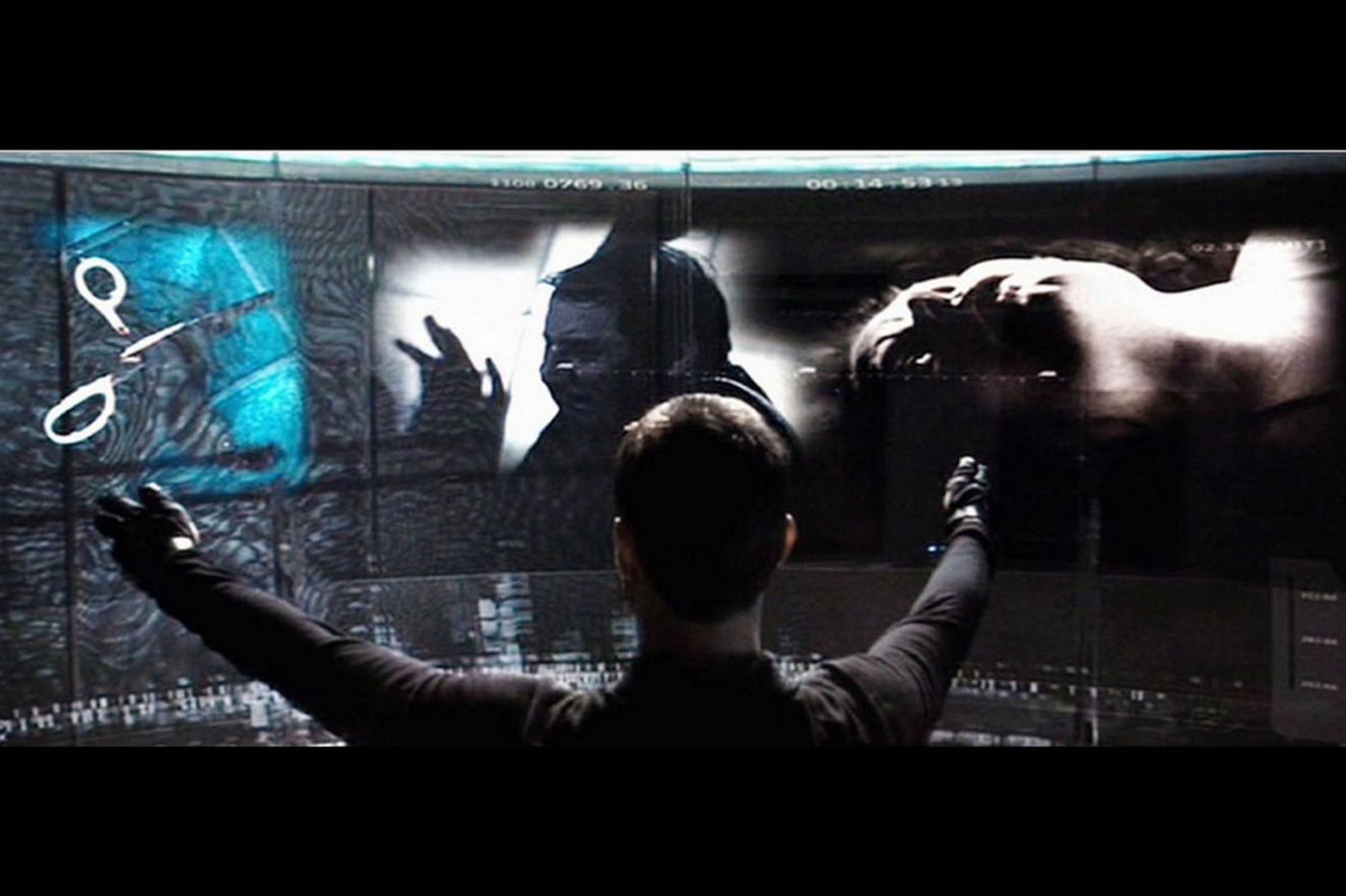
The film has had major influence on the development of gestural interfaces. But research has since shown that gestural interfaces might not be appropriate for real-world applications. Holding out your arms in front of your body, gesturing, or doing precise motions for extended periods of time causes aching muscles and stiffness. This condition has been dubbed “gorilla arm.” Rumor has it that Tom Cruise had to take breaks from even just acting the scenes for the movie.
Yet, industries like gaming have adopted gestural interfaces with great success. The Microsoft Kinect lets gamers control Xbox games or navigate menus without any further device or controller. Users wave hands or move their body to control what they want to do.
Simpler forms of gesture interaction have also been integrated into more mundane products. The original Nest Protect smoke alarm had a featured called “wave to hush.” The feature was meant to solve the problem of alarms going off because of burnt toast or smoky frying. Users could stand underneath the device and wave their hands at it to silence it for a short period of time (see Nest’s illustration in Figure 1-16).

In gestural interfaces, there is always a risk of false positive input detection. In the case of the Nest “wave to hush” feature, the possibility of users unintentionally activating it (perhaps waving their hands during a real fire) could delay an alarm. In April 2014, Nest had halted sales and disabled the feature on already installed units to investigate potential problems with the feature. So, gesture interaction can be an elegant solution to interacting with a device that is hard to reach (like a smoke alarm). Yet, designers need to think carefully about the context and risk of false positives.
Intangible interactions
It’s worth briefly discussing some fundamental differences in interfaces where user input is more intangible, like in gesture or voice recognition interfaces, to interfaces where input is very explicit. For intangible interactions, the space that the interface needs to sense to recognize user action is necessarily quite broad: for example, all movement in a device camera’s field of vision or all sounds audible to the device’s microphone. Input is inferred from actions happening in that space, as opposed to being explicitly received. A device controlled through buttons receives explicit input when a button is pressed and so it only has to “sense” a contained space that is the state of that button. An intangible interface like a gesture interface “senses” all movement in front of its sensors and infers input from identifying particular gestures or patterns. This means there is always more room for error and false positive input.
| Gestural Input | |
|---|---|
|
Is great… |
… for video games. Gestural control makes games more immersive and physically challenging. |
|
… when precision and lengthy interaction is required. Giving precise input is hard with gestural interfaces. Lengthy interaction leads to fatigue and muscle pains. |
Tangible and Tactile Interaction
In this section, we’ll discuss two types of interfaces: ones that work through manipulating tokens or placing a product in a certain way to give input (we’ll call these tangible user interfaces), and interfaces that involve haptic or tactile feedback like vibration or force feedback.
Tangible user interfaces
Earlier in this chapter, we discussed interfaces using physical controls like buttons, sliders, or dials. Such physical controls are certainly a type of tangible interface and so are keyboards or computer mice. In this section, however, we look at tangible interfaces where input is given through manipulating physical objects or tokens representing intangible assets.
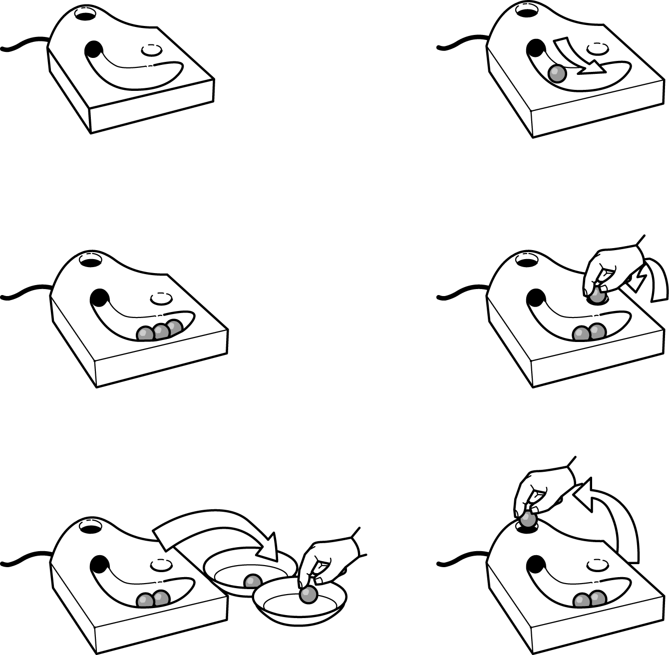
In 1992, designer Durrell Bishop created one of the earliest explorations of this idea. Bishop envisioned an answering machine that made messages tangible through marbles that represent messages (see Figure 1-17).
Colored marbles represent recorded messages. The machine releases them into a groove for the user to pick up. To play a message, the user places a marble into a depression on the surface of the machine. Playback stops as soon as the user removes the marble from that spot. Users can either keep messages by holding on to the marbles, or delete them by putting the marbles back into the answering machine through a hole.
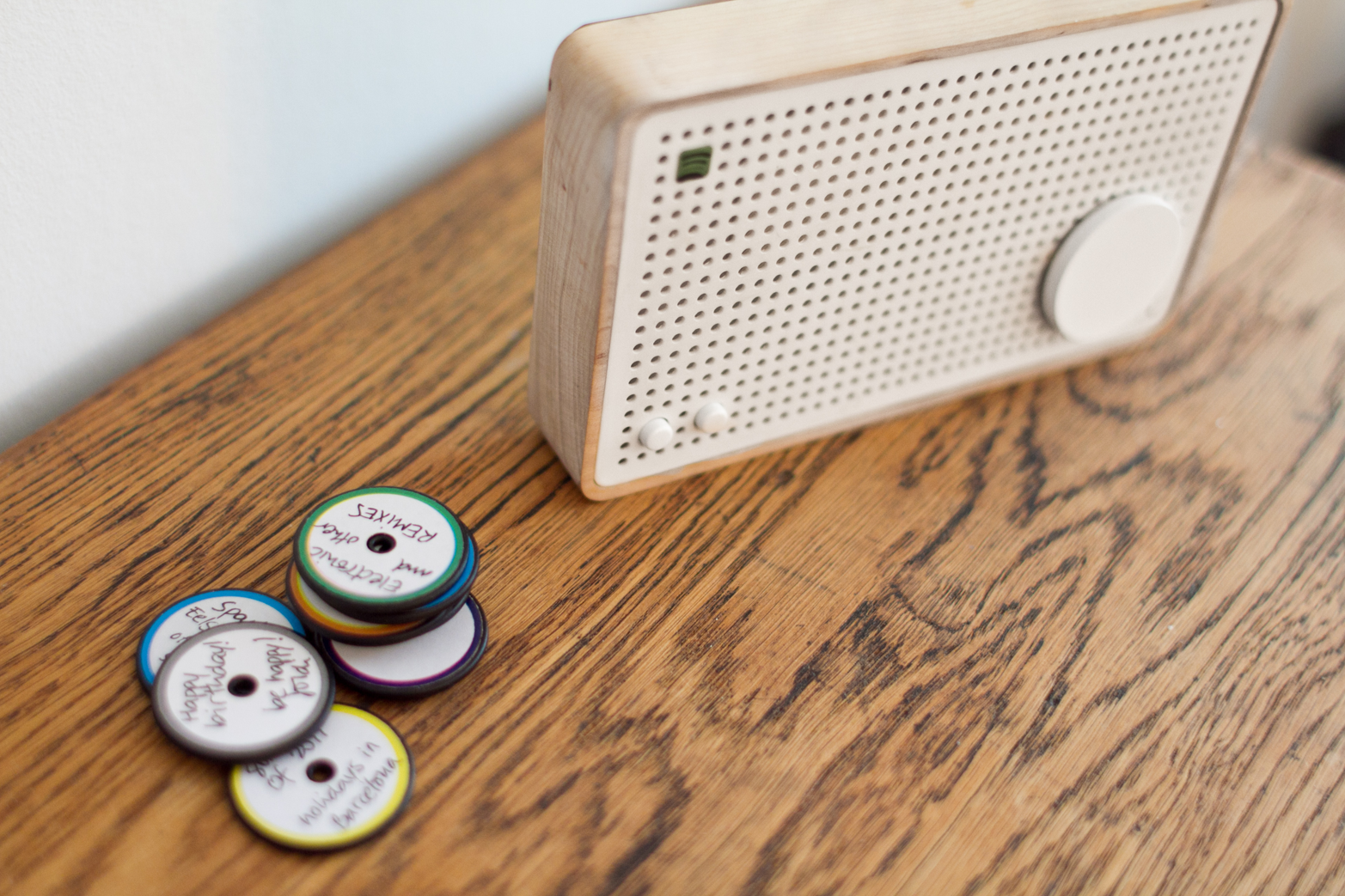
A more recent exploration of tangible interaction is designer Jordi Parra’s Spotify Box, which was created as a student project (see Figure 1-18).
The box plays music streamed from Spotify. By placing a physical magnetic token on the box, users can select a playlist. No menu or button combination is required. This gives an analog quality to the interactions with digital music. Users can label tokens or draw on them. They can also exchange them with other owners of the Spotify Box.
The marble answering machine and the Spotify Box are interesting concepts because they explore giving things that are intangible (e.g., voice messages or music) a physical representation that users manipulate or control physically. This changes the nature of interaction with a digital system, turning it into something more direct and immediate.
Tangible interfaces offer a way to simplify the control of a device. The direct and physical nature of manipulation can be easier to learn and understand than abstracted menu structures or conceptual mappings of controls.
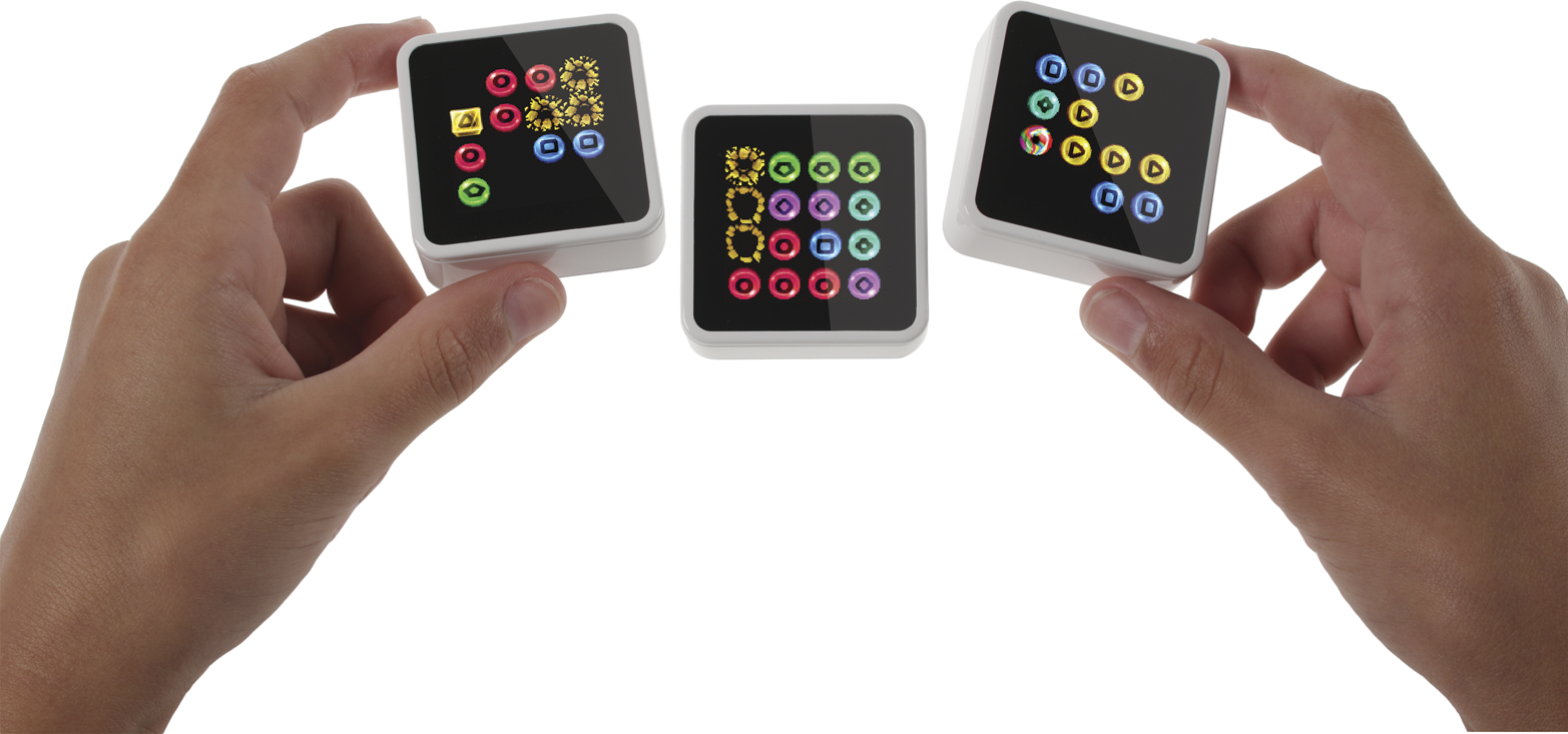
Sifteo cubes were a great example of this, but they are unfortunately no longer available (see Figure 1-19). They are matchbox-sized cubes with a screen that sense when they are next to each other. Through tilting, placing, or rearranging them, kids can play educational and entertainment games across the cubes.
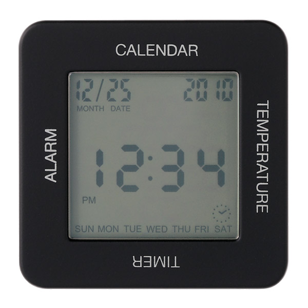
A simpler example is the Muji Multi Clock alarm clock. It’s a cubic device with labels for its four functions placed along each side of its display. Users select a function by orienting the clock with the corresponding label on the top. Figure 1-20 shows the calendar function activated.
A promising application of tangible user interfaces is in musical instruments. The Reactable (see Figure 1-21) is such a musical instrument with a tangible user interface. Musicians manipulate and create sounds using physical objects placed and moved on the table’s surface. The tangible nature means the musician can create and control many different sounds and keep the overview during a live performance.
Experimenting with tangible user interfaces is thought provoking and inspiring. But interfaces involving many small physical tokens to manipulate or represent data have an obvious impracticality: if you lose parts, the interface breaks.
Imagine not being able to listen to messages because your cat or a child has made off with the marbles. So you need to think carefully about the application of tangible interfaces.
Tactile output: Vibration, force feedback, and shape shifting
We’ve all experienced vibration alerts of our mobile phones. It’s a useful feature when it’s noisy or when sounds would cause disturbance. But it requires body contact, which few devices have reliably.
The potential of tactile output is intriguing: researchers at the University of Amsterdam have explored the use of vibration for cyclists. Their “vibrobelt,” a GPS-based navigation using vibration, is worn around the waist and gives the cyclist tactile feedback when they need to take a turn.7 Apple’s watch has a similar feature. It can “tap” users on the wrist during navigation, using different taps for “go left” or “go right.”
A much more sophisticated form of tactile output are force feedback mechanisms. These use motors to push back on the user in specific directions. Gaming joysticks use this to great effect to let players feel the g-forces involved in flying a plane, for example.
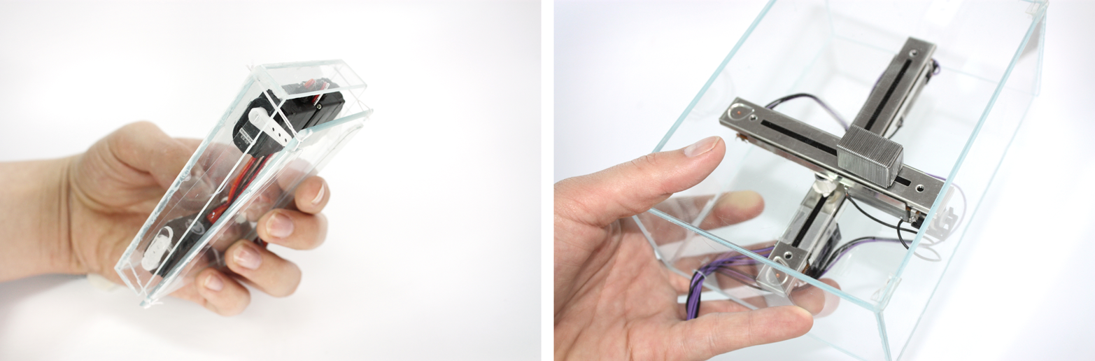
A more serious device using force feedback is the 3D Systems Touch (see Figure 1-22). This is a device that makes virtual objects tangible.
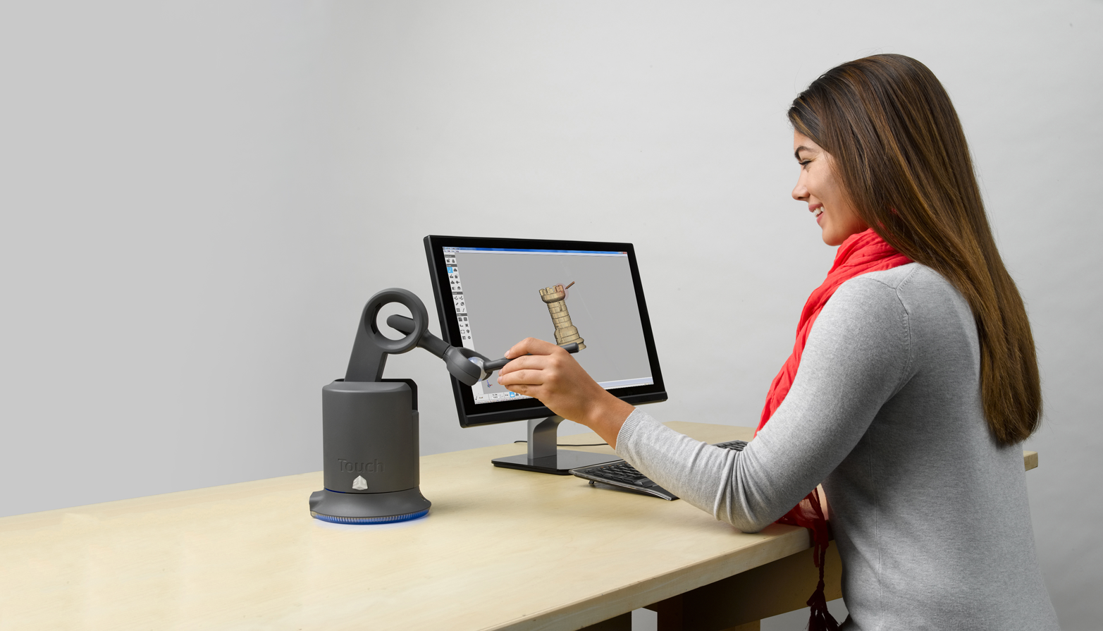
The central feature is a pen-like device mounted on multiple motorized axes. Users can give input in three dimensions using the pen, but the device can also “push back” in all three dimensions, too. The applications are specific, such as 3D CAD modeling or surgery robots. An advantage is that users can physically feel virtual boundaries.
As with tangible interfaces, it’s intriguing and inspiring to explore how tactile interfaces can change everyday interactions. The Proverbial Wallets project from MIT explores this with financial data. The researchers created three prototype wallets, each using a different kind of tactile output for different kinds of data.
The first wallet is Bumblebee. It uses vibration to notify the owner of every transaction that is happening with their bank account. The second is Mother Bear (see Figure 1-23). It uses its force feedback hinge mechanism to make it harder (or easier) to open the wallet depending on the current budget. The last is Peacock. It’s a wallet that swells and shrinks, reflecting the balance in the owner’s account.
Researcher Fabian Hemmert has explored the possibilities of tactile output in mobile phones. His prototypes include devices that shift their center of gravity and devices that shift their shape (see Figure 1-24).
As with the Proverbial Wallets, it is intriguing to think about the ambient representation of data. Instead of displaying it in concrete terms, users feel it while interacting with the device. Hemmert gives the example of representing progress through a playlist and the current song at the same time using the center of gravity, or giving nonvisual directions in navigation applications.
Context-Sensitive Interaction
Context, or “the circumstances that form the setting for an event, statement, or idea, and in terms of which it can be fully understood” (Oxford Dictionaries), plays an important role in the design of almost anything. Throughout this chapter, and the entire book, we discuss when some interfaces are more or less appropriate, how user scenarios and situations inform design decisions you make, and many other things that all, in some ways or others, are about understanding context.
In human–computer interaction, understanding and using context, or “context-aware computing,” is an area of research in its own right with many papers, experimental projects, and healthy discussions. The definition of “context” in context-aware computing varies across articles and papers written about this, but the general idea is that computers sense and act on inputs such as time of day, the weather, the current location, or the identity of the user.
In examining what makes up context, you’ll find that there are many different kinds of contexts that play a role in the design of a product and the user’s interaction with it. For example, there is social context (i.e., who a user is or who they are with), environmental context (i.e., where a user is and whether this place is noisy, rainy, outdoors, or indoors), and user activity context (i.e., whether the user is preoccupied with another activity like driving or cooking).
These examples are loosely based on some of the seven “flavors” of context designer Cennydd Bowles discusses in a post on his blog.8
In systems where apps or websites form part of the controls, designers can rely on a range of inputs for contextual information (e.g., device location, user identity, social network data, calendar entries, etc.). The British Gas Hive app, for example, uses device location to determine when the user has left home and sends a push notification if the heating is still set to higher than a predefined temperature.
When it comes to connected physical products, context sensing is still fairly limited. Some devices use proximity sensors or GPS to sense presence or location, but many facets of context aren’t currently used to tailor and enhance the user experience.
The opportunity of context-sensitive interaction is to enable products that behave in ways that fit better into the user’s routine and behaviors—for example, by transforming active user input into more passive input. Instead of gesturing to make a command, simply being (or not being) in a certain room can provide input to a system, too. Another example is being close by or further away from a product. This can be useful information to tailor an interface.
David Rose, founder of Ambient Devices, demonstrated a product that works in such a way at the LIFT’09 conference. Rose showed a connected weather forecasting device with a screen and a proximity sensor.9
Using the proximity sensor, the device changes the amount of information it displays (see Figure 1-25).

When a user is standing across the room, the screen displays only essential information: the current outside temperature fills up the screen in large digits and the background gives clues about the weather (e.g., rain drops around the temperature). When the user is closer to the device, the screen shows more information using smaller fonts. It now includes a forecast for the next 24 hours. Finally, when users tap the device, it shows even more information.
The interface is sensitive to proximity, which is far from sensing all there is to the user’s context, but it allows for some basic interpretation: If the user is across the room, they might benefit from the product providing information in a condensed way that is readable from a distance. If they are standing right in front of the product, font sizes can reduce and the user might benefit from more detailed information. Note that this interpretation of physical context into user intention is just that: the designer’s interpretation of a sensor’s reading as a proxy for something else. In other words, the product doesn’t really sense context; rather, it senses proximity—and it’s important not to forget that.
The Aether Cone connected speaker (Figure 1-26) also has some context-sensitivity features. It’s a mobile device that learns about the user’s musical preference in different rooms of the house. It uses this to automatically adjust what it plays based on what room the user places it in. It is important to remember that the device builds up a picture of two things:
-
Its own location
-
The user’s actions to change what is playing
The insight, or hypothesis, that users listen to music differently in different rooms, and that these two data points can be combined to provide a better experience based on this idea is the designer’s work and may or may not be true for the user. Other contextual information that is harder to sense is likely to influence the user’s musical preference, too. For example, whether the user is alone or with other people might change the musical preference, too.
An opportunity for context-sensitive interfaces is to demand less of the user’s attention and require less interaction. Ideally, a device could take actions for the user, or tailor the user experience, because it understands the context and what the user would desire. This is a slippery slope and finding the right balance between taking action on behalf of the user and keeping the user in control needs to be found.
Designing interfaces like this requires a very good understanding of your users. Designers can only ever assume the user’s context through a proxy that a device can sense, like location or proximity. It’s the designer that needs to establish the correlation between such data points and user intentions or desire. Careful user experience design then needs to ensure that any context-sensitive features don’t worsen the user’s experience if the assumptions made aren’t true.
Computer Vision, Barcodes, and Devices “Seeing”
In this section, we’ll talk about interfaces that involve devices seeing or responding to artifacts and activity around them. By this we mean interactions such as face, object, or pattern recognition, as well as other ways a device can receive input—for example, by scanning barcodes or receiving light input.
To clarify, computer vision isn’t an interface type but an enabler. The gestural interactions we discussed previously rely on computer vision. Simpler forms such as face recognition can enable useful features such as smartphones that can unlock using the owner’s face. Face detection (instead of recognition) can enable smart cameras that automatically follow a person’s face.
The power of these kinds of interactions is to simplify or remove user input. Compared to inputting a PIN code, it’s faster and easier to just look at a device to unlock it. It may be less secure, but that is a different story.
This power of simplification is also handy when users need to enter information from the physical world (like a book title) to start a digital interaction. The Amazon Fire Phone introduced a feature called FireFly that does just that. In Figure 1-27 you can see the device recognizing a physical book in front of it. It then displays relevant information and actions.
In connected products, designers can use these kinds of interfaces to tailor the experience—for example, by recognizing who is in front of a device. A challenge here is not to create a patronizing experience.

The smart drinks vending machines installed in some train stations in Tokyo are a real-world example that caused some debate due to their Orwellian characteristics. Instead of a glass through which available drinks can be seen, this machine displays its selection using a large screen on its front. The machine also uses a camera to determine the age and gender of whoever is standing in front of it. Based on this information, the machine displays a targeted selection of drinks. For example, it is said to suggest a slightly sweeter beverage to a woman in her 20s.10 The device also captures the data and the actual choice the customer made for marketing analytics. To some users, even the idea of a vending machine prescribing choices, trivializing social norms, and collecting user data is shocking. The sensitivity to features like this is different in different cultures. Allegedly, the Japanese customers don’t share such views and concerns.11
Marketing applications aside, there are also practical uses of such interfaces. A well-known example is QR codes. It’s a useful way for users to input complex information with a minimal interface. Instead of manually entering WiFi credentials, for example, users could present them using a QR code for a device to decode.
Scanning a QR code requires a camera and the ability to interpret the image presented. This means the device to scan needs to be relatively complex. But the principle of encoding and transmitting information optically can take other, less computationally intensive ways, too.
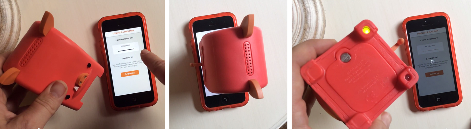
The Electric Imp, a platform to connect a device to the Internet uses a form of optical communication to receive WiFi credentials. The Imp uses a simple light sensor (instead of a camera) to receive this input. Users enter the WiFi credentials on a smartphone that turns them into a sequence of light flashes performed by the screen. The light sensor recognizes the sequence and the device decodes the information contained. Electric Imp calls this process “BlinkUp.”
The connected kids’ toys manufactured by Toymail use this platform to connect. See Figure 1-28 for the key steps in the process.
Are QR codes good or bad?
QR codes have a bad reputation among designers. The apps required to scan them haven’t reached widespread adoption. The outcome of scanning one often doesn’t match the effort required to scan a code in the first place. An Internet joke mocking this reality is a Tumblr blog that has been set up to collect pictures of people scanning QR codes. The irony is, since its creation in early 2012, no pictures have been posted to it (see Figure 1-29).

But when the scanning logic isn’t for the user to worry about, QR codes are a perfect means to input complex data quickly. Great examples are airplane boarding passes or event tickets stored on mobile phones. For connected products, they can be a great method, too. A connected lock might use its door camera to validate a temporary key presented using a QR code.
Multimodal Interaction and Interface Combinations
When we talk to another person, we communicate using multiple channels at the same time. Speech, gestures, facial expression, and body language work together. In a similar way, interaction with a connected device can combine different types of interfaces into one. This is called multimodal interaction.
A great example of this is Jared Ficklin’s Room-E project12 (see Figure 1-30). By combining gesture and voice interaction, Ficklin demonstrates how users can provide input similar to the way they would talk to another person. In his demo, Ficklin points at a specific light in the room (gesture input) and says “Computer, turn off this light” (voice input). The computer combines both inputs into a single command. It is able to understand that Ficklin specifies which light he means to switch off using the gesture.13
Although Room-E is a prototype, it shows the potential of multimodal interaction. By combining interface types, designers can create interactions that feel more like human-to-human interaction.
IoT-Specific Challenges and Opportunities
Having discussed different interface types from a relatively general point of view, we will now take a look at some of the specific challenges to do with device interfaces you might face in developing a connected product.
Deciding on the Level of Interactivity of a Connected Device
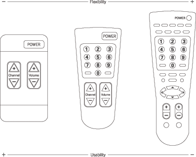
Adding interactivity to a device is a cost question. Buttons, switches, and the components required add to the bill of materials and increase development costs. It’s also a usability question. Designers need to strike a balance between easy-to-use devices and ones with many features and functions. This is sometimes referred to as the “flexibility usability tradeoff” (see Figure 1-31).
However, simple devices with little features have other disadvantages. They often rely on other devices for full-feature interaction. This makes them dependent on things outside of the designer’s control, such as a working Internet connection or a compatible browser. Imagine you couldn’t change the temperature in your house because of problems with your Internet service provider.
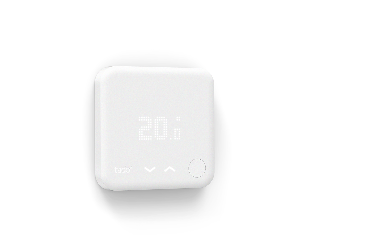
An example of this approach was the first Tado thermostat. Users controlled it using a website and smartphone app. But the product offered a minimal degree of control on the device, too. A single physical button let users switch the heating on or off as a fallback option.
Tado has since introduced a new generation that features capacitive touch buttons and a display to adjust temperature up and down right on the device (see Figure 1-32).
Only having few controls on a device can be advantageous if you know your product will change and develop. In this case, supporting a physical interface can become a burden when system features are changed or abandoned.
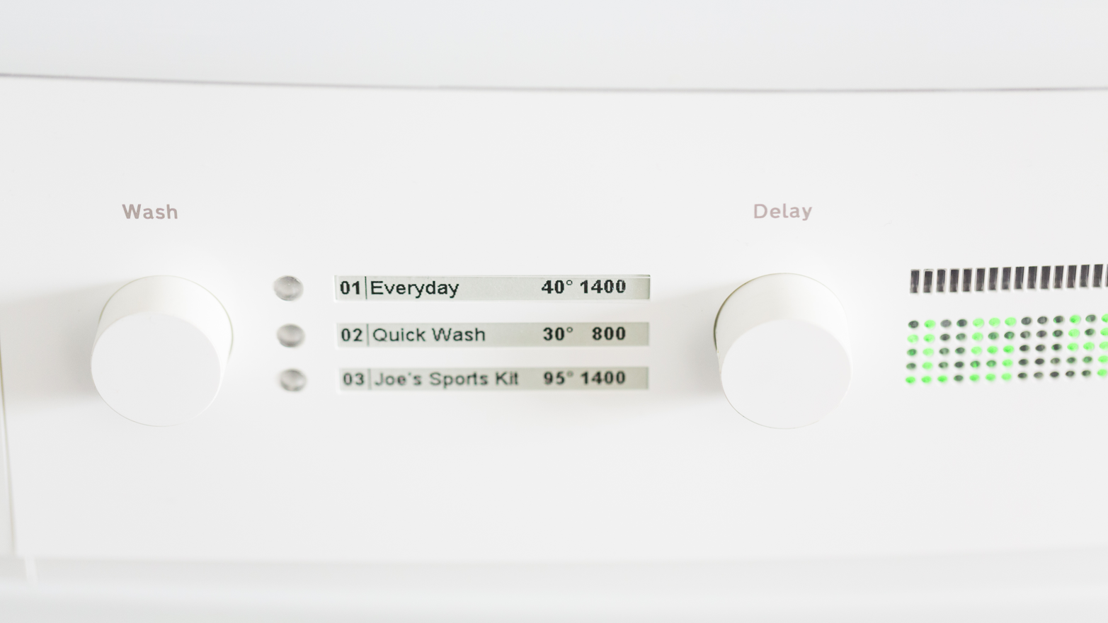
There are ways to balance the benefits and drawbacks of physical controls. An example is Cloudwash, BERG’s connected washing machine prototype (see Figure 1-33). The physical device has some controls that only cover selected functions. Full control is delivered through a smartphone app. But users can perform the everyday tasks without needing the smartphone app. Also, the device uses a combination of physical controls with displays. This keeps the physical interface flexible within reason.
From BERG’s website:
The legends for these washes are in e-ink so they can be updated but still feel like part of the legends one would expect to find on a washing machine. They can be far more descriptive than the descriptions on a traditional dial, since there’s no need for generalisations like “cottons.” We like human-readable descriptions like “Joe’s sports kit” or “really really quick” or “use this for baby stuff.”
Mobile and Web UIs
A lot of connected products use mobile apps or web interfaces as their primary means of control or split the interaction between them and the device itself. There are good reasons to do this:
-
App and web interfaces are much easier to change and develop in response to changing or developing requirements. If you add or remove a feature, updating or rethinking the UI of an app or a web interface accordingly is less of a problem than when you have a fixed interface on an embedded device.
-
App and web development have a large, active developer community with many useful resources easily available. There is a lot of documentation for best practice solutions and even libraries developers can use to solve particular problems as opposed to developing from scratch.
-
Smartphones and personal computers provide ample processing power to allow for features an embedded device might not be capable of (like speech recognition or using a camera). High-resolution color screens and rich input capabilities make it easier to create interfaces that move between simple and complex when necessary. (For example, allowing text input when necessary, but not bloating the interface with a keyboard for most of the time.)
-
Users carry smartphones with them, so user location can become a trigger or data point used by the product. Because a smartphone is a personal device, interfaces can be tailored to a particular user.
-
App stores handle the distribution of software updates so developers don’t have to.
-
App platforms offer notification channels that are irrespective of the user’s location or that of the connected product. This means a connected product can notify a user even if they aren’t near it.
But there are also reasons why you might avoid relying on a mobile phone or web UIs:
-
Smartphones aren’t reliably available all the time: users might switch them off or turn them to silent mode, or the devices might run out of battery or lose a signal. This all makes smartphones less appropriate for critical notifications that need to be received immediately.
-
Web UIs that require a personal computer, but also using a smartphone can be slower than on-device controls in the right context. For example, some users of connected locks complain that the process of getting out their smartphone and launching the right app takes them longer than getting out their keys and unlocking a door.
-
When functions or alarms need to be available to anyone in certain locations, whether they have a smartphone or not, on-device interfaces are necessary.
-
Less tech-savvy users can have difficulty building accurate mental models of how a system works. For example, during the research for BBC’s Radiodan project, participants connecting to the radio’s setup interface using their web browser were unsure if the radio would still work when they closed the browser window.
Even if not appropriate for all connected products, using web UIs and mobile phones especially is a great way for designers to off-load complex and rarely used features, and to keep the physical device simple. not available discusses in depth the design decisions to be made in distributing interactions between different interfaces on different devices.
Specific design advice for how to design for mobile or web UIs is not within the scope of this book, and there are some great resources available on these topics:
-
The Mobile Frontier by Rachel Hinman (Rosenfeld Media)
-
Don’t Make Me Think by Steve Krug (New Riders)
-
Designing for Interaction by Dan Saffer (New Riders)
-
Designing Interfaces by Jenifer Tidwell (O’Reilly)
Glanceable and Ambient Interfaces
We’ve already touched on how designers can create interactions that require less attention. Considering the ever-increasing amount of information around us, this will become ever more important. We’ll soon all crave a less distracting environment.
This kind of interaction is already around us. Consider how a wall clock “disappears” into our surrounding. We completely ignore it for the most part. The moment we’re interested in the time, we can get it at a glance. Even from across the room. We might only be able to see roughly the angle of the two main hands—but it’s enough to give us an idea of what time it is. If we want more detail, we can walk closer to see exactly what time it is.
The ambient devices mentioned earlier are attempts to achieve similar characteristics. That can mean devices that only grab the user’s attention when required, like the Ambient Umbrella, or devices that convey information in a way similar to how you sense what time of day it is by seeing, in the corner of your eye, how bright it is outside through a nearby window. David Rose, founder of Ambient Devices, has created a list of these characteristics that designers can use to inform and inspire the design of their products:14
- Pre-attentive
-
Glanceable; no cognitive load required
- Calm
-
Nonintrusive; seamless with environment (e.g., Evergreen, Friendly)
- Universal
-
No language, characters, or numbers
- Open
-
Able to represent multiple types of data; coded, private
We highly recommend exploring how you could bring some of these characteristics into the products you’re working on, even if it’s just a thought experiment.
Working with Limited Input and Output Capabilities
A particular challenge in connected devices is to work around limited input and output capabilities. Many connected devices only require complex input rarely and a simple interface is sufficient most of the time. So how can designers handle these rare, but complex interactions without having to bloat the interface with capabilities that aren’t needed most of the time?
The Withings Smart Body Analyzer provides a great example. The smart body scale supports multiple users, each with their own accounts. It automatically identifies which user is standing on it by comparing the reading with its historic data. If the new reading is within a realistic extrapolation of only one account, it can only be that person.
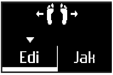
This doesn’t always work. When a reading is within range of more than one account, the device cannot reliably decide which user it is. In this case, the device needs user input. But instead of having specific controls for this situation, the designers found a solution that keeps the interface simple. They work with the capabilities available. In this case, the display shows a selection between the likely accounts. Users then lift either their left or the right foot to make a selection (see Figure 1-34).
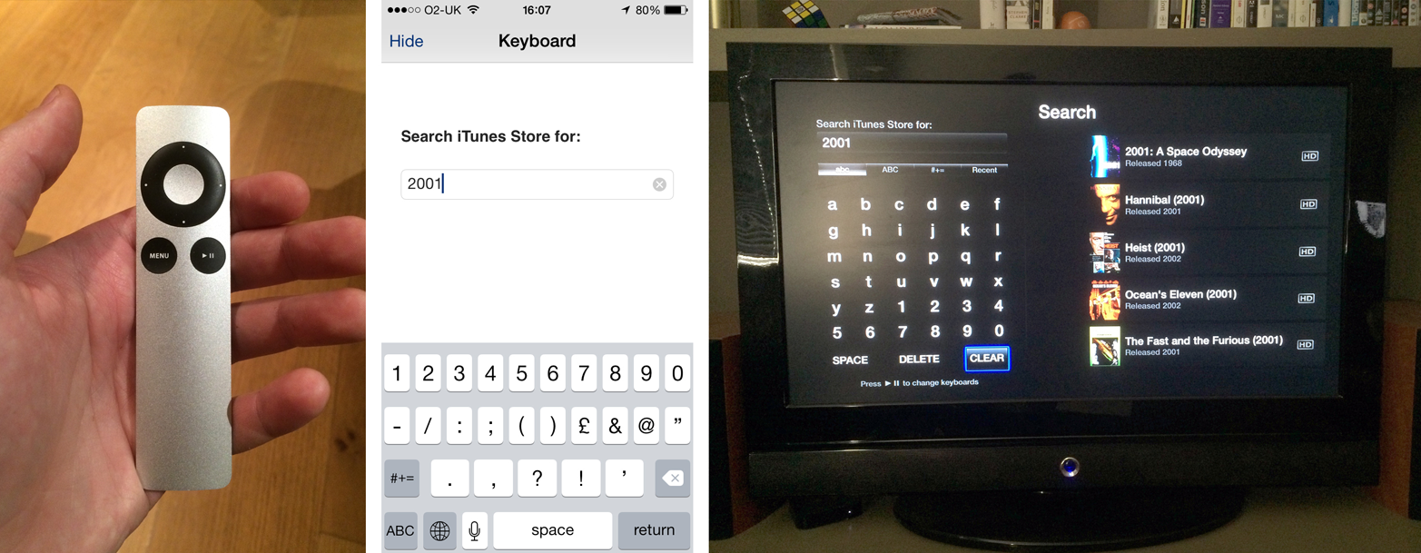
Another strategy is to support devices with more capabilities. Navigating and controlling Apple TV with the minimalistic remote is sufficient for most of the time. When it comes to entering search terms or login credentials, using the remote becomes tedious. By supporting an iPhone as an alternative input device, users can switch to the more capable device when required (see Figure 1-35).
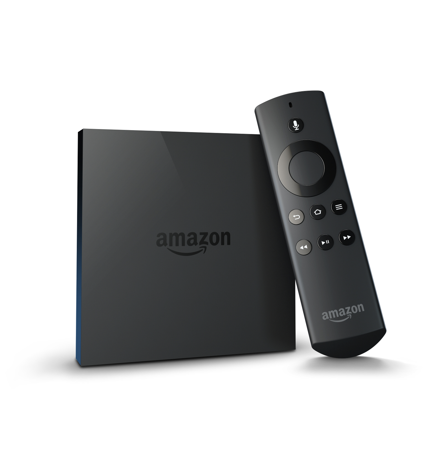
The Amazon Fire TV remote (see Figure 1-36) uses speech recognition to overcome this same hurdle. Its remote has a dedicated button for voice search and users can speak a search term into the remote rather than having to type. That way, the interface stays simple even though complex input is possible.
Universal Design and Accessibility
It is easy to forget that many products we work on as designers are inaccessible or much harder to use for people with disabilities like visual impairment. Sometimes products even become less accessible with the integration of new technologies (e.g., washing machines that move from physical controls to touchscreens). Connected products offer an opportunity to create more accessible and universal products.
In this section, we’ll take a brief look at accessible and universal design in relation to connected products.
Accessibility
There are many aspects of a physical device that designers need to consider to make it appropriate for users with a certain disability. Checklists published by organizations such as the Royal National Institute of Blind People (RNIB) help designers with this task.
Here is an excerpt from the “handling” section of RNIB’s checklist “35 Questions to ask yourself when designing products for people with sight loss, disabilities and older people”:
| Checklist Excerpt: Handling | ||
|---|---|---|
|
6. Is the product easy to orientate? Could a visually impaired and/or older person easily locate the front, back, top, and bottom of the product? |
Yes |
No |
|
7. Does the product require little physical strength to use? Consider, for example, an older person with arthritis – would they be able to lift, open, turn, grip or rotate the product to use it effectively? |
Yes |
No |
|
8. Does the product have smooth edges and surfaces (not sharp or rough) and is without finger traps? Consider that an older and/or visually impaired person may have limited vision, reduced reaction time, motor control and dexterity. |
Yes |
No |
The full checklist is a great tool if you want to make your product more accessible. It is available here: www.designingconnectedproducts.com/resources/35QuestionsChecklist.pdf.
Another simple but powerful method that helps designers make products accessible is to simulate disabilities. You can close your eyes and see if you can still use your prototype. You can even use props, often called “empathy tools” to help you. Wear earplugs and earmuffs to simulate deafness. Or wear gardening gloves to simulate how somebody with arthritis might experience your product.
Enabled by Design, a nonprofit organization hosting a community around the philosophy of “design for all,” uses such empathy tools in their workshops and hackathons (see Figure 1-37). Cofounder Denise Stephens, however, points out that empathy tools aren’t a replacement for working with real users that have lived with a disability. For that reason, in addition to exercises using such tools, Enabled by Design’s hackathons bring together designers with “design partners,” people who live with disabilities that form teams with designers to collaborate.

A third strategy to create accessible products is to utilize existing accessible platforms. Android, iOS, and the Web all have great built-in accessibility features. If you don’t have the resources to make your device accessible, a less resource-intensive approach is to ensure you support these built-in features. You could make sure an app or website is available that lets users control every aspect of the product. Users can then use braille displays or built-in accessibility features like Apple’s VoiceOver to control your product.
Universal Design—We’re All Disabled Sometimes
It’s worth bearing in mind that designing for a particular disability doesn’t mean a product alienates or is less desirable for other user groups. In fact, it can mean quite the opposite. An example frequently used to illustrate this is the success of the OXO Good Grips brand.
Founded in 1990 on the philosophy of universal design, the company was at least partly inspired by the observation of the founder’s wife’s difficulties with ordinary kitchen tools: she was suffering from arthritis. But instead of staying a niche brand solving problems of users with specific needs, OXO Good Grips products became successful because they improved household products for anyone, not just specific groups.
Universal design is a term coined by architect Ronald L. Mace. Similar to “design for all,” it refers to a design approach that aims to make products and environments usable for as many people as possible, regardless of their age or ability. Rather than designing for certain disabilities, the approach aims to create a design solution that works for everybody, whether disabled or not. You could say the approach assumes that everybody is disabled sometimes: listening to music with headphones means you’re temporarily “deaf” to other audio alerts; carrying your grocery shopping in one hand means you temporarily only have one hand available for other interactions. Universal design aims to make products usable in the broadest range of situations, whether the user is permanently disabled or not.
When it comes to technology, this can mean including multiple modes of output and input. For example, including light output in a smoke alarm in addition to audio makes the product accessible to deaf users without alienating nondeaf users; or including audio cues and tactile signposting in a device like a washing machine makes it accessible to blind users without alienating the sighted.
Openness and compatibility with other systems also enable users to create such systems themselves. For example, the Nest smoke alarm and the LIFX connected light bulbs are compatible. This means users can set up light bulbs to flash red in case of an alert from the smoke alarm.
As part of your design process, you should spend some time examining your concept through the lens of universal design. The seven principles of universal design can help with that:15
- Principle 1: Equitable Use
-
The design is useful and marketable to people with diverse abilities.
- Principle 2: Flexibility in Use
-
The design accommodates a wide range of individual preferences and abilities.
- Principle 3: Simple and Intuitive Use
-
Use of the design is easy to understand, regardless of the user’s experience, knowledge, language skills, or current concentration level.
- Principle 4: Perceptible Information
-
The design communicates necessary information effectively to the user, regardless of ambient conditions or the user’s sensory abilities.
- Principle 5: Tolerance for Error
-
The design minimizes hazards and the adverse consequences of accidental or unintended actions.
- Principle 6: Low Physical Effort
-
The design can be used efficiently and comfortably and with a minimum of fatigue.
- Principle 7: Size and Space for Approach and Use
-
Appropriate size and space is provided for approach, reach, manipulation, and use regardless of user’s body size, posture, or mobility.
Summary
There are many different interaction channels through which users can control a connected product. They all have different benefits and drawbacks that designers need to be aware of to create the most appropriate interface.
New kinds of connected products might require hitherto unfamiliar combinations of inputs and outputs to create effective and user-friendly experiences. To identify these, designers shouldn’t settle too quickly for familiar or established interfaces, whether they are common mobile UI patterns or the rows of LEDs and reset buttons used in many connected devices so far. Instead, they should experiment with and explore new possibilities of interacting with a device or system.
Deciding on the input and output capabilities of an embedded device almost always involves compromising on either the device’s flexibility or its usability. It’s the designer’s role to pick the right trade-off. This decision is partly about product strategy, but also about human insight gained through thorough research and prototyping: What is the right sweet spot for the particular device that is being designed?
Using mobile apps or web UIs as main or part of the interface of a connected product has advantages and disadvantages. Developing for these platforms benefits from their popularity, the available resources, and the body of precedent projects. App platform features can be utilized and smartphone capabilities tapped into. However, the devices might not always be available, and going through a smartphone can be slower compared to direct on-device control.
As the number of devices people own increases, creating interfaces that require less attention, are less intrusive, and require less cognitive load will become more important. But only some interface types are suitable to create such glanceable or ambient interfaces.
When input and output capabilities are limited, designers need to develop strategies to enable edge-case interactions that require complex interaction. This can be about finding creative ways of using these limited capabilities, or about supporting other devices.
Designers need to make sure devices are accessible or universal. Supporting multiple ways to input and output, relying on accessible software platforms, and creating open systems that allow users to connect different devices together all help with this.
In summary, here are some of the things to consider with different interface types:
-
Physical controls are great for direct, fast control, especially when precise or fine adjustments might be required. They also make it easier for users with impaired vision to still use a product. Bear in mind that physical controls can’t be easily changed and you might have to keep labeling abstract or use screens.
-
Lights can be useful to create glanceable and less intrusive information output, but using LEDs has limitations: you might need blink patterns and color coding to convey more complex information.
-
Screens are of course useful to create dynamic interfaces and keeping the UI flexible and updateable, but having a screen often makes it difficult for design teams to keep interfaces simple because there is no extra cost to add more features or UI elements.
-
Audio output often trumps light output and can grab the user’s attention. It also inherently carries emotional qualities you need to design. On the flip side, it can quickly become annoying and users might want to turn it off.
-
Voice interfaces are a powerful way to input or output fairly complex information and users can operate them while doing other things. At the moment, though, they tend to be unreliable, only available in particular geographic regions (due to language support), and often require an Internet connection for server-side processing.
-
Gestural input works well for gaming, or when it is short and the commands are obvious. Longer interactions lead to fatigue and muscle pain, and false positive inputs can be an issue.
-
Tangible user interfaces can be great for interactive experiences in museums, educational products, or for musical instruments. They are also interesting for giving digital content physical representations. Losing tokens or parts of the interface can render them unusable.
-
Tactile output is a promising field with concept products conveying information in ways that are subtle and that require less attention. Vibration output aside, this is currently mostly research and there are few commercial products using tactile output.
-
Context-sensitive interfaces can reduce complexity by making decisions for the user or tailoring interfaces based on context. They only ever sense data points that are proxies for context, and that might be wrongly interpreted. There is also a risk that users see them as patronizing or overbearing.
-
Computer vision and barcodes can replace cumbersome input. But they can sometimes be a clumsy solution that is easier done differently.
Case Study 3: Ford SYNC 3: Connected Car
About Ford SYNC 3
“SYNC” is Ford’s brand for its in-car communications and entertainment connectivity system. The company currently has over 10 million SYNC-equipped vehicles on roads today across the planet. SYNC 3 is Ford’s third-generation voice-controlled connectivity system featuring an all-new hardware and software experience. More than 70% of all Ford customers in North America currently choose the touchscreen version of SYNC as an option within their new vehicle purchases. Multimodal input, connectivity, and system performance are the topics of the times in vehicle system enhancements, and this updated version is Ford’s latest upgrade in that race. This latest system provides simpler voice control as well as more intuitive touchscreen access to audio, phone, climate, navigation, and smartphone application functions.
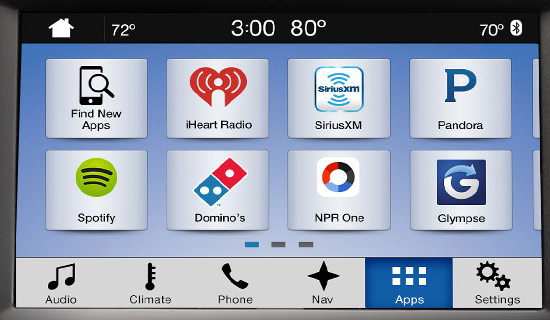
Connectivity is now like the air that we breathe for many younger consumers. SYNC 3 introduces our third-party application interface, AppLink (see Figure 1-38), which provides integration between SYNC and your connected smartphone. Using the SYNC touchscreen, users can interact directly with applications on the phone, such as Spotify, Glympse, Pandora, NPR News, and MLB.COM At Bat. SYNC 3’s software can be updated over-the-air via WiFi, or via USB. Clicking the “Apps” icon along the bottom row of the SYNC 3 touchscreen provides access to a vast array of third-party apps that have been optimized for use while driving. Apps for use via SYNC have to be redesigned to be safe while driving, while still maintaining the functional integrity of the app (and its brand). Available apps are easy to discover, as the tiles with each app logo appear on the touchscreen.
Our goal is always to design systems to enable the situations that people value—with a particular emphasis on clarity and ease of use, fast response, simplicity, and modernity. Multiple shapes, textures, tones, and behavior also need to be combined in such a way to communicate our intended Ford interactive brand experience. We need to support people’s needs (by providing the technology infrastructure required), yet also direct their limited attention and prioritize their most important actions (by providing what we consider to be the optimal design for safe interaction).
Ford worked with Panasonic to develop SYNC 3. The software operating system is QNX running on a contemporary Texas Instruments multimedia processor. The navigation application is provided by TeleNav and map data is provided by HERE (formerly NAVTEQ). Our hardware and software decisions were driven by the need to satisfy and then exceed our consumer’s expectations—particularly of performance and ease of use.
As vehicles rapidly evolve from simple mechanical machines to complex multimodal emotional platforms, what remains the same is the need to put the safety of all people first.
Designing for Connected Car Systems
Like the operating system and digital ecosystem world of Apple, Google, Microsoft, and others, automobile manufacturers must now make strategic decisions regarding whether to develop open or closed systems, and the level of third-party integration and support they are going to provide.
Regarding connectivity of your car, the latest options include supporting alternative OS integration from companies like Apple and Google, supporting a wide range of mobile device integration, and supporting mobile service and support providers like Verizon, AT&T, and others. In the future, “upgrades” may come from software companies and app developers, mobile phone manufacturers and service providers, and of course automotive companies. One potential outcome of this future of upgrades could be that vehicles adapt architectures of flexible components and hardware so that they can keep pace.
The addition of application programming interfaces (APIs) and a modem unleashes an unlimited world of functionality and content available in vehicles. The Digital Revolution is partially driving your car. When we consider new features, we have to decide whether it will be a built-in function (embedded in the system), or if it will be beamed in (delivered over the air) or brought in (transported via a personal phone or tablet). Complex enablers are continuously evolved to support each of those scenarios (see Figure 1-39). New automobiles are high-speed multifunction devices.
A Functional-Rich Small Space
The diversity of system integration in vehicles is vast and via connectivity and the evolution of sensors, is increasing at an accelerated rate. Across the domains of comfort, entertainment, and safety, we strive to satisfy basic needs, provide easy to use, clear systems, and spark surprise and delight through clever, thoughtful executions.
Our goal is to integrate multiple interactive systems in a layout and flow that is integrated, cohesive, and logical to the driver. And to do it in a way that is unique and recognizable to Ford or Lincoln.
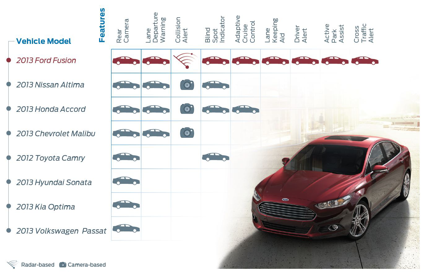
In the future, as our systems become more “smart,” perhaps they are more driver aware, contextually aware, situation aware, and they recommend and present functions as needed—or they interact on your behalf. Early examples of shifts from warning to intervention are present in industry features like Lane Keeping Aid, Active Park Assist, Collision Warning with Pedestrian Detection, and Traffic Jam Assist (see Figure 1-40). When activated, each of these features will assist the driver with control of the vehicle, override the driver’s actions, and/or automate control of the vehicle in certain situations.
When designing the interior interactive experience, one of our biggest challenges is deciding the logical distribution and representation of content and functionality throughout a limited interior space. Should it be grouped by related functions, should it correlate to activities inside or outside of the vehicle, should it be grouped by proxemics and frequency of use/need? There are a limited amount of physical surfaces to continuously populate with physical buttons.
In theory, digital displays offer an unlimited amount of space (with pages, layers, 3D, etc.) to present features and functions. But navigating and interacting with these digital or virtual spaces while driving can be very challenging and unsafe. So, some design principles of physical space (like button size, readability, spacing, shape, etc.) are still vitally important in in-car digital interfaces.
Like Your Tablet but Intentionally Different
Throughout the process of designing a touch interface for driving, we needed to translate traditional graphic design and interface design rules. These included the definition and design of optimized button sizes and behaviors as well as font characteristics that combine to maximize readability and interaction at a quick glance. The gesture vocabulary of your smartphone or tablet is not appropriate for touchscreens in cars. We studied the basic mechanics or motion required to perform a gesture along with the goal of the gesture or the intended task. Some relative gestures like pinch & zoom and swipe do translate, but others that require precise movements and control (like moving along a slider or drag and drop) were deemed as not appropriate.
Throughout the history of SYNC, voice input has continuously been evolved and improved to increase the safety of interaction. So, each new release supports enhanced voice features that better support the natural way people speak. Ease of user input and ensuring the system understands what users are saying is critical: particular priorities are addresses, locations, and other navigation-related items, as well as more personal content such as music, artists, and entertainment-related items. With SYNC 3, we have also integrated SIRI hands-free capabilities. How many voice interaction systems will we associate with brands and will that association or recognition feel comfortable in other physical contexts?
Through observational research methods applied to iterative prototypes in both simulators and on the road, we learned how a vehicle touchscreen should differ from your personal device touchscreens (see Figure 1-41). For instance, drivers did not see the value of a Homepage or the need for the vehicle to reset to a homepage with each key cycle. So, the next time that you turn on your vehicle, SYNC 3 retains the state that you left it in. Remember HyperCard?
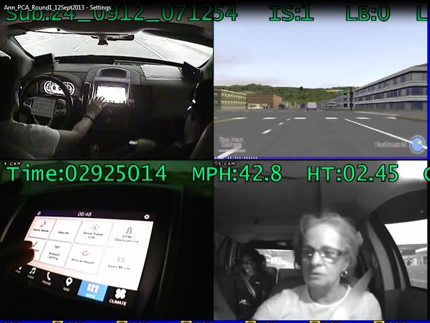
We also came to thoroughly understand the most important and most frequently performed consumer tasks. The first of these, by far, is listening to and adjusting music. We also strive to easily get from point A to point B and when we want to be productive, we find ourselves making phone calls. So, we simplify and clarify the system design around the optimization of the best ways to complete these tasks. The SYNC 3 system also provides a display that can support other systems in the car—like the cameras mounted outside the car, the multicontour seat adjustment, and other adjustments like volume adjustments and temperature changes.
We also study the stereotypes or mental models of driving activities. When I ask drivers to adjust their seats, in most cases they move their hands around the bottom of the seat looking for adjustment buttons. When we ask drivers to play music, they used to look for a physical Play button, but now they look for it on the glass. When we ask drivers to adjust their cabin temperature, they tend to look for an adjustable knob or a physical Temperature Up button. However, we are seeing many high-end automotive companies move their climate controls to the glass. Is this a mental model that will change and become permanent?
The complexity of driving systems will continue to increase—particularly driven by a next wave of complex systems like driver assist technologies, driver recognition and personalization, computational learning systems, and ever more sophisticated brought-in devices. Over time, a continuous loop of learning ought to be built in to these systems. The integration and implementation of over-the-air (OTA) systems on the frontend, and data analytics capture and analysis on the backend are the platforms for continuous improvement. This “closed loop” of understanding and improvement is critical for success and safety. However, this level of infrastructure is costly and time consuming to achieve.
Demonstrating and Implementing an Iterative User-Centered Design Process
As mentioned, SYNC 3 was designed and developed based on direct consumer feedback through market research and in-person clinics. All of Ford’s new product and service development is informed by the triangulation of different types of research, from lab based, to survey based, to direct observation of usage. Our previous SYNC systems have generated more than 22,000 data points, which were translated into many insights that were used to inform the design of the SYNC 3 system (see Figure 1-42). Like carving a sculpture from a block of marble, we shaped the system through iterative prototyping—from low-fidelity paper and cardboard models to high-fidelity simulator and drivable prototypes—and continuous consumer validation and measurement. Then statistical validation of large consumer sample sizes ensured that we were on the right track and had designed a highly competitive and useful system.
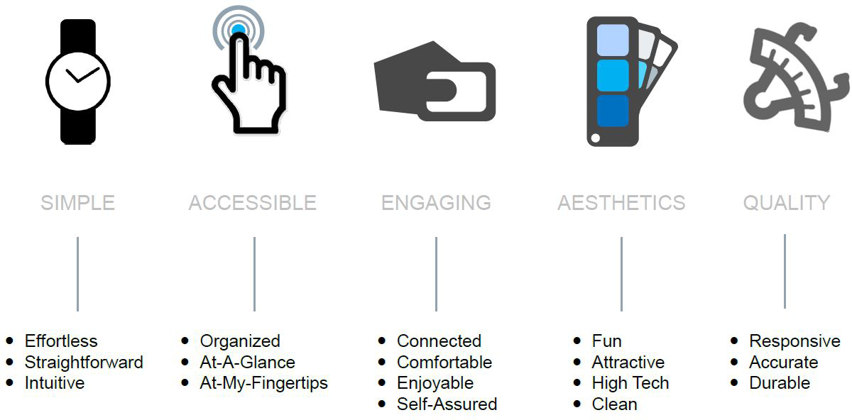
In general, we have noticed that drivers are self-aware and occasionally self-regulate and do not do a particular distracting activity in the car. But for the most part, they do them anyway (like eating, putting on makeup, or most frequently, texting) and their confidence artificially grows each time they complete the activity without a crash. And if an accident does occur, SYNC now can provide 911 operators with additional crash details, such as type of accident (front, side, rear, roll-over), change in speed, and number of safety belts detected, to help them better judge the severity of the accident and the emergency resources.
SYNC 3 will launch later this year in North America, first on 2016 model year products, and migrate to all vehicles in North America by the end of 2016 calendar year. After that, SYNC 3 will migrate into all of our vehicles globally.
We are working with Apple on implementation of CarPlay in the future. We are working with Google on implementation of Android Auto in the future. Siri Eyes-Free allows drivers to initiate a Siri session in the same way as they do on the iPhone, but using SYNC’s Push to Talk button on the steering wheel. Siri only will respond to commands with audio-based results, not visual images that require looking at the iPhone screen. As product and service design cycles continue to shorten and new models of integration (like CarPlay and Android Auto) emerge, the possibilities of interaction and use will expand.
From Designing Features to Designing for Experiences
The experiences that are afforded in today’s automobiles are the result of the ad-hoc integration of disparate components and features, particularly in the realm of full digital displays, driver assistance, head-up displays, and ever more connected infotainment systems and touchscreens. In most cases, automotive OEM’s do not know what the complete interior interactive system will be like until all of the interior components and software solutions are delivered from suppliers and bolted into the first drivable prototypes. By that time, specifications are most likely complete (or “locked”) and changes and/or improvements are difficult to implement. Auto manufacturers must invest in iterative prototype development to learn and predict system performance and use.
In the future, Ford and Lincoln vehicles will be designed with the intent of enabling consumers to have specific experiences and form emotional connections to their vehicles and their related services and systems (see Figure 1-43).
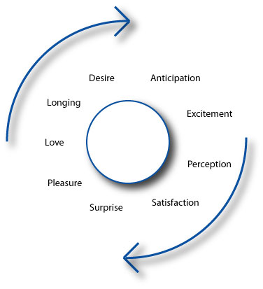
Mobility as an Emotional System
We also observe that consumers have strong emotional connections to their automobiles. They give them names, they refer to them as “an integral part of their group of friends,” and they think of them as an extension of themselves. The automobile originally enabled freedom on the open road, and it has evolved into much more. It now represents a place to stay connected to the world, your friends, and your family; to be entertained; to be productive; and to clear your mind and remove stress and anxiety from your life.
As a technology-infatuated society, we find ourselves addicted to being busy and that often involves being connected to digital technologies—we are addicted to screens. SYNC 3 was designed to appropriately fit the car, our ever-changing cultural and societal norms, and most importantly to fit our lives (see Figure 1-44).
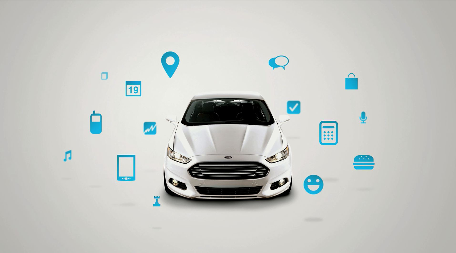
1“A Brief Rant On The Future Of Interaction Design,” Bret Victor, accessed March 25, 2015, http://worrydream.com/ABriefRantOnTheFutureOfInteractionDesign/.
2Dan O’Sullivan and Tom Igoe, Physical Computing: Sensing and Controlling the Physical World with Computers. Boston: Thomson Course Technology PTR, 2004, xix.
3Chris Woodyard, “Ford recalls Lincoln MKC—twice in same day,” USA Today, January 4, 2015, accessed March 25, 2015, http://usat.ly/1BuFYwK.
4More reviews at: http://knobfeel.tumblr.com.
5“Geordie Accent Rated UK’s Most Friendly, Most Likely to Put You in a Good Mood,” Bloomberg, April 20, 2010, accessed March 25, 2015, http://bloom.bg/1I5LLh8.
6Xbox One Sign Out Trolling: https://www.youtube.com/watch?v=mWZLa4AnN5k.
7See this link for more: http://bit.ly/1I5Oszh.
8“Designing with context,” Cennydd Bowles’ Blog, accessed March 25, 2015, http://www.cennydd.com/blog/designing-with-context.
9See the talk here: http://bit.ly/1I5Pb3r.
10Julian Ryall, “Japanese vending machine tells you what you should drink.” The Telegraph, November 16, 2010, accessed March 25, 2015, http://bit.ly/1I5PY4q.
11“Japanese embrace “human-feeling” machine.” Globalite Magazine, October 10, 2010, accessed March 25, 2015, http://bit.ly/1I5POdk.
12Jared Ficklin is a frog fellow and the Chief Creative Technologist at argodesign. Find him on Twitter (@jaredrawk) or at argodesign.com.
13Watch the demo here: https://www.youtube.com/watch?v=d-LvtHs-6O0.
14See slide 51 here: http://www.slideshare.net/davidloringrose/designing-ambient.
15The seven principles of universal design were developed in 1997 by a working group of architects, product designers, engineers, and environmental design researchers.