More tools for managing and reproducing complex data projects
A survey of the landscape shows the types of tools remain the same, but interfaces continue to improve.
 Detail from Counter-Composition VI by Theo van Doesburg (source: The Athenaeum)
As data projects become complex and as data teams grow in size, individuals and organizations need tools to efficiently manage data projects. A while back, I wrote a post on common options, and I closed that piece by asking:
Are there completely different ways of thinking about reproducibility, lineage, sharing, and collaboration in the data science and engineering context?

Learn faster. Dig deeper. See farther.
At the time, I listed categories that seemed to capture much of what I was seeing in practice: (proprietary) workbooks aimed at business analysts, sophisticated IDEs, notebooks (for mixing text, code, and graphics), and workflow tools. At a high level, these tools aspire to enable data teams to do the following:
- Reproduce their work — so they can rerun and/or audit when needed
- Collaborate
- Facilitate storytelling — because in many cases, it’s important to explain to others how results were derived
- Operationalize successful and well-tested pipelines — particularly when deploying to production is a long-term objective
As I survey the landscape, the types of tools remain the same, but interfaces continue to improve, and domain specific languages (DSLs) are starting to appear in the context of data projects. One interesting trend is that popular user interface models are being adapted to different sets of data professionals (e.g. workflow tools for business users). I took a stab at creating a simple graphic to illustrate this (examples are meant to be illustrative; this isn’t a comprehensive list):
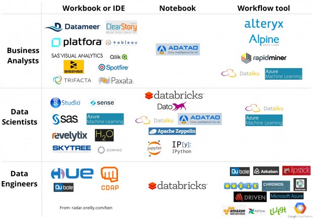
Workbooks and IDEs have user interfaces that are quite specific to a vendor (or open source project), and thus involve a learning curve. Notebooks are particularly popular for instructional purposes and prototyping, but they aren’t typically used for long, complex data pipelines. One recent exception: Databricks users are building pipelines using notebooks; a notebook is used to piece together a series of other notebooks (and, full disclosure — I am an advisor to Databricks). That said, I think using notebooks to build pipelines will grow and get supplemented by a (visual) workflow tool for piecing things together.
As I note in the graphic above, visual workflow tools are starting to be popular interfaces for targeting business users. A GUI lets users compose pipelines from elements (“nodes” in a DAG) for data ingestion, data preparation, and analytics. As projects become more complex, accompanying DAGs can be overwhelming (there are nodes of different “shapes” to denote different tasks), and as such, many of these tools let users annotate the resulting pipeline.
Of the ideas I’ve seen, I’d have to say my favorite is the combination of notebooks (for creating custom “nodes”) and workflow tools (for creating, annotating, scheduling, and monitoring DAGs). Are there other more effective interfaces and tools for managing complex data projects? Feel free to shoot me examples in the comments below.
For more on interfaces and visualization, watch two recent O’Reilly videos: Using Storytelling to Effectively Communicate Data (by Michael Freeman) and Effective Data Visualization (by Jeffrey Heer).