

 Solar correlation map. (source: Stefan Zapf and Christopher Kraushaar, used with permission)
 An ancient curse haunts data analysis. The more variables we use to improve our model, the exponentially more data we need. By focusing on the variables that matter, however, we can avoid underfitting, and the need to collect a huge pile of data points. One way of narrowing input variables is to identify their influence on the output variable. Here correlation helps—if the correlation is strong, then a significant change in the input variable results in an equally strong change in the output variable. Rather than using all available variables, we want to pick input variables strongly correlated to the output variable for our model.
There’s a catch though—and it arises when the input variables have a strong correlation among themselves. As an example, suppose we want to predict parental education, and we find a strong correlation with country club membership, the number household cars, and costs of vacations in our data set. All of these luxuries grow from the same root: the family is rich. The true underlying correlation is that highly educated parents usually have a higher income. We can either use the household income to predict parental education, or use the array of variables above. We call this type of correlation “intercorrelation.”
Intercorrelation is the correlation between explanatory variables. Adding many variables, where one suffices, conjures up the curse of dimensionality, and requires large amounts of data. It is sometimes beneficial therefore, to elect just one representative for a group of intercorrelated input variables. In this article, we’ll explore both correlation and intercorrelation with a “solar correlation map”—a new type of visualization created for this purpose, and we’ll show you how to simply create a solar correlation for yourself.
Using the solar correlation map on housing price data
We can use covariance and coefficient matrices to apply the solar correlation map to housing price data. As efficient as these tools are, however, they are hard to read. Thankfully, there are visualizations that can beautifully and succinctly represent the matrices to explore the correlations.
The solar correlation map is designed for a dual purpose—it addresses:
- the visual representation of the correlation of each input variable, to the output variable
- the intercorrelation of the input variables
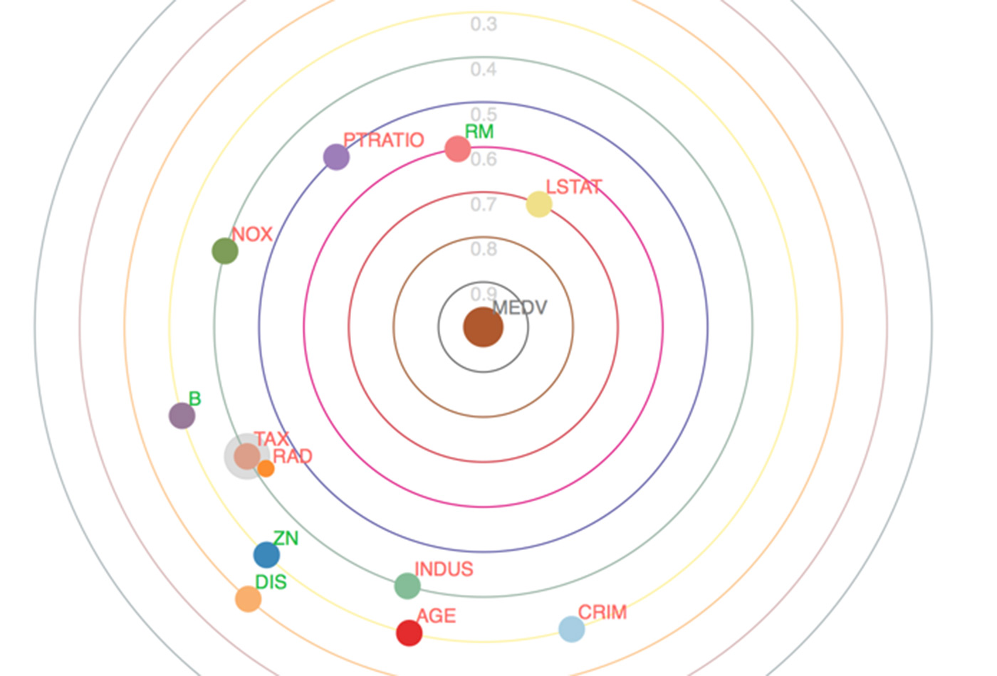
Let’s generate the solar correlation map for a standard data set and explore it. Carnegie Mellon University has collected data on Boston Housing prices in the 1990s; it is one of the freely accessible data sets from the UCI (University of California Irvine) Machine Learning repository. Our goal in this data set is to predict the output variable—the value of a home (MEDV)—with several input variables in the data set.
Let’s first generate a correlation matrix:
You can find the correlation between the output variable, the value of a home, and an input variable (like tax) by searching for MEDV row, then finding the column TAX, and finding the cell where the row meets the column. To explore intercorrelation, you’ll need to find all cells with absolute values higher than, e.g., 0.8. In complex data sets, the sheer number of columns and rows take a long time to digest. The solar correlation map can help; we’ll begin by looking at correlation to the output variable first. Below is a summary of the information, represented as a solar correlation:
The output variable MEDV, the value of the Boston home, is the sun at the center of the solar system. Each circle around the sun is an orbit. Planets are input variables, and moons are input variables that are inter-correlated with the planet they orbit. The closer the orbit, the stronger the correlation. For example, on the second orbit is a planet that describes lower income neighborhoods (LSTAT), the third orbit describes the number of rooms in the home (RM), and the fourth orbit describes the size of the homes (PTRATIO). The size of houses, the number of rooms, and the potential purchasing power of the inhabitants strongly determine the value of the homes. We did not pick this example to surprise you, but for the opposite reason—common sense analysis of the variables helps us recognize the validity of the solar correlation map.
The strengths of correlations are determined by the absolute value of the Pearson correlation coefficient. Planets on the first orbit have an absolute value of 0.9-1.0. The second orbit planets have a correlation coefficient of 0.8-0.9, and so forth. Another indication is the color and size of the indicator. The sun is a large circle, the planets are middle-sized circles, and moons are small circles.
Exploring intercorrelated input variables
You probably noticed there aren’t that many moons in the solar system. Our threshold for calling multiple variables inter-correlated is set to default that the Pearson correlation coefficient must be greater than 0.8. Usually, a strong correlation is anything above a Pearson coefficient of 0.5. The default is very cautious, but you can adjust that number in your correlation analysis. If we have inter-correlated variables, the variable with the strongest correlation to the output variable becomes the planet, and the others its moons. This is to ensure that the planets are the ones that best explain the output variable.
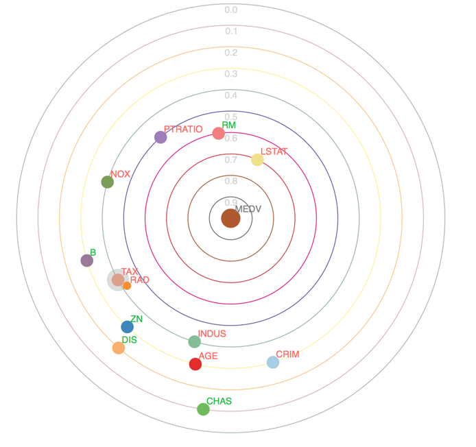
In our example, there are only two variables that are so strongly correlated to be almost identical. Not every solar system has few moons. In a big data context, there are usually many more variables (and, incidentally, many moons) in correlation solar maps. As the number of variables grows, the solar correlation map becomes even more important.
Let us now turn to the issue of the inter-correlation of input variables. On the 6th (green) orbit, we have a planet with one moon. The planet variable is TAX, the full value of property tax rate, and the moon is RAD, the accessibility to highways. As the tax rate differs for residential and commercial estates, the planet variable may be an indicator to separate commercial from residential areas. Businesses often want quick access to the highway, while private homeowners often wish to avoid the noise and air pollution of highly frequented roads. The mostly commercial or residential nature of a neighborhood might be the underlying reason for the inter-correlation of these variables. If this is the case, then including one of the two is sufficient to explain their effect on house prices.
A word of caution is in order. Data analysis is not a mechanical or deterministic process. Even a wealthy family may not buy a sports car because they care about the impact on the environment, for example. We may thus see a distant orbit of the sports car when trying to predict the wealth of families, indicating that sports cars are not a good indicator of wealth. Still, we know that owning a sports car is a good indication of wealth. Not picking the sports car as an indicator of wealth because it is a distant planet is almost certainly the wrong move, as a complex model can condition its effect on the environmental attitudes of the family. Correlation is a useful tool, but always weigh the results against your common sense, and trust your gut feeling, a vast array of hypothesis tests, and Bayesian analysis.
Used in exploratory data analysis (EDA), and with caution in modeling, the solar correlation map may help us to understand the correlation in a visual manner. An understanding of correlation can serve as a basis to prioritize our model building: planets in a low orbit are promising candidates, next in line are the moons, and lastly the outermost planets.
Positive and negative labels
We have so far explained the strength of correlations and the importance of a correlation. However, we also want to know about whether a correlation is positive or negative; it’s “the more, the better” correlation. A positive correlation means that an increase in one variable also increases the other. Let’s explore the variable RM first, which is the average number of rooms. The more rooms in a house, the higher the price, as it both indicates that the house is larger and also that space can be more easily divided. When we have 10 rooms instead of two, we will probably have a higher price. This is the essence of a positive correlation. You can see that the correlation between MEDV and the RM is positive, as the label RM is green.
A negative correlation means that an increase in one variable, decreases the other: it’s the “sometimes less is more” variable. The less crime, the more price we can get from our house, so we suspect the label for crime is red. Our suspicion holds true in the solar correlation map.
Through the solar correlation map, we can discover the strength, the inter-correlation, and the type of correlation at one glance.
How to simply create a solar correlation
The creation of a solar correlation is as simple as baking frozen cookie dough. It is a Python module you can install with pip: pip install solar-correlation-map. Then, try downloading the jedi.csv file from our GitHub repo. The csv file itself is a standard csv file, with a header:
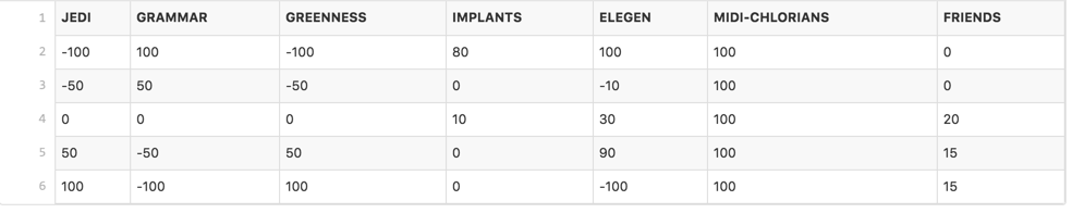
The data set is about variables relating to being a Jedi:
1.JEDI: the larger the variable, the closer the Jedi is to the light side
2.GRAMMAR: higher values indicate a better grammar
3.GREENESS: the greener the skin, the higher the variable
4.IMPLANTS: the number of implants in the body
5.ELEGEN: the megajoules of electrical energy, the force wielder can channel
6.MIDI-CHLORIANS: midi-chlorian count in the bloodstream
7.FRIENDS: the number of friends
Please observe, that the midi-chlorians are the same for all the persons in this list. It seems that we picked really strong force-users.
Then use the following command to run the solar correlation map in the directory where you downloaded the jedi-csv file:
winterfell:solar-correlation-map daebwae$ python -m solar_correlation_map jedi.csv JEDI
Now a window opens up and you will find the solar correlation map on your screen:
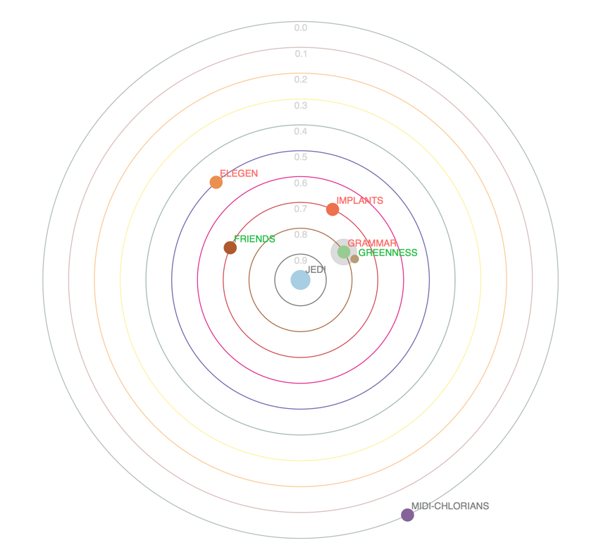
Grammar is in a close orbit and the label is red, so there’s a strong negative correlation between grammar and Jedi. The better the grammar, the less likely the person is a Jedi. In addition, “greenness” is inter-correlated with bad grammar, so both might refer to the same underlying factor. Remember that all people had the very same midi-chlorian count? Therefore it cannot possibly tell us anything about the jedi-ness of the force-wielder. That’s why the midi-chlorians are in the outer-most orbit.
There are many tweaks we could do to improve the solar correlation map. This is the introduction of a new tool, and we are happy to hear your ideas on how to improve the initial version—please feel free to contact us at stefan@zapf-consulting.com.
Three steps to a new visualization
Having introduced the solar correlation map, let’s step back and look at the bigger picture. We started out with a data analysis problem of finding the input variables with the greatest impact on the output variable. We found the tool of the correlation matrix to analyze that problem. Visually summarizing the problem helps to both find intercorrelation and the most influential input variables. As visualization is all about communication, we chose the metaphor of the solar system because it is known to many readers.
So, here are our three steps to a new visualization:
- Identify a problem in data analysis
- Find an analytical tool that solves this problem
- Use a visual metaphor to explore and communicate your results
Storytellers throughout the ages were creative and daring, and data analysis is often likened to storytelling. In a similar vein, a data scientist can follow the footsteps of ancient storytellers, to boldly explore new ways to communicate the story of data to the reader.
In exploratory data analysis, our toolbox of visualizations plays a significant role of communication and persuasion. This article presented the solar correlation map, and also served as high altitude map of the process, to create new types of visualizations that solve real exploratory data analysis problems. As you are telling the stories of your data, explore strange new worlds of visualization that no reader has seen before. Let your creativity roam to enthrall your reader and help to extend the visual metaphors of your fellow data scientists.