 Visualizing Data with Seaborn
 Visualization with Seaborn
Matplotlib is a useful tool, but it leaves much to be desired. There are several valid complaints about matplotlib that often come up:
- Matplotlib’s defaults are not exactly the best choices. It was based off of MatLab circa 1999, and this shows.
- Matplotlib is relatively low-level. Doing sophisticated statistical visualization is possible, but often requires a lot of boilerplate code.
- Matplotlib is not designed for use with Pandas dataframes. In order to visualize data from a Pandas dataframe, you must extract each series and often concatenate these series’ together into the right format.
The answer to these problems is Seaborn. Seaborn provides an API on top of matplotlib which uses sane plot & color defaults, uses simple functions for common statistical plot types, and which integrates with the functionality provided by Pandas dataframes.
Let’s take a look at Seaborn in action. We’ll start by importing the key libraries we’ll need.
from __future__ import print_function, division

%matplotlib inline
import matplotlib.pyplot as plt
import numpy as np
import pandas as pd
Then we import seaborn, which by convention is imported as sns. We can set the seaborn style as the default matplotlib style by calling sns.set(): after doing this, even simple matplotlib plots will look much better. Let’s look at a before and after:
x = np.linspace(0, 10, 1000)
plt.plot(x, np.sin(x), x, np.cos(x));
import seaborn as sns
sns.set()
plt.plot(x, np.sin(x), x, np.cos(x));
Ah, much better!
Exploring Seaborn Plots
The main idea of Seaborn is that it can create complicated plot types from Pandas data with relatively simple commands.
Let’s take a look at a few of the datasets and plot types available in Seaborn. Note that all o the following could be done using raw matplotlib commands (this is, in fact, what Seaborn does under the hood) but the seaborn API is much more convenient.
Histograms, KDE, and Densities
Often in statistical data visualization, all you want is to plot histograms and joint distributions of variables.
Seaborn provides simple tools to make this happen:
data = np.random.multivariate_normal([0, 0], [[5, 2], [2, 2]], size=2000)
data = pd.DataFrame(data, columns=['x', 'y'])

for col in 'xy':
    plt.hist(data[col], normed=True, alpha=0.5)
Rather than a histogram, we can get a smooth estimate of the distribution using a kernel density estimation:
for col in 'xy':
    sns.kdeplot(data[col], shade=True)
Histograms and KDE can be combined using distplot:
sns.distplot(data['x']);
If we pass the full two-dimensional dataset to kdeplot, we will get a two-dimensional visualization of the data:
sns.kdeplot(data);
We can see the joint distribution and the marginal distributions together using sns.jointplot.
For this plot, we’ll set the style to a white background:
with sns.axes_style('white'):
    sns.jointplot("x", "y", data, kind='kde');
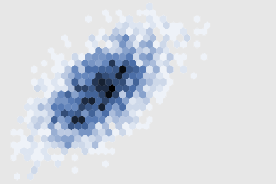
There are other parameters which can be passed to jointplot: for example, we can use a hexagonally-based histogram instead:
with sns.axes_style('white'):
    sns.jointplot("x", "y", data, kind='hex')
Pairplots
When you generalize joint plots to data sets of larger dimensions, you end up with pair plots. This is very useful for exploring correlations between multi-dimensional data, when you’d like to plot all pairs of values against each other.
We’ll demo this with the well-known iris dataset, which lists measurements of petals and sepals of three iris species:
iris = sns.load_dataset("iris")
iris.head()
Visualizing the multi-dimensional relationships among the samples is as easy as calling sns.pairplot:
sns.pairplot(iris, hue='species', size=2.5);
Faceted Histograms
Sometimes the best way to view data is via histograms of subsets. Seaborn’s FacetGrid makes this extremely simple.
We’ll take a look at some data which shows the amount that restaurant staff receive in tips based on various indicator data:
tips = sns.load_dataset('tips')
tips.head()
tips['tip_pct'] = 100 * tips['tip'] / tips['total_bill']

grid = sns.FacetGrid(tips, row="sex", col="time", margin_titles=True)
grid.map(plt.hist, "tip_pct", bins=np.linspace(0, 40, 15));
Factor Plots
Factor plots can be used to visualize this data as well. This allows you to view the distribution of a parameter within bins defined by any other parameter:
with sns.axes_style(style='ticks'):
    g = sns.factorplot("day", "total_bill", "sex", data=tips, kind="box")
    g.set_axis_labels("Day", "Total Bill");
Joint Distributions
Similar to the pairplot we saw above, we can use sns.jointplot to show the joint distribution between different datasets, along with the associated marginal distributions:
with sns.axes_style('white'):
    sns.jointplot("total_bill", "tip", data=tips, kind='hex')
The joint plot can even do some automatic kernel density estimation and regression:
sns.jointplot("total_bill", "tip", data=tips, kind='reg');
Bar Plots
Time series can be plotted using sns.factorplot:
planets = sns.load_dataset('planets')
planets.head()
with sns.axes_style('white'):
    g = sns.factorplot("year", data=planets, aspect=1.5)
    g.set_xticklabels(step=5)
We can learn more by looking at the method of discovery of each of these planets:
with sns.axes_style('white'):
    g = sns.factorplot("year", data=planets, aspect=4.0,
                       hue='method', x_order=range(2001, 2015))
    g.set_ylabels('Number of Planets Discovered')
For more information on plotting with Seaborn, see the seaborn documentation, the seaborn gallery, and the official seaborn tutorial.