Fundamentals of mapping experiences
Learn the basics—touchpoints, moments of truth, and jobs to be done—and study examples of successful user experiences.
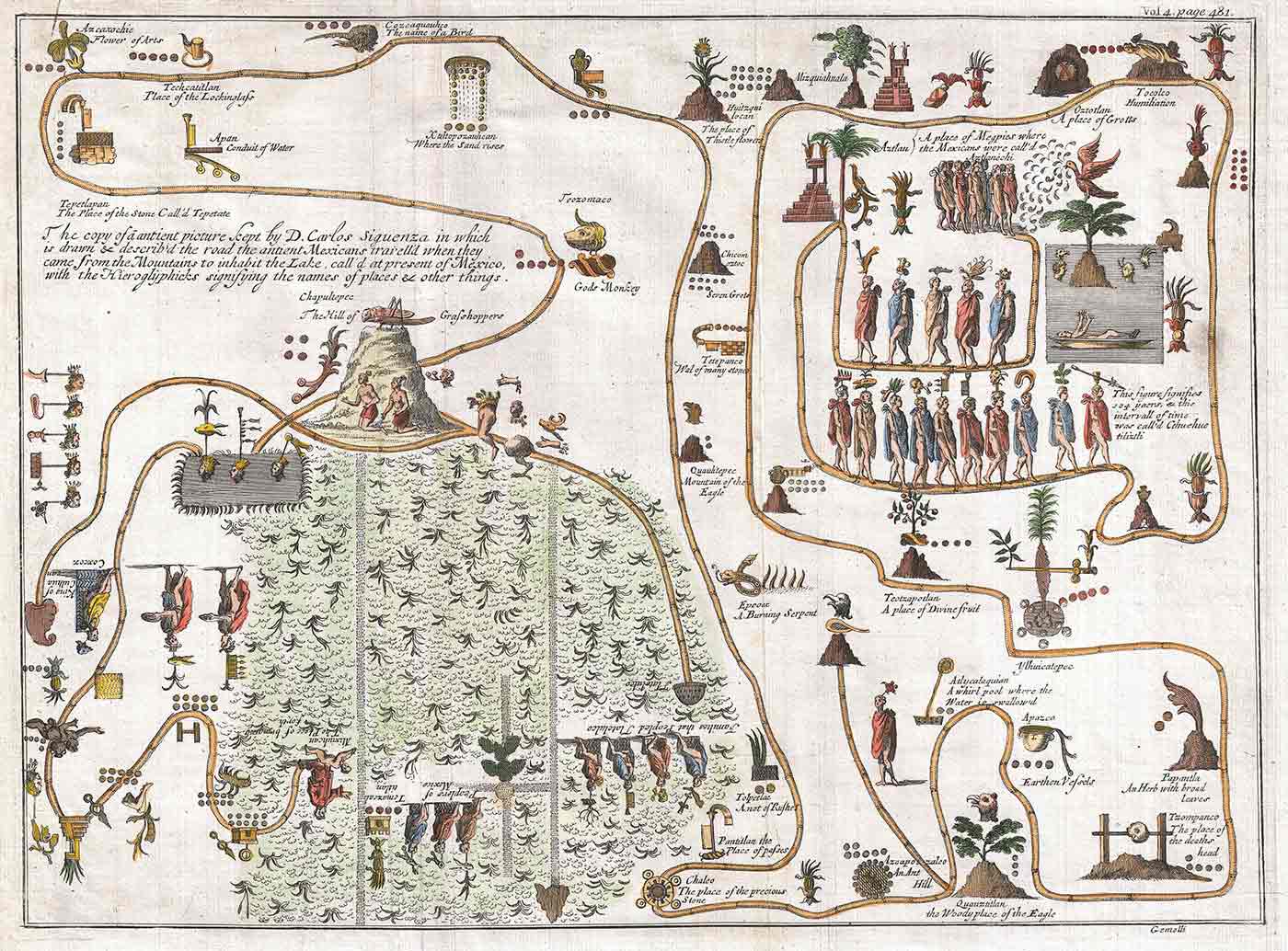 1704 Gemelli Map of the Aztec Migration from Aztlan to Chapultapec. (source: Via Geographicus Rare Antique Maps on Wikimedia Commons)
“The purpose of visualization is insight, not pictures.”
Ben Shneiderman Readings in Information Visualization

Learn faster. Dig deeper. See farther.
IN THIS CHAPTER
-
Framing the mapping effort
-
Touchpoints
-
Moments of truth
-
Value creation
-
Case Study: Identifying Opportunities: Combining Mental Model Diagrams and Jobs to Be Done
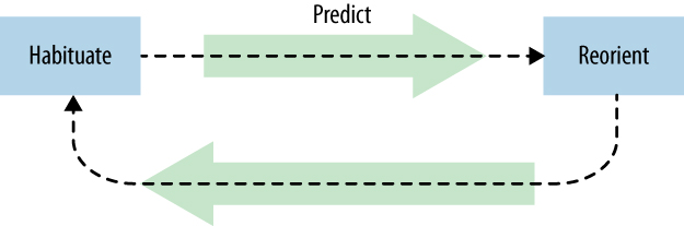
In my first book, Designing Web Navigation, I discuss the principle of transitional volatility. First described by David Danielson in 2003, transitional volatility is the degree of reorientation a person experiences when moving from page to page in a website. If there is too much volatility, they get lost in hyperspace.
Figure 1-1 shows this pattern of interaction. It’s a sequence of becoming accustomed to one location (habituate), forming an expectation about the next point (predict), and then adjusting to a new position (reorient). The pattern then repeats.
We see the same thing happening on a larger scale when individuals interact with an organization. Instead of page to page, they move from touchpoint to touchpoint. At each interaction there is a reorientation period, even if brief. If there is too much reorientation at each touchpoint, the experience feels disjointed.
A high degree of transitional volatility arises from an inconsistency in touchpoints. You’ve probably experienced this yourself. For instance, I once had an unpleasant incident with my credit card. The card issuer and the bank backing it seemed to disagree about who was responsible for my problem. Each blamed the other, and I got caught in the middle.
My experience spanned months and used various means of communication. For some things I used their website; for others I had to call. There were emails, regular mail, and even a fax. The degree of reorientation at each point was high. Apparently it was my job to figure it all out. Needless to say, they no longer have my business and I will not recommend them.
The advice is clear: don’t force people to bridge gaps of your offering. That’s your job. Mapping experiences allows you to locate transitional volatility within a broader system of interactions and find innovative solutions to address it.
This is not to say, however, that you must design every touchpoint. That would be futile. Some aspects will be beyond your control. However, understanding multiple factors that make up an experience allows you to determine which parts to focus on as well as how to avoid negative experiences, even if beyond your control.
What’s more, the aim isn’t for uniformity across the board. Rather, strive for coherency in the conception and design of the overall system. Create a balanced perception of your organization, but still give people control to shape their own experiences.
Diagrams provide a systematic overview of the experiences you create. By fostering conversations across the organization, the process of mapping helps avoid negative transitional volatility and promote coherency. Regardless of the specific diagram type you create, there are overarching aspects to consider in mapping experience, covered in this chapter. These include:
-
Frame the effort clearly up front. Determine the point of view, scope, focus, and structure of the diagram, as well as how you intend to use it.
-
Identify the various touchpoints in the system, as well as critically charged points, called moments of truth.
-
Focus on creating value. Use the diagram to improve and to innovate your offering and your business.
By the end of this chapter, you should have a greater understanding of the key decisions you’ll have to make when mapping experiences.
Frame the Mapping Effort
The term experience defies precise definition. Still, we can point to some common aspects to better understand it:
- Experiences are holistic.
-
The notion of an experience is by its nature all-encompassing, including actions, thoughts, and feelings over time.
- Experiences are personal.
-
An experience is not an objective property of a product or service; it’s the subjective perception of the individual.
- Experiences are situational.
-
I like rollercoasters, but not immediately after eating a large meal. In one case, the experience is exhilirating; in the other, it’s a dreadful few minutes of nausea. The rollercoaster didn’t change, the situation did. Experiences differ from situation to situation. Circumstance drives experience more than disposition.
How, then, do we approach mapping experiences? Put simply, it’s a matter of selection. Maps are purposefully focused. As the mapmaker, it’s up to you to decide which aspects to include and which to leave out.
Cartographic maps, for instance, are selective in what they show. Consider Harry Beck’s famous map of the London Underground, first published in 1933 (Figure 1-2). It is sparing in what it includes: tube lines, stops, exchanges, and the River Thames—nothing more.
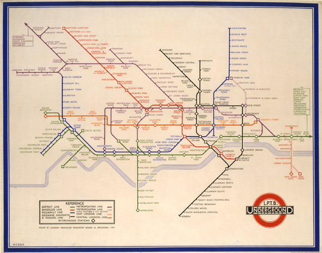
This map also distorts the train lines, relying only on horizontal, vertical, and 45-degree angled lines. Stops are spaced equidistantly as well, when in reality the distances vary greatly.
Beck’s map has remained virtually intact for over 70 years with only minor updates. Its brilliance lies in what it doesn’t show: streets, buildings, curves in lines, and actual distances between stops. The longevity of Beck’s map is given by its appropriateness—it fulfills a specific need extremely well.
Likewise, mapping experiences requires choice: what to include and how to represent it. For now, it’s important to understand the aspects that frame mapping efforts: point of view, scope, focus, structure, and how a diagram will be used.
Point of View
Mapping experiences requires a common thread or a “bouncing ball” to follow. The point of view of a diagram should answer the question, what is it about?
Point of view is given by two criteria: the people involved and the types of experiences focused on. For instance, a news magazine might serve two distinct audiences: readers and advertisers. The interactions each has with the publisher are very different. Whose experience you illustrate depends on the goals of the organization.
Once you’ve decided on the people to focus on—assume readers in this example—there are different experiences to choose from. Consider these three potential experiences for a news magazine reader:
- Purchasing behavior
-
One point of view is to look at how readers purchase the news magazine: how they first hear of the magazine, why they bought it, if they make a repeat purchase, and so on. Mapping an experience from this point of view makes sense if there is a need to optimize sales. A customer journey map would be a good fit.
- News consumption
-
Another point of view might be to look at how readers consume news in general. This would situate the magazine within a broader spectrum of human information behavior. This point of view could be beneficial if the magazine is looking to expand its offering. A mental model diagram could be useful in this case.
- Day-in-the-life
-
You could also look at a day-in-the-life of typical readers: how does a news magazine fit into their daily actions? Where do they come in contact with the magazine? When? What else do they do to find and read news? An experience map may be appropriate for mapping this experience.
Each of these points of view has a different unit of analysis—purchasing, consuming news, or a daily routine. And each can be beneficial depending on the needs of the organization.
Typically, focus a given diagram on single point of view in a given diagram. A clear perspective generally strengthens the message of a diagram.
To compare different points of view, you could create several individual diagrams and display them together—for instance, by hanging them next to each other on a wall. But it’s also entirely possible to include multiple people and multiple experiences within the same diagram. This provides an overview of the complete service ecosystem. If you do, just be clear about how different points of view come together. In the end, it’s the mapmaker’s job to determine which points of view to follow.
Scope
The equally spaced Tube stops on Beck’s map of the London Underground allow the entire system to fit on one page. Actual spacing would have put the end stations far off the page. Given his scope—to show the entire system—this lack of fidelity is necessary.
Scope requires tradeoff in breadth versus depth. A map of an end-to-end experience reveals the big picture but leaves out detail. On the other hand, a detailed diagram may illustrate specific interactions, but cover less ground. Determine the boundaries of the experience and the granularity needed to tell a complete story.
As the mapmaker, it’s up to you to decide which aspects to include and which to leave out.
For example, imagine you’ve been contracted by the tourist bureau of a city in the US to improve the experience of visiting tourists, with a specific goal of increasing the mobile services offered.
One approach could be to scope the entire visit starting from planning at home, to visiting the city, and all the way to follow-up actions afterwards. This would give you a broad picture across different touchpoint types across the entire service ecology for multiple stakeholders.
In another approach, you could limit the effort to only experiences in the city with mobile services. This journey might begin and end at the airport or train station, but would provide greater depth on mobile touchpoints for a particular user type.
Both approaches are valid depending on the needs of the organization, as well as their interests and gaps in knowledge. Are you focused on a discrete problem or do you need a view of the entire system? The point is to be explicit about the tradeoffs you’re making upfront and set the right expectations.
Focus
The mapmaker also chooses which aspects come to the foreground. There are many types of elements to consider. The ones you choose depend on how you’ve framed the effort (see not available) and what aspects are most salient to the organization.
In describing the individual’s experience you might include some of the following typical aspects:
-
Physical: artifacts, tools, devices
-
Behavioral: actions, activities, tasks
-
Cognitive: thoughts, views, opinions
-
Emotional: feelings, desires, state of mind
-
Needs: goals, outcomes, jobs to be done
-
Challenges: pain points, constraints, barriers
-
Context: setting, environment, location
-
Culture: beliefs, values, philosophy
-
Events: triggers, moments of truth, points of failure
Elements that describe the organization can include:
-
Touchpoints: mediums, devices, information
-
Offering: products, services, features
-
Processes: activities, workflow
-
Challenges: problems, issues, breakdowns
-
Operations: roles, departments, reporting structures
-
Metrics: traffic, financials, statistics
-
Evaluation: strengths, weaknesses, learnings
-
Opportunities: gaps, weaknesses, redundancies
-
Goals: revenue, savings, reputation
-
Strategy: policy, design making, principles
The question of balance of the above elements comes into play as well. For instance, a customer journey map may focus primarily on an experience with only a minimal description of the organization. A service blueprint, on the other hand, may highlight the service provision process across channels at the expense of a detailed description of the user experience.
Structure
Alignment diagrams differ in structure. The most common scheme is chronological (Figure 1-3), and many of the examples in this book have a chronological organization. However, other arrangements are possible, including hierarchical, spatial, and network structures (Figure 1-4, Figure 1-5, Figure 1-6).
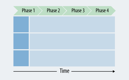
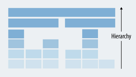
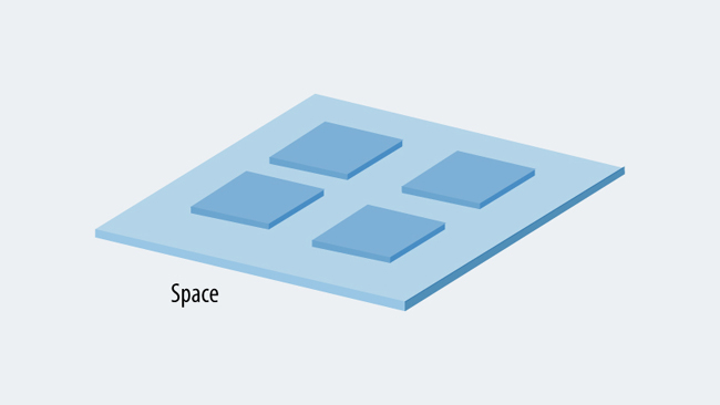
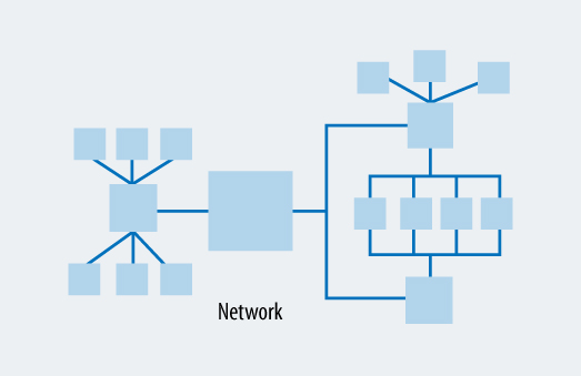
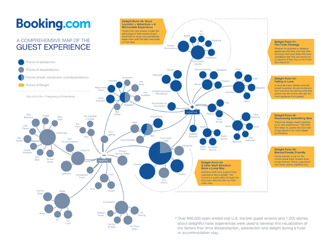
Figure 1-7 is an example of the guest experience of the service Booking.com. It’s an excellent example of illustrating an experience in network-like structure. The focus is on touchpoints that lead to positive or negative experiences.
Use
Keep the intended use of an alignment diagram in mind from the very beginning.
First, consider who will be consuming the information in your diagram. The London Underground map is read by everyday travelers on the Tube. They use it to determine how to travel between any two points on the network. But the engineers who maintain the switching signals in the London Underground would likely find Beck’s map lacking in detail. They need specifications with a much higher degree of fidelity to accomplish their work. Beck’s map is not intended for that audience.
Also consider what you’ll use diagrams for. Frame the effort in a way that is appropriate for your team’s needs. What questions does the organization have that a diagram can address? What gaps in knowledge does it fill? What problems will it help solve?
Finally, ask yourself how the diagram will be used. Will they be used to diagnose problems or improve the design of an existing system? Will they be used to create a strategy and plan for development? Or does your audience intend to use the alignment diagram to discover new opportunities for innovation and growth?
Keep in mind that the goal of a mapping effort isn’t to complete an artifact, but to address the challenges the diagrams help discover and understand. Diagrams are compelling documents that invite engagement by others. Use this to your advantage to find ways of solving customer problems and creating value.
Identify Touchpoints
Framing the effort, as outlined above, provides a basis for illustrating the overall experience. Within that experience, you also need to consider the relationship between individuals and an organization. The concept of touchpoints, the means of value exchange, allows you to show the interaction between the two.
Typically, touchpoints include a range of things, such as:
-
TV ads, print ads, brochures
-
Marketing emails, newsletters
-
Website, apps, software program
-
Phone calls, service hotline, online chat
-
Service counter, checkout register, consulting
-
Physical objects, buildings, roads
-
Packaging, shipping materials
-
Bills, invoices, payment systems
Historically, there are three primary types of touchpoints:
- Static
-
These touchpoints don’t allow for users to interact with them. They include things such as an email newsletter or an advertisement.
- Interactive
-
Websites and apps are interactive touchpoints, as are online chats.
- Human
-
This type involves human-to-human interaction. Examples include a sales representative or a support agent on the phone.
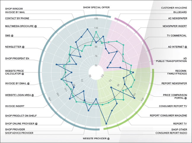
Consider the inventory of touchpoints in Figure 1-8. This diagram was created by the Swiss-based marketing firm Accelerom, an international consultancy and research firm based in Zurich (www.accelerom.com), as part of their 360° touchpoint management process.1 This shows a fairly comprehensive list of touchpoints a company has with its customers.
Notice that the touchpoints are grouped by channel in Figure 1-9—in this case, point of sale, one-to-one, indirect, and mass communication. A channel is not a touchpoint but rather a category of touchpoint given by the mode of delivery.
Diagrams are compelling documents that invite engagement by others.
Inventories such as the one in Figure 1-8 are necessary to get a comprehensive overview of touchpoints. But some people call for a broader perspective. Chris Risdon, for one, defines a touchpoint as the context around an interaction. In his article “Unsucking the Touchpoint” he writes:
A touchpoint is a point of interaction involving a specific human need in a specific time and place.
Jeanie Walters, a leading customer experience consultant, also advocates a broader definition. She is critical of touchpoint inventories, writing:
The challenge with viewing touchpoints this way is this approach often assumes the customer has a) been in a linear and direct relationship with the organization and b) reads and engages with these touchpoints in meaningful ways. In short, an examination of touchpoints is often entirely company-focused. (Sometimes, it is so company-focused the touchpoints are categorized by org chart: marketing; operations; billing, etc.).
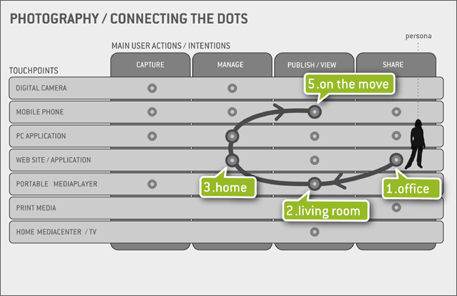
In Gianluca Brugnoli’s article “Connecting the Dots of User Experience,” he offers the touchpoint matrix shown in Figure 1-9. This diagram illustrates various activities around photography. By providing a sequence and locations of interactions, Brugnoli provides context for touchpoints in a journey.
Brugnoli believes that the system is the experience. It’s the sum of all touchpoints, as well as the connections between them. He writes:
The challenge that logically follows is to design connections. In the system scenario, design should be mainly focused on finding the right connections within the network and its parts, rather than in creating closed and self-sufficient systems, tools and services.
Creating value in the 21st century will increasingly involve systems of experiences. Touchpoints are the basic building blocks that make up the system.
Organizations that take an ecological view on the experiences they provide have a competitive advantage. For businesses, this impacts the bottom line. One study from 2013 by Alex Rawson and colleagues found that optimization across touchpoints was a strong predictor of business health.2 The researchers found a 20% to 30% correlation with improved outcomes, such as higher revenue, better retention, and positive word of mouth.
Alignment diagrams reinforce such an ecological view of the interaction with customers. They not only illustrate individual touchpoints but also provide an end-to-end picture of the experience.
Moments of Truth
Alignment diagrams are not just a collection of touchpoints. They also provide insight for identifying and understanding critical points in the experience. Called moments of truth, these key, emotional instances help focus attention on the aspects that matter most.
Moments of truth can be thought of as a special type of touchpoint. They are critical, emotionally charged interactions, and usually occur when someone has invested a high degree of energy in a desired outcome. Moments of truth either make or break the relationship.
The term moments of truth was popularized by Jan Carlzon, the then CEO of SAS Airlines, in his book of the same name. To illustrate his point, Carlzon starts his book with a story of a customer who arrived at the airport without his boarding pass. The SAS agents personally drove back to the hotel where he left it and delivered it to him at the airport. This left an indelible impression on the customer.
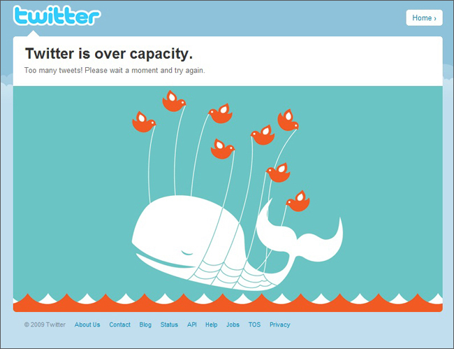
Or, consider something as simple as Twitter’s infamous “fail whale.” Now retired, the fail whale was an image of a whale (Figure 1-10) that appeared when Twitter servers were overloaded. Though disruptive at a critical moment—the point at which a person is posting a tweet—many people actually felt an emotional connection to the fail whale. Twitter turned a potentially negative moment of truth into something positive.
Moments of truth point to opportunities for innovation and growth. For instance, in their book The Innovator’s Method, business scholars and consultants Nathan Furr and Jeff Dyer suggest creating what they call “journey lines,” or a brief visualization of the steps customers take. They write:
Create an in-depth visual portrait in which you identify pain points to understand how your customers do the job today and how they feel while doing it. Visually map out the steps customers take to achieve an outcome. It helps to assign a customer emotion to each step to identify how the customer is feeling.
Creating value in the 21st century will increasingly involve systems of experiences. Touchpoints are the basic building blocks that make up the system.
They go on to recommend looking for moments “that ignite their emotions”—in other words, moments of truth. Solutions that address these moments, they claim, are more likely to be monetizable: people are generally willing to pay for services that address critical needs. In this sense, moments of truth are points of opportunity for the organization.
The individual’s perception of an organization is given by the sum of all moments of truth. These may be moments of delight—positive interaction after positive interaction. On the negative side, the relationship may suffer from a “death by a thousand cuts.”
Focusing on moments of truth allows you to concentrate your energy on experiences that matter. The perceived coherency of your offering is given by how you handle moments of truth. Diagrams provide insight into these points across time, allowing organizations to design a more cohesive experience and reduce transitional volatility.
Focus on Creating Value
Business magnate Warren Buffet once said, “price is what you pay, value is what you get.” In other words, from the individual’s perspective value is a much richer, more dynamic concept than cost, involving human behavior and emotions. Value is a perceived benefit.
Existing frameworks help us understand the subjective nature of the concept. Sheth, Newman and Gross4 identify five types of customer value:
-
Functional value relates to the ability to perform a utilitarian purpose. Performance and reliability are key considerations with this type of value.
-
Social value refers to the interaction among people, emphasizing lifestyle and social awareness. For instance, Skype in the Classroom is a program aimed at inspiring students with prominent speakers who lecture from remote locations.
-
Emotional value emphasizes the feelings or affective responses a person has while interacting with an organization’s offerings. For example, personal data security services tap into the fear of identity theft or data loss.
-
Epistemic value is generated by a sense of curiosity or a desire to learn. This type of value emphasizes personal growth and the acquisition of knowledge. The Khan Academy, for instance, provides online courses for people to learn at their own pace.
-
Conditional value is a benefit that depends on specific situations or contexts. For instance, the perceived value of pumpkins and monster costumes increases conditionally just before Halloween in the US each year.
Beyond these types, design strategist and educator Nathan Shedroff points to meaning as forms of what he calls “premium value.”5 This exceeds mere novelty and delight, and looks at the purpose products and services have in our lives. Products and services that provide meaningful experiences help us make sense of the world and give us personal identity.
Together with coauthors Steve Diller and Darrel Rheas Shedroff identifies 15 types of premium value in the book Making Meaning:
-
Accomplishment.
The sense of pride in achieving goals
-
Beauty.
The appreciation of aesthetic qualities that give pleasure to the senses
-
Community.
A sense of connectedness with others around us
-
Duty.
The satisfaction of having fulfilled a responsibility
-
Enlightenment.
The gratification of learning about a subject
-
Freedom.
A sense of living without constraints
-
Harmony.
The pleasure of balance between parts of a whole
-
Justice.
The assurance of just and fair treatment
-
Oneness.
A sense of unity with people and things that surround us.
-
Redemption.
Deliverance from past failure
-
Security.
A freedom from worry about loss
-
Truth.
A commitment to honesty and integrity
-
Validation.
External recognition of one’s worth
-
Wonder.
Experiencing something beyond comprehension
Diagrams illuminate the human dynamics of value creation at all levels. They embrace the subjective nature of value and provide organizations an outside-in view to the value they actually create.
As a class of documents, alignment diagrams foster value-centered design. They allow you to visualize and locate value within your offering ecosystem. From this you can ask, what is your value proposition at each point in the experience? Or, how is the organization meaningfully unique from the customer’s perspective? And, what meaning can you create for customers?
Jobs to Be Done
The concept of jobs to be done provides a lens through which to understand value creation. The framework looks at customer motivations in business settings. When we map experiences, we are effectively mapping jobs to be done.
The term was made popular by business leader Clayton Christensen in his book The Innovator’s Solution, the follow-up to his landmark work The Innovator’s Dilemma. It’s a straightforward principle: people “hire” products and services to get a job done.
For instance, you might hire a new suit to make you look good at a job interview. Or, you hire Facebook to stay in touch with friends on a daily basis. You could also hire a chocolate bar to relieve stress. These are all jobs to be done. For each job, there are three dimensions to consider:
- Functional job
-
The practical task at hand to meet a person’s requirements.
- Emotional job
-
The feelings a person desires while completing a job.
- Social job
-
How a person believes he or she will be perceived socially while using the solution.
Typically, a job to be done is expressed in terms of its functional jobs. As a result, many people assume the technique is nothing more than task analysis or a list of use cases. This is a fallacy. Jobs to be done are ultimately about an underlying need and desired outcomes.
Value is a much richer, more dynamic concept than cost involving human behavior and emotions. Value is a perceived benefit.
For instance, a homeowner may buy a digital keyless lock for their front door. The desired outcome is to reduce the chance that an intruder can enter their home. But there’s also an emotional job: to increase the homeowner’s sense of safety and security. Socially, the digital lock also fulfills the jobs of letting invited guests in and out as desired.
Viewing value creation in this way shifts focus from the psycho-demographic aspects of individuals to their goals and motivations. It’s not about the user but about usage.
Finally, the context of the job is critical to understand. Christensen writes:
Companies that target their products at the circumstances in which customers find themselves, rather than at the customers themselves, are those that can launch predictably successful products. Put another way, the critical unit of analysis is the circumstance and not the customer.
Alignment diagrams describe those circumstances—the broader context of goals, desired outcomes, and emotions, as well as constraints and pain points. Mapping experiences illustrates conditions of jobs to be done in an holistic way for everyone in an organization to learn from.
Summary
The concept of transitional volatility in web navigation serves as an analogy for the experiences people have when moving from touchpoint to touchpoint of a provider. If individuals have to constantly reorient themselves, the experience feels incoherent. Coherency in experience is a common goal for most organizations, and has been shown to increase profits.
But experiences are frustratingly intangible and overwhelmingly broad. As the mapmaker, it’s your job to frame the diagram and experiences you’ll be mapping. This includes decisions about the perspective, scope, focus, structure, and use. not available discusses the process of selection in more detail.
Touchpoints are the means by which an interaction between individuals and an organization can take place. Typically, these are seen in terms of interaction with an advertisement, applications, websites, a service encounter, and a phone call.
A broader definition of touchpoints, however, sees them as the context in which they occur. The interaction between an individual and an organization happens at a given time and within a given environment. Organizations that design for and manage coherency across touchpoints see enormous benefits: greater satisfaction, stronger loyalty, and larger returns.
Moments of truth are critical, emotionally intense moments. They are those instances that make or break a relationship. Looking for the moments of truth gives points to potential opportunities for innovation.
From the individual’s perspective, value is subjective and complex. There are many types of value they may consider: functional, emotional, social, epistemic, and circumstantial. Premium value goes beyond these types to include meaning and identity.
Jobs to be done is an existing framework that helps view value from an individual’s standpoint. Popularized by Clayton Christensen, the practice looks at why people “hire” products and services to reach a desired outcome.
Further Reading
“Adaptive Path’s Guide to Experience Mapping” (2013) http://mappingexperiences.com
This is a free guide to experience mapping from the good folks at Adaptive Path. In less than 30 pages they are able to describe the mapping process with clarity. This includes an excellent discussion of the advantages of experience mapping in general.
Gianluca Brugnoli, “Connecting the Dots of User Experience,” The Journal of IA (Spring, 2009)
This is a well-referenced article on cross-channel design. Gianluca provides some practical tips on how to map systems. The highlight of the article is his customer journey matrix. He observes: “The user experience takes shape on many interconnected devices and through various interfaces and networks used in many different context and situations.”
Harvey Golub et al. “Delivering value to customers,” McKinsey Quarterly (Jun 2000)
This is an excellent summary of articles from the prior three decades on the creation and delivery of customer value. It highlights the work of McKinsey employees with references to their respective full articles on the subject.
Marc Stickdorn and Jakob Schneider. This Is Service Design Thinking: Basics-Tools-Cases (BIS Publishers, 2012)
This is a collection of chapters by leaders in the service design field. It includes many diagrams and descriptions of tools, many of which are mapping exercises. This is a comprehensive book on service design that belongs on every designer’s desk.
Diagram and Image Credits
Figure 1-2: Harry Beck’s London Underground map, licensed from © TfL from the London Transport Museum collection.
Figure 1-7. Image of Booking.com, used with permission. See: Andre Manning. “The Booking Truth: Delighting Guests Takes More Than a Well-Priced Bed” (Jun 2013). http://news.booking.com/the-booking-truth-delighting-guests-takes-more-than-a-well-priced-bed-us.
Figure 1-8: 360° Touchpoint matrix Accelerom AG, international consultancy and research firm based in Zurich (www.accelerom.com), used with permission. Accelerom has been combining management practice, cross-media marketing research, and cutting-edge analysis and visualization technologies for over a decade. For more, see: http://bit.ly/1WM1QyU.
Figure 1-9: Touchpoint matrix created by Gianluca Brugnoli, used with permission, originally appearing in: Gianluca Brugnoli. “Connecting the Dots of User Experience,” Journal of Information Architecture (2009). http://journalofia.org/volume1/issue1/02-brugnoli/jofia-0101-02-brugnoli.pdf.
Figure 1-11: Zero Moment of Truth from: Jim Lecinski. ZMOT: Winning the Zero Moment of Truth (Google, 2011). https://ssl.gstatic.com/think/docs/2011-winning-zmot-ebook_research-studies.pdf.
Figure 1-12: Original photo by Elizabeth Thapliyal, used with permission.
Figure 1-15: Extended mental model diagram created by Amber Brown, Elizabeth Thapliyal, and Ryan Kasper, used with permission.
1See Christoph Spengler, Werner Wirth, and Renzo Sigrist. “360° Touchpoint Management – How important is Twitter for our brand?” Marketing Review St. Gallen (Feb 2010).
2See Alex Rawson, Ewan Duncan, and Conor Jones. “The Truth About Customer Experience” Harvard Business Review (Sep 2013).
3Jim Lecinski. ZMOT: Winning the Zero Moment of Truth (Google, 2011).
4Jagdish Sheth, Bruce Newman, and Barbara Gross. Consumption Values and Market Choices (South-Western Publishing, 1991).
5See Nathan Shedroff’s talk at Interaction South America on the topic of design and value creation: “Bridging Strategy with Design: How Designers Create Value for Businesses” (Nov 2014), http://bit.ly/1WM0410.