Making a scatterplot with D3.js
The scatterplot is a common type of visualization that represents two sets of corresponding values on two different axes.
 D3 Scatterplot
In this tutorial, we’ll look at the scatterplot: a common type of visualization that represents two sets of corresponding values on two different axes: horizontal and vertical, x and y. This is what the final result will look like:
The Data
You have a lot of flexibility around how to structure a dataset in D3. For our
scatterplot, I’m going to use an array of arrays. The primary array will contain one element for each data “point.” Each of those “point” elements will be another array, with just two values: one for the x value, and one for y:

Learn faster. Dig deeper. See farther.
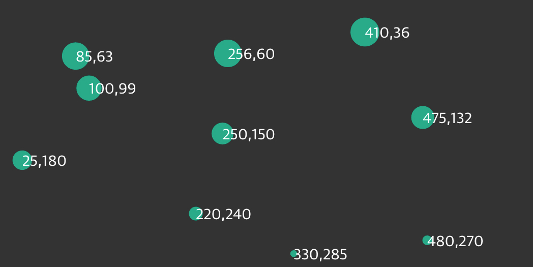
var dataset = [
  [5, 20], [480, 90], [250, 50], [100, 33], [330, 95],
  [410, 12], [475, 44], [25, 67], [85, 21], [220, 88]
];
Remember, [] means array, so nested hard brackets [[]] indicate an array within another array. We separate array elements with commas, so an array containing three other arrays would look like this: [[],[],[]].
We could rewrite our dataset with more whitespace so it’s easier to read:
var dataset = [
  [ 5,     20 ],
  [ 480,   90 ],
  [ 250,   50 ],
  [ 100,   33 ],
  [ 330,   95 ],
  [ 410,   12 ],
  [ 475,   44 ],
  [ 25,    67 ],
  [ 85,    21 ],
  [ 220,   88 ]
];
Now you can see that each of these 10 rows will correspond to one point in our visualization. With the row [5, 20], for example, we’ll use 5 as the x value, and 20 for the y.
The Scatterplot
Let’s carry over most of the code from our bar chart experiments, including the piece that creates the SVG element:
//Create SVG element
var svg = d3.select("body")
  .append("svg")
  .attr("width", w)
  .attr("height", h);
Instead of creating rects, however, we’ll make a circle for each data point:
svg.selectAll("circle") // No longer "rect"
  .data(dataset)
  .enter()
  .append("circle") // No longer "rect"
Also, instead of specifying the rect attributes of x, y, width,
and height, our circles need cx, cy, and r:
.attr("cx", function(d) {
    return d[0];
  })
  .attr("cy", function(d) {
    return d[1];
  })
  .attr("r", 5);
Notice how we access the data values and use them for the cx and cy values. When using function(d), D3 automatically hands off the current data value as d to your function. In this case, the current data value is one of the smaller, subarrays in our larger dataset array.
When each single datum d is itself an array of values (and not just a single value, like 3.14159), you need to use bracket notation to access its values. Hence, instead of return d, we use return d[0] and return d[1], which return the first and second values of the array, respectively.
For example, in the case of our first data point [5, 20], the first value (array position 0) is 5, and the second value (array position 1) is 20. Thus:
d[0] returns 5
d[1] returns 20
By the way, if you ever want to access any value in the larger dataset
(outside of D3, say), you can do so using bracket notation. For example:
dataset[5] returns [410, 12]
You can even use multiple sets of brackets to access values within
nested arrays:
dataset[5][1] returns 12
Don’t believe me? Type in
dataset[5] or dataset[5][1] on JS Bin, and see what happens.
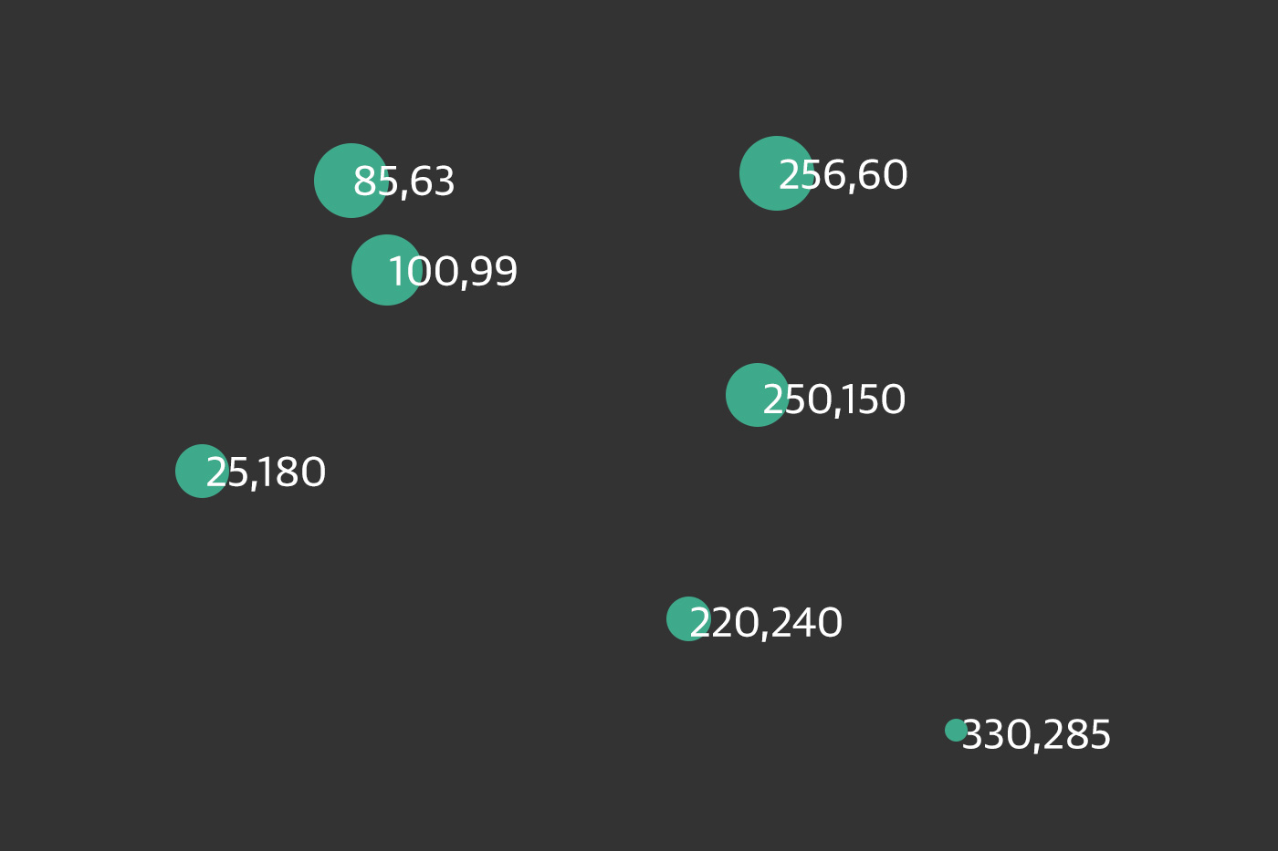
Maybe you want the circles to be different sizes, so each circle’s area corresponds to its y value. As a general rule, when visualizing quantitative values with circles, make sure to encode the values as area, not as a circle’s radius. Perceptually, we understand the overall amount of “ink” or pixels to reflect the data value. A common mistake is to map the value to the radius. (I’ve done this many times myself.) Mapping to the radius is easier to do, as it requires less math, but the result will visually distort your data.
Yet when creating SVG circles, we can’t specify an area value; we have to calculate the radius r and then set that. So, starting with a data value as area, how do we get to a radius value?
You might remember that the area of a circle equals π times the radius squared, or pass:A = πr
Let’s say the area, then, is our data value, which is ++d[1]++, in this case. Actually, let’s subtract that value from h, so the circles at the top are larger. So our area value is h - d[1].
To convert this area to a radius value, we simply have to take its square root. We can do that using JavaScript’s built-in Math.sqrt() function, as in Math.sqrt(h - d[1]).
Now, instead of setting all r values to the static value of 5, try:
.attr("r", function(d) {
  return Math.sqrt(h - d[1]);
});
After arbitrarily subtracting the datum’s y value d[1] from the SVG height h, and then taking the square root, we see that circles with greater y values (those circles lower down) have smaller areas (and shorter radii).
This particular use of circle area as a visualization tool isn’t necessarily useful. I simply want to illustrate how you can use d, along with bracket notation, to reference an individual datum, apply some transformation to that value, and use the newly calculated value to return a value back to the attribute-setting method (a value used for r, in this case).
Labels
Let’s label our data points with text elements. I’ll adapt the label
code from our bar chart experiments, starting with the following:
svg.selectAll("text") // Note "text", not "circle" or "rect"
  .data(dataset)
  .enter()
  .append("text") // Same here!
This looks for all text elements in the SVG (there aren’t any yet),
and then appends a new text element for each data point. Then we use the
text() method to specify each element’s contents:
.text(function(d) {
  return d[0] + "," + d[1];
})
This looks messy, but bear with me. Once again, we’re using
function(d) to access each data point. Then, within the function,
we’re using __both__ d[0] __and__ d[1] to get both values within that
data point array.
The plus + symbols, when used with strings, such as the comma between
quotation marks ",", act as append operators. So what this one line
of code is really saying is this: get the values of d[0] and d[1] and
smush them together with a comma in the middle. The end result should be
something like 5,20 or 25,67.
Next, we specify where the text should be placed with x and y
values. For now, let’s just use d[0] and d[1], the same values that
we used to specify the circle positions:
.attr("x", function(d) {
  return d[0];
})
.attr("y", function(d) {
  return d[1];
})
Finally, add a bit of font styling with:
.attr("font-family", "sans-serif")
  .attr("font-size", "11px")
  .attr("fill", "red");
Go ahead and edit the final scatterplot code below.
var w = 600;
var h = 300;

var dataset = [
  [256, 60], [480, 270], [250, 150], [100, 99], [330, 285],
  [410, 36], [475, 132], [25, 180], [85, 63], [220, 240]
];

//Create SVG element
var svg = d3.select("body")
  .append("svg")
  .attr("width", w)
  .attr("height", h);

svg.selectAll("circle")
  .data(dataset)
  .enter()
  .append("circle")
  .attr("cx", function(d) {
    return d[0];
  })
  .attr("cy", function(d) {
    return d[1];
  })
  .attr("r", function(d) {
    return Math.sqrt(h - d[1]);
  })
  .attr("fill", "#00aa88");

svg.selectAll("text")
  .data(dataset)
  .enter()
  .append("text")
  .text(function(d) {
    return d[0] + "," + d[1];
  })
  .attr("x", function(d) {
    return d[0];
  })
  .attr("y", function(d) {
    return d[1];
  })
  .attr("font-size", "15px")
  .attr("fill", "white");
Next Steps
Hopefully, some core concepts of D3 are becoming clear: loading data,
generating new elements, and using data values to derive attribute
values for those elements.
Yet the image is barely passable as a data visualization. The
scatterplot is hard to read, and the code doesn’t use our data flexibly.
However, generating a shiny, interactive chart involves taking our
D3 skills to the next level. To use data flexibly, we’ll learn about
D3’s scales.