The mechanics of interface design
Learn how to design effective interfaces across different form factors by understanding how people hold devices and complete tasks.
 Cutaway drawing of a pocketwatch movement. (source: B. G. Seielstad on Wikimedia Commons)
The Push and Pull of Prototypes Versus Pixel Perfection
I keep a large number of details that will later go. I first do the animal with almost all its trappings. Then I gradually eliminate them…
FRANÇOIS POMPON, FRENCH SCULPTOR AND ANIMALIER

Learn faster. Dig deeper. See farther.
BORN IN 1855, ONE of my favorite new artists, François Pompon, applied his coveted talents as a sculpting assistant for legendary artists Auguste Rodin and Camille Claudel in Paris. It wasn’t until 1922 at the age of 67, however, that Pompon became famous for his own work.
Called L’ours Blanc, or The White Bear, Pompon’s huge sculpture of a polar bear is something truly unique (Figure 1-1). It lacks any ornamentation or flourish. It eliminates every unnecessary detail. And it makes no attempt to be realistic. Without these elements, the viewer is struck by the raw presence and personality of the bear. Pompon eliminated the unnecessary details to help us focus on what makes the bear, well, a bear.
In this case, both the product and the process fascinate me. Pompon would actually sculpt his subjects (at this point in his life, they were mostly animals) with most of the details intact. Then, over time, he’d eliminate these details—the waviness of the fur, the texture of the feathers, the sharpness of the claw—to focus on only the necessary aspects of the subject’s form. Without these details, he let the viewer focus on the purest elements of the animal’s character.

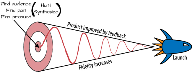
As product designers, our job in this phase is similar, albeit less physical. We’re gathering all of the information we can, completely immersing ourselves in the problems faced by our potential customers. We’re binging on current alternatives in the marketplace, sampling heavily to get inspiration for our own yet-to-be-invented solutions. Then, we’re iterating rapidly through the most plausible solutions to see what works best.
At this stage, we’re already moving along the process of stripping away the unnecessary. Increasing fidelity. Moving toward something we can ship (Figure 1-2). In not available, we created the copy for our product’s interface and began turning that copy into user flows and screens. In not available, we began morphing those flows into something tangible, something we could use to test ideas and start feeling how the product might behave.
Now, we’re finally going to refine these elements into the ingredients necessary for a badass user interface.
I think a lot of product designers make the mistake of jumping directly into Photoshop or Sketch or Illustrator. They misinterpret what it means to be interface first, and get caught in a loop of trying to achieve pixel perfection before really knowing which direction they’re going.
Look, there’s a push and a pull between all these axes. If interface copywriting, pixel-perfect mocks, and functioning prototypes were on a spaceship together, they’d be the directional thrusters responsible for lining up the ship for a clean seal on the airlock.
Like I said in not available, this push-and-pull depends on your timeframe, your internal audience, the required fidelity at any given stage, and your comfort with the tools you’re using.
But at some point after you’ve written out your interface and its flows, you’re going to have to deliver pixel-perfect mocks.
Here’s why. See, regardless of the internal living document that is your product plan and milestones—call it a spec, call it a user story, call it whatever buzzword your people use—combined with the prototypes you create, you’re still going to need the “hero” version of your product’s interface.
Apple, unsurprisingly, takes this approach to the extreme. Called 10 to 3 to 1, Apple product designers are expected to design 10 wholly different, high-fidelity mocks for each feature to be built. The 10 ideas are narrowed down to the best three, and then the team combines the best ideas of the best three into the final product.1
While this approach might seem too systematic or wasteful to some, it balances the pressures of creativity with a production mentality. It codifies the fact that most ideas will be left on the cutting room floor, but also sets limits on creative exploration. The goal is to drive a designer’s imagination in the right direction.
Why? Because pixel-perfect mockups are the ultimate communicator, because they can be integrated into your prototypes and filled out with the real copy you’ve already created. Then, boom. Suddenly, you’re fooling everybody that this is a real product. Disbelief is suspended, and true opinions flow out. On top of that, pixel perfection, combined with prototypes, are the ultimate guidebook for engineers.
So when the final product launches, nobody’s going to be taken by surprise.
I’ll take those benefits over a so-called functional spec any day.
But while pixel perfection is critical, it sure ain’t easy. It takes a crazy amount of time. There are multiple screen sizes. Different platforms. Landscape mode. Portrait mode. Ergonomics to keep in mind. And five states for every interface.
But if you plan for these contingencies, the process becomes less overwhelming.
Let’s start with the UI stack. In the next section, you’ll learn how to avoid the pitfalls of what I call “awkward UI” by always remembering how the five states of an interface work together.
The UI Stack: Five States of Interface Design
Have you ever experienced a user interface that feels lifeless? Have you created a UI that just seems to be missing…something?
If that’s the case, you’ve probably experienced a case of awkward UI.
Awkward UI is a missing loading indicator. It’s forgetting to tell your customer where something went wrong (bonus points for doing so with a scary error message). It’s a graph that looks weird with only a few data points. It’s a linear snap into place when a new piece of data is introduced.
Still not clear about what awkward UI is? Here’s a simple real-world example: I use Apple TV. A lot. (In fact, I have the latest episode of Star Wars: Rebels playing in the background as I write this.) Whenever I pull up my Purchased movies, I see the screen shown in Figure 1-3.

For a second, I get scared. Every time. And I use this screen often. I know what to expect.
But why am I scared? What are the mechanics that cause my brain to think I’m seeing what the Apple TV intends for me to see?
There’s no loading indicator. No sign of activity. So in the span of seconds, scary questions race through my head. Where are my movies? Are they lost? Deleted? Hijacked?
Then, after my heart stops racing, the movies I own suddenly and unceremoniously pop into place.
Man, that’s jarring.
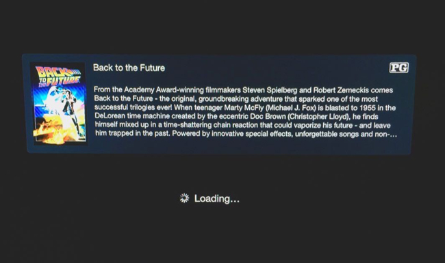
Contrast this with playing a movie. After clicking “play” on the Apple remote, I see a nice indicator that Back to the Future is getting ready to play (Figure 1-4).
Notice the experiential difference?
Creating interfaces that are easily understood by humans puts us product designers right up against the sad fact that computers are lazy. They don’t care about helping people understand what’s new, what to do next, or how to react when something goes wrong.
In a computer’s ideal world, all it would have to do is throw obscure error codes and scary-sounding alerts when something unexpected happens. Or, better yet, it would just talk with you in binary.
But we don’t speak binary. We think in flows, and we’re used to the physical world. When a door opens, it swings on an arc. When something travels, you can see it move. When something falls, you can see it bounce.
Awkward UI is when a product designer doesn’t take these things into account. That means that somewhere along the line, some rules have been broken.
But which rules?
The rules of the UI stack. Let’s talk about that now.
What’s the UI Stack?
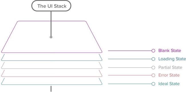
Every screen you interact with in a digital product has multiple personalities. Five, to be exact (Figure 1-5).

Depending on the context, these personalities are revealed to your customer. In designer-speak, we call these states. And you should consider these states for every screen you make.
That’s because following the rules of the UI stack and the five states helps you create a cohesive interface that’s forgiving, helpful, and human.
Be honest with yourself. When’s the last time you created a screen that had only one state? Even if you’re creating weather apps (cue Dribbble joke), one state won’t cut it.
The reality is that the world in which we live isn’t perfect, and things go wrong. Servers take time to respond. And your customers won’t always use your product the way in which you intended.
So, as a product designer, you’ve got to take these realities into account.
That’s why every screen you’ll design for your product can have up to five states:
As your customer moves through your product’s flows, they’re also going to move seamlessly between between each state within those flows. In other words, each state in the UI stack is built with the notion that UI states smoothly transition from one to another, and as many times as necessary. We’ll explore this notion together in the section A hypothetical example of this chapter in A hypothetical example.
But first, a brief interlude into Internet history. Back in 2004, Basecamp, the company formerly known as 37signals, wrote, in my humble opinion, a groundbreaking piece entitled The Three State Solution.2 (And no, this isn’t a plan to end the Israeli-Palestinian conflict.) They outlined that every screen should consider three possible states: “regular, blank, and error.” This blew my mind. And changed how I thought about design for the Web forever.
But things change on the Internet. First, there was the AJAX revolution (coinciding with the rise of Web 2.0, as it was then known). Then came mobile apps. Next came the mass consumerization of mobile and tablets and the Web in general.
Demands and expectations for UIs changed. And so the UI stack is my adaptation of the decade-plus idea from Basecamp.
With that noted, let’s talk about the ideal state.
Ideal state
This is the first state to create, since it’s what you want people to see most often. Aptly named, it embodies the zenith of your product’s potential—when your product is providing maximum value and is full of useful, actionable content. It’ll serve as the foundation for every other state you’ll create for this screen. Think of this as the quintessential marketing page or mobile app store screenshot.
Let this state set the tone of each of the other states. Because as you iterate on your core interface, this UI could change completely over time. That’s both the beauty and the risk of iteration.
And this has vast consequences for all of the other states.
All UI states lead to the ideal state. So start with this first, and let all of the other states fall into place as your designs get closer to solving your customer’s problem.
Still not sure what I mean by the ideal state? Let’s take a look at some examples to clarify (see Figure 1-6 through Figure 1-8).

Empty state
An empty state really is bigger than just one screen. It’s about providing your customer an incredible first impression as you introduce them to your product—to spur them to action, keep them interested, and remind them of the value your product’s going to provide.
There are three broad versions of the empty state. The first is what’s seen by your customer the first time they use your product. The second is what’s seen when your customer voluntarily clears existing data from the screen, like when you attain the exalted “Inbox Zero,” for example. And the third is what happens when there isn’t anything to show, say, for a search result.
Broadly speaking, the risk with empty states is that it’s easy to tack them on as an afterthought. Most of the time, doing this either creates an overwhelming experience (see Figure 1-9) or a cold, impersonal one.

Coach marks—or instructional overlays—are, in my opinion, the best examples of an underthought first-time experience. They place a burden of learning on the customer that includes more interface and more memorization, all done with a pretty big mental interruption. What a buzzkill.
Let’s explore the first-time use state more in depth.
First-time use/onboarding
If a customer is using your product for the first time, this state is your one shot to describe what your customer will see when data exists. It’s your opportunity to encourage action, to help them understand the value they’re going to get out of this screen. First impressions happen only once, and this is your chance to make a great one.
I liken this state partially to what’s known in the literary and screenwriting world as the “hero’s journey” (Figure 1-10). Introduced by Joseph Campbell in his amazing work The Hero with a Thousand Faces,3 it’s the foundation of mythological stories found throughout the world, from The Odyssey to Star Wars. Here’s the basic premise:
A hero ventures forth from the world of common day into a region of supernatural wonder: fabulous forces are there encountered and a decisive victory is won: the hero comes back from this mysterious adventure with the power to bestow boons on his fellow man.

Propel your customers down the hero’s journey with the empty state. Call them to adventure, take them through known challenges and the temptations of the abyss, and transform them into more powerful individuals.
- Lead a horse to water. Be encouraging and uplifting in your copywriting, and speak plainly about what to do. For example, saying things like “Nothing to see here” really says nothing about what your customer should expect, and it’s a bit depressing that this would be the first thing they’d see. Instead, telling your customer the exact button to press and why they should press it is a much more helpful prospect.
- Use your product’s content to instruct your customer about what to do. For example, if you’re building a messaging product, your first-time experience might automatically include a message in the customer’s inbox. The subject line could say “tap to open me,” while the text within the message discusses more about how to manipulate and reply to a message.
- Offer an example screenshot of what the screen will look like in the ideal state. It brings a bit of hope to your customer that they’ll achieve something similar while showing off how potentially useful your product can be.
- Monitor your customer’s progress and respond accordingly. If they pause too long on a certain screen, for example, you could message them with a live chat asking if they need help.
Figure 1-11 through Figure 1-14 show a few first-time-use empty states that I love.

The subject of onboarding and first-time states is a topic big enough for another book. And it just so happens that one exists. If you want to jump into the user onboarding pool, I highly recommend Samuel Hulick’s excellent The Elements of User Onboarding.4
User-cleared data
The second type of empty state is the case where your customer has voluntarily removed data from the screen. An example of this would be if your customer completed all of the items on their to-do list, read all of their notifications, archived all of their emails, or finished downloading all of their music.
These types of empty states are great opportunities to reward your customers or to spur further action (Figure 1-15). Achieved “Inbox Zero”? Great! View this amazing photo. Downloaded all of your music? Good—now go listen to it. Sifted through all of your notifications? Here’s something else you might want to read.
A customer clearing data is a customer who’s engaged with your product. Keep them in the flows your product has in place by doing the work for them. Don’t put the onus on your customer to make the next leap.

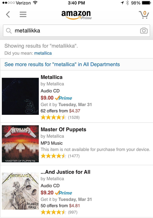
No results
In cases where your customers are browsing or searching for a piece of data in your product, there’s a chance that they won’t find what they’re looking for. These scenarios are amazing opportunities to infer what your customer intended to find and to make intelligent suggestions.
Amazon employs one of the best examples I’ve seen of this technique. Accounting for misspellings and similar searches, Amazon’s search rarely gives you an empty result (Figure 1-16). Instead, it’ll give you the closest matching result while showing which terms it didn’t match.
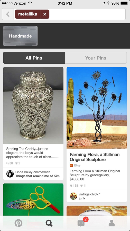
As for Pinterest (Figure 1-17), well, not quite the same results as Amazon, but this is Pinterest, after all. Based upon how their search parsed my query, it should be relatively easy for a customer to adjust their search terms to get what they want.
The lesson: don’t just drive your customer off a wall in this state. Give them something they might be able to work with, or suggest an alternate path.
Error state
This is the screen when things go wrong. Typically, this is more complex than just one screen, since errors can occur in surprising combinations. Error states can include anything from missing or invalid form data; an inability for your app to connect to the server; the app trying to move forward to the next step without finishing an upload, leaving a page without text submitted; and more.
Error states should also be comforting in the sense that your product keeps all user input safe. Your product shouldn’t undo, destroy, or delete anything entered or uploaded by your customer in the event of an error.
It’s apt to paraphrase Jef Raskin, creator of the original Macintosh and author of The Humane Interface. He writes:
The system should treat all user input as sacred and—to paraphrase Asimov’s first law of robotics, ‘A robot shall not harm a human, or, through inaction, allow a human to come to harm.’ The first law of interface design should be: A computer shall not harm your work or, through inaction, allow your work to come to harm.5
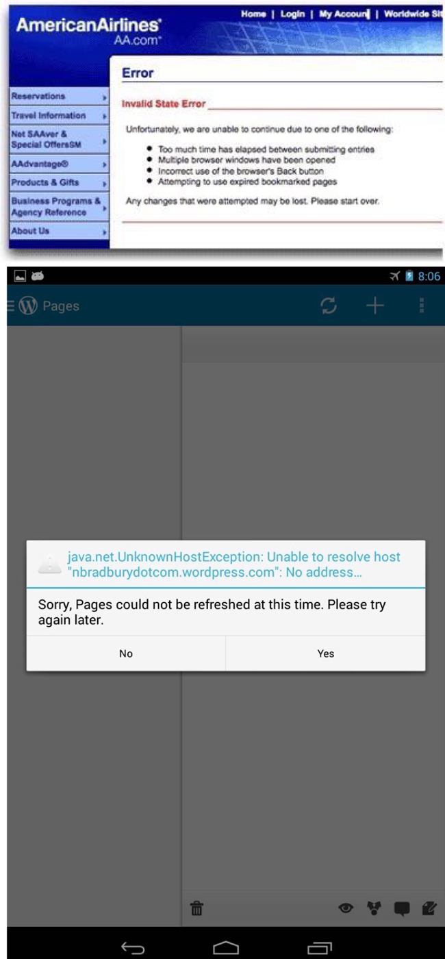
This advice could be well heeded by some particularly vile offenders of this rule: airline websites. Missing a tiny form field for a credit card security code, for example, frequently results in a page reload that blows away all of your meticulously entered details while highlighting the missed field with an offensive red hue (Figure 1-18).
No! Yes! Maybe?
Ah, finally, a contextual error message we can follow. Bonus: we get a little sense of humor to humanize it (Figure 1-19).
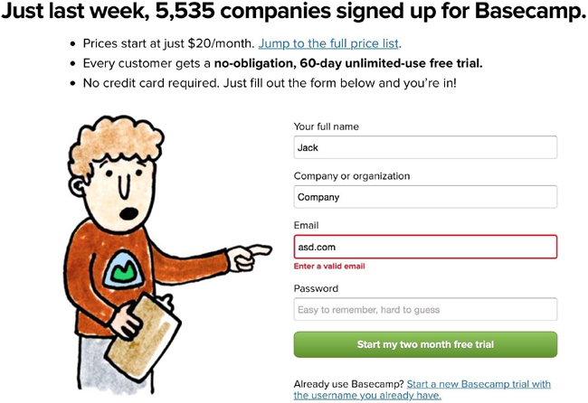
Ideal error states, like Basecamp’s, occur dynamically without destroying any data input by the user. If a page or screen reload must occur to detect an error, please do everyone a favor and save whatever data—however flawed—was input into your product. Typically, though, reloading a page to detect an error is a sign of laziness. For the sake of your customers, ensure you and your developers go the extra mile to handle errors in graceful and accommodating ways.
Additionally, error states shouldn’t be dramatic, nor should they be vague. Remember the “Blue Screen of Death”? The Mac’s “Kernel Panic”? Or—for those computing veterans—”Abort, Retry, Fail”? Each of these error states, by necessity, marked a significant system error requiring a computer reboot or retry. But to this day, each is well remembered because of the shock, fear, and confusion it conveyed to the end user.
Microsoft’s Blue Screen of Death (Figure 1-20) became so infamous because it simply freaked people out. The blue screen—while better than a red one—was out of context, abrupt, and filled with scary-sounding jargon, even if it was useful in debugging the problem.
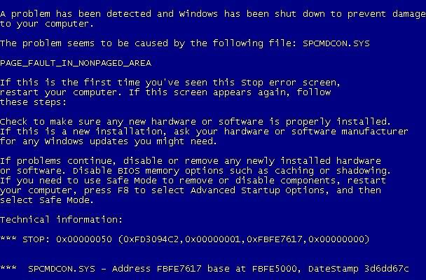
That’s because error states must incorporate concise, friendly, and instructive copy as to what to do next. Vague error codes, hexadecimal numbers, and confusing advancement options are only going to scare and frustrate the people who experience these errors.
Of course, your product’s audience might consist of rocket scientists or computer engineers. That’s a case when these highly technical error messages may be well suited to your customer. But as most of the world adopts software in their everyday lives, these types of error messages become less and less appropriate.
Generally speaking, great error messages are:
- Written with your specific customer in mind.
- Constructive, clear, and helpfully specific.
- Positive—not intimidating or overly dramatic.
- Presented with the core of the error first, and, if possible, an inferred solution.
- Specific about exactly what is in error.
- As timely as possible.
- Written in grammatically and thematically correct language, without jargon and excessive abbreviation.
- Offered with clear paths or options to resolution, and without excessive requirements (especially in the event of password security).
The error state is such a widespread occurrence, and one of the least desirable states for which to design. But I promise that if you put as much care into this state as you do into the previous two states, your product will be infinitely more joyful to use—and, more helpful, as you’ll have thought through common customer pitfalls and solved them in advance.
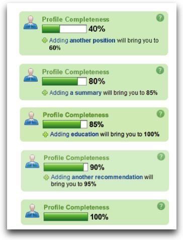
Partial state
The difference between an error state and an ideal state is like night and day. But how does the screen look when there’s only one row of data? A few photos? A half-completed profile?
The partial state is the screen someone will see when the page is no longer empty and sparsely populated. Your job here is to prevent people from getting discouraged and giving up on your product.
This is a great opportunity to design micro-interactions to guide people toward the full glory of the ideal state. It’s a journey on which you take your customers to help them realize the true value of your product. This implies an accomplishment—that your customer has spent some time in your product to see a glimpse of its potential. Keep them hooked.
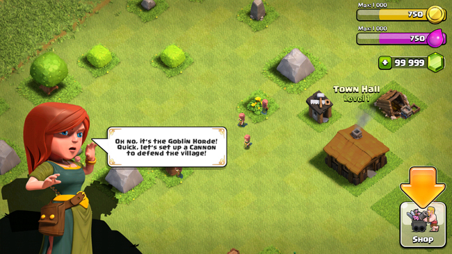
Some game design principles can be useful here. I’m not referring to the scourge-like yet addictive practice of making your customers gather crystals to advance à la Clash of Clans (Figure 1-21), but instead building what is called acceleration into this state of your product.
Acceleration helps a player visualize how they’ll be more powerful in the future, guiding them along a predefined series of tasks to complete to achieve this vision. The trick is to make the player not realize they’re performing what could be perceived as tedium in order to extract the maximum value from your product.
Players entering [an acceleration phase] aren’t thinking about the tedious repetitions they have to perform in order to level up, they’re just doing them, and enjoying the accelerating rate of the results…Rather, those players are caught up in a future in which their character(s) will be powerful in a way they can’t even understand yet. To put it more technically, they’re inferring an exponentially increasing power structure that vanishes beyond their player prediction horizon. It’s not exactly the same as traditional flow, but the exhilaration of the players is subjectively very similar.7
Figure 1-22 through Figure 1-24 are some great examples of the partial state in the wild…

Loading state
It’s easy to overlook this state, and many product designers insert it as an afterthought. But there’s a very real burden that comes with setting expectations. When your app is loading data, waiting for an Internet connection, or transitioning to another screen, you must take great care to be mindful of how you represent situations where you’re fetching data. This can consist of an entire page takeover, lazy loading of content panes, or inline loading, potentially used when one might look up username availability from a form field.
And the perception of loading is equally important. Too often designers simply fill their screens with whitespace and spinners, placing a massive burden of responsibility on the content that isn’t there. This, in turn, encourages your customers to figuratively watch the clock—putting the focus on the indication of progress versus actual loading progress being made.
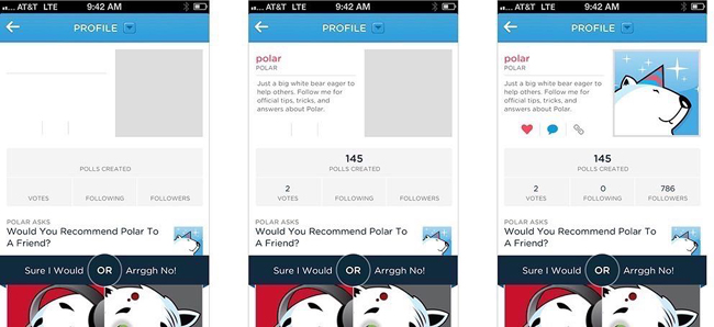
Such is the belief of Luke Wroblewski, a product design expert that’s led design teams from eBay to Yahoo! to Google, where he now resides after selling his mobile polling startup Polar.
Wroblewski and his team discovered that after they implemented a series of loading spinners for each poll, Polar customers began complaining that the app seemed slower, saying things like “There seems to be an excessive amount of waiting around for pages to refresh and load—it doesn’t seem as quick as the previous version.”
Wroblewski realized that:
With the introduction of these progress indicators, we had made people watch the clock. As a result, time went slower and so did our app. We focused on the indicator and not the progress, that is making it clear you are advancing toward your goal not just waiting around.8
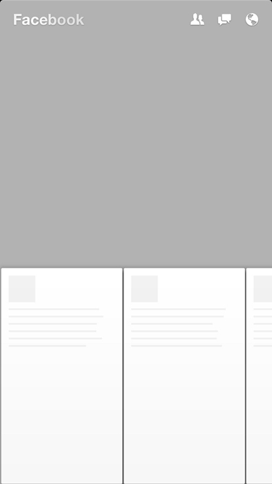
Skeleton screens
This realization directly resulted in the creation of what Wroblewski calls “skeleton screens” (Figure 1-25). They’re a technique that’s been co-opted by at least Pinterest and Facebook in both their web and mobile versions.
Skeleton screens are an innovative take on the loading state—they place the focus on the content as it loads versus the fact that the content is loading. They accomplish this by displaying the basic structure of the page and gradually filling in the missing pieces as they download. The beautiful thing about this technique is that it can eliminate spinners completely. And it can increase the perceived performance of your product.
Pinterest, while employing the use of the skeleton screen loading state concept, put a unique twist on its implementation: deriving the “average color” of the pin’s image and using that color to fill in the pin’s background. So before the pin’s image loads, you feel like you get a preview of what the pin will be. This technique is now used in Google Image search results, too.
Facebook invented a similar technique, used in their mobile app Paper and later implemented in their web version (Figure 1-26). The Facebook experience displays a stylized skeleton screen with shapes resembling content. And to communicate that the content is loading, the shapes will pulse with what Facebook calls a “shimmer effect.”
Assuming success with optimistic actions
“Nobody wants to wait while they wait,” said Instagram cofounder Mike Krieger in 2011 as he described how his engineering efforts achieved the app’s perceived speed (Figure 1-27).10
Krieger, in fact, pioneered the notion that actions should be performed “optimistically” by a product. When an action’s success is assumed, actions appear to take place much faster.

Take the case of “liking” a photo or leaving a comment. In both cases, the action is registered as completed instantly from the perspective of the customer. And in the background, the product is making server requests to actually complete the action.
Optimistic actions can also greatly help to reduce the perceived speed of uploading media. Instead of uploading when a user taps “Done” at the end of the photo upload flow, Instagram starts uploading the photo immediately after a filter is selected. While it’s not an optimal engineering solution—and data might get thrown out if your customer backtracks—it makes uploads appear to happen very quickly. Following the “move bits when no one’s watching” mantra can help make your product’s speed one of your assets.
A hypothetical example
You’ve seen a number of examples of the UI stack and its five states in isolation (Figure 1-28). But how would they work together? How does the UI account for the transitions between each state?
That’s the power of the UI stack. These states don’t exist in vacuums. They exist on a vertical axis that can be called at any time by the product. It’s your job not only to account for each of these states, but to dictate how the screen moves between each state.
I’ve created a hypothetical messaging app to illustrate these ideas.
Why a messaging app? Because it’s not an immediately obvious example of these states at play. But I think it’s a great example of how even temporal UIs like messaging interfaces follow the rules of the UI stack. And, even further, it’s an illustration of how immense our responsibility is to ensure that each screen’s states flow smoothly from one to another.
So what do we have to deal with in a messaging app?
We have to account for when there’s no messages. This is our blank state.
Our partial state is when only one party has sent a message.
Then, there’s receiving a message—the typing indicator. This, in other words, is our loading state.
But wait. There’s another series of loading states—when we send a message out. And then there’s the delivery confirmation.
An error can happen along the line, too. That’s when our message fails to send.
And you can’t forget the mechanism by which we recover from an error, and attempt to send again. There’s another version of the loading state.
Finally, we reach our ideal state: when messages turn into a conversation.
Our hypothetical messaging app
Let’s say Marty and Doc just exchange numbers and Marty wants to message Doc about what he’s just seen at Twin Pines Mall.
Since there are no messages, we have an opportunity to exploit the empty state and encourage the customer into acting how we want them to act—in this case, that’s sending a message (Figure 1-29).
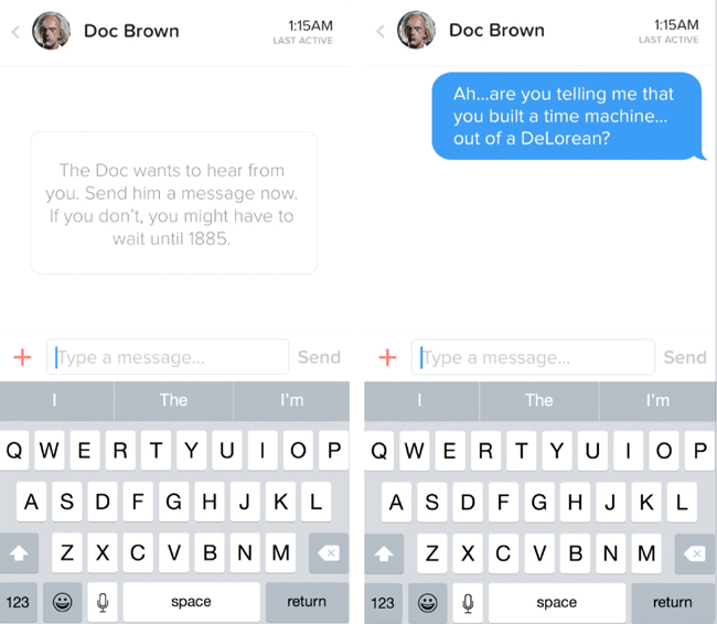
But what happens to this state when a message is sent? We need to gracefully wash away the empty state and shift it into a partial state: in this case, that’s when Marty sends only one message.
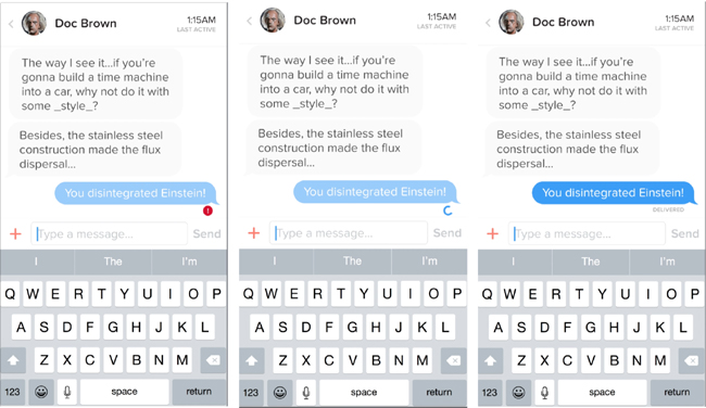
Let’s fast forward to when Doc has responded (Figure 1-30). He’s sent one message—but he’s not done yet! Hence the typing indicator, another form of a loading state.
Once the typing is done and the message is sent, we transition out of the typing indicator and bring in the new message, pushing the others out of the way.
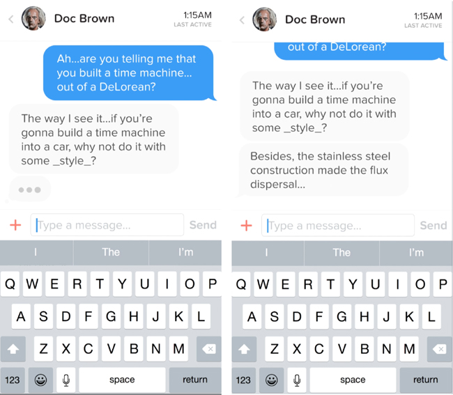
But what about when Marty wants to reply back (Figure 1-31)? First, we have to show some state awareness when there is text in the field—notice how the “Send” button turns from grey (a disabled state) to blue (an enabled state). Then, once we send the message, another loading state occurs for our send process. We keep the message dimmed during this time because there’s not a successful delivery yet—until the “delivered” stamp tells the customer that all is well.
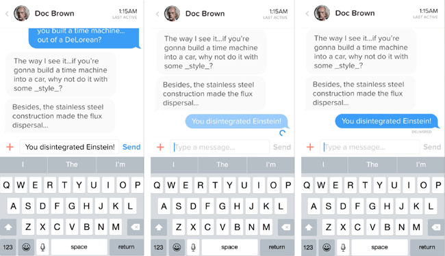
But what happens if the message isn’t successfully delivered (Figure 1-32)? Here comes our error state. The red marker replaces the loading spinner, and we’re left with a message in the “undelivered” dimmed state. Tapping (or, in this case, clicking into the Quartz Composer prototype) on the undelivered message retries the send. We’re in luck this time, and the message fills in after the angry red “!” disappears and we can register a delivered indicator.
And that, my friends, is the UI stack in action.
It’s the five screen states and the seamless transitions between them. Without these transitional elements, we risk confusing or surprising our customers as new states appear and disappear. Making people uncomfortable and confused isn’t exactly in our job description, now, is it?
Speaking of comfort, let’s shift over to the ergonomic considerations UIs need to consider in this world of touch screens and wearables.
Ergonomics: Thumb Zones and Tap Targets
In the last section, we dove into the five states of a user interface: ideal, partial, empty, error, and loading. These constitute the UI stack. And they exist on every screen you design—these user interface states are universal, no matter the context. Desktop. Mobile. Tablet. Wearables. TVs. Cars.
Now, we’re going to talk about how your interface should take into account the physical world.
No, we haven’t suddenly jumped into the world of Minority Report, Back to the Future 2015 style, or gotten to play with those awesome holograms Tony Stark made with his friend JARVIS (or is he his friend? Hmmm…)
We’re actually going to be talking about natural thumb arcs and why they’re important for touch screen design.
See, if you aren’t designing yet for touch screens, you soon will be.
Don’t believe me? Look at Figure 1-33. IT’S A BABY USING AN iPAD.

For the first time ever, a generation is growing up touch-screen-first. Let’s just say touch-based interactions aren’t going anywhere anytime soon. The mouse is becoming a relic of the past. We now must design for screens that can be tapped, pinched, swiped, zoomed, and more.
So how do we handle this?
Well, remember when we explored the history of product design in not available together? We looked at the work of Lillian Gilbreth, Henry Dreyfuss, and Scott Cook. What was the big theme?
Research. Namely, we need to understand how people hold their phones, tablets, and wearables, and how they use touch-enabled desktops.
And we’re in luck.
Mobile expert Steve Hoober conducted a study with 1,333 people in early 2013.11 He discovered that people held their phones in the following ways (Figure 1-34):
- One-handed: 49%
- Cradled: 36%
- Two-handed: 15%
Handedness figures were also instructive:
- Right thumb on the screen: 67%
- Left thumb on the screen: 33%
Hoober notes that left-handedness figures in the population are around 10 percent. So the observed higher rate of left-handed use could be correlated with people doing other things at the same time—smoking, riding a bike, drinking coffee, eating currywurst, and so on.
So it’s looking like the 3.5- and 4-inch screens of yore will start their inevitable decline very quickly. That means that those of us who’ve gotten comfortable building apps, responsive sites, and mobile-optimized web views with the old ways in mind have to learn new tricks.
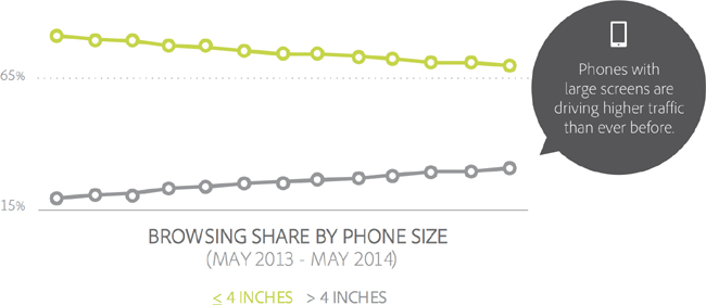
That decline is already in motion. Adobe’s 2014 Mobile Benchmark Report claims that mobile browsing among phones with 4-inch screens or smaller was down by 11 percent in May 2014 versus a year earlier (Figure 1-35).13
But this only accounts for phones sold up to May 2014. If you remember, Apple reported the most successful quarter ever of any company well…ever, in January 2015. Almost 75 million iPhones were sold, with the iPhone 6 being its most popular device.14
That means that learning how to design for thumbs is now more important than ever. Luckily, it helps that these phone display sizes are going to be practically universal. A cursory examination15 of the most popular Android screen sizes points to a range of 5.1 to 5.7 inches.16
Apple’s changes will make our lives easier as smaller screen sizes die off, since the iPhone 6 and 6+ clock in at 4.7 and 5.5 inches, respectively.
But why do we need to adapt our designs? As Hoober’s research showed, people using their phones tend to switch their grip depending on the interface’s demands. They seem to do this subconsciously, too, repositioning their hands or setting things down to take an action.
That sends up a red flag for me, though. Why should people adapt to your app? Why is your app special? Why not create app controls that are the most comfortable for most people’s grips and thumb arcs?
Designing for Thumbs?
What does it mean to design for thumbs? It means building interfaces that are the most comfortable to use within our thumb’s natural, sweeping arc.
But this gets complicated. Take touch screen mobile phones, for example. We unconsciously adjust the way we hold our phones to reach certain controls in various areas of the screen. During any given day, I’ll wager that you stretch your grip, choke up on the phone, or angle it in ways that make reaching difficult areas easier.
But we have to start somewhere. Hoober’s research suggests that most of us hold our phones in the following way—with the bottom of the thumb anchored on the lower-righthand corner (Figure 1-36).

Enter the Thumb Zone
This leads us to the idea of the Thumb Zone. It’s a heat map of sorts—a best guess for how easy it is for our thumbs to tap areas on a touch screen.
Let’s use Hoober’s research to create a Thumb Zone map representing what seems to be the most common use case for touch screen use:
- One-handed use
- Right thumb on the screen
- Thumb anchored in the lower-righthand corner
Here’s the Thumb Zone heat map applied to mobile phone sizes from 4 inches to almost 6 inches, measured diagonally (Figure 1-37).
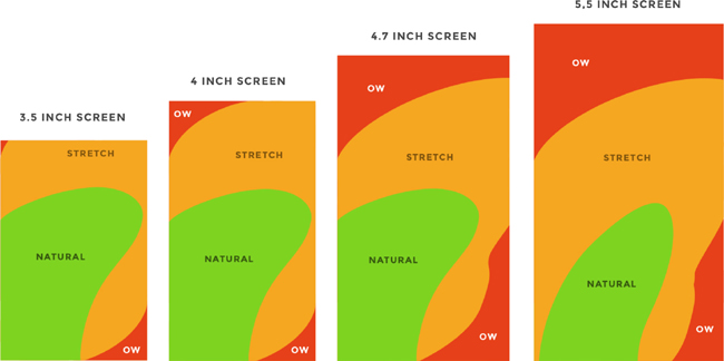
Here’s a more direct comparison of large screens next to each other—4.7 inches and 5.5 inches (Figure 1-38).
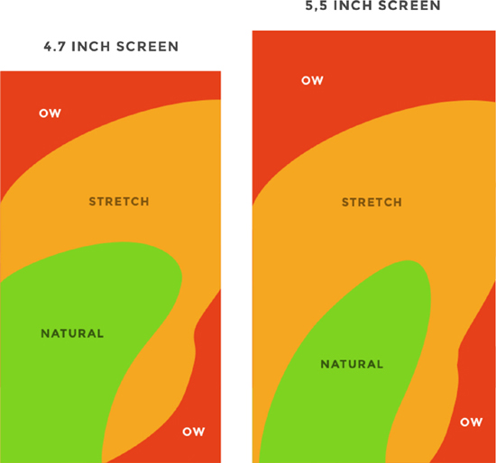
You’ll notice that the “safe” green zone stays roughly the same (more on why the largest screen is different in a second). That’s because our thumbs don’t magically scale with the screen size. And that’s also unfortunate, because I loved Dhalsim in Street Fighter as a kid (Figure 1-39).

But what changes is the sheer amount of “Ow” space, which becomes startlingly apparent with the 5.5-inch screen.
Furthermore, you’ll notice how the shape of the “Natural” zone changes for the largest screen. That’s because it requires a different type of grip due to its size, using your pinkie finger as a stabilizer. It surprises me how different the experience can be with less than an inch of added real estate.
Choking up
Let’s analyze how the Thumb Zones change when you shift your grip. Sometimes you might be in a situation where it’s easier to tap the phone with your thumb’s anchor at the vertical midpoint. This is demarcated by the white dot on the right side of the Thumb Zone mockups.
Here’s an illustration of this in action for 4.7- and 5.5-inch screens (Figure 1-40).
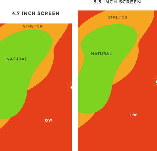
Notice how the larger screen actually gains natural thumb space because of its size. By comparison, the 4.7-inch screen just runs out of real estate.
Thumb-Friendly Interfaces in the Wild
Mobile screen sizes on the whole are becoming more similar, and that’s a good thing. But it also means that we can’t just treat screens above the 4.7-inch range simply as a scaled-up version of a smaller phone. Grips completely change, and with that, your interface might need to do so as well.
But how would that look? Let’s explore a few thumb-friendly interface ideas.
Airbnb
After Airbnb’s rebranding, the home rentals app went through a redesign to place some primary actions near the bottom of the screen. Take a look at the two examples in Figure 1-41.
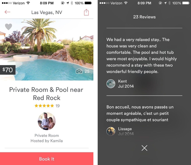
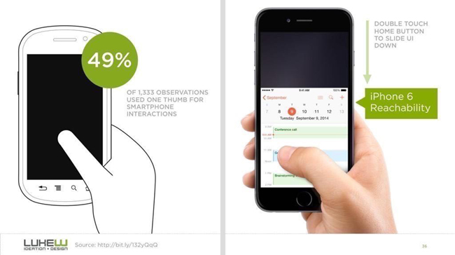
Both screens have obvious primary actions, and they don’t depend on obscure gestures or OS-level controls—like Apple’s “reachability” feature, which brings the top of the screen down into Thumb Zone green territory with the double tap of the home button.
Airbnb, however, does incorporate Apple’s “edge swipe” to prevent needless hand stretching to reach the top back arrow.
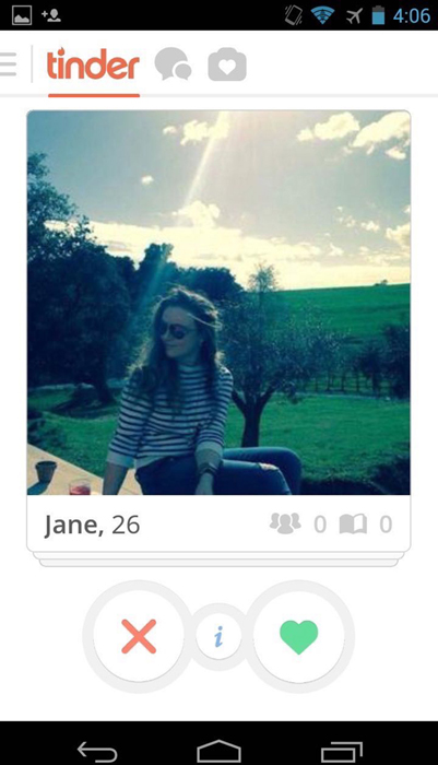
Tinder
Tinder’s primary controls are nice and obvious at the bottom of the screen, and well in the comfortable realm of the Thumb Zone. But what’s even more fantastic is that swiping each card away (both “Like” and “Nope”) lives in the green zone as well (Figure 1-42).
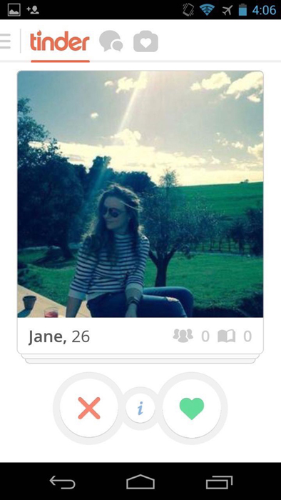
Finally, the app’s been geared to respond to broader swipes for navigation—so swiping between Settings, Discovery, and your matches can be done with one hand. Beautiful.
In the end, placing controls closer to the bottom of the screen when designing for touch is a wise choice. This way, your controls are in reach of natural thumb arcs. And even if your customer cradles the phone with one hand and uses the other as their primary hand, your product will still be optimized for one-handed use. Don’t forget, too, where device manufacturers place their primary controls: Apple’s home button, Android’s navigation controls, and Windows Phone’s back, start, and search all rest at the bottom of the device.
Next up: how to design for an unlimited number of devices and their unique screen sizes, capabilities, and contexts.
Cross-Platform Design
There are now more mobile-connected devices than people on our planet.17 And each device brings with it a series of constraints: screen sizes, input methods, hardware limitations, and more.
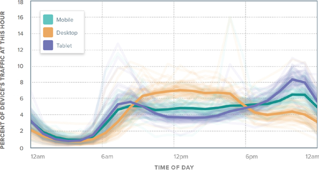
But it gets even more nuanced. We’re using a more diverse set of devices on an individual level (Figure 1-43). In the morning, we might use a tablet, a mobile phone, and a TV. During the day, we might use a laptop, our smartwatch, and the onboard computers in our cars. And at night, we might be back to the mobile phone, tablet, and TV combination.
With the onset of cheap, networked, and largely touch-driven devices, there’s no way that we, as product designers, can predict the future. We live in a world now that already sees networked light bulbs, refrigerators, and toasters. Heck, my electric toothbrush even has a companion app. It tells me when to replace my brush head. Speaking of, I just got a push notification that I’m overdue for a replacement.
So when there’s an endless constellation of devices for which we might need to design consistent experiences, how do we cope? How do we create products that are not only future-proof, but can still destroy our customers’ pain on any device they decide to use?
This was a big question. And so I turned to Benedikt Lehnert, the chief design officer of successful cross-platform to-do company Wunderlist. Wunderlist spans a slew of platforms from desktop to iOS to Kindle Fire, including iPhone, iPad, Apple Watch, Mac, Android, Windows Phone, Windows, and the Web. Wunderlist was acquired by Microsoft in June 2015.
Lehnert had a few messages for us on this topic.
What Do Your Customers Need and Expect?
“We want people to feel that Wunderlist helps them get stuff done and keeps their life in sync,” Lehnert said in our interview. That’s the core task that Lehnert instilled in his product team when setting out to build a cross-platform experience. It’s “the most important thing to formulate, communicate, and instill in your team…how it feels for people to interact with your product.”
Lehnert’s statement reflects the spirit of what we’ve been talking about from the start in not available: your product exists to find a customer, and it stays alive by solving their pains. Living on a new platform doesn’t change this unbreakable rule.
At Wunderlist, everything flows from here. “From there, you start and go into specific UX definitions and spec for each of the functionalities…we want every interaction to be as lightweight (fast and simple), easy (obvious and clear), and fun (delightful and human) as possible. The values that are formulated in our UX vision for Wunderlist shape every decision we make on flows, colors, language, iconography, etc.”
The Berlin-based company—consciously or unconsciously—infuses their product’s behavior on every platform with the things that their customers care about. Speed. Clarity. Simplicity. A little humanity. These are the commonalities a customer can expect to encounter when using Wunderlist, from iOS to Kindle Fire.
What’s Specific to the Platform?
Just because a customer might expect to have a consistent experience with your product across multiple platforms doesn’t mean that you can ignore the specifics of each operating system.
“A cross-platform product experience has to be both consistent with the core product experience as well as the platform paradigms of each operating system,” Lehnert said. “So, as a designer your job is to know and understanding those paradigms in order to navigate your way through them.” Building a product for multiple platforms means that you have to respect the norms. On Android, for example, system controls are at the bottom of the device, versus a single home button on iOS devices. This significantly affects how you approach a product on mobile phones and tablets.
It’s the same with every platform. Designing for set-top boxes? You’ll need to know the capabilities of each remote control or controller—Roku, Apple TV, Google Chromecast, Xbox, PS4, and so on—they each have their nuances. Being intimately aware of these nuances and incorporating them into your product is an essential responsibility of a product designer.
But there’s a limit. “Knowing when to follow the guidelines of the OS and when to break those guidelines in order to ensure consistency across platforms needs a certain level of experience and design mastery,” said Lehnert. Ultimately, we’re building a product for our customers. What are their needs? If the guidelines of the platform for which you’re building come into conflict with those responsibilities, what should you do?
“Whenever we find conflicting interactions across platforms, we try to come up with a better solution,” said Lehnert. “It’s easy to follow guidelines. It’s harder to know when to break them. We want to encourage all developers and designers to question existing paradigms and push boundaries with the end goal of making products easier and more enjoyable to use.”19
One example of this is the pull-to-refresh gesture versus the refresh button introduced by Loren Brichter in Tweetie, and since incorporated into Twitter’s app after Tweetie’s acquisition (Figure 1-44).

This is the perfect example of a UI evolution driven by platform constraints: in Tweetie 1.0, a refresh button would sit at the top of a user’s timeline. This was borne of necessity at the time—Brichter couldn’t fit a refresh button into the navigation bar. For the next version, he sought to correct this. “Why not just make refreshing part of the scroll gesture itself?” he asked himself. And so pull-to-refresh was born (Figure 1-45).21

What Are the Use Cases for Each Device?
The same version of your product isn’t going to exist on every platform. What are people trying to accomplish on their devices? When are they using them? A product that’s tone deaf to these considerations can easily blow it.
I love how Lehnert characterizes this notion. “Wunderlist is a part of our user’s life on multiple devices and platforms every day,” he said. “Our goal is to escalate Wunderlist from mere software to a character, a helpful friend, that is there when our users need or want it. An authentic character that is opinionated and infused with our values and which evolves over time in the way it looks, works, and speaks. That’s what inspires people and makes them fall in love with our Wunderlist.”
He knows the expectations that his customers have for Wunderlist in each unique situation, and they build the product on each platform to meet those expectations. “We want to get a deep understanding of what needs and demands people have in certain situations, and how we can cater the product best to their needs.”
So that’s why, for example, there’s not a full-fledged, bloated version of Wunderlist running on the Apple Watch. Instead, it’s a stripped-down, lean piece of software that tells someone only what they need to know, when they need to know it (Figure 1-46).
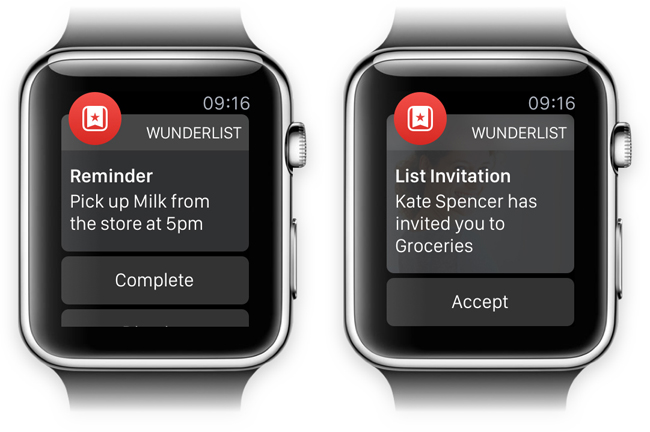
“One of the most exciting things about Wunderlist for Apple Watch is the hands-free experience in situations where you would have had to juggle your phone,” Lehnert wrote. “Whether that’s going through the supermarket and checking items off your grocery list or, soon, using smart voice input to add to-dos for tomorrow’s meeting.”22
Remembering what your customer expects, respecting—and breaking, when it matters—a platform’s paradigms, and understanding the specific use cases of each platform are principles that are going to benefit any product in the coming years. The number of screens, devices, and contexts is only going to increase.
That concludes our exploration of the mechanics of interface design. Let’s review what we’ve discussed and move onto what goes into the psychology of an experience.
Do This Now
- Which pieces of your product’s interface are jolting and scary? Apply the principles of the UI stack to every screen of your user flows. See what you’re missing, and what you can make more communicative.
- Apply the Thumb Zone overlays to your product’s designs. How many of your product’s primary controls rest in the easy-to-reach areas?
- Rethink what you know about layouts. Adapt them to the various devices used by your customer base. Refer to Luke Wroblewski’s excellent “Responsive Navigation” piece for inspiration.23
- It might be worth conducting your own study of your customer base. How do you observe them holding their phones? What’s the context in which they’ll be using your product, and what are their hands doing?
1http://pragmaticmarketing.com/resources/you-cant-innovate-like-apple?p=0#sthash.JmgfLmPI.dpuf
2https://gettingreal.37signals.com/ch09_Three_State_Solution.php
4https://www.useronboard.com/training/
5Jef Raskin, The Humane Interface (Boston: Addison-Wesley Professional, 2000), 5.
6hhttp://clashofclans.wikia.com/wiki/Flammy’s_Strategy_Guides/Total_Newbie_Guide
7http://thegamedesignforum.com/features/acceleration_flow_1.html
8http://www.lukew.com/ff/entry.asp?1797
9Ibid.
10https://speakerdeck.com/mikeyk/secrets-to-lightning-fast-mobile-design
11http://www.uxmatters.com/mt/archives/2013/02/how-do-users-really-hold-mobile-devices.php
12https://twitter.com/lukew/status/510442401736187904
13http://www.cmo.com/content/dam/CMO_Other/ADI/ADI_Mobile_Report_2014/2014_US_Mobile_Benchmark_Report.pdf
14http://www.slate.com/blogs/moneybox/2015/01/27/iphone_6_shatters_sales_records_apple_has_a_great_first_quarter_in_2015.html
15http://www.forbes.com/sites/gordonkelly/2014/09/04/samsung-galaxy-note-4-vs-galaxy-s5/
16http://www.emirates247.com/business/technology/revealed-top-5-most-popular-android-smartphones-of-2014-2014-08-10-1.558896
17http://www.cisco.com/c/en/us/solutions/collateral/service-provider/visual-networking-index-vni/white_paper_c11-520862.html
18Charbeat Quarterly, vol. 1 (Fall 2014), http://bit.ly/1GKe9dq.
21http://www.macstories.net/news/loren-brichter-talks-about-pull-to-refresh-patent-and-design-process/
22https://www.wunderlist.com/blog/designing-wunderlist-for-apple-watch-from-benedikt-lehnert/
23http://www.lukew.com/ff/entry.asp?1649
24http://uxdiogenes.com/blog/on-being-a-designer-and-a-developer-not-quite-unicorn-rare