We are not bad at technology – technology is bad at us
Amber Case covers the principles of designing Calm Technology and explains how they can work to conserve and respect human attention.
 "Seascape, Guarujá," by José Ferraz de Almeida Júnior, 1895. (source: Google Art Project on Wikimedia Commons)
Principles of Calm Technology
The most profound technologies are those that disappear. They weave themselves into the fabric of everyday life until they are indistinguishable from it.
Consider writing, perhaps the first information technology… Not only do books, magazines and newspapers convey written information, but so do street signs, billboards, shop signs and even graffiti. Candy wrappers are covered in writing.

Learn faster. Dig deeper. See farther.
The constant background presence of these products of “literacy technology” does not require active attention, but the information to be conveyed is ready for use at a glance.
…we are trying to conceive a new way of thinking about computers in the world, one that takes into account the natural human environment and allows the computers themselves to vanish into the background.
MARK WEISER, “THE COMPUTER FOR THE 21ST CENTURY”
The Limited Bandwidth of Our Attention
THIS CHAPTER WILL COVER the principles of designing Calm Technology and how they can work to conserve and respect human attention. If there’s one fundamental truth that demands a new approach to technology, it’s this: although the number of alerts vying for our attention has increased, the amount of attention we have remains the same. Imagine if interacting with writing, Mark Weiser’s example of an ideal information technology, required as much active attention as our current technology requires.
Today we face overwhelming information in almost every aspect of our lives. No longer is data something we examine at work—it is part of our homes and our cars, and a constant resident in our purses and pockets. Our social lives, our houses and TV sets, laptops and phones are bombarding us with data constantly.
They are always drawing more attention from us, but our attention is already overdrawn by the devices we have. The reality is this: we are not bad at technology, technology is bad at us. This book is about improving the relationship between humans and technology, saving thousands of hours of development, countless design revisions, and millions of dollars in product loss. This book is meant as a reference for designing objects, both physical and virtual. We need our devices to disappear into our environment more, allowing us to conduct our lives with less technological friction.
This means we need to design toward minimalism and simplicity: the minimum amount of tech means the minimum amount of support. This doesn’t mean the minimum amount of development time! It means instead that the designers went through enough edge cases and “everyday situations” to determine what could go wrong before delivering the products to market, and designed solutions into those products before the initial launch.
If good design allows someone to get to their goal with the fewest steps, Calm Technology allows them to get there with the lowest mental cost. These principles are guidelines to consider when designing technology:
-
I. Technology should require the smallest possible amount of attention.
-
II. Technology should inform and create calm.
-
III. Technology should make use of the periphery.
-
IV. Technology should amplify the best of technology and the best of humanity.
-
V. Technology can communicate, but doesn’t need to speak.
-
VI. Technology should work even when it fails.
-
VII. The right amount of technology is the minimum needed to solve the problem.
-
VIII. Technology should respect social norms.
In this chapter, we will lay out the principles of design in an abstract way; later chapters will go into more of their application in designing technology. We need to learn how to design for the long term, which means writing code that is small instead of large. It means valuing simple systems over complex ones. It means designing technology for generations, not just seasons.
Principles of Calm Technology
The principles of Calm Technology are not hard-and-fast rules. You might find that some principles are more applicable to the specific product or service you are building, and that others are not applicable at all—a fire alarm system, for example, should command your full attention (when it’s alerting you to an actual fire, anyway). Not every tech project needs all eight; principles I through IV might not come into play, while principles V through VIII do. But as we move into a future crowded with new environments and edge cases, with unpredictable connectivity, more and more categories of product are going to benefit from these principles. And keeping these ideas in mind when making early design decisions could well reduce usability issues you encounter when products first launch.
I. Technology Should Require the Smallest Possible Amount of Attention
As we’ve already discussed, attention overload is now the single biggest bottleneck most technologies face, and the strongest argument for making technology “calm.” The more things you have to pay attention to, the less mental space you have available for actually getting things done, and the more stressful those interactions are going to be.
Ideally, technology should allow us to shift our attention to it very briefly, get the information we need, and shift back, letting us attend to more things in our environment without being overwhelmed. When building technology, we should strive to communicate information to the user without interrupting or distracting them from their primary goal.
When you sit down in front of a workstation, your primary focus is on the machine in front of you, and nothing else. And while this works well for the increasingly narrow slice of technological interaction that is strictly productivity-minded, it’s a terrible paradigm for the massively parallel, mobile, multiplatform environment that most of us inhabit today.
Today we have enough mobile technology making demands on our attention that it is literally impossible to interact with everything as if it were a desktop device. And it’s not necessary: the fact is that most of what we use technology for doesn’t explicitly require our full attention, and if it does, it doesn’t require it for long. Sitting down, booting up a machine, loading a mail program and clicking on your inbox just to see if anyone sent you a note made sense in 1999, but today it makes about as much sense as sitting someone down in a dedicated conversation room just so you can say “hi.”
Attention is still not a widespread consideration in design, because it wasn’t nearly as crucial an issue in the desktop computing era that defined so much of what we know about human–computer interaction. Most technology right now is still designed like a desktop machine, to some degree. It forces you to focus all of your attention on it in order to receive any useful information. Unlike an oven or a teapot, it makes use of visual feedback on screens instead of tones or other audio-based alerts, making it difficult to do other things at the same time. We take for granted that you can set an oven to preheat and then walk away, but imagine if you had to stare at it the entire time!
A lot of our connected technology doesn’t “just work” right out of the box, despite the advances we’ve made in recent decades. It must first be hooked up to a network or Bluetooth. It may need an update before it even starts, and then additional updates almost continually, each requiring you to break from your task or retrieve pieces of information, and often changing the user interface without your permission or knowledge, forcing you to relearn the application all over again.
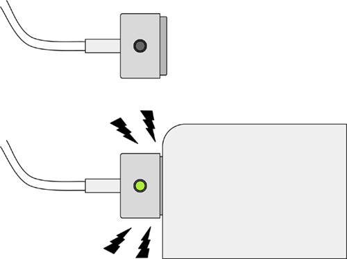
The power cord for a MacBook doesn’t need an interface to tell you when it is charging; you can open the laptop and see the indicator on the screen, but the charging indicator is built right into the cord (see Figure 1-1). In this case, the visual display is the secondary information system of the product (the primary one is the light indicator). You can get more information from the display, but the single most relevant and useful piece of information is available at a glance. Consider doing away with an interface or screen entirely, replacing it with physical buttons or lights.
A video camera utilizes a very small light to show whether the camera is recording or not. The light is off by default, but when it’s on, it tells both the user and the subject that recording is taking place. Google Glass didn’t have one of these indicator lights for recording, leading people to be unnerved by the tech. When it’s uncertain whether something is operating—especially if it’s recording information—people tend to assume that it is.
Light is not the only alert style you might use. We’ll get into a complete catalog of indicator types in the next chapter, but think about audio. Sometimes it’s more informative to use a buzz as an alert, or a calm tone. Consider the environment in which the technology is likely to be used. Is it noisy? Crowded? Will the user be constrained from looking at the device? Think about using vibration when the user needs an indicator, but nobody else does. They’ll be likely to feel the vibrating device, even if the environment is noisy.
Conversely, will the device be used in a calm, quiet environment? Use a calm tone to indicate status without unnecessary disruption, but at the same time, take advantage of the quiet in order to carry the message across. This kind of alert works well on a washer or dryer in a home: loud enough to be heard unambiguously in other rooms in the house, but not shrill enough to disturb the peace.
II. Technology Should Inform and Create Calm
Have you ever wondered whether something was done or not? How far you are into a road trip? If the oven is preheated or not? Whether a team has scored another point in a game? Calm Technology can answer such questions by giving you information in an unobtrusive way.
Don’t think of “look at me, I need your attention,” but rather “this task is done,” “this person is here,” “this person is on their way,” or even “your Uber is arriving now.” Technology can create calm by letting you know definitively that a system is functioning correctly and all is well. The calm comes from knowing that you will be alerted at the appropriate time if something needs to be addressed.
The Uber example is especially useful, because it cuts down on the uncertainty of when the Uber is going to get there. You call, put the phone in your pocket, and forget about it; the app buzzes when the car is approaching. In a similar way, the “your package has arrived” message from Amazon is helpful for letting you know it’s time to go home and pick it up, or that you should look out for it when you get home, or simply to open the front door.
In fact, most information that comes from devices can be presented in a calm way. This is just a matter of good design. Don’t believe me? Think how much free-floating anxiety you could avoid with a simple system that accurately indicates that your whole complex system is running just fine, so you actually don’t need to worry about it until it tells you it needs attention.
Think of how many things in your life just happen without you noticing: water when you turn on the faucet, the lights when you flip a switch, the realization that a friend is online given by a green indicator in Skype or Google Chat (Figure 1-2). All of these are technologies that are calm because they have evolved to work with us in our everyday lives with the least amount of friction.
A shrill alert yanks you out of your current task and requires you to refocus attention on something new. Sometimes experiences should be uncalm and unnerving, like a fire alarm or a tornado warning. These are designed specifically to change your tempo—they interrupt so that you can get out of the building. They interrupt your life for the purpose of saving your life.
Before you design a notification, ask yourself where the person will be using the product or service. How does their environment come into play? Is the environment quiet or loud? Is it public or private?
Then you’re ready to ask how the technology will communicate. Is there a way you can inform the user without distracting from their primary focus? Also ask what might happen if the primary alert fails. Can you design an alert with redundancy?
All of these considerations add to your task as a designer. But properly done, design will remove the burden of tasks from the user, which is the goal of Calm Technology.
III. Technology Should Make Use of the Periphery
A calm technology engages both the center and the periphery of our attention, and in fact moves back and forth between the two.
MARK WEISER AND JOHN SEELY BROWN, “THE COMING AGE OF CALM TECHNOLOGY”
A calm experience is when you’re performing a primary task and an alert shows up in your periphery, like the dashboard light indicating you need to fill up the gas tank, or the one telling you you’re too close to the side of the road. Indications like these improve or inform your primary task (in this case, driving) and give you a sense of calm while you do something else. A calm experience does not demand your full attention.
The periphery of our attention is important because we can’t focus our attention on many different things at once. We have high-resolution perception in front of our faces, directly in line with our vision, and that resolution degrades as we move off to the sides. We can, however, hear sounds, see shapes, and feel objects without having to directly look at them. The focus directly in front of us is limited to our sight and sometimes our touch, but there are many more layers to our spectrum of perception than just sight.
The truth is most of the information we need from technology doesn’t have to be high resolution to be useful. When a technology forces a low-resolution update into the high-resolution space of your full attention, it wastes your time, attention, and patience. This is why it’s crucial, when building a piece of technology, to consider whether the update you’re trying to get across is actually a high-resolution or low-resolution one. Does it require the user’s whole attention, or can you get it across with a lower resolution alert type?
Driving is a prime example of this principle in action. Over many decades, we’ve evolved the car driver’s environment into a complex, multisensory, largely peripheral interface. Honks are sound; the vehicle moving forward is something we feel, as are the pedals we use with our feet, without having to look at them.
We see lights turn red or green, or stop signs and other road signs right in front of us because they are the punctuation of traffic and require our attention. But we can still sense where cars are around us. The mirrors in the vehicle help us glance at our periphery to see cars behind and to the sides of us, allowing us to get relevant information without having to stop our primary task of watching the road and controlling the car.
Lights that tell us about the engine turn on only when relevant. They are not on all of the time. We can switch on a turn signal while driving or turn on the stereo simply by feeling for it. Using touch, sound, and peripheral vision opens up our sight to focus entirely on the road while doing secondary tasks in our periphery.
A vehicle, a teapot, a washer/dryer have all evolved over time to meet our needs. They work with us and we work with them in the periphery. But new devices, such as smartphones, have become part of our everyday lives but haven’t yet learned to be calm or quiet. Just like the desktop computers of the ’80s, they frequently demand our full attention, distract us, beep at us, and don’t make use of the periphery.
A useful way to think of this is to decide whether your technology is a primary goal or task, or a secondary task during the pursuit of a primary goal.
The group messaging software known as Slack (https://slack.com) got its start as part of an online game called Glitch. It was originally designed not as a standalone app, but as an integrated chat interface that allowed people to communicate while playing the game. Ironically, its origin as a secondary tool may be what has made Slack so successful. Because it was never intended to take up your full attention, it was designed from the start to work well within an environment where the user’s focus is directed elsewhere.
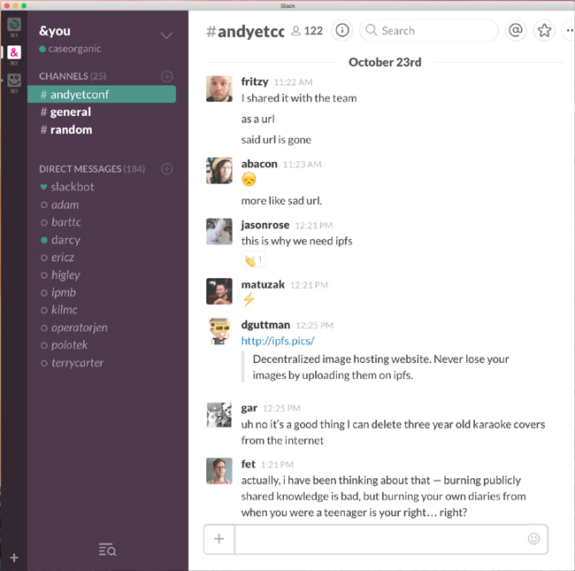
The Slack interface dashboard communicates things like active users and unread channels through subtle cues like colored dots and text that toggles between bold and standard typeface (see Figure 1-3). When running in the background, it announces new messages via a small blue dot on its desktop icon. When it gets disconnected, it simply turns your text box yellow while reconnecting, rather than interrupting you with a pop-up box or text message.
A lot of talk in recent years about learning interaction techniques from game design focuses on features like leaderboards and reward medals. As Slack indicates, one of the great contributions of game design to productivity software has been an improved ability to get secondary tasks out of the way of the primary one, whether it’s shooting goblins or writing code. In Glitch, the primary task was to play the game; communication was secondary, but necessary. An office environment is exactly the same. The primary task should be work, and communication secondary.
As we get more and more devices making demands on our attention, we find it more difficult to get primary tasks done. We go online to respond to an email and get distracted by a Facebook message, text message, or article.
User interface researcher Antti Oulasvirta and his Finnish collaborators created what they called the “Resource Competition Framework” to describe the results of attention disruption on completing tasks. They discussed how competing information technologies forces users to switch back and forth between tasks and external sources, temporarily leaving the switched-from tasks on hold or slowing them down.3 For instance, a cell phone user sitting at a dinner table down the street might try to participate in the conversation of stablemates, but might find themselves frequently interrupted. A person trying to finish writing a work email might get distracted by a smartwatch alert.
Attention models
Assuming not every piece of information goes to the periphery, then, how do we prioritize? What goes where? The answer lies in delegating primary, secondary, and tertiary attention. Primary attention is visual and direct—namely, the attention you might pay to the road in a car, or the attention you might pay to a desktop computer. Secondary attention is more distant—the attention you pay to auditory signals or vibrations that do not need to be directly focused on in order to be felt. Tertiary consists of peripheral attention such as distant sound, light, or environmental vibration. In a vehicle, primary attention is on driving, so the windshield of the car must be the primary focus at all times. The secondary information is in the rearview mirrors and side windows, as well as the feedback from the gas and brake pedals, the speedometer, and any status lights on the dashboard. The blinker function, radio, radio dial, and emergency light function all communicate tertiary information. In some cases, secondary or tertiary information might include the in-vehicle direction system.
The following tables can help you understand how a piece of technology engages your attention. For instance, in the model shown in Table 1-1, the secondary attention channel is filled with audio, but there is still room for ambient sound.
| Primary | Secondary | Tertiary |
|---|---|---|
|
Unused |
Audio |
Unused |
In the attention model shown in Table 1-2, the primary focus is on the visual screen and touch navigation; the secondary proximal understanding of where you are in space is diminished, and ambient information around you is diminished or blocked. This is why someone can walk down the street while texting on a phone and almost walk into a wild bear (https://www.youtube.com/watch?v=QCAntD1-DIk), as a California man did in April 2012.
| Primary | Secondary | Tertiary |
|---|---|---|
|
Visual screen and touch navigation |
Diminished |
Diminished or blocked |
The attention model for driving is shown in Table 1-3. In this model, the attention is paid to oncoming traffic and traffic signals in the front window. This is why it is difficult to talk while driving, especially while merging onto a highway ramp. Your attention is almost entirely filled up with the primary and secondary channels.
| Primary | Secondary | Tertiary |
|---|---|---|
|
Front window and general awareness of vehicle in space |
Rearview mirrors, side windows, brake and acceleration pedal |
Radio buttons, conversations with other people in the vehicle |
Expanding on this, Table 1-4 shows the attention model for cell phone use while driving. In this mode, the primary, secondary, and tertiary information channels are consumed by the cell phone screen. The context shift takes precious moments away from driver responsiveness, making it difficult to adequately respond in time to prevent accidents or notice green lights or oncoming traffic. It is worth noting that the advent of automated cars will usher in an era of greater safety on the road. Individuals will be free to use phones while driving, as their primary focus will no longer be on the road but on the content in front of them. Automated cars will, in general, be much more capable drivers than humans, even when we are not distracted by something specific like a cell phone.
| Primary | Secondary | Tertiary |
|---|---|---|
|
Visual screen and touch navigation; blocked: front window and general awareness of vehicle in space |
Blocked: rearview mirrors, side windows; diminished attention to brake and acceleration pedal and street lights |
Blocked: conversations and entire outside world diminished or blocked |
Attention graphs
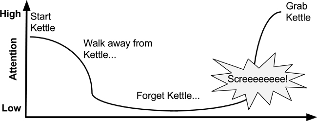
We can also introduce the concept of an attention graph. An attention graph can help you identify or plan out how a device captures attention over a period of time. Figure 1-4 illustrates the example of a teakettle. The attention is relatively high when the kettle is being set up, but diminishes when the user walks away from the kettle, and eventually the kettle is forgotten. When the kettle shouts, all attention is drawn to the kettle’s state, and the user runs to pick it up.
Our daily tech-saturated lives increasingly resemble the act of driving: there’s a single, central task of crucial importance, but dozens of small, occasional supporting channels around it. Or perhaps, modern life is dysfunctional in part because it is more like trying to drive many cars at once, all of them pulled in their own separate directions and requiring lots of separate, individualized attention and product updates. Vehicle design has a lot to teach us about identifying and prioritizing primary and secondary tasks. Does an object require all of your attention to be focused right in front of you, or can you pay attention to it in the periphery? Acquiring a good understanding of peripheral attention is essential to designing calm products. We’ll go over how to use the periphery in more detail in not available.
IV. Technology Should Amplify the Best of Technology and the Best of Humanity
One of the hallmarks of poorly designed systems is that they force the human user to act like a machine in order to successfully complete a task. Machines shouldn’t act like humans—at least, not in the current design environment that lacks the framework to effectively integrate “humanness” with devices—and humans shouldn’t act like machines. Amplify the best of each, without expecting them to do each other’s jobs. “Affective Computing” (https://en.wikipedia.org/wiki/Affective_computing) involves studying and developing devices that can “recognize, interpret, process, and simulate human affects.” The term was first introduced in 1995 by Rosalind Picard, professor of media arts and sciences at MIT. We’ll say more about affective technology soon.
Think of the automatic faucet that turns on the water for you, but requires you to hold your hands in a very narrowly defined location during the entire process of washing—something few humans naturally do.
The best technology, on the other hand, amplifies the best parts of both machines and people. It never crosses their roles, or forgets who is who. All tech is designed by people at some point. The responsibility is on us to make it not just more efficient, but more accepting of the humanness of its users. A person’s primary task should not be computing; it should be being human.
Being human means seeking food, fun, and social connection. It means improving the local environment, participating in the community, meeting or finding friends and family, participating in rituals or festivals. It means finding, creating, and performing meaningful work; learning constantly; and developing skills. Humans are problem solvers, but we also feel pain, love and friendship, jealousy, fear, happiness and joy. We feel a sense of accomplishment when we achieve our goals. We study religion and history, and ache for belonging.
We are also the ones who create the next steps in a field—something technology, by itself, cannot do. A machine can run a piece of code and even evolve that code if a human programs it to do so, but the human specialty of jumping a layer of abstraction and coming up with an insight that changes the fundamental way we do things is something that is unpredictable.
We have a history and a set of skills that we’ve developed in response to our culture and our environment. Humans understand context. Computers cannot understand context unless humans train them to. Originally the problem of teaching a machine to identify an object was thought to be a trivial task, but decades later it remains one of the most difficult problems in machine learning. Humans are still the best at object recognition, and machines can take those human insights and index them in order to make them available to other humans.
No matter how much human knowledge is put into a computer, it will never have the same needs as a living organism. It won’t seek friendship or experience hunger, need to pee or clean itself. It doesn’t care about its environment as long as it’s able to function. Computers don’t form families, or hang out in groups.
During the ’90s, my father worked on voice concatenation systems (combining individual prerecorded words to create meaning) for a large telecom company in the Midwest. His task was to build a digital directory assistance system that allowed people to call a number and have an automated voice respond to it. First he worked with voice talent to record hundreds of thousands of words and phrases. Then he worked with linguists to stitch the words together so that text could be read back in a smooth and human-like way.
I used to sit at the dinner table and discuss artificial intelligence for hours with my dad. He didn’t like the idea of artificial intelligence, and insisted on reading me bedtime stories from a pair of books called The Evolution of Consciousness by Robert E. Ornstein and Naturally Intelligent Systems by Maureen McHugh.
When my dad and I discussed voice recognition and automated systems, he would always point out how difficult these systems were to build: “Computers don’t have human forms. They don’t grow up,” he told me. “They don’t understand what it’s like to walk outside into the sun, or feel grass beneath their toes. They’re a brain without a body. Because of that, they don’t understand things the way that humans do. The best thing computers can do is to connect humans to one another.”
What this ultimately got me to realize was that no computer can understand humans as well as we can understand one another. Therefore, the best interfaces don’t connect us to technology; they connect us to other people. Google is indispensable not because it provides all the answers, but because it connects us to what others have discovered or written—and they have the answers. The Google interface itself is almost invisible. We don’t look at it; we look at the search results. Google Search doesn’t try to act human—it helps humans to find one another.
Google Search is an example of a system that amplifies humanness and makes the best use of a machine. You can think of it as a switchboard connecting humans to humans, through a series of bots that index the majority of human digital knowledge. Without bots indexing data, we could never find anything. Google doesn’t determine the best result for us, but it does give us a series of results we can choose from, prioritized by their importance to other humans. From a given list of results, we can then understand which ones best pertain to our problem. The bots themselves only index human knowledge and help with the search results; they do not choose the result for us.
Mouse inventor Douglas Engelbart defined “augmenting human intellect” as the use of technology to increase the capability of people to be able to better approach complex problems and situations, to gain knowledge to suit specific needs, and to finally derive solutions to problems.4 The lesson for designers and engineers is to focus on optimizing your technology so that it amplifies the tasks that humans are better at that machines; tasks like curation, working with context, understanding, being flexible, and improvisation. A computer can’t truly understand or curate, and once it’s been programmed, it’s relatively inflexible. The better a system supports humans to do these things, the better the result!
These may seem like obvious differences, but they’re worth acknowledging explicitly as we decide how to design the interactions between these two very different intelligences.
Designing affective technology
We know how to make products that are easy to use and understand. But what about emotions? What about designs that delight? What do we know about how to produce an emotional impact?
DON NORMAN, AUTHOR, PROFESSOR, AND COFOUNDER OF NIELSEN NORMAN GROUP
Technology that is closest to interacting with humans as fully socio-emotional humans is affective technology. If we said before that we are not bad at technology, technology is bad at us, then affective technology is one of the most exciting opportunities for technology to be good at us, even including our socio-emotional “programming.” It designs interfaces that account for human concerns such as usability, touch, access, persona, emotions, and personal history. This approach to devices can be exceptionally low-friction (if well designed), and not only respects humans’ limited amount of attention, but actually rewards it positively through constructive emotional reinforcement from the technological device itself. The principles of affective technology represent a significant step in making an Internet of Things that is responsive and helpful to humans.
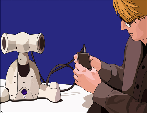
In Japan and elsewhere, many residents of nursing homes for the elderly seek companionship, but find none. Real companion animals are expensive, and difficult to feed and toilet train. Paro, shown in Figure 1-5, is a robotic companion in the shape of a baby harp seal. The robot has a touch sensor for petting and a light sensor for lightness and darkness in the environment. Posture and temperature sensors detect whether it is sitting on someone’s lap or bed. Paro also has a direction-based auditory sensor to detect greetings and its own name.

Paro can be trained to increase or decrease a certain behavior by remembering whether it is stroked or punished for a specific action. The soft, robotic animal responds to interaction as if it were alive, by moving its head and legs and emitting the voice of a real baby harp seal. Paro is well loved in Japan. In addition to being the subject of a number of research studies proving its helpfulness, it is now a mainstay in many Japanese assisted living centers, and is especially helpful for residents living with dementia and depression. Paro provides animal companionship without the maintenance, and has a robotic body that universally responds to touch.
Affective technology can work with the needs of people and create experiences of delight. Delight is something that can be achieved when the needs of humans and the interaction of technology are matched up. In some cases, counter to what we said about non-affective technology in the previous section, it can work as a stand-in when a human resource is not available or nearby.
Guy Hoffman, now co-director of the media innovation lab at MIT, was inspired by the animation of the Pixar lamp to consider just how emotion could be built into robots and objects. He noticed that existing robotics possessed jerky and uncoordinated movements; it was difficult for people to identify with them. He strove to create robots with cleaner, more friendly and more “human” movements. Going to animation school and studying acting, he was able to build in more emotive reactions and “soft” movements into the robots. People interacting with them identified with them(as we do with anything properly anthropomorphised), finding them to be engaged, happy partners to work with.
V. Technology Can Communicate, But Doesn’t Need to Speak
One of the most common, and most vexing, examples of technology trying to emulate humans is the disembodied voice. As voice-based interfaces become more common, it’s worth addressing the problems with voice interaction specifically, which is why it gets its own Calm Design principle.
A couple of years ago, I had a conversation with one of the cofounders of Siri. We talked about how Siri was “trained” on a Californian English vocal pattern and accent, because that’s where Siri was designed. Within minutes, Siri’s cofounder started showing me videos in which Siri completely fails to understand users, despite them lacking any trace of an accent that differs from Siri’s own. This kind of experience can be uniquely frustrating for users, because it forces them to modify their own behavior for the benefit of a machine, but the machine is only demanding such contortions because it’s trying to “communicate like a human.” Making a computer speak like a human without instilling it with a sense of human context or relationships ultimately leads to a sense of dissonance in the person using it—exactly what affective design is seeking to remedy.
Siri is still considered a failure by some groups because it was advertised as having far more accurate capabilities than it turned out to have. We’re accustomed to hearing computer voices in movies, but movies have post-production. They are polished and cut to look perfect. Real life doesn’t work that way. Many of us have been led to believe we can have computers as accurate as the ship’s computer in Star Trek, but that voice is a carefully scripted plot device intended to help bring the computer to life in a way that looks (and performs) better than text on a screen. The computer voice lets the device be a part of the action instead of a simple terminal. When we watch these films, we get used to the idea of talking to a computer, even though the idea of human–computer communication relies much more on context than we realize.
One of the biggest draws for robotic voice systems is the idea that they could anticipate our emotional and physical needs without judgment. They could be our faithful servants and provide unwavering emotional support. And while there are some examples of Japanese virtual boyfriend and girlfriend systems, as well as the virtual chatbot psychologists of early days, the best way to train an AI system is by connecting it to human context. The Google Search engine does this well. Google uses bots to index content created by people and provides suggested search results. In the end, it is the human that decides what site is more relevant to them. Google just does a bit of the heavy lifting.
Voice interfaces rarely work, for the same reason that visual interfaces at the center of our field of vision rarely work (Principle II): they both require the majority of our limited attention. As we discussed in Principle II, the path to calmer interaction is primarily about presenting information in parallel, and matching the information density of the interaction with the channel through which it communicates.
A user interface requiring all of our visual focus distracts us from doing anything else. An interface that requires our complete auditory focus (or perfect enunciation) is equally distracting. In the absence of audible interfaces, consider making use of tones or lights or sensory stimulation to get the point across.
Voice recognition works best in a quiet environment, but most environments are not quiet. I once watched a woman get frustrated while attempting to use a voice-recognition system at a kiosk in an airport. Halfway through the automated menu, the noise of her kids, combined with the background noise of the airport paging system, threw her back to the beginning of the menu, interrupting her progress and forcing her to do it all over again. An auditory-based machine on a busy street faces similar problems.
Or take the example of a parking ticket machine that uses a prerecorded human voice to communicate. First, it speaks in a slow, disjointed voice that’s more disorienting than helpful. Second, it takes your card but offers no feedback of whether the transaction went through. Third, if nothing happens, there is no call button to ask for help from a person, and no person nearby. People get stuck in parking lots this way—a deeply disconcerting experience that puts the user, not the machine, on pause (the next principle addresses this issue directly).
Human voice, then, should be used only when absolutely necessary. Introducing a voice creates a variety of new issues: the need for stringing together words in voice “concatenation,” the near certainty of misinterpretation, or the accent issue that Siri so clearly demonstrates. Human voices must also be translated into multiple languages for accessibility purposes, while a simple positive or negative tone, symbol, or light can be designed in a way that’s universally understood.
Instead, create ambient awareness through different senses. Use a status tone instead of a spoken voice. Use a buzz instead of a voice-based alert. Use a status light instead of a display. If done well, a simple light or tone can clearly convey information without forcing users to pay all of their attention.
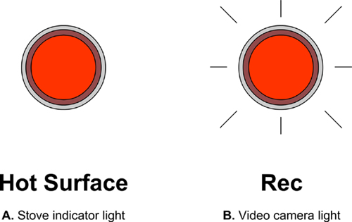
One example might be the light status indicator you find on a convection stove after the stove is turned off, but the surface is still hot. This indicator is not necessary on gas stoves, as the burners quickly cool down when the gas is turned off. Another example is the recording indicator light on a standard video camera.
Many of us remember the brief period in the 1980s when several car makers, led by BMW, started putting voice alerts in their cars to convey extremely simple messages. Suddenly, showrooms around the world were full of luxury cars saying, “Your door is ajar! Your door is ajar!” every time you left the door open. Consumer response was swift, strong, and decidedly negative—nobody wants to be lectured by their car, and a speaking voice is overkill for such a basic piece of information. BMW switched to a gentle, wordless tone the following year, other makers followed suit, and now the talking car door is just a footnote, and the subject of a handful of ’80s-era comedy sketches.
Getting the alert tone right takes careful consideration. There’s no question that our day-to-day technological lives are currently filled with too much beeping and buzzing, but this is largely a result of how those alerts are designed. It’s still rare to find an audible alert that uses a calming tone. Most are sharp and distracting—a result, most often, of the hubris of designers and engineers who believe that their technology’s alert is the most important thing in the user’s environment, so it must be unmistakable. But getting a loud buzz for every email, status update, and news item quickly makes every buzz meaningless. Strive to match the urgency of the tone with the urgency of the alert, and recognize that many pieces of information aren’t time-sensitive enough to need one.
The Roomba robotic vacuum cleaner, for example, emits a happy tone when cleaning is complete, and a sad tone when it gets stuck. The tone is unambiguous but unintrusive, and needs no translation. Additionally, a light display on the Roomba shows green when clean and orange when dirty or stuck.
Where does voice interaction make sense, then? Under certain controlled circumstances, where it’s reliably quiet, where the task is simple, or where a tone doesn’t convey enough information. Also, where there are clear benefits to not having to look at or touch your device. Turn-by-turn interactive directions while driving are the most common and most successful example of this kind of interaction.
A car is a closed, quiet, and controlled environment. Driving directions follow a very consistent format, but differ in content every time. More important, driving is an activity that demands complete visual attention, making a strong safety case for voice interaction. Audible driving directions aren’t chatty or quirky; they provide a secondary focus that can help someone reliably get to a destination without being distracted from the road. A vehicle is a realm in which the user’s humanness isn’t really at stake in the same way, so ignoring social and emotional cues is perfectly acceptable. It seems to be a principle of parsimony, or “minimal technology.”
Smartphones that use voice interaction successfully also take advantage of pre-inputted information—for example, learning what address constitutes “home,” then letting the user simply say “give me directions home” and resolving it to the address.
We’ve already talked extensively about using the periphery to convey information in parallel. But if you have three types of peripheral notification—visual, haptic (“related to touch or proprioception”) and audible—when do you know when to use which?
The answer is context.
Where is the tech going to be used? Is it a loud environment? A quiet one? A messy one? A dark or light one? If it’s in bright sun, the user might not be able to see an indicator light. If it’s a personal notification, a haptic notification might be the most appropriate. Haptic notifications can consist of anything that involves a sense of touch, including texture, braille, vibration, electricity, or temperature. A haptic alert can be very useful for personal notifications, as touch has the greatest proximity of any alert. A haptic alert can be configured to allow just one person to feel it, especially if it’s a personal device worn on the user’s body. A calm alert is almost always better than a sharp one: a haptic buzz doesn’t have to be intense, a light doesn’t have to be blinding, and a tone doesn’t have to be obnoxiously loud.
Sometimes having two notifications is useful, as it increases the likelihood of the user noticing it without demanding their full attention.
As a primary notification method, simulated human voice has many downsides. Sometimes, it is justified and necessary, but often it can be replaced by something simpler, calmer, and more appropriate. Think very hard about why you might need to put a human voice into a product, and first consider if any of the other alerts described in not available might be more appropriate. If there’s a better way to do it, don’t hesitate to change how the product communicates with the user!
VI. Technology Should Work Even When It Fails
An airplane whose engines have failed defaults to a glider. On the less catastrophic side of things, escalators are more resilient than elevators because they revert to stairs when they stop working.
This mindset should govern the design of technology as much as possible. Designers and developers tend to focus their efforts on the use cases that they foresee as most common, putting tremendous thought into how they might make these cases work faster and more smoothly. This is necessary and admirable, but it does little to address the cases when failure is most likely to occur.
The edge cases are where things go wrong. When users try to do something unusual with the technology, or get to an outcome without going through all the correct steps, that’s when failure tends to strike, and calmness disappears.
There’s a strong temptation for designers and developers to shrug these cases off, either because they’re too rare to address, or the result of a user that’s “too dumb,” but the fact is that everyone is an edge case at one time or another. Sometimes it’s because they’re just learning the technology, and don’t realize exactly what’s expected of them. Sometimes they have an unusual need and they’re trying to stretch the tech’s capabilities. Sometimes—as in the example discussed in “The False Alarm That Wouldn’t Stop”—it’s not their fault at all, and they’re just trying to deal with a rare but unpleasant exception.
The problem with edge cases is that their impact far outweighs their frequency. Hue is a lighting system developed by Philips that gives users unprecedented control over the lighting in their homes, through a well-designed app that governs a system of adjustable-color LEDs. When it works—which is the vast majority of the time—it’s quite magical, and the setup and installation are surprisingly straightforward. But in 2014, if you asked Hue owners about their systems, most of them would probably tell you about the time that it crashed, leaving them with a house full of lights at full brightness, and no obvious way to turn them off.
A bug in the most recent automatic firmware update was the culprit, and once alerted, Philips did a decent job of rushing the patch in…but try telling that to a family trying to go to sleep in a fully lit bedroom.
In fact, there was a temporary fix: you could simply turn the lights off at the wall switch. But many users, accustomed to controlling their lights via the app, didn’t realize this. Philips eventually announced the fact via the Hue Twitter account, and apologized profusely, but the damage had been done. Thousands of users were left with the uneasy feeling that the lights in their house could crash, and Philips has struggled to rebuild the faith ever since.
What the designers should have done was anticipated this edge case, and built language into their marketing materials. When a user is untrained for what to do during a technology failure, confidence in a product can shatter.
We, as humans, hate bumping up against these kinds of gaps in the user experience because they lay bare the difference between people and machines. People have a built-in capacity for flexibility and empathy, and machines don’t, so “crashing” is about the least human thing a piece of technology can do.
When you design, put yourself in the shoes of your users—not just the competent, experienced users doing the thing you want them to do, but the users just figuring it out, pushing the edges, or dealing with a bug. A simple “off” switch can work wonders. So can a fallback mode that offers less functionality but easier access to the basics.
In general, though, the key to dealing with edge cases is providing redundancy. Make sure your system can still work when a portion of it fails, and give users a choice of options for getting crucial tasks done. Designing and building multiple parallel action paths may not feel like the most efficient solution, but then, neither is training jet pilots to fly a glider.
VII. The Right Amount of Technology Is the Minimum Needed to Solve the Problem
Perfection is achieved, not when there is nothing more to add, but when there is nothing left to take away.
ANTOINE DE SAINT-EXUPERY
All products might begin as a simple idea, but bringing that idea to life involves a series of complex processes and design decisions. Designing a simple thing often requires a complicated process.
A product that utilizes the right amount of technology becomes invisible more quickly, which is a hallmark of effective Calm Design. When a product works with us in our existing environment, and fits into our existing workflow, we begin to ignore it, or take it for granted. This may sound defeatist, but the alternative is far worse: using poorly designed tech is like solving a story problem every time we use it. It requires us, the users, to adapt to clunky technology and find the features we actually need to use.
But while good technology is often simple, a good design process almost never is. Good designers aren’t afraid of working through all the tiny details and all the edge cases they can conceive, removing unnecessary features until there is nothing left to take away. They design with the fewest number of components, because more features make for more failures, and complex systems leave more room for security faults.
For hardware products, good design means fewer things that can break, easier assembly, and fewer failed units. It means less physical tech support, shorter onboarding, and a more beloved product. Each new feature must be developed, tested, explained to the market, and then supported. It must also be updated when underlying systems change. Add a feature only when absolutely necessary.
Dieter Rams famously said that “good design is as little design as possible” many decades ago, and designers have been quoting him ever since. So if we all know it and agree with it, why are we often so reluctant to actually deliver on simplicity?
In part, it’s because of speed. It’s often faster to build a feature-laden product than a streamlined one, because adding something new without evaluating what’s already there is a fairly straightforward process. Complexity is also a management issue. We often empower managers and directors to add features, but very few people have the authority to take them away.
In the digital world, complexity also arises out of conflict between legacy systems and newer technologies. We may try to use a new programming language that everyone’s talking about, but we don’t take into account that it, too, will be legacy one day, and that the designers who work on the next iteration will be reluctant to deal with the “old” code, just as we are today.
Every product starts out complicated. Life is complex, reality is complex, and you’re no longer designing for a desktop sitting in a simplified, isolated bubble. When your product is competing with many others in an unpredictable environment, you must design for a complex system. This means abstracting the insights gained from your research and the concepts developed in your design process so that the user is left with the simplest possible product that can be used. This doesn’t mean doing the user’s tasks for them. It means empowering the user to get to their goal with the least amount of attention.
What problem does your system solve? For each new feature, ask yourself, is this something necessary to the product? Not fun, but necessary. If it doesn’t solve a core problem, don’t build it. Even if managers and stakeholders get in the way, you can always have them answer these core questions.
The technology in our homes offers a good example. Home technology systems include many components—lights and switches, outlets, breakers, major appliances, heating and cooling systems, etc.—and they all work pretty well. Everyone basically knows how to use all of the components (even the more exotic ones, like dimmers and fan controls), and can adjust them to their needs. This is largely because interfaces are fairly obvious, and provide direct feedback on the outcome, whether it’s a light coming on or a kettle getting hot. It’s also because the systems are extremely standardized: practically any homeowner can quickly figure out any house.
There’s much more behind the scenes. Home wiring diagrams can become very complicated, very quickly, which is one of the reasons electricians have to go through long periods of training, apprenticeship, and accreditation before they’re allowed to work on your home. That complexity, though, is designed to ensure safety and reliability, and to minimize additional interaction demands on the user.
But suppose you want to control your lights using a remote control, or your phone. Perhaps you find an exciting new system on Kickstarter that you want to fund, or maybe you buy some Hue lights and install them. Then suppose you want to get into your home by pressing a few buttons rather than using a key, and you install SmartThings so you can trigger your lights to turn on when you enter a room.
Suddenly, you have a lot of new complexity, and it’s not just behind the scenes. Your various software systems don’t always work well together, because they don’t adhere to a consistent set of standards. You forget to update the system. You leave town for a couple of weeks and the entry system’s batteries run flat so you can’t get into your own house. Or you set up the systems a year ago in a fervor of excitement and have forgotten which parts go where, so you end up living in a home that is slowly breaking down on you. Or you break up with your partner and they move out of your house, but still have access to all of the shared home tech accounts; suddenly your ex knows when you enter and leave your home, and gets push notifications every time you weigh yourself on your connected scale.
Both of the systems described here are complex, but the second one isn’t standardized, nor is it optimized for calm interactivity. It does offer more functionality, but only by shifting most of the interaction demand to the user.
There is a tendency in the tech world for technical capability to race ahead of reliability. We do not install electrical systems with the expectation that the homeowner can fix every system in the house, or rewire it if something breaks down, and that influences how we install them in the first place. It’s not just a matter of using the least amount of tech possible, but of building that tech in such a way that the complexity is, to some degree, self-policing—that’s why home electrical systems have ground wires, waterproof outdoor outlets, and dimmers placed next to the relevant switches.
You shouldn’t have to be a system administrator to live in your own home. And you shouldn’t have to have a system administrator either. I am not condemning the home automation hobbyist here, but in order for home automation to become widespread, it needs to be as reliable as electricity. A current automated home remote control system can take up to four steps to turn on the lights: for most of us, a light switch is better. The Hue customizable lighting system now offers HueTap, a wireless light switch that mounts to your wall or is set on your desk. Crucially, it’s powered by the kinetic energy of pressing the buttons, so it doesn’t require batteries.
Such small positive steps illuminate a guiding principle of Calm Technology: don’t introduce new dependencies unless there’s no other way. Instead of a remote control or dedicated app, why not text your house? Every phone already has a text message system, but not all phones can run every kind of app. If a technology relies on the newest mobile technology, it may break with the next software upgrade. But if it works via text message or a physical button, it has a longer interaction lifetime, and a shorter learning curve.
In general, when you design technology, consider the lifetime of the interaction models you use with it, and introduce a new mode of interaction only as a last resort. 95% of the time, there’s already an existing level of interaction that the user is familiar with and that satisfies your interaction needs. Put your design efforts into making that work right, not always into creating a new gadget that can crash.
VIII. Technology Should Respect Social Norms
A society’s cultural norms define the social forces that push humans to interact in a way that is congruent with accepted social rules. Else, the individual may encounter what sociologist Erving Goffman describes as “losing face.”5 Our interactions with technology are not exempt: every device and tool comes with societal expectations that tell us how and when they’re acceptable to use. When we talk about a socially “normal” technology, what we really mean is one that conforms with existing norms, or (more often) one that our norms have adjusted to accept.
Marc Weiser wrote that “the most profound technologies are those that disappear. They weave themselves into the fabric of everyday life until they are indistinguishable from it.”6 An accepted technology becomes unremarkable, to the point where it is effectively invisible. In much of the urbanized world, a smartphone is one such technology. We don’t take a second glance at someone using a smartphone today, even though it would have been quite astonishing to watch someone tapping away at a mobile screen 10 years ago.
This process of cultural “metabolization” takes place at different rates for different technologies, and for some technologies it never happens at all. The smartphone took just a year or two to seem normal, while Google Glass is still creepy three years after release, and the Segway remains a joke after a decade.
Journalism can act as a catalyst for metabolization, but the creators of the technology are also responsible for the task of designing its message in a way that minimizes fear and dismissiveness. They also need to serve up new features in a digestible size, so that users aren’t bombarded with too many shifts at once.
One of the easiest ways for a technology to be metabolized is if it’s perceived as restoring people to the norm. Eyeglasses are not fear inducing, and neither are wheelchairs or crutches, because they give people capabilities that put them back in line with what’s considered “normal.” If a technology is seen as enhancing, on the other hand—if it promises to elevate someone’s capabilities beyond “normal”—the reaction to it is more likely to be fear. So part of the task of creating messaging for new technologies lies in expanding people’s definition of “normal.” This is almost always a gradual process.
Can you imagine the early reaction to the telephone? It was magical and exciting, of course, but also a dramatically unfamiliar experience. Some people couldn’t imagine the idea of a person going into a room alone and talking to another person far away. In fact, many at the time were worried that telephones would lead to social isolation and depression. But after they started showing up in people’s businesses and homes, calling people far away became the norm, and the telephone was seen as a connector, not an isolator.
The telephone was metabolized in a very gradual way, over the course of decades, and it helped that it began with public telephones in places like post offices and banks, to make the technology feel “under control” and less intimidating. It also helped that it was building on the precedent set by the telegraph. By the time the first telephone exchanges were opening in the 1880s, the telegraph had been in operation for more than 40 years, and “reported via telegraph” was a common notation in the newspapers Americans and Europeans read every day. This helped the telephone feel like a next step, not a complete disruption.
A similar revolution happened with the advent of the mobile phone camera. Neither the cell phone nor the digital camera were new technologies, but when the two were combined, a certain paranoia set in. Now people could take pictures discreetly anywhere. Camera phones were banned from locker rooms, even offices. Papers were written about the end of privacy. People were upset, but 5–10 years later, camera phones have become the norm.
What happened? Everyone bought one. The social action of taking a photo became commonplace, whether at a family gathering, a concert, or a restaurant. The ability for anyone to take a picture at any time made the entire concept mundane, and that made it feel safe.
In 2005, Apple began working on a mobile phone that offered a new method of interaction: a large, multi-touch touchscreen. It wasn’t the first phone with Internet capabilities, but it did allow a much clearer view of the Web than any previous mobile device. Suddenly the Web became enjoyable on the phone, and there were apps, too—but not at first. Let’s take a closer look at how the product evolved.
On June 29, 2007, Steve Jobs introduced what at the time seemed like a ridiculous product to the world. It was an iPhone (see Figure 1-9). A solid piece of metal and glass that was like a smooth stone about the size of your hand. Inside this strange device were some built-in apps like a web browser and a very low-resolution camera.
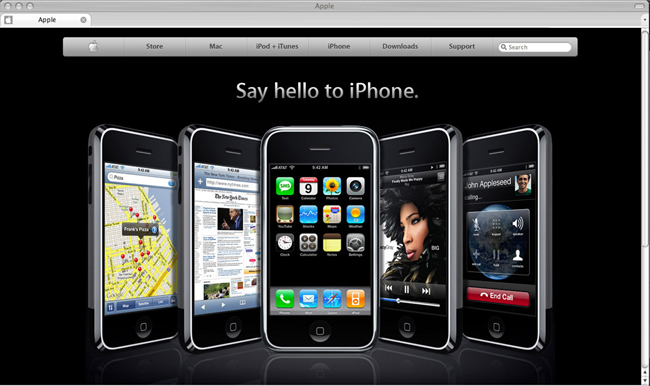
Consumers were a little shocked. Where was the keyboard? Why was the screen the full size of the device? Why would Apple make a phone? It seemed like a huge risk. And the price was outrageous! One thing was for sure—only a few people were going to buy this thing (or rather, some tech writers quipped, beta test it). It didn’t seem like a good idea at all. But it was.
At first, the iPhone was an expensive luxury item, allowing its supply chain to start small and build up as demand increased. In 2008, Apple introduced an improved iPhone at a lower price point, and the phone came with another new capability: the ability to download apps developed by third parties. At that point, customers were familiar with what an iPhone could do, and any team of developers could pay $99 to get early access to Apple’s developer tools and build apps in anticipation of the next phone’s release. Before long, developers started showing up from all over. Fourteen-year-olds made silly apps. A whoopee cushion app caused headlines and mirth. This playfulness helped demonstrate the features that made the iPhone unique, but it also made it feel less frightening. The developers, along with news sites and early adopters, told the story—not Apple.
The iPhone’s core hardware continued to improve. Every season, a new set of improvements and capabilities were introduced, and everyone got to learn about the new features at the same time, build new categories of software using them, and communicate the new features to one another. The App Store grew and grew with each new release, ushering in a whole new set of developers and an entirely new way to make money. Young developers, some just barely teenagers, could post tutorials on YouTube and teach people to code. Documentation was written by users and added to over time. As of mid-2015, over 1.5 million apps were listed on the App Store, and 100+ billion apps have been downloaded.
Apple’s iPhone became a market leader because it improved on what was already out there. The first iPhone improved the user interface standards set by a market dominated by Nokia, Blackberry, Palm, and Windows Mobile phones. All of these devices had a physical keyboard. While useful for emails and text messages, the keyboards took up roughly half of the device. By allowing the keyboard to dissolve and reappear on the screen, the iPhone could make use of a much larger screen size. This opened up an industry-changing shift—the ability to make full-screen, full-touch applications.
It still took many years for the iPhone to come to maturity, but imagine if Apple had released an iPhone with apps, location awareness, multitasking, and a large screen all at once? The price point would have been outrageous, the device completely alien, and the smartphone almost certainly a disastrous failure. Give people one feature or concept at a time, per season, so users can readjust to the idea and it can become the norm. Otherwise you might be stuck with an amalgamation of random features, many of which will not be functional for your users. And if you’re making a physical product, it gives your supply chain a chance to breathe, improve, and evolve.
Google Glass, shown in Figure 1-10, failed for exactly this reason. When Glass launched in 2013, developers had to pay $1,600 USD and be invited by Google in order to buy a device and start building applications for it. Without many people capable of doing this, it became mysterious, and certainly not an object of play. It also included a broad array of features released all at once, making for a big marketing splash but very little focus, and a lot of confusion and concern.
Without a clear feature to focus on, public opinion seized on its own concern: the idea that anyone wearing Glass was recording everyone all the time. Glass didn’t have a recording indicator light, as essentially every other video recording device up to that point had. This omission created ambiguity, leading many people to assume that any Glass-wearer was persistently recording—when in fact, after 15–20 minutes of video, it got too hot and the battery ran out. For about six weeks in 2014, I wore Glass constantly, all around the world, in groups of people from a wide range of social classes, age groups, and nationalities. By far the most common first question I received was, “are you recording me right now?”
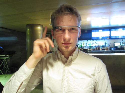
If you took all of the articles about feature phones with cameras from the 2000s and replaced the word “camera” with “Glass,” you’d have the same articles on Google Glass we saw in 2014. As with cameraphones, there will eventually be a new set of social rules to govern head-wearable devices, but we’re not there yet. Wearing Glass gives you a lot of power, but you also have to explain the limits of that power to others, and many of us are fundamentally uncomfortable with the idea of wearing a camera on our faces. Sometimes it’s better just to leave it off.
Additionally, Google created a closed system that couldn’t be hacked or played with, meaning that all excitement about and discovery of the product was blocked. The so-called “Explorers” program Google launched with Glass didn’t actually allow people to explore the product because its use cases were actually fairly limited.
To make a successful product launch, it’s crucial to study your audience, their social cues, and the local culture around technology, to ensure that you understand why people might or might not want your product. Release features slowly until they are adopted by the general public, and provide a way for people to play with your product and become comfortable with it.
Calm Technology lives in the real world, among people. Respect their expectations, and they’ll respect your technology.
Conclusions
Although the principles discussed in this chapter cover a wide range of behaviors and expectations, they generally revolve around three key considerations: attention, reliability, and context. Designing Calm Technology requires that we respect human attention for the valuable commodity it is, that we make our technology so reliable that we don’t have to expend cognitive energy on its base functioning, and that we always take into account the context in which it’s used.
These ideas are familiar in human-centered design, social design, and anthropology. All of the other principles flow from them.
It’s never too late.
It is important to realize that making technology “calm” is an ongoing process—it’s a set of values that inform decision making, rather than an algorithm that governs a phase of your project. Learn the principles now and look for opportunities to apply them in your products, new and existing.
You can always “calm down” existing technology by compressing notifications into different forms or using different notification styles. You can always reduce the feature set on your next release; you can always replace a visual display with a tone, a visual indicator, or a moment of haptic feedback. You can always mine the history of your technology’s category for ideas of what’s accessible and acceptable.
The principles of Calm Technology discussed in this chapter can be applied through the use of status indicators and alerts. In the next chapter, we’ll discuss different types of status indicators and alert styles that you can use in your products to make technology take up less attention.
These are the key takeaways from this chapter:
-
Keep in mind that people have a limited amount of attention. Attempt to create technology that requires the least amount of their attention while providing the most useful functions.
-
Consider how your interface can provide information without taking the user out of their primary task.
-
Explore ways in which your technology can make use of peripheral attention. Technology should make use of the periphery.
-
Consider how your product amplifies a person’s natural strengths and uses the capabilities of technology to reduce the human load.
-
Does your product need to rely on voice, or can it use a different communication method? Consider how your technology communicates status.
-
Think about what happens if your technology fails. Does it default to a usable state or does it break down completely?
-
What is the minimum amount of technology needed to solve the problem? Slim the feature set down so that the product does what it needs to do and no more.
-
What social norms exist that your technology might violate or cause stress on? Ideally, people should feel good when they interact with the product.
1“Brown Out,” Snopes, 2014. (http://www.snopes.com/music/artists/vanhalen.asp)
2Roth, David Lee. Crazy from the Heat. New York: Hyperion, 1997.
3Oulasvirta, Antti, Sakari Tamminen, Virpi Roto, and Jaana Kuorelahti. “Interaction in 4-second Bursts: The Fragmented Nature of Attentional Resources in Mobile HCI.” Proceedings of SIGCHI Conference on Human Factors in Computing Systems, 2005, 919-28.
4Engelbart, Douglas. “Augmenting Human Intellect: A Conceptual Framework.” SRI Summary Report AFOSR-3223, 1962. (http://www.dougengelbart.org/pubs/augment-3906.html)
5Goffman, Erving. Interaction Ritual: Essays on Face to Face Behavior. 1st Pantheon Books ed. New York: Pantheon Books, 1982.
6Weiser, Mark. “The Computer for the Twenty-First Century.” Scientific American 265, no. 9 (1991): 66-75.