
 Shortcut through trees (source: Ronald Saunders via Flickr)
 I’ve trained hundreds of developers in Python and data science over my career. A broad generalization I’ve seen is that the Python camp is split into roughly three groups: web, scientific, and ops.
I’ve seen many Python developers (web developers or DevOps types) shy away from touching the “numerical” Python stack—NumPy, Jupyter, pandas, and the like. This may be due to my biased sample, or it might be due to the traditionally more involved route to installing such libraries (though Anaconda and friends have removed that excuse). Or perhaps it is due to the numerical stack coming from more academic engineering backgrounds rather than website creation. This probably isn’t helped by the fact that most “data scientist” job offerings make a MS or PhD a requirement. A vibe may come off as “stay away unless you are ready for deep math.” I don’t believe this is the case for these tools, and my intention is to provide a counter-example with the pandas data analysis library. These tools are useful and easy for any programmer who needs to do analysis or have a notebook-like environment for exploration of data.
My experience training others has led me to realize something else. Reading about code is not sufficient. If you really want to really learn something you need to try it. So, I’m presenting three easy commands to get you started being productive with pandas. Don’t just read this. Try it out. You may find a tool that will make your life easier.
I have been impressed with the urgency of doing. Knowing is not enough; we must apply. Being willing is not enough; we must do.
-Leonardo da Vinci (emphasis mine)
From fascination to understanding
One of my children has, shall we say, an obsessive compulsive demeanor. He is currently focused on learning all about the periodic table. He wants to know every element, its number, name, and uses. He will check out books from the library on elements, and read, and re-read them. Probably not your normal behavior, but hey, he is off the streets.
Prior to his fascination with the elements, he went through a period of being preoccupied with presidents. We saw the same behavior:
- Get books discussing the current and prior leaders of the free world.
- Read them.
- Re-read them.
One day, I came home and he was very proud of a creation he had made. My son went through all of the presidents and tallied up their political party. He then carefully made a pie chart of the results! He was beaming when he showed it to me.
Being involved with many aspects of data science (training others, but also crawling data, munging it, creating predictive models, and visualizing it), I was really impressed by my son. Of his own accord (this wasn’t even homework) he had done a nice visualization of presidential parties (granted, many don’t consider pie charts to be valid visualizations, but we’ll ignore that).
I figured this would a prime opportunity for one of those father-son bonding experiences. I could congratulate him on his hard work, and then show him how I do some of the exact things he did for his pie chart using a computer. My kids know that I work with a computer, but this would be a good chance for him to see what I really do. And I would expose him to some of the same tools that those fancy data scientists that sit around all day planning what ads I click on use. Namely the pandas library and Jupyter.
The nice thing about this example below, based on a project I did with my son, is that not only can a third grader understand it, but most anyone who has some programming experience will find it really straight forward.
Installation: The hard part
Installation is arguably the hardest part of using pandas or Jupyter. If you are familiar with Python tooling, it isn’t too hard. For the rest of you, luckily there are Python meta-distributions that take care of the hard part. One example is the Anaconda Python distribution from Continuum Analytics that is free to use and is probably the easiest to get started with. (This is what I use when I’m doing corporate training).
Once you have Anaconda installed, you should have an executable called conda, (you will need to break out a command prompt on Windows). The conda tool runs on all platforms. To install pandas and Jupyter (we’ll add a few more libraries needed for the example) type:
conda install pandas jupyter xlrd matplotlib
This will take a few seconds, but should provision you an environment with all of the libraries installed. After that has finished, run:
jupyter-notebook
And you should have a notebook running. A browser will pop up with a directory listing. Congratulate yourself for getting through the most difficult part!
Creating a notebook
On the Jupyter web page, click the New button on the right-hand side. This will bring up a dropdown. Click Python in the drop-down menu, and you will now have your own notebook. A notebook is a collection of Python code and Markdown commentary. There are a few things you should be aware of to get started.
First, there are two modes:
- Command mode: where you create cells, move around cells, execute them, and change the type of them (from code to markdown).
- Edit mode: where you can change the text inside of a cell, much like a lightweight editor. You can also execute cells.
Here are the main Command commands you should know:
- b: create a cell below.
- dd: delete this cell (yep that is two “d”s in a row).
- Up/Down Arrow: navigate to different cells.
- Enter: go into edit mode in a cell.
Here are the Edit commands you should know:
- Control-Enter: Run cell.
- Esc: Go to command mode.
That’s it really. There are more commands (type h in command mode to get a list of them), but these are what I use 90% of the time. Wasn’t that easy?
Using pandas
Go into a cell and type (first create a cell by typing b, then hit enter to go into edit mode):
import pandas as pd
Type control enter to run this cell. If you installed pandas this won’t do much, it will just import the library. Then, it will put you back in command mode. To do anything interesting, we need some data. After searching for a while, my son and I found an Excel spreadsheet online that had relevant information about presidents: not your common csv file, but better than nothing. We were in luck though because pandas can read Excel files!
Create a new cell below and type and run the following:
df = pd.read_excel('http://qrc.depaul.edu/Excel_Files/Presidents.xls')This might take a few seconds, as it has to go fetch the spreadsheet from the url, then process it. The result will be a variable, df (short for DataFrame), that holds the tabular data in that spreadsheet.
By simply creating another cell and putting the following in it, we can take advantage of the REPL aspects of Jupyter to look at the data. (Jupyter is really a fancy Python REPL, Read Eval Print Loop.) Just type the name of a variable and Jupyter does an implicit print of the value.
To inspect the contents of the DataFrame type and execute:
df
This will present a nice HTML table of the contents. By default it hides some of the content if pandas deems there is too much to show.
Shortcuts for data analysis and visualization
The DataFrame has various columns that we can inspect. My son was particularly interested in the “Political Party” column. Running the following will let you see just that column:
df['Political Party']
The nice thing about pandas is that it provides shortcuts for common operations we do with data. If we wanted to see the counts of all of the political parties, we simply need to run this command that tallies up the count for the values in the column:
df['Political Party'].value_counts()
Pretty slick, but even better, pandas has integration with the Matplotlib plotting library. So we can create those nice little pie charts. Here is the command to do that:
%matplotlib inline
df['Political Party'].value_counts().plot(kind="pie")
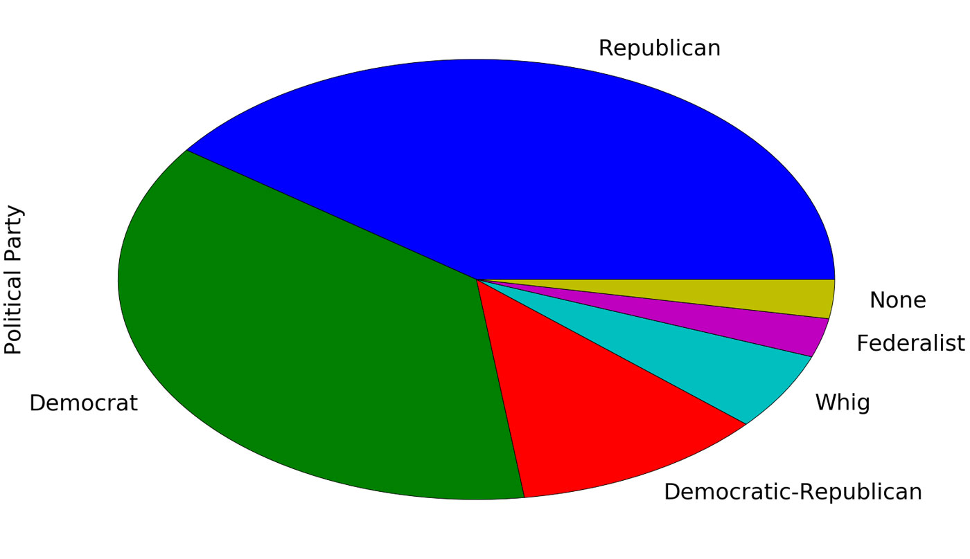
If you are familiar with Python but not Jupyter, you won’t recognize the first line. That’s ok, because it is not Python, rather it is a “cell magic,” or a directive to tell Jupyter that it should embed plots in the webpage.
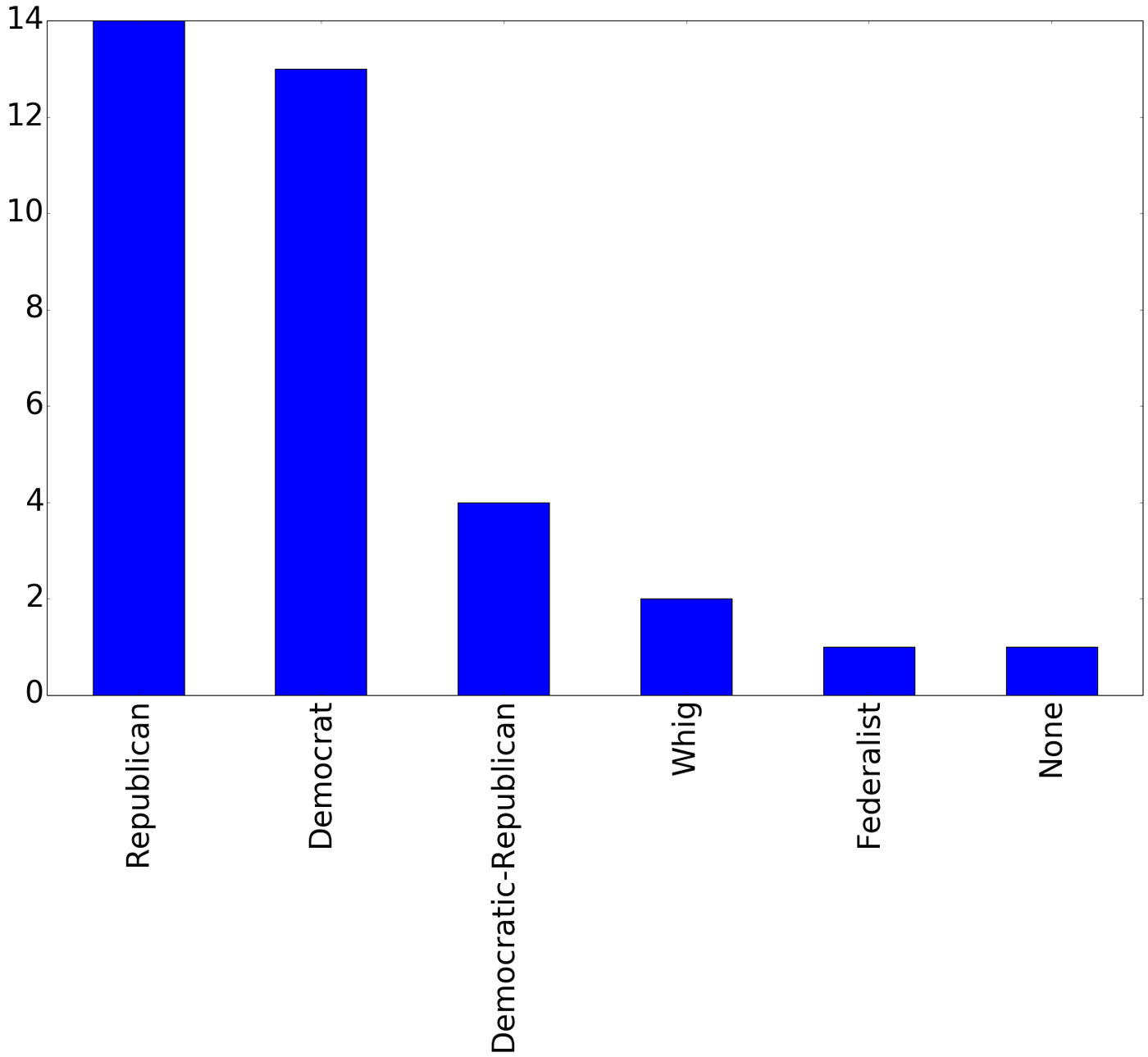
I’m slightly more partial to a bar plot, as it allows you to easily see the difference in values. On the pie chart it is hard to determine whether there were more Republican presidents or Democrats. Not a problem, again this is one line of code:
df['Political Party'].value_counts().plot(kind="bar")
Three lines of code = pandas + spreadsheet + graph
There you go. With three lines of code (four if we count the Jupyter directive) we can load the pandas library, read a spreadsheet, and plot a graph:
import pandas as pd
df = pd.read_excel('http://qrc.depaul.edu/Excel_Files/Presidents.xls')
%matplotlib inline
df['Political Party'].value_counts().plot(kind="pie")
This isn’t just something that statisticians or PhDs can use. Jupyter and pandas are tools that elementary kids can grok. If you are a developer, you owe it to yourself to take a few minutes checking out these tools. For fun, try making some plots of the College and Occupation columns. You will see an interesting path of the future plans of my son on his route to become president! Go ahead, it is only two more lines of code:
df['College'].value_counts().plot(kind="bar")

df['Occupation'].value_counts().plot(kind="bar")