The anatomy of an information architecture
Properly organizing information is essential, but it can be hard to know where to start. Learn the fundamental building blocks of a modern information architecture.
 Polar bear swimming in zoo (source: Wikimedia)
We are searching for some kind of harmony between two intangibles: a form which we have not yet designed and a context which we cannot properly describe.
Christopher Alexander

Learn faster. Dig deeper. See farther.
In this chapter, we’ll cover:
-
Why it’s important (and difficult) to make an information architecture as tangible as possible
-
Examples that help you visualize an information architecture from both the top down and the bottom up
-
Ways of categorizing the components of an information architecture so you can better understand and explain IA
In not available, we discussed information architecture from a conceptual perspective. This chapter presents a more concrete view of what information architecture actually is to help you recognize it when you see it. We also introduce the components of an architecture; these are important to understand because they make up our palette. We’ll cover them in greater detail in Chapters 6–10.
Visualizing Information Architecture
Why is it important to be able to visualize information architecture? As we mentioned in not available, the field is abstract, and many who might conceptually understand the basic premise of information architecture won’t really “get it” until they see it and experience it. Also, a well-designed information architecture is invisible to users (which, paradoxically, is quite an unfair reward for IA success).
Because it’s highly probable that you’ll need to explain information architecture to several important people, including colleagues, managers, prospects, clients, and perhaps your significant other, it’s in your interest to be able to help them visualize what an information architecture actually is.
Let’s start by looking at something many of us are familiar with: a website’s main page. Figure 1-1 shows the main page for Gustavus Adolphus College in Saint Peter, Minnesota.
What’s obvious here? Most immediately, you see that the site’s visual design stands out. You can’t help but notice the site’s colors, typeface choices, and photographs. You also notice aspects of the site’s information design; for example, the number of columns—and their widths—change throughout the page.
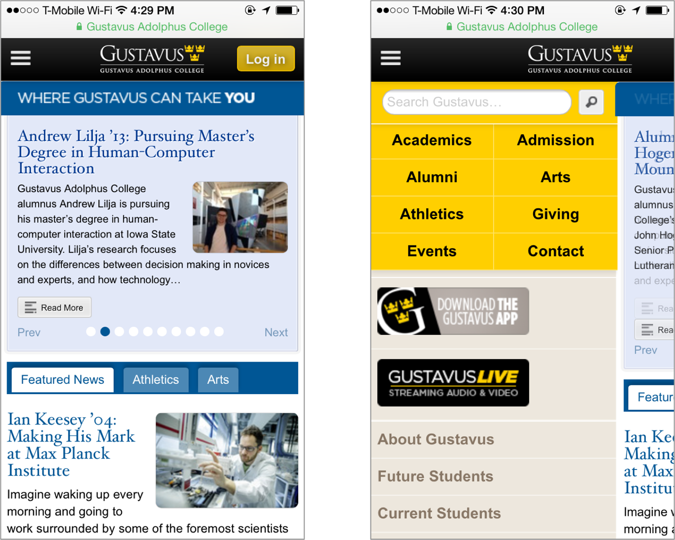
What else? With a careful eye, you can detect aspects of the site’s interaction design, such as the use of mouseovers over main menu choices. Although the college’s logo and logotype are prominent, the site relies on textual content (e.g., “Make your life count,” “Where Gustavus can take you,” etc.) to convey its message and brand. And although this particular site functions well, you’d learn something about its supporting technology (and related expertise) just from the main page—for example, if it didn’t reflow properly when rendered in small browser windows, you might guess that the designers weren’t aware of or concerned with responsive web design techniques for display in mobile browsers (Figure 1-2).
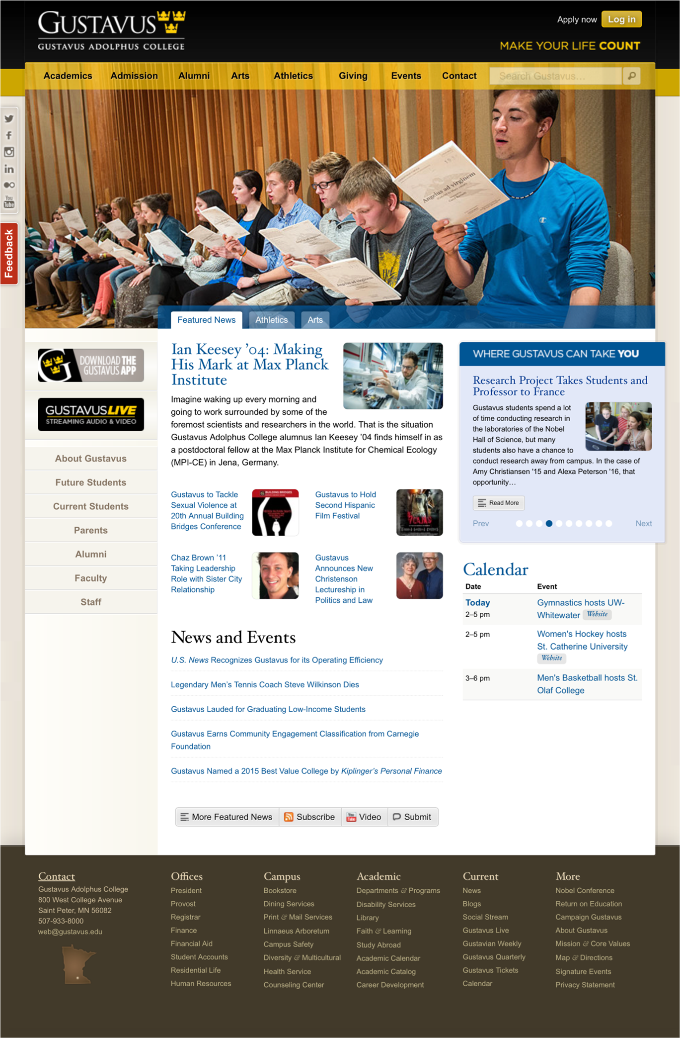
Thus far, we’ve noticed all sorts of things that aren’t information architecture. So what is recognizable as information architecture? You might be surprised by how much information architecture you can see if you know how to look. For example, the information has been structured in some basic ways, which we’ll explain further in later chapters:
-
Organization systems present the site’s information to us in a variety of ways, such as content categories that pertain to the entire campus (e.g., the top bar and its “Academics” and “Admission” choices), or to specific audiences (the block on the middle left, with such choices as “Future Students” and “Staff”).
-
Navigation systems help users move through the content, such as with the custom organization of the individual drop-down menus in the main navigation bar.
-
Search systems allow users to search the content; when the user starts typing in the site’s search bar, a list of suggestions is shown with possible matches for the user’s search term.
-
Labeling systems describe categories, options, and links in language that (hopefully) is meaningful to users; you’ll see examples throughout the page (e.g., “Admission,” “Alumni,” “Events”).
Top-Down Information Architecture
Categories are used to group pages and applications throughout the site; labels systematically represent the site’s content; navigation systems and a search system can be used to move through the site. In effect, the Gustavus main page tries to anticipate users’ major information needs, such as “How do I find out about admissions?” or “What’s going on this week on campus?” The site’s designers have worked hard to determine the most common questions, and have designed the site to meet those needs. We refer to this as top-down information architecture (Figure 1-3), and the Gustavus main page addresses many common “top-down” questions that users have when they land on a site, including:
-
Where am I? (1)
-
I know what I’m looking for; how do I search for it? (2)
-
How do I get around this site? (3)
-
What’s important and unique about this organization? (4)
-
What’s available on this site? (5)
-
What’s happening there? (6)
-
How do I engage with them via various other popular digital channels? (7)
-
How can I contact a human? (8)
-
What’s their address? (9)
-
How can I access my account? (10)
In top-down information architecture, the environment’s designers posit a structure that aims to answer users’ questions such as these. The form that the environment takes—its content, page layout, etc.—is designed and produced to support this structure that has been centrally defined “from above.” This was the main way information architecture was done when we wrote the first edition of this book—not surprisingly, given many of that era’s readers were designing new sites from scratch. Over time, as information environments have become more dynamic and search engines have become more powerful and widespread, a different modality—bottom-up information architecture—has gained prominence.
Bottom-Up Information Architecture
Content itself can have information architecture embedded within it. For example, the recipe in Figure 1-4 shows a refreshing drink in the Epicurious Android app.
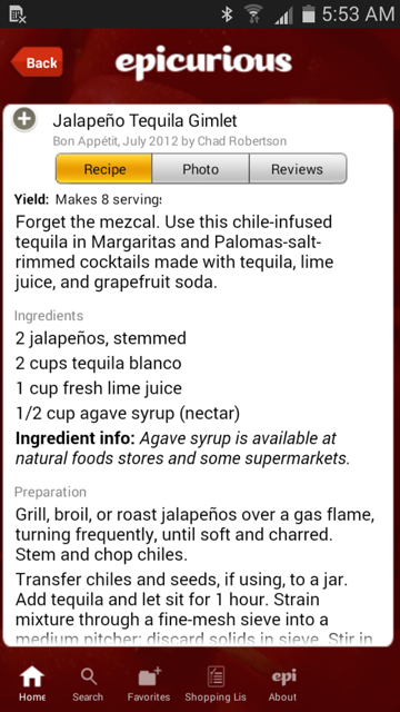
Beyond the navigational options at the bottom of the screen, there’s not much information architecture here. Or is there?
The recipe itself has a clear, strong structure: a title at the top, a list of ingredients, then preparation directions and serving information. This information is “chunked” so you know what’s what. The recipe’s native chunking could also support searching and browsing; for example, users might be able to search on the chunks known as “recipe titles” for “gimlet” and retrieve this one. And these chunks are sequenced in a logical manner; after all, you’ll want to know the ingredients (“Do I have agave syrup?”) before you start mixing the drink. The definition and sequential placement of chunks helps you to recognize that this content is a recipe before you even read it. And once you know what it is, you have a better idea what this content is about and how to use it, move around it, and go somewhere else from it.
So, if you look closely enough, you can see information architecture even when it’s embedded in the guts of your content. In fact, by supporting searching and browsing, the structure inherent in content enables the answers to users’ questions to “rise” to the surface. This is bottom-up information architecture; content structure, sequencing, and tagging help you answer such questions as:
-
Where am I?
-
What’s here?
-
Where can I go from here?
Instead of being dictated “from above,” bottom-up information architecture is suggested by and inherent in the system’s content. It’s important because users are increasingly likely to bypass your system’s top-down information architecture; instead, they’re using web-wide search tools like Google Search, clicking through ads, and clicking links while reading your content via social networks such as Facebook or Twitter to find themselves deep in your site. Once there, they’ll want to jump to other relevant content on your site without learning how to use its top-down structure. A good information architecture is designed to anticipate this type of use; Keith Instone’s simple and practical “navigation stress test” is a great way to evaluate a site’s bottom-up information architecture.
Figure 1-5 shows a slightly different example of a bottom-up information architecture: images stored in one of this book’s authors’ iCloud account, as displayed in the iOS Photos app.
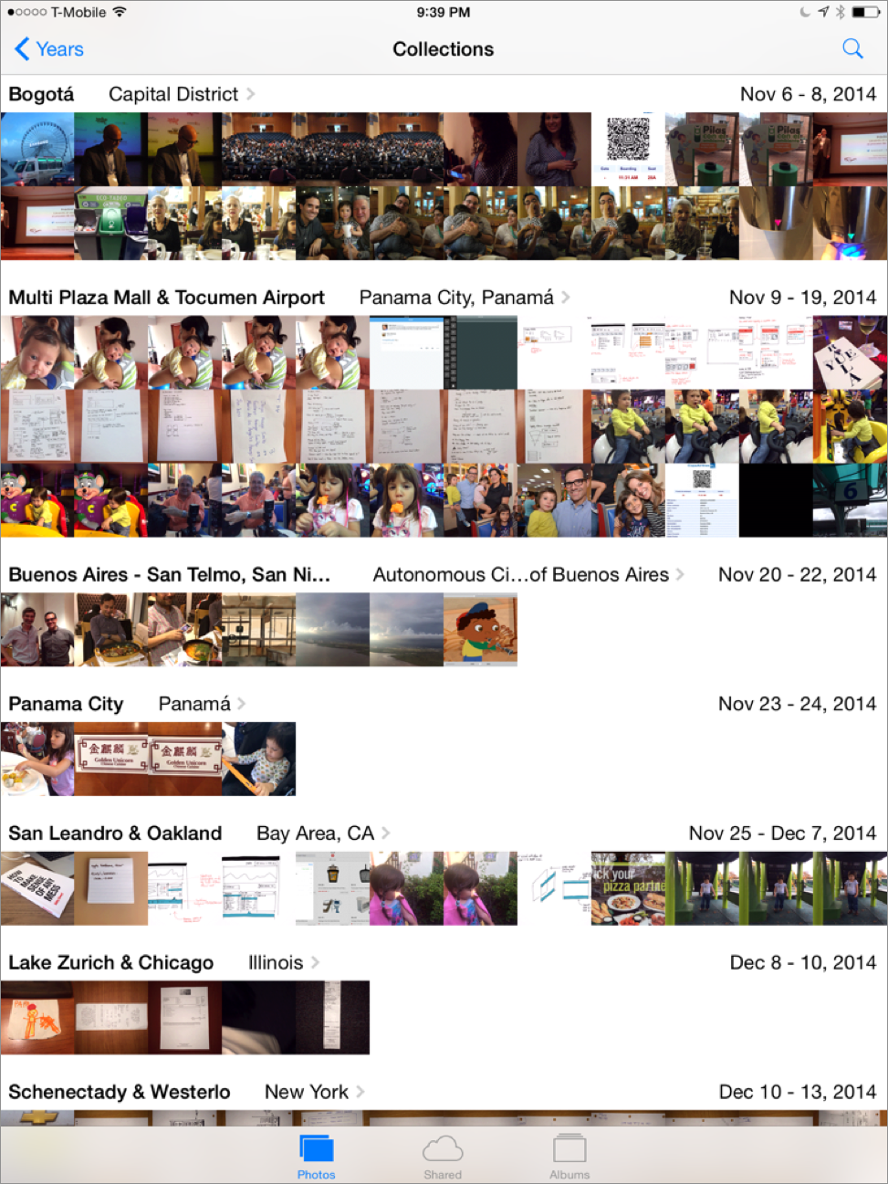
There is little to see here besides the information architecture and the content itself. In fact, as the content is just collections of thumbnails pointing to individual images, the information architecture is what dominates the display. It provides context for the content, and tells us what we can do while we’re here:
-
The information architecture tells us where we are (in the Photos app, looking at “Collections,” which are defined as ranges of dates in a particular geographic region).
-
It helps us move to other closely related views (e.g., by switching to “Albums,” collections of photos we’ve defined).
-
It helps us move through the information hierarchically (e.g., we can choose to view collections of images grouped by the year they were saved, instead of by more granular ranges of dates and locations) and contextually (e.g., by clicking on the city in which they were shot, we can see them arranged spatially over a map).
-
It allows us to search the content based on various criteria, such as different time periods and locations.
-
It allows us to share the content with others.
In many respects, the user interface for the Photos app is nothing but information architecture. Its bottom-up structure is defined primarily by the metadata and deep contextual links embedded in the content (the photos) it contains, presented in a way that makes sense given how people are used to organizing photographs.
Invisible Information Architecture
You now know that information architecture is something that can be seen, if you know what to look for. But it’s important to understand that information architecture is often invisible. For example, Figure 1-6 shows some search results from the BBC’s website.
What’s going on here? We’ve searched for “ukraine,” and the site has presented us with a couple of different things, most interestingly three results labeled “Editor’s Choice.” As you’d imagine, all the search results were retrieved by a piece of software—a search engine—that the user never sees. The search engine has been configured to index and search certain parts of the site, to display certain kinds of information in each search result (i.e., page title, extract, and date), and to handle search queries in certain ways, such as removing “stop words” (e.g., “a,” “the,” and “of”). All of these decisions regarding search system configuration are unknown to users, and are integral aspects of information architecture design.
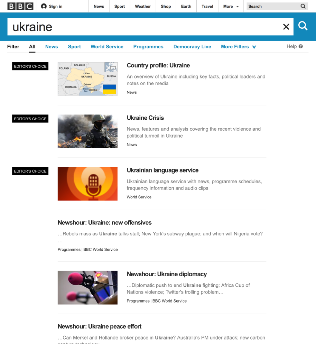
What’s different is that the “Editor’s Choice” results are manually created: some people at the BBC decided that “ukraine” is an important term and that some of the BBC’s best content is not news stories, which normally come up at the top of most retrieval sets. So they applied some editorial expertise to identify three highly relevant pages and associated them with the term “ukraine,” thereby ensuring that these three items are displayed when someone searches for “ukraine.” Users might assume these search results are automatically generated, but humans are manually modifying the information architecture in the background;1 this is another example of invisible information architecture.
Information architecture is much more than just blueprints that portray navigational routes and wireframes that inform visual design. Information architecture involves more than meets the eye, and both its visible and invisible aspects help define what we do and illustrate how challenging it really is.
Information Architecture Components
It can be difficult to know exactly what components make up an information architecture. People interact directly with some, while (as we just saw) others are so behind the scenes that users are unaware of their existence.
In the next four chapters, we’ll present and discuss information architecture components by breaking them up into the following four categories, which were introduced earlier:
- Organization systems
-
How we categorize information (e.g., by subject or chronology); see not available
- Labeling systems
-
How we represent information—for example, using scientific terminology (“Acer”) or lay terminology (“maple”); see not available
- Navigation systems
-
How we browse or move through information (e.g., clicking through a hierarchy); see not available
- Searching systems
-
How we search information (e.g., executing a search query against an index); see not available
Like any categorization scheme, this one has challenges. For example, it can be difficult to distinguish organization systems from labeling systems (hint: you organize content into groups, and then label those groups; each group can be labeled in different ways). As in other situations that involve categorization, it can be useful to group objects in new ways to examine them from different perspectives. So, before we delve into these systems, we’ll present an alternative method of categorizing information architecture components. This method is comprised of browsing aids, search aids, content and tasks, and “invisible” components.
Browsing Aids
These components present users with a predetermined set of paths to help them navigate the information environment. They also help create a sense of place, as we explained in not available. When browsing, users don’t articulate their queries through search fields, but instead find their way through menus and links. Types of browsing aids include:
- Organization systems
-
Also known as taxonomies and hierarchies, these are the main way of categorizing or grouping content (e.g., by topic, by task, by audiences, or by chronology); user-generated tags are also a form of organization system
- General navigation systems
-
Primary navigation systems that help users understand where they are and where they can go within an information environment
- Local navigation systems
-
Primary navigation systems that help users understand where they are and where they can go within a portion of an information environment (e.g., a subsite)
- Sitemaps/tables of contents
-
Navigation systems that supplement primary navigation systems; provide a condensed overview of and links to major content areas within the environment, usually in outline form
- Indices
-
Supplementary navigation systems that provide an alphabetized list of links to the contents of the environment
- Guides
-
Supplementary navigation systems that provide specialized information on specific topics, as well as links to related subsets of content
- Walkthroughs and wizards
-
Supplementary navigation systems that lead users through sequential sets of steps; may also link to related subsets of content
- Contextual navigation systems
-
Consistently presented links to related content; often embedded in text and generally used to connect highly specialized content within an information environment
Search Aids
These components allow the entry of user-defined queries (e.g., searcheses) and automatically present users with customized sets of results that match their queries. Think of these as dynamic and mostly automated counterparts to browsing aids. Types of search components include:
- Search interface
-
The means of entering and revising a search query, typically with information on how to improve your query, as well as other ways to configure your search (e.g., selecting from specific search zones)
- Query language
-
The grammar of a search query; query languages might include Boolean operators (e.g., AND, OR, NOT), proximity operators (e.g., ADJACENT, NEAR), or ways of specifying which field to search (e.g., AUTHOR=“Shakespeare”)
- Query builders
-
Ways of enhancing a query’s performance; common examples include spell checkers, stemming, concept searching, and drawing in synonyms from a thesaurus
- Retrieval algorithms
-
The part of a search engine that determines which content matches a user’s query; Google’s PageRank is perhaps the best-known example
- Search zones
-
Subsets of site content that have been separately indexed to support narrower searching (e.g., searching the tech support area within a software vendor’s site)
- Search results
-
Presentation of content that matches the user’s search query; involves decisions about what types of content should make up each individual result, how many results to display, and how sets of results should be ranked, sorted, and clustered
Content and Tasks
These are the users’ ultimate destinations, as opposed to separate components that get users to their destinations. However, it’s difficult to separate content and tasks from an information architecture, as there are components embedded in them that help us find our way. Examples of information architecture components embedded in content and tasks include:
- Headings
- Embedded links
-
Links within text; these label (i.e., represent) the content they link to
- Embedded metadata
-
Information that can be used as metadata but must first be extracted (e.g., in a recipe, if an ingredient is mentioned, this information can be indexed to support searching by ingredient)
- Chunks
-
Logical units of content; these can vary in granularity (e.g., sections and chapters are both chunks) and can be nested (e.g., a section is part of a book)
- Lists
-
Groups of chunks or links to chunks; these are important because they’ve been grouped together (e.g., they share some trait in common) and have been presented in a particular order (e.g., chronologically)
- Sequential aids
-
Clues that suggest where the user is in a process or task, and how far he has to go before completing it (e.g., “step 3 of 8”)
- Identifiers
-
Clues that suggest where the user is in an information system (e.g., a logo specifying what site she is using, or a breadcrumb explaining where she is)
“Invisible” Components
Certain key architectural components are manifest completely in the background; users rarely (if ever) interact with them. These components often “feed” other components, such as a thesaurus that’s used to enhance a search query. Some examples of invisible information architecture components include:
- Controlled vocabularies and thesauri
-
Predetermined vocabularies of preferred terms that describe a specific domain (e.g., auto racing or orthopedic surgery); typically include variant terms (e.g., “brewski” is a variant term for “beer”). Thesauri are controlled vocabularies that generally include links to broader and narrower terms, related terms, and descriptions of preferred terms (aka “scope notes”). Search systems can enhance queries by extracting a query’s synonyms from a controlled vocabulary.
- Retrieval algorithms
-
Used to rank search results by relevance; retrieval algorithms reflect their programmers’ judgments on how to determine relevance.
- Best bets
-
Preferred search results that are manually coupled with a search query; editors and subject matter experts determine which queries should retrieve best bets and which documents merit best bet status.
Whichever method you use for categorizing architectural components, it’s useful to drill down beyond the abstract concept of information architecture and become familiar with its more tangible and, when possible, visual aspects. In the following chapters, we’ll take an even deeper look at the nuts and bolts of an information architecture.
Recap
Let’s recap what we learned in this chapter:
-
You’ll probably need to explain information architecture to others, so it’s important that you help them visualize it.
-
You can visualize information architecture from the top down, or from the bottom up.
-
There are various ways of categorizing IA components, but here we’ll be looking at four categories: organization systems, labeling systems, navigation systems, and searching systems.
And now that we’ve given you the overview of the basic systems we’ll be discussing, we’ll dive into the first of them: organization systems.
1This effort is often guided by search logs that allow editors to identify which search terms would benefit most from editorial intervention.