Job no:81378-5 Title : RP_All Access (New PB Verdions) Client : Pro-vision
Scn :
#
175 Size : 203.2(w)254(h)mm Co : M6 (mac J)
Dept : DTP D/O : 22.10.05 (Job no:000000 D/O : 00.00.04 Co: CM0)
5th Black
p189
P
retty much anything goes in graphic design.
As in fashion, trends remain—currents and quirky
little eddies that curl away and disappear—
but the authoritative party-line style of earlier times
is gone. At this point it takes desire and a tight focus
to learn the craft of minimalist Swiss typography.
It takes a young eye, guided by immaculate taste, to use
its tools to create design that is relevant and holds its
own amidst the flood of dazzling, more effects-laden
work. Valerie Kiock describes her approach: “Stylistically,
I tend towards the pragmatic approach: legible, clear,
comprehensible, well-founded, rather straight ahead, strict,
but certainly neither boring nor bland. I always like to
play around, figuring out what works and how it works.”
C
ANDY AND THE CLASSICS Growing up in
Munich, Valerie Kiock started collecting candy
wrappers as a child, attracted by the combination
of colors and typography. She remembers small chewy
squares wrapped in colored paper, ringed with printed
tinfoil that identified the flavor of each piece with words
and picture. It didn’t take long for her to form a Pavlovian
connection between sugar and graphic design.
The second push toward design occurred when Kiock
went to see a Raymond Loewy exhibit. “I remember the
progression of the Shell logo exactly. I was intrigued by the
reworking, the mutations. I remember the Lucky Strike
package, of course. Beautiful to begin with, it turns from
green to white for nonaesthetic reasons. The brand, the
application, following a need was what interested me.
You might call it ‘freedom within boundaries.’” Following
the exhibit, she started leafing through magazines,
clipping typestyles, pictures, ads—image/type combi-
nations, colors, and patterns—and placing them in
scrapbooks. “Also packages, postcards, and stamps—
everything I thought was beautiful.”
189
2002
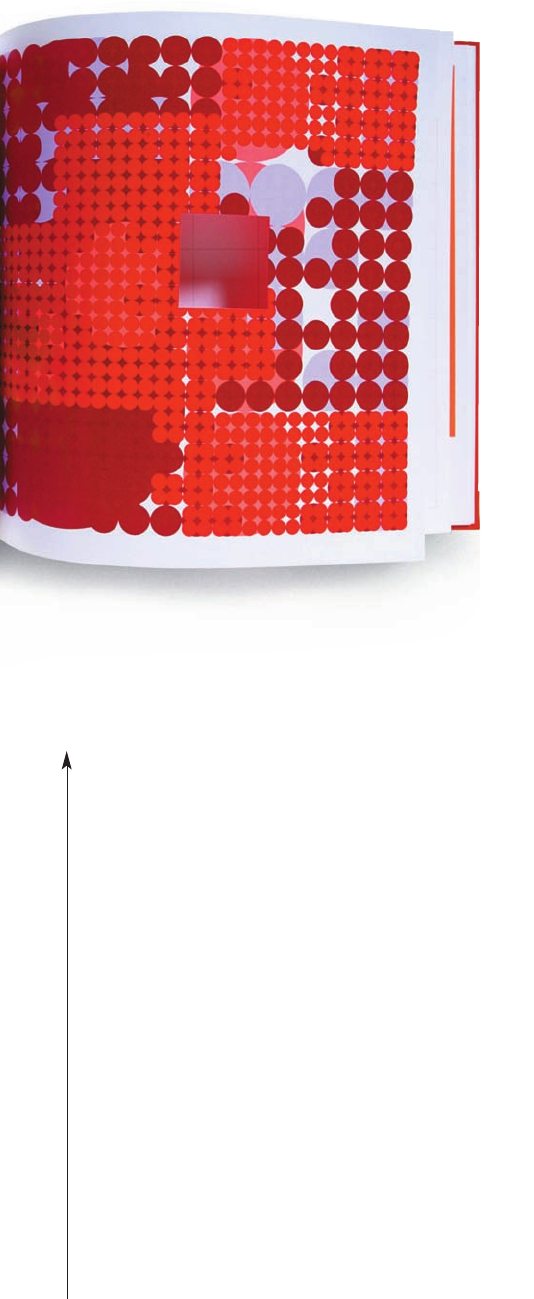
Taylor Bloxham Diary 2002 The day planner advertising
the client’s new twelve-color press was a studio collaboration
at Williams & Phoa. “My section is die-cut and shows dots
and flowers that use eleven special inks, including day-glo
and metallic inks and a varnish.”
German designer Valerie Kiock
has integrated her love for graphics
with an ever-growing interest
in furniture design to forge
a unique body of work that benefits
from its exposure to both worlds.
KIOCK
26
VALERIE
All_Access_154-208-10-13-05-M6.qxd 10/25/05 11:11 AM Page 189
Get All Access now with the O’Reilly learning platform.
O’Reilly members experience books, live events, courses curated by job role, and more from O’Reilly and nearly 200 top publishers.

