Chapter 4. Acquire an Initial Dataset
Once you have a plan to solve your product needs and have built an initial prototype to validate that your proposed workflow and model are sound, it is time to take a deeper dive into your dataset. We will use what we find to inform our modeling decisions. Oftentimes, understanding your data well leads to the biggest performance improvements.
In this chapter, we will start by looking at ways to efficiently judge the quality of a dataset. Then, we will cover ways to vectorize your data and how to use said vectorized representation to label and inspect a dataset more efficiently. Finally, we’ll cover how this inspection should guide feature generation strategies.
Let’s start by discovering a dataset and judging its quality.
Iterate on Datasets
The fastest way to build an ML product is to rapidly build, evaluate, and iterate on models. Datasets themselves are a core part of that success of models. This is why data gathering, preparation, and labeling should be seen as an iterative process, just like modeling. Start with a simple dataset that you can gather immediately, and be open to improving it based on what you learn.
This iterative approach to data can seem confusing at first. In ML research, performance is often reported on standard datasets that the community uses as benchmarks and are thus immutable. In traditional software engineering, we write deterministic rules for our programs, so we treat data as something to receive, process, and store.
ML engineering combines engineering and ML in order to build products. Our dataset is thus just another tool to allow us to build products. In ML engineering, choosing an initial dataset, regularly updating it, and augmenting it is often the majority of the work. This difference in workflow between research and industry is illustrated in Figure 4-1.
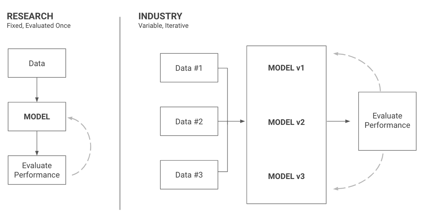
Figure 4-1. Datasets are fixed in research, but part of the product in industry
Treating data as part of your product that you can (and should) iterate on, change, and improve is often a big paradigm shift for newcomers to the industry. Once you get used to it, however, data will become your best source of inspiration to develop new models and the first place you look for answers when things go wrong.
Do Data Science
I’ve seen the process of curating a dataset be the main roadblock to building ML products more times than I can count. This is partly because of the relative lack of education on the topic (most online courses provide the dataset and focus on the models), which leads to many practitioners fearing this part of the work.
It is easy to think of working with data as a chore to tackle before playing with fun models, but models only serve as a way to extract trends and patterns from existing data. Making sure that the data we use exhibits patterns that are predictive enough for a model to leverage (and checking whether it contains clear bias) is thus a fundamental part of the work of a data scientist (in fact, you may have noticed the name of the role is not model scientist).
This chapter will focus on this process, from gathering an initial dataset to inspecting and validating its applicability for ML. Let’s start with exploring a dataset efficiently to judge its quality.
Explore Your First Dataset
So how do we go about exploring an initial dataset? The first step of course is to gather a dataset. This is where I see practitioners get stuck the most often as they search for a perfect dataset. Remember, our goal is to get a simple dataset to extract preliminary results from. As with other things in ML, start simple, and build from there.
Be Efficient, Start Small
For most ML problems, more data can lead to a better model, but this does not mean that you should start with the largest possible dataset. When starting on a project, a small dataset allows you to easily inspect and understand your data and how to model it better. You should aim for an initial dataset that is easy to work with. Only once you’ve settled on a strategy does it make sense to scale it up to a larger size.
If you are working at a company with terabytes of data stored in a cluster, you can start by extracting a uniformly sampled subset that fits in memory on your local machine. If you would like to start working on a side project trying to identify the brands of cars that drive in front of your house, for example, start with a few dozens of images of cars on streets.
Once you have seen how your initial model performs and where it struggles, you will be able to iterate on your dataset in an informed manner!
You can find many existing datasets online on platforms such as Kaggle or Reddit or gather a few examples yourself, either by scraping the web, leveraging large open datasets such as found on the Common Crawl site, or generating data! For more information, see “Open data”.
Gathering and analyzing data is not only necessary, it will speed you up, especially early on in a project’s development. Looking at your dataset and learning about its features is the easiest way to come up with a good modeling and feature generation pipeline.
Most practitioners overestimate the impact of working on the model and underestimate the value of working on the data, so I recommend always making an effort to correct this trend and bias yourself toward looking at data.
When examining data, it is good to identify trends in an exploratory fashion, but you shouldn’t stop there. If your aim is to build ML products, you should ask yourself what the best way to leverage these trends in an automated fashion is. How can these trends help you power an automated product?
Insights Versus Products
Once you have a dataset, it is time to dive into it and explore its content. As we do so, let’s keep in mind the distinction between data exploration for analysis purposes and data exploration for product building purposes. While both aim to extract and understand trends in data, the former concerns itself with creating insights from trends (learning that most fraudulent logins to a website happen on Thursdays and are from the Seattle area, for example), while the latter is about using trends to build features (using the time of a login attempt and its IP address to build a service that prevents fraudulent accounts logins).
While the difference may seem subtle, it leads to an extra layer of complexity in the product building case. We need to have confidence that the patterns we see will apply to data we receive in the future and quantify the differences between the data we are training on and the data we expect to receive in production.
For fraud prediction, noticing a seasonality aspect to fraudulent logins is the first step. We should then use this observed seasonal trend to estimate how often we need to train our models on recently gathered data. We will dive into more examples as we explore our data more deeply later in this chapter.
Before noticing predictive trends, we should start by examining quality. If our chosen dataset does not meet quality standards, we should improve it before moving on to modeling.
A Data Quality Rubric
In this section, we will cover some aspects to examine when first working with a new dataset. Each dataset comes with its own biases and oddities, which require different tools to be understood, so writing a comprehensive rubric covering anything you may want to look for in a dataset is beyond the scope of this book. Yet, there are a few categories that are valuable to pay attention to when first approaching a dataset. Let’s start with formatting.
Data format
Is the dataset already formatted in such a way that you have clear inputs and outputs, or does it require additional preprocessing and labeling?
When building a model that attempts to predict whether a user will click on an ad, for example, a common dataset will consist of a historical log of all clicks for a given time period. You would need to transform this dataset so that it contains multiple instances of an ad being presented to a user and whether the user clicked. You’d also want to include any features of the user or the ad that you think your model could leverage.
If you are given a dataset that has already been processed or aggregated for you, you should validate that you understand the way in which the data was processed. If one of the columns you were given contains an average conversion rate, for example, can you calculate this rate yourself and verify that it matches with the provided value?
In some cases, you will not have access to the required information to reproduce and validate preprocessing steps. In those cases, looking at the quality of the data will help you determine which features of it you trust and which ones would be best left ignored.
Data quality
Examining the quality of a dataset is crucial before you start modeling it. If you know that half of the values for a crucial feature are missing, you won’t spend hours debugging a model to try to understand why it isn’t performing well.
There are many ways in which data can be of poor quality. It can be missing, it can be imprecise, or it can even be corrupted. Getting an accurate picture of its quality will not only allow you to estimate which level of performance is reasonable, it will make it easier to select potential features and models to use.
If you are working with logs of user activity to predict usage of an online product, can you estimate how many logged events are missing? For the events you do have, how many contain only a subset of information about the user?
If you are working on natural language text, how would you rate the quality of the text? For example, are there many incomprehensible characters? Is the spelling very erroneous or inconsistent?
If you are working on images, are they clear enough that you could perform the task yourself? If it is hard for you to detect an object in an image, do you think your model will struggle to do so?
In general, which proportion of your data seems noisy or incorrect? How many inputs are hard for you to interpret or understand? If the data has labels, do you tend to agree with them, or do you often find yourself questioning their accuracy?
I’ve worked on a few projects aiming to extract information from satellite imagery, for example. In the best cases, these projects have access to a dataset of images with corresponding annotations denoting objects of interest such as fields or planes. In some cases, however, these annotations can be inaccurate or even missing. Such errors have a significant impact on any modeling approach, so it is vital to find out about them early. We can work with missing labels by either labeling an initial dataset ourselves or finding a weak label we can use, but we can do so only if we notice the quality ahead of time.
After verifying the format and quality of the data, one additional step can help proactively surface issues: examining data quantity and feature distribution.
Data quantity and distribution
Let’s estimate whether we have enough data and whether feature values seem within a reasonable range.
How much data do we have? If we have a large dataset, we should select a subset to start our analysis on. On the other hand, if our dataset is too small or some classes are underrepresented, models we train would risk being just as biased as our data. The best way to avoid such bias is to increase the diversity of our data through data gathering and augmentation. The ways in which you measure the quality of your data depend on your dataset, but Table 4-1 covers a few questions to get you started.
| Quality | Format | Quantity and distribution | |
|---|---|---|---|
Are any relevant fields ever empty? |
How many preprocessing steps does your data require? |
How many examples do you have? |
|
Are there potential errors of measurement? |
Will you be able to preprocess it in the same way in production? |
How many examples per class? Are any absent? |
For a practical example, when building a model to automatically categorize customer support emails into different areas of expertise, a data scientist I was working with, Alex Wahl, was given nine distinct categories, with only one example per category. Such a dataset is too small for a model to learn from, so he focused most of his effort on a data generation strategy. He used templates of common formulations for each of the nine categories to produce thousands more examples that a model could then learn from. Using this strategy, he managed to get a pipeline to a much higher level of accuracy than he would have had by trying to build a model complex enough to learn from only nine examples.
Let’s apply this exploration process to the dataset we chose for our ML editor and estimate its quality!
ML editor data inspection
For our ML editor, we initially settled on using the anonymized Stack Exchange Data Dump as a dataset. Stack Exchange is a network of question-and-answer websites, each focused on a theme such as philosophy or gaming. The data dump contains many archives, one for each of the websites in the Stack Exchange network.
For our initial dataset, we’ll choose a website that seems like it would contain broad enough questions to build useful heuristics from. At first glance, the Writing community seems like a good fit.
Each website archive is provided as an XML file. We need to build a pipeline to ingest those files and transform them into text we can then extract features from. The following example shows the Posts.xml file for datascience.stackexchange.com:
<?xml version="1.0" encoding="utf-8"?><posts><rowId="5"PostTypeId="1"CreationDate="2014-05-13T23:58:30.457"Score="9"ViewCount="516"Body="<p> "Hello World" example? "OwnerUserId="5"LastActivityDate="2014-05-14T00:36:31.077"Title="How can I do simple machine learning without hard-coding behavior?"Tags="<machine-learning>"AnswerCount="1"CommentCount="1"/><rowId="7"PostTypeId="1"AcceptedAnswerId="10".../>
To be able to leverage this data, we will need to be able to load the XML file, decode the HTML tags in the text, and represent questions and associated data in a format that would be easier to analyze such as a pandas DataFrame. The following function does just this. As a reminder, the code for this function, and all other code throughout this book, can be found in this book’s GitHub repository.
importxml.etree.ElementTreeasElTdefparse_xml_to_csv(path,save_path=None):"""Open .xml posts dump and convert the text to a csv, tokenizing it in theprocess:param path: path to the xml document containing posts:return: a dataframe of processed text"""# Use python's standard library to parse XML filedoc=ElT.parse(path)root=doc.getroot()# Each row is a questionall_rows=[row.attribforrowinroot.findall("row")]# Using tdqm to display progress since preprocessing takes timeforitemintqdm(all_rows):# Decode text from HTMLsoup=BeautifulSoup(item["Body"],features="html.parser")item["body_text"]=soup.get_text()# Create dataframe from our list of dictionariesdf=pd.DataFrame.from_dict(all_rows)ifsave_path:df.to_csv(save_path)returndf
Even for a relatively small dataset containing only 30,000 questions this process takes more than a minute, so we serialize the processed file back to disk to only have to process it once. To do this, we can simply use panda’s to_csv function, as shown on the final line of the snippet.
This is generally a recommended practice for any preprocessing required to train a model. Preprocessing code that runs right before the model optimization process can slow down experimentation significantly. As much as possible, always preprocess data ahead of time and serialize it to disk.
Once we have our data in this format, we can examine the aspects we described earlier. The entire exploration process we detail next can be found in the dataset exploration notebook in this book’s GitHub repository.
To start, we use df.info() to display summary information about our DataFrame, as well as any empty values. Here is what it returns:
>>>>df.info()AcceptedAnswerId4124non-nullfloat64AnswerCount33650non-nullint64Body33650non-nullobjectClosedDate969non-nullobjectCommentCount33650non-nullint64CommunityOwnedDate186non-nullobjectCreationDate33650non-nullobjectFavoriteCount3307non-nullfloat64Id33650non-nullint64LastActivityDate33650non-nullobjectLastEditDate10521non-nullobjectLastEditorDisplayName606non-nullobjectLastEditorUserId9975non-nullfloat64OwnerDisplayName1971non-nullobjectOwnerUserId32117non-nullfloat64ParentId25679non-nullfloat64PostTypeId33650non-nullint64Score33650non-nullint64Tags7971non-nullobjectTitle7971non-nullobjectViewCount7971non-nullfloat64body_text33650non-nullobjectfull_text33650non-nullobjecttext_len33650non-nullint64is_question33650non-nullbool
We can see that we have a little over 31,000 posts, with only about 4,000 of them having an accepted answer. In addition, we can notice that some of the values for Body, which represents the contents of a post, are null, which seems suspicious. We would expect all posts to contain text. Looking at rows with a null Body quickly reveals they belong to a type of post that has no reference in the documentation provided with the dataset, so we remove them.
Let’s quickly dive into the format and see if we understand it. Each post has a PostTypeId value of 1 for a question, or 2 for an answer. We would like to see which type of questions receive high scores, as we would like to use a question’s score as a weak label for our true label, the quality of a question.
First, let’s match questions with the associated answers. The following code selects all questions that have an accepted answer and joins them with the text for said answer. We can then look at the first few rows and validate that the answers do match up with the questions. This will also allow us to quickly look through the text and judge its quality.
questions_with_accepted_answers=df[df["is_question"]&~(df["AcceptedAnswerId"].isna())]q_and_a=questions_with_accepted_answers.join(df[["Text"]],on="AcceptedAnswerId",how="left",rsuffix="_answer")pd.options.display.max_colwidth=500q_and_a[["Text","Text_answer"]][:5]
In Table 4-2, we can see that questions and answers do seem to match up and that the text seems mostly correct. We now trust that we can match questions with their associated answers.
| Id | body_text | body_text_answer |
|---|---|---|
1 |
I’ve always wanted to start writing (in a totally amateur way), but whenever I want to start something I instantly get blocked having a lot of questions and doubts.\nAre there some resources on how to start becoming a writer?\nl’m thinking something with tips and easy exercises to get the ball rolling.\n |
When I’m thinking about where I learned most how to write, I think that reading was the most important guide to me. This may sound silly, but by reading good written newspaper articles (facts, opinions, scientific articles, and most of all, criticisms of films and music), I learned how others did the job, what works and what doesn’t. In my own writing, I try to mimic other people’s styles that I liked. Moreover, I learn new things by reading, giving me a broader background that I need when re… |
2 |
What kind of story is better suited for each point of view? Are there advantages or disadvantages inherent to them?\nFor example, writing in the first person you are always following a character, while in the third person you can “jump” between story lines.\n |
With a story in first person, you are intending the reader to become much more attached to the main character. Since the reader sees what that character sees and feels what that character feels, the reader will have an emotional investment in that character. Third person does not have this close tie; a reader can become emotionally invested but it will not be as strong as it will be in first person.\nContrarily, you cannot have multiple point characters when you use first person without ex… |
3 |
I finished my novel, and everyone I’ve talked to says I need an agent. How do I find one?\n |
Try to find a list of agents who write in your genre, check out their websites!\nFind out if they are accepting new clients. If they aren’t, then check out another agent. But if they are, try sending them a few chapters from your story, a brief, and a short cover letter asking them to represent you.\nIn the cover letter mention your previous publication credits. If sent via post, then I suggest you give them a means of reply, whether it be an email or a stamped, addressed envelope.\nAgents… |
As one last sanity check, let’s look at how many questions received no answer, how many received at least one, and how many had an answer that was accepted.
has_accepted_answer=df[df["is_question"]&~(df["AcceptedAnswerId"].isna())]no_accepted_answers=df[df["is_question"]&(df["AcceptedAnswerId"].isna())&(df["AnswerCount"]!=0)]no_answers=df[df["is_question"]&(df["AcceptedAnswerId"].isna())&(df["AnswerCount"]==0)]("%squestions with no answers,%swith answers,%swith an accepted answer"%(len(no_answers),len(no_accepted_answers),len(has_accepted_answer)))3584questionswithnoanswers,5933withanswers,4964withanacceptedanswer.
We have a relatively even split between answered and partially answered and unanswered questions. This seems reasonable, so we can feel confident enough to carry on with our exploration.
We understand the format of our data and have enough of it to get started. If you are working on a project and your current dataset is either too small or contains a majority of features that are too hard to interpret, you should gather some more data or try a different dataset entirely.
Our dataset is of sufficient quality to proceed. It is now time to explore it more in depth, with the goal of informing our modeling strategy.
Label to Find Data Trends
Identifying trends in our dataset is about more than just quality. This part of the work is about putting ourselves in the shoes of our model and trying to predict what kind of structure it will pick up on. We will do this by separating data into different clusters (I will explain clustering in “Clustering”) and trying to extract commonalities in each cluster.
The following is a step-by-step list to do this in practice. We’ll start with generating summary statistics of our dataset and then see how to rapidly explore it by leveraging vectorization techniques. With the help of vectorization and clustering, we’ll explore our dataset efficiently.
Summary Statistics
When you start looking at a dataset, it is generally a good idea to look at some summary statistics for each of the features you have. This helps you both get a general sense for the features in your dataset and identify any easy way to separate your classes.
Identifying differences in distributions between classes of data early is helpful in ML, because it will either make our modeling task easier or prevent us from overestimating the performance of a model that may just be leveraging one particularly informative feature.
For example, if you are trying to predict whether tweets are expressing a positive or negative opinion, you could start by counting the average number of words in each tweet. You could then plot a histogram of this feature to learn about its distribution.
A histogram would allow you to notice if all positive tweets were shorter than negative ones. This could lead you to add word length as a predictor to make your task easier or on the contrary gather additional data to make sure that your model can learn about the content of the tweets and not just their length.
Let’s plot a few summary statistics for our ML editor to illustrate this point.
Summary statistics for ML editor
For our example, we can plot a histogram of the length of questions in our dataset, highlighting the different trends between high- and low-score questions. Here is how we do this using pandas:
importmatplotlib.pyplotaspltfrommatplotlib.patchesimportRectangle"""df contains questions and their answer counts from writers.stackexchange.comWe draw two histograms:one for questions with scores under the median scoreone for questions with scores overFor both, we remove outliers to make our visualization simpler"""high_score=df["Score"]>df["Score"].median()# We filter out really long questionsnormal_length=df["text_len"]<2000ax=df[df["is_question"]&high_score&normal_length]["text_len"].hist(bins=60,density=True,histtype="step",color="orange",linewidth=3,grid=False,figsize=(16,10),)df[df["is_question"]&~high_score&normal_length]["text_len"].hist(bins=60,density=True,histtype="step",color="purple",linewidth=3,grid=False,)handles=[Rectangle((0,0),1,1,color=c,ec="k")forcin["orange","purple"]]labels=["High score","Low score"]plt.legend(handles,labels)ax.set_xlabel("Sentence length (characters)")ax.set_ylabel("Percentage of sentences")
We can see in Figure 4-2 that the distributions are mostly similar, with high-score questions tending to be slightly longer (this trend is especially noticeable around the 800-character mark). This is an indication that question length may be a useful feature for a model to predict a question’s score.
We can plot other variables in a similar fashion to identify more potential features. Once we’ve identified a few features, let’s look at our dataset a little more closely so that we can identify more granular trends.
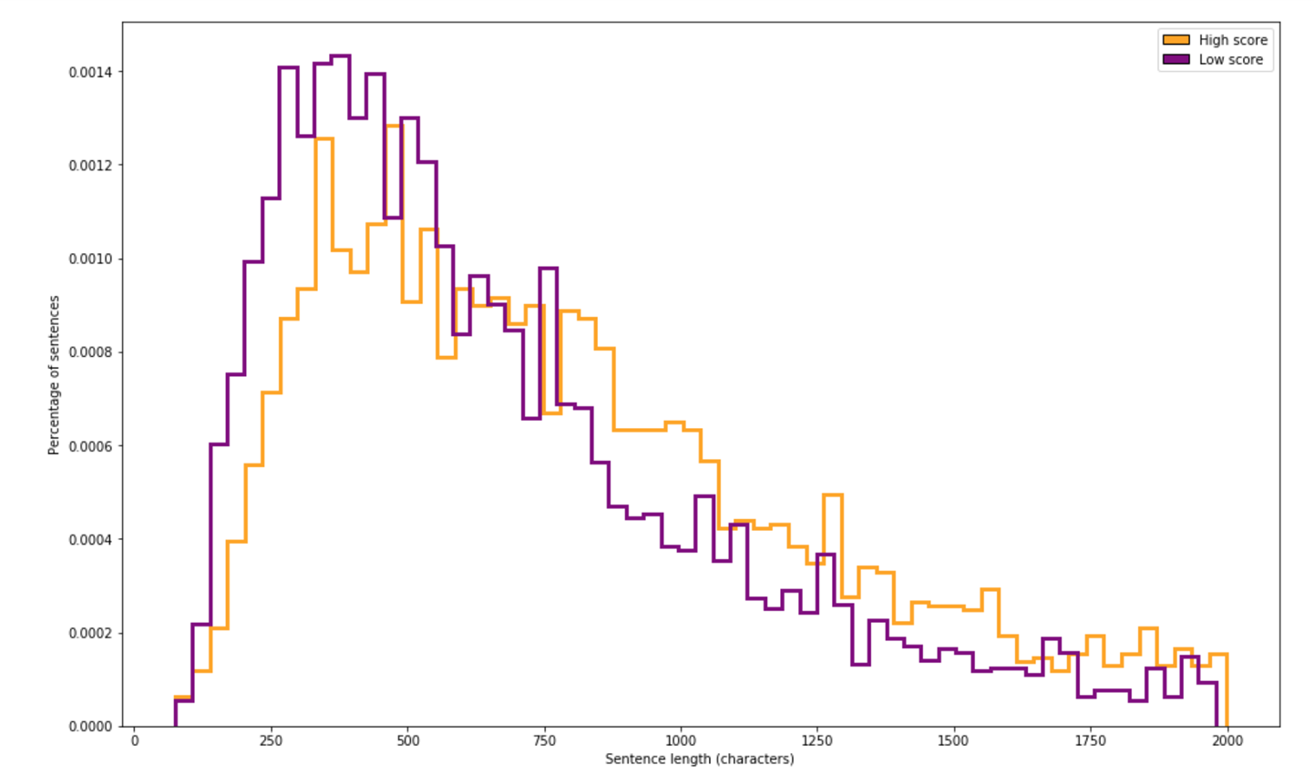
Figure 4-2. Histogram of the length of text for high- and low-score questions
Explore and Label Efficiently
You can only get so far looking at descriptive statistics such as averages and plots such as histograms. To develop an intuition for your data, you should spend some time looking at individual data points. However, going through points in a dataset at random is quite inefficient. In this section, I’ll cover how to maximize your efficiency when visualizing individual data points.
Clustering is a useful method to use here. Clustering is the task of grouping a set of objects in such a way that objects in the same group (called a cluster) are more similar (in some sense) to each other than to those in other groups (clusters). We will use clustering both for exploring our data and for our model predictions later (see “Dimensionality reduction”).
Many clustering algorithms group data points by measuring the distance between points and assigning ones that are close to each other to the same cluster. Figure 4-3 shows an example of a clustering algorithm separating a dataset into three different clusters. Clustering is an unsupervised method, and there is often no single correct way to cluster a dataset. In this book, we will use clustering as a way to generate some structure to guide our exploration.
Because clustering relies on calculating the distance between data points, the way we choose to represent our data points numerically has a large impact on which clusters are generated. We will dive into this in the next section, “Vectorizing”.
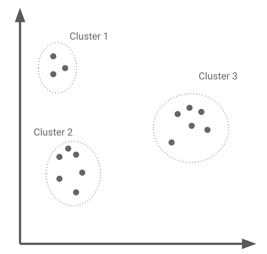
Figure 4-3. Generating three clusters from a dataset
The vast majority of datasets can be separated into clusters based on their features, labels, or a combination of both. Examining each cluster individually and the similarities and differences between clusters is a great way to identify structure in a dataset.
There are multiple things to look out for here:
-
How many clusters do you identify in your dataset?
-
Do each of these clusters seem different to you? In which way?
-
Are any clusters much more dense than others? If so, your model is likely to struggle to perform on the sparser areas. Adding features and data can help alleviate this problem.
-
Do all clusters represent data that seems as “hard” to model? If some clusters seem to represent more complex data points, make note of them so you can revisit them when we evaluate our model’s performance.
As we mentioned, clustering algorithms work on vectors, so we can’t simply pass a set of sentences to a clustering algorithm. To get our data ready to be clustered, we will first need to vectorize it.
Vectorizing
Vectorizing a dataset is the process of going from the raw data to a vector that represents it. Figure 4-4 shows an example of vectorized representations for text and tabular data.
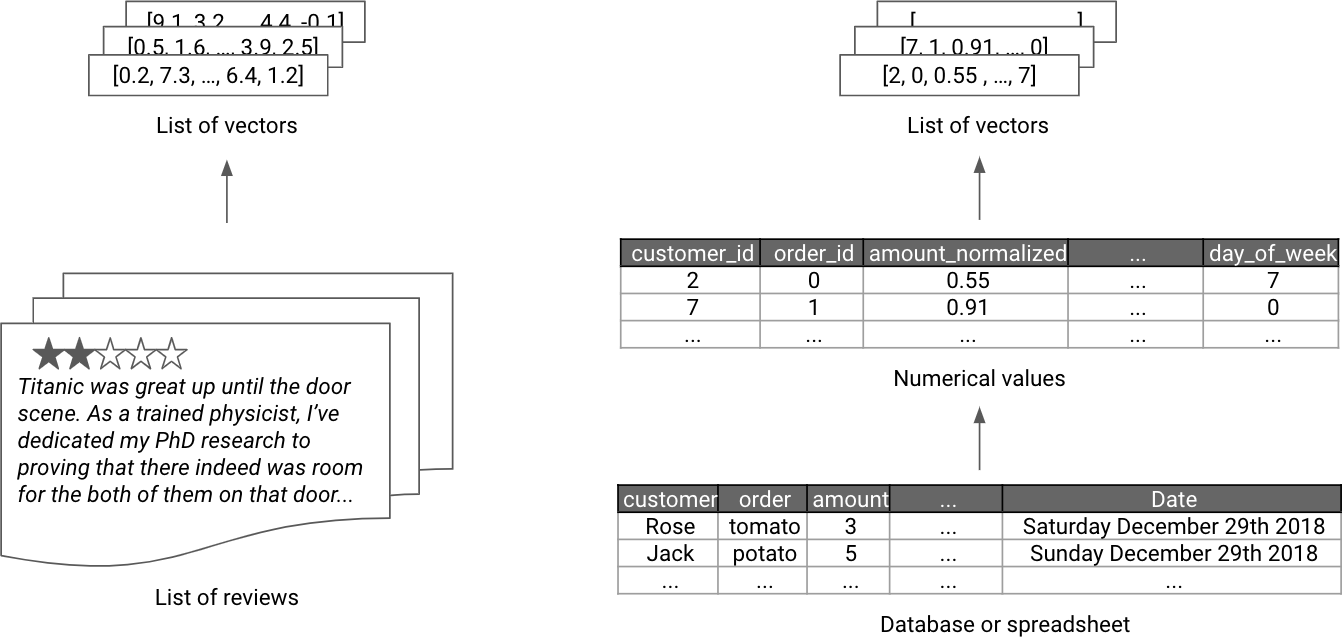
Figure 4-4. Examples of vectorized representations
There are many ways to vectorize data, so we will focus on a few simple methods that work for some of the most common data types, such as tabular data, text, and images.
Tabular data
For tabular data consisting of both categorical and continuous features, a possible vector representation is simply the concatenation of the vector representations of each feature.
Continuous features should be normalized to a common scale so that features with larger scale do not cause smaller features to be completely ignored by models. There are various way to normalize data, but starting by transforming each feature such that its mean is zero and variance one is often a good first step. This is often referred to as a standard score.
Categorical features such as colors can be converted to a one-hot encoding: a list as long as the number of distinct values of the feature consisting of only zeros and a single one, whose index represents the current value (for example, in a dataset containing four distinct colors, we could encode red as [1, 0, 0, 0] and blue as [0, 0, 1, 0]). You may be curious as to why we wouldn’t simply assign each potential value a number, such as 1 for red and 3 for blue. It is because such an encoding scheme would imply an ordering between values (blue is larger than red), which is often incorrect for categorical variables.
A property of one-hot encoding is that the distance between any two given feature values is always one. This often provides a good representation for a model, but in some cases such as days of the week, some values may be more similar than the others (Saturday and Sunday are both in the weekend, so ideally their vectors would be closer together than Wednesday and Sunday, for example). Neural networks have started proving themselves useful at learning such representations (see the paper “Entity Embeddings of Categorical Variables”, by C. Guo and F. Berkhahn). These representations have been shown to improve the performance of models using them instead of other encoding schemes.
Finally, more complex features such as dates should be transformed in a few numerical features capturing their salient characteristics.
Let’s go through a practical example of vectorization for tabular data. You can find the code for the example in the tabular data vectorization notebook in this book’s GitHub repository.
Let’s say that instead of looking at the content of questions, we want to predict the score a question will get from its tags, number of comments, and creation date. In Table 4-3, you can see an example of what this dataset would look like for the writers.stackexchange.com dataset.
| Id | Tags | CommentCount | CreationDate | Score |
|---|---|---|---|---|
1 |
<resources><first-time-author> |
7 |
2010-11-18T20:40:32.857 |
32 |
2 |
<fiction><grammatical-person><third-person> |
0 |
2010-11-18T20:42:31.513 |
20 |
3 |
<publishing><novel><agent> |
1 |
2010-11-18T20:43:28.903 |
34 |
5 |
<plot><short-story><planning><brainstorming> |
0 |
2010-11-18T20:43:59.693 |
28 |
7 |
<fiction><genre><categories> |
1 |
2010-11-18T20:45:44.067 |
21 |
Each question has multiple tags, as well as a date and a number of comments. Let’s preprocess each of these. First, we normalize numerical fields:
defget_norm(df,col):return(df[col]-df[col].mean())/df[col].std()tabular_df["NormComment"]=get_norm(tabular_df,"CommentCount")tabular_df["NormScore"]=get_norm(tabular_df,"Score")
Then, we extract relevant information from the date. We could, for example, choose the year, month, day, and hour of posting. Each of these is a numerical value our model can use.
# Convert our date to a pandas datetimetabular_df["date"]=pd.to_datetime(tabular_df["CreationDate"])# Extract meaningful features from the datetime objecttabular_df["year"]=tabular_df["date"].dt.yeartabular_df["month"]=tabular_df["date"].dt.monthtabular_df["day"]=tabular_df["date"].dt.daytabular_df["hour"]=tabular_df["date"].dt.hour
Our tags are categorical features, with each question potentially being given any number of tags. As we saw earlier, the easiest way to represent categorical inputs is to one-hot encode them, transforming each tag into its own column, with each question having a value of 1 for a given tag feature only if that tag is associated to this question.
Because we have more than three hundred tags in our dataset, here we chose to only create a column for the five most popular ones that are used in more than five hundred questions. We could add every single tag, but because the majority of them appear only once, this would not be helpful to identify patterns.
# Select our tags, represented as strings, and transform them into arrays of tagstags=tabular_df["Tags"]clean_tags=tags.str.split("><").apply(lambdax:[a.strip("<").strip(">")forainx])# Use pandas' get_dummies to get dummy values# select only tags that appear over 500 timestag_columns=pd.get_dummies(clean_tags.apply(pd.Series).stack()).sum(level=0)all_tags=tag_columns.astype(bool).sum(axis=0).sort_values(ascending=False)top_tags=all_tags[all_tags>500]top_tag_columns=tag_columns[top_tags.index]# Add our tags back into our initial DataFramefinal=pd.concat([tabular_df,top_tag_columns],axis=1)# Keeping only the vectorized featurescol_to_keep=["year","month","day","hour","NormComment","NormScore"]+list(top_tags.index)final_features=final[col_to_keep]
In Table 4-4, you can see that our data is now fully vectorized, with each row consisting only of numeric values. We can feed this data to a clustering algorithm, or a supervised ML model.
| Id | Year | Month | Day | Hour | Norm-Comment | Norm-Score | Creative writing | Fiction | Style | Char-acters | Tech-nique | Novel | Pub-lishing |
|---|---|---|---|---|---|---|---|---|---|---|---|---|---|
1 |
2010 |
11 |
18 |
20 |
0.165706 |
0.140501 |
0 |
0 |
0 |
0 |
0 |
0 |
0 |
2 |
2010 |
11 |
18 |
20 |
-0.103524 |
0.077674 |
0 |
1 |
0 |
0 |
0 |
0 |
0 |
3 |
2010 |
11 |
18 |
20 |
-0.065063 |
0.150972 |
0 |
0 |
0 |
0 |
0 |
1 |
1 |
5 |
2010 |
11 |
18 |
20 |
-0.103524 |
0.119558 |
0 |
0 |
0 |
0 |
0 |
0 |
0 |
7 |
2010 |
11 |
18 |
20 |
-0.065063 |
0.082909 |
0 |
1 |
0 |
0 |
0 |
0 |
0 |
Different types of data call for different vectorization methods. In particular, text data often requires more creative approaches.
Text data
The simplest way to vectorize text is to use a count vector, which is the word equivalent of one-hot encoding. Start by constructing a vocabulary consisting of the list of unique words in your dataset. Associate each word in our vocabulary to an index (from 0 to the size of our vocabulary). You can then represent each sentence or paragraph by a list as long as our vocabulary. For each sentence, the number at each index represents the count of occurrences of the associated word in the given sentence.
This method ignores the order of the words in a sentence and so is referred to as a bag of words. Figure 4-5 shows two sentences and their bag-of-words representations. Both sentences are transformed into vectors that contain information about the number of times a word occurs in a sentence, but not the order in which words are present in the sentence.
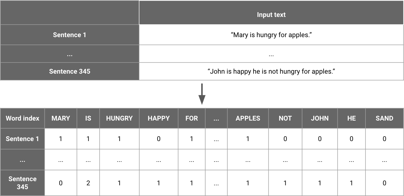
Figure 4-5. Getting bag-of-words vectors from sentences
Using a bag-of-words representation or its normalized version TF-IDF (short for Term Frequency–Inverse Document Frequency) is simple using scikit-learn, as you can see here:
# Create an instance of a tfidf vectorizer,# We could use CountVectorizer for a non normalized versionvectorizer=TfidfVectorizer()# Fit our vectorizer to questions in our dataset# Returns an array of vectorized textbag_of_words=vectorizer.fit_transform(df[df["is_question"]]["Text"])
Multiple novel text vectorization methods have been developed over the years, starting in 2013 with Word2Vec (see the paper, “Efficient Estimation of Word Representations in Vector Space,” by Mikolov et al.) and more recent approaches such as fastText (see the paper, “Bag of Tricks for Efficient Text Classification,” by Joulin et al.). These vectorization techniques produce word vectors that attempt to learn a representation that captures similarities between concepts better than a TF-IDF encoding. They do this by learning which words tend to appear in similar contexts in large bodies of text such as Wikipedia. This approach is based on the distributional hypothesis, which claims that linguistic items with similar distributions have similar meanings.
Concretely, this is done by learning a vector for each word and training a model to predict a missing word in a sentence using the word vectors of words around it. The number of neighboring words to take into account is called the window size. In Figure 4-6, you can see a depiction of this task for a window size of two. On the left, the word vectors for the two words before and after the target are fed to a simple model. This simple model and the values of the word vectors are then optimized so that the output matches the word vector of the missing word.
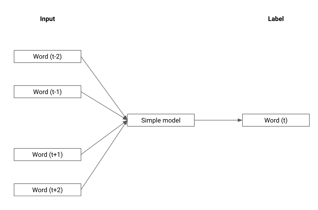
Figure 4-6. Learning word vectors, from the Word2Vec paper “Efficient Estimation of Word Representations in Vector Space” by Mikolov et al.
Many open source pretrained word vectorizing models exist. Using vectors produced by a model that was pretrained on a large corpus (oftentimes Wikipedia or an archive of news stories) can help our models leverage the semantic meaning of common words better.
For example, the word vectors mentioned in the Joulin et al. fastText paper are available online in a standalone tool. For a more customized approach, spaCy is an NLP toolkit that provides pretrained models for a variety of tasks, as well as easy ways to build your own.
Here is an example of using spaCy to load pretrained word vectors and using them to get a semantically meaningful sentence vector. Under the hood, spaCy retrieves the pretrained value for each word in our dataset (or ignores it if it was not part of its pretraining task) and averages all vectors in a question to get a representation of the question.
importspacy# We load a large model, and disable pipeline unnecessary parts for our task# This speeds up the vectorization process significantly# See https://spacy.io/models/en#en_core_web_lg for details about the modelnlp=spacy.load('en_core_web_lg',disable=["parser","tagger","ner","textcat"])# We then simply get the vector for each of our questions# By default, the vector returned is the average of all vectors in the sentence# See https://spacy.io/usage/vectors-similarity for morespacy_emb=df[df["is_question"]]["Text"].apply(lambdax:nlp(x).vector)
To see a comparison of a TF-IDF model with pretrained word embeddings for our dataset, please refer to the vectorizing text notebook in the book’s GitHub repository.
Since 2018, word vectorization using large language models on even larger datasets has started producing the most accurate results (see the papers “Universal Language Model Fine-Tuning for Text Classification”, by J. Howard and S. Ruder, and “BERT: Pre-training of Deep Bidirectional Transformers for Language Understanding”, by J. Devlin et al.). These large models, however, do come with the drawback of being slower and more complex than simple word embeddings.
Finally, let’s examine vectorization for another commonly used type of data, images.
Image data
Image data is already vectorized, as an image is nothing more but a multidimensional array of numbers, often referred to in the ML community as tensors. Most standard three-channel RGB images, for example, are simply stored as a list of numbers of length equal to the height of the image in pixels, multiplied by its width, multiplied by three (for the red, green, and blue channels). In Figure 4-7, you can see how we can represent an image as a tensor of numbers, representing the intensity of each of the three primary colors.
While we can use this representation as is, we would like our tensors to capture a little more about the semantic meaning of our images. To do this, we can use an approach similar to the one for text and leverage large pretrained neural networks.
Models that have been trained on massive classification datasets such as VGG (see the paper by A. Simonyan and A. Zimmerman, “Very Deep Convolutional Networks for Large-Scale Image Recognition”) or Inception (see the paper by C. Szegedy et al., “Going Deeper with Convolutions”) on the ImageNet dataset end up learning very expressive representations in order to classify well. These models mostly follow a similar high-level structure. The input is an image that passes through many successive layers of computation, each generating a different representation of said image.
Finally, the penultimate layer is passed to a function that generates classification probabilities for each class. This penultimate layer thus contains a representation of the image that is sufficient to classify which object it contains, which makes it a useful representation for other tasks.

Figure 4-7. Representing a 3 as a matrix of values from 0 to 1 (only showing the red channel)
Extracting this representation layer proves to work extremely well at generating meaningful vectors for images. This requires no custom work other than loading the pretrained model. In Figure 4-8 each rectangle represents a different layer for one of those pretrained models. The most useful representation is highlighted. It is usually located just before the classification layer, since that is the representation that needs to summarize the image best for the classifier to perform well.
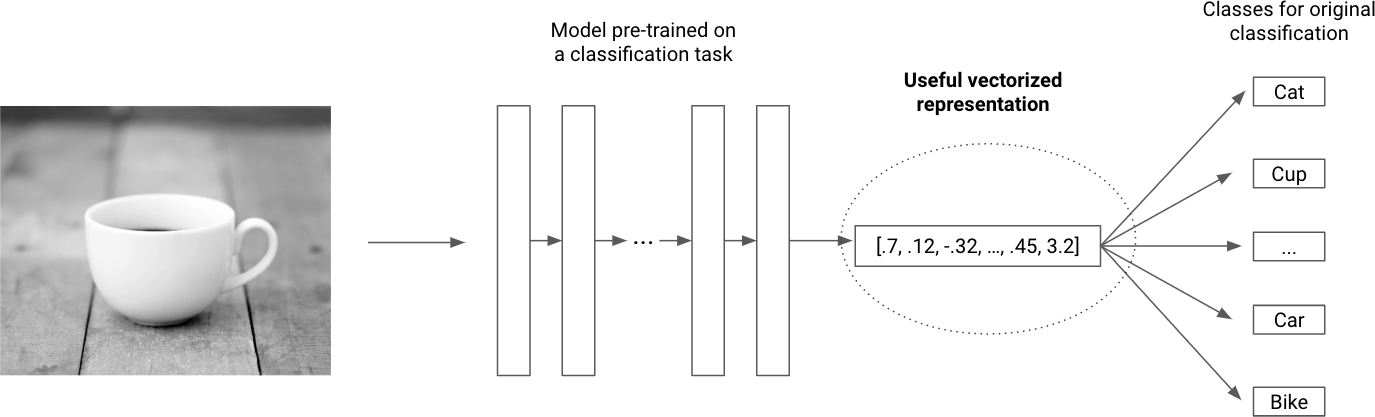
Figure 4-8. Using a pretrained model to vectorize images
Using modern libraries such as Keras makes this task much easier. Here is a function that loads images from a folder and transforms them into semantically meaningful vectors for downstream analysis, using a pretrained network available in Keras:
importnumpyasnpfromkeras.preprocessingimportimagefromkeras.modelsimportModelfromkeras.applications.vgg16importVGG16fromkeras.applications.vgg16importpreprocess_inputdefgenerate_features(image_paths):"""Takes in an array of image pathsReturns pretrained features for each image:param image_paths: array of image paths:return: array of last-layer activations,and mapping from array_index to file_path"""images=np.zeros(shape=(len(image_paths),224,224,3))# loading a pretrained modelpretrained_vgg16=VGG16(weights='imagenet',include_top=True)# Using only the penultimate layer, to leverage learned featuresmodel=Model(inputs=pretrained_vgg16.input,outputs=pretrained_vgg16.get_layer('fc2').output)# We load all our dataset in memory (works for small datasets)fori,finenumerate(image_paths):img=image.load_img(f,target_size=(224,224))x_raw=image.img_to_array(img)x_expand=np.expand_dims(x_raw,axis=0)images[i,:,:,:]=x_expand# Once we've loaded all our images, we pass them to our modelinputs=preprocess_input(images)images_features=model.predict(inputs)returnimages_features
Once you have a vectorized representation, you can cluster it or pass your data to a model, but you can also use it to more efficiently inspect your dataset. By grouping data points with similar representations together, you can more quickly look at trends in your dataset. We’ll see how to do this next.
Dimensionality reduction
Having vector representations is necessary for algorithms, but we can also leverage those representations to visualize data directly! This may seem challenging, because the vectors we described are often in more than two dimensions, which makes them challenging to display on a chart. How could we display a 14-dimensional vector?
Geoffrey Hinton, who won a Turing Award for his work in deep learning, acknowledges this problem in his lecture with the following tip: “To deal with hyper-planes in a 14-dimensional space, visualize a 3D space and say fourteen to yourself very loudly. Everyone does it.” (See slide 16 from G. Hinton et al.’s lecture, “An Overview of the Main Types of Neural Network Architecture” here.) If this seems hard to you, you’ll be excited to hear about dimensionality reduction, which is the technique of representing vectors in fewer dimensions while preserving as much about their structure as possible.
Dimensionality reduction techniques such as t-SNE (see the paper by L. van der Maaten and G. Hinton, PCA, “Visualizing Data Using t-SNE”), and UMAP (see the paper by L. McInnes et al, “UMAP: Uniform Manifold Approximation and Projection for Dimension Reduction”) allow you to project high-dimensional data such as vectors representing sentences, images, or other features on a 2D plane.
These projections are useful to notice patterns in data that you can then investigate. They are approximate representations of the real data, however, so you should validate any hypothesis you make from looking at such a plot by using other methods. If you see clusters of points all belonging to one class that seem to have a feature in common, check that your model is actually leveraging that feature, for example.
To get started, plot your data using a dimensionality reduction technique and color each point by an attribute you are looking to inspect. For classification tasks, start by coloring each point based on its label. For unsupervised tasks, you can color points based on the values of given features you are looking at, for example. This allows you to see whether any regions seem like they will be easy for your model to separate, or trickier.
Here is how to do this easily using UMAP, passing it embeddings we generated in “Vectorizing”:
importumap# Fit UMAP to our data, and return the transformed dataumap_emb=umap.UMAP().fit_transform(embeddings)fig=plt.figure(figsize=(16,10))color_map={True:'#ff7f0e',False:'#1f77b4'}plt.scatter(umap_emb[:,0],umap_emb[:,1],c=[color_map[x]forxinsent_labels],s=40,alpha=0.4)
As a reminder, we decided to start with using only data from the writers’ community of Stack Exchange. The result for this dataset is displayed on Figure 4-9. At first glance, we can see a few regions we should explore, such as the dense region of unanswered questions on the top left. If we can identify which features they have in common, we may discover a useful classification feature.
After data is vectorized and plotted, it is generally a good idea to start systematically identifying groups of similar data points and explore them. We could do this simply by looking at UMAP plots, but we can also leverage clustering.
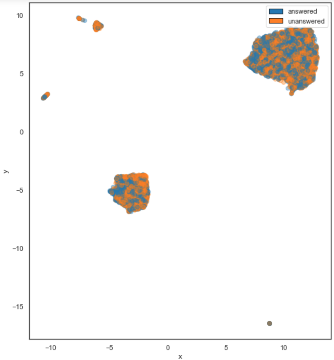
Figure 4-9. UMAP plot colored by whether a given question was successfully answered
Clustering
We mentioned clustering earlier as a method to extract structure from data. Whether you are clustering data to inspect a dataset or using it to analyze a model’s performance as we will do in Chapter 5, clustering is a core tool to have in your arsenal. I use clustering in a similar fashion as dimensionality reduction, as an additional way to surface issues and interesting data points.
A simple method to cluster data in practice is to start by trying a few simple algorithms such as k-means and tweak their hyperparameters such as the number of clusters until you reach a satisfactory performance.
Clustering performance is hard to quantify. In practice, using a combination of data visualization and methods such as the elbow method or a silhouette plot is sufficient for our use case, which is not to perfectly separate our data but to identify regions where our model may have issues.
The following is an example snippet of code for clustering our dataset, as well as visualizing our clusters using a dimensionality technique we described earlier, UMAP.
fromsklearn.clusterimportKMeansimportmatplotlib.cmascm# Choose number of clusters and colormapn_clusters=3cmap=plt.get_cmap("Set2")# Fit clustering algorithm to our vectorized featuresclus=KMeans(n_clusters=n_clusters,random_state=10)clusters=clus.fit_predict(vectorized_features)# Plot the dimentionality reduced features on a 2D planeplt.scatter(umap_features[:,0],umap_features[:,1],c=[cmap(x/n_clusters)forxinclusters],s=40,alpha=.4)plt.title('UMAP projection of questions, colored by clusters',fontsize=14)
As you can see in Figure 4-10, the way we would instinctively cluster the 2D representation does not always match with the clusters our algorithm finds on the vectorized data. This can be because of artifacts in our dimensionality reduction algorithm or a complex data topology. In fact, adding a point’s assigned cluster as a feature can sometimes improve a model’s performance by letting it leverage said topology.
Once you have clusters, examine each cluster and try to identify trends in your data on each of them. To do so, you should select a few points per cluster and act as if you were the model, thus labeling those points with what you think the correct answer should be. In the next section, I’ll describe how to do this labeling work.
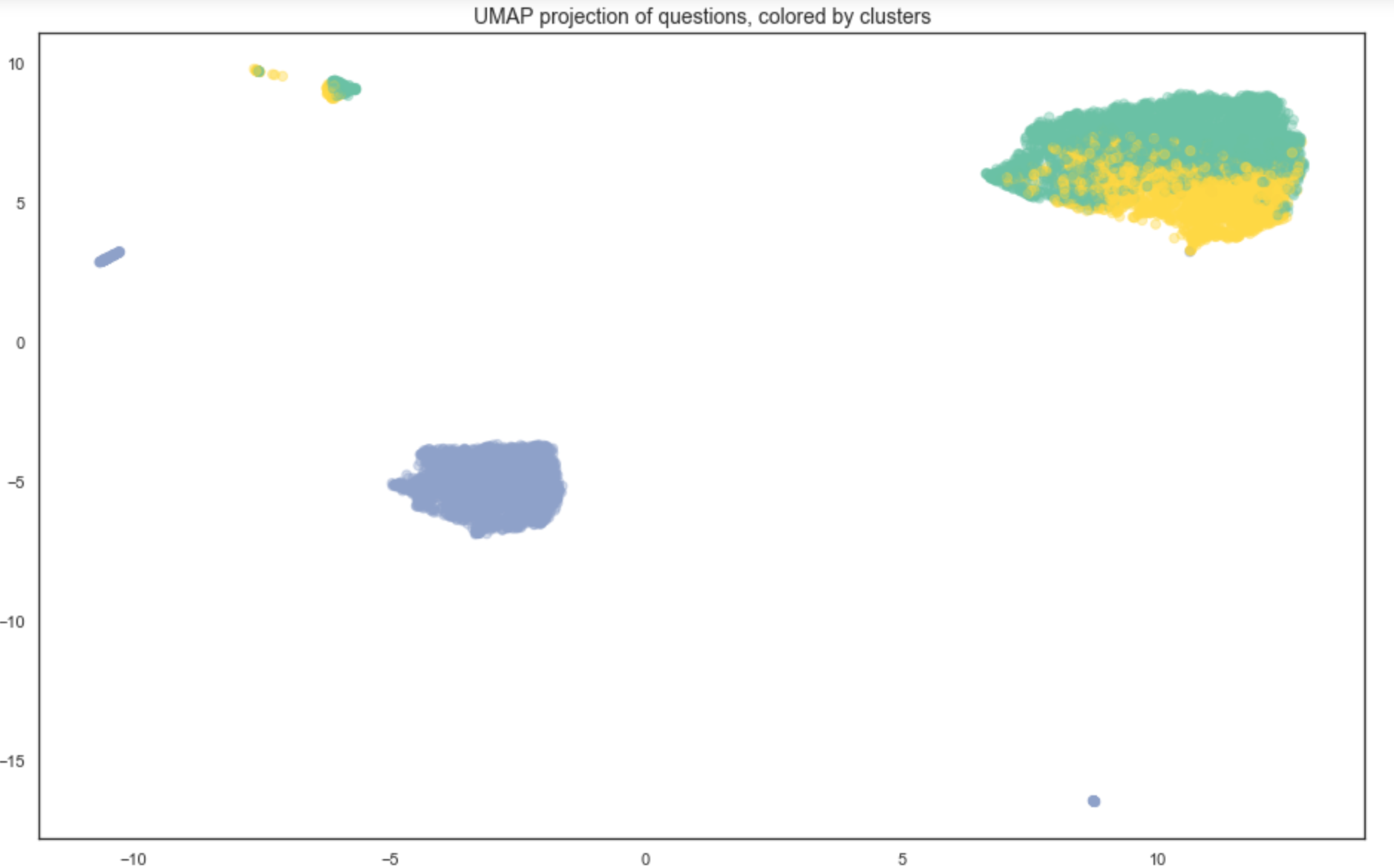
Figure 4-10. Visualizing our questions, colored by cluster
Be the Algorithm
Once you’ve looked at aggregate metrics and cluster information, I’d encourage you to follow the advice in “Monica Rogati: How to Choose and Prioritize ML Projects” and try to do your model’s job by labeling a few data points in each cluster with the results you would like a model to produce.
If you have never tried doing your algorithm’s job, it will be hard to judge the quality of its results. On the other side, if you spend some time labeling data yourself, you will often notice trends that will make your modeling task much easier.
You might recognize this advice from our previous section about heuristics, and it should not surprise you. Choosing a modeling approach involves making almost as many assumptions about our data as building heuristics, so it makes sense for these assumptions to be data driven.
You should label data even if your dataset contains labels. This allows you to validate that your labels do capture the correct information and that they are correct. In our case study, we use a question’s score as a measure of its quality, which is a weak label. Labeling a few examples ourselves will allow us to validate the assumption that this label is appropriate.
Once you label a few examples, feel free to update your vectorization strategy by adding any features you discover to help make your data representation as informative as possible, and go back to labeling. This is an iterative process, as illustrated in Figure 4-11.
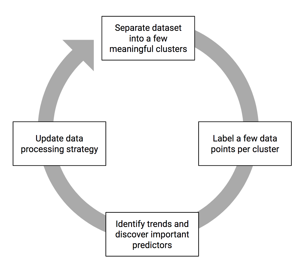
Figure 4-11. The process of labeling data
To speed up your labeling, make sure to leverage your prior analysis by labeling a few data points in each cluster you have identified and for each common value in your feature distribution.
One way to do this is to leverage visualization libraries to interactively explore your data. Bokeh offers the ability to make interactive plots. One quick way to label data is to go through a plot of our vectorized examples, labeling a few examples for each cluster.
Figure 4-12 shows a representative individual example from a cluster of mostly unanswered questions. Questions in this cluster tended to be quite vague and hard to answer objectively and did not receive answers. These are accurately labeled as poor questions. To see the source code for this plot and an example of its use for the ML Editor, navigate to the exploring data to generate features notebook in this book’s GitHub repository.
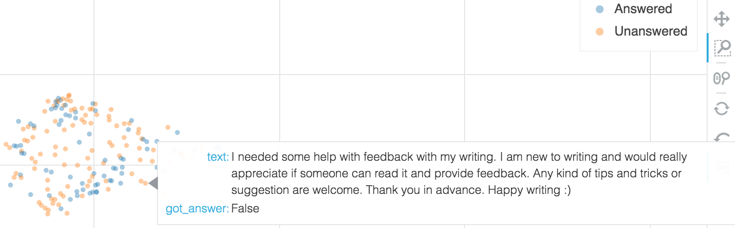
Figure 4-12. Using Bokeh to inspect and label data
When labeling data, you can choose to store labels with the data itself (as an additional column in a DataFrame, for example) or separately using a mapping from file or identifier to label. This is purely a matter of preference.
As you label examples, try to notice which process you are using to make your decisions. This will help with identifying trends and generating features that will help your models.
Data Trends
After having labeled data for a while, you will usually identify trends. Some may be informative (short tweets tend to be simpler to classify as positive or negative) and guide you to generate useful features for your models. Others may be irrelevant correlations because of the way data was gathered.
Maybe all of the tweets we collected that are in French happen to be negative, which would likely lead a model to automatically classify French tweets as negative. I’ll let you decide how inaccurate that might be on a broader, more representative sample.
If you notice anything of the sort, do not despair! These kinds of trends are crucial to identify before you start building models, as they would artificially inflate accuracy on training data and could lead you to put a model in production that does not perform well.
The best way to deal with such biased examples is to gather additional data to make your training set more representative. You could also try to eliminate these features from your training data to avoid biasing your model, but this may not be effective in practice, as models frequently pick up on bias by leveraging correlations with other features (see Chapter 8).
Once you’ve identified some trends, it is time to use them. Most often, you can do this in one of two ways, by creating a feature that characterizes that trend or by using a model that will easily leverage it.
Let Data Inform Features and Models
We would like to use the trends we discover in the data to inform our data processing, feature generation, and modeling strategy. To start, let’s look at how we could generate features that would help us capture these trends.
Build Features Out of Patterns
ML is about using statistical learning algorithms to leverage patterns in the data, but some patterns are easier to capture for models than others. Imagine the trivial example of predicting a numerical value using the value itself divided by 2 as a feature. The model would simply have to learn to multiply by 2 to predict the target perfectly. On the other hand, predicting the stock market from historical data is a problem that requires leveraging much more complex patterns.
This is why a lot of the practical gains of ML come from generating additional features that will help our models identify useful patterns. The ease with which a model identifies patterns depends on the way we represent data and how much of it we have. The more data you have and the less noisy your data is, the less feature engineering work you usually have to do.
It is often valuable to start by generating features, however; first because we will usually be starting with a small dataset and second because it helps encode our beliefs about the data and debug our models.
Seasonality is a common trend that benefits from specific feature generation. Let’s say that an online retailer noticed that most of their sales happens on the last two weekends of the month. When building a model to predict future sales, they want to make sure that it has the potential to capture this pattern.
As you’ll see, depending on how they represent dates, the task could prove quite difficult for their models. Most models are only able to take numerical inputs (see “Vectorizing” for methods to transform text and images into numerical inputs), so let’s examine a few ways to represent dates.
Raw datetime
The simplest way to represent time is in Unix time, which represents “the number of seconds that have elapsed since 00:00:00 Thursday, 1 January 1970.”
While this representation is simple, our model would need to learn some pretty complex patterns to identify the last two weekends of the month. The last weekend of 2018, for example (from 00:00:00 on the 29th to 23:59:59 on the 30th of December), is represented in Unix time as the range from 1546041600 to 1546214399 (you can verify that if you take the difference between both numbers, which represents an interval of 23 hours, 59 minutes, and 59 seconds measured in seconds).
Nothing about this range makes it particularly easy to relate to other weekends in other months, so it will be quite hard for a model to separate relevant weekends from others when using Unix time as an input. We can make the task easier for a model by generating features.
Extracting day of week and day of month
One way to make our representation of dates clearer would be to extract the day of the week and day of the month into two separate attributes.
The way we would represent 23:59:59 on the 30th of December, 2018, for example, would be with the same number as earlier, and two additional values representing the day of the week (0 for Sunday, for example) and day of the month (30).
This representation will make it easier for our model to learn that the values related to weekends (0 and 6 for Sunday and Saturday) and to later dates in the month correspond to higher activity.
It is also important to note that representations will often introduce bias to our model. For example, by encoding the day of the week as a number, the encoding for Friday (equal to five) will be five times greater than the one for Monday (equal to one). This numerical scale is an artifact of our representation and does not represent something we wish our model to learn.
Feature crosses
While the previous representation makes the task easier for our models, they would still have to learn a complex relationship between the day of the week and the day of the month: high traffic does not happen on weekends early in the month or on weekdays late in the month.
Some models such as deep neural networks leverage nonlinear combinations of features and can thus pick up on these relationships, but they often need a significant amount of data. A common way to address this problem is by making the task even easier and introducing feature crosses.
A feature cross is a feature generated simply by multiplying (crossing) two or more features with each other. This introduction of a nonlinear combination of features allows our model to discriminate more easily based on a combination of values from multiple features.
In Table 4-5, you can see how each of the representations we described would look for a few example data points.
| Human representation | Raw data (Unix datetime) | Day of week (DoW) | Day of month (DoM) | Cross (DoW / DoM) |
|---|---|---|---|---|
Saturday, December 29, 2018, 00:00:00 |
1,546,041,600 |
7 |
29 |
174 |
Saturday, December 29, 2018, 01:00:00 |
1,546,045,200 |
7 |
29 |
174 |
… |
… |
… |
… |
… |
Sunday, December 30, 2018, 23:59:59 |
1,546,214,399 |
1 |
30 |
210 |
In Figure 4-13, you can see how these feature values change with time and which ones make it simpler for a model to separate specific data points from others.
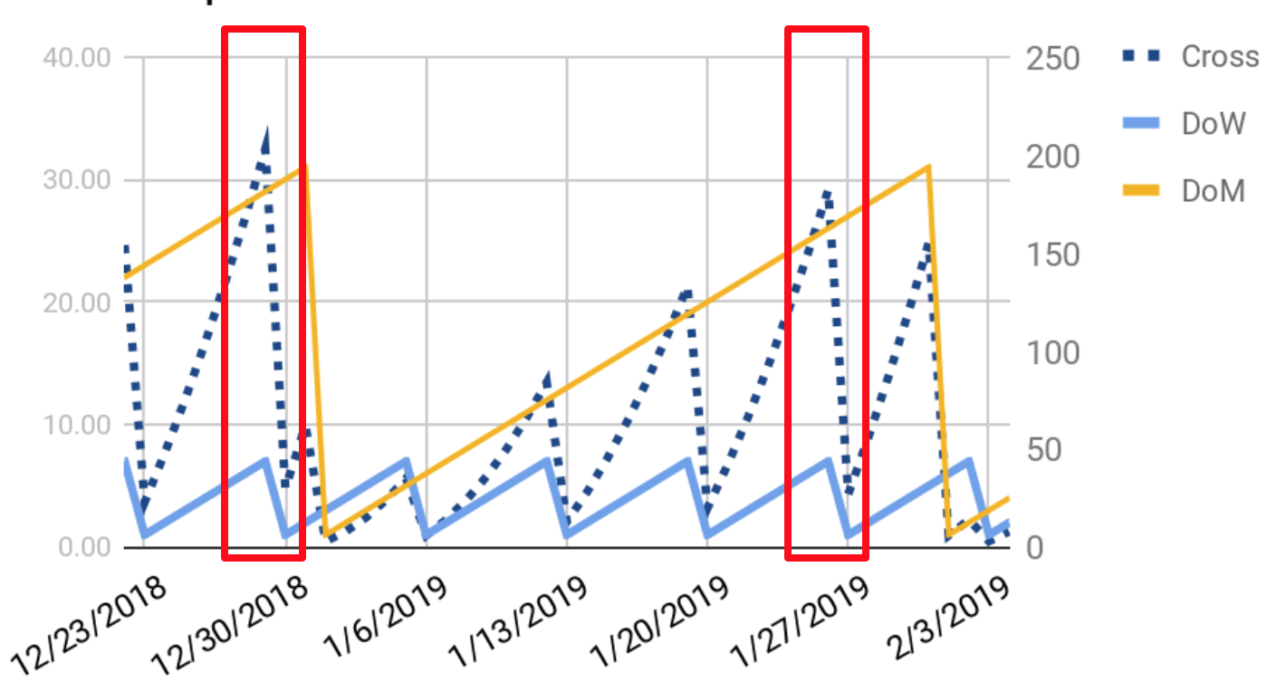
Figure 4-13. The last weekends of the month are easier to separate using feature crosses and extracted features
There is one last way to represent our data that will make it even easier for our model to learn the predictive value of the last two weekends of the month.
Giving your model the answer
It may seem like cheating, but if you know for a fact that a certain combination of feature values is particularly predictive, you can create a new binary feature that takes a nonzero value only when these features take the relevant combination of values. In our case, this would mean adding a feature called “is_last_two_weekends”, for example, that will be set to one only during the last two weekends of the month.
If the last two weekends are as predictive as we had supposed they were, the model will simply learn to leverage this feature and will be much more accurate. When building ML products, never hesitate to make the task easier for your model. Better to have a model that works on a simpler task than one that struggles on a complex one.
Feature generation is a wide field, and methods exist for most types of data. Discussing every feature that is useful to generate for different types of data is outside the scope of this book. If you’d like to see more practical examples and methods, I recommend taking a look at Feature Engineering for Machine Learning (O’Reilly), by Alice Zheng and Amanda Casari.
In general, the best way to generate useful features is by looking at your data using the methods we described and asking yourself what the easiest way is to represent it in a way that will make your model learn its patterns. In the following section, I’ll describe a few examples of features I generated using this process for the ML Editor.
ML Editor Features
For our ML Editor, using the techniques described earlier to inspect our dataset (see details of the exploration in the exploring data to generate features notebook, in this book’s GitHub repository), we generated the following features:
-
Action verbs such as can and should are predictive of a question being answered, so we added a binary value that checks whether they are present in each question.
-
Question marks are good predictors as well, so we have generated a
has_questionfeature. -
Questions about correct use of the English language tended not to get answers, so we added a
is_language_questionfeature. -
The length of the text of the question is another factor, with very short questions tending to go unanswered. This led to the addition of a normalized question length feature.
-
In our dataset, the title of the question contains crucial information as well, and looking at titles when labeling made the task much easier. This led to include the title text in all the earlier feature calculations.
Once we have an initial set of features, we can start building a model. Building this first model is the topic of the next chapter, Chapter 5.
Before moving on to models, I wanted to dive deeper on the topic of how to gather and update a dataset. To do that, I sat down with Robert Munro, an expert in the field. I hope you enjoy the summary of our discussion here, and that it leaves you excited to move on to our next part, building our first model!
Robert Munro: How Do You Find, Label, and Leverage Data?
Robert Munro has founded several AI companies, building some of the top teams in artificial intelligence. He was chief technology officer at Figure Eight, a leading data labeling company during their biggest growth period. Before that, Robert ran product for AWS’s first native natural language processing and machine translation services. In our conversation, Robert shares some lessons he learned building datasets for ML.
Q: How do you get started on an ML project?
A: The best way is to start with the business problem, as it will give you boundaries to work with. In your ML editor case study example, are you editing text that someone else has written after they submit it, or are you suggesting edits live as somebody writes? The first would let you batch process requests with a slower model, while the second one would require something quicker.
In terms of models, the second approach would invalidate sequence-to-sequence models as they would be too slow. In addition, sequence-to-sequence models today do not work beyond sentence-level recommendations and require a lot of parallel text to be trained. A faster solution would be to leverage a classifier and use the important features it extracts as suggestions. What you want out of this initial model is an easy implementation and results you can have confidence in, starting with naive Bayes on bag of words features, for example.
Finally, you need to spend some time looking at some data and labeling it yourself. This will give you an intuition for how hard the problem is and which solutions might be a good fit.
Q: How much data do you need to get started?
A: When gathering data, you are looking to guarantee that you have a representative and diverse dataset. Start by looking at the data you have and seeing if any types are unrepresented so that you can gather more. Clustering your dataset and looking for outliers can be helpful to speed up this process.
For labeling data, in the common case of classification, we’ve seen that labeling on the order of 1,000 examples of your rarer category works well in practice. You’ll at least get enough signal to tell you whether to keep going with your current modeling approach. At around 10,000 examples, you can start to trust in the confidence of the models you are building.
As you get more data, your model’s accuracy will slowly build up, giving you a curve of how your performance scales with data. At any point you only care about the last part of the curve, which should give you an estimate of the current value more data will give you. In the vast majority of cases, the improvement you will get from labeling more data will be more significant than if you iterated on the model.
Q: What process do you use to gather and label data?
A: You can look at your current best model and see what is tripping it up. Uncertainty sampling is a common approach: identify examples that your model is the most uncertain about (the ones closest to its decision boundary), and find similar examples to add to the training set.
You can also train an “error model” to find more data your current model struggles on. Use the mistakes your model makes as labels (labeling each data point as “predicted correctly” or “predicted incorrectly”). Once you train an “error model” on these examples, you can use it on your unlabeled data and label the examples that it predicts your model will fail on.
Alternatively, you can train a “labeling model” to find the best examples to label next. Let’s say you have a million examples, of which you’ve labeled only 1,000. You can create a training set of 1,000 randomly sampled labeled images, and 1,000 unlabeled, and train a binary classifier to predict which images you have labeled. You can then use this labeling model to identify data points that are most different from what you’ve already labeled and label those.
Q: How do you validate that your models are learning something useful?
A: A common pitfall is to end up focusing labeling efforts on a small part of the relevant dataset. It may be that your model struggles with articles that are about basketball. If you keep annotating more basketball articles, your model may become great at basketball but bad at everything else. This is why while you should use strategies to gather data, you should always randomly sample from your test set to validate your model.
Finally, the best way to do it is to track when the performance of your deployed model drifts. You could track the uncertainty of the model or ideally bring it back to the business metrics: are your usage metrics gradually going down? This could be caused by other factors, but is a good trigger to investigate and potentially update your training set.
Conclusion
In this chapter, we covered important tips to efficiently and effectively examine a dataset.
We started by looking at the quality of data and how to decide whether it is sufficient for our needs. Next, we covered the best way to get familiar with the type of data you have: starting with summary statistics and moving on to clusters of similar points to identify broad trends.
We then covered why it is valuable to spend some significant time labeling data to identify trends that we can then leverage to engineer valuable features. Finally, we got to learn from Robert Munro’s experience helping multiple teams build state-of-the-art datasets for ML.
Now that we’ve examined a dataset and generated features we hope to be predictive, we are ready to build our first model, which we will do in Chapter 5.
Get Building Machine Learning Powered Applications now with the O’Reilly learning platform.
O’Reilly members experience books, live events, courses curated by job role, and more from O’Reilly and nearly 200 top publishers.

