Chapter 1. General
Introduction
Cascading style sheets (CSS) provides a simple way to style the content on your web pages. CSS may look complicated to the first-time CSS user, but this chapter shows how easy it is to use CSS. The recipes provide the basics to get you started with CSS. After you write a few lines of HTML page, add a little CSS and you immediately see the results.
Here’s an exercise with the traditional “Hello, world!” example. First, open a text editor or a favorite web page editing tool and enter the following:
<html>
 <head>
  <title>CSS Cookbook</title>
 <head>
 <body>
  <p>Hello, world!</p>
 </body>
</html>
Save the file and view it in your web browser. This line is nothing special as you can see in Figure 1-1.
To change the style of the HTML text from to sans serif, add a bit of the following CSS (see Figure 1-2):
<p style="font-family: sans-serif;">Hello, world!</p>
Or, keeping the default font, change the font size to 150% font-size, using the following example that you see in Figure 1-3:
<p style="font-size: 150%">Hello, world!</p>
In this chapter, you’ll learn about selectors and properties, organizing style sheets, and positioning. These general recipes prepare you for fancier recipes in upcoming chapters.
Using CSS with HTML
Solution
Start with a blank page in Notepad, your favorite text processor, or web development software like Macromedia Dreamweaver or Microsoft Expression.
Add the following HTML between the body tags and save
the file as cookbook.html (see Figure 1-4):
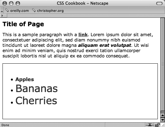
<html>
 <head>
  <title>CSS Cookbook</title>
 </head>
 <body>
  <h1>Title of Page</h1>
  <p>This is a sample paragraph with a
  <a href="http://csscookbook.com">link</a>.</p>
 </body>
</html>
Then add the following code changes in order to redefine the style for header, paragraph and links, and then check out Figure 1-5:
<html>
 <head>
  <title>CSS Cookbook</title>
  <style type="text/css">
  <!--
  body {
   font-family: verdana, arial, sans-serif;
  }
  h1 {
   font-size: 120%;
  }
  a {
   text-decoration: none;
  }
  p {
   font-size: 90%;
  }
  -->
  </style>
 </head>
 <body>
  <h1>Title of Page</h1>
  <p>This is a sample paragraph with a
<a href="http://csscookbook.com">link</a>.</p>
 </body>
</html>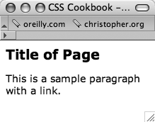
Discussion
CSS contain rules with two parts: selectors and properties. A selector identifies what portion of your web page gets styled. Within a selector are one or more properties and their values. The property tells the browser what to change and the value lets the browser know what that change should be.
For example, in the following declaration block example, the selector tells the browser to
style the content marked up with the h1 element in the web
page to 120% of the default size:
h1 {
 font-size: 120%;
}
Table 1-1 breaks out the CSS by selector, property, and value used in the solution. The result column explains what happens when you apply the property and value to the selector.
The standard for writing CSS syntax includes the selector, which is normally the tag you want to style followed by properties and values enclosed within curly braces:
selector { property: value; }However, most designers use the following format to improve readability:
selector {
property: value;
}Both are valid approaches to writing CSS. Use whatever method is more comfortable for you.
Also, CSS allows selectors to take on more than one property at a time to create more complex visual presentations. In order to assign multiple properties within a selector, use a semicolon to separate the properties as shown below:
selector {
 property: value;
 property: value, value, value;
 property: value value value value;
}
selector, selector {
 property: value;
}
See Also
Recipe 1.2 for more information about CSS selectors; and Appendix C, “CSS 2.1 Selectors, Pseudo-classes, and Pseudo-elements,” for a listing of selectors.
Using Different Selectors to Apply Styles
Problem
You want to use selectors to apply unique styles to different parts of a web page.
Solution
Use different kinds of selectors to target different portions of web pages that you want to style (see Figure 1-6):
<html>
 <head>
  <title>CSS Cookbook</title>
  <style type="text/css">
  <!--
  * {
   font-family: verdana, arial, sans-serif;
  }
   h1 {
   font-size: 120%;
  }
  #navigation {
   border: 1px solid black;
   padding: 40px;
  }
  li a {
   text-decoration: none;
  }
  p {
   font-size: 90%;
  }
  -->
  </style>
 </head>
 <body>
  <h1>Title of Page</h1>
  <p>This is a sample paragraph with a
<a href="http://csscookbook.com">link</a>. Lorem ipsum dolor sit amet,
consectetuer adipiscing elit, sed diam nonummy nibh euismod tincidunt ut
laoreet dolore magna <em class="warning">aliquam erat volutpat</em>. Ut
wisi enim ad minim veniam, quis nostrud exerci tation ullamcorper suscipit
lobortis nisl ut aliquip ex ea commodo consequat.<p>
   <ul id="navigation">
    <li><a href="http://csscookbook.com">Apples</a></li>
    <li><a href="http://csscookbook.com">Bananas</a></li>
    <li><a href="http://csscookbook.com">Cherries</a></li>
   </ul>
 </body>
</html>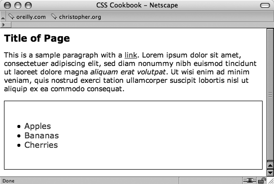
Discussion
CSS allows for many, and sometimes ingenious, ways to pinpoint which elements of a web page should be styled.
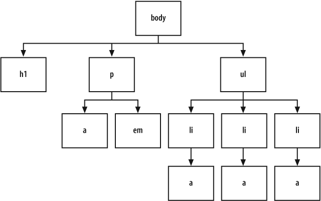
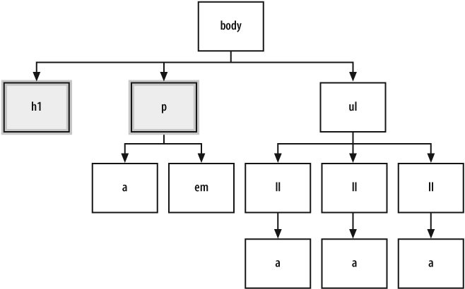
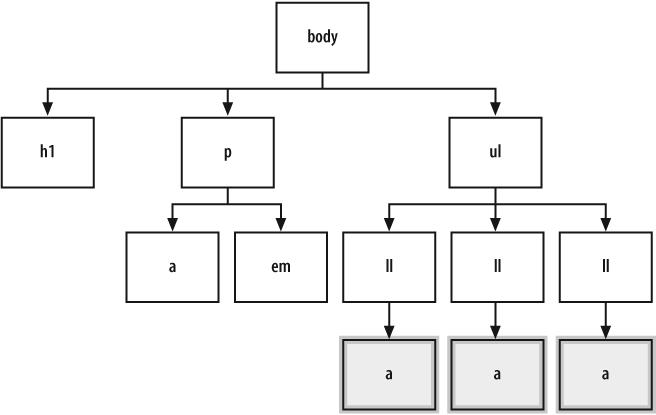
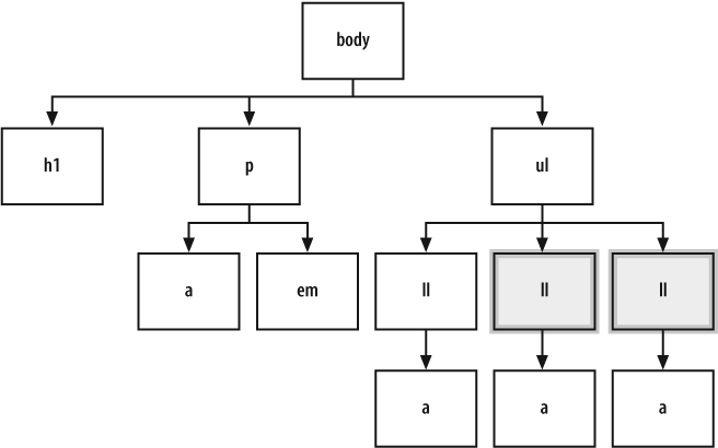
To better understand how to select portions of a web page to use selectors, a developer needs to recognize that content marked up with HTML creates a structure. Although the elements used in an HTML may look like the jumbled order shown in Figure 1-7, there is a structure.
This structure may be invisible to the visitor visiting the web page, but it’s a crucial part of the rendering process that a browser goes through.
When a browser pulls a web page from the server and begins to display the page, the elements of the page are placed in a structure that is assembled by the browser software. Although this process of placing the elements in an organizational structure is more programming oriented, a good visual representation would be to view the structure much like an organizational chart at a company.
Using the HTML in the solution, Figure 1-8 shows what the organizational chart would look like.
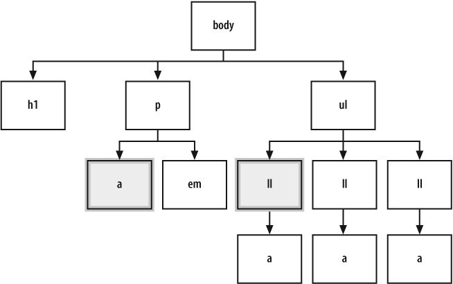
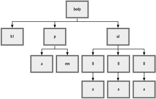
Type selectors
Type selectors are selectors that name the element or HTML tag
to style. The following rules would apply font styles to the h1 and p elements within a web page (see Figure 1-9):
h1 {
 font-size: 120%;
}
p {
 color: blue;
} 
Tip
Note that some elements inherit their parent’s property values. For example, the text in the paragraph is set to blue, as is the em element.
Class selectors
When you want to apply the same CSS rule many times to different elements, use the class selector.
For example, class selectors can be used to identify warnings with red color in a paragraph, as well as in a list item.
First, create a warning class selector preceded with a period, “.”, which is also known as full stop:
<html>
 <head>
  <title>CSS Cookbook</title>
  <style type="text/css">
  <!--
  * {
   font-family: verdana, arial, sans-serif;
  }
  body {
  }
  h1 {
   font-size: 120%;
  }
  #navigation {
   border: 1px solid black;
   padding: 40px;
  }
  li a {
   text-decoration: none;
  }
  p {
   font-size: 90%;
  }
  .warning {
  color: red;
  font-weight: bold;
  }
  -->
  </style>
 </head>
 <body>
  <h1>Title of Page</h1>
  <p>This is a sample paragraph with a
<a href="http://csscookbook.com">link</a>. Lorem ipsum dolor sit amet,
consectetuer adipiscing elit, sed diam nonummy nibh euismod tincidunt
ut laoreet dolore magna <em class="warning">aliquam erat volutpat</em>.
Ut wisi enim ad minim veniam, quis nostrud exerci tation ullamcorper suscipit
lobortis nisl ut aliquip ex ea commodo consequat.<p>
   <ul id="navigation">
    <li><a href="http://csscookbook.com">Apples</a></li>
    <li><a href="http://csscookbook.com">Bananas</a></li>
    <li><a href="http://csscookbook.com">Cherries</a></li>
   </ul>
 </body>
</html>
Then add the class attribute to a link and a list item
to style those elements, as you see in Figure
1-10:
<html>
 <head>
  <title>CSS Cookbook</title>
  <style type="text/css">
  <!--
  * {
   font-family: verdana, arial, sans-serif;
  }
h1 {
   font-size: 120%;
  }
  #navigation {
   border: 1px solid black;
   padding: 40px;
  }
  li a {
   text-decoration: none;
  }
  p {
   font-size: 90%;
  }
  .warning {
   font-weight: bold;
  }
  -->
  </style>
 </head>
 <body>
  <h1>Title of Page</h1>
  <p>This is a sample paragraph with a
<a href="http://csscookbook.com" class="warning">link</a>. Lorem ipsum dolor
sit amet, consectetuer adipiscing elit, sed diam nonummy nibh euismod tincidunt
ut laoreet dolore magna <em class="warning">aliquam erat volutpat</em>. Ut wisi
enim ad minim veniam, quis nostrud exerci tation ullamcorper suscipit lobortis
nisl ut aliquip ex ea commodo consequat.<p>
   <ul id="navigation">
    <li class="warning"><a href="http://csscookbook.com">Apples</a></li>
    <li><a href="http://csscookbook.com">Bananas</a></li>
    <li><a href="http://csscookbook.com">Cherries</a></li>
   </ul>
 </body>
</html> 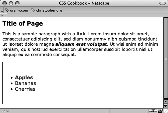
Look at these selectors in the structure of the web page; it would look like Figure 1-11.
ID selectors
ID selectors resemble class selectors except that according to
the specification they appear only once in the document. Often they appear in a div, but they can be used elsewhere. To create an ID selector, use
the hash, “#”, and then immediately place a label or name:
#navigation {
   border: 1px solid black;
   padding: 40px;
  }
Then add an id attribute with the value of navigation (see Figure 1-12):
<ul id="navigation">
 <li class="warning"><a href="http://csscookbook.com">Apples</a></li>
 <li><a href="http://csscookbook.com">Bananas</a></li>
 <li><a href="http://csscookbook.com">Cherries</a></li>
</ul>
Descendant selectors
Descendant selectors come next in line and override the type and class selector styles. They typically have two elements with the second element being a descendant of the first:
                  li a {
 text-decoration: none;
}
Add the HTML in which a appears within li as you see in Figure 1-13:
<ul id="navigation">
 <li class="warning"><a href="http://csscookbook.com">Apples</a></li>
 <li><a href="http://csscookbook.com">Bananas</a></li>
 <li><a href="http://csscookbook.com">Cherries</a></li>
</ul>
Child selectors
A child selector means that an element is styled if it is the direct descendant of its parent element. A child selector is signified by right-angled bracket often set between two type selectors as shown here:
p > strong {
  text-decoration: underline;
}
Only the strong element that isn’t contained within
another element, the p element in this case, is underlined
(see Figure 1-14):
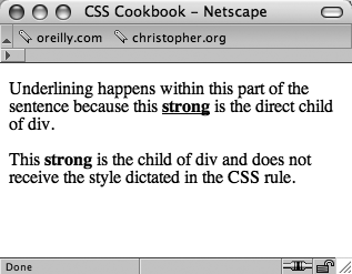
<div>
 <p>Nothing happens to this part of the sentence because this
<strong>strong</strong> isn't the direct child of div.</p>
 However, this <strong>strong</strong> is the child of div.
Therefore, it receives the style dictated in the CSS rule.
</div>
To see which elements are affected by this CSS rule in an organizational chart, take a look at Figure 1-15.
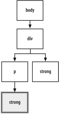
In Figures 1-14 and 1-15, the reason the first strong element is underlined is because it was placed within the
p element. If the direct parent-to-child relationship is
not present, then the style won’t hold. This is an easy, but powerful, difference between a
child selector and descendent selector.
Universal selectors
Universal selectors are represented with an asterisk (*) and apply to all elements (see Figure 1-16). In the following code, every element containing HTML text would be styled with a Verdana, Arial, or some other sans-serif font:
* {
 font-family: Verdana, Arial, sans-serif;
} 
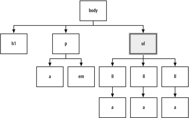
Adjacent sibling selectors
Adjacent siblings describe the relationship between two elements that are placed side-by-side within the flow of a web page’s markup.
An adjacent sibling can be seen by the plus sign as shown here:
li + li {
 font-size: 200%;
}
The effect of this adjacent sibling rule is seen in Figure 1-17. Notice that only the second and third list item are styled since the second and third list item are placed side-by-side with another list item.
To see which elements are affected by this CSS rule showcasing adjacent sibling selectors in an organizational chart, take a look at Figure 1-18.
Warning
Note that adjacent sibling selectors are not widely supported in modern browsers, most notably Internet Explorer 6 for Windows. Adjacent sibling selectors are supported in Mozilla, Firefox, Opera 5+, and Safari.
Attribute selectors
Attribute selectors have four ways to find an element that has a matching attribute. Take a look at examples of each option:
Whenever href attribute appears within an a element in the HTML, the link won’t have an underline.
Whenever a link that points to csscookbook.com appears
in the HTML, the link won’t have an underline.
Whenever "digital" appears in the title attribute of
an anchor element, the link won’t have an underline.
Also, whenever "digital-" appears in the href attribute of an anchor element, the link won’t have an
underline.
Warning
Note that attribute selectors are not widely
supported in modern browsers, most notably Internet Explorer 6 for Windows. Attribute
selectors are supported in Mozilla, Firefox Opera 5+, and Safari.
Pseudo-classes
You may want to add style to items that aren’t based on elements’ name, attributes, or content. This example of pseudo-classes creates rollover effects:
a:link {
 color: blue;
}
a:visited {
 color: purple;
}
a:hover {
 color: red;
}
a:active {
 color: gray;
}
In this setup, a basic link appears in blue. As soon as the mouse pointer hovers over the link, it changes to red. During the clicking of the link, the link appears gray. When returning to the page with the link after visiting, the link appears purple.
Three other pseudo-classes include :first-child,
:focus, and :lang(n).
Pseudo-elements
With most selectors, a developer makes use of elements and their arrangement within a web
document to style a document. However, sometimes a developer can style an item within a web
document that’s not marked up by elements through the use of pseudo-elements.
Pseudo-elements consist of :first-letter, :first-line, :before, and
:after.
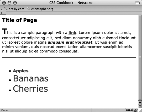
You can see an example of the following pseudo-element in:first-letter in Figure
1-19:
p:first-letter {
 font-size: 200%;
 font-weight: bold;
} 
Or you can use :first-line (see Figure 1-20) to style the entire first
line. If the first line isn’t a complete sentence or includes the start of a second sentence,
:first-line still only impacts the first line.
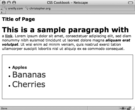
p:first-line {
 font-size: 200%;
 font-weight: bold;
}
See Also
The CSS 2.1 specification for selectors at http://www.w3.org/TR/CSS21/selector.html; Selectutorial, a tutorial of CSS selectors (http://css.maxdesign.com.au/selectutorial/); westciv browser selector support (http://westciv.com/style_master/academy/browser_support/selectors.html) shows the browsers that do and do not support specific selectors; and Appendix C for a listing of selectors.
Determining When to Use Class and ID Selectors
Solution
Use class selectors when you need to apply a style
multiple times within a document and ID selectors for
one-time only appearances of a style within a document.
In the following style sheet, #banner, #sub_banner, #nav1, #nav2, #footer, and #content are ID selectors and
.title and .content are
class selectors.
body {
 margin: 0;
 font-family: Verdana, Arial, Helvetica, sans-serif;
 font-size: .75em;
 padding: 0;
}
#banner {
 margin-top: 0;
 margin-bottom: 0;
 background-color: #900;
 border-bottom: solid 1px #000;
 padding: 5px 5px 5px 10px;
 line-height: 75%;
 color: #fff;
}
#sub_banner {
 background-color: #ccc;
 border-bottom: solid 1px #999;
 font-size: .8em;
 font-style: italic;
 padding: 3px 0 3px 10px;
}
#content {
 position: absolute;
 margin-left: 18%;
 width: 40%;
 top: 100px;
 padding: 5px;
}
#nav1 {
 position: absolute;
 width: 30%;
 left: 60%;
 top: 100px;
 padding: 5px;
}
#nav2 {
 position: absolute;
 padding: 5px 5px 5px 10px;
 top: 100px;
 width: 15%;
}
#footer {
 text-align: center;
 padding-top: 7em;
}
.warning {
 font-weight: bold;
 color: red;
}
.title {
 font-size: 120%;
}
.content {
 font-family: Verdana, Arial, sans-serif;
 margin-left: 20px;
 margin-right: 20px;
}
.footer {
 font-size: 75%;
}
Apply the ID and class selectors into the HTML code:
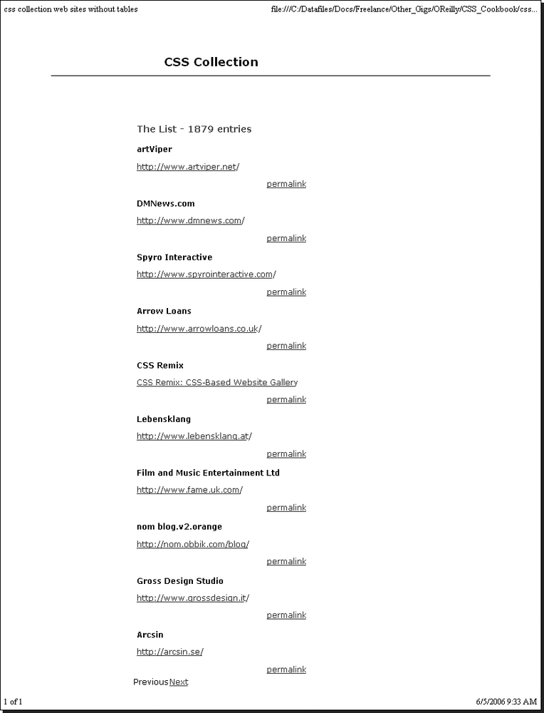
<!DOCTYPE html PUBLIC "-//W3C//DTD XHTML 1.0 Transitional//EN"
"http://www.w3.org/TR/xhtml1/DTD/xhtml1-transitional.dtd">
<html>
 <head>
  <title>CSS Cookbook</title>
  <link href="1-2.css" rel="stylesheet" type="text/css" />
 </head>
 <body>
 <div id="header">
  <h1>CSS Collection</h1>
  <h2>Showcase of CSS Web Sites</h2>
 </div>
 <div id="content">
  <h3>Content Page Title</h3>
  <p class="title">Content Item Title</p>
  <p class="content">Content goes here.</p>
 </div>
 <div id="navigation">
  <h3>List Stuff</h3>
  <a href="http://csscookbook.com/">Submit a site</a><br />
  <a href="http://csscookbook.com/">CSS resources</a><br />
  <a href="http://csscookbook.com/">RSS</a><br />
  <h3>CSS Cookbook Stuff</h3>
  <a href="http://csscookbook.com/">Home</a><br />
  <a href="http://csscookbook.com/">About</a><br />
  <a href="http://csscookbook.com/">Blog</a><br />
  <a href="http://csscookbook.com/">Services</a><br />
 </div>
 <div id="blipverts">
  <h3>Ads go here.</h3>
 </div>
 <div id="siteinfo">
   <p class="footer">Copyright 2006</p>
  </div>
</body>
</html>
Discussion
The ID selectors identify unique attributes that have
one instance in the document tree, whereas class selectors can be used frequently throughout
the web page. Remember that ID selectors use a hash, “#”,
while class selectors begin with a period, “.”.
Typically, web developers will use ID selectors to mark
off unique sections of a web page. In the previously shown solution, notice that the page is
divided into the following sections:
header
content
navigation
blipverts
siteinfo
By assigning these sections their own ID selector,
designers are able to apply customized styles to those areas of the page, while keeping those
same styles away from the other sections. This is accomplished through the combination of
descendent selectors with ID selectors.
In the following example, the different h3 elements get
different CSS rules:
#content h3 {
 font-size: 2em;
 font-weight: bold;
}
#navigation h3 {
 font-size: 0.8em;
 font-wieght: normal;
 text-decoration: underline;
}
See Also
The CSS 2.1 specification for ID selectors at http://www.w3.org/TR/CSS21/selector.html#id-selectors; the CSS 2.1 specification for class selector at http://www.w3.org/TR/CSS21/selector.html#class-html.
Understanding CSS Properties
Solution
Recipes in this chapter cooked up popular properties such as color, font-family, font-size, and text-decoration. Properties fall
between the brackets and their values immediately follow as shown here in a generic example:
selector {
 property: value;
}
A real-world example might look like the following:
li {
 list-style-type: square;
}
Any time li appears in the document, the bullet appears
as a square rather than a traditional bullet.
Discussion
Selectors identify what should be styled within a web document, while properties and selectors identify the what and how that portion of the web document should be modified.
For example, the color property means the element’s
color will change, but not what color. That’s the job for value. Table 1-2 showcases a few more properties,
values, and what they do.
For a more complete rundown of available CSS properties, see Appendix B.
See Also
W3C full property table at http://www.w3.org/TR/CSS21/propidx.html; HTML Dog CSS Properties at http://www.htmldog.com/reference/cssproperties/; a detailed look at the border property in Recipe 4.4; a complete listing of CSS properties in Appendix B.
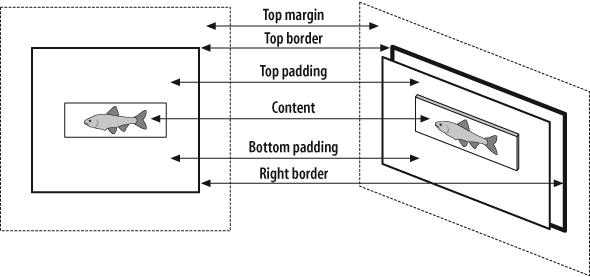
Understanding the Box Model
Problem
You want to better understand the box model and how margins, borders, and padding work around content.
Solution
Every block level element, like a
p or div element,
contains a top, right, bottom, and left edge. These sides of block elements are composed of
three layers surrounding the content. So, therefore each block element contains four sections:
-
content Actual content such as text, images, Java applets, and other objects. The content area is in the middle of the box.
-
padding Surrounds the content area.
-
border Next outer layer that surrounds padding and makes up the box border.
-
margin Transparent box that begins at the edge of the border and expands beyond.
The default margin value is 0, which lines up with the edge of the border. A
border with a value of 0 lines up with the padding edge.
Obviously, a padding value of 0 lines flush against the content. Values above 0 expand the boxes. Take a look at Figure 1-21 to see views of a box model.
Discussion
For a mental image of the box model, picture a cardboard box on the floor. Looking down at
the box and you see its four sides: top, right, bottom, and left. The box can be big or small
as you can modify the height and width properties.
div {
 height: 150px;
 width: 150px;
}
Add as many books as you want into the box until you fill the space with the contents that you see in Figure 1-22:
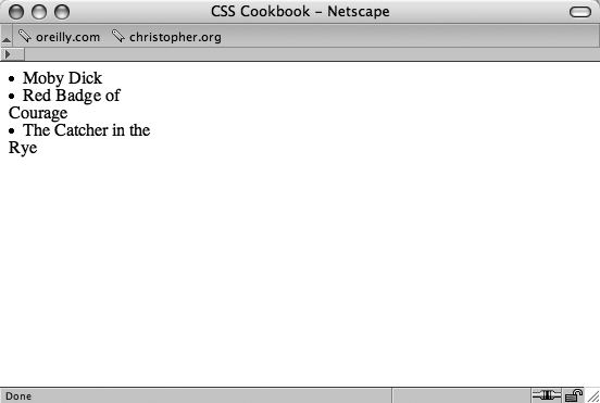
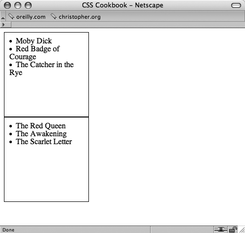
<div>
 <li>Moby Dick</li>
 <li>The Red Badge of Courage</li>
 <li>The Catcher in the Rye</li>
</div>
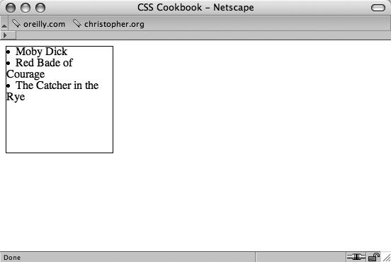
To help see the edges of the box, I’ll place a thin border around the box (see Figure 1-23):
div {
 border: thin solid #000000;
 height: 150px;
 width: 150px;
}
The books overlap or sit next to each other and that’s not good for the books especially
since, in this example, they’re collector’s items. So, I’ll add
padding between the books and the box with the
padding property for a little breathing room and
protection. As you use more padding, you also reduce the number of books you can place into the
box. Some padding has been added to the example in Figure 1-24:
div {
 border: thin solid #000000;
 height: 150px;
 width: 150px;
 padding: 10px;
} 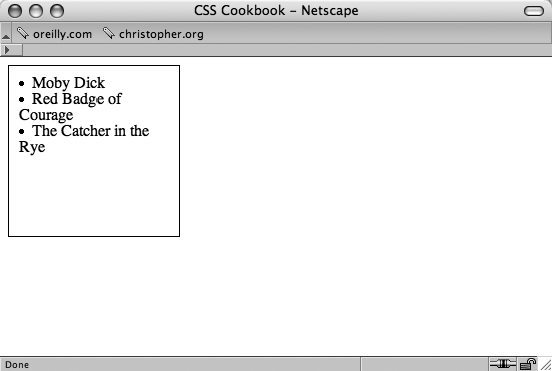
Tip
Adding padding changes the overall box size, despite being set to width and height of 150 pixels. With the addition of the padding on all sides of the box, the new width is 170 pixels (padding of 10 pixels is placed on both the right and left sides). Also the height is now 170 pixels, too.
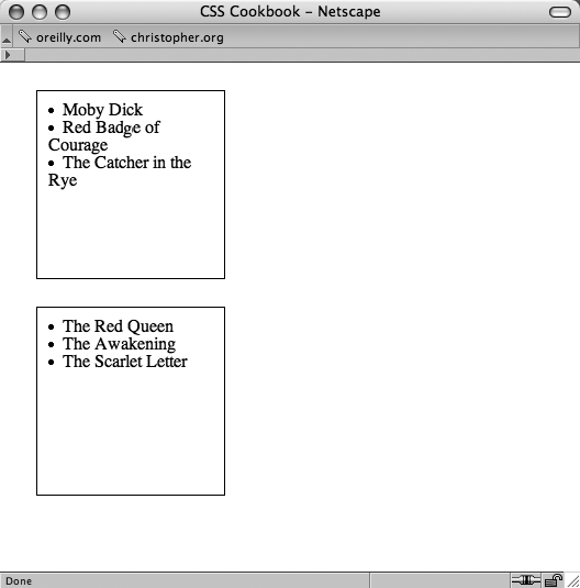
You need another box to fit the contents that didn’t fit in the first box. So create another box, and enter the rest of the books or contents. Put the new box next to the original (see Figure 1-25):
<div>
 <li>Moby Dick</li>
 <li>The Red Badge of Courage<li>
 <li>The Catcher in the Rye</li>
</div>
<div>
 <li>The Red Queen</li>
 <li>The Awakening</li>
 <li>The Scarlet Letter</li>
</div>
However, you want to space out the boxes so that they aren’t on top of each other. So,
modify the space between the boxes by using the margin
property (see Figure 1-26):
div {
 border: thin solid #000000;
 height: 150px;
 width: 150px;
 padding: 10px;
 margin: 25px;
}
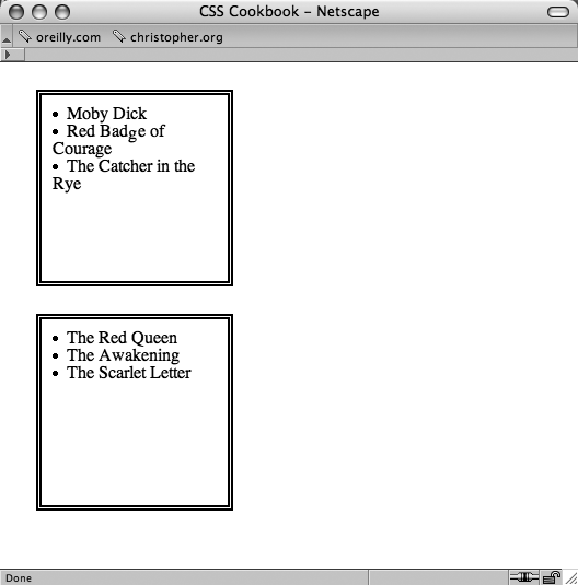
To help you distinguish the two boxes, modify the border property. Like the margin and padding, the border can be as thick or thin as
you want (see Figure 1-27):
div {
 border: 5px double #000000;
 height: 150px;
 width: 150px;
 padding: 10px;
 margin: 25px;
}
At this point, you’ve modified the box model fairly consistently across two elements. You’ve adjusted the margin, padding, and borders around each side. However, you can also modify specific edges of the box model.
For example, if you want to adjust the right side of the div element (see Figure
1-28), but keep the same values for the other sides, the code could look something like
the following:
div {
 border: 5px solid #000000;
 height: 150px;
 width: 150px;
 padding: 10px;
 margin: 0px;
 border-right: 1px solid #000000;
 padding-right: 1px;
 margin-right: 1px;
}
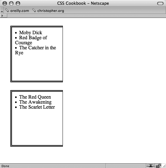
You could also modify the other sides of the edges specifically as well. For example,
using the margin property, the code might look like the
following:
div {
 margin-top: 1px;
 margin-right: 1px;
 margin-bottom: 1px;
 margin-left: 1px;
}
By adjusting the sides and different properties of the box model, developers are able to better format the presentation of their web pages.
Warning
Microsoft instituted its own box model in their browser, Internet Explorer for Windows. For more information about that box model and how to work around it, see Recipe 11.2.
See Also
The CSS 2.1 box model http://www.w3.org/TR/CSS21/box.html; the
Brain Jar box model at http://www.brainjar.com/css/positioning/default.asp; and the interactive CSS Box Model at http://www.redmelon.net/tstme/box_model/.
Understanding DOCTYPES and Effects on Browser Layout
Problem
You want to make your web page standard-compliant and valid.
Solution
HTML 4.01 has three document types: strict, transitional, and frameset. XHTML 1.1 has one document type, but XHTML 1.0 has three document types, like HTML 4.01. Only one document type definition (DTD) appears in the HTML document, using any one of the following:
- HTML 4.01 Strict DTD:
<!DOCTYPE HTML PUBLIC "-//W3C//DTD HTML 4.01//EN"
"http://www.w3.org/TR/html4/strict.dtd">
- HTML 4.01 Transitional DTD:
<!DOCTYPE HTML PUBLIC "-//W3C//DTD HTML 4.01 Transitional//EN"
"http://www.w3.org/TR/1999/REC-html401-19991224/loose.dtd">
- HTML 4.01 Frameset DTD:
<!DOCTYPE HTML PUBLIC "-//W3C//DTD HTML 4.01 Frameset//EN"
" http://www.w3.org/TR/1999/REC-html401-19991224/frameset.dtd">
- XHTML 1.0 Strict DTD:
<!DOCTYPE html PUBLIC "-//W3C//DTD XHTML 1.0 Strict//EN"
"http://www.w3.org/TR/xhtml1/DTD/xhtml1-strict.dtd">
- XHTML 1.0 Transitional DTD:
<!DOCTYPE html PUBLIC "-//W3C//DTD XHTML 1.0 Transitional//EN"
"http://www.w3.org/TR/xhtml1/DTD/xhtml1-transitional.dtd">
- XHTML 1.0 Frameset DTD:
<!DOCTYPE html PUBLIC "-//W3C//DTD XHTML 1.0 Frameset//EN"
"http://www.w3.org/TR/xhtml1/DTD/xhtml1-frameset.dtd">
- XHTML 1.1 DTD:
<!DOCTYPE html PUBLIC "-//W3C//DTD XHTML 1.1//EN"
"http://www.w3.org/TR/xhtml11/DTD/xhtml11.dtd">
Here’s a basic page with the XHTML 1.1 DTD and the required head, body, and html tags.
<!DOCTYPE html PUBLIC "-//W3C//DTD XHTML 1.1//EN"
"http://www.w3.org/TR/xhtml11/DTD/xhtml11.dtd">
<html>
 <head>
  <title>XHTML DTD</title>
 </head>
 <body>
  <p>XHTML requires having a DTD in every document otherwise it won't pass muster with the validators.</p>
 </body>
</html>
Discussion
DOCTYPE, short for DTD, defines an HTML or XHTML document’s building blocks and tells the browsers and validators which version of HTML or XHTML your document is using.
The DOCTYPE declaration
must appear at the beginning of every web page document before the html element to ensure your markup and CSS are standards compliant, and that
browsers handle the pages based on the appropriate DTDs.
XHTML requires DOCTYPE, otherwise the pages won’t validate and the browsers fall back on quirks mode, treating the pages as if they were written in invalid markup and therefore need to be improperly rendered in modern browsers even if the code may be perfect XHTML and CSS.
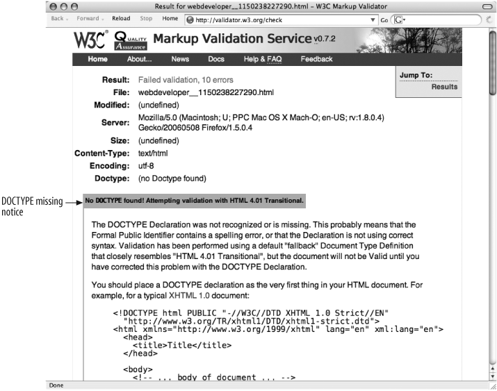
The W3C provides an HTML validator and a CSS validator so you can verify document validity. If there’s no DOCTYPE, the validator chokes, as you see in Figure 1-29.
A page without DOCTYPE, an older DOCTYPE, or an incorrectly coded DOCTYPE renders in quirks mode, in which a browser treats the page as buggy. In some cases, depending on the browser, some content will render according to W3C guidelines.
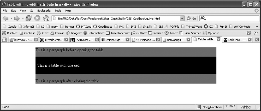
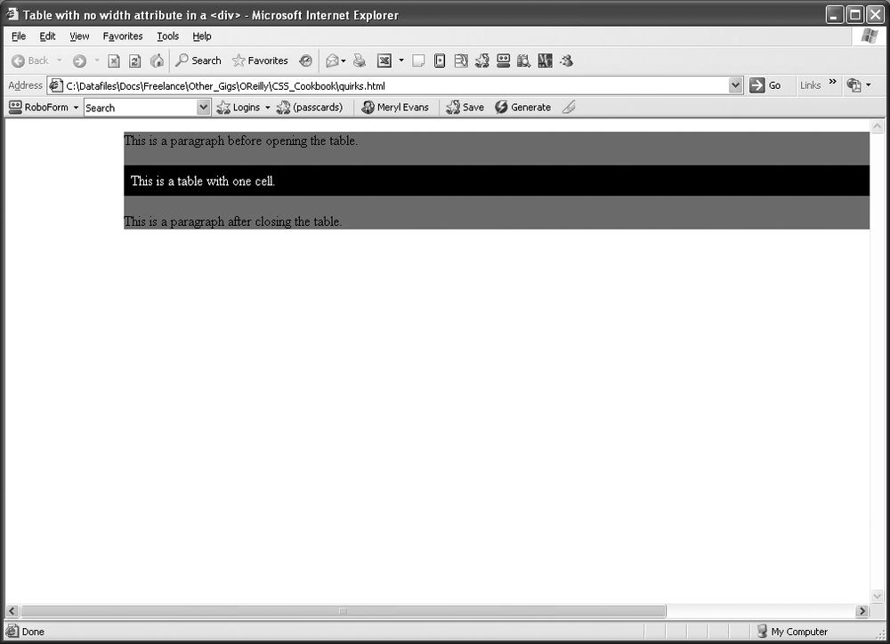
Figures 1-30 and 1-31 show how a web document with the same
markup, a table contained within a div with a width of
100% goes into quirks mode in Internet Explorer 6.0 and how
the page should look in standards mode.
See Also
The HTML 4.01 specification for DTD at http://www.w3.org/TR/html401/intro/sgmltut.html#h-3.3; W3C validators at http://www.w3.org/QA/Tools/#validators; “A List Apart” article on DOCYTPES at http://www.alistapart.com/stories/doctype/; “QuirksMode” article at http://www.quirksmode.org/index.html?/css/quirksmode.html; Mozilla’s quirks Mode information explains the differences between the modes and how it handles quirks mode at http://developer.mozilla.org/en/docs/Mozilla%27s_Quirks_Mode; Opera’s DOCTYPE page at http://www.opera.com/docs/specs/doctype/.
Associating Styles to a Web Page
Solution
You can apply styles in three ways:
external, internal, and
inline. An internal style sheet appears near the top of the HTML document
within the head.
<style>
<!--
#header {
 width: 100%;
 height: 100px;
 font-size: 150%
}
#content {
 font-family: verdana, arial, sans-serif;
 margin-left: 20px;
 margin-right: 20px
}
.title {
 font-size: 120%
}
-->
</style>
Tip
Note the use of HTML comments immediately after the style element. Comments are placed there to hide the CSS content and keep it from showing up in the web page layout or from being rendered by the browser in some unwanted fashion.
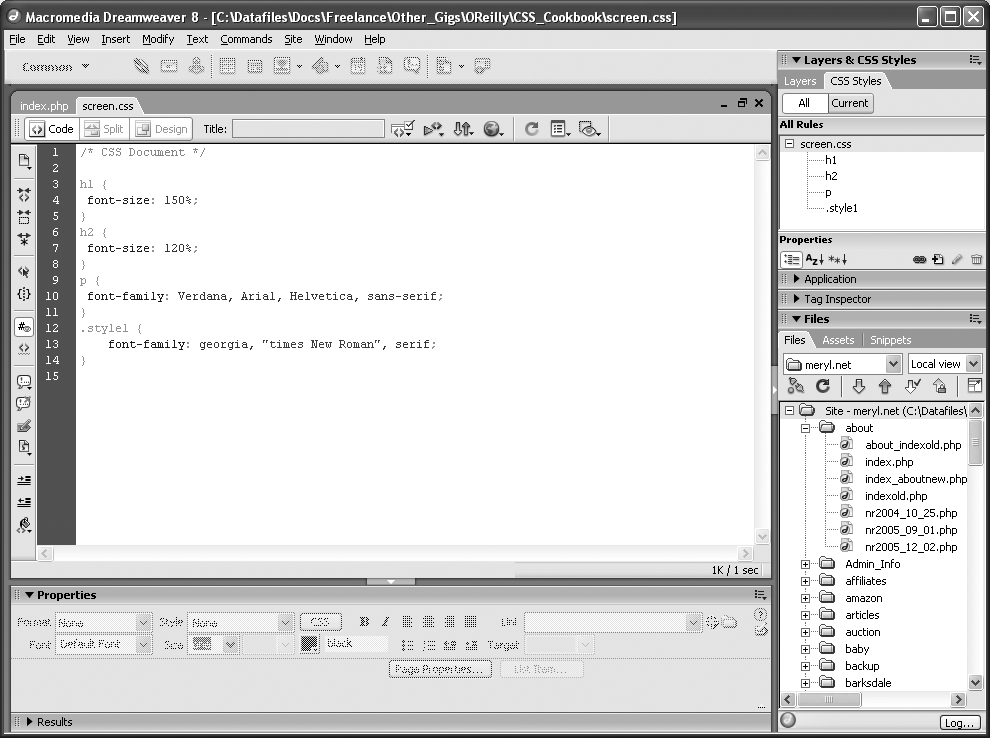
External style sheets are stored in a separate file, which become associated with the HTML file through linking. The following code is saved in its own file:
/* CSS Document */
h1 {
 font-size: 150%;
}
h2 {
 font-size: 120%;
}
p {
 font-family: Verdana, Arial, Helvetica, sans-serif;
}
Warning
Notice that the style element is not present in the
external style sheet. Also, HTML comments are not used in external style sheets.
In the web page, add the following line between the head tags to link to the external style sheet that contains the above styles:
<link href="screen.css" rel="stylesheet" type="text/css" media="screen" />
Inline styles work similarly to font in that they
appear with the markup they affect.
<h1 style="font-family: verdana, arial, sans-serif;font-size: 150%; color: blue;">Page Title</h1> <p style="font-family: sans-serif; font-size: 90%;">Hello, world!</p>
Discussion
The three different types of style sheets are:
- External
All web pages link to the external style sheet that contains nothing but CSS styles. If you want to change the font color on all pages linked to this style sheet, just update the external style sheet. Link to the style sheet with the
linktag.- Internal
A unique web page may have its own style sheet so styles only affect the page and not all web pages. Define internal styles within the
styletags.- Inline
Inline styles work similarly to
fontwith the style information applied to a specific tag within a web page. Designers rarely apply inline styles.
External and internal style sheets are better over internal styles in terms of time spent on maintaining web sites.
For example, you inherit a web page where all the text is blue and use font to control the size. You receive orders to make change the text
to black, so you search for every instance of <p> to
change it from blue to black like the following:
<p><font size="2" color="blue">Text goes here</font></p>
To change all p from blue to black in an external style
sheet takes two steps. Open the CSS file and change the color.
p {
 color: blue;
}
In an internal style sheet, changing the text from blue to black takes one step. Search
for the style at the top of the page and replace blue with
black.
<style>
<!--
p {
 color: blue
}
-->
</style>
When to use inline styles
However, with inline styles, changing the color takes as much time as fixing
the original file with font tag:
<p style="font-color: blue">Test goes here.</p>
Why would anyone want to use inline styles considering it’s time-consuming to make changes? It’s rare, but you may have content that appears once in the whole web site that is in need of a special style. Rather than cluttering the external style sheet with the style for one item, you use inline styles instead.
When to use internal style sheets
As for internal and external style sheets, most sites use external style sheets. However, when starting to write CSS code for a web page design, it’s best to start out with an inline style sheet. When you reach the point where the design is complete or starts to get a little unwieldy, move the style sheet to a separate file. Then make edits to the external style sheet as needed.
Also, you may have a special page that’s not related to the web site or uses a special style. In this case, an internal style sheet could be easier to use as opposed to adding more clutter to the external style sheet.
See Also
The Style Sheets section in HTML 4.01 specification at http://www.w3.org/TR/html401/present/styles.html; W3Schools’ “CSS How to Insert a Style Sheet” at http://www.w3schools.com/css/css_howto.asp.
How to Use Different Types of Style Sheets
Problem
You want to provide style sheets for different media types such as aural, print, and handheld.
Solution
Create separate external style sheets for the different media and name them by their media
such as
print.css,
screen.css, and
handheld.css. Then use the link element with the media type in the web page to link to these
styles. Another option is to use the @media rule.
Here’s print.css:
body {
 font: 10pt times, georgia, serif;
 line-height: 120%
}
A new file called screen.css:
body {
 font: 12pt verdana, arial, sans-serif;
 line-height: 120%
}
Then finally another file called projection.css:
body {
 font: 14pt;
 line-height: 120%
}
Then link to the three files from the web page with the following lines within the
head section. Each link has a different media type:
<link rel="stylesheet" type="text/css" href="/css/print.css"media="print" /> <link rel="stylesheet" type="text/css" href="/css/screen.css"media="screen" /> <link rel="stylesheet" type="text/css" href="/css/projection.css"media="projection" />
You could use the @media rule instead to specific the
different
media rules within the same style sheet:
<style type="text/css">
<!--
@media print {
 body { font: 10pt times, georgia, serif }
}

@media screen {
 body { font: 12pt verdana, arial, sans-serif}
}

@media projection {
 body { font-size: 14pt }
}

@media screen, print, projection {
 body { line-height: 120% }
}
-->
</style>
Discussion
When creating the styles for printing, add them to print.css and then only these styles are applied during printing. This ensures the page prints without wasting space or ink from printing the images.
Only devices supporting the specific media type will see its related media CSS styles. The media style sheets don’t affect the appearance of other media or the web page itself.
The @media rule allows you to put all the media in one
style sheet.
Figure 1-32 shows how the web page looks in its original screen format. Users don’t need to print the side items, so copy the screen.css style sheet and save it as a new one called print.css. Rather than starting from scratch, modify screen.css to optimize the web page for printing. The following items in screen.css have been changed in print.css.
#sub_banner {
 background-color: #ccc;
 border-bottom: solid 1px #999;
 font-size:.8em;
 font-style: italic;
 padding: 3px 0 3px 5px;
}
#nav1 {
 position: absolute;
 width: 30%;
 left: 60%;
 top: 100px;
 padding: 5px 5px px 5px 0;
}
#nav2 {
 position: absolute;
 width: 15%;
 left: 1%;
 top: 100px;
 padding: 5px 5px px 5px 0;
}
h1 {
 text-align: left;
 color: #fff;
 font-size: 1.2em;
 text-align: left;
 margin-bottom: 5px;
 margin-top: 5px;
}
.entry {
 padding-bottom: 20px;
 padding: 5px;
 border: solid 1px #999;
 background-color: #fcfcfc;
 margin-bottom: 25px;
} 
Figure 1-33 shows how they now appear with print.css:
#sub_banner {
 display: none
}
#nav1 {
 display: none
}
#nav2 {
 display: none
}
h1 {
 display: none
}
.entry {
 padding: 5px;
} 
This takes out the sub-banner with the tagline and
hides the two navigation columns. The h1 element wasn’t
necessary to have and removing it saved space at the top. The entries have a light gray box, a
big waste of ink, so they’ve been simplified to show only the padding between entries.
Remember to add the link element in the HTML page:
<link rel="stylesheet" type="text/css" href="/css/print.css" media="print" />
<link rel="stylesheet" type="text/css" href="/css/screen.css" media="screen" />
That’s all there is to it. CSS simplifies many things including design for different media. Table 1-3 lists the current media types that appear in the CSS 2.1 specification.
See Also
Chapter 10 for setting up styles for printing; media types section in CSS 2.1 specification at http://www.w3.org/TR/CSS21/media.html; “ALA’s New Print Styles” at http://www.alistapart.com/articles/alaprintstyles; and “Pocket-Sized Design: Taking Your Website to the Small Screen” at http://www.alistapart.com/articles/pocket.
Adding Comments Within CSS
Solution
Add /* and */
anywhere in the styles to show the start and end of a comment.
/* This is a comment */
a {
 text-decoration: none;
}
/* This is also a comment */
h1, h2 {
 font-size: 100%;
 color: #666666;
}
Discussion
You may look at old code and not remember why you took certain steps with that code.
Comments can explain and organize code to help with reviewing at a later time. Comments also
help those who don’t create the original code understand its purpose. Browsers ignore content
that appears between the /* and */.
As you break up your code by section, comments come in handy in identifying each section such as header, footer, primary navigation, subnavigation, and so on. Comments provide a great way to test your web pages. If you’re not sure about a style rule or how it affects the page, add a comment around the style to turn it off.
/*
a {
 text-decoration: none;
}
*/
The style rule for text-decoration won’t take affect
with the comments taking it out of circulation. Unless there are other styles for a, the underline appears under links until the comment is
removed.
See Also
The CSS 2.1 specification on comments, online at http://www.w3.org/TR/CSS21/syndata.html#comments.
Organizing the Contents of a Style Sheet
Problem
You want to know how effectively to organize contents within a style sheet for easier management.
Solution
Managing CSS can be accomplished by grouping common visual elements of a web page together. The following list shows a suggestion of the order of items grouped in a style sheet:
Elements (h1–h6, p, a, list, links, images)
Typography
Page layout (header, content, navigation, global navigation, subnavigation, sidebar, footer)
Form tags (form, fieldset, label, legend)
Content (post, events, news)
Here are the comments from three style sheets with each organizing the CSS differently:
/* Typography & Colors
------------------------------------ */
[css code ]

/* Structure
------------------------------------ */
[css code ]

/* Headers
------------------------------------ */
[css code ]

/* Images
------------------------------------ */
[css code ]

/* Lists
------------------------------------ */
[css code ]

/* Form Elements
------------------------------------ */
[css code ]

/* Comments
------------------------------------ */
[css code ]

/* Sidebar
------------------------------------ */
[css code ]

/* Common Elements
------------------------------------ */
[css code ]
Discussion
What works for one person may not work for another. This setup from the solution is a recommendation based on a combination of experience and best practices that should work best for small- to medium-size web sites.
For different projects and your own personal preference, you may find a way that works better for you. Visit your favorite web sites and review their style sheets to study how they’re organized.
See Also
Doug Bowman’s “CSS Organization Tip 1: Flags,” a method for finding rules in your CSS files, at http://www.stopdesign.com/log/2005/05/03/css-tip-flags.html; Recipe 1.11 on how to organize style sheet files; and Recipe 11.7 on how to set up an intelligent hacking system.
Organizing Style Sheet Files
Solution
Manage CSS files by placing them in their own directory. The following CSS files live in
their own css directory.
/_assets/css/print.css
/_assets/css/screen.css
For a large or complex sites, rather than having one CSS file for each type (print, screen, and so on), break out CSS by function. These are in the same directory as the simple version.
/_assets/css/layout.css
/_assets/css/color-imagery.css
/_assets/css/type.css
Then, in the HTML file, link to these files by placing the following in the head
element:
<link rel="stylesheet" type="text/css"media="print"href="/_assets/css/print.css"/> <link rel="stylesheet" type="text/css"media="screen"href="/_assets/css/screen.css"/>
For the large sites, the screen.css would include
methods for importing the separate CSS files that dictate the design for screen delivery.
Here’s what the screen.css would look like in this solution:
/* import style sheets */
@import url("/_assets/css/layout.css");
@import url("color-imagery.css");
@import url("type.css");
Discussion
If you are using external style sheets (Recipe 1.6) for smaller or easily managed sites, breaking out style sheets by media type (print, screen, and so on) does the job nicely.
Taking this approach with larger or more complex site can make it difficult to search the files to see how the CSS is set up.
Currently, there isn’t a standard or recommended approach for managing CSS-related files. Like the previous recipe, you may discover another approach that works better for you. Experiment with file and content organization until you find one that works well.
See Also
See Recipe 1.7 for more information on external style sheets.
Working with Shorthand Properties
Solution
Begin with a properly marked up section.
<h3>Shorthand Property</h3>
<p>Combine properties with shorthand and save time, typing, and a
few bytes. Your style sheets will also be easier to read.</p>
Then use just one instance of font property instead of
three: font-style, font-size, and font-family:
h3 {
 font: italic 18pt verdana, arial, sans-serif;
}
p {
 border: 2pt solid black;
}
Discussion
Several CSS properties can be tossed in favor of shorthand properties.
The border property is a shorthand property, which
combines three properties into one. The border property can
cover the values from the following properties:
border-color
border-width
border-style
The font property is a shorthand property, which
combines three properties into one. The font property can
cover the values from the following properties:
font-style
font-size/line-height
font-family
font-weight
font-variant
Enter the values just as you would with any other property except for font-family and font-size/line
height. With font-family, enter the fonts in the
order you wish for them to have priority and use a comma between each.
If you use both font-size and line height, then separate their values with a forward slash:
h3 {
 font: italic 18pt/20pt verdana, arial, sans-serif
}
For a rundown on the shorthand properties available to web developers, see Table 1-4.
Tip
There is not an order for the placement of the values for font and background shorthand properties. However, it is recommended to be consistent in their placement throughout your style sheet.
See Also
The CSS 2.1 specification for border shorthand properties at http://www.w3.org/TR/CSS21/box.html#border-shorthand-properties and font shorthand properties at http://www.w3.org/TR/CSS21/about.html#shorthand; and see Appendix B for a full listing of CSS properties.
Setting up an Alternate Style Sheet
Problem
You want to provide other style options for users who may want larger text or a different color scheme.
Solution
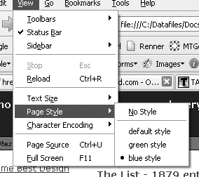
Use the link element with a title and link it to the alternate style sheets. The title lets the user see what options are available when viewing the list of
available styles. In Firefox, click View→Page Styles to see the list.
<link href="default.css" rel="stylesheet" title="default styles"
type="text/css" media="screen" />
<link href="green.css" rel="stylesheet" title="green style"
type="text/css" media="screen" />
<link href="blue.css" rel="stylesheet" title="blue style"
type="text/css" media="screen" />
Unfortunately, this solution doesn’t work in Internet Explorer 6.0 or Safari.
Discussion
Alternate style sheets work similarly to the media type style sheets in Recipe 1.7. Instead of creating styles for media, you’re providing users with multiple choices of styles for the screen. Furthermore, this technique doesn’t require using JavaScript. Some users have disabled JavaScript, which would affect a style sheet switcher.
All you have to do is make a copy of your default style sheet and rename it. Make the
changes to the style sheet and add the link element with a
title (see Figure 1-34).
See Also
The article “Invasion of the Body Switchers” by Andy Clarke and James Edwards shows how to create a JavaScript style switcher at http://www.alistapart.com/articles/bodyswitchers; and Amit Ghaste’s CSS Style Switcher tutorial at http://ghaste.com/pubs/styleswitcher.html.
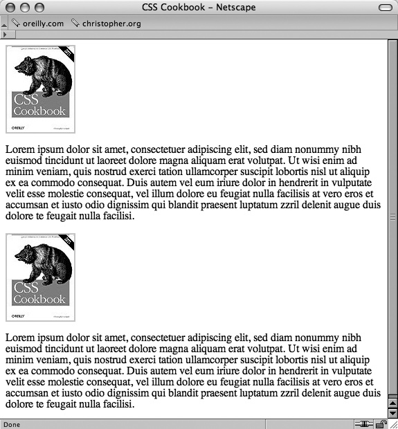
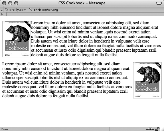
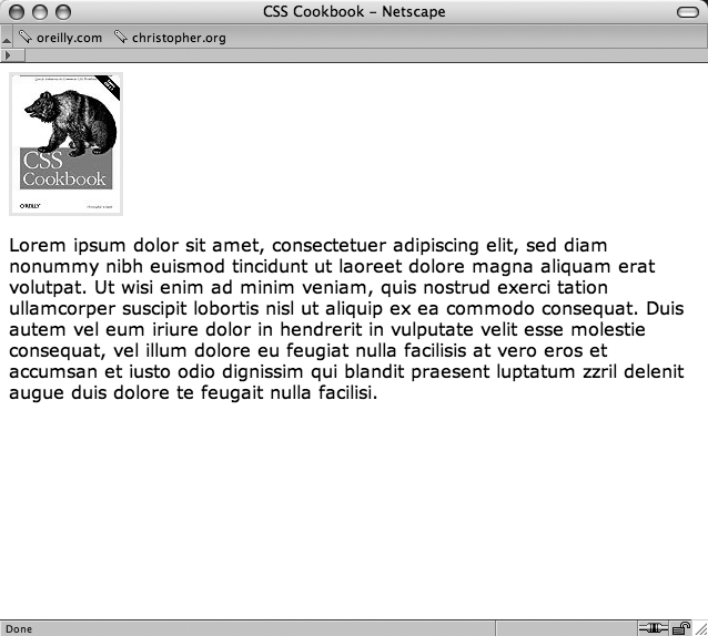
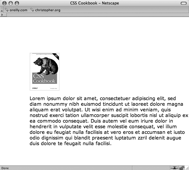
Using Floats with Images
Problem
You want to place an image on the left or the right side with text wrapping around the image instead of appearing above or below the image (see Figure 1-35).
Solution
First create class selectors for the images:
.leftFloat {
 float: left
}
.rightFloat {
 float: right
}
Then add the class selector to the markup and see how it works in Figure 1-36:
<img src="csscookbook.gif" class="leftFloat" alt="cover" />
<p>This is the book cover for the <em>CSS Cookbook</em>.</p>
<img src="csscookbook.gif" class="rightFloat" alt="cover" />
<p>This is the book cover for the <em>CSS Cookbook</em>.</p>
Discussion
In the times before CSS was widely adopted by mainstream browsers, designers used the
align attribute with the img element to move images to the side with text wrapping. W3C deprecated align and now recommends using float instead.
Instead of just images, however, floats can be used with elements other than images to shift an item left or right within its current place. When using floats, you might want a keep text from wrapping. To work around that, use clear, which is shown in Figure 1-36.
p {
 clear: left;
} 
The clear property tells the paragraph to appear after
the end of the image flow. At the second img, the clear properties push the image down to the first line after the
previous ends. Instead of lining up with the second p
element, the image waits for a new line before showing up.
See Also
W3C 2.1 specification on floats at
http://www.w3.org/TR/CSS21/visuren.html#floats; Chapter 9 provides three recipes on using
float with page columns; and Eric Meyer’s CSS/edge covers
floats at http://meyerweb.com/eric/css/edge/.
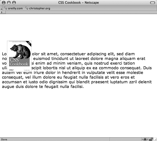
Using Absolute Positioning
Problem
You want to position an element based on the window rather than on the element’s default position.
Solution
Use the position property with the absolute value in the style sheet. Also use bottom, left, or both properties to indicate
where to position an element:
.absolute {
 position: absolute;
 bottom: 50px;
 left: 100px;
}
Discussion
Designing with absolute places the content
out of the natural flow of the page layout and puts it exactly where the
CSS properties tell it to go within the current box or window. The sample code used in the
solution tells the browser to position the element with the absolute class exactly 100 pixels from the left and 50 pixels off of the bottom edge
of the the browser’s viewport.
Look at the natural flow of an image and a paragraph in Figure 1-37.
Next, apply the absolute positioning to the div that
encompasses the content by adding the class attribute and
the absolute value and take a look at Figure 1-38:
<div class="absolute">
 <img src="csscookbook.gif" alt="cover" />
<p>Lorem ipsum dolor sit amet, consectetuer adipiscing elit,
sed diam nonummy nibh euismod tincidunt ut laoreet dolore
magna aliquam erat volutpat...
 </p>
</div>
You can also use right and bottom properties for changing the absolute position. Bottom represents the bottom of the window not matter how big or small you make the
window. Beware that right and bottom aren’t supported in Internet Explorer 5 and Netscape 6.0.
Warning
Absolute positioning of elements was used to shift a block of content around to demonstrate how it works. However, the practice needs to be used with care because absolutely positioned elements will remain in place even as flexible web page layouts change due to flexible browsers and/or text resizing.
See Also
Recipe 9.8 for a discussion about using absolute positioning for creating a layout; W3C 2.1 specification on absolute positioning at http://www.w3.org/TR/CSS21/visuren.html#absolute-positioning; and W3Schools tutorial on positioning at http://www.w3schools.com/css/css_positioning.asp.
Using Relative Positioning
Problem
You want to place content based on its position in the document. In other words, the element’s position is modified relative to its natural position as rendered by the browser.
Solution
Use the position property with the relative value in the style sheet. Also add top, left or both properties to
indicate where to position an element.
Using the following CSS rule on the image, the image was able to move over the paragraph content in Figure 1-39:
.relative {
 position: relative;
 top: 100px;
 left: 20px;
}
Discussion
Unlike absolute positioning, the sample code doesn’t start at the top and left edges of
the window. Instead, it begins where p elements would be if
left alone. The code tells the browser to position the paragraph 100 pixels down from the top
and 20 pixels over from the left edge of the original paragraph’s position instead of from the
edge of the window. With absolute, the content is placed
exactly where the properties tell it to go from the edges in the current box.
See Also
W3C 2.1 specification on relative positioning at http://www.w3.org/TR/CSS21/visuren.html#relative-positioning and W3Schools tutorial on positioning at http://www.w3schools.com/css/css_positioning.asp.
Using CSS in Adobe Dreamweaver
Solution
Use the CSS Styles Panel to create, edit, delete, and view CSS styles (see Figures 1-40 and 1-41). You have several ways to work with styles sheets. While editing an HTML page, you can attach an external style sheet through the CSS Styles panel or start a new CSS document (click File→New and then choose Basic page and CSS).
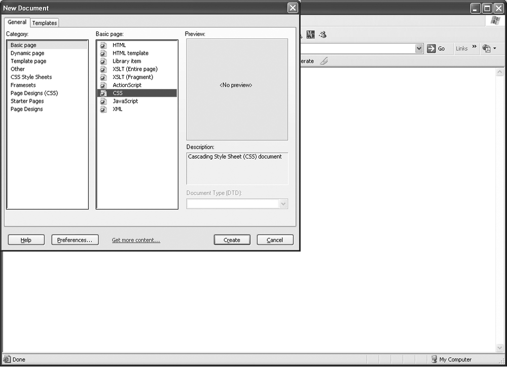
Another option is to use the Code or Split view and enter the CSS directly into the code for inline and internal style sheets.
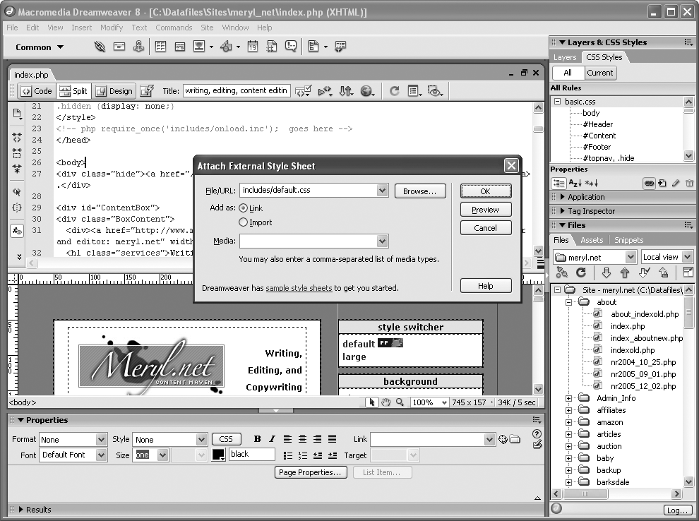
To attach an external style sheet to any web page in Dreamweaver, click the Attach icon on the CSS Styles Panel (see Figure 1-42).
Click File→New and choose Basic page and CSS to start a blank CSS document.
Edit the web page like a word document, Dreamweaver automatically adds internal styles.
Enter styles in Code view.
You can view CSS properties by categories, such as font, background, and border. You can switch to List view, an alphabetical list of properties.
Discussion
If you add styles to content within an HTML page in Dreamweaver, using Properties, the
application automatically adds inline CSS (see Figure 1-43). As you select fonts and color to selected text, Dreamweaver creates an
internal style sheet rather than use font element. In older
versions of Dreamweaver, the code would look like the following:
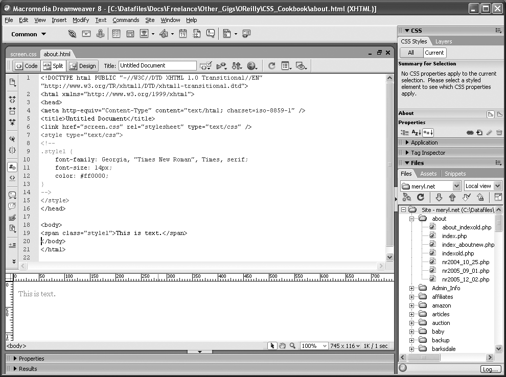
<font face="georgia, times new roman, serif" color="#ff0000"
size="2">This is text.</font>
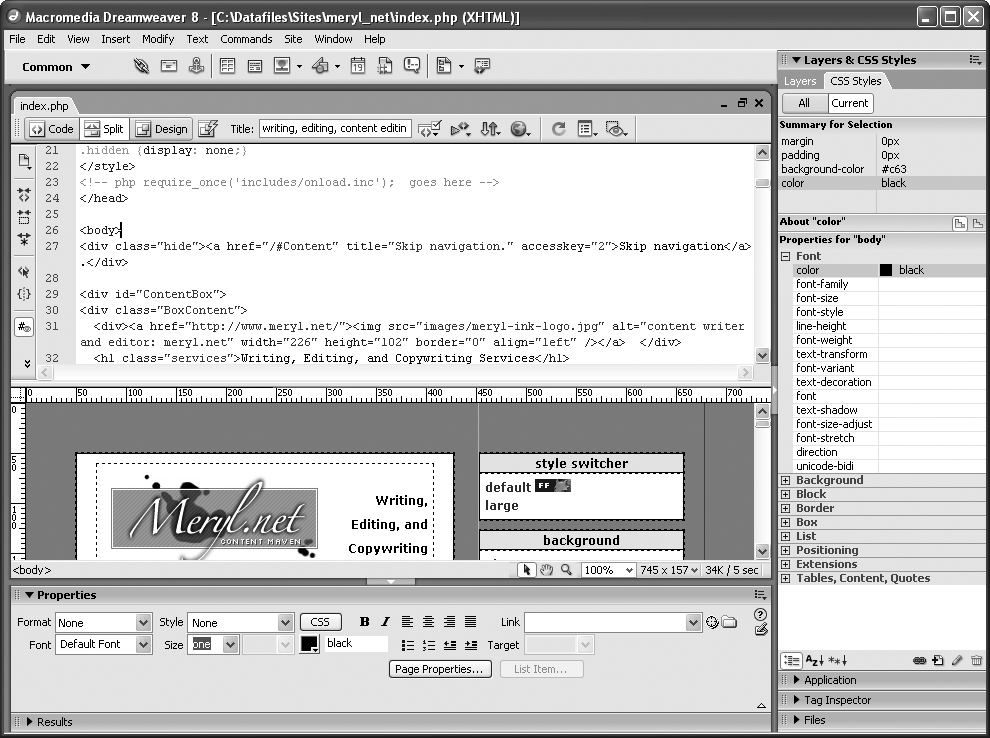
You can review the style sheet generated by Dreamweaver (see Figure 1-44).
See Also
Adobe’s Best Practices of CSS selectors http://www.adobe.com/products/dreamweaver/bestpractices/css/ and Dreamweaver home at http://www.adobe.com/products/dreamweaver/.
Using CSS in Microsoft Expression Web Designer
Problem
You use Microsoft Expression Web Designer to design web pages and want to take advantage of its CSS features.
Solution
Like Dreamweaver, Microsoft Expression Web Designer allows you to attach an external style sheet, create a new one from scratch, and add styles within the HTML page as you can see in Figures 1-45 through 1-47. Here are a few ways to add CSS:
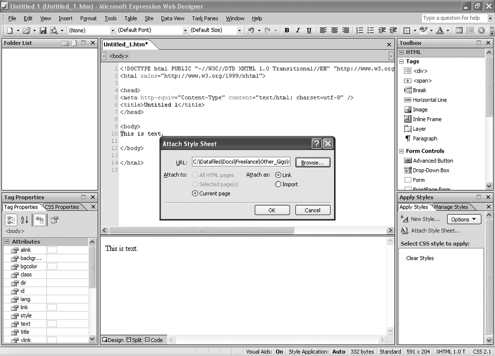
To attach an external style sheet to any web page in Microsoft Web Expression, click Attach Style Sheet in the Apply Styles task pane.
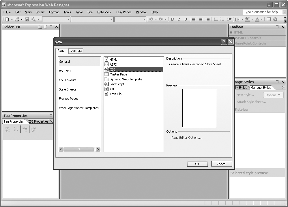
Click the New Document icon, and then click CSS to start a new CSS document with a blank page.
Edit the web page like a Word document; Expression Web Designer automatically adds internal styles.
Enter styles in the Code view.
Discussion
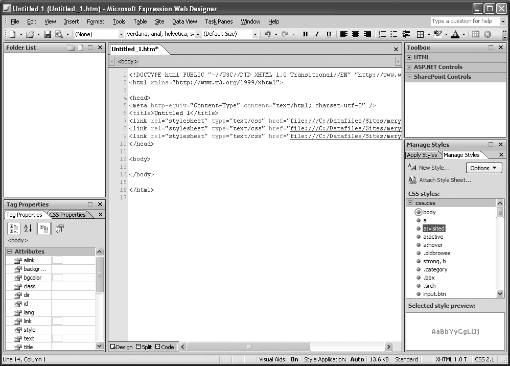
Microsoft Expression Web Designer has made strides in CSS support over FrontPage, its predecessor. After adding styles to a web page, refer to the Manage Styles task pane to list current styles and to switch styles from external CSS to internal CSS and vice versa.
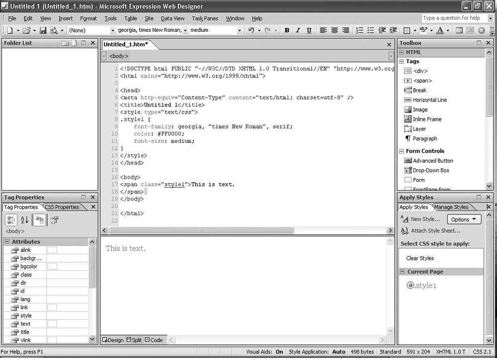
If you add styles to content within an HTML page in using the Formatting toolbar, the
application automatically adds inline CSS. As you select fonts and color to selected text,
Expression Web Designer creates an internal style sheet rather than use <font>. In FrontPage, the code would look like the following:
<font face="georgia, times new roman, serif" color="#ff0000"
size="2">This is text.</font>
If you made changes to the code in FrontPage, the application often doubled-up on the code, such as the following:
<font face="georgia, times new roman, serif" color="#ff0000"
size="2"><font face="times new roman, serif">This is text.</font></font>
This led to bloated pages that rarely rendered correctly in browsers other the Internet Explorer. Expression Web Designer doesn’t have double code trouble as you can see in Figure 1-48. Furthermore, styles can be categorized by order or type for easier reviewing.
See Also
The Microsoft Expression Web Designer CSS Tours at http://www.microsoft.com/products/expression/en/web_designer/demos.mspx.
Get CSS Cookbook, 2nd Edition now with the O’Reilly learning platform.
O’Reilly members experience books, live events, courses curated by job role, and more from O’Reilly and nearly 200 top publishers.

