Chapter 4. User Interfaces Begin with Words
Really? Start with Words?
As far as the customer is concerned, the interface is the product.
—JEF RASKIN, HUMAN-COMPUTER INTERACTION EXPERT AND THE CREATOR OF THE MACINTOSH PROJECT AT APPLE[72]
IMAGINE IF YOU’D WITNESSED the birth of the Macintosh project in 1979.
Disco. Bell bottoms. Anticipation for The Empire Strikes Back. The Iran hostage crisis.
But in a dingy office in Cupertino, you’d have seen the implementation of the first commercial graphical user interface. The invention of the one-button mouse. The creation of some of the most essential, foundational apps in computing.
But, even more powerfully, you’d have been exposed to the idea that the computer could be something used by regular people—not just scientists, businesspeople, or engineers. The dream was that the computer could be like any other household appliance, winning space in the living room next to the television or the solar-powered calculator.
This was a huge step in thinking at the time. Computers are business machines, went the conventional thinking.
Not only was a man named Jef Raskin there to witness this spectacle, but he helped to make this dream into a tangible reality. Raskin was the one who started the Macintosh project at Apple. Seeing that the Apple II was still too complex for everyday use, he believed that the computer could be as easy to use as a regular home appliance.
So Raskin decided to define the guiding principles of what a so-called “easy-to-use” computer should be. And in his book The Humane Interface, published about two decades after he left the Mac project, he revisited and refined his ideas about human-computer interfaces.
Raskin believed that the success of a product’s interface was dependent upon how well the designer understood two parties: the human using it, and the capabilities of the machine on which the software ran.
One of his core beliefs was that a designer should start designing the UI with...copy.
The place to start the implementation is to list exactly what the user will do to achieve his or her goals and how the system will respond to each user action.[73]
This is where the foundation of your product’s user interface is laid. And you’ve earned the right to be here because you’ve already defined the tasks that the product needs to accomplish—because you know your audience, you’ve done the research (you did use the Pain Matrix, right?:) ), and you know what your team is capable of delivering.
So go into this stage with the confidence that what you’re creating has a soul and a direction. Will the product change as you’re developing it? Perhaps, as you learn more about your customer and determine what you’re capable of building. But that’s part of the process of being flexible.
The foundation you lay here will help you understand exactly how your product can annihilate your customers’ pain. You’ll understand exactly the steps required to make your product tangible.
And don’t forget—doing this will save you time. How long does it take you to type words into a text editor? How long does it take you to draw squares and arrows with words in it?
Not long. So it’s easy to shuffle the cards, so to speak, if what you came up with feels wrong, or bloated, or impossible to pull off.
The other added benefit of writing your interface first is that you’re not worried about which font you should use, the border radius on your dialogs, or the interaction convention of the week. You’re focused on your customers’ productivity.
But a lot of us get this backward. We get sucked into the dopamine rush of inventing novel interactions and layouts, worried too much about impressing our peers in the product design community.
Words are the building blocks of practically all user interfaces. That’s because interfaces are really just a set of tasks driven by words and symbols—and by focusing on good copywriting, you’ll vastly improve your product and its design. Words are the nucleus of the interface, the design built out of them.
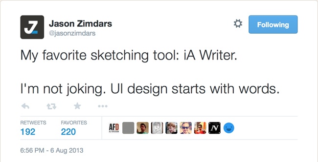
I love how Jason Zimdars, a designer at project management company Basecamp, puts this (Figure 4-1):[74]
My favorite sketching tool: iA Writer [a minimalist text editor]. I’m not joking. UI design starts with words. Writing first makes me treat UI as a conversation. How would I tell a friend what they can do here and now?
Words get you, in old-school engineering parlance, “close to the metal”—closer to the who and why of your product, versus jumping into the how and what. It’s beginning your user interface as a dialogue with your future customers, versus trying to invent UI components right out of the gate. Because, as Raskin writes, “Users do not care what is inside the box, as long as the box does what they need done.”
So how does one go about writing out a user interface? There are three key steps:
Map out the sequences of interactions—otherwise known as flows—that your audience will use to complete every task in your product.
For each screen in these flows, list out the components that are required to make each step in the flow do what it’s supposed to do. Forms? Buttons? Pieces of data? List everything out.
Write the actual copy. What’s the headline going to say? What’s the context? In what tone should you write it, and should you reflect a certain personality? Don’t settle for Lorem Ipsum here.
In the end, there’s no one perfect way to do this. The goal is, as a famous stormtrooper once said, to “move along now,” and get something working as quickly as possible without having to juggle all of the product’s variables in your head. Clarity around what you’re building and opening a line of communication with the people who are building it is the primary goal of the copywriting process. Systemic design problems can be thought out and designed on paper or in text first—before even a single pixel is created, or a line of code typed.
With that in mind, let’s talk about mapping your product’s user flows.
Creating User Flows
Science fiction, fantasy, and thriller writers who have to handle a bunch of plot lines need a way to keep track of what’s going on. Writing a book—especially a series of books—with separate and intertwining plot lines demands an overarching method of organization. Can you imagine what George R.R. Martin, J.R.R. Tolkien, or J.K. Rowling had to do to keep track of all their characters and subplots?
Well, you’re in luck, because you can jump inside the head of Rowling while she wrote The Order of the Phoenix. A sample page of her handwritten plot spreadsheet surfaced online in 2010. The columns dividing the spreadsheet consist of chapter numbers, story timeline, main plot points, subplots, and chapter titles (Figure 4-2).[75]
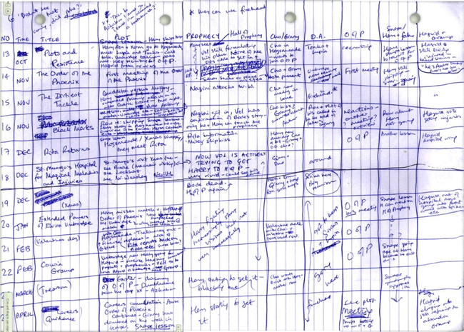
If you’re familiar with the Potterverse and have read the books, you’ll notice some events that took place that were never explicitly mentioned in the novel—namely, the subplots near the right of the page. Rowling made sure to note that these events were happening in the context of the universe she created so she could keep track of what was going on, even if she never explicitly exposed them.
There are also many elements present here that were changed in the final novel. Note, for example, that “Elvira Umbridge” is mentioned instead of Dolores, and that Dumbledore’s Army and the Order of the Phoenix swap names later.
Even if you haven’t read the Harry Potter series (hold on—you haven’t read that and you’re reading this? I recommend fixing this problem as soon as possible), the lesson here is clear: Rowling didn’t just dive into writing her book. She didn’t create a successful story without forethought. She meticulously planned it in a way that forgave mistakes and bad ideas, and without much overhead. At worst, Rowling would have to crumple up a piece of paper and throw it away if the plot didn’t make sense. You can even see how she crossed out mistakes and bad ideas in the spreadsheet—imagine the cost of having written an entire scene instead?
Creating a user interface for your product really isn’t much different. By mapping out the flows of your interface first, you’re outlining the story, your characters, and your subplots.
And flows are important, because your customers aren’t going to accomplish the task you’ve laid out before them in just one screen. From signing up, to taking a photo, to even confirming something with a simple “OK,” everything in your product is going to be judged by how well the flow of screens...well, flows.
Creating user flows that are both smooth and logical is an essential hallmark of a great product. It is rare that a feature exists within a single screen. In many cases, mapping out your product’s flows will help you determine the type of interaction best for each step. For example:
Does this step need to be a single screen, or could it just be a pop-up window?
Do you need another form on this step, or could you just reuse existing data from a previous screen?
Will you need a double confirmation because you’re dealing with a potentially destructive action?
More generally, flows are so essential at this stage of product design because all of the following details are getting out in the open:
Where are people starting in your design: from within your product? Or are they coming to a page from outside of it?
What are the assumptions your customers have at this point: are the customers new? Exploratory? Cautious? Or are they experienced and trying to get a task done as quickly possible?
What are the possible decisions your customers can make on each screen—and where does each decision take them?
On the flip side, what pieces of data do you need your customers to input?
What happens if something goes wrong—or right? What do you display? Where do you direct customers?
Doing this early legwork relieves you of the burden of keeping these details in your head. It’s also an iterative process with your team: by keeping them aware of what you’re thinking, they know how their pieces each fit into the overall product and can adjust them as the flows change.
That’s why it’s fine to be as verbose as possible. There’s nothing to lose at this stage, and it’s best to put all of the variables that you’re dealing with out in the open. Furthermore, there’s a high probability that these flows will change as you turn them into interactive prototypes, and, eventually, a fully refined experience.
But where to begin? Start by focusing on what makes up the essence of the product—the centerpoint of your product’s use case—and then work out from there. By mapping out the most essential flows first, you can then orient every other flow around them. In other words, the secondary functionality of your product should be in service to the primary flows. This approach has the effect of leading customers back to what makes your product unique and the most useful.
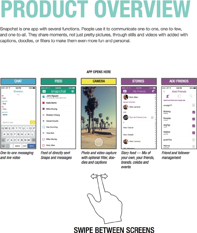
As an example, Snapchat famously made the camera the first screen a customer sees. So whenever someone opens up Snapchat, the app opens the camera first. This places every other action—viewing other people’s Snaps, playing with settings, adding friends—as secondary. It makes content creation the most encouraged flow. It also had the side effect of creating new customer expectations within the photo sharing space (Figure 4-3).
So how do you write out these flows? What’s the most efficient, flexible way to get this stuff out of your head and into a format that can be consumed by your team?
One of the most unique methods for mapping I’ve ever heard of—and one that I’ve actually adopted myself—was created by Jon Troutman, cofounder and chief creative officer for home security startup Canary. Based in New York City, Canary sells a security device and suite of software services that makes it easy to not just see, but understand, what’s happening in your home from anywhere. Troutman’s responsible for the company’s hardware and software design, which includes a suite of mobile and web applications.
Troutman eschews anything visual in this phase and instead maps all of the flows in the text editor TextEdit. His philosophy is that by preventing any ability to focus on visual or layout details, he’s better able to focus on the content and purpose of each screen. And since copywriting is a major part of interface design, he’s simultaneously crafting large swaths of the interface.
I like to start in TextEdit as a content inventory canvas where I start to type out things that I know are going to be on the page or on the app. I like to organize things in TextEdit just because—it’s comfortable now, because I’ve been doing it for a while—but at least starting out there were uncomfortable constraints that forced me not to get visual, but instead think in terms of content.
It’s also a convenient way to collaborate with the team, and creates a quick way to start experiencing the flows you’ve built.
We used [the raw HTML flows] as a way to collaborate with other members of the team to make sure, “hey, is this the content that we’re going to want on this page?” By getting the right content in there, it was then super easy to turn the text into an HTML prototype with no styling. Then we all tested it by clicking through, making sure it felt like the right flows and things fit together right and the information architecture was right, then increasing fidelity from there.
Troutman found that this was a way to quickly determine if a page or section of the user flow was overloaded:
TextEdit forces you to be linear. Then you start to think about importance. What’s going to be further down within the content, or what’s going to be higher within the content—whether or not you break them into separate pages or different flows, you start to prioritize and give the content a hierarchy just based on the amount of things before it. Doing this forces you to whittle down your content and make things shorter and smaller and more succinct and you start to rearrange stuff around. It’s actually pretty key to my process and I use it all the time.
The goal of mapping your flows is to answer the following questions: How does the customer get into a position to complete a task? How do they complete these tasks? Where do they go afterward? What are the potential hangups?
And how are these communicated? Sketches? Diagrams? Mind maps?
Troutman’s method may not be for you. Maybe it’s not visual enough, or maybe it’s too minimalist.
Katelyn Friedson, when she was mobile product manager at publicly traded Care.com, used flowcharts to communicate the general flows of a new product with her designers and engineering counterparts (Figure 4-4). “While it’s important to get something in the hands of a developer quickly,” Friedson said, “I think it’s also important to put as much thought into the flow or feature or product as possible before handing off something that’s half-baked. This is done to avoid waste.”
But she doesn’t let the fear of handing off something that may be ill-conceived at the moment prevent developers from thinking about what’s going to be required for a new feature:
That said, developers are looped into what we’ll be working on building for a specific iteration cycle. For example, at Care, we were building a peer-to-peer payments flow. We knew which payment vendor we’d be integrating with, and we knew of 4–6 use cases that we were sure we would need to build out. This gave our developers time to begin researching, even coding, these flows—integrating with APIs, testing, etc. It also allows them to prepare questions they have in the event they aren’t covered in the product specifications.
In other words, Friedson uses her user flow maps to enable developers to get more specific in their thinking:
Forget about design and flow, and focus on areas and use cases that developers can start tackling right away from a backend perspective. These use cases can be easily and very quickly communicated through user flows, which are essentially made up of boxes and arrows, showing the various use cases a user would take. For example, if a user’s credit card were to fail, what would we present to the user?
Just because a designer hasn’t worked through every loading state or error screen doesn’t mean that you should keep your cards close to your vest. Friedson’s thought-through-but-evolving user flows let the organization start moving forward even when everything isn’t finalized.
Diogenes Brito, product designer at LinkedIn, uses this flow-mapping phase more as a personal step to organize all of the variables in his head:
What ends up mostly in my notebook, which I always have and I think is an important part of any designer’s toolset, is more mindmap kind of stuff. Listing all the requirements, the kind of problems you should think about and related problems, and things we might want to keep in the back of our heads as we’re designing a certain thing.
I’m going through all the options and arrangements, and what really [ends up] I think in my logbook specifically are questions about information architecture. It’s complex categorization. What if we think about it this way in these other categories? What if we think about it this other way in these other categories?
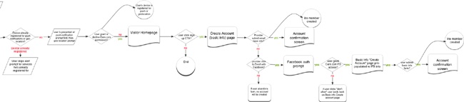
For my own projects, I personally like to invoke J.K. Rowling’s technique—by first scrawling text and arrows on a piece of paper. And, like Brito, this is an exercise first for myself. It’s a way to organize my thoughts and account for all of the variables flying around. Here’s an example from a signup flow I had to create for a mobile product on which I worked as product designer (Figure 4-5).
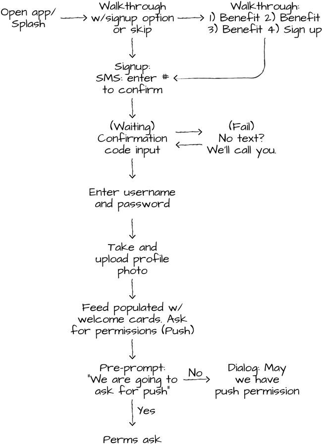
With these broad user flows, I’m seeking to communicate only the broadest strokes of the essential functionality of each screen. Once I have the broad flow down, only then will I go and sketch out the specifics of each screen. You can see this sentiment in the “Walkthrough” section of the signup flow—I know that I want to highlight three benefits, but I don’t know what those are yet. There’s no need to represent those here in specificity yet.
Here’s a more complicated flow that includes a series of forks—importing photos into one’s profile from two possible sources. What happens if you choose Instagram? Or Facebook? What happens if you’re not authorized with Instagram yet, and what happens if authorization fails (Figure 4-6)?
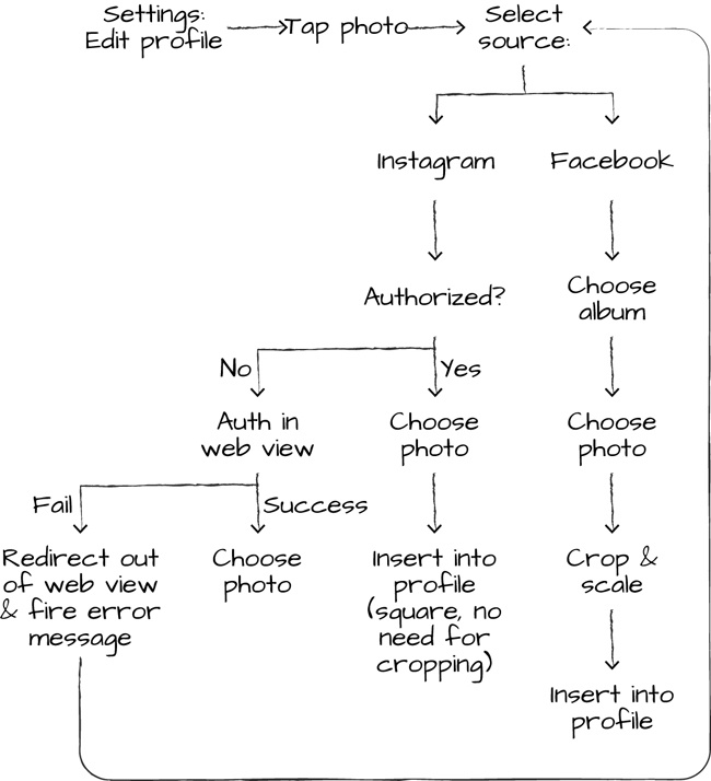
What I like about this technique is that it easily highlights where and when to reuse flows. For example, if I attempt to authorize Instagram and my login fails, we’ll just pop you back to the “Select source” step and throw an error message.
From here, I like to sit down with the lead engineer on the project and work through each step together. We’ll literally scratch out, flip, and invent new steps in the flow during these sessions based upon what’s right for the customer and what’s technically feasible.
Sometimes, if it’s necessary, we’ll turn these into a higher-fidelity flowchart like the one created by Friedson in Figure 4-4. This is usually in response to a need to “socialize” the user flows more widely within the company.
So, these are the broad strokes, but what about each screen?
Let’s look at those next.
Writing Your Screens
Writing out flows is one thing. But writing out the specifics of what’s on each screen is where some of the most meaningful user interface work happens—because, as Raskin wrote in The Humane Interface, “as far as the customer is concerned, the interface is the product.”[76]
The reason why it’s so useful to map out the key product flows ahead of time is because every screen lives in context. Successful screens are aware of the screens that came before them and appear after them.
So how do you make sure that you’ve accounted for all of the elements required to make a screen successful?
Well, the first step is to relinquish all fear. Ernest Hemingway—whether he actually said these words or not—is now universally credited with saying, “the first draft of anything is shit.”[77]
Ryan Scherf, a product designer at Quirky, gets this. “I think sketching is super important. There’s no such thing as a bad idea. So as we’re thinking through these things and throwing ideas out, it’s really important to me to have a team that understands that there’s no such thing as a bad idea, and someone has to have the first idea, and usually the first idea is the worst idea.”
Think of your screen sketch as a canvas where nothing’s impossible. Just as J.K. Rowling used a blank piece of paper to spreadsheet out her plot lines (if spreadsheet is even a verb), take this chance to get every crazy, dumb, implausible, or ridiculous idea out of your system.
So list everything that you think needs to be on this specific screen of your product. This could possibly include:
User information like name, age, biography, job title, etc.
Common connections like friends, interests, or visited locations to which two or more people could share
Photos, videos, and any kind of rich media
Core and secondary actions the user could take
Really, this list includes anything that your product requires to successfully fulfill its promise to your audience—namely, a prompt to the user about what they should do, the primary action you’d like them to take, and any bits of information that you can supply to them that makes their decision easier.
I recommend making this list next to a rough sketch of what you’ve envisioned the interface to be in your mind’s eye. For example, in Figure 4-7, I created a list of potential elements for a hypothetical profile. I listed out all of the possible pieces I could include—with a rough sketch of where they might go, so I could visualize these elements as I listed them.
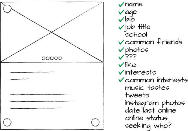
Note that I didn’t list these interface items with any priority in mind—it was a stream-of-consciousness exercise in what could possibly make sense on the screen.
What’s great about doing this is that you get all the insane, crazy ideas out of your system. Once you write it all down, you can take a step back and really look at what you’ve written down on paper.
That’s because you’re dealing with reality. You’ve got a dataset from which to load data. You’ve got constraints on the client for which you’re designing—desktop, iPhone, Android, Windows Phone—you get the gist. What are the essential interface elements that you need to convey the purpose of this screen? What’s everything you need for the ideal state of this screen?
We’ll explore the ideal state in Chapter 6, but for the sake of this step, you’re creating the ideal version of this screen by hand. And the ideal version of the screen starts at its center—what’s its primary purpose? What functionality can you exclude that doesn’t fit within the purview of the screen’s function?
A great example from Internet history lies in Jack Dorsey’s initial conception of Twitter (Figure 4-8).[78] In 2006, Dorsey drew the components of an interface that you’ll recognize even today. That’s because he was able to identify the core components (however straightforward they might have been) of an interface that aligned with the product’s use case.
Also, notice how Dorsey’s notes about potential avenues to pursue on this screen never endured in the Twitter interface. While we might have the benefit of hindsight here, Twitter has maintained the core tenets of Dorsey’s original interface sketches even 9+ years later (Figure 4-9).
In the end, writing and drawing out your product’s interface before you even put pixel to canvas has immense benefits—because you’re weeding out the bad ideas before you make big investments. But even in these early stages you can flesh out another massively important interface element—an interface’s actual copy.
Traits of Good Interface Copy
Here’s the beauty of starting your design with words: it can help you set the tone of your product, especially if you’ve researched your audience as we discussed in the previous chapters.
These early words are the foundation on which the walls of your interface will be built. So they’d better be good.
Jon Troutman of Canary eschews any efforts at this phase to insert fake text like Lorem Ipsum (or, even my favorite, Riker Ipsum, as tempting as it may be):[79]
I write out what it would actually say. I think it forces you to not let yourself put in Lorem Ipsum and just headline goes here and things like that. You put all the content in and when you first start, you’re not playing with font sizes or anything. It’s all inline.
Here are four broad principles that you can use to make sure your copywriting starts off on the right foot.
Who’s the Audience?
Who’s using your product? How comfortable are they with your product on any given screen? Are they just now being introduced to your product’s capabilities, or are they veteran customers? Have they paid for anything yet, or are they on a free plan?
Use the jargon you found while researching your customers to ingratiate yourself with them. What words and terminology will be most recognizable?
But don’t mistake your customers’ jargon for your own. Internal terms—like project nicknames, error codes, acronyms, inside jokes, or placeholder copy—have no place in your product’s interface. Your job is to make it make sense for your audience, not for you.
In What Tone Is It Written?
Good interface copywriting isn’t overly technical, vague, or laden with branded or internal buzzwords. It’s helpful and forgiving, and it’s aware of when it’s delivering good or bad news.
Is your product for stockbrokers? Teenage girls? Book authors? Eco-conscious mothers? The tone of your product’s copywriting should be conscious of this. Humor, seriousness, dryness, and other tones each have their place.
The ultimate tone to strike, though, communicates your product’s capability of fulfilling its promise—that it can be relied upon to do the job it said it can do.
What’s the Context?
Is it a landing page? A signup form? Settings? The first time a customer sees a screen? Your shipping policy? In response to something on which they explicitly took action?
Good interface copywriting takes into account where a customer is reading. And it helps them to decide which action they should take next, if any. Most of the time an interface is presenting information to a person so they can make a decision. Be as clear as possible about which decision might be best for your customer in this moment.
Effective interface copywriting also takes into account the limitations of the context. For example, if you’re sending information via text message, you should be courteous and write your message in less than or equal to 160 characters.
The best way I’ve heard the copywriting process described is to act like a newspaper editor. You’re trying to create short, direct, easily absorbed copy that succinctly describes every decision in which a customer might find themselves. The goal is to make those situations effortlessly understandable—so your customer knows what to do next without question.
Are You Being Consistent?
Humans are creatures of habit and your customers will quickly adapt to the patterns and cadence of your product. That’s why being consistent within your product with labels and commands is essential.
Can you “Log In,” then “Sign Out”? Do you advance by tapping “Continue” or “Next”? Do confirmations come with “OK,” “Okay,” “Submit,” or “Confirm”? Universal commands should be consistent across your product.
And, when possible, buttons should reflect the action they’re performing. The best button titles are written with one or two words that describe the result of using the button. “Send Message,” “Take Photo,” “Leave Comment,” and “Not Now” are all much more descriptive than a generic “Submit.”
Be aware of common industry terms and the geographical region in which your product is being used. If people know a camera as a “camera,” then call it that.
Considering regional differences is also an exercise in consistency. “Zip code” versus “postal code” is a real thing—so is “state” versus “province.” And be aware of how you’re representing dates. Most countries present the day before the month.
And different cultures have different norms. The United Kingdom, for example, might take offense to an excessive use of exclamation points. Who knew? It’s your job to know.
In the end, this is the canvas that you can go crazy on at little cost. Writing actual, tangible copy turns it back into reality, because the next phase increases the fidelity of your product—by turning these screens into interactive prototypes that you can socialize among your team.
Shareable Notes
Interface design begins with words. Before you invest inordinate amounts of time creating the next great user interface, spend your time mapping out each user flow in your product. Then, dial down into each screen.
But with each screen, keep it low fidelity. Write out all of your hopes and dreams for each screen, even with a rough sketch of what you envisioned the interface to be in your mind’s eye. List every element that could possibly be on the screen.
Assess what it’d take to load all of the data for what you listed on the screen. Then, eliminate what you don’t need. Remember the centerpoint and purpose of each screen—what does your audience need to understand what’s going on? What elements do they need to make the right decision along each step?
Ultimately, you’re creating flows and screens to create the product that’ll annihilate your customer’s pain. So start crazy, then reel it back in—because, in the next phase, we’ll turn these screens into prototypes.
Do This Now
On your next project, challenge yourself to start with the most intimidating blank slate of all: the blinking cursor on a white background.
Think about the tone your product should strike. Playful? Witty? Comforting? How can you use this tone to make your product more useful for your customers?
Just say no to Lorem Ipsum (or, even my personal favorite, Riker Ipsum)!
[72] Jef Raskin, The Humane Interface (Boston: Addison-Wesley Professional, 2000), 5.
[73] Ibid.
[76] Raskin, The Humane Interface, 5.
Get Designing Products People Love now with the O’Reilly learning platform.
O’Reilly members experience books, live events, courses curated by job role, and more from O’Reilly and nearly 200 top publishers.

