
(F39)_Job:01-40630 Title:RP-Designing the Editional Experience
#175 Dtp:160 Page:160
001-224_40630.indd 160 1/24/14 7:03 PM
160 DESIGNING THE EDITORIAL EXPERIENCE
TEXT
Case Study:
The New Republic
WEBSITE: NEWREPUBLIC.COM
FREQUENCY: BIWEEKLY PRINT, MOBILE,
CONTINUOUSLY WEB
FORMATS: PRINT, WEB, MOBILE
LOCATION: WASHINGTON D.C.
EDITOR: FRANKIN FOER
CREATIVE DIRECTOR: DIRK BARNETT
PUBLISHER: CHRIS HUGHES
FOUNDED: 1914 PRINT
When Facebook cofounder Chris
Hughes acquired Old Guard political
and literary publication The New
Republic, the then 29-year-old’s
actions surprised many in both
the tech and journalism camps. By
hitching his wagon to a 100-year-old
D.C.–based publication, he acquired
its reputable name but also much
of its baggage. His mission, he said,
was to “[hold] onto the heritage of
the magazine while trying to make
it more responsive to what people
are interested in and how they read
in 2013,” as he told The New York
Times. In his new role as publisher
and editor in chief, Hughes focused
on a digital-first strategy that
wouldn’t abandon print. He set up a
satellite oice in New York and hired
its first-ever on-sta creative director,
Dirk Barnett, formerly of Newsweek
and Maxim.
In an interview that was published on
NewRepublic.com, Barnett describes
how the website redesign came first,
with a responsive design by Hard
Candy Shell, an interactive agency in
New York (also behind websites for
the Wall Street Journal, the New
York Observer, Newsweek, and
Gawker). Barnett joined the team
midway and “finalized the type-
faces”—Publico Headline, Publico
Text, and Atlas Grotesk, as well as the
logo designed in Antenna—to fit with
their design. “And I was continually
thinking about iPad design from the
beginning, so there are a lot of details
that, while they look phenomenal in
print, really come to life in our new
app.” He also noted the influence of
its legacy. “My first few trips to the
New Republic’s D.C. oices were spent
poring through back issues. There are
definitely some new design details in
the redesign that owe their inspiration
to those old magazines.”
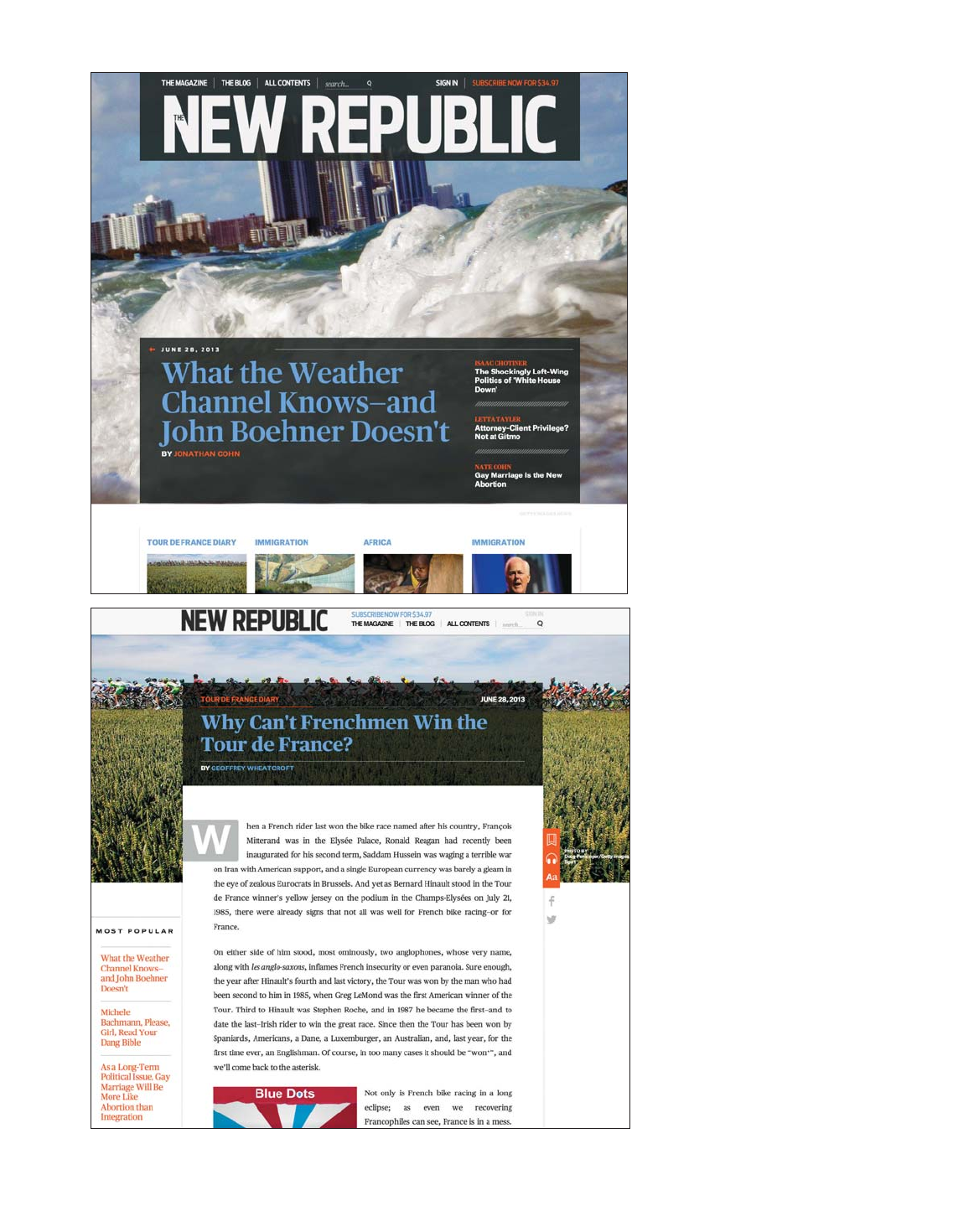
The home page is distinctly unclut-
tered and bears nary a trace of
its legacy (the complete archives
going back to 1914 are accessible to
subscribers through the EBSCOhost
database). The header is spare, giv-
ing users just three content catego-
ries to choose from, while the footer
features many more options for
navigation. And rather than filling the
front page with the entire contents of
the site, there’s one splash image for
a feature story, with links to addi-
tional headlines.
Article pages feature beautiful
full-width images with centered,
readable text and plenty of white
space around it. There’s persistent
navigation at the top of the page to
remind users, as they scroll, of which
article they’re reading and how to get
to the next story (next and previous
articles are also noted at the bottom
of the page). A nice user interface
detail is how marginalia (similar to
footnotes except that, here, they sit
to the right of where you’re reading)
are represented on smaller screens
by red asterisks to either tap or
click for the full annotation. On the
desktop version, the annotation in
the margin is inobtrusive. Many cues
exist in the design to indicate pro-
gression and keep the reader
from feeling lost.
The design also integrates ad units
that are noticeable but not too
disruptive to the reading experience,
and notations on the left of each arti-
cle track how many more free articles
you can read without subscription.
(The site is metered, with eight free
articles per month.)
(F39)_Job:01-40630 Title:RP-Designing the Editional Experience
#175 Dtp:160 Page:160
001-224_40630.indd 160 1/24/14 7:10 PM
(F39)_Job:01-40630 Title:RP-Designing the Editional Experience
#175 Dtp:160 Page:161
001-224_40630.indd 161 1/24/14 7:03 PM
161
TEXT
The New Republic’s decluttered home
page focuses the reader on four pos-
sible lead stories and four secondary
ones. Even the top navigation oers just
three choices plus a search field. Below,
article pages feature full-width images,
easy-to-read large text. Navigation and
social features remain persistent as the
reader moves down the page.
CASE STUDY: THE NEW REPUBLIC
(F39)_Job:01-40630 Title:RP-Designing the Editional Experience
#175 Dtp:160 Page:161
001-224_40630.indd 161 1/24/14 7:10 PM
(F39)_Job:01-40630 Title:RP-Designing the Editional Experience
(221)_02-AC70362 #175 Dtp:160 Page:162
001-224_C70362.indd 162 2/11/14 4:37 PM
162 DESIGNING THE EDITORIAL EXPERIENCE
TEXT
(F39)_Job:01-40630 Title:RP-Designing the Editional Experience
#175 Dtp:160 Page:162
001-224_40630.indd 162 1/24/14 7:10 PM
Get Designing the Editorial Experience now with the O’Reilly learning platform.
O’Reilly members experience books, live events, courses curated by job role, and more from O’Reilly and nearly 200 top publishers.

