Understanding the Box Model
It’s no coincidence that you find the Float property in the “Box” category of the CSS Rule Definition window (Figure 9-10). To fully understand CSS layouts and how to make the most of floats, you need to understand the other CSS properties in this category: width, height, padding, margin, and clear.
Width and height. You can specify the width and height for any styled object using these properties. If you want a paragraph that’s 100 pixels wide, create a class style with the Width property set to 100 pixels, and then apply it to the paragraph. You’ll often use the Width property in conjunction with the Float property (see the following paragraph) to do things like create a box with a set width that floats to either the left or right side of the page—a common format for pull-quotes, message boxes, and sidebars.
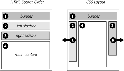
Figure 9-9. A three-column design uses the same concepts as the two-column design. In this case, you float both the left and right sidebars, and add both left and right margins to the center column. The left-hand diagram shows the order of the HTML, the right side shows what the web page looks like.
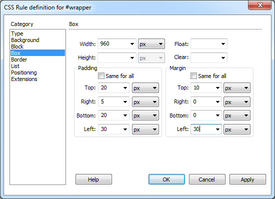
Figure 9-10. Use the Box category to define the dimensions of a style, to position an object on the page, and to add space between the styled object and the ...
Get Dreamweaver CS5: The Missing Manual now with the O’Reilly learning platform.
O’Reilly members experience books, live events, courses curated by job role, and more from O’Reilly and nearly 200 top publishers.

