Chapter 6
Charting Your Data
People like to see information presented visually. Looking at data in graphical form lets readers—and spreadsheet viewers—quickly and vividly understand what's going on, in a way that hundreds or thousands of rows worth of data can't. Compare the two portrayals of test scores shown in Figure 6–1.
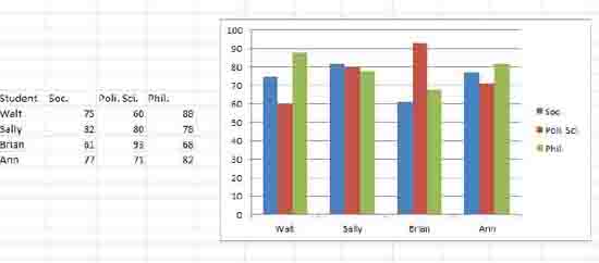
Figure 6–1. Two points of view
Same data, two different looks. The column chart (that's what shown in Figure 6–1, and once you learn a bit about how charts are constructed, you'll be able to fashion one in about 10 seconds) conveys a sense of proportion among the scores that the cells to its left can't.
Excel makes it ...
Get Excel 2010 Made Simple now with the O’Reilly learning platform.
O’Reilly members experience books, live events, courses curated by job role, and more from O’Reilly and nearly 200 top publishers.

