
Text (DS)
Job:12-84823 Title:RP-Graphic Design That Works
(NEW)
175# Dtp:22 Page:254
One Step Beyond
In design, type can be more than mere words on a page. Used properly, it can be
an effective tool to enhance a communications message. When designer Matt Ralph
envisioned an educational brochure for Antioch College, he wanted to use type as a
way to reinforce the feeling of experiencing the college and its students firsthand.
“The college is an interesting place. They have different kinds of programs and
courses that support the students’ interest and commitment to social and environ-
mental issues,” says Ralph. “Rather than design a book that is organized by
departments, I decided to design it as a random walk-through. I wanted the type
to reinforce that by changing quite a bit as you go through the book. In some places
the type would be simple and quiet and a little more reflective, while in other places
it would become a more playful and exuberant, and in others it would get big, bold,
and loud.” Ralph chose to use type as a way to bring out the variety and diversity
of the small town college. As you look at each spread, you are introduced to a
new aspect of the school and its unique student body.
Type can also be an expressive, almost pictorial, element used to give visual impact
to a page. In a promotional brochure for illustrator Rick Sealock, designer Ken Bessie
used type in a highly visual way. “I thought a lot about how I wanted the reader to
perceive the type,” recalls Bessie. “I went with an asymmetrical type layout because
Rick’s illustrations are so colorful and aggressive.” Bessie’s painterly use of type
brought variety and spontaneity to each spread. “I wanted to do something a little
bit different on every page. I’d put a lowercase letter in a full cap word, change the
color for one letter, jump the baseline, and use different point sizes and leading in
the same text block,” details Bessie. “When words repeated or when punctuation
was used, I really wanted the reader to get a sense of the emphasis on these words.
I wanted the piece to be typographically fun to read.” Through his inventive and
playful use of type, Bessie was able to tell a visual story while also highlighting
the illustrator’s whimsical work.
By far, the most important aspect of type is that it be legible to ensure that the
communications is clearly disseminated. “You have to think about your audience,”
concludes Ralph. “Once the information is readable and understandable, you can
go off and be more expressive and playful. I like work that blends the two.”
The Graphic Use of Typography
Graphic Design That Works
254
244-257_84823 12/10/05 3:05 PM Page 254
Text (DS)
Job:12-84823 Title:RP-Graphic Design That Works
(NEW)
175# Dtp:22 Page:255
NEW)
e:254
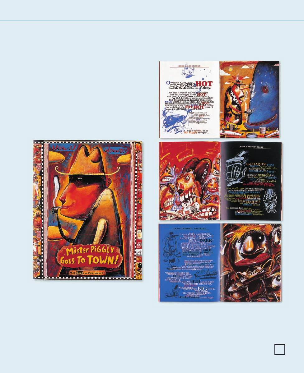
CLIENT:
Rick Sealock is a whimsical
illustrator working in Alberta,
Canada.
FIRM:
Blackletter Design
ART DIRECTOR:
Rick Sealock
DESIGNER:
Ken Bessie
ILLUSTRATOR/COPYWRITER:
Rick Sealock
ABOVE: Taking a children’s story-
book approach, the 14-page
promotional piece was created to
attract the attention of a variety
of clients—editorial, publishing,
and advertising. The asymmetrical
layout and whimsical use of
type reflects the story and the
imagery—colorful, energetic,
and fun.
ABOVE: Two typefaces,
Clarendon and ITC New
Baskerville, are used
throughout the illustrative
promotional book.
255
244-257_84823 12/10/05 3:05 PM Page 255
Text (DS)
Job:12-84823 Title:RP-Graphic Design That Works
(NEW)
175# Dtp:22 Page:256
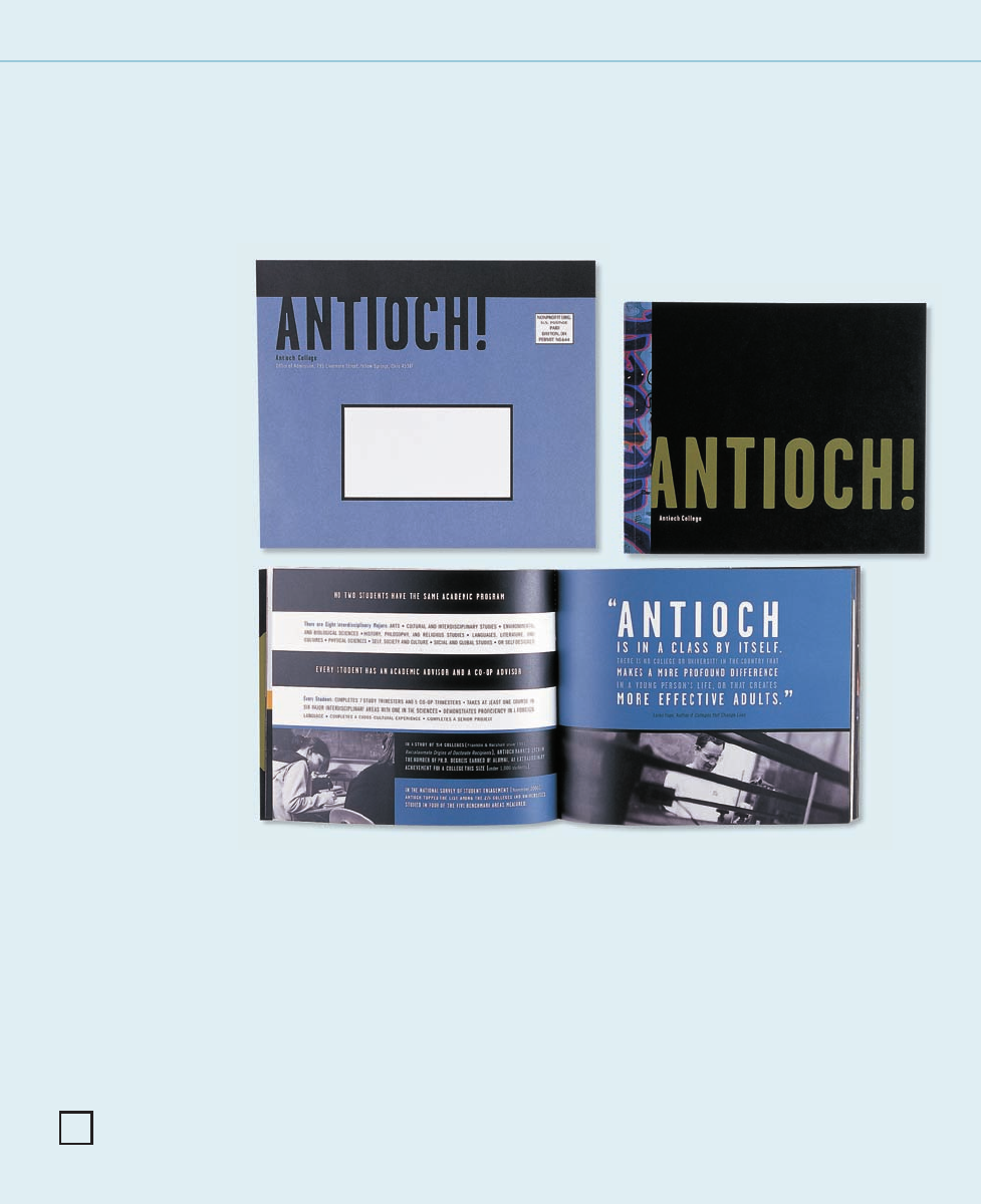
CLIENT:
Antioch College is a liberal arts
college in Ohio where individuality
and independence are nurtured.
FIRM:
Plainspoke
ART DIRECTOR:
Matt Ralph
DESIGNERS:
Matt Ralph and Stephanie Brazeal
PHOTOGRAPHERS:
Brian Wilder and Dennie Eagleson
COPYWRITER:
David Treadwell
RIGHT: The educational brochure is
designed to convey the feeling of
walking through the Antioch
College campus—experiencing the
culture, people, and unique pro-
grams. The brochure was mailed to
prospective students in a custom-
designed envelope.
Graphic Design That Works
256
244-257_84823 12/10/05 3:05 PM Page 256
Text (DS)
Job:12-84823 Title:RP-Graphic Design That Works
(NEW)
175# Dtp:22 Page:257
NEW)
e:256
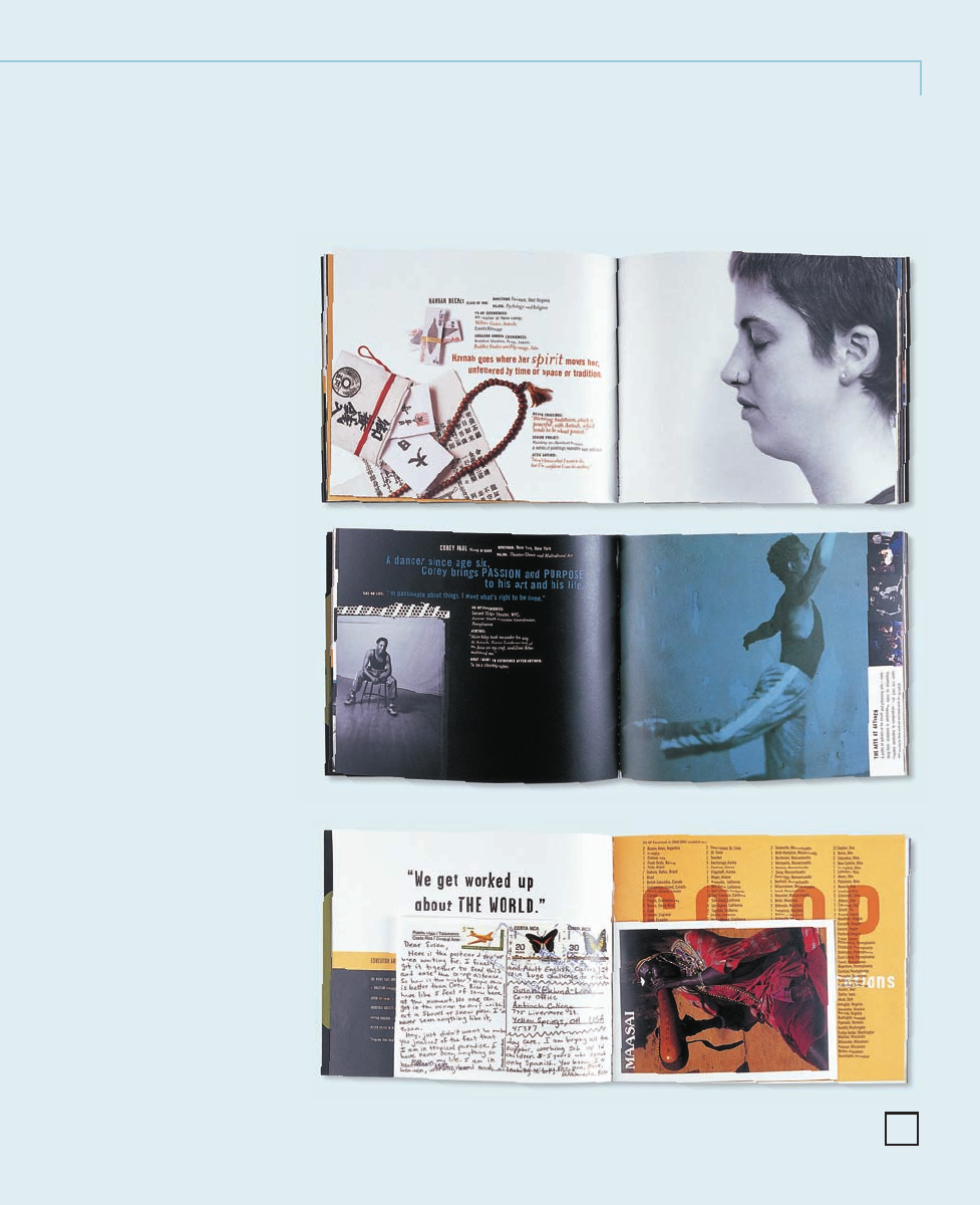
One Step Beyond
ABOVE AND CENTER RIGHT: The profile
pages help to reinforce the cultural
diversity and interests of the student
body. By varying the posture, height,
and weight and repositioning the kern-
ing, leading, and column structure,
Ralph was able to portray Antioch
College with clarity and impact. The
typefaces vary from Garage Gothic
to Trade Gothic with Mrs. Eaves as
an accent.
BELOW RIGHT: Within the brochure,
actual postcards are reproduced to
highlight the study abroad program
in a fun and personal way.
257
244-257_84823 12/10/05 3:05 PM Page 257
Get Graphic Design That Works now with the O’Reilly learning platform.
O’Reilly members experience books, live events, courses curated by job role, and more from O’Reilly and nearly 200 top publishers.

