(RAY)
Job:07-26153 Title:RP-Graphic Designer’s Essential Reference PB Edn
#175 Dtp:204 Page:34
001-035_26153.indd 34 7/12/11 10:32 AM
34
(Text)
GRAPHIC DESIGNER’S ESSENTIAL REFERENCE
{}
Positioning Images Dynamically
Given the regularity of proportions inher-
ent in using a grid, the potential for image
placement to feel a bit static or regular can
be a problem designers need to overcome to
produce dynamic layouts. It’s very important
to remember that a grid allows the designer to
size and position an image any way he or she
wants, as long as the image corresponds to the
columns (and rows, if the grid is modular).
Showing as much variation in arrangement
as possible helps the reader see the grid in
different ways, reinforcing its presence, while
keeping him or her from getting bored. One
way to ensure dynamic image placement
on a grid
—
on a single page, across a spread,
or from spread to spread
—
is to establish a
formula for size, proportion, and position cal-
culated to vary the composition as methodi-
cally as possible. This method, called bounce,
usually results in dynamic layout changes
from spread to spread.
Relating Full-Bleed Images to the Structure
Large images that bleed the margins offer
strong counterpoint to small images and text-
only pages; but even though the image fi lls
the entire page, it doesn’t mean it can ignore
the grid underneath. To the contrary, such
images must be scaled and positioned within
the frame of the page so that some geometric
element within aligns with the column or row
and helps articulate it.
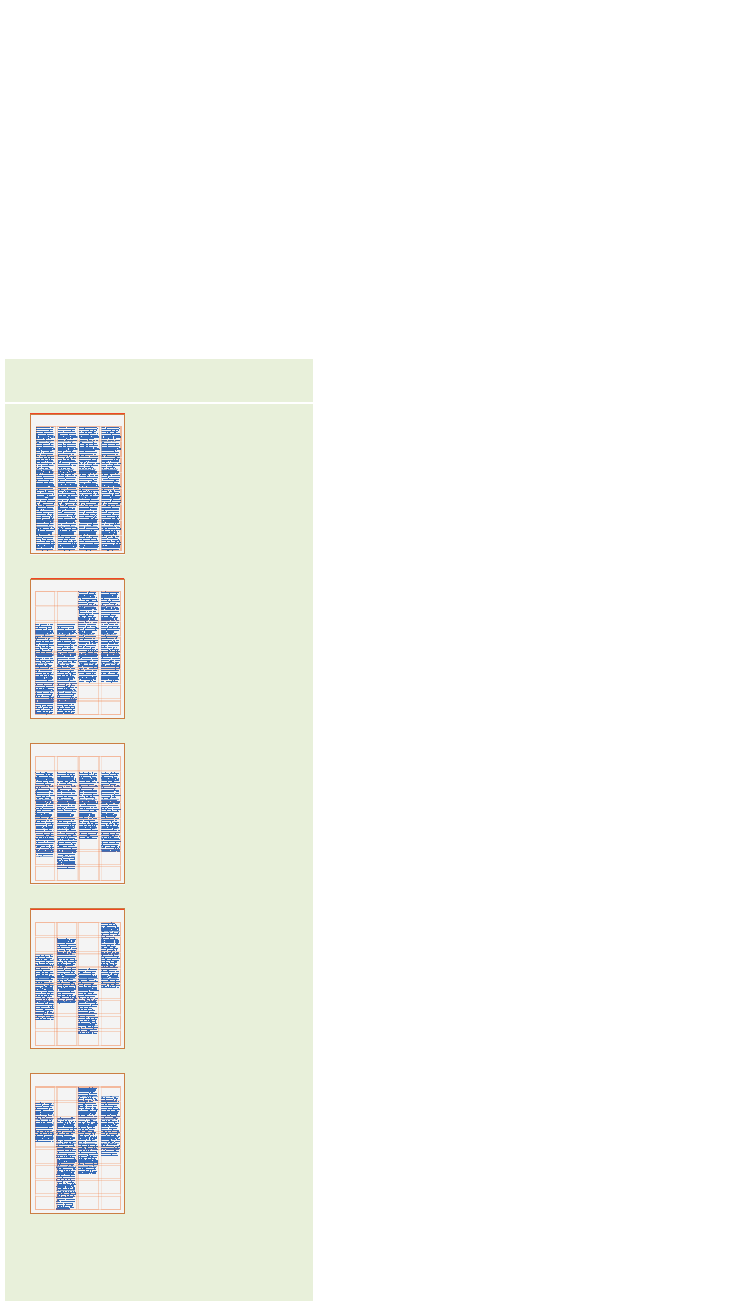
A Columns of text may justify
to the head and foot margins,
broken by the introduction of
images into the text fi eld and
by the insertion of callouts.
This approach creates a very
dense page and emphasizes
the image proportions over
the shaping of the text, which
becomes a neutral fi eld.
B Text columns may justify to
specifi c fl owlines or module
depths, creating a very rigidly
geometric shift up and down
across the page.
C Columns may hang or
grow from margin or fl owline,
ragging in depth at the oppo-
site end. This option provides
a strong, unifying constant
that is counterbalanced by
the organic change in depth.
D Columns of the same depth
can stagger up and down,
either responding to fl owlines
and rows, or at random. The
consistency of the column
depths plays counterpoint to
the irregularity of the vertical
motion across the spread.
E The most organic approach
is one in which the columns
change depth as well as
stagger up and down. The
effect is extremely rhythmic,
with text pushing and
pulling fl uidly against the
consistency of the head and
foot margins.
Most any three-, four-, six-, or eight-column
grids will usually work well; it’s the way in
which columns of text interact with negative
space—and with each other—that truly de-
termines how a grid is articulated. The spaces
above and below columns play an active part
in giving the columns a rhythm as they relate
to each other across pages and spreads. Every
approach has a dramatic impact on the overall
rhythm of the pages within a publication,
ranging from austere and geometric to wildly
organic in feeling—all the while ordered by
the underlying grid. Changing the column
logic from section to section provides yet
another method of differ-entiating informa-
tional areas.
Column Logic and Baseline Alignment
When columns begin to separate vertically,
shifting up and down past one another—or
dropping to different depths while adher-
ing to a single hangline above—consider the
relationship between lines of text across the
gutter separating the columns. In a grouping
of columns set justifi ed, with no line breaks
(or a hard return of the same leading) between
paragraphs, the baselines between columns
will align. Any other situation, and the base-
lines between columns will not align.
In hanging columns, text will align
between columns until a paragraph change.
Because the depth of the hanging columns
changes, this might feel appropriate. A
problem will occur in a page spread set with
columns justifying top and bottom, however,
if the paragraph space introduces an uneven
line: The lines of text at the foot margin will
be noticeably off.
Effectively Using a Column Grid
understanding the options
A
B
C
D
E
(RAY)
Job:07-26153 Title:RP-Graphic Designer’s Essential Reference PB Edn
#175 Dtp:204 Page:34
001-035_26153.indd 34
7/12/11 10:30 AM
Get Graphic Designer's Essential Reference now with the O’Reilly learning platform.
O’Reilly members experience books, live events, courses curated by job role, and more from O’Reilly and nearly 200 top publishers.

