(RAY)
Job:07-26153 Title:RP-Graphic Designer’s Essential Reference PB Edn
#175 Dtp:204 Page:191
160-207_26153.indd 191 7/12/11 3:16 PM
(Text)
191
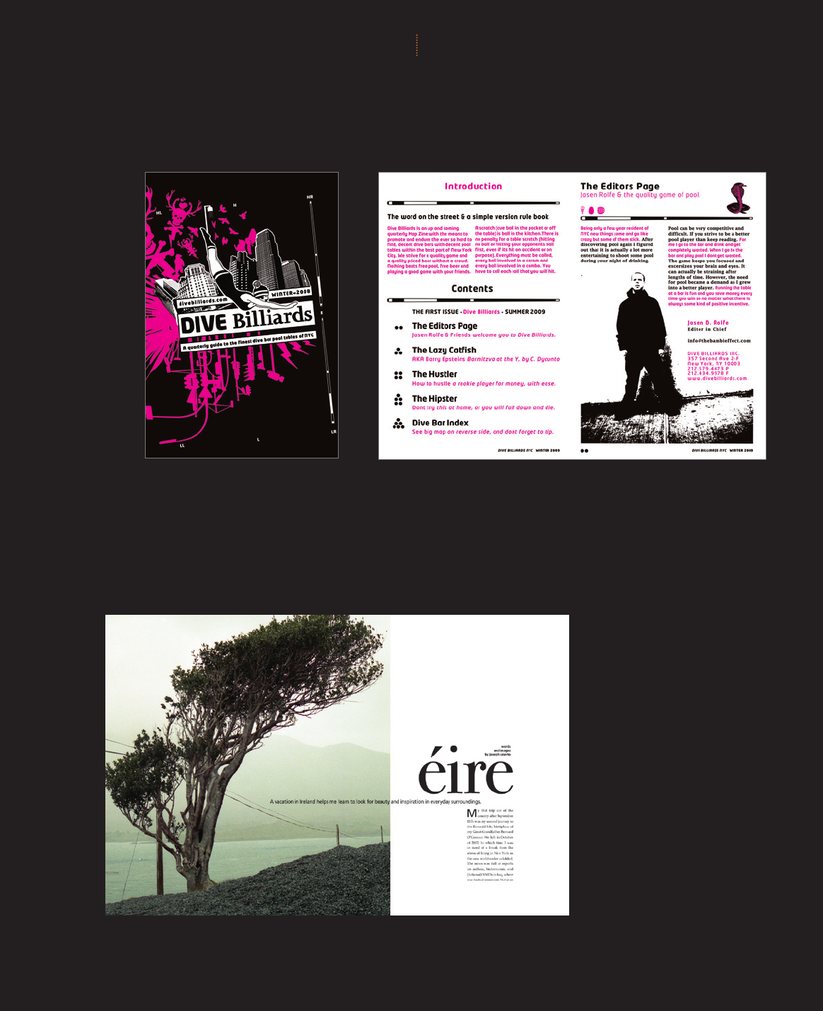
This quarterly newsletter mixes a variety of illustration styles
—
high-contrast photography, vector objects, and engraving
—
with
contemporary sans serif faces and Victorian layout and text
detailing to evoke the hip, yet timeless, character of the dive bar
billiards enthusiast.
JASEN D. ROLFE LEXINGTON, MA
|
UNITED STATES
Starkly defi ned spatial divisions across
the width of this magazine page spread
establish a strong compositional
geometry which the various elements
alternately complement and contrast.
The boundary between image and
negative space is crossed by the deck,
but repeated by the text block. The
architectural qualities of the layout are
contrasted by the roundness of the title
form, yet the tree’s arc is repeated in
by the accented lowercase e. Diagonals,
differing line weights, and scale within
the image are restated by the sizes,
weights, and positioning of the typo-
graphic elements.
JOSEPH CASERTO
ART DIRECTION AND DESIGN
BROOKLYN, NY
|
UNITED STATES
PROJECT STRATEGIES
SETTING THE STAGE
(RAY)
Job:07-26153 Title:RP-Graphic Designer’s Essential Reference PB Edn
#175 Dtp:204 Page:191
160-207_26153.indd 191 7/12/11 4:49 PM
Job:07-26153 Title:RP-Graphic Designer’s Essential Reference PB Edn
#175 Dtp:204 Page:192
(RAY)
160-207_26153.indd 192 7/12/11 3:16 PM
GRAPHIC DESIGNER’S ESSENTIAL REFERENCE
{}
192
(Text)
PICTO
04001 46
04019 47
06022 51
07009 52
07015 52
CHROMA
20003 80
20025 80
20035 80
TYPO
37048 117
38038 119
38043 119
40009 122
41029 125
42024 127
44017 130
44019 130
46026 135
SPATIAL
49008 142
53026 151
PICTO
04026 47
05022 49
17069 73
CHROMA
19026 78
25002 90
TYPO
33021 108
34028 111
37025 117
38007 118
38017 118
40005 122
41009 124
42004 126
44012 130
46012 134
SPATIAL
49052 143
53026 151
55007 154
56021 157
PICTO
04001 46
04009 46
04032 47
06005 50
CHROMA
21039 83
25002 90
TYPO
37038 117
38017 118
38038 119
40009 122
41009 124
44002 130
44026 131
46013 134
SPATIAL
52022 149
56003 156
56027 157
57006 158
VISUAL PROFILE
Metaphorical
4
Illustrative
4
Inviting
4
Diverse
4
Personal
4
Metaphorical
4
Narrative
4
Hierarchic
4
Navigable
VISUAL PROFILE
Geometric
4
Hierarchic
4
Journalistic
4
Ecological
4
Urban
4
Architectural
4
Businesslike
VISUAL PROFILE
Modular
4
Precisely Organized
4
Dramatic Depth
4
Textural
4
Gritty
4
Businesslike
4
Urban
Interactive
4
Confrontational
Job:07-26153 Title:RP-Graphic Designer’s Essential Reference PB Edn
#175 Dtp:204 Page:192
(RAY)
160-207_26153.indd 192 7/12/11 4:49 PM
Job:07-26153 Title:RP-Graphic Designer’s Essential Reference PB Edn
#175 Dtp:204 Page:193
(RAY)
160-207_26153.indd 193 7/12/11 3:16 PM
(Text)
SETTING THE STAGE
PROJECT STRATEGIES
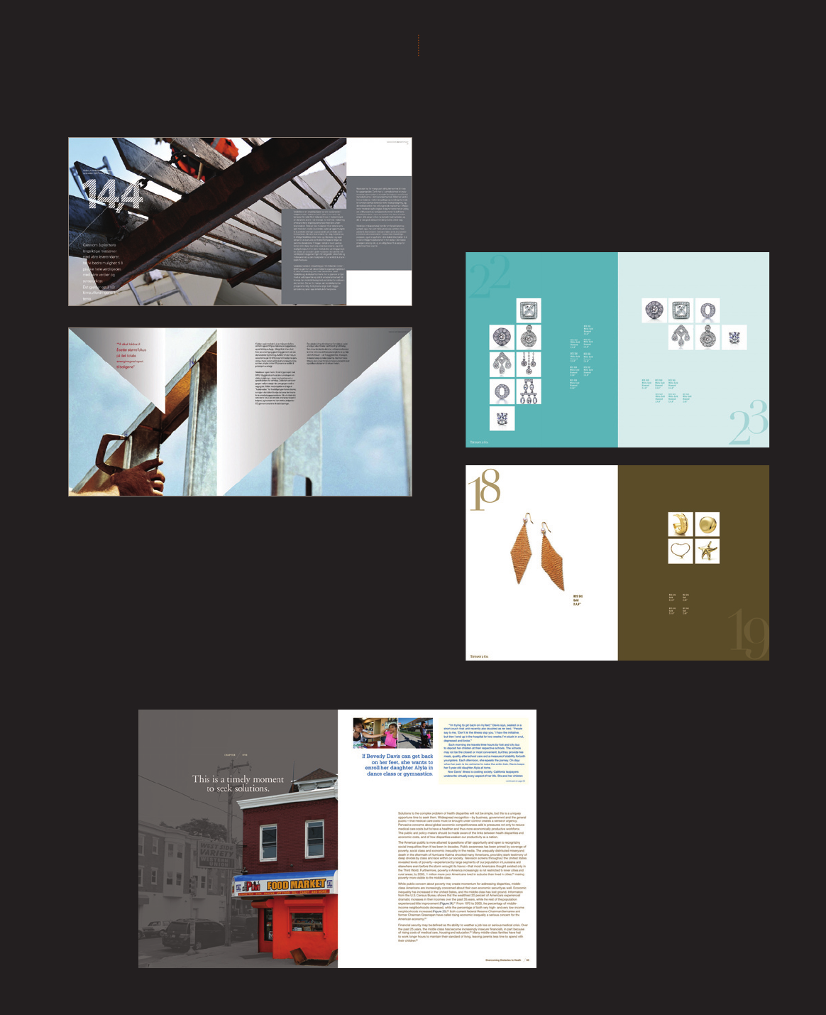
This sleek layout for a report related to
urban poverty juxtaposes stately, almost
bookish, typography
—
in a quiet mix of
serif and sans serif faces
—
with selectively
toned images in which focal points are
silhouetted in vivid color.
IDEAS ON PURPOSE
NEW YORK, NY
|
UNITED STATES
Basic geometric shapes frame text columns, integrating them in
the compositional spaces of dramatically cropped color photographs.
Typographic callouts are treated with a linear pattern.
CREUNA OSLO
|
NORWAY
193
For a product catalog, jewelry is
presented in varying layouts on a
consistent grid structure, with page
colors responding to the particular
metal used in the work.
SUNG SOO SONG
NEW YORK, NY
|
UNITED STATES
Job:07-26153 Title:RP-Graphic Designer’s Essential Reference PB Edn
#175 Dtp:204 Page:193
(RAY)
160-207_26153.indd 193 7/12/11 4:49 PM
(RAY)
Job:07-26153 Title:RP-Graphic Designer’s Essential Reference PB Edn
#175 Dtp:204 Page:194
160-207_26153.indd 194 7/12/11 3:16 PM
(Text)
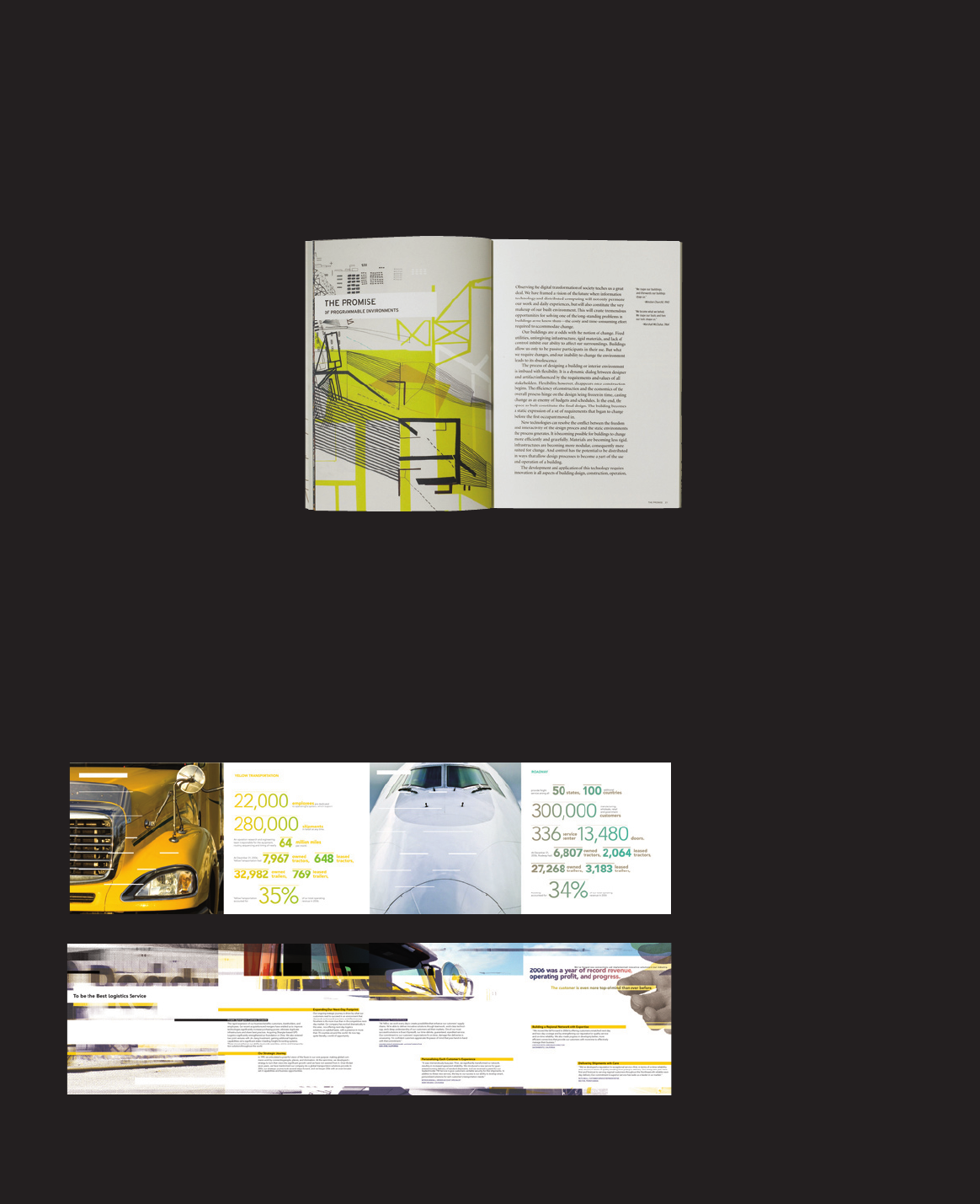
Geometric forms, abstracted from furniture, architecture,
and science diagrams, compose the section-opener pages in
this furniture brochure. Offsetting their cold linearity is the
fact that they were drawn by hand. Overprinted colors in
muted, complementary palettes enrich the chromatic experi-
ence. The typography alternates between hard-edged sans
serif display and sharply elegant serif text.
PEOPLE DESIGN GRAND RAPIDS, MI
|
UNITED STATES
194
This annual report is unconventionally
formatted as an accordion-fold booklet.
One side presents upper-level messaging—
an overview of business performance
integrated with texture-treated slices of
photography—while the other shows
saturated, full-bleed photographs alternat-
ing with large typographic highlights.
The fi nancial tables are bound in as a
saddle-stitched booklet, continuing
the linear elements established in the
other pages.
ANN IM SUNWOO
NEW YORK, NY
|
UNITED STATES
GRAPHIC DESIGNER’S ESSENTIAL REFERENCE
{}
(RAY)
Job:07-26153 Title:RP-Graphic Designer’s Essential Reference PB Edn
#175 Dtp:204 Page:194
160-207_26153.indd 194 7/12/11 4:49 PM
Job:07-26153 Title:RP-Graphic Designer’s Essential Reference PB Edn
#175 Dtp:204 Page:195
(RAY)
160-207_26153.indd 195 7/12/11 3:16 PM
195
(Text)
SETTING THE STAGE
PROJECT STRATEGIES
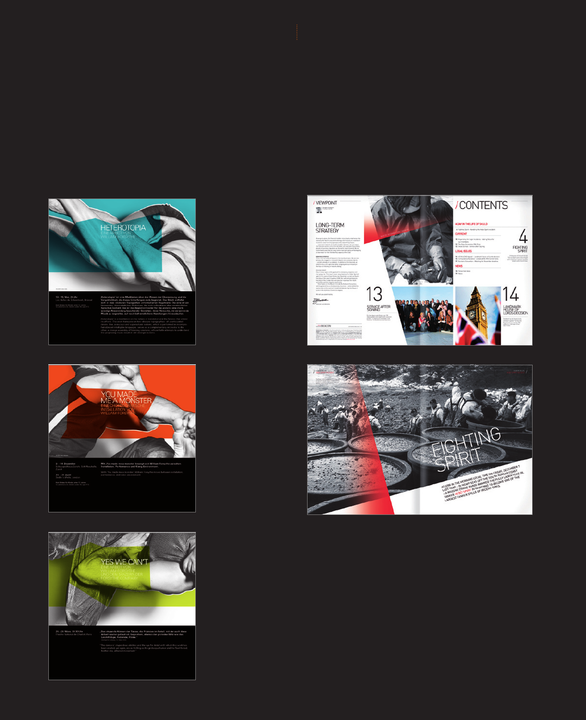
Spreads from Beacon Magazine exhibit
the overall visual unity provided by a
tight, eight-column grid and single
typeface family
—
in this case, a slightly
condensed sans serif with rounded ter-
minals that is both strong and friendly.
CREUNA OSLO
|
NORWAY
This season brochure for a dance company features
closely cropped black-and-white photographs of dancers,
overlaid with colored cutouts derived from the shapes
within the images. A neutral typographic structure
offsets the images’ dynamism.
SURFACE FRANKFURT AM MEIN
|
GERMANY
—
Job:07-26153 Title:RP-Graphic Designer’s Essential Reference PB Edn
#175 Dtp:204 Page:195
(RAY)
160-207_26153.indd 195 7/12/11 4:49 PM
Get Graphic Designer's Essential Reference now with the O’Reilly learning platform.
O’Reilly members experience books, live events, courses curated by job role, and more from O’Reilly and nearly 200 top publishers.

