Chapter 6. Drawing with Data
It’s time to start drawing with data.
Let’s continue working with our simple dataset for now:
vardataset=[5,10,15,20,25];
Drawing divs
We’ll use this to generate a super-simple bar chart. Bar charts are
essentially just rectangles, and an HTML div is the easiest way to
draw a rectangle. (Then again, to a web browser, everything is a
rectangle, so you could easily adapt this example to use spans or
whatever element you prefer.)
Formally, a chart with vertically oriented rectangles is a column chart, and one with horizontal rectangles is a bar chart. In practice, most people just call them all bar charts, as I’ll do from now on.
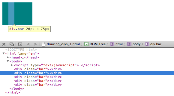
This div could work well as a data bar, shown in Figure 6-1.
<divstyle="display: inline-block;width: 20px;height: 75px;background-color: teal;"></div>
Among web standards folks, this is a semantic no-no. Normally, one
shouldn’t use an empty div for purely visual effect, but I am making
an exception for the sake of this example.
Because this is a div, its width and height are set with CSS
styles. Except for height, each bar in our chart will share the same
display properties, so I’ll put those shared styles into a class called
bar, as an embedded style up in the head of the document:
div.bar{display:inline-block;width:20px;height:75px;/* We'll override height later */background-color:teal;}
Now each div needs to be assigned the bar class, so our new CSS rule
will apply. If you were writing the HTML code by hand, you would write the following:
<divclass="bar"></div>
Using D3, to add a class to an element, we use the selection.attr()
method. It’s important to understand the difference between attr() and
its close cousin, style(). attr() sets DOM attribute values, whereas
style() applies CSS styles directly to an element.
Setting Attributes
attr() is
used to set an HTML attribute and its value on an element. An HTML
attribute is any property/value pair that you could include between an
element’s <> brackets. For example, these HTML elements:
<pclass="caption"><selectid="country"><imgsrc="logo.png"width="100px"alt="Logo"/>
contain a total of five attributes (and corresponding values), all of
which could be set with attr():
| Attribute | Value |
|
|
|
|
|
|
|
|
|
|
To assign a class of bar, we can use:
.attr("class","bar")
A Note on Classes
Note that an element’s class is stored as an HTML attribute. The class, in turn, is used to reference a CSS style rule. This could cause some confusion because there is a difference between setting a class (from which styles are inferred) and applying a style directly to an element. You can do both with D3. Although you should use whatever approach makes the most sense to you, I recommend using classes for properties that are shared by multiple elements, and applying style rules directly only when deviating from the norm. (In fact, that’s what we’ll do in just a moment.)
I also want to briefly mention another D3 method, classed(), which can
be used to quickly apply or remove classes from elements. The preceding line of
code could be rewritten as the following:
.classed("bar",true)
This line simply takes whatever selection is passed to it and applies
the class bar. If false were specified, it would do the opposite,
removing the class of bar from any elements in the selection:
.classed("bar",false)
Back to the Bars
Putting it all together with our dataset, here is the complete D3 code so far:
vardataset=[5,10,15,20,25];d3.select("body").selectAll("div").data(dataset).enter().append("div").attr("class","bar");
To see what’s going on, look at 01_drawing_divs.html in your browser,
view the source, and open your web inspector. You should see five
vertical div bars, one generated for each point in our dataset.
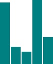
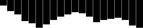
However, with no space between them, they look like one big rectangle, as seen in Figures 6-2 and 6-3.

Setting Styles
The style()
method is used to apply a CSS property and value directly to an HTML
element. This is the equivalent of including CSS rules within a style
attribute right in your HTML, as in:
<divstyle="height: 75px;"></div>
To make a bar chart, the height of each bar must be a function of its corresponding data value. So let’s add this to the end of our D3 code (taking care to keep the final semicolon at the very end of the chain):
.style("height",function(d){returnd+"px";});
See that code in 02_drawing_divs_height.html. You should see a very small bar chart, like the one in Figure 6-4.
When D3 loops through each data point, the value of d will be set to
that of the corresponding value. So we are setting a height value of
d (the current data value) while appending the text px (to specify
the units are pixels). The resulting heights are 5px, 10px, 15px,
20px, and 25px.
This looks a little bit silly, so let’s make those bars taller:
.style("height",function(d){varbarHeight=d*5;//Scale up by factor of 5returnbarHeight+"px";});
Add some space to the right of each bar (in the embedded CSS style, in the document head), to space things out:
margin-right:2px;
Nice! We could go to SIGGRAPH with that chart (Figure 6-5).

Try out the sample code 03_drawing_divs_spaced.html. Again, view the source and use the web inspector to contrast the original HTML against the final DOM.
The Power of data()
This is exciting, but real-world data is never this clean:
vardataset=[5,10,15,20,25];
Let’s make our data a bit messier, as in 04_power_of_data.html:
vardataset=[25,7,5,26,11];
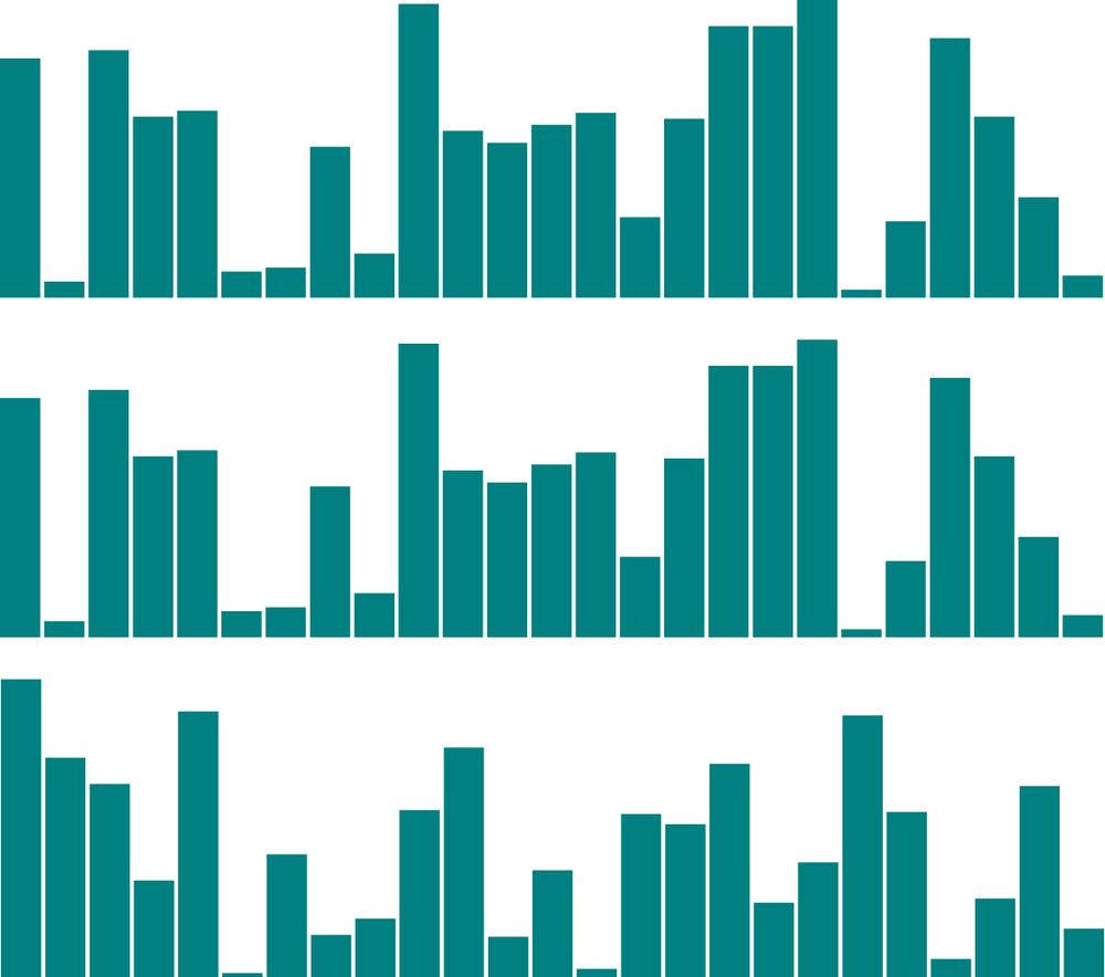
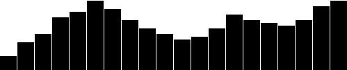
That change in data results in the bars shown in Figure 6-6. We’re not limited to five data points, of course. Let’s add many more! (See 05_power_of_data_more_points.html.)
vardataset=[25,7,5,26,11,8,25,14,23,19,14,11,22,29,11,13,12,17,18,10,24,18,25,9,3];
Twenty-five data points instead of five (see Figure 6-7)!

How does D3 automatically expand our chart as needed?
d3.select("body").selectAll("div").data(dataset)// <-- The answer is here!.enter().append("div").attr("class","bar").style("height",function(d){varbarHeight=d*5;returnbarHeight+"px";});
Give data() 10 values, and it will loop through 10 times. Give it
one million values, and it will loop through one million times. (Just be
patient.)
That is the power of data()—being smart enough to loop through the
full length of whatever dataset you throw at it, executing each method
beneath it in the chain, while updating the context in which each method
operates, so d always refers to the current datum at that point in the
loop.
That might be a mouthful, and if it all doesn’t make sense yet, it will
soon. I encourage you to make a copy of 05_power_of_data_more_points.html, tweak the dataset values, and note how the bar chart changes.
Remember, the data is driving the visualization—not the other way around.
Random Data
Sometimes it’s fun to generate random data values, whether for testing purposes or just pure geekiness. That’s just what I’ve done in 06_power_of_data_random.html. Notice that each time you reload the page, the bars render differently, as shown in Figure 6-8.
View the source, and you’ll see this code:
vardataset=[];//Initialize empty arrayfor(vari=0;i<25;i++){//Loop 25 timesvarnewNumber=Math.random()*30;//New random number (0-30)dataset.push(newNumber);//Add new number to array}
That code doesn’t use any D3 methods; it’s just JavaScript. Without going into too much detail, this code does the following:
-
Creates an empty array called
dataset. -
Initiates a
forloop, which is executed 25 times. -
Each time, it generates a new random number with a value between 0 and 30. (Well, technically, almost 30.
Math.random()returns values as low as 0.0 all the way up to, but not including, 1.0. So ifMath.random()returned 0.99999, then the result would be 0.99999 times 30, which is 29.9997, or the teensiest bit less than 30.) -
That new number is appended to the
datasetarray. (push()is an array method that appends a new value to the end of an array.)
Just for kicks, open up the JavaScript console and enter console.log(dataset). You should see the full array of 25 randomized data values, as shown in Figure 6-9.
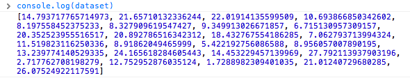
Notice that they are all decimal or floating point values (such as 14.793717765714973), not whole numbers or integers (such as 14) like we used initially. For this example, decimal values are fine, but if you ever need whole numbers, you could use JavaScript’s Math.round() or Math.floor() methods. Math.round() rounds any number to the nearest integer, whereas Math.floor() always rounds down, for greater control over the result. For example, you could wrap the random number generator from this line:
varnewNumber=Math.random()*30;
as follows:
varnewNumber=Math.floor(Math.random()*30);
Using this code, newNumber would always be either 0 or 29, or any integer in between. Why not 30? Because Math.random() always returns values less than 1.0, and Math.floor() will always round down, so 29 is the highest possible return value.
Try it out in 07_power_of_data_rounded.html, and use the console to verify that the numbers have indeed been rounded to integers, as displayed in Figure 6-10.
That’s about all we can do visually with divs. Let’s expand our visual
possibilities with SVG.
Drawing SVGs
For a quick refresher on SVG syntax, see SVG.
One thing you might notice about SVG elements is that all of their properties are specified as attributes. That is, they are included as property/value pairs within each element tag, like this:
<elementproperty="value"></element>
Hmm, that looks strangely like HTML!
<pclass="eureka">Eureka!</p>
We have already used D3’s handy append() and attr() methods to
create new HTML elements and set their attributes. Because SVG elements
exist in the DOM, just as HTML elements do, we can use append() and
attr() in exactly the same way to generate SVG images.
Create the SVG
First, we need to create the SVG element in which to place all our shapes:
d3.select("body").append("svg");
That will find the document’s body and append a new svg element just
before the closing </body> tag. That code will work, but I’d like to
suggest a slight modification:
varsvg=d3.select("body").append("svg");
Remember how most D3 methods return a reference to the DOM element on
which they act? By creating a new variable svg, we are able to capture
the reference handed back by append(). Think of svg not as a
variable but as a reference pointing to the SVG object that we just
created. This reference will save us a lot of code later. Instead of
having to search for that SVG each time—as in d3.select("svg")—we
just say svg:
svg.attr("width",500).attr("height",50);
Alternatively, that could all be written as one line of code:
varsvg=d3.select("body").append("svg").attr("width",500).attr("height",50);
See 08_drawing_svgs.html for that code. Inspect the DOM and notice that there is, indeed, an empty SVG element.
To simplify your life, I recommend putting the width and height values into variables at the top of your code, as in 09_drawing_svgs_size.html. View the source, and you’ll see the following code:
//Width and heightvarw=500;varh=50;
I’ll be doing that with all future examples. By variabalizing the size values, they can be easily referenced throughout your code, as in the following:
varsvg=d3.select("body").append("svg").attr("width",w)// <-- Here.attr("height",h);// <-- and here!
Also, if you send me a petition to make “variabalize” a real word, I will gladly sign it.
Data-Driven Shapes
Time to add some shapes. I’ll bring back our trusty old dataset:
vardataset=[5,10,15,20,25];
and then use data() to iterate through each data point, creating a
circle for each one:
svg.selectAll("circle").data(dataset).enter().append("circle");
Remember, selectAll() will return empty references to all circles
(which don’t exist yet), data() binds our data to the elements we’re
about to create, enter() returns a placeholder reference to the new
element, and append() finally adds a circle to the DOM. In this
case, it appends those circles to the end of the SVG element, as
our initial selection is our reference svg (as opposed to the document
body, for example).
To make it easy to reference all of the circles later, we can create a
new variable to store references to them all:
varcircles=svg.selectAll("circle").data(dataset).enter().append("circle");
Great, but all these circles still need positions and sizes, displayed in Figure 6-11. Be warned, the following code might blow your mind:
circles.attr("cx",function(d,i){return(i*50)+25;}).attr("cy",h/2).attr("r",function(d){returnd;});

Feast your eyes on the demo 10_drawing_svgs_circles.html. Let’s step through the code, one line at a time:
circles.attr("cx",function(d,i){return(i*50)+25;})
This takes the reference to all circles and sets the cx attribute
for each one. (Remember that, in SVG lingo, cx is the x position value
of the center of the circle.) Our data has already been bound to the
circle elements, so for each circle, the value d matches the
corresponding value in our original dataset (5, 10, 15, 20, or 25).
Another value, i, is also automatically populated for us. (Thanks,
D3!) Just as with d, the name i here is arbitrary and could be set to whatever you like, such as counter or elementID. I prefer to use i because it is concise, it alludes to the convention of using i in for loops, and it is very common, as you’ll see it in all the online examples.
So, i is a numeric index value of the current element. Counting starts at zero, so for our “first” circle i == 0, the second circle’s i == 1, and so on. We’re using i to push each subsequent circle over to the right, because each subsequent loop through, the value of i increases by one:
(0*50)+25//Returns 25(1*50)+25//Returns 75(2*50)+25//Returns 125(3*50)+25//Returns 175(4*50)+25//Returns 225
To make sure i is available to your custom function, you must include
it as an argument in the function definition, function(d, i). You must
also include d, even if you don’t use d within your function (as in
the preceding case). This is because, again, the actual names used for these arguments are not important, but the total number of arguments (one or two) is.
Also, in case you’re feeling a surge of parameter anxiety, don’t worry. You’ll only ever have to worry about d and i. There are no additional anonymous function parameters to learn about later.
On to the next line:
.attr("cy",h/2)
cy is the y position value of the center of each circle. We’re setting
cy to h divided by two, or one-half of h. You’ll recall that h
stores the height of the entire SVG, so h/2 has the effect of aligning
all circles in the vertical center of the image:
.attr("r",function(d){returnd;});
Finally, the radius r of each circle is simply set to d, the
corresponding data value.
Pretty Colors, Oooh!
Color fills and strokes are just other attributes that you can set using the same methods. Simply by appending this code:
.attr("fill","yellow").attr("stroke","orange").attr("stroke-width",function(d){returnd/2;});
we get the colorful circles shown in Figure 6-12, as seen in 11_drawing_svgs_color.html.

Of course, you can mix and match attributes and custom functions to apply any combination of properties. The trick with data visualization, of course, is choosing appropriate mappings, so the visual expression of your data is understandable and useful for the viewer.
Making a Bar Chart
Now we’ll integrate everything we’ve learned so far to generate a simple bar chart as an SVG image.
We’ll start by adapting the div bar chart code to draw its bars with
SVG instead, giving us more flexibility over the visual presentation.
Then we’ll add labels, so we can see the data values clearly.
The Old Chart
See the div chart, updated with some new data, in
12_making_a_bar_chart_divs.html:
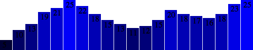
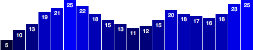
vardataset=[5,10,13,19,21,25,22,18,15,13,11,12,15,20,18,17,16,18,23,25];d3.select("body").selectAll("div").data(dataset).enter().append("div").attr("class","bar").style("height",function(d){varbarHeight=d*5;returnbarHeight+"px";});
It might be hard to imagine, but we can definitely improve on the simple
bar chart in Figure 6-13 made of divs.

The New Chart
First, we need to decide on the size of the new SVG:
//Width and heightvarw=500;varh=100;
Of course, you could name w and h something else, like svgWidth
and svgHeight. Use whatever is most clear to you. JavaScript
programmers, as a group, are fixated on efficiency, so you’ll often see
single-character variable names, code written with no spaces, and other
hard-to-read, yet programmatically efficient, syntax.
Then, we tell D3 to create an empty SVG element and add it to the DOM:
//Create SVG elementvarsvg=d3.select("body").append("svg").attr("width",w).attr("height",h);
To recap, this inserts a new <svg> element just before the closing
</body> tag, and assigns the SVG a width and height of 500 by 100
pixels. This statement also puts the result into our new variable called
svg, so we can easily reference the new SVG without having to reselect
it later using something like d3.select("svg").
Next, instead of creating divs, we generate rects and add them to
svg:
svg.selectAll("rect").data(dataset).enter().append("rect").attr("x",0).attr("y",0).attr("width",20).attr("height",100);
This code selects all rects inside of svg. Of course, there aren’t
any yet, so an empty selection is returned. (Weird, yes, but stay with
me. With D3, you always have to first select whatever it is you’re about
to act on, even if that selection is momentarily empty.)
Then, data(dataset) sees that we have 20 values in the dataset, and those values are handed off to enter() for processing. enter(), in turn, returns a placeholder selection for each data point that does not yet have a corresponding rect—which is to say, all of them.
For each of the 20 placeholders, append("rect") inserts a rect into
the DOM. As we learned in Chapter 3, every
rect must have x, y, width, and height values. We use attr()
to add those attributes onto each newly created rect.
Beautiful, no? Okay, maybe not. All of the bars are there (check the DOM of
13_making_a_bar_chart_rects.html with your web inspector), but they all share
the same x, y, width, and height values, with the result that
they all overlap (see Figure 6-14). This isn’t a visualization of data yet.
Let’s fix the overlap issue first. Instead of an x of 0, we’ll
assign a dynamic value that corresponds to i, or each value’s position
in the dataset. So the first bar will be at 0, but subsequent bars
will be at 21, then 42, and so on. (In a later chapter, we’ll learn about D3’s scales, which offer a better, more flexible way to accomplish this same feat.)
.attr("x",function(d,i){returni*21;//Bar width of 20 plus 1 for padding})
See that code in action with 14_making_a_bar_chart_offset.html and the result in Figure 6-15.

That works, but it’s not particularly flexible. If our dataset were longer, then the bars would just run off to the right, past the end of the SVG! Because each bar is 20 pixels wide, plus 1 pixel of padding, a 500-pixel wide SVG can only accommodate 23 data points. Note how the 24th bar gets clipped in Figure 6-16.

It’s good practice to use flexible, dynamic coordinates—heights, widths, x values, and y values—so your visualization can scale appropriately along with your data.
As with anything else in programming, there are a thousand ways to
achieve that end. I’ll use a simple one. First, I’ll amend the line
where we set each bar’s x position:
.attr("x",function(d,i){returni*(w/dataset.length);})
Notice how the x value is now tied directly to the width of the SVG
(w) and the number of values in the dataset (dataset.length). This
is exciting because now our bars will be evenly spaced, whether we have
20 data values, as in Figure 6-17.

Or only five, as in Figure 6-18.

See that code so far in 15_making_a_bar_chart_even.html.
Now we should set the bar widths to be proportional, too, so they get narrower as more data is added, or wider when there are fewer values. I’ll add a new variable near where we set the SVG’s width and height:
//Width and heightvarw=500;varh=100;varbarPadding=1;// <-- New!
and then reference that variable in the line where we set each bar’s
width. Instead of a static value of 20, the width will now be set as
a fraction of the SVG width and number of data points, minus a padding
value:
.attr("width",w/dataset.length-barPadding)
It works! (See Figure 6-19 and 16_making_a_bar_chart_widths.html.)

The bar widths and x positions scale correctly whether there are 20 points, only 5 (see Figure 6-20), or even 100 (see Figure 6-21).


Finally, we encode our data as the height of each bar. You would hope
it were as easy as referencing the d data value when setting each
bar’s height:
.attr("height",function(d){returnd;});
Hmm, the chart in Figure 6-22 looks funky. Maybe we can just scale up our numbers a bit?
.attr("height",function(d){returnd*4;// <-- Times four!});
Alas, it is not that easy! We want our bars to grow upward from the bottom edge, not down from the top, as in Figure 6-23—but don’t blame D3, blame SVG.
You’ll recall that, when drawing SVG rects, the x and y values
specify the coordinates of the upper-left corner. That is, the origin
or reference point for every rect is its top-left. For our purposes,
it would be soooooo much easier to set the origin point as the
bottom-left corner, but that’s just not how SVG does it, and frankly,
SVG is pretty indifferent about our feelings on the matter.
Given that our bars do have to “grow down from the top,” then where is “the top” of each bar in relationship to the top of the SVG? Well, the top of each bar could be expressed as a relationship between the height of the SVG and the corresponding data value, as in:
.attr("y",function(d){returnh-d;//Height minus data value})
Then, to put the “bottom” of the bar on the bottom of the SVG (see Figure 6-24), each
rect’s height can be just the data value itself:
.attr("height",function(d){returnd;//Just the data value});
Let’s scale things up a bit by changing d to d * 4, with the result shown in Figure 6-25. (Just as with the bar placements, this can be done more properly using D3 scales, but we’re not there yet.)
The working code for our growing-down-from-above, SVG bar chart is in 17_making_a_bar_chart_heights.html.
Color
Adding color is easy. Just use attr() to set a fill:
.attr("fill","teal");
Find the all-teal bar chart shown in Figure 6-26 in 18_making_a_bar_chart_teal.html.

Teal is nice, but you’ll often want a shape’s color to reflect some quality of the data. That is, you might want to encode the data values as color. (In the case of our bar chart, that makes a dual encoding, in which the same data value is encoded in two different visual properties: both height and color.)
Using data to drive color is as easy as writing a custom function that
again references d. Here, we replace "teal" with a custom function, resulting in the chart in Figure 6-27:
.attr("fill",function(d){return"rgb(0, 0, "+(d*10)+")";});
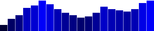
See the code in 19_making_a_bar_chart_blues.html. This is not a particularly
useful visual encoding, but you can get the idea of how to translate
data into color. Here, d is multiplied by 10, and then used as the
blue value in an rgb() color definition. So the greater values of d
(taller bars) will be more blue. Smaller values of d (shorter bars)
will be less blue (closer to black). The red and green components of the
color are fixed at zero.
Labels
Visuals are great, but sometimes you need to show the actual data values as text within the visualization. Here’s where value labels come in, and they are very, very easy to generate with D3.
You’ll recall from the SVG primer that you can add text elements to an
SVG element. Let’s start with:
svg.selectAll("text").data(dataset).enter().append("text")
Look familiar? Just as we did for the rects, here we do for the
texts. First, select what you want, bring in the data, enter the new
elements (which are just placeholders at this point), and finally append
the new text elements to the DOM.
We’ll extend that code to include a data value within each text
element by using the text() method:
.text(function(d){returnd;})
and then extend it further, by including x and y values to position
the text. It’s easiest if I just copy and paste the same x/y code we
previously used for the bars:
.attr("x",function(d,i){returni*(w/dataset.length);}).attr("y",function(d){returnh-(d*4);});
Aha! Value labels! But some are getting cut off at the top (see Figure 6-28).
Let’s try
moving them down, inside the bars, by adding a small amount to the x
and y calculations:
.attr("x",function(d,i){returni*(w/dataset.length)+5;// +5}).attr("y",function(d){returnh-(d*4)+15;// +15});
The chart in Figure 6-29 is better, but not legible.
Fortunately, we can fix that:
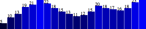
.attr("font-family","sans-serif").attr("font-size","11px").attr("fill","white");
Fantasti-code! See 20_making_a_bar_chart_labels.html for the brilliant visualization shown in Figure 6-30.

If you are not typographically obsessive, then you’re all done. If,
however, you are like me, you’ll notice that the value labels aren’t
perfectly aligned within their bars. (For example, note the “5” in the
first column.) That’s easy enough to fix. Let’s use the SVG
text-anchor attribute to center the text horizontally at the assigned
x value:
.attr("text-anchor","middle")
Then, let’s change the way we calculate the x position by setting it
to the left edge of each bar plus half the bar width:
.attr("x",function(d,i){returni*(w/dataset.length)+(w/dataset.length-barPadding)/2;})
And I’ll also bring the labels up one pixel for perfect spacing, as you can see in Figure 6-31 and 21_making_a_bar_chart_aligned.html:
.attr("y",function(d){returnh-(d*4)+14;//15 is now 14})
Making a Scatterplot
So far, we’ve drawn only bar charts with simple data—just one-dimensional sets of numbers.
But when you have two sets of values to plot against each other, you need a second dimension. The scatterplot is a common type of visualization that represents two sets of corresponding values on two different axes: horizontal and vertical, x and y.
The Data
As you saw in Chapter 3, you have a lot of flexibility around how to structure a dataset. For our scatterplot, I’m going to use an array of arrays. The primary array will contain one element for each data “point.” Each of those “point” elements will be another array, with just two values: one for the x value, and one for y:
vardataset=[[5,20],[480,90],[250,50],[100,33],[330,95],[410,12],[475,44],[25,67],[85,21],[220,88]];
Remember, [] means array, so nested hard brackets [[]] indicate an
array within another array. We separate array elements with commas, so
an array containing three other arrays would look like this: [[],[],[]].
We could rewrite our dataset with more whitespace so it’s easier to read:
vardataset=[[5,20],[480,90],[250,50],[100,33],[330,95],[410,12],[475,44],[25,67],[85,21],[220,88]];
Now you can see that each of these 10 rows will correspond to one point
in our visualization. With the row [5, 20], for example, we’ll use 5
as the x value, and 20 for the y.
The Scatterplot
Let’s carry over most of the code from our bar chart experiments, including the piece that creates the SVG element:
//Create SVG elementvarsvg=d3.select("body").append("svg").attr("width",w).attr("height",h);
Instead of creating rects, however, we’ll make a circle for each
data point:
svg.selectAll("circle")// <-- No longer "rect".data(dataset).enter().append("circle")// <-- No longer "rect"
Also, instead of specifying the rect attributes of x, y, width,
and height, our circles need cx, cy, and r:
.attr("cx",function(d){returnd[0];}).attr("cy",function(d){returnd[1];}).attr("r",5);
See the working scatterplot code that recreates the result shown in Figure 6-32 in 22_scatterplot.html.
Notice how we access the data values and use them for the cx and cy
values. When using function(d), D3 automatically hands off the current
data value as d to your function. In this case, the current data value
is one of the smaller, subarrays in our larger dataset array.
When each single datum d is itself an array of values (and not just a
single value, like 3.14159), you need to use bracket notation to
access its values. Hence, instead of return d, we use return d[0]
and return d[1], which return the first and second values of the
array, respectively.
For example, in the case of our first data point [5, 20], the first
value (array position 0) is 5, and the second value (array position
1) is 20. Thus:
d[0] returns 5
d[1] returns 20
By the way, if you ever want to access any value in the larger dataset (outside of D3, say), you can do so using bracket notation. For example:
dataset[5] returns [410, 12]
You can even use multiple sets of brackets to access values within nested arrays:
dataset[5][1] returns 12
Don’t believe me? Take another look at the scatterplot page
22_scatterplot.html, open your JavaScript console, type in
dataset[5] or dataset[5][1], and see what happens.
Size
Maybe you want the circles to be different sizes, so each circle’s area corresponds to its y value. As a general rule, when visualizing quantitative values with circles, make sure to encode the values as area, not as a circle’s radius. Perceptually, we understand the overall amount of “ink” or pixels to reflect the data value. A common mistake is to map the value to the radius. (I’ve done this many times myself.) Mapping to the radius is easier to do, as it requires less math, but the result will visually distort your data.
Yet when creating SVG circles, we can’t specify an area value; we have to calculate the radius r and then set that. So, starting with a data value as area, how do we get to a radius value?
You might remember that the area of a circle equals π times the radius squared, or A = πr2.
Let’s say the area, then, is our data value, which is d[1], in this case. Actually, let’s subtract that value from h, so the circles at the top are larger. So our area value is h - d[1]. (We’ll cover a cleaner way to achieve this effect using scales in Chapter 7.)
To convert this area to a radius value, we simply have to take its square root. We can do that using JavaScript’s built-in Math.sqrt() function, as in Math.sqrt(h - d[1]).
Now, instead of setting all r values to the static value of 5, try:
.attr("r",function(d){returnMath.sqrt(h-d[1]);});
See 23_scatterplot_sqrt.html for the code that results in the scatterplot shown in Figure 6-33.
After arbitrarily subtracting the datum’s y value d[1] from the SVG height h, and then taking the square root, we see that circles with greater y values (those circles lower down) have smaller areas (and shorter radii).
This particular use of circle area as a visualization tool isn’t necessarily useful. I simply want to illustrate how you can use d, along with bracket notation, to reference an individual datum, apply some transformation to that value, and use the newly calculated value to return a value back to the attribute-setting method (a value used for r, in this case).
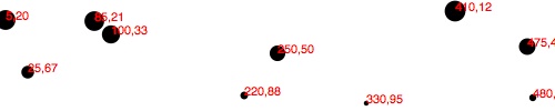
Labels
Let’s label our data points with text elements. I’ll adapt the label
code from our bar chart experiments, starting with the following:
svg.selectAll("text")// <-- Note "text", not "circle" or "rect".data(dataset).enter().append("text")// <-- Same here!
This looks for all text elements in the SVG (there aren’t any yet),
and then appends a new text element for each data point. Then we use the
text() method to specify each element’s contents:
.text(function(d){returnd[0]+","+d[1];})
This looks messy, but bear with me. Once again, we’re using
function(d) to access each data point. Then, within the function,
we’re using both d[0] and d[1] to get both values within that
data point array.
The plus + symbols, when used with strings, such as the comma between
quotation marks ",", act as append operators. So what this one line
of code is really saying is this: get the values of d[0] and d[1] and
smush them together with a comma in the middle. The end result should be
something like 5,20 or 25,67.
Next, we specify where the text should be placed with x and y
values. For now, let’s just use d[0] and d[1], the same values that
we used to specify the circle positions:
.attr("x",function(d){returnd[0];}).attr("y",function(d){returnd[1];})
Finally, add a bit of font styling with:
.attr("font-family","sans-serif").attr("font-size","11px").attr("fill","red");
The result in Figure 6-34 might not be pretty, but we got it working! See 24_scatterplot_labels.html for the latest.
Next Steps
Hopefully, some core concepts of D3 are becoming clear: loading data, generating new elements, and using data values to derive attribute values for those elements.
Yet the image in Figure 6-34 is barely passable as a data visualization. The scatterplot is hard to read, and the code doesn’t use our data flexibly. To be honest, we haven’t yet improved on—gag—Excel’s Chart Wizard!
Not to worry: D3 is way cooler than Chart Wizard (not to mention Clippy), but generating a shiny, interactive chart involves taking our D3 skills to the next level. To use data flexibly, we’ll learn about D3’s scales in the next chapter. And to make our scatterplot easier to read, we’ll learn about axis generators and axis labels.
This would be a good time to take a break and stretch your legs. Maybe go for a walk, or grab a coffee or a sandwich. I’ll hang out here (if you don’t mind), and when you get back, we’ll jump into D3 scales!
Get Interactive Data Visualization for the Web now with the O’Reilly learning platform.
O’Reilly members experience books, live events, courses curated by job role, and more from O’Reilly and nearly 200 top publishers.

