Building Applications with Silverlight 1.1
Now it is time to pull all of the concepts, code samples, and
Silverlight 1.1 ideas together to build a sample Silverlight application.
In this section, two sample Silverlight controls will be built that can be
used in any Silverlight 1.1 application: a custom button control and an upload control. These controls will illustrate
the concepts covered in this Short Cut and provide more insight into the
Silverlight application development process.
Custom Silverlight 1.1 Button Control
Creating a custom Silverlight control involves two basic tasks—defining the visual appearance of the control and providing it with functionality. The UI is primarily defined in XAML markup and the object model is primarily defined in code. Each custom control is described by its API (Application Programming Interface), which exposes public properties, data fields, and events.
The general structure of a custom Silverlight control is a XAML file and a code behind file contained in a Silverlight User Control project.
Every custom Silverlight control must inherit from the .NET Control class, illustrated in Figure 25.
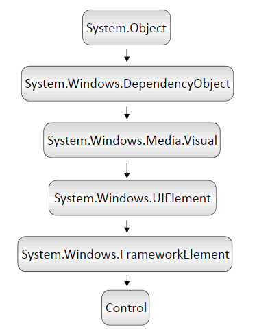
Figure 25. Class hierarchy of .NET Control class
Our XAML file will contain one Rectangle that will determine the boundaries
of the control and one TextBlock that
will serve as a text holder. The XAML markup for the control can be seen
in Example 6.
Example 6. Button ...
Get Introducing Silverlight 1.1 now with the O’Reilly learning platform.
O’Reilly members experience books, live events, courses curated by job role, and more from O’Reilly and nearly 200 top publishers.

