Project
Client
Design Firm
Identity icons for iPhone users
New York Times
Felix Sockwell
20
LogoLounge 5
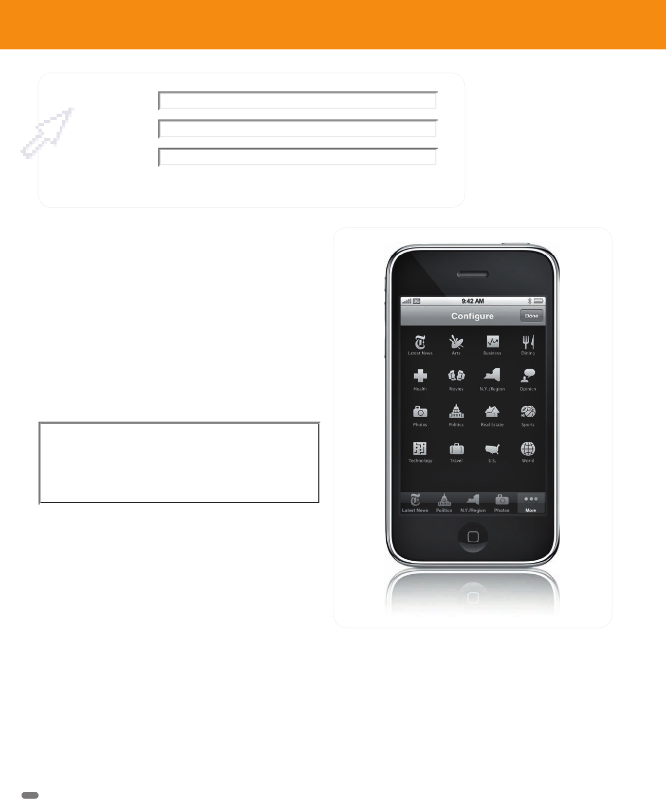
For all its bells and whistles and oohs and aahs, the iPhone has the same
screen as most other phones—smallish, with limited resolution—only 163
ppi. With that in mind, it’s easy to understand the challenge a designer would
face in designing a set of 30 icons that would somehow communicate the
contents of the New York Times to iPhone users through the tiny screen.
Such GUI projects are more and more common these days: Each presents
special challenges. Designer Felix Sockwell is a master of the reduction
necessary to cull art to its most basic form while blessing it with the person-
ality of the project and client at hand. His collection of thirty, 29 x 29-pixel
icons deliver just the facts, yet behave in the elegant yet lively manner of
the “Old Gray Lady,” the Times.
It was an interesting project, said Sockwell. Working with the Times’ Web
wizard Khoi Vinh and design director Caryn Tutine, he produced many trials
for each section, trying to make each communication as simple and direct
as possible. It was very unlike a traditional logo project where a design is
usually replete with meaning and/or symbolism.
“I had to think about each icon for a long time,” he says, “trying to fi nd the
most obvious solution. It’s hard to pick just one object to represent some-
thing like sports, so some designs took a while. Also, keeping the language
consistent was a challenge. In the end, some are 2-D and some are 3-D.”
Each icon is a curious puzzle for a designer: The fi nished drawing must
be readable in a fraction of a second, but not be a cliché. It must convey
information forcefully, but not be so strong (in humor, style, history, or what-
ever) that it becomes a distraction. And, of course, what might seem like
the perfect icon in the designer’s mind may not hold as much resonance
for the client: Like all design, judgment is subjective. So back-and-forthing
can be a bit more likely.
Designs for GUI projects have some similarities. A fi nished set must have a
familial feel—that is, simply look like they go together. That means that as
the entire group is developed, certain designs—previously okay—will have
to be reworked or even discarded to maintain the aesthetic.
I had to think about each icon for a long time
trying to find the most obvious solution.
The NYT’s icon set lives well in the existing iPhone environment.
TEXT
Black
(Provision RP) Logo Lounge 5
D209-128 / 4275 1st proof1st proof
LL5 020-031_NC_.indd 20 LL5 020-031_NC_.indd 20 2/25/09 9:03:26 PM2/25/09 9:03:26 PM
Get LogoLounge 5 now with the O’Reilly learning platform.
O’Reilly members experience books, live events, courses curated by job role, and more from O’Reilly and nearly 200 top publishers.

