133
In late 2000, El Paso Energy Corporation—one of the largest
natural gas companies in the world—had acquired a competitor,
was solidifying new business, and was looking for a way to
articulate its unique vision and build its reputation on Wall
Street. In short, it needed a global brand that would support its
merged busi nesses and help it become a leader in the global
energy market.
The first thing the Sterling Group did after accepting the challenge
was to interview executives, customers, analysts, and share-
holders to understand the roots, passions, and visions of El Paso.
From this process emerged a new brand positioning statement:
The new path to energy value.
“After all, El Paso means the pass,” notes Marcus Hewitt, man-
aging partner and creative director for the Sterling Group. “This
positioning statement captures the new approach that they take
to create value in the energy value.”
The second step was to recommend shortening the company’s
name to simply El Paso Corporation, which places more empha-
sis on El Paso as a name instead of the energy modifier. Pushing
the words together felt much more integrated and compact. The
latter is especially helpful when the name must be combined with
that of one of the many business units El Paso operates.
“Some unit names were short, some were long,” says Hewitt.
“With the old ident
ity, the unit name got most of the attention;
now El Paso gets more emphasis. This readdresses the problem
of the hierarchy of the single brand.”
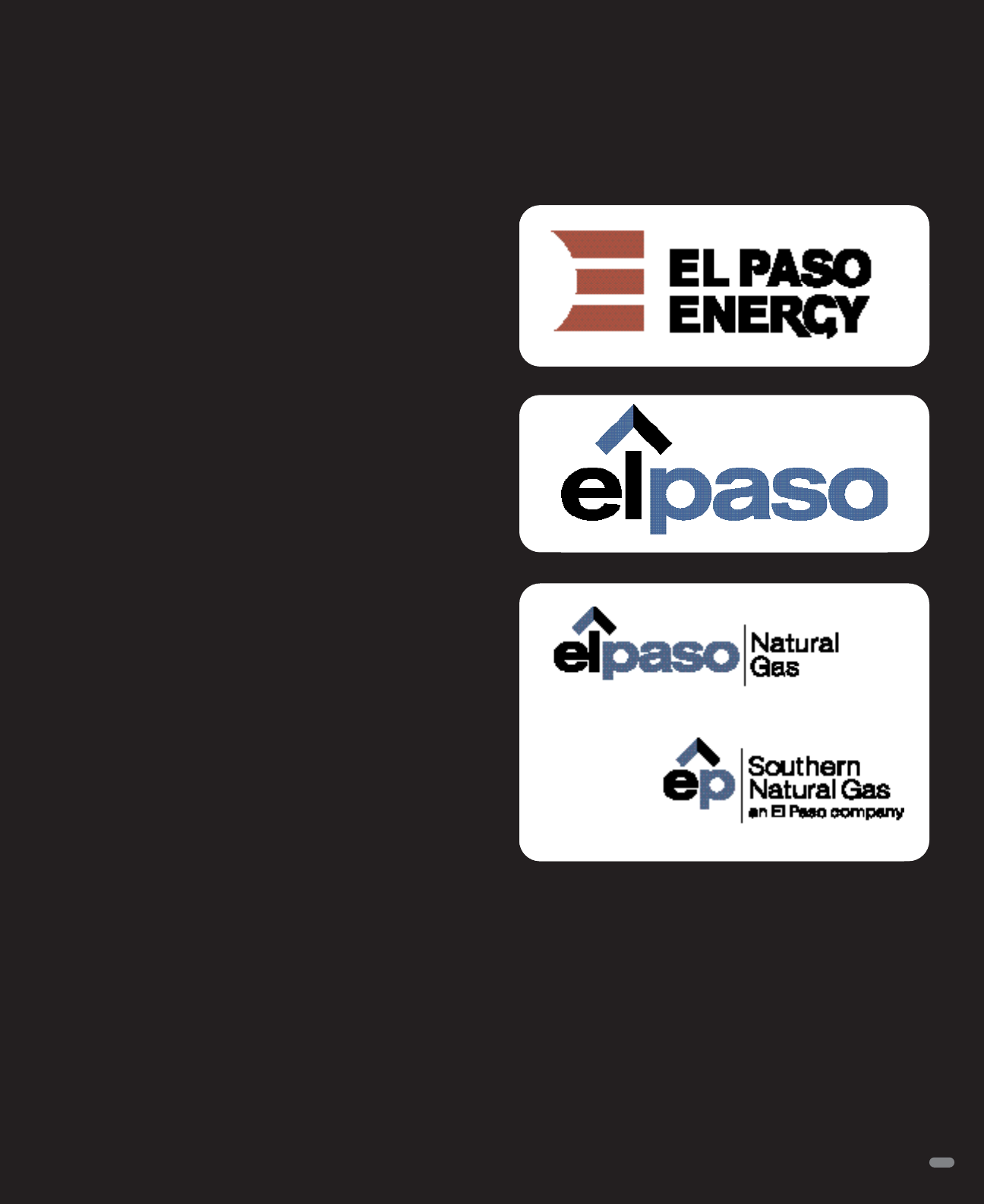
To design the actual logo, Sterling designers focused on the
notion of pathways. Every trial they did contained some sort of
path, either depicted through negative spaces in the letterforms
or shown in an actual graphical representation. In the version that
was eventually selected, an upwardly pointing arrow leading off
the letter l introduces the concept of a path.
Blue was selected as the new corporate color for its more con-
temporary look than the red and black the company had used,
and for its subtle suggestion of the clean flame of natural gas.
The custom sans serif face chosen for the design is also clean
and approachable.
The lesson Hewitt took away from the pro
ject was that even a very
large corporation can take giant steps, given the proper guidance.
“They changed the identity from all uppercase to all lowercase
letters, from red to blue, and even changed their name. That’s
because their management has a very flat organization, and
they went with their gut,” he says. “Usually, large corporations
constantly adjust in small ways. But if we can make our advice
simple, big changes are possible.”
El Paso Corporation
Identity Redesign
The Sterling Group, New York, NY
Old identity
Get LogoLounge now with the O’Reilly learning platform.
O’Reilly members experience books, live events, courses curated by job role, and more from O’Reilly and nearly 200 top publishers.

