One way a Checkbutton or Radiobutton
differs from a standard Button is the indicator. Use the
-indicatoron option to tell Perl/Tk not to draw
that funny little square Button at all:
-indicatoron => 0 | 1As we have seen in previous examples, the default for
-indicatoron is 1 (i.e., show the indicator). If
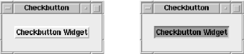
we change this -indicatoron to 0, the Checkbutton
will look almost like a normal Button (without quite as much space
around the text, however). Though it looks a lot like a regular
Button, its behavior when clicked (to turn the hidden indicator on)
is completely different (see Figure 4-36). Note that
the -relief option is ignored completely when
-indicatoron is set to 0.
In this example, the color for the background on the checked Button
is the -selectcolor, not the
-backgroundcolor. You might want to use the
nonindicator configuration if you change the text of the Button to
reflect the new state of the Checkbutton (for instance, changing
Logging Enabled to Logging Disabled).
Get Mastering Perl/Tk now with the O’Reilly learning platform.
O’Reilly members experience books, live events, courses curated by job role, and more from O’Reilly and nearly 200 top publishers.

