Defining Scrollbar Parts
Figure 6-1 shows all the different parts of a Scrollbar and their names.
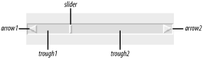
Figure 6-1. Different parts of a Scrollbar
The trough is the sunken part
between the two arrows. It is divided into two parts,
trough1 and trough2, by the
slider. The slider is the rectangle that indicates how much of the
window is available for scrolling. If you were in the middle of the
list, you would see the slider rectangle in the center of the trough
with space on either side of it. The arrows on either end are called
arrow1 and arrow2. If the
Scrollbar were vertical (rotated 90 degrees clockwise),
arrow1 would be the top arrow.
Clicking on either arrow will move the information in the associated widget one unit at a time. What the unit is depends on the type of widget with which the Scrollbar is associated. With an Entry widget, the units are characters. With a Listbox widget and a vertical Scrollbar, the units are lines. Clicking in the trough on either side of the slider will page the information in the widget in that direction. You can also click directly on the slider and, holding the mouse button down, move it directly.
Scrollbars can be horizontal or vertical. They typically reside on the bottom and/or to the right of the widget they are scrolling, but not always.
Not just any widget can have scrollbars attached to it. Generally speaking, for a widget to be ...
Get Mastering Perl/Tk now with the O’Reilly learning platform.
O’Reilly members experience books, live events, courses curated by job role, and more from O’Reilly and nearly 200 top publishers.

