14. Creating Charts and Sparklines
This chapter will show you how easy it is to add and customize a chart. Topics in this chapter include the following:
→ Quickly adding a chart to a sheet
→ Creating a chart mixing bars and lines
→ Making a pie chart easier to read
→ Inserting sparklines into a report
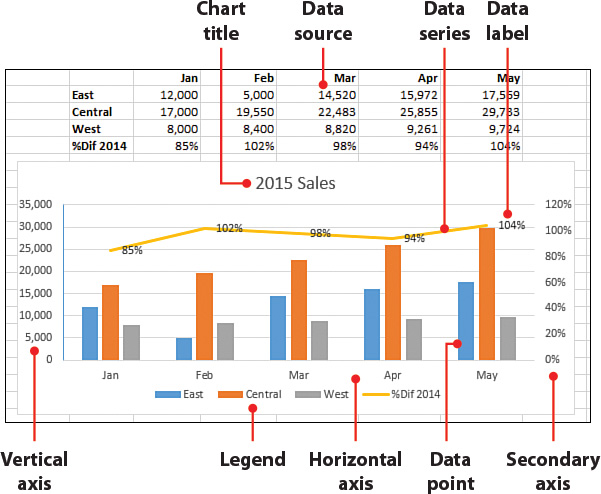
Using charts is a great way to graphically portray data. They provide a quick and simple way to emphasize trends in data. Some people prefer to look at charts instead of trying to make sense of rows and columns of numbers. Excel offers two methods for charting data—charts and sparklines. Charts, which you are most likely ...
Get My Excel 2016 now with the O’Reilly learning platform.
O’Reilly members experience books, live events, courses curated by job role, and more from O’Reilly and nearly 200 top publishers.

