Chapter III.5. Heavenly Charting
In This Chapter
Making different kinds of charts
Deciding where the chart should live
Using error bars
Getting a Gantt chart
Creating histograms
Charts are an Excel strongpoint. Students, businesses, scientists, news organizations, economists, and many other groups use charts. When you make charts in Office 2008, you find a brand-new charting engine that gleams with the latest Microsoft charting technology.
Note
The terms chart and graph are interchangeable. We stick with chart, while acknowledging when graph is the preferred term.
Because the chart feature of Excel is now common to Word, Excel, and PowerPoint, we cover most aspects of charts in Book I, Chapter 5. If certain terms here seem foreign to you, we recommend that you flip to that chapter before you dive into this one. However, if you've worked with charts before, you might be familiar with chart basics. This chapter focuses primarily on aspects of charts that are unique to working with them in Microsoft Excel.
Making a Chart
In Excel, making a chart is a one-click operation after you perform a minimal amount of setup. It's hard to imagine an easier way to create charts, as shown in Figure 5-1. Follow these steps:
Select a data range.
Click the Charts tab of Elements Gallery.

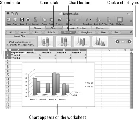
Figure III.5.1. Making a chart ...
Get Office 2008 for Mac All-in-One For Dummies® now with the O’Reilly learning platform.
O’Reilly members experience books, live events, courses curated by job role, and more from O’Reilly and nearly 200 top publishers.

