(Ray)
(Fogra 39)Job:10-29438 Title:RP-Playing with Type
#175 Dtp:225 Page:56
042-079_29438.indd 56 10/24/12 2:44 PM
(Ray)
(Fogra 39)Job:10-29438 Title:RP-Playing with Type
#175 Dtp:225 Page:57
042-079_29438.indd 57 10/24/12 2:44 PM
56 playing with type
(Text)
16
adding flourishes
Create a typographic composition that
combines three or more fonts, flourishes,
and vector elements (such as lines or
dots). The format is up to you; a postcard,
restaurant menu, fruit crate label, and so
on. Make sure the typefaces you select are
of high contrast to one another. Maintain
hierarchy among levels of information.
Don’t let the ornamentation overpower
the type.
Combining this many typefaces can be
difficult, so choose wisely!
If you loved this, you’ll love these!
Mixing Typefaces, page 52; Script for Special Occasions, page 59
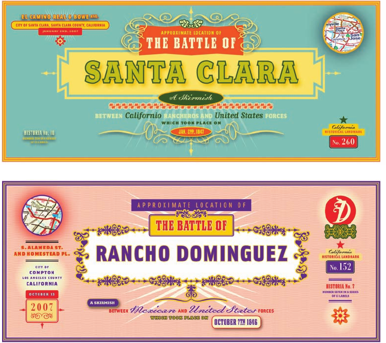
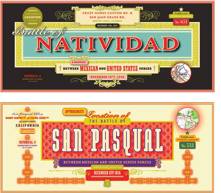
Above and opposite page: Here, Émigré took an approach that was evocative of various historical forms of
American typographic styles but was made with distinctly contemporary design sensibilities and typefaces. The
result is a series of labels resembling a hybrid of antique bond certificates and California orange crate labels.
Typefaces: Émigré Type Library
Designer: Rudy VanderLans
(Ray)
(Fogra 39)Job:10-29438 Title:RP-Playing with Type
#175 Dtp:225 Page:56
042-079_29438.indd 56 10/24/12 2:43 PM
project-based play 57
(Text) (Ray)
(Fogra 39)Job:10-29438 Title:RP-Playing with Type
#175 Dtp:225 Page:57
042-079_29438.indd 57 10/24/12 2:43 PM
(Ray)
(Fogra 39)Job:10-29438 Title:RP-Playing with Type
#175 Dtp:225 Page:56
042-079_29438.indd 56 10/24/12 2:44 PM
(Ray)
(Fogra 39)Job:10-29438 Title:RP-Playing with Type
#175 Dtp:225 Page:57
042-079_29438.indd 57 10/24/12 2:44 PM
56 playing with type
(Text)
16
adding flourishes
Create a typographic composition that
combines three or more fonts, flourishes,
and vector elements (such as lines or
dots). The format is up to you; a postcard,
restaurant menu, fruit crate label, and so
on. Make sure the typefaces you select are
of high contrast to one another. Maintain
hierarchy among levels of information.
Don’t let the ornamentation overpower
the type.
Combining this many typefaces can be
difficult, so choose wisely!
If you loved this, you’ll love these!
Mixing Typefaces, page 52; Script for Special Occasions, page 59
Above and opposite page: Here, Émigré took an approach that was evocative of various historical forms of
American typographic styles but was made with distinctly contemporary design sensibilities and typefaces. The
result is a series of labels resembling a hybrid of antique bond certificates and California orange crate labels.
Typefaces: Émigré Type Library
Designer: Rudy VanderLans
(Ray)
(Fogra 39)Job:10-29438 Title:RP-Playing with Type
#175 Dtp:225 Page:56
042-079_29438.indd 56 10/24/12 2:43 PM
project-based play 57
(Text) (Ray)
(Fogra 39)Job:10-29438 Title:RP-Playing with Type
#175 Dtp:225 Page:57
042-079_29438.indd 57 10/24/12 2:43 PM
(Ray)
(Fogra 39)Job:10-29438 Title:RP-Playing with Type
#175 Dtp:225 Page:58
042-079_29438.indd 58 10/24/12 2:44 PM
(Ray)
(Fogra 39)Job:10-29438 Title:RP-Playing with Type
#175 Dtp:225 Page:59
042-079_29438.indd 59 10/24/12 2:44 PM
58 playing with type
(Text)
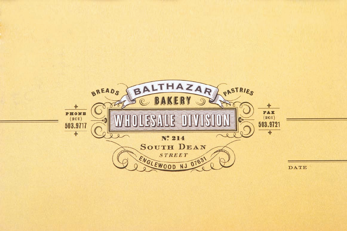
A key strategy in creating the Balthazar restaurant brand was to develop the
tools and materials that would allow it to grow beyond the walls of the original
brasserie. The Balthazar Bakery logo is a play on the original and is set over a
signature Provence-yellow background.
Typeface: custom
Designer: Mucca Design
(Ray)
(Fogra 39)Job:10-29438 Title:RP-Playing with Type
#175 Dtp:225 Page:58
042-079_29438.indd 58 10/24/12 2:43 PM
project-based play 59
(Text)
17
script for special occasions
Script lettering is often used to bring elegance to a design.
This makes it the perfect choice when designing for a
special occasion.
Create an invitation to an event. The format should be
determined by what best fits the occasion. Use two or three
typefaces; the most prominent should
be a script.
If you loved this, you’ll love these!
Mixing Typefaces, page 52; Adding Flourishes, page 56; Script Practice, page 112
Above: Silkscreened invitations
Typefaces: Sloop Script 3, Baskerville
Designer: Annica Lydenberg
Right: Inspired by the incredible Jessica Hische
Typefaces: Welo Script (modified), Archer
Designer: Alix Sorrell
(Ray)
(Fogra 39)Job:10-29438 Title:RP-Playing with Type
#175 Dtp:225 Page:59
042-079_29438.indd 59 10/24/12 2:43 PM
Get Playing with Type: 50 graphic experiments for exploring typographic design principles now with the O’Reilly learning platform.
O’Reilly members experience books, live events, courses curated by job role, and more from O’Reilly and nearly 200 top publishers.

