Chapter 6. Creating Pie Charts
A pie chart shows the relative proportions of several items. By looking at the relative size of the pie slices and their accompanying percentage figures, you can clearly see the relationship between the items (Figure 6.1).
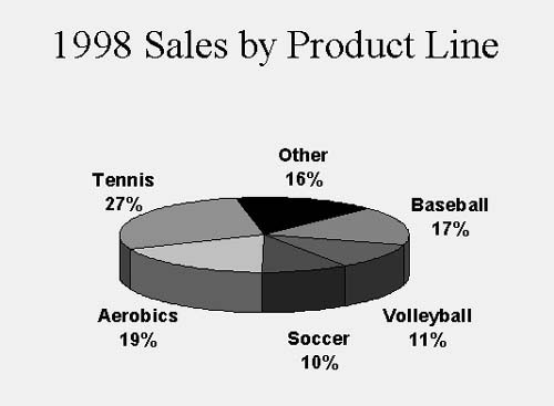
Figure 6.1. Use a 3-D pie chart to clearly show relative values.
Unlike column and line charts, which typically show different values over time, pie charts show values at a particular point in time (such as 1999 sales). Pie charts are one of the simplest types of charts to create because they have only one data series.
Microsoft Graph offers a number of ways to enhance your pie charts. For instance, ...
Get PowerPoint 2000/98: Visual QuickStart Guide now with the O’Reilly learning platform.
O’Reilly members experience books, live events, courses curated by job role, and more from O’Reilly and nearly 200 top publishers.

