Chapter 68. How to Filter Out Partial Time Periods
One of the most panic-inducing visuals in data visualization is a line graph that has a sudden, and steep, decline. When there is truly an issue with the business that needs to be addressed, it is important to share the illustrated insight with stakeholders that can take action.
However, an apparent steep drop on a line graph can also be caused when time periods are not the same number of days, as is the case when a week, month, or year starts over (i.e., one day in the current week versus seven days in the prior week).
When the latter scenario happens, it can lead to misinterpreted findings and unnecessary panic; both of which you want to avoid in data visualization. Misinterpretations can lead to the wrong actions and unnecessary panic is a distraction from finding the real stories in the data.
This chapter shares a technique for filtering out partial time periods in an analysis.
How to Filter Out Partial Time Periods in Tableau
To illustrate when it helps to filter out partial time periods in Tableau, let’s first take a look at a view that often shows up in real life. Using the Sample – Superstore dataset, we’ll say we’re looking at an annual report for the year 2015 with data through December 6th:
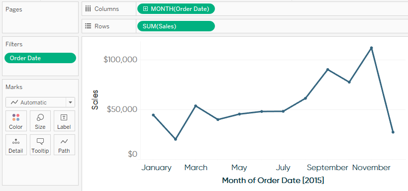
By the looks of this graph, after a brief downturn in February, the business recovered and has been steadily trending upward. ...
Get Practical Tableau now with the O’Reilly learning platform.
O’Reilly members experience books, live events, courses curated by job role, and more from O’Reilly and nearly 200 top publishers.

