ASP.NET provides five server controls for selecting single or multiple items from a list:
BulletedListCheckBoxListDropDownListListBoxRadioButtonList
All of these controls are derived from ListControl and have much in common:
ListItem(the information displayed by the list) works exactly the same way for all theListControls, with aValueproperty and aTextproperty.The
Itemsproperty of the control contains the collection of all theListItems.ListItemscan be added to the Items collection either statically, i.e., declaratively in the content file, programmatically through theAddmethod, or from a data source.The Data Source Configuration Wizard or the ListItem Collection Editor can be easily accessed by clicking the control’s smart tag, the little icon in the upper-right corner of the control.
The
SelectedIndexandSelectedItemproperties of the control point to the selected item with the lowest index. For single select controls, such as theDropDownList, theRadioButtonList, and theListBox(if theSelectionModeproperty is set toListSelectionMode.Single, the default value), the selected index is by definition, the lowest index. For multi-select controls, such asCheckBoxListand theListBoxwith theSelectionModeproperty set toListSelectionMode.Multiple, these properties will refer to the selected item with the lowest index.The
SelectedValueproperty of the control retrieves or specifies the value of the selected item.The
AppendDataBoundItemsproperty of the control (new to Version 2 of ASP.NET) allows items added through data binding (described in Chapter 9) to be added to the Items collection, rather than replace the Items collection, the default behavior.All five controls raise and respond to the
SelectedIndexChangedevent.
The ListBox and DropDownList controls differ from the other list controls (BulletedList, CheckBoxList, and RadionButtonList) in that they appear to the user to be a single control (a list box or a drop-down list) rather than a collection of links, buttons or checkboxes. The ListBox and DropDownList controls lend themselves to longer lists because they scroll.
Table 4-5 summarizes the differences among the five list controls.
Table 4-5. Differences among the five list controls
|
Characteristic |
BulletedList |
CheckBoxList |
RadioButtonList |
DropDownList |
ListBox |
|---|---|---|---|---|---|
|
Single selection only |
✗ |
✗ |
✗ | ||
|
Able to select more than one item |
✗ |
✗ | |||
|
Displays the entire list |
✗ |
✗ |
✗ | ||
|
Displays single item at a time, along with a button for seeing the entire list, using vertical scrollbar if necessary |
✗ | ||||
|
Displays multiple items, using vertical scrollbar if necessary |
✗ | ||||
|
Best for short lists |
✗ |
✗ |
✗ | ||
|
Best for long lists |
✗ |
✗ |
The following sections describe the controls and objects related to selecting items from a list.
Five server controls allow you to select from a list, all derived from the ListControl class. A ListControl control consists of a collection of ListItem objects. Each ListItem object has four properties, detailed in Table 4-6.
Table 4-6. Properties of the ListItem object
|
Name |
Type |
Get |
Set |
Description |
|---|---|---|---|---|
|
|
Boolean |
✗ |
✗ |
If set to |
|
|
Boolean |
✗ |
✗ |
A value indicating that the item has been selected. |
|
|
String |
✗ |
✗ |
The text string displayed for a |
|
|
String |
✗ |
✗ |
A value associated with a |
When dealing with lists, displaying one thing to the user but passing something different to your code is common. For example, if presenting your users with a list of states, the list might display state names, such as Massachusetts. But when they select an item, the program will pass the selected item as ma. Massachusetts would be the ListItem object’s Text property, and ma would be the Value property.
The Text property can be specified in one of two ways:
- Inner HTML content
Text contained between the opening and closing tags of any control
-
Textattribute An attribute within the opening tag of the
ListItemcontrol
There can be either a closing tag with no inner HTML, or the opening tag can be self-closing. All three of the following lines are equivalent:
<asp:ListItem>Item 7</asp:ListItem>
<asp:ListItem text="Item 7"></asp:ListItem>
<asp:ListItem text="Item 7"/>
If both a Text property and inner HTML content are specified, the inner HTML content will be displayed. For example, consider the following line:
<asp:ListItem text="Item 7">Item 8</asp:ListItem>
If you used that line, “Item 8” would be displayed on the web page.
The Value property can be set similarly to the Text property. So, for example, you could modify the lines of code presented previously to also set the value, as follows:
<asp:ListItem value="7">Item 7</asp:ListItem>
<asp:ListItem text="Item 7" value="7"></asp:ListItem>
<asp:ListItem text="Item 7" value="7"/>
The CheckBoxList is a parent control containing a collection of CheckBox items. It is very similar to the group of CheckBox controls shown previously in CheckBoxDemo in Figure 4-6, except that all the child checkboxes are handled as a group. The CheckBoxList control derives from ListControl rather than directly from WebControl.
The CheckBoxList control is better suited than individual checkboxes for creating a series of checkboxes out of data in a database, although either type of control can be bound to data. Chapter 9 discusses data binding.
There are three ways to add items to the Items collection of a CheckBoxList:
Declaratively using the
<asp:ListItem>control tagProgrammatically from an array
Dynamically from a data source such as a database
The web site shown in Figure 4-8, CheckBoxList-DeclarativeItems, demonstrates many of the properties of the CheckBoxList control. The list items are added declaratively in the content file, Default.aspx. Attributes in the CheckBoxList control declaration, corresponding to properties of the CheckBoxList class, specify the appearance and behavior of the control.
The content file for this web site is shown in Example 4-16. Since there are no events handled in this web application and hence no event handlers, there is no code-behind file.
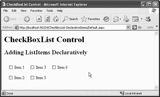
Example 4-16. Default.aspx for CheckBoxList-DeclarativeItems web site
<%@ Page Language="C#" AutoEventWireup="true" CodeFile="Default.aspx.cs"
Inherits="_Default" %>
<!DOCTYPE html PUBLIC "-//W3C//DTD XHTML 1.1//EN"
"http://www.w3.org/TR/xhtml11/DTD/xhtml11.dtd">
<html xmlns="http://www.w3.org/1999/xhtml" >
<head runat="server">
<title>CheckBoxList Control</title>
</head>
<body>
<form id="form1" runat="server">
<div>
<h1>CheckBoxList Control</h1>
<h2>Adding ListItems Declaratively</h2>
<asp:CheckBoxList ID="cblItems" runat="server"
AutoPostBack="True"
CellPadding="5"
CellSpacing="10"
RepeatColumns="3">
<asp:ListItem> Item 1 </asp:ListItem>
<asp:ListItem> Item 2 </asp:ListItem>
<asp:ListItem> Item 3 </asp:ListItem>
<asp:ListItem> Item 5 </asp:ListItem>
<asp:ListItem> Item 6 </asp:ListItem>
</asp:CheckBoxList>
</div>
</form>
</body>
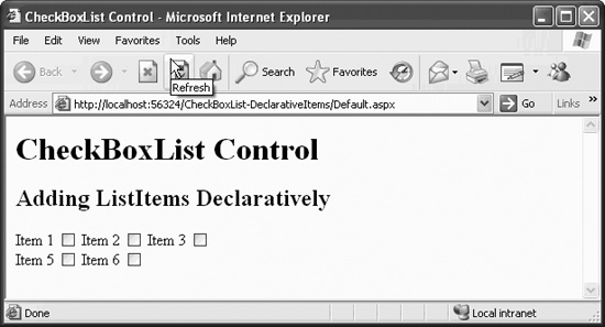
</html>In the code in Example 4-16, default values were used for those properties that have defaults, as indicated in Table 4-7. By changing the RepeatDirection, RepeatLayout, and TextAlign properties to Horizontal, Flow, and Left, respectively, you get the results shown in Figure 4-9.
Table 4-7. Properties of CheckBoxList control
|
Name |
Type |
Get |
Set |
Values |
Description |
|---|---|---|---|---|---|
|
|
Boolean |
✗ |
✗ |
|
Determines if automatic postback to the server will occur if the user changes the contents of the control |
|
|
integer |
✗ |
✗ |
Integers |
Distance in pixels between the border and contents of a cell |
|
|
integer |
✗ |
✗ |
Integers |
Distance in pixels between the border and contents of a cell. The default is |
|
|
Object |
✗ |
✗ |
Source that populates the control. | |
|
|
Integer |
✗ |
✗ |
Integers |
Number of columns to display. |
|
|
RepeatDirection |
✗ |
✗ |
|
The default value is |
|
|
RepeatLayout |
✗ |
✗ |
|
Default is |
|
|
Boolean |
✗ |
✗ |
|
Indicates an item has been selected. Default is |
|
|
TextAlign |
✗ |
✗ |
|
Dictates if the text label is on the left or right of the checkboxes. Default is |
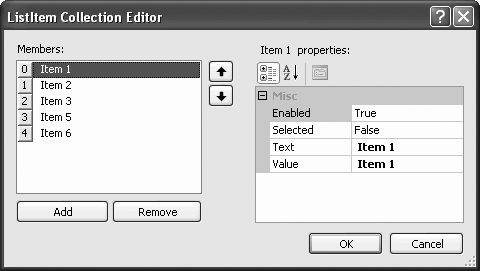
The ListItems can be manually typed into the content file (Intellisense will help minimize the typing), or you can use the Collection Editor. To use the Collection Editor, select the CheckBoxList in Design view, click on the smart tag (the little icon in the upper-right corner of the control in Design view) and select Edit Items... from the smart tag menu. The dialog box shown in Figure 4-10 will appear. Use this dialog box to add or remove ListItems and change their properties.
There are times when you do not know at compile time what checkboxes you want to create. For example, you may want your program to populate the list dependent on the value of other controls on the page. In these cases, you need to be able to add items to the Items collection programmatically.
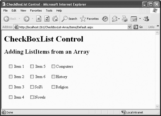
In this next example, CheckBoxList-ArrayItems, shown in Figure 4-11, ListItem objects are added both programmatically and also are hardcoded within the CheckBoxList tags for purposes of illustration.
The content file for this web site is shown in Example 4-17, and the code-behind file is listed in Example 4-18.
Example 4-17. Default.aspx for CheckBoxList-ArrayItems web site
<%@ Page Language="C#" AutoEventWireup="true"  CodeFile="Default.aspx.cs"
    Inherits="_Default" %>

<!DOCTYPE html PUBLIC "-//W3C//DTD XHTML 1.1//EN"
    "http://www.w3.org/TR/xhtml11/DTD/xhtml11.dtd">

<html xmlns="http://www.w3.org/1999/xhtml" >
<head runat="server">
    <title>CheckBoxList Control</title>
</head>
<body>
    <form id="form1" runat="server">
    <div>
      <h1>CheckBoxList Control</h1>
      <h2>Adding ListItems from an Array</h2>
       <asp:CheckBoxList ID="cblGenre" runat="server"
                         AutoPostBack="True"
                         CellPadding="5"
                         CellSpacing="10"
                         RepeatColumns="3"

                         OnInit="cblGenre_Init">
         <asp:ListItem> Item 1 </asp:ListItem>
         <asp:ListItem> Item 2 </asp:ListItem>
         <asp:ListItem> Item 3 </asp:ListItem>
         <asp:ListItem> Item 4 </asp:ListItem>
         <asp:ListItem> Item 5 </asp:ListItem>
         <asp:ListItem> Item 6 </asp:ListItem>
       </asp:CheckBoxList>

    </div>
    </form>
</body>
</html>
Example 4-18. Event handler in code-behind file for CheckBoxList-ArrayItems web site
protected void cblGenre_Init(object sender, EventArgs e)
{
   // create an array of items to add
   string[] Genre = { "SciFi", "Novels", "Computers", "History",
                    "Religion" };
   for (int i = 0; i < Genre.Length; i++)
   {

      this.cblGenre.Items.Add(new ListItem(Genre[i]));
   }
}
The remainder of the code-behind file for this example is just boilerplate inserted by VS2005.
You add an attribute to the control tag that implements an event handler for control initialization:
onInit="cblGenre_Init"
Then you add the cblGenre_Init method, called by onInit, to the code-behind file, default.aspx.cs. This method creates a string array of genres to add to the list of checkboxes. Then, a for loop is used to iterate through the array, calling the Add method on each item to add a new ListItem object to the Items collection of the CheckBoxList control.
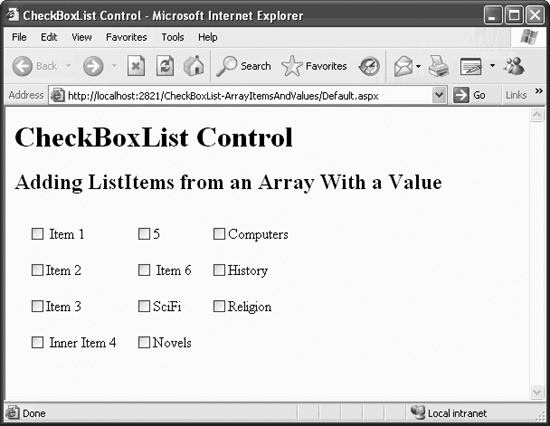
You can modify the code in Examples 4-17 and 4-18 to add Value properties for some of the ListItems created in the CheckBoxList declaration, as well as in all the ListItem objects created in the cblGenre_Init event procedure. This is demonstrated in the new web site CheckBoxList-ArrayItemsAndValues, copied from CheckBoxList-ArrayItems and modified. The resulting web page is shown in Figure 4-12. The default.aspx content file for the web site is listed in Example 4-19, with lines of code highlighted which differ from Example 4-17.
Example 4-19. Default.aspx for CheckBoxList-ArrayItemsAndValues web site
<%@ Page Language="C#" AutoEventWireup="true"  CodeFile="Default.aspx.cs"
         Inherits="_Default" %>

<!DOCTYPE html PUBLIC "-//W3C//DTD XHTML 1.1//EN"
   "http://www.w3.org/TR/xhtml11/DTD/xhtml11.dtd">

<html xmlns="http://www.w3.org/1999/xhtml" >
<head runat="server">
    <title>CheckBoxList Control</title>
</head>
<body>
    <form id="form1" runat="server">
    <div>
      <h1>CheckBoxList Control</h1>
      <h2>Adding ListItems from an Array With a Value</h2>
       <asp:CheckBoxList ID="cblGenre" runat="server"
                         AutoPostBack="True"
                         CellPadding="5"
                         CellSpacing="10"
                         RepeatColumns="3"
                         OnInit="cblGenre_Init">

         <asp:ListItem value="1"> Item 1 </asp:ListItem>
         <asp:ListItem text="Item 2" value="2"></asp:ListItem>
         <asp:ListItem text="Item 3"/>
         <asp:ListItem text="Item 4"> Inner Item 4 </asp:ListItem>
         <asp:ListItem value="5"></asp:ListItem>
         <asp:ListItem> Item 6 </asp:ListItem>
       </asp:CheckBoxList>

    </div>
    </form>
</body>
</html>
In the Init event handler in the code-behind file, shown in Example 4-20, the difference from the previous example is highlighted.
Example 4-20. Event handler in code-behind file for CheckBoxList-ArrayItemsAndValues web site
protected void cblGenre_Init(object sender, EventArgs e)
{
   // create an array of items to add
   string[] Genre = { "SciFi", "Novels", "Computers", "History",
                      "Religion" };

   string[] Code = { "sf", "nvl", "cmp", "his", "rel" };

   for (int i = 0; i < Genre.Length; i++)
   {

      //  Add both Text and Value
      this.cblGenre.Items.Add(new ListItem(Genre[i], Code[i]));
   }
}
In cblGenre_Init, listed in Example 4-20, where you previously created a single string array to hold the Text properties, there are now two string arrays: one for the Text properties and one for the Value properties. You now use the overloaded Add method, passing in a single argument consisting of a ListItem object:
this.cblGenre.Items.Add(new ListItem(Genre[i],Code[i]));
Tip
An object may overload its methods, which means it may declare two or more methods with the same name. The compiler differentiates among these methods based on the number and type of parameters provided.
For example, the ListItemCollection class overloads the Add method. One version takes a string, and the second version takes a ListItem object.
Finally, in creating the static ListItems, you used several different methods of creating Values and Text, including instances of missing Text (Item 5), missing Value (Item 3, Item 4, Item 6), and divergent Text property from inner HTML content (Item 4). The differences between Figures 4-11 and 4-12 can be seen in Items 4 and 5.
You can see that if the Value is missing, then the Text is displayed. If the Text is missing, the Value will be displayed. If the Text is different from the inner HTML content, the inner HTML content will be displayed.
The real power of adding items programmatically comes when you can use a data source to populate the items in a CheckBoxList control. The ultimate data source, obviously, is a database. This will be covered in Chapter 9. However, you can use the array just created to demonstrate binding to a data source.
Copy the previous example to a new web site, called CheckBoxList-ArrayItemsData-Bind. Modify only the cblGenre_Init event handler method in the code-behind file. By replacing the for loop in cblGenre_Init in Example 4-18 with two lines of code (which specify the data source and then bind to it), the method now appears, as shown in Example 4-21.
Example 4-21. Modified code-behind for CheckBoxList-ArrayItemsDataBind web site
protected void cblGenre_Init(object sender, EventArgs e)
{
   // create an array of items to add
   string[] Genre = { "SciFi", "Novels", "Computers", "History",
                      "Religion" };


   cblGenre.DataSource = Genre;
   cblGenre.DataBind();
}
You might expect the results to be unchanged from Figure 4-12, but that is not the case. Instead, you get the results shown in Figure 4-13.
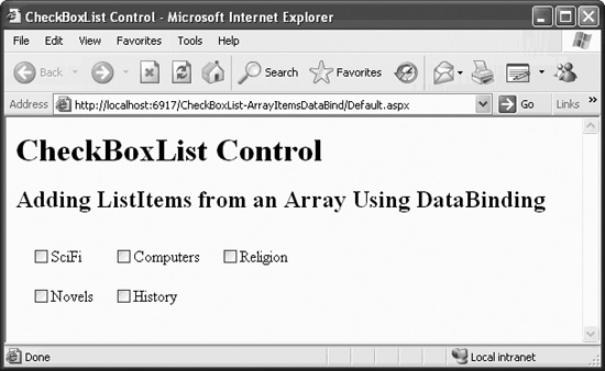
In the previous example, using the for loop, ListItems were added by the Init method after the control was created. In this example, the preexisting ListItem objects were replaced by the new data source because the ListControl.Items collection is initialized by the data source, so any previously defined ListItem objects are lost.
That is the default behavior when data binding to a ListControl object. Alternatively, you can set the AppendDataBoundItems property (new to Version 2.0 of ASP.NET) of the control to true, in which case the data-bound items will be added to the existing Items collection, rather than replacing the existing Items collection.
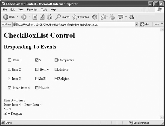
When a user checks or unchecks one of the checkboxes in a CheckBoxList, the SelectedIndexChanged event is raised. This event passes an argument of type EventArgs, which does not expose any properties. By setting an attribute for handling this event and putting code in the event handler method, you can respond to the user clicking on one of the checkboxes. If AutoPostBack is set to true, the response occurs immediately. Otherwise, the response occurs the next time the form is posted to the server.
To see this, copy the previous example to a new web site, CheckBoxList-RespondingToEvents, and add the highlighted code from the content file in Example 4-22 and the code-behind file shown in Example 4-23. The resulting web page, after selecting a few checkboxes, is shown in Figure 4-14.
Example 4-22. default.aspx in CheckBoxList-RespondingToEvents web site
<%@ Page Language="C#" AutoEventWireup="true"  CodeFile="Default.aspx.cs"
         Inherits="_Default" %>

<!DOCTYPE html PUBLIC "-//W3C//DTD XHTML 1.1//EN"
   "http://www.w3.org/TR/xhtml11/DTD/xhtml11.dtd">

<html xmlns="http://www.w3.org/1999/xhtml" >
<head runat="server">
    <title>CheckBoxList Control</title>
</head>
<body>
    <form id="form1" runat="server">
    <div>
      <h1>CheckBoxList Control</h1>
      <h2>Responding To Events</h2>
       <asp:CheckBoxList ID="cblGenre" runat="server"
                         AutoPostBack="True"
                         CellPadding="5"
                         CellSpacing="10"
                         RepeatColumns="3"
                         OnInit="cblGenre_Init"

                   OnSelectedIndexChanged="cblGenre_SelectedIndexChanged">
         <asp:ListItem value="1"> Item 1 </asp:ListItem>
         <asp:ListItem text="Item 2" value="2"></asp:ListItem>
         <asp:ListItem text="Item 3"/>
         <asp:ListItem text="Item 4"> Inner Item 4 </asp:ListItem>
         <asp:ListItem value="5"></asp:ListItem>
         <asp:ListItem> Item 6 </asp:ListItem>
       </asp:CheckBoxList>

       <asp:Label ID="lblGenre" runat="server" Text="Label"></asp:Label>
    </div>
    </form>
</body>
</html>
Example 4-23. Modified event handlers in CheckBoxList-RespondingToEvents web site
protected void cblGenre_Init(object sender, EventArgs e)
{
   string[] Genre = { "SciFi", "Novels", "Computers", "History",
                      "Religion" };
   string[] Code = { "sf", "nvl", "cmp", "his", "rel" };

   for (int i = 0; i < Genre.Length; i++)
   {
      //  Add both Text and Value
      this.cblGenre.Items.Add(new ListItem(Genre[i], Code[i]));
   }
}

protected void cblGenre_SelectedIndexChanged(object sender, EventArgs e)
{
   StringBuilder sb = new StringBuilder();
   foreach (ListItem li in cblGenre.Items)
   {
      if (li.Selected == true)
      {
         sb.Append("<br/>" + li.Value + " - " + li.Text);
      }
   }

   if (sb.Length == 0)
      lblGenre.Text = "No genres selected.";
   else
      lblGenre.Text = sb.ToString();

}
Tip
Notice how the StringBuilder class is used in the method cblGenre_SelectedIndexChanged to create the string, rather than concatenating each string value onto the previous value, as in this line of C# code:
str += "<br/>" + li.Value + " - " + li.Text;
Strings are immutable. When you write :
String firstString = "Hello";
string firstString += " world";
it appears as if you are concatenating the second part of the string onto firstString. What is actually happening, however, is that a second string is being allocated and assigned to your string reference, and the first string is being destroyed. If you do this a lot (in a tight loop, for example) it is very inefficient since creating and destroying the string objects are time-consuming operations.
The StringBuilder class provides a more efficient way of constructing strings, since it does not require that a new string be created with every modification.
The additional code added to the previous examples, shown highlighted in Examples 4-22 and 4-23, demonstrates responding to SelectedIndexChanged.
In the code in Examples 4-22 and 4-23, you add an attribute named OnSelectedIn-dexChanged to identify the event handler for the SelectedIndexChanged event. Like all event handlers, the attribute name comes from prepending the word “On” to the event name. Add a Label control to the form, lblGenre, to display the selected items.
The event handler points to a method in the code-behind file called cblGenre_SelectedIndexChanged. In this event handler method, you iterate through the collection of ListItems in the CheckBoxList. For each ListItem, you check to see if the Selected property is true. If it is, then you add the Value property of that item to the HTML string you are constructing, using the StringBuilder class. Finally, the length of the StringBuilder string is tested. If it is zero length, then an appropriate message is displayed; otherwise, the StringBuilder string containing the selected values is displayed.
The RadioButtonList control is very similar to the CheckBoxList control. Both are derived from the ListControl class and share all of the same properties
, events, and methods. The only difference between the two (aside from the round versus square shape) is that the RadioButtonList control can have only one item selected at a time. When an item is selected, any other selected item is deselected.
The RadioButtonList and the CheckBoxList controls share two properties inherited from ListControl, shown in Table 4-8.
To demonstrate how these properties are useful, copy the web site used to demonstrate radio buttons, RadioButtonDemo, to a new web site, called RadioButtonListDemo. Replace the three radio buttons controlling the font size with a single RadioButtonList, calling it rblSize, as shown in Example 4-24. The final page is shown in Figure 4-15 after selecting a font size. It looks similar to the individual radio buttons, but it is easier to populate from a data source.
Example 4-24. default.aspx for RadioButtonListDemo web site
<%@ Page Language="C#" AutoEventWireup="true"  CodeFile="Default.aspx.cs"
         Inherits="_Default" %>

<!DOCTYPE html PUBLIC "-//W3C//DTD XHTML 1.1//EN"
   "http://www.w3.org/TR/xhtml11/DTD/xhtml11.dtd">

<html xmlns="http://www.w3.org/1999/xhtml" >
<head runat="server">
    <title>RadioButtonList Control</title>
</head>
<body>
    <form id="form1" runat="server">
    <div>
      <h1>RadioButtonList Control</h1>
       <br />
       <asp:Label ID="lblTime" runat="server"
                  OnInit="lblTime_Init"></asp:Label>

       <br />
       <br />
      <asp:radioButtonList
         id="rblSize" runat="server"
         autoPostBack="true"
         cellSpacing="20"
         repeatColumns="3"
         repeatDirection="horizontal"
         RepeatLayout="table"
         textAlign="right"

         OnSelectedIndexChanged="rblSize_SelectedIndexChanged">


         <asp:ListItem text="10pt" value="10"/>
         <asp:ListItem text="14pt" value="14"/>
         <asp:ListItem text="16pt" value="16"/>
      </asp:radioButtonList>

    </div>
    </form>
</body>
</html>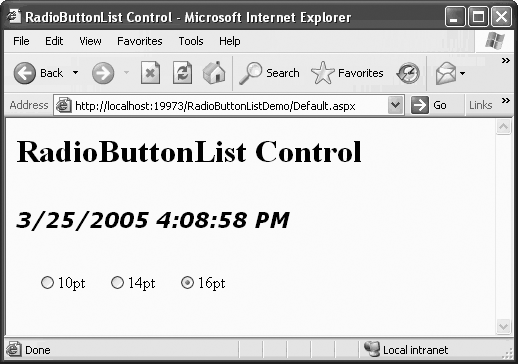
The event handlers in the code-behind file for this page are shown in Example 4-25.
Example 4-25. Event handlers in default.aspx.cs for RadioButtonListDemo web site
protected void lblTime_Init(object sender, EventArgs e)
{
   lblTime.Font.Name = "Verdana";
   lblTime.Font.Size = 20;
   lblTime.Font.Bold = true;
   lblTime.Font.Italic = true;
   lblTime.Text = DateTime.Now.ToString();
}

protected void rblSize_SelectedIndexChanged(object sender, EventArgs e)
{
   //  Check to verify that something has been selected.
   if (rblSize.SelectedIndex != -1)
   {
      int size = Convert.ToInt32(rblSize.SelectedItem.Value);
      lblTime.Font.Size = size;
   }
}
In RadioButtonListDemo, the original separate radio buttons are replaced by a RadioButtonList control. Each ListItem object has a Text property and a Value property. The event handler, rblSize_SelectedIndexChanged, sets the Font.Size property, requiring an integer value to do so, which it gets from the SelectedItem.Value property of the radio button list:
int size = Convert.ToInt32(rblSize.SelectedItem.Value);
lblTime.Font.Size = size;
Tip
This works because C# provides an implicit conversion operator
to convert the Int32 to a new FontUnit instance.
The event handler method makes use of the SelectedIndex and SelectedItem properties mentioned previously. The SelectedIndex property represents the lowest integer value index of all the selected items. The SelectedItem property returns the Text property of the item pointed to by SelectedIndex. Since a RadioButtonList, by definition, can have at most a single selected item, then SelectedIndex and SelectedItem will tell us which item is selected. These properties are more ambiguous when applied to a CheckBoxList control or other multi-select ListControl control.
RadioButtonListDemo verifies that at least one of the values has been selected. If no item has been selected, then the SelectedIndex property is equal to -1. If an item has been selected, you set the Font.Size property by converting the SelectedItem.Value property to an integer. Note the following two lines of C# code in Example 4-25:
int size = Convert.ToInt32(rblSize.SelectedItem.Value);
lblTime.Font.Size = size;
They could have been written as a single line:
lblTime.Font.Size = Convert.ToInt32(rblSize.SelectedItem.Value);
However, I often use the more verbose version to enhance readability and make the code easier to debug.
DropDownList controls display a single item at a time with a button for dropping the list to display more selections. Only a single item can be selected.
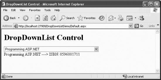
This next example, DropDownListDemo, demonstrates a DropDownList control. A two-dimensional string array is used in the Page_Load event handler to hold the Text and Value properties. The array is then used to add the ListItem objects to the Items collection. The result can be seen in Figure 4-16. The content file to accomplish this page is listed in Example 4-26, and the code-behind file is shown in Example 4-27.
Example 4-26. default.aspx for DropDownListDemo
<%@ Page Language="C#" AutoEventWireup="true"  CodeFile="Default.aspx.cs"
    Inherits="_Default" %>

<!DOCTYPE html PUBLIC "-//W3C//DTD XHTML 1.1//EN"
    "http://www.w3.org/TR/xhtml11/DTD/xhtml11.dtd">

<html xmlns="http://www.w3.org/1999/xhtml" >
<head runat="server">
    <title>DropDownList Control</title>
</head>
<body>
    <form id="form1" runat="server">
    <div>
      <h1>DropDownList Control</h1>


       <asp:DropDownList ID="ddl" runat="server"
                      AutoPostBack="True"
                      OnSelectedIndexChanged="ddl_SelectedIndexChanged">
       </asp:DropDownList>
       <br />
       <asp:Label ID="lblDdl" runat="server" ></asp:Label>

    </div>
    </form>
</body>
</html>
Example 4-27. Event handlers in code-behind file for DropDownListDemo
protected void Page_Load(object sender, EventArgs e)
{

   if (!IsPostBack)
   {
      //  Build 2 dimensional array for the lists
      //  First dimension contains bookname
      //  2nd dimension contains ISBN number
      string[,] books = {
           {"Programming C#","0596001177"},
           {"Programming Visual Basic .NET","0596004389"},
           {"Programming .NET Windows Applications","0596003218"},
           {"Programming ASP.NET","0596001711"},
           {"WebClasses From Scratch","0789721260"},
           {"Teach Yourself C++ in 21 Days","067232072X"},
           {"Teach Yourself C++ in 10 Minutes","067231603X"},
           {"XML & Java From Scratch","0789724766"},
           {"Complete Idiot's Guide to a Career in Computer Programming",
               "0789719959"},
           {"XML Web Documents From Scratch","0789723166"},
           {"Clouds To Code","1861000952"},
           {"C++ Unleashed","0672312395"}
        };

      //  Now populate the list.
      for (int i = 0; i < books.GetLength(0); i++)
      {
         //  Add both Text and Value
         ddl.Items.Add(new ListItem(books[i, 0], books[i, 1]));
      }
   }
}

protected void ddl_SelectedIndexChanged(object sender, EventArgs e)
{
   //  Check to verify that something has been selected.
   if (ddl.SelectedIndex != -1)
   {

      lblDdl.Text = ddl.SelectedItem.Text + " --->ISBN: " +
         ddl.SelectedValue;
   }
}
In Example 4-26, a DropDownList with the ID of ddl is added. This control is populated when the page is first loaded in the Page_Load event handler method.
To prevent this code from running every time the page is reloaded, you test to see if the IsPostBack property is true. The IsPostBack property is false when the page is first loaded but is set to true whenever the form is posted back to the server as a result of user action on one of the controls. In many applications, the contents of controls are filled from a database, which can be an expensive operation. Hitting the database only when necessary makes the implementation more efficient. In the CheckBoxList-ArrayItemsAndValues example, you used two arrays to populate a CheckBoxList with both the Text and Value properties. In this example, you use a single two-dimensional array to accomplish the same thing. As before, you call the Items.Add method to add the ListItems to the control. In Chapter 9, you will see how to populate a ListControl from a database.
As with the other ListControls, the OnSelectedIndexChanged attribute points to the event handler method, ddl_SelectedIndexChanged. In that method, as with the RadioButtonList control, you first check to see if something is selected by testing if the SelectedIndex property is not equal to -1. If an item has been selected, you display a concatenation of SelectedItem.Text and SelectedValue in the Label called lblDdl.
ListBox controls are very similar to DropDownList controls, except that all the list items are visible, with the aid of a vertical scrollbar if necessary. By changing the SelectionMode property from the default value of Single to Multiple, the ListBox control can be used to select multiple items.
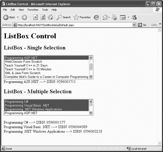
This next example, ListBoxDemo, shown in Figure 4-17, demonstrates two different ListBoxes: one using single selection and one allowing multiple selection. As you will see, the two ListBoxes are almost identical in implementation, the significant difference between them being the technique used to identify the selected item(s).
The significant differences between this example and the previous example, DropDownListDemo, are highlighted in Example 4-28, the content file for ListBoxDemo, and Example 4-29, the event handlers in the code-behind file for ListBoxDemo. These differences include the addition of the two DropDownList controls, modification to the Page_Load method to populate those controls, and the addition of event handlers for those two controls.
Example 4-28. default.aspx for ListBoxDemo
<%@ Page Language="C#" AutoEventWireup="true"  CodeFile="Default.aspx.cs"
         Inherits="_Default" %>

<!DOCTYPE html PUBLIC "-//W3C//DTD XHTML 1.1//EN"
   "http://www.w3.org/TR/xhtml11/DTD/xhtml11.dtd">

<html xmlns="http://www.w3.org/1999/xhtml" >
<head runat="server">
   <title>ListBox Control</title>
</head>
<body>
   <form id="form1" runat="server">
   <div>
      <h1>ListBox Control</h1>
      <h2>ListBox - Single Selection</h2>

      <asp:ListBox ID="lbSingle" runat="server"
                   AutoPostBack="True"
                   Rows="6"
                   OnSelectedIndexChanged="lbSingle_SelectedIndexChanged">
      </asp:ListBox>
      <br />

      <asp:Label ID="lblSingle" runat="server"></asp:Label>
      <br />
      <h2>ListBox - Multiple Selection</h2>

      <asp:ListBox ID="lbMulti" runat="server"
                   AutoPostBack="True"
                   SelectionMode="Multiple"
                   OnSelectedIndexChanged="lbMulti_SelectedIndexChanged">
      </asp:ListBox>
      <br />

      <asp:Label ID="lblMulti" runat="server"></asp:Label>
   </div>
   </form>
</body>
</html>
Example 4-29. Event handlers in code-behind file for ListBoxDemo
protected void Page_Load(object sender, EventArgs e)
{
   if (!IsPostBack)
   {
      //  Build 2 dimensional array for the lists
      //  First dimension contains bookname
      //  2nd dimension contains ISBN number
      string[,] books = {
           {"Programming C#","0596001177"},
           {"Programming Visual Basic .NET","0596004389"},
           {"Programming .NET Windows Applications","0596003218"},
           {"Programming ASP.NET","0596001711"},
           {"WebClasses From Scratch","0789721260"},
           {"Teach Yourself C++ in 21 Days","067232072X"},
           {"Teach Yourself C++ in 10 Minutes","067231603X"},
           {"XML & Java From Scratch","0789724766"},
           {"Complete Idiot's Guide to a Career in Computer Programming",
               "0789719959"},
           {"XML Web Documents From Scratch","0789723166"},
           {"Clouds To Code","1861000952"},
           {"C++ Unleashed","0672312395"}
        };

      //  Now populate the list.
      for (int i = 0; i < books.GetLength(0); i++)
      {
         //  Add both Text and Value

         lbSingle.Items.Add(new ListItem(books[i, 0], books[i, 1]));
         lbMulti.Items.Add(new ListItem(books[i, 0], books[i, 1]));
      }
   }
}


protected void lbSingle_SelectedIndexChanged(object sender, EventArgs e)
{
   //  Check to verify that something has been selected.
   if (lbSingle.SelectedIndex != -1)
   {
      lblSingle.Text = lbSingle.SelectedItem.Text + " ---> ISBN: " +
         lbSingle.SelectedItem.Value;
   }
}


protected void lbMulti_SelectedIndexChanged(object sender, EventArgs e)
{
   string str = "";
   foreach (ListItem li in lbMulti.Items)
   {
      if (li.Selected == true)
      {
         str += "<br/>" + li.Text + " ---> ISBN: " + li.Value;
      }
   }

//  Alternative technique
//   foreach (int i in lbMulti.GetSelectedIndices())
//   {
//      ListItem li = lbMulti.Items[i];
//      str += "<br/>" + li.Text + " ---> ISBN: " + li.Value;
//   }

   if (str.Length == 0)
      lblMulti.Text = "No books selected.";
   else
      lblMulti.Text = str;
}
ListBox controls have two properties in addition to those inherited from ListControl. These properties are shown in Table 4-9.
The first ListBox added in ListBoxDemo, with an ID of lbSingle, is a single-selection list box. The Rows property has been set to 6, and six items are displayed. Since the control has been populated with more than six items, a vertical scrollbar automatically appears. If a second item is selected, the first item is deselected. As with most of the examples in this chapter, AutoPostBack has been set to true so the effects of the change are visible immediately.
The second ListBox control, with an ID of lbMulti, is a multiple selection list box. The Rows property has not been set, so the default four rows are visible. Since it is multiselect, the standard Windows techniques of multi-selection can be used.
The event handlers for processing the selections of the two list boxes are very different. The event handler for the single selection list box is similar to the one for the DropDownList control or any other single select ListControl, such as the RadioButtonList control.
The event handler listed in Example 4-29 for the multi-select list box
shows two different techniques for building up the string of selected items. The first technique is like that used for the CheckBoxList control. It iterates through the collection of ListItem objects, checking each to see if the Selected property is true. If it is true, then the Text and Value properties will be added to the string for output to a label. The second technique, commented out in Example 4-29, uses the ListBox GetSelectedIndices method (new to Version 2.0 of ASP.NET) to return an integer array of indices of all the selected items. That array is iterated, with each selected ListItem being instantiated to get its Text and Value properties.
The BulletedList control (new to Version 2.0 of ASP.NET) provides an ASP.NET server control analog to the HTML ordered (<ol>) and unordered lists
(<ul>). The appearance and functionality of the list is controlled with properties of the BulletedList control. Like the other controls derived from ListControl, the BulletedList has an Items property, which is a collection of ListItem objects.
The style of the bullet is specified with the BulletStyle property. The valid values are contained within the BulletStyle enumeration, with values such as Circle, Disc, Numbered, LowerAlpha, UpperAlpha, LowerRoman, and UpperRoman. If the BulletStyle property is not set, a value of NotSet is the default, in which case the browser determines what style of bullet to use, typically the same as Disc.
If the BulletStyle property is set to a numeric or alphabetic style, such as Numbered, LowerAlpha, UpperAlpha, LowerRoman, or UpperRoman, then the starting value can be set using the FirstBulletNumber property. The default value is 1. Numeric bullet styles (Numbered, LowerRoman, UpperRoman) display numbers, and alphabetic types display the alphabetical equivalent.
The DisplayMode property determines appearance and functionality. It can be any one of the three values of the BulletedListDisplayMode enumeration:
-
Text The default value; causes the list content to display as text. No events will be associated with the control if this value is used, that is, there is no user interaction with this control, other than eyeballing it on the page.
-
HyperLink Each
ListItemis displayed as an underlined link. When clicked, no server-side events are raised, and the form is not posted back to the server. Rather, like theHyperLinkcontrol itself, the user is navigated directly to the URL specified in theValueproperty of theListItemthat was clicked.The
Targetproperty of theBulletedListcontrol works in conjunction with theDisplayModeset toHyperLink, dictating the browser window in which the target page will be displayed. The values of theTargetproperty are the same as those listed in Table 4-3 for theHyperLinkcontrol.-
LinkButton Each
ListItemis displayed as an underlined link, exactly like theHyperLink. However, when the user clicks an item, theBulletedList.Clickevent is raised and immediately posted back to the server. A server-side event handler, specified by theOnClickattribute of theBulletedListcontrol, is executed.
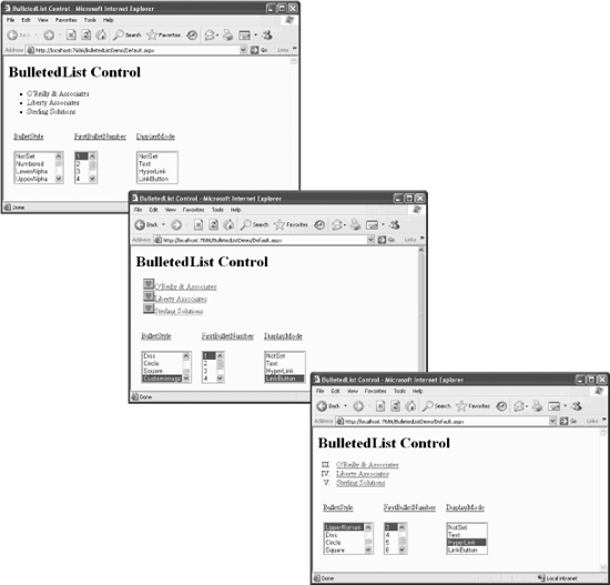
The example shown in Figure 4-18, BulletedListDemo, demonstrates the different bullet styles, starting numbers and display modes, as well as event handling with the BulletedList control. The content file for the example is shown in Example 4-30, and the event handler methods from the code-behind file are shown in Example 4-31.
Example 4-30. Default.aspx for BulletedListDemo
<%@ Page Language="C#" AutoEventWireup="true"  CodeFile="Default.aspx.cs"
         Inherits="_Default" %>

<!DOCTYPE html PUBLIC "-//W3C//DTD XHTML 1.1//EN"
   "http://www.w3.org/TR/xhtml11/DTD/xhtml11.dtd">

<html xmlns="http://www.w3.org/1999/xhtml" >
<head runat="server">
   <title>BulletedList Control</title>
</head>
<body>
<form id="form1" runat="server">
<div>
   <h1>BulletedList Control</h1>

   <asp:BulletedList ID="bltList" runat="server"
                     OnClick="bltList_Click"
                     Target="_blank">
     <asp:ListItem Value="http://www.oreilly.com/">
        O'Reilly & Associates</asp:ListItem>
     <asp:ListItem Value="http://www.LibertyAssociates.com">
        Liberty Associates</asp:ListItem>
     <asp:ListItem Value="http://www.stersol.com"
                   Text="Sterling Solutions"></asp:ListItem>
   </asp:BulletedList>

   <table cellpadding=10>
      <tr>
         <td colspan=3 id="tdMessage" runat="server">
         </td>
      </tr>
      <tr>
         <td>
            <u>BulletStyle</u>
         </td>
         <td>
            <u>FirstBulletNumber</u>
         </td>
         <td>
            <u>DisplayMode</u>
         </td>
      </tr>
      <tr>
         <td>
            <asp:ListBox ID="lbBulletStyle" runat="server"

                    AutoPostBack=true
                    OnSelectedIndexChanged="lb_SelectedIndexChanged">
               <asp:ListItem>NotSet</asp:ListItem>
               <asp:ListItem>Numbered</asp:ListItem>
               <asp:ListItem>LowerAlpha</asp:ListItem>
               <asp:ListItem>UpperAlpha</asp:ListItem>
               <asp:ListItem>LowerRoman</asp:ListItem>
               <asp:ListItem>UpperRoman</asp:ListItem>
               <asp:ListItem>Disc</asp:ListItem>
               <asp:ListItem>Circle</asp:ListItem>
               <asp:ListItem>Square</asp:ListItem>
               <asp:ListItem>CustomImage</asp:ListItem>
            </asp:ListBox>
         </td>
         <td>
            <asp:ListBox ID="lbFirstBulletNumber" runat="server"

                   AutoPostBack=true
                   Width=50
                   OnSelectedIndexChanged="lb_SelectedIndexChanged">
               <asp:ListItem selected="true">1</asp:ListItem>
               <asp:ListItem>2</asp:ListItem>
               <asp:ListItem>3</asp:ListItem>
               <asp:ListItem>4</asp:ListItem>
               <asp:ListItem>5</asp:ListItem>
               <asp:ListItem>6</asp:ListItem>
            </asp:ListBox>
         </td>
         <td>
            <asp:ListBox ID="lbDisplayMode" runat="server"

                   AutoPostBack=true
                   OnSelectedIndexChanged="lb_SelectedIndexChanged">
               <asp:ListItem>NotSet</asp:ListItem>
               <asp:ListItem>Text</asp:ListItem>
               <asp:ListItem>HyperLink</asp:ListItem>
               <asp:ListItem>LinkButton</asp:ListItem>
            </asp:ListBox>
         </td>
      </tr>
   </table>
</div>
</form>
</body>
</html>
Example 4-31. Event handler methods from default.aspx.cs for BulletedListDemo
protected void lb_SelectedIndexChanged(object sender, EventArgs e)
{
   ListBox lb = (ListBox)sender;
   string strID = lb.ID;
   string strValue = lb.SelectedValue;

   switch (strID)
   {
      case "lbBulletStyle":

         BulletStyle style =
            (BulletStyle)Enum.Parse(typeof(BulletStyle), strValue);
         bltList.BulletStyle = style;

         //  Special case the CustomImage
         if (style == BulletStyle.CustomImage)
         {

            bltList.BulletImageUrl = "heart.bmp";
         }
         break;

      case "lbFirstBulletNumber":

         bltList.FirstBulletNumber = Convert.ToInt32(strValue);
         break;

      case "lbDisplayMode":

         BulletedListDisplayMode displayMode =
            (BulletedListDisplayMode)Enum.Parse(
               typeof(BulletedListDisplayMode),
               strValue);


         bltList.DisplayMode = displayMode;
         break;

      default:
         break;
   }
}      //  close for lb_SelectedIndexChanged


protected void bltList_Click(object sender, BulletedListEventArgs e)
{
    BulletedList b = (BulletedList)sender;
    tdMessage.InnerHtml = "Selected index: " + e.Index.ToString() +
         "<br>" +
         "Selected value: " + b.Items[e.Index].Value +
         "<br>";
}
In Example 4-30, the BulletedList control has three ListItems in its Items collection, all added statically. It so happens that all the list items represent web sites. In anticipation of the HyperLink DisplayMode being applied, each ListItem has its Value property set, which supplies the URL to navigate to. The Target property of the BulletedList control is set to _blank, so according to Table 4-3, this will cause the new page to open in a new, unnamed browser window.
The OnClick attribute of the BulletedList control hooks the Click event to the bltList_Click method in the code-behind file, shown highlighted in Example 4-31.
The event handler for this Click event will concatenate the Index and the Value properties of the clicked ListItem, along with some HTML elements, and assign that string to the InnerHtml property of an HTML server-side control. This event handler method requires an event argument of type BulletedListEventArgs, which exposes a single property, Index. This property returns the zero-based index of the clicked ListItem in the Items collection.
However, to retrieve either the actual Text or Value of the clicked ListItem, you must have a reference to the specific BulletedList control that raised the event. In this example, there is only a single BulletedList control and the ID is known to us: bltList. However, a more generic technique is used here where a single event handler will work with any number of controls. You first cast the object that raised the event, encapsulated in sender, to an object of type BulletedList, then index into the ListItems collection represented by the Items property of that BulletedList object. This is accomplished in the following line of code from Example 4-31:
"Selected value: " + b.Items[e.Index].Value +
Though not directly related to the BulletedList control, some interesting techniques are used with all three of the ListBox controls on the page.
All the ListBoxes have AutoPostBack set to true so you will see the results of changing a value immediately. Also, all three controls use the same event handler method, lb_SelectedIndexChanged, for the SelectedIndexChanged event. The following two attributes in each of the ListControl declarations implements this:
AutoPostBack=true
OnSelectedIndexChanged="lb_SelectedIndexChanged">
Looking at the lb_SelectedIndexChanged method in the code-behind file in Example 4-31, the first line of code gets a reference to the control that raised the event by casting sender to a ListBox object:
ListBox lb = (ListBox)sender;
Then the ID and SelectedValue properties of the list box can be retrieved.
A switch block is used to take action appropriate for each list box. The ListBox that sets the FirstBulletNumber property is straightforward, converting the SelectedValue, contained in the string variable strValue, to an integer and assigning that integer to the FirstBulletNumber property:
bltList.FirstBulletNumber = Convert.ToInt32(strValue);
The case blocks for the other two ListBoxes are a bit more interesting. The goal is to determine the item selected, either a BulletStyle or a DisplayMode, and apply that to the BulletedList. In both cases, this is accomplished using the static Enum.Parse method. This method converts a name or value of an enumerated constant into its equivalent enumerated object. You must pass it the type of the enumerated constant and the value of the constant.
So, looking at the case for lbBulletStyle (lbDisplayMode is exactly equivalent), the Type of the enumeration is obtained from the typeof operator, which returns a System.Type object. The value of the selected constant is contained in strValue. Given these two arguments, Enum.Parse returns an object, which you then cast to the desired type and assign to a variable:
BulletStyle style =
   (BulletStyle)Enum.Parse(typeof(BulletStyle), strValue);
This variable can then be used to set the appropriate property:
bltList.BulletStyle = style;In the case of lbBulletStyle, you must special case the CustomImage to assign the BulletImageUrl property. Here you can compare BulletStyle directly with the enumerated constants to see if there is a match:
if (style == BulletStyle.CustomImage)
{

   bltList.BulletImageUrl = "heart.bmp";
}
Get Programming ASP.NET, 3rd Edition now with the O’Reilly learning platform.
O’Reilly members experience books, live events, courses curated by job role, and more from O’Reilly and nearly 200 top publishers.

