Setting the available viewport for use
When viewing a website on different devices, we of course expect it to resize to the available device width automatically with no loss of experience; unfortunately, not every site does this quite the right way or successfully!
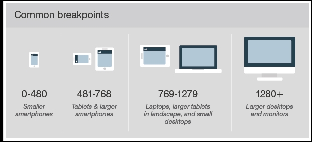
To understand why this is important, let's assume we operate a desktop version of our site (one in the 1280+ group in this screenshot), and a mobile equivalent from the 418-768 group:
The first stage in making our site responsive is to add the viewport directive; without it, we are likely to end up with a similar effect to this when resizing our sites:
See what I mean? It looks awful—text ...
Get Responsive Web Design with HTML5 and CSS3 Essentials now with the O’Reilly learning platform.
O’Reilly members experience books, live events, courses curated by job role, and more from O’Reilly and nearly 200 top publishers.

