Producing a Sankey diagram with the networkD3 package
A Sankey diagram is a really powerful way of displaying your data. Particularly, Sankey diagrams are a really convenient way of showing flows of data from their origin to their end.
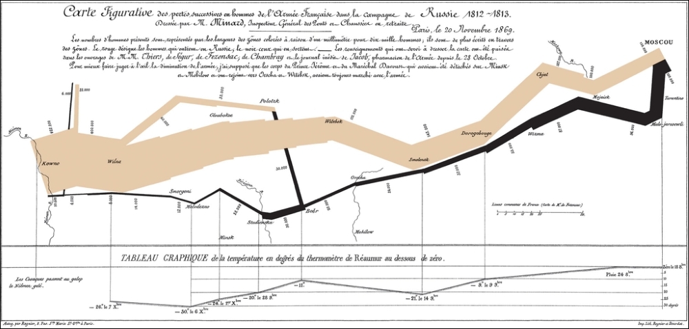
A really famous example of these kind of diagrams is the one presented by Charles Minard's 1869 chart showing the number of men in Napoleon's 1812 Russian campaign army, their movements, as well as the temperature they encountered on the return path:
In a Sankey diagram, a given amount is shown on the leftmost side of the plot and, while moving ...
Get RStudio for R Statistical Computing Cookbook now with the O’Reilly learning platform.
O’Reilly members experience books, live events, courses curated by job role, and more from O’Reilly and nearly 200 top publishers.

