Chapter 35 Clouds and Bubbles
The Allure of Word Clouds and Bubble Charts
As you know from reviewing the scenarios and reading about the problems with pies, circles, and donuts, word clouds and bubble charts may look great, but they are analytically impoverished.
So what do you do if somebody shows you an infographic that has a word cloud or a bubble chart, or both, and asks you why your dashboard—which they think is boring because it has a lot of bar charts—doesn't have either?
We thought it would be useful to share a case study about an organization that grappled with this very issue.
Marist Poll and Views of the 2016 Presidential Election
The Marist Poll, a survey research center at Marist College, partners with media organizations including NBC News, The Wall Street Journal, and McClatchy to provide publicly available poll results on elections and issues. In November 2015, the Marist Poll asked Americans to describe in one word the tone of the 2016 presidential election. Figure 35.1 shows the results.
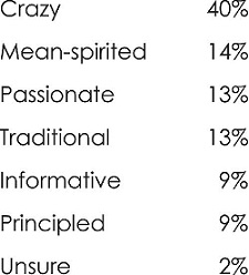
Figure 35.1 Marist Poll results in tabular form.
Attempt 1: Word Cloud
The results from the poll are very compelling, but the results as depicted in the text table don't exactly pop. Marist first tried a word cloud, shown in Figure 35.2.
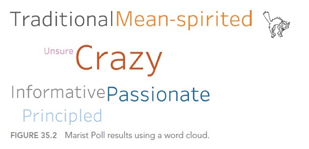
Figure 35.2 Marist Poll results ...
Get The Big Book of Dashboards now with the O’Reilly learning platform.
O’Reilly members experience books, live events, courses curated by job role, and more from O’Reilly and nearly 200 top publishers.

